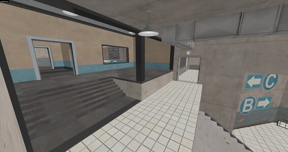
Pl_Cashworks

PL Pl_Cashworks rc3

Aug 19, 2008
1,011
1,158
eerieone submitted a new resource:

Pl_Cashworks_rc3 - This overhaul took me 13 years.

Hey

With the map being in the official roster now, it most certainly needed an update.
I´d love to get it tested with you to check if it imporves on the old layout without losing the flavour. :)

Prepare for some drastic changes. :)

- eerieone

-----------------------------

Changelog:

Area 1:
Blu Spawn 1:
  • changed the outside visuals of blu spawn to be more interesting
  • slowly spinning antenna on top
  • updated visuals
  • solved a lot of clipping issues at doors and stairs...

Read more about this resource...
 

MM1011

L1: Registered
Apr 15, 2023
44
17
Hey, already downloaded and played some quick rounds of this! First off, wow what an update! We'll need to play it more to really put all the changes through their paces, but here are some initial thoughts.
  • The new flank on the first point is much appreciated. It's small, but having an additional angle to dislodge a heavily entrenched RED team is very nice. Capping first is generally possible even with stacked teams on original Cashworks, but RED can often hold the small uphill afterwards. Having a door that exits onto flat ground so ubers can't be seen a mile away and pushed back so easily is another big benefit.
  • The update to the "balcony" above the second point's downward hill is nice "quality of life" item. It was always possible for any class to transfer directly from the hill to the railing, "widening the path" so to speak is just nice.
  • The sawblade on the same balcony is surprisingly hard to see, especially when coming up from the new RED side. Not sure yet whether I like the sawblade as a feature, but adding elements to the walls and floor that call more attention to it would be nice in any case.
  • The third point has so much changed that I don't have ordered thoughts on the back half.
  • On the front half of the third point, the more open balcony, new left flank, and extended right area are all very nice. In original Cashworks, if RED had a sentry above the first open area, it was often incredibly difficult to dislodge, and the balcony in general felt easy to spam out. These are no longer issues, I think.
  • On the fourth point, breaking up the sniper sightlines with the curved bridge is fantastic.
  • The new bridge directly over the point connecting BLU's right flank with the raised area on the left is also exciting. Said area on the left has always felt awkward from the RED side though (that is, RED's right), and even with this update it still feels somewhat disconnected and not like something I want to use.

Not much in the way of helpful criticism yet, but wanted to share the general excitement of our server's players over the update so far!
 

Jacov

L2: Junior Member
Feb 25, 2021
51
16
I'm not a fan of changes to first BLU spawn exterior. I think that previous version looked better. New one has less material variety (muh wood) and feels blocky.

Haven't had a chance to play this yet, but on the first glance B feels less defendable than A with all those shortcut shenanigans.

Last areas feel like major improvements visually, nice work.

Important thing: please, clip your stairs with blockbullets. And bridge with playerclip (is too bumpy).
 
Aug 19, 2008
1,011
1,158
Thank you all for the rapid feedback :)

There´s no set date on shipping, so all feedback is greatly appreciated.
I want to ship the best version yet, so I´ll take the necessary time
 

Boonie

L2: Junior Member
Sep 22, 2015
84
57
Im liking these changes overall.

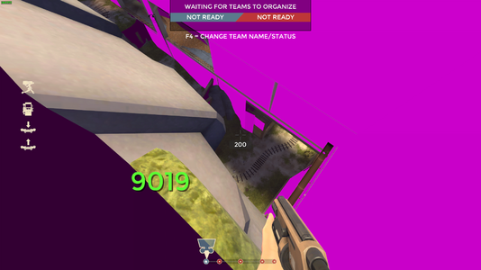
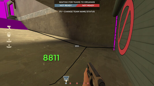
Can stand up here
bnbgN.png

This spot as been annoying for years since engies put teles here and you have to jump over them to get out of spawn due to the ramp.
If you flatten it out for a bit, it would fix that.
XrS3g.jpg
 

Yikes

L1: Registered
Jul 24, 2022
2
1
Really disappointed that the balconies over serpentine were blocked off. That was a really fun and interesting map piece to play around, it opened up a lot of creativity that the other surrounding spots just don't provide. Really fun as a demoknight

Personally never felt while playing the map that it provided much of a power position or was frustrating to deal with players who used the spot. This just feels like a bit of excessive sanitization that removes some of the map's character
 

Boonie

L2: Junior Member
Sep 22, 2015
84
57
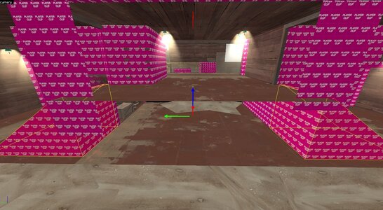
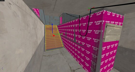
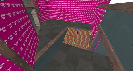
Both of these staircases are offgrid so you get stuck/spaz out when walking over them.

-1188 -3449 -57
WKyBA.jpg

695 788 -607
o3kgZ.jpg

These two staircases should have clips
55X4L.jpg
wXmYw.jpg
 

Boonie

L2: Junior Member
Sep 22, 2015
84
57
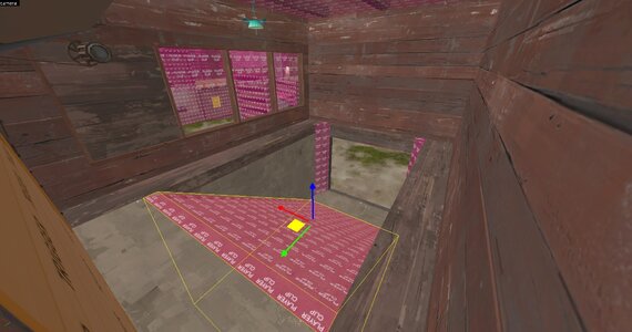
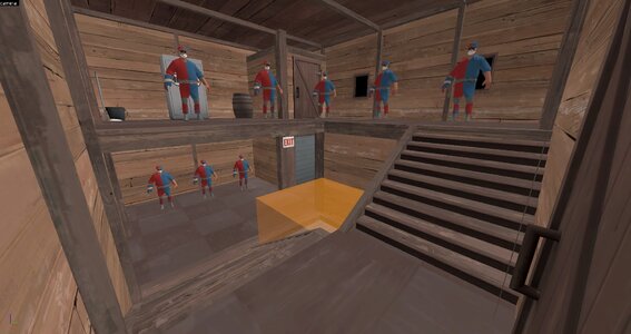
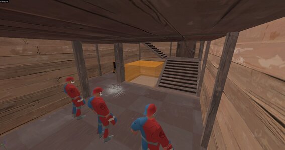
Red first spawn has a problem where if explosive classes can get behind, they can just shoot up through the bottom rear entrance and 100% spawn camp.

The rear dropdown door should really be a trigger door to open it instead of always being open. Would have to expand red first spawn a tiny bit though, extremely fast mockup.

D3VGl.jpg
b17M3.jpg
 

Boonie

L2: Junior Member
Sep 22, 2015
84
57
After running this version since release and it getting played at least once a day, its far to easy for blue to get behind on 2nd point.
Having these doors blocked off until 2nd is capped may be a good idea so 1/2 the team cant just waltz on through behind and stall.

lGlDq.jpg