Here's what I found by running around solo.
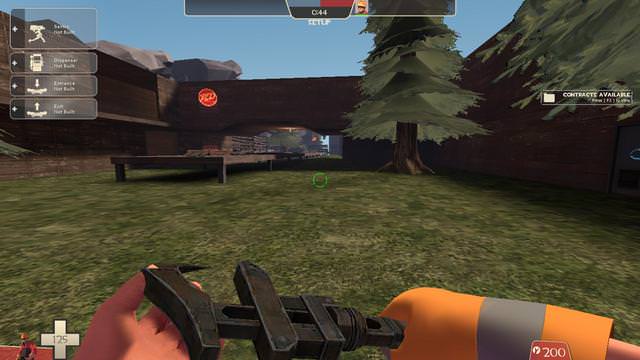
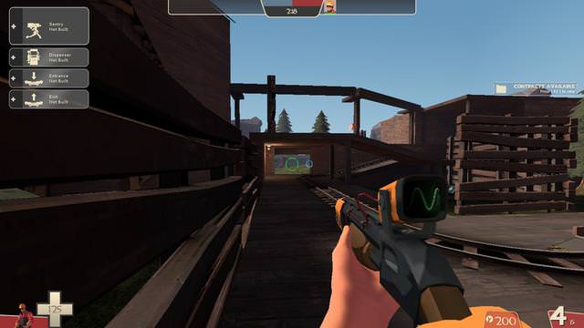
Firstly, this sightline is pretty insane. A Sniper is going to be able to stand back and watch the doorway and nobody will be able to touch them as there's no flank round - and before it gets to that point, a Sniper will be able to pick off anyone pushing the cart along the completely flat, empty path to the entrance - imagine a Machina in there!
Second, the fact that there's only one way into this area means that it's going to become an absolute meatgrind of a choke. Attackers will likely have to use Ubercharges to get in most of the time.
Thirdly, the whole area is just completely flat. Maybe some raised platforms/scaffolding/decks could make this more interesting?
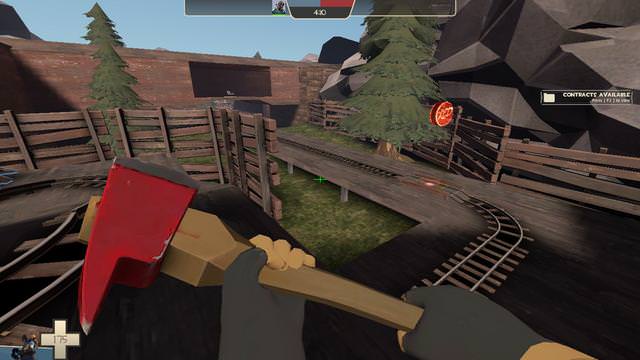
Also, the penultimate capture point is right in view of the last one. While this has been done in one of the most recent Halloween maps, in that case it was handled by splitting up the areas with height. Here, it feels as though this cap has just been placed as a buffer or timewaster before the final point, rather than an area for RED to actually hold.
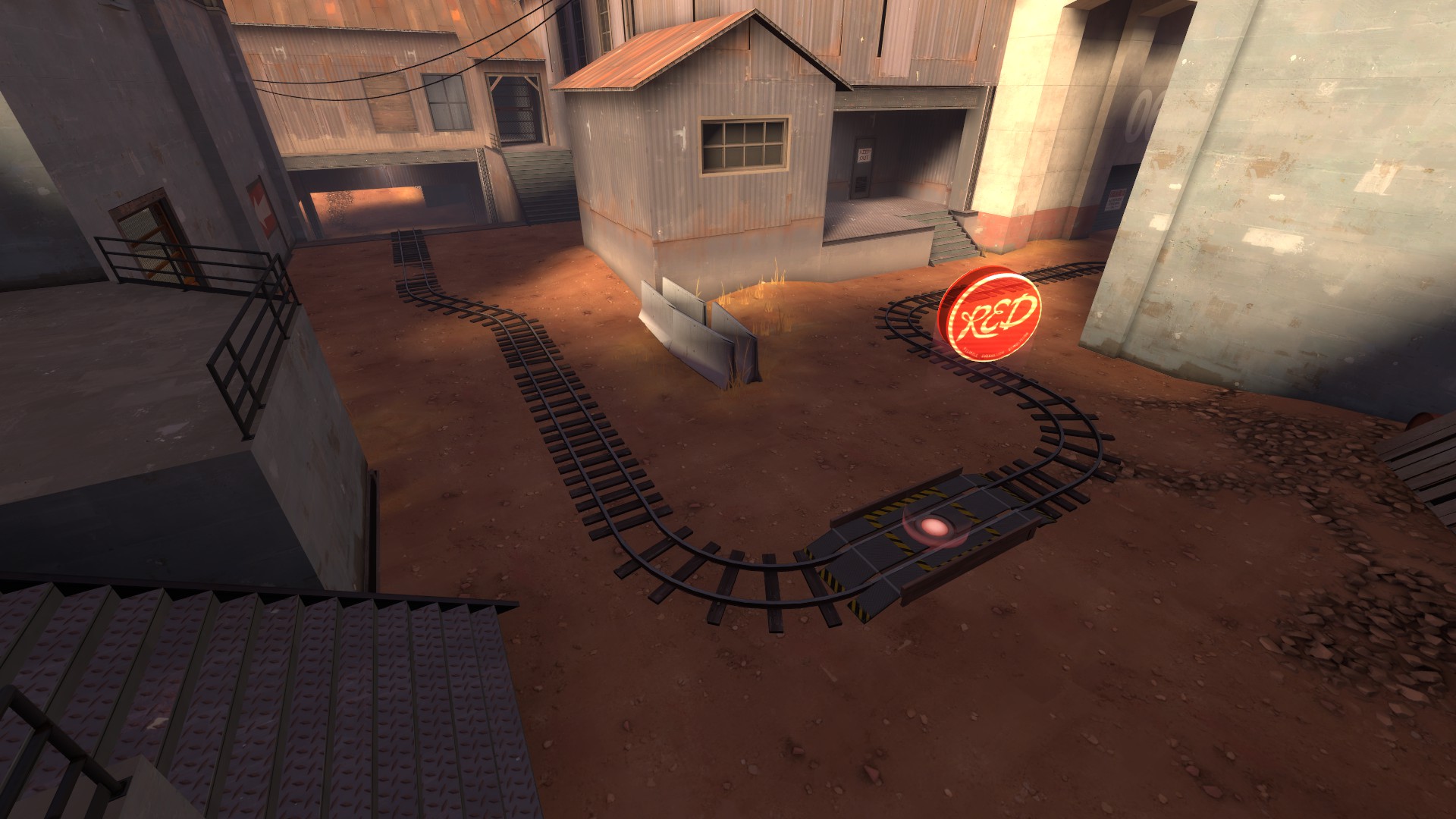
There's another reason the penultimate cap looks problematic:
Here's the position BLU have after pushing the cart just a little way past the first (I think?) point. They have perfect high ground over the point, and they reach this position immediately after capping the one before it! So, my theory is that this point is going to play out as follows: Firstly, nobody defends it because you're right in BLU's face or they're above you, and then, after it's been capped, BLU will be completely exposed to Snipers and Wranglers from a loooong way away - basically, it's a burden on whoever owns it.
I recommend moving the point in such a way that it's more separate from the others, and give defenders a proper opportunity to hold it.
Also, I'm assuming that huuuuuge long stretch of track is to fill out the "Track goes straight for 1500 units" check.
Remember that you can still vary the height of the track! You should use height variation to pull this checklist point off properly - look at how Badwater's third point has an almost perfectly straight track horizontally, but dips under a building which blocks sight and allows for interesting gameplay:
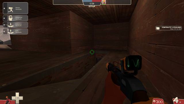
I do like the little spiral crossover track thing.
")
Moving onto BLU's spawn:
These corridors are just far too cramped. It'll be a nightmare to deal with incoming spam splash and stickies with no way around, and with the only two exits being within bombing range of each other. A good general rule is to try to never make your corridors smaller than 256 units (excluding vents and other special cases)!
Also, you can get stuck on those protruding doorframes, which is made worse by the small corridor size. This applies to all doorframes and sticking-out geometry in the map, including RED spawn and those non-opening detail doors you've made. More problems with spawn:
This low-hanging roof should probably get axed - it only cramps the area more, making it harder for attackers to avoid spam and meaning that jumping classes can't jump once they're through that door. It also looks really ugly in my eyes. A general reference is that ceilings should usually be 192-256 units above players' heads.
These problems are amplified tenfold by this:
This sightline! Just look at it!! That entrance is completely locked down if a Sniper sits here. Even if they don't, the huge space outside of spawn means that a Sniper can watch
both entrances, although they do have to be further forward.
I recommend shifting the spawn area to the right enough to cut off this sightline, varying up the displacements in the area outside spawn, and making a third spawn entrance that exits onto a higher plane. Using Upward as an example, the spawns are all far enough apart that a camper can't cover them all, and one of them has high ground over the area, meaning that campers will feel very uncomfortable staying there for too long, and will fall back. But your BLU spawn, in its current state, is a meat grinder.
I feel like this area above the stairs has no purpose other than for Pyros to camp above. Maybe you could open it into a route that leads somewhere? In general the area to my left in this screenshot feels overscaled and empty. Perhaps some more walls could help? Not sure.
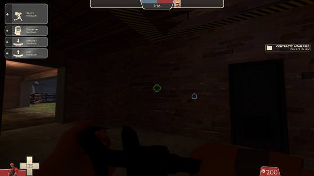
What's up with this shadow? I can't see what could be casting it. Did you change the light falloff options?
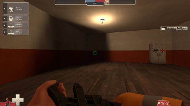
You should brighten this area. Also, the broken planks look quite messy. They're tapered off at the ends, when I think they should be flatter. I'd probably just axe that detail and make it just a hazard stripe dropdown.
Overall, I'd say it's a really cool map but if it were tested right now, I don't think people would get to see the cool parts because they'd be trapped in spawn! I hope what I say doesn't sound harsh, just needs some work. Good luck mapping!