Morras Castle
- Thread starter Sergis
- Start date
-
This map is featured! Our best maps, all together in one place for your viewing pleasure.
You are using an out of date browser. It may not display this or other websites correctly.
You should upgrade or use an alternative browser.
You should upgrade or use an alternative browser.
- Jul 22, 2009
- 1,874
- 1,258
Medieval assets, integrate them NOW!
I would if I hadn't spilled tea on my laptop

First thing I thought when I saw cp_degrootcastle was "Hey, isn't this cp_morrascastle?". Genuinely
Damn Valve taking my niche
- Jul 22, 2009
- 1,874
- 1,258
Great news! (not really). Due to framerate being strangely lower than it should be on the decompiled map, brushwork being a mess even in the original .vmf and mostly because of point C not wanting to have a good framerate, I've decided to start the map over. Expect alpha_1 coming soon (Valve time)
REEJ
L420: High Member
- Aug 26, 2010
- 437
- 176
- Jul 22, 2009
- 1,874
- 1,258
alpha3 ready.
Thing is, with official medieval assets, degrootkeep and Deloras' grid map, the TF2 castles' quality standard is a bit higher now.
Their sucks though
Thing is, with official medieval assets, degrootkeep and Deloras' grid map, the TF2 castles' quality standard is a bit higher now.

I would recommend ditching the Sawmill rock texture now that we have the one from Degroot. The Sawmill one looks like someone took a photo, made a few seam fixes, and ran it through a posterize filter. It's one of the worst Valve-made textures in the game, if not the worst.
As for everything else, I dunno. The small directional signs are hard to make out until you get right up to them, and I didn't like the fact that most of the paths were fairly narrow spaces between two extremely high walls. It was like walking through a nightmare world or something.
As for everything else, I dunno. The small directional signs are hard to make out until you get right up to them, and I didn't like the fact that most of the paths were fairly narrow spaces between two extremely high walls. It was like walking through a nightmare world or something.
- Jul 22, 2009
- 1,874
- 1,258
sawmill rock texture? which one is that?I would recommend ditching the Sawmill rock texture now that we have the one from Degroot. The Sawmill one looks like someone took a photo, made a few seam fixes, and ran it through a posterize filter. It's one of the worst Valve-made textures in the game, if not the worst.
if you mean the cliff wall texture, i like how it looks with grassy ground. i might tone down the bumpmap sometime though because it makes the top of the texture too dark. if you mean the ground texture, the degroot grass/ground blend is a lot darker. i prefer the lighter grass007.
As for everything else, I dunno. The small directional signs are hard to make out until you get right up to them, and I didn't like the fact that most of the paths were fairly narrow spaces between two extremely high walls. It was like walking through a nightmare world or something.
signs are only really needed while you dont know where to go. after that, they might as well not be there at all. and i like how they look.
the narrow spaces might feel better once i start detailing them and make them look more like cliff walls instead of just a high block. also they are that high because i don't want people to see over them.
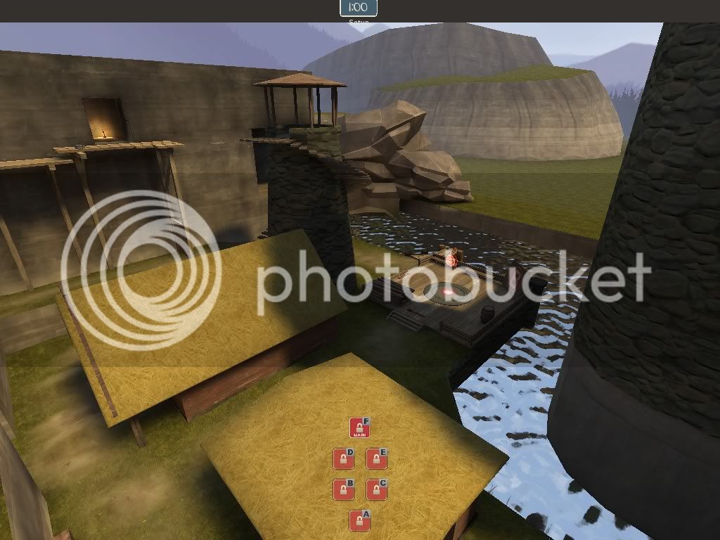
Some points from testing:
More textures, repetitive textures, blending, cubemaps, staircases not touching the ground, hard to find healthpacks - This is first alpha since i've started over. So there are no health/ammo overlays yet, there's only one cubemap and the repetitive desert texture is on a brush, not on a displacement with painted alpha as it should be.
Long respawn times - Red respawn wave time is set to 8 seconds, blu to 4. dunno why would they seem long.
Too open in the blu spawn for round 1 - Red team has no access to that area, which means there will be no combat, which means i can forget balancing and just place whatever i want there.
Shooting through setup gates - I don't really see why it is a bad thing as long as blu cant shoot at CP and red cant shoot at spawnpoints. It gives players something other to do than running around aimlessly waiting for the setup timer.
Point on a tower with only one entrance is bad - Theoretically it seems so, but so far the tower was actually defended maybe once out of 10 playtests I've had.
Too big - It's only an illusion really i think. sdk_cp gravelpit is 8768.0x9296.0 units big, alpha3 includes two gravelpits and is 11264x9121 units big. Only ~2500 units wider.
Why resupply lockers at cps? - The idea was to speed things up. If your team has a control point locked, it's your territory and you can go there to resupply if the nearby health/ammo is all taken and the cp is closer than the spawnroom.
Maybe replace sandwich with steak - I somehow like sandwich model more
Not TF2-y - It was never really intended to be. This is more Gothic 3/Gothic 2 setting adapted for TF2.
Overall the test wasnt all that bad considering that most of the time there was 9 or less players only. Even with 9 players I managed to get 48 comments
I think I'll try to submit the map for a gameday to get some testing with more people.
Last edited:
REEJ
L420: High Member
- Aug 26, 2010
- 437
- 176
Not TF2-y - It was never really intended to be. This is more Gothic 3/Gothic 2 setting adapted for TF2.
Cheers for that
I don't wanna see another dustbowl textured clone, let's see some interesting ideas develop.
absurdistof
aa
- Aug 10, 2009
- 1,240
- 399
When you're looking at size, don't just look at an overall box surrounding your map. I find a feeling about map size develops from each area, and time to get to each area. Also, everybody tends to do this, please please please don't compare maps to Valve maps. Every map is different, and Valve maps are often the way they are for a very complex set of reasons.
Anyways, here are some examples of areas I find overscaled.
A point - A is in a large courtyard inside a pattern of pathways surrounding it. Why do I find it overscaled? I ask myself this: how much of A is actually used? I rarely find myself on any of the ramparts, and it often falls to the attackers very quickly because defending it is very difficult. Shrink the whole area down (not literally, cutting paths out etc..) until all or most of the area around A is being used effectively and enjoyably. Getting from A to B is also a pretty long adventure, and I feel like I'm running miles when I go from A or B to D (that's with the chair, right?).
B point - for many of the same reasons as A, the little town around the castle didn't see much action. Also, side note about the tower: it's not that the one entrance makes it too hard to defend, it just takes out a lot of interesting possibilities. The fight is very restricted, and ends quickly when someone falls off. Demos are favored for their arcing grenade spam, and other classes have a difficult time surviving it.
C also has a lot of 'dead' or unused space around it.
Basically, my estimation of what you could do to make your map a comfortable size is to remove all the dead space, wasted space, or brush clutter, essentially refining the map. Reducing the areas players can go to a point where they all serve an important purpose that each path does concisely and simply is a goal I would shoot for. Having all parts of the map be parts used is probably going to solve your size problem.
Sorry for the ramblage, that's my feedback :O
Anyways, here are some examples of areas I find overscaled.
A point - A is in a large courtyard inside a pattern of pathways surrounding it. Why do I find it overscaled? I ask myself this: how much of A is actually used? I rarely find myself on any of the ramparts, and it often falls to the attackers very quickly because defending it is very difficult. Shrink the whole area down (not literally, cutting paths out etc..) until all or most of the area around A is being used effectively and enjoyably. Getting from A to B is also a pretty long adventure, and I feel like I'm running miles when I go from A or B to D (that's with the chair, right?).
B point - for many of the same reasons as A, the little town around the castle didn't see much action. Also, side note about the tower: it's not that the one entrance makes it too hard to defend, it just takes out a lot of interesting possibilities. The fight is very restricted, and ends quickly when someone falls off. Demos are favored for their arcing grenade spam, and other classes have a difficult time surviving it.
C also has a lot of 'dead' or unused space around it.
Basically, my estimation of what you could do to make your map a comfortable size is to remove all the dead space, wasted space, or brush clutter, essentially refining the map. Reducing the areas players can go to a point where they all serve an important purpose that each path does concisely and simply is a goal I would shoot for. Having all parts of the map be parts used is probably going to solve your size problem
.Sorry for the ramblage, that's my feedback :O
- Jul 22, 2009
- 1,874
- 1,258
What you call ramblage, I call multiple paragraphs of feedback
However, I cant agree with it. You're saying that I have a lot of unused space but the last two playtests had 9 and 13 players when the map is meant for 24. In older playtests with 20 players, there were no unused areas even though the map was even wider than it is now. I believe that the problem is not the lack of use for areas, but the lack of players to use the areas and I do not think that accurate evaluation of what is dead space and what is not is possible with half the playercount the map is made for.
A often falls to the attackers very easily because defending it is very difficult. I'll refer to older playtests again because the castle of point A has not been changed really. With >20 players and engineers setting up in upper areas, point A was actually defended quite a few times. So again, I blame not the map, but the low player count.
A to B is a long adventure. I ran as engie from A capplate to B capplate. I got to B general area in 8 seconds, to base of tower in 14, and to B in 18. I then ran as engie for Gravelpit A to C (example chosen because Gravelpit C is on a tower too). Times were 9, 12 and 18 respectively, so I can't see why would it seem long.
A or B to D (of F if you meant point with the throne) is running miles Why would you run from Stage 1 points to Stage 2 points?
The tower:
takes out a lot of interesting possibilities It itself is an interesting possibility IMO by being quite different from your average control point
The fight is very restricted, and ends quickly when someone falls off The fight is supposed to be more around the point than on it. Also the attackers have the little platform on the cliff wall to fire at the point. The stairs had railings in older versions. I'll put them back sometime.
Demos are favored for their arcing grenade spam, and other classes have a difficult time surviving it. The demo has to get quite close to the tower to spam it. Jump out, kill him in close range, resume capping.
don't just look at an overall box surrounding your map when comparing sizes It's just a convenient statistic to use when speaking about size and trying to prove a point that the map is not THAT big.
please please please don't compare maps to Valve maps Well what am I supposed to compare maps to? I feel my runtimes are OK. Some players don't. If I don't compare my map to Valve' maps, what is the standart I should be comparing against?
I find a feeling about map size develops from each area, and time to get to each area Again, I feel my runtimes and area sizes are acceptable. But what objective argument am I supposed to use to defend my opinion if I don't use comparison to Valve maps? Also, speaking about feeling, I think one of the reasons the map feel big is the seamless transitions into skybox instad of walling off in stage 1. I actually had a player run up the tower at B, look over the lake into skybox, and leave feedback that it's too open.
Bottom line is, until I get a playtest with 20+ players, I will disregard size and unused areas comments. And even then I'm not sure if I will do any big resizes because the map has been resized multiple times and all that's left in it is important either theme wise, optimization wise or has proven to work in previous playtests (like point F, which was played well in very second playtest and since then I'm only doing very minor improvements there).

- Jul 22, 2009
- 1,874
- 1,258
funny how the map plays better with bots than humans, even though bots don't really understand two simultaneously available cps and the attacking bots often attack 12 defenders on point in small groups of 2-3 that dont stand a chance.
in both stages ive blocked off everything from the other stage except spawn area and an alternate route to either point
If you've got multiple stages, block them off between rounds! Imagine how many people would run the length of Gold Rush or Dustbowl on RED if the doors weren't disabled!
in both stages ive blocked off everything from the other stage except spawn area and an alternate route to either point
Last edited:
- Jul 22, 2009
- 1,874
- 1,258
beta 1 ready. I have changed CP logic so that when 2 CPs are available, one of them is randomly locked until the other one is captured. So the first stage will be Artpass style A-B-C or A-C-B and the secong one D-E-F or E-D-F. In theory this should get rid of teamsplitting while retaining at least a little bit of Gravelpit variability spirit
I won't be changing the layout anymore, simply because the map has been in development for far too long and it's time to finish it up.
I won't be changing the layout anymore, simply because the map has been in development for far too long and it's time to finish it up.
Last edited:


That may work. Can i suggest rotating the tower, so the "Landing" at the top isnt a viable spamming position, and is directly opposite the point. Players defending B from above can then do so from the stairs, at a not hugely significant advantage, or the close confines of the tower top. The lnding looks like it might make it too easy. Plus, if the landing is directly behind the best spamming positions, the positions are less good.
- Jul 22, 2009
- 1,874
- 1,258
I want the caves to be controlled by blue team. Scout and pyro can jump over there already, I think that's good enough.
edit: misread your post. from the caves to the tower I think that would be gaining a lot of high ground too quickly.
edit: misread your post. from the caves to the tower I think that would be gaining a lot of high ground too quickly.
Last edited: