You are using an out of date browser. It may not display this or other websites correctly.
You should upgrade or use an alternative browser.
You should upgrade or use an alternative browser.
- Status
- Not open for further replies.
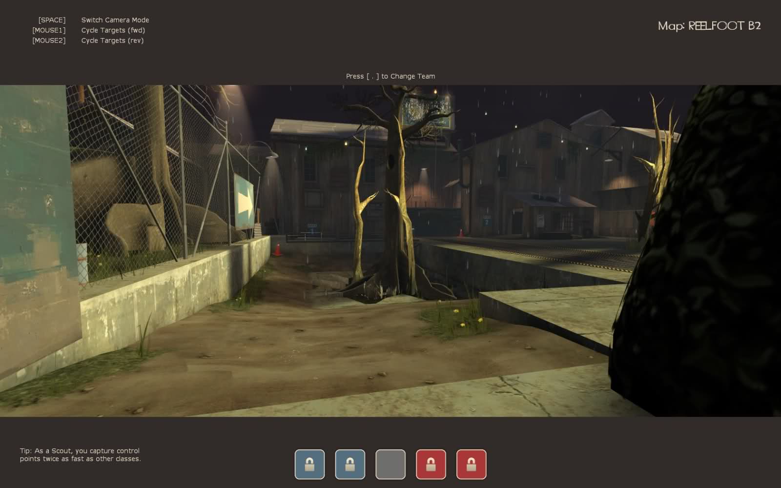
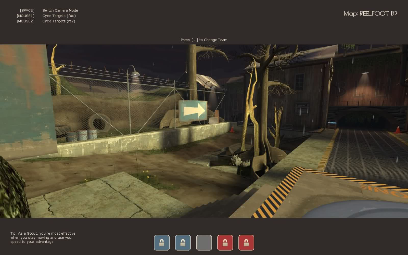
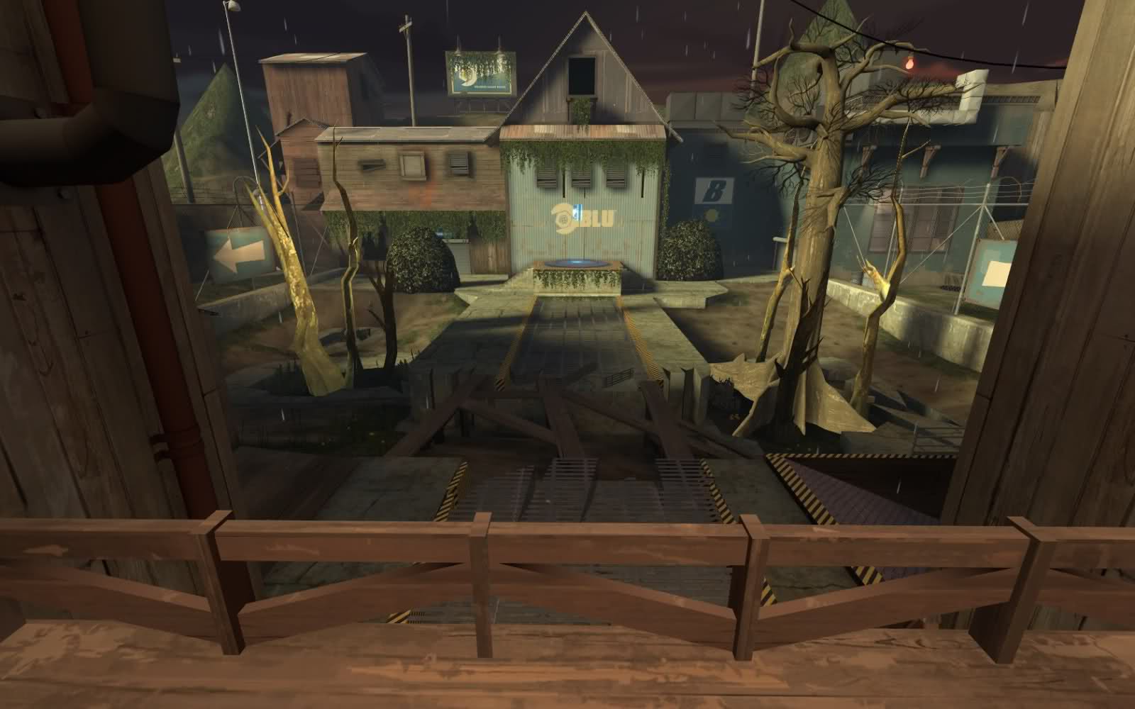
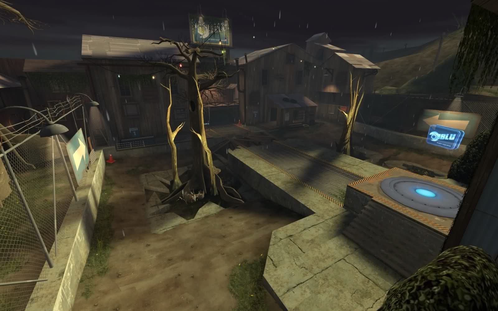
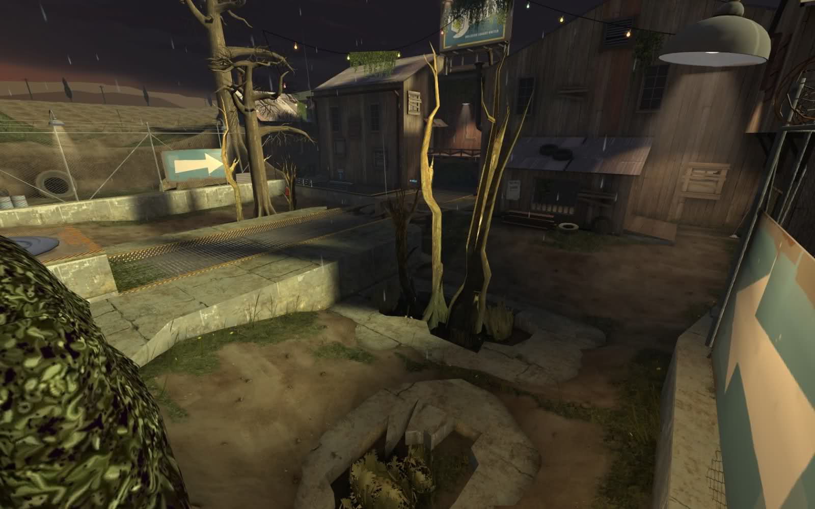
Hopefully we can all be nice now. Anyways, beta 2 is almost done. These are the changes that I have made so far.
-Fixed spawn doors sticking out when opening.
-Fixed some nodraw visisble leaks in some places.
-Fixed a bunch of playerclipping problems.
-Disabled collision on some props.
-Added 3D skybox
-Redesigned middle cap.
-Added some height variation to the 2nd and 1st cap.
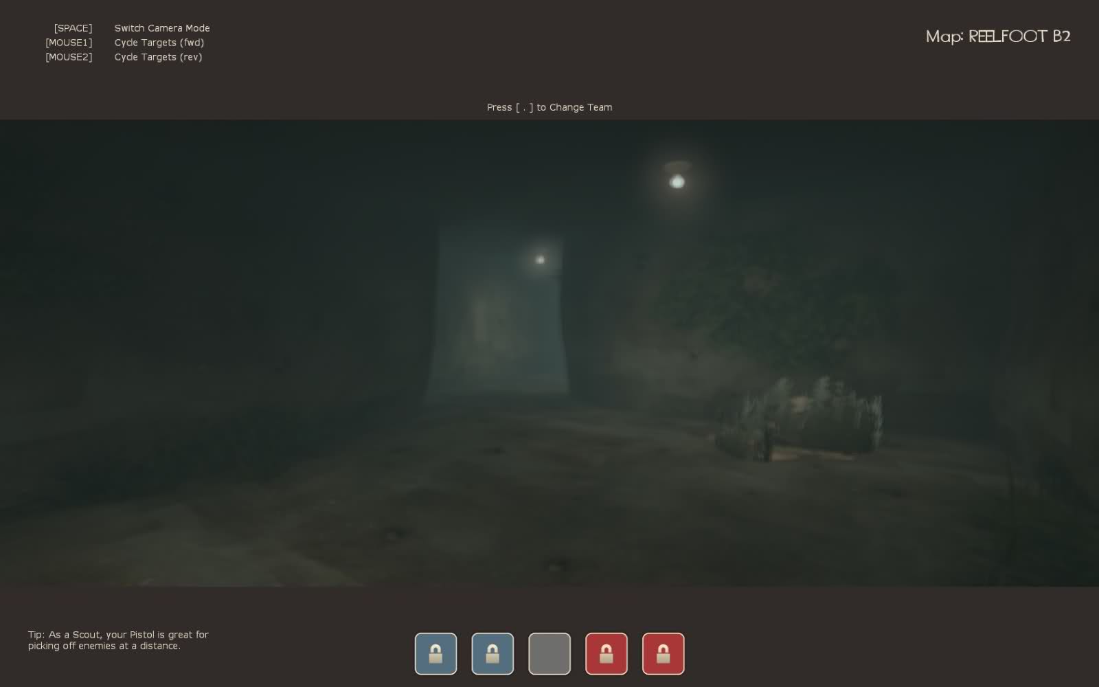
-Added an underground path to the middle point.
Last edited:
- Apr 19, 2009
- 4,460
- 1,724
absurdistof
aa
- Aug 10, 2009
- 1,240
- 399
Maybe have an indicator that it was flooded? Such as a storm drain pouring out water into it or something. Also, the (I want to say its from granary) side of the skybox with the hills and trees looks to be too bright in comparison to the rest of the skybox.
SiniStarR
L8: Fancy Shmancy Member
- Mar 31, 2009
- 585
- 116
Having foliage of that kind growing underwater doesn't look right.
i think it looks nice, kinda like algae.
I think the lighting outside by the lamps is a bit too bright, maybe tone it down a bit?
Here are some small problems I found.
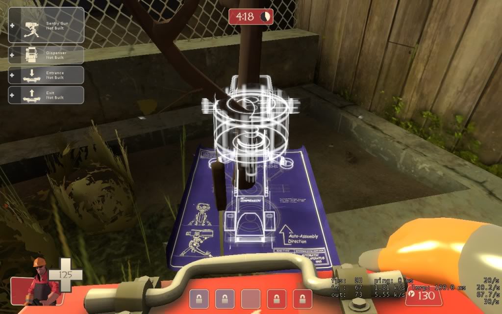
Alot of props such as this tree and traffic cones you walk through and that also means sentrys can be built right on top of them, while it isnt a game braking problem, it does look kinda weird.
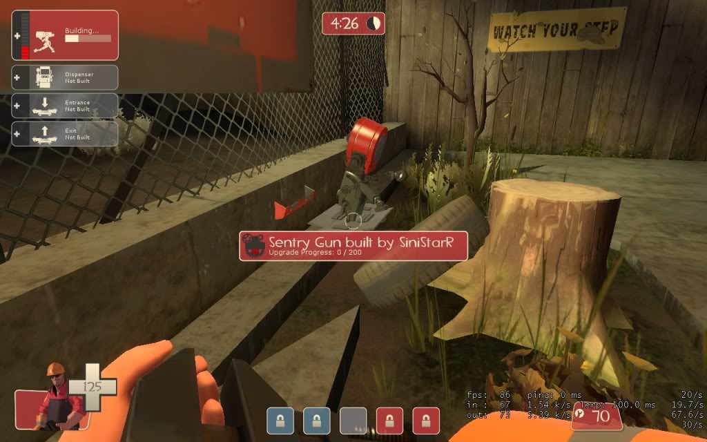
This was a weird spot but it gave a floating sentry some cover.
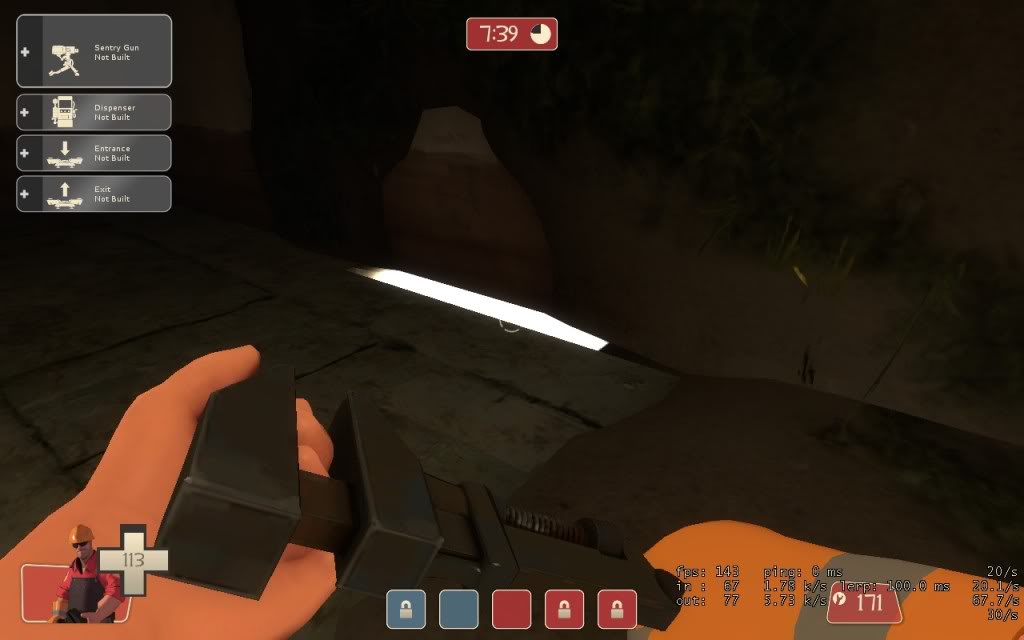
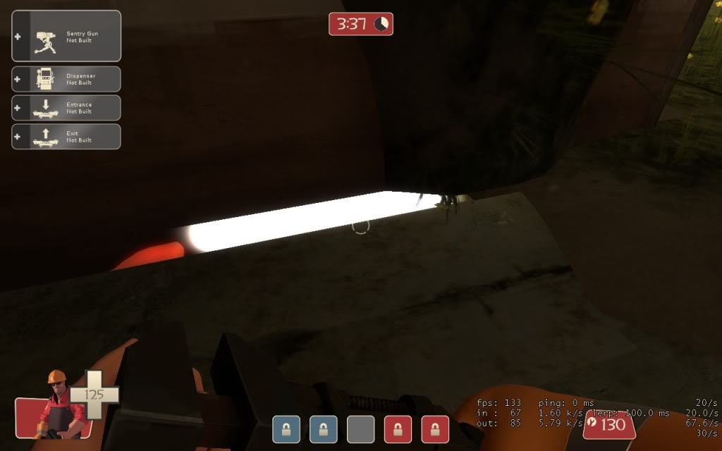
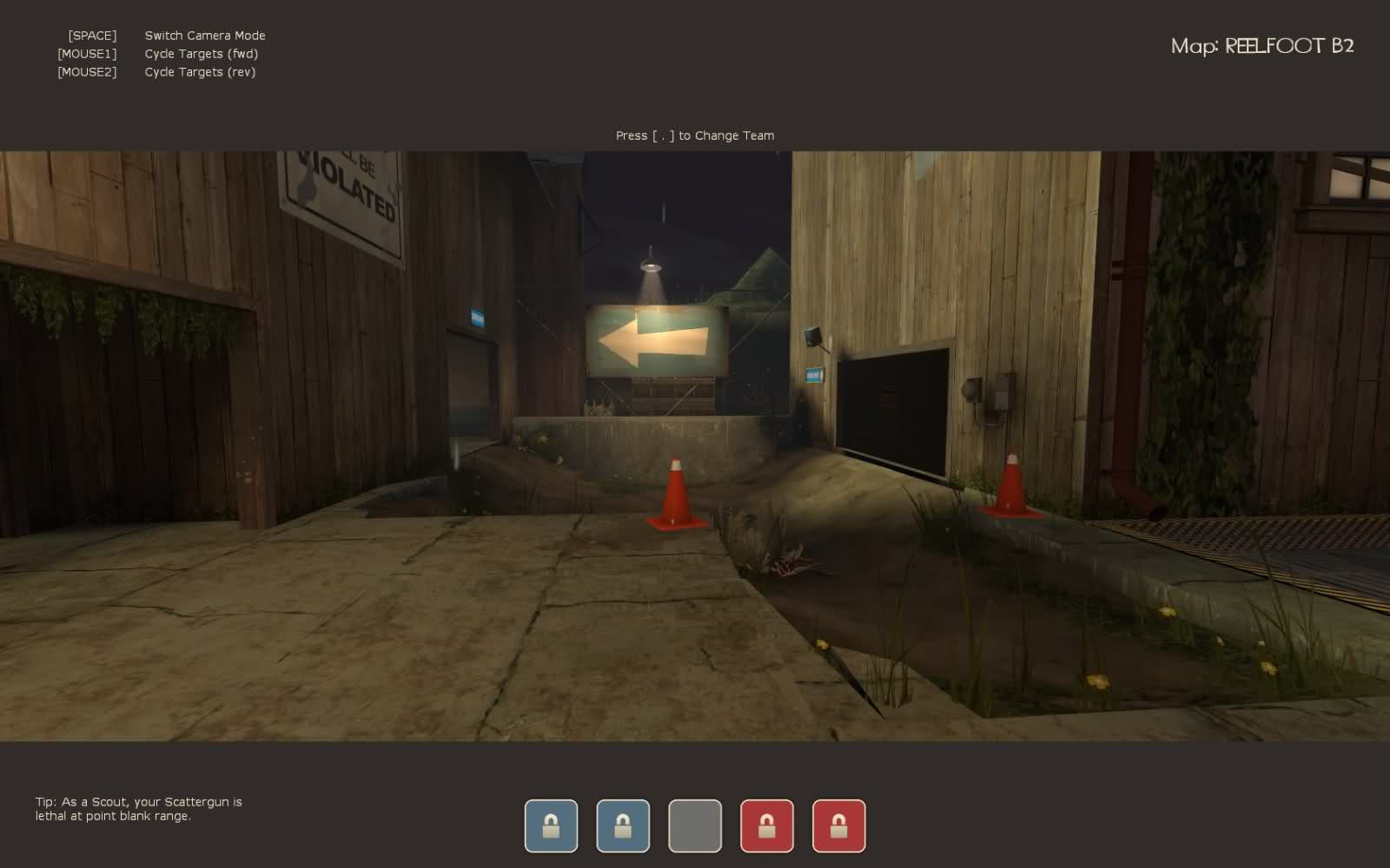
The entrances to the center cp on red both have these empty void things, made probably from an areaportal? or something like that. May wanna prioritize fixing that.
keptfireball
L1: Registered
- Jun 25, 2009
- 18
- 6
This is what i came up with when i played map. Sorry guys if this is all a repost of pictures. When i first played it was very impressed.
The door in the picture isn't player clipped so you can jump on top of it.
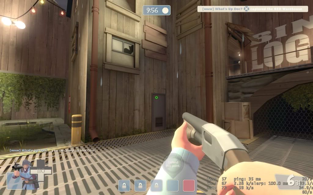
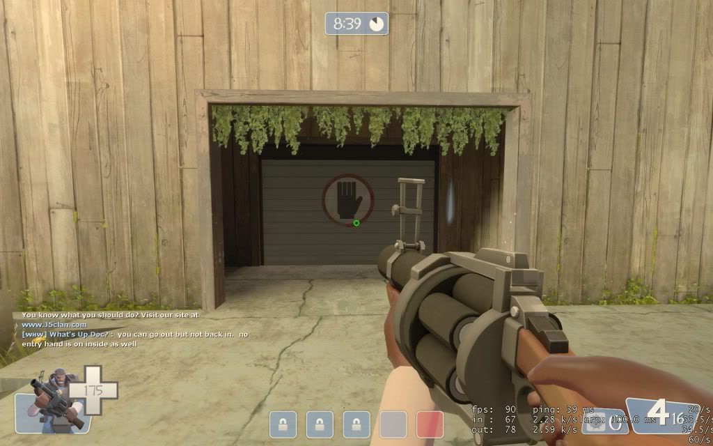
The spawn door gives a no entry hand inside and outside and you are unable to walk back into that spawn door.
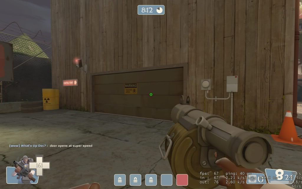
Door opens at super speed
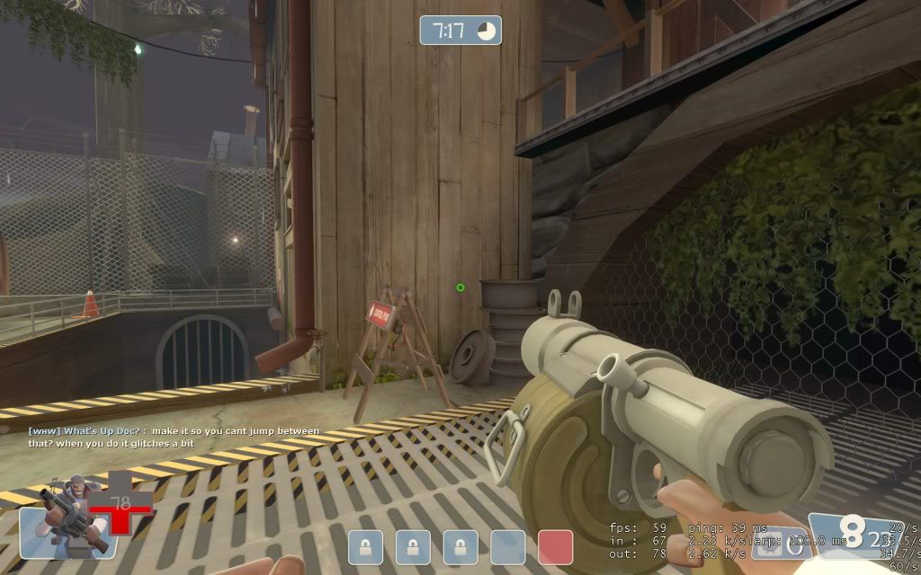
A little opinion is make it a little clipped in this gap because when you do jump in between it, it will start to glitch your screen a little bit.
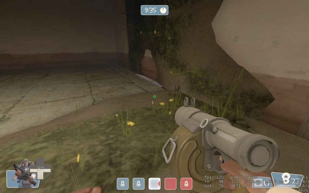
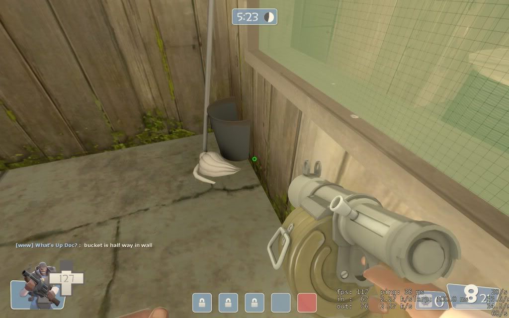
I know this has been mention before but the only leaks i could find besides the water falling through the crack. Here are all the leaks i could find though.
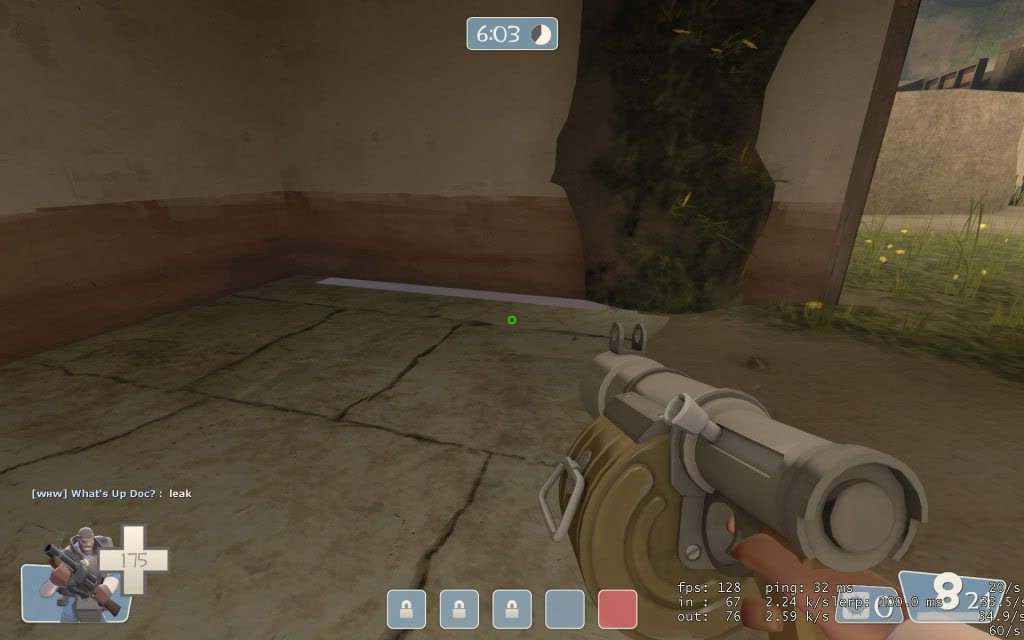
The mop is in the ground and the bucket is half way in the wall.
You are able to jump on top of these vents above the last cap.
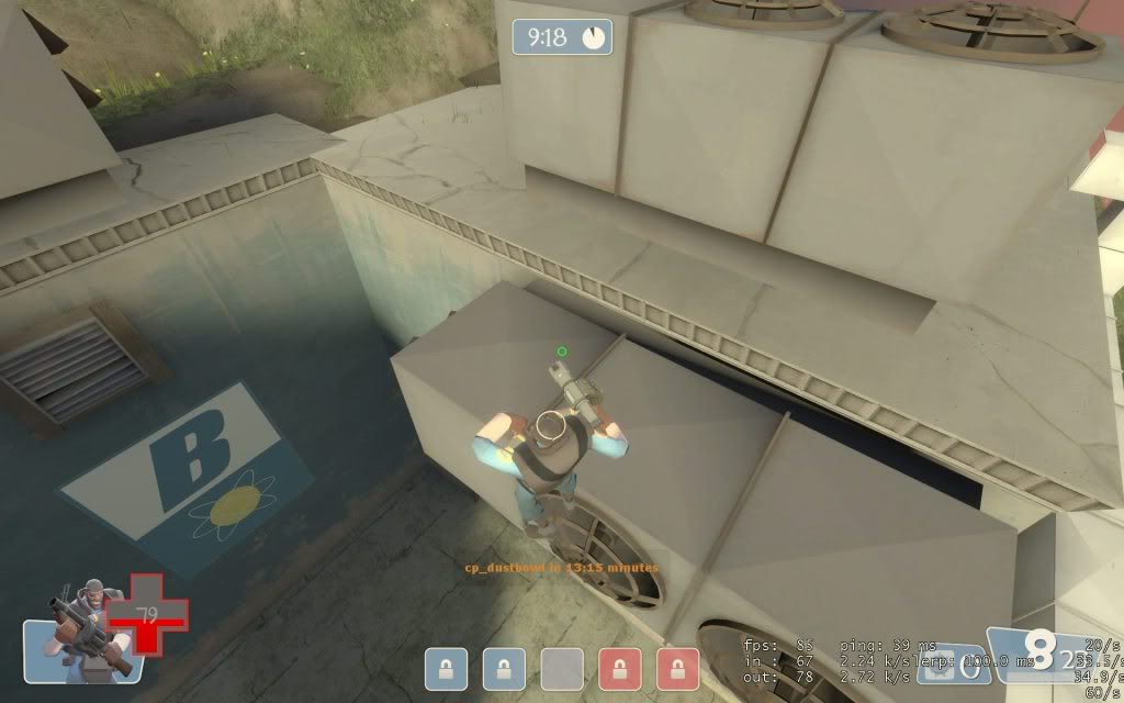
I don't know if you can see but at the bottom of this moss texture it looks like it is starting the moss texture again. Its just a little piece.
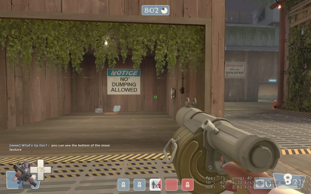
 More pictures are soon to come when i play it a little more in depth. Also for the trees i don't know if you want people jumping on top of it. you may want to clip the whole tree or put a push effect when you land ontop of the tree so you can't stay on top.
The door in the picture isn't player clipped so you can jump on top of it.

The spawn door gives a no entry hand inside and outside and you are unable to walk back into that spawn door.

Door opens at super speed

A little opinion is make it a little clipped in this gap because when you do jump in between it, it will start to glitch your screen a little bit.

I know this has been mention before but the only leaks i could find besides the water falling through the crack. Here are all the leaks i could find though.


The mop is in the ground and the bucket is half way in the wall.

You are able to jump on top of these vents above the last cap.

I don't know if you can see but at the bottom of this moss texture it looks like it is starting the moss texture again. Its just a little piece.

FreeLance_FoX
L6: Sharp Member
- Sep 6, 2008
- 353
- 173
Swaty, to be perfectly, PERFECTLY honest, those changes look to be almost entirely cosmetic.
While lowering the two side areas will add interest and change the gameplay of that CP some, the issue isn't the lack of height in that area so much as the lack of access. There's a big, big, wide open area, either way. You didn't add any new geometry, really, except that wooden plank ramp up to the concrete/grate main path. Otherwise, the changes are really the visual changes of the planks.
Your focus should be to differentiate the sides so that each has a specific advantage and disadvantage approaching the CP. You could improve that area moving the CP closer to the entrances or by even adding some kind of structure in the middle or to the side of the area. Some sort of new, playable, geometry.
No matter how you look at it, it's still Granary's last without the pipe, right now. I'm especially worried that it would be hard to push out of that area with only two exits (left & right) since you have no third route (for pushing out) like the pipe on Granary.
Although, the one thing I think you did improve there is the sightlines, since you now cannot see from one side to the other. The only thing is that I think you need to work on sightlines from last to 2nd rather than side to side.
Also, in the second to last screen, it looks like accessing the point from that left lower area would be tricky and require walking past the enemy's spawn (and that ridiculous rock).
<3
-FoXy
The broken metal looks bad.
Too blocky and generally the broken edges dont have more metal grates
I know that the broken metal looks bad, I just didn't have time to make it look good which is what I will do tomorrow, and I didn't know what texture to use for the edges which makes the metal look fake. I'll try to use some other texture or something.
The broken metal looks bad.
Too blocky and generally the broken edges dont have more metal grates
yeah, metal doesn't really get chopped up like that when it breaks... have you thought about using displacements with metal textures on them, to suggest bent metal plates?
Swaty, to be perfectly, PERFECTLY honest, those changes look to be almost entirely cosmetic.
While lowering the two side areas will add interest and change the gameplay of that CP some, the issue isn't the lack of height in that area so much as the lack of access. There's a big, big, wide open area, either way. You didn't add any new geometry, really, except that wooden plank ramp up to the concrete/grate main path. Otherwise, the changes are really the visual changes of the planks.
Your focus should be to differentiate the sides so that each has a specific advantage and disadvantage approaching the CP. You could improve that area moving the CP closer to the entrances or by even adding some kind of structure in the middle or to the side of the area. Some sort of new, playable, geometry.
No matter how you look at it, it's still Granary's last without the pipe, right now. I'm especially worried that it would be hard to push out of that area with only two exits (left & right) since you have no third route (for pushing out) like the pipe on Granary.
Although, the one thing I think you did improve there is the sightlines, since you now cannot see from one side to the other. The only thing is that I think you need to work on sightlines from last to 2nd rather than side to side.
Also, in the second to last screen, it looks like accessing the point from that left lower area would be tricky and require walking past the enemy's spawn (and that ridiculous rock).
<3
-FoXy
There are 3 ways to get to the last, there is the balcony in the first pic.
FreeLance_FoX
L6: Sharp Member
- Sep 6, 2008
- 353
- 173
Can it be accessed by the defense? In b1 I don't believe it can be (by jumpers yes, but that doesn't make it a main path).
Can it be accessed by the defense? In b1 I don't believe it can be (by jumpers yes, but that doesn't make it a main path).
I see where you coming from, I'll see what i can do about that, I like the idea though
Sgt.Sausage
L420: High Member
- Dec 5, 2008
- 420
- 103
keptfireball
L1: Registered
- Jun 25, 2009
- 18
- 6
Some changes that I have made in the first part of the map.
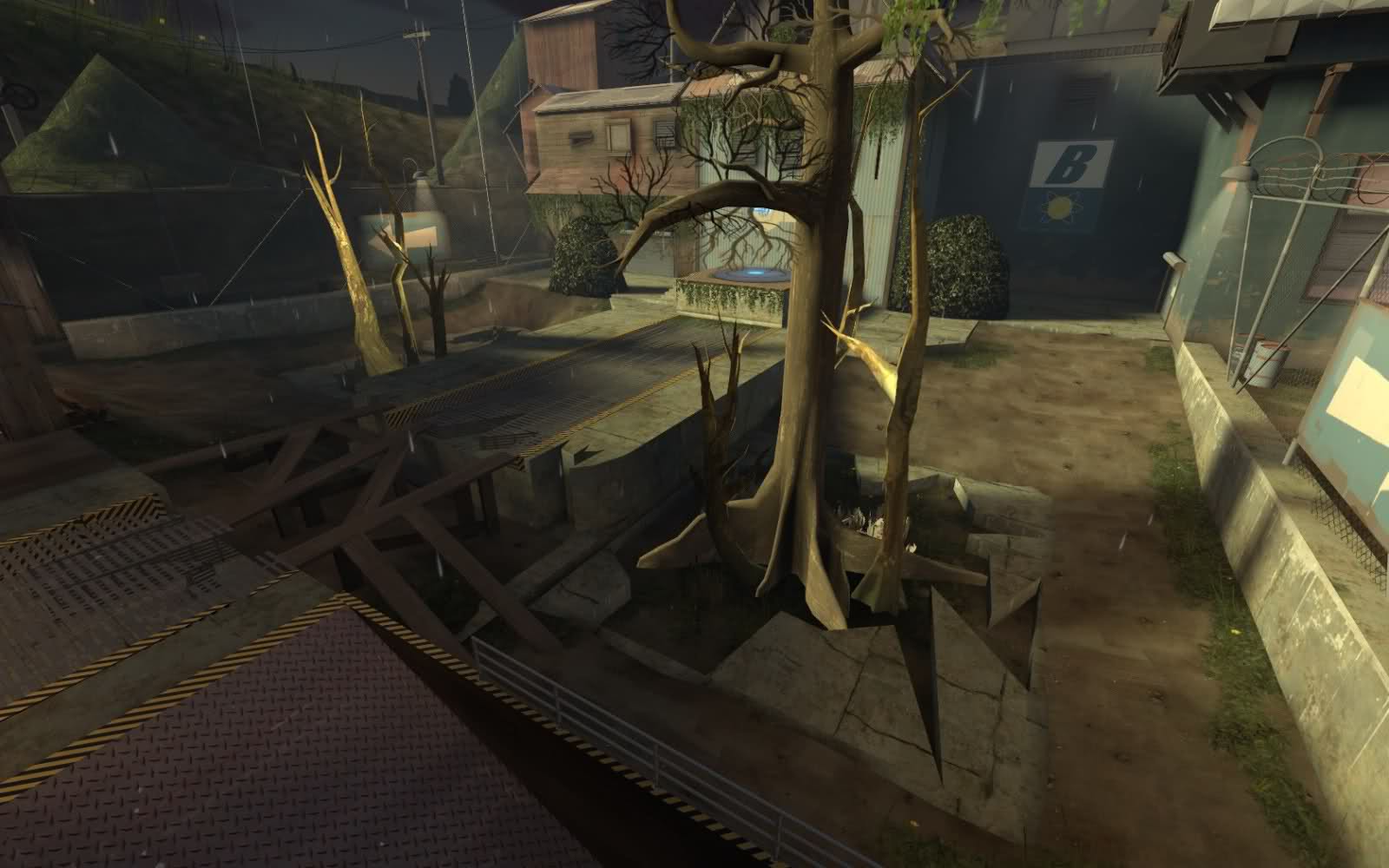
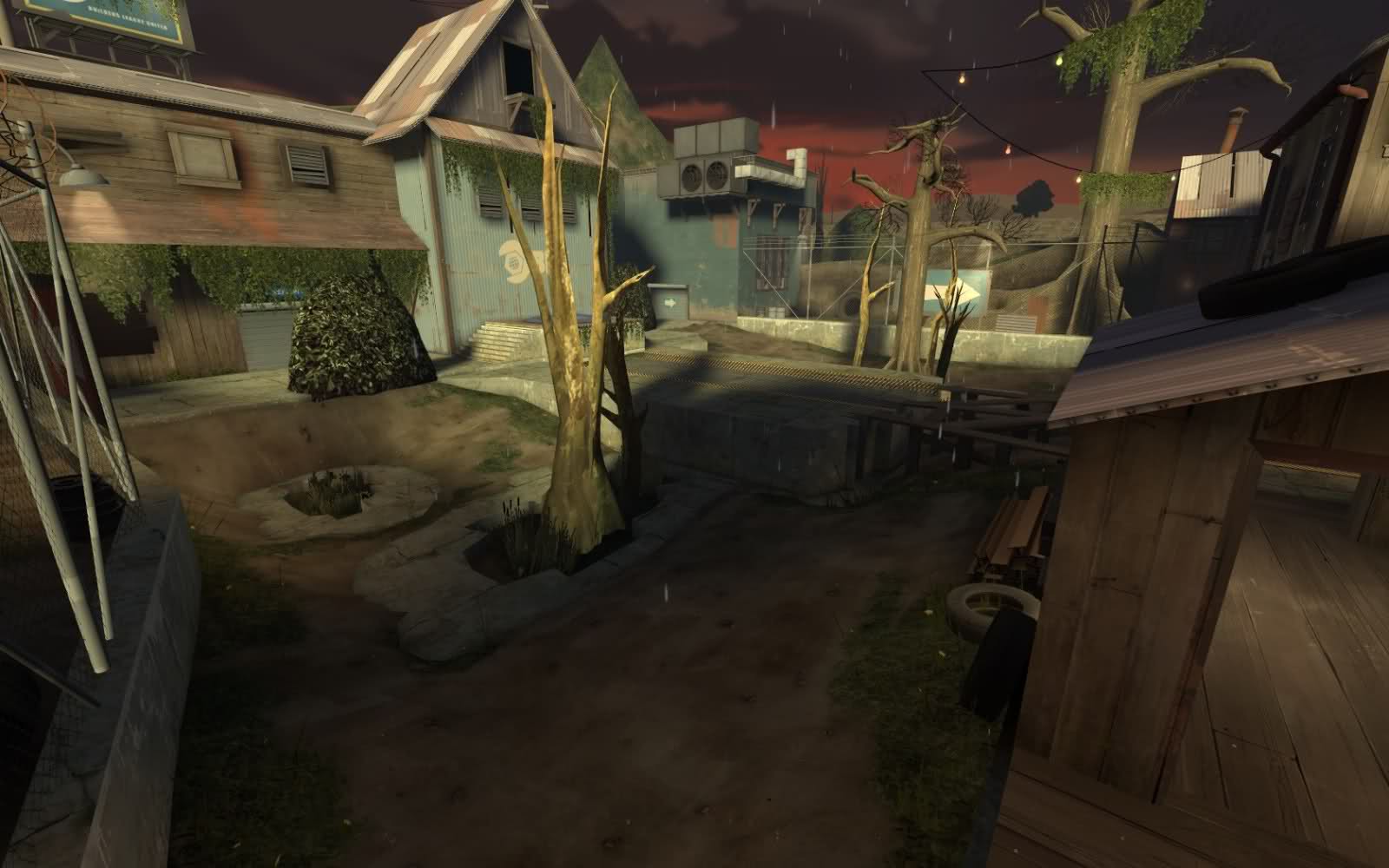
Swaty i thought under that metal walkway there was water running. I would think you could make it so where you have the wood going over the break that there might be some water hole there or something. Or maybe just you see the water from under those grates like a flowing thing of water to that puddle. It would be a great idea in my opinion.
- Status
- Not open for further replies.

