LittleMaker

KotH LittleMaker A2

TwinMill

L2: Junior Member
Nov 2, 2017
52
28
LittleMaker - A casual re-work of an old project of mine

"Sir, the project's gone down the tubes. We're out of funding, our machine didn't work, and worse yet people didn't like playing on it. what should we do?"

"Do it again!"

This is LittleMaker - a working title for what is essentially "ShrinkRay II". The first map I made was shrinkray, and it was woefully below average. Since then I've wanted to try again, because I love the idea of a shrinkray, and dammit I'm gonna use it. This project is focusing on speed and efficiency, as well as getting it to testing as soon as possible, then going from there. Let's get minimized ya'll.
 

MegapiemanPHD

Doctorate in Deliciousness
aa
Mar 31, 2012
2,002
1,311
Took a run around your map and have some feedback for ya

-The map is very dark overall. Could be sun angle or light_env settings but could also be the textures you use for walls. Textures in Source have different reflectivities to them that effect how they bounce light around. Darker textures bounce less light than brighter ones and a lot of the walls use dark textures.

-There's no where to attack the point from. The point is the highest area in the map without anything around it at a similar height. Think about a map like highpass, viaduct, and Lakeside. They all have areas both near and far from the point that are higher or similar in height for classes to attack from. Far away areas for snipers and closer areas for everyone else. The purpose of this is so that whomever holds the point, doesn't hold ALL the advantage.

-The map is kinda thin and short. Just about as soon as you get out of the spawn area you're right at the point, which could lead to spawn camping and lots of dying, respawning, and dying again before getting to do anything.

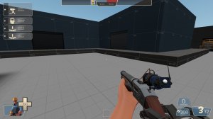
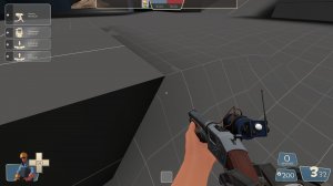
20190122131516_1.jpg
-This odd step around the spawnroom makes it so that you have to jump to get up there, which doesn't make sense. There should at least be a ramp or stairs that players can just walk up to get into their spawn

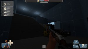
20190122131534_1.jpg
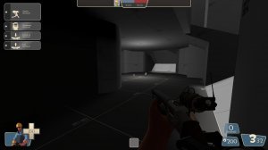
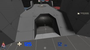
-Dark. Could use some lights down here

20190122131601_1.jpg
-The void calls to me

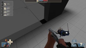
20190122131607_1.jpg
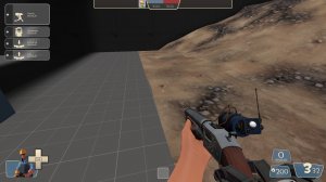
-seam in you're displacement. If the starting brush of a displacement is the same height as surrounding non displacement brushes and the verts line up, then you can sew them together to get the displacement to connect to the brush

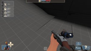
20190122131617_1.jpg
-Z fighting where the 2 brushes meet. Also that ramp is too steep to walk up

20190122131638_1.jpg
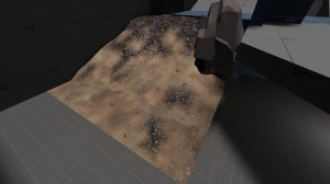
-more z fighting between brushes. For the most part, you're displacement work could really use some work. Use the smoothing option to smooth them out and make them less weird.

20190122131652_1.jpg
-Put some lights here. It's so dark I can't find my car keys.

Lastly, the map uses mirrored symmetry instead of rotational symmetry. This is a point of contention for mappers but it's generally thought that rotational is better due to weapons being on the right side of the screen by default. This means that for mirrored maps, stuff for one team is covered up by their gun that isn't for the other. Also mirrored can mess with rocket jumping. It's not a bad thing to have mirrored symmetry so it may not be work doing anything about, just something to keep in mind.
 

TwinMill

L2: Junior Member
Nov 2, 2017
52
28
Thanks for the run around, Pie!
Truth is there's a lot wrong with this map as it is, this one is actually more for a video about the map making progress so this was built in about an afternoon for the sake of expediency, though I hope it does turn into a longer-running project.. Regardless, I really really appreciate the input and I'll take pretty much all of it into consideration when working on the next alpha.
Thanks again!
 

Wyvern

Certified TF2 Cartographer
Feb 16, 2018
105
152
I'd figure i'd give some input on some of the gameplay issues. So, I like the height variation in some areas, but the point was really difficult to fight against, as there was no real height variation higher than the point. To elaborate, look at koth_highpass:
Highpass.png
As you can see, there is height variation that oversees the point, which makes is MUCH easier(and fun) to push. Keep in mind, that the point is still raised, so the team capturing the point still has some advantage.
Other than that, i'd get rid of that super mangled displacement that megapieman was talking about, there's no saving that thing, lol. But in all seriousness, this is a good start, TwinMill, keep working!

(Side note: I love your videos, man! You're like the sole reason I even considered picking up medic. Keep doing what you do!:) )
 
Last edited:

TwinMill

L2: Junior Member
Nov 2, 2017
52
28
Hey Wyvern, thanks for feedback!
I agree with your statement, the point seems to be very hard to retake or at least clear, so making that less annoying will probably be first on the block. I'm still a bit new to map making (if you can't tell by the "mangled displacement pie") so I really appreciate the input!
 

Wyvern

Certified TF2 Cartographer
Feb 16, 2018
105
152
No worries! It takes everyone a little while before they can nail a map. I'm not sure if you're planning on staying after the video is made, but I'd love to see your progress as a mapper!
 

TwinMill

L2: Junior Member
Nov 2, 2017
52
28
"Sir the prototype forthe new shrinkray was an utter failure."

"Well, can't make an omelette without breaking a few legs!"

"I'm not sure that's how it goes..."

Remember that first a1 version of littlemaker I realeased? Yeah me neither. This is a literal total redesign of the original layout. Gone is the mirrored symmetry, replaced by rotational which wasn't necessary but I'm pretty okay with it. Everything has been built up from scratch again, this time all in a weekend, and I feel very happy about it. This is more interesting, has some fun ideas, and more importantly has some 45 degree angles involved which should make it a bit different to play. I've got a couple things to keep an eye on in mind, particularly mid. I'm not 100% happy with how it looks but I want to get playtesting in before I start making changes. I guess we'll find out huh?
Welcome to KotH_Littlemaker_a1b.

Read the rest of this update entry...
 

Wyvern

Certified TF2 Cartographer
Feb 16, 2018
105
152
Hey there TwinMill, It seems that the bsp you provided is just a copy of your a1. I made sure that the map I was playing was labeled with the a1b tag, but it seems that the file is the exact same as your a1. Just thought you should know.
20190211165334_1.jpg
20190211165415_1.jpg
Both images taken under koth_littlemaker_a1b
 

SwaggyZeal

L1: Registered
Jul 30, 2018
32
28
Oh snap I think it is, the map I was remembering was shrink ray rip. I guess you forgot to update the file. ;w;
 

_Blamo

aa
Feb 18, 2017
25
97
I actually thought shrinkray wasn't as objectively bad as you're making it out to be if that makes you feel any better. Sure it was flawed but it was still one of my favorite maps to play on TF2maps (sorry to be blunt but many maps here aren't good, but that's what testing is for isn't it?). And that was the first time I did a map feedback video (albeit a long drawn out one) which was fun.

I'm at least glad that you're sticking with the original concept as I thought that was a great way of implementing your map into TF2's style of humor/art direction.

I'm not sure when I'll hop on for a run around since I've been burnt out of TF2 and I'm taking a break as of now (if I even decide to be fully dedicated to the game again), so at the very least all I can really do is to wish you luck and keep an eye on the mapping community!
 

TwinMill

L2: Junior Member
Nov 2, 2017
52
28
Ignore all the pings, I'm just trying to get this all updated right. The files lied to me.
I really hope this plays better than the first shrinkray. There was a lot I wasn't happy with and I couldn't bring myself to undo so much of the work I did. At least this plays better than the last alpha.

Read the rest of this update entry...
 

TwinMill

L2: Junior Member
Nov 2, 2017
52
28
"Sir! The staff has finally made more progress on the 'littlemaker'!"

"That's great, but why did it take this long?"

"It's just me here."

Welp, here's second alpha for Shrinkray II, codenamed "Littlemaker" for now. The recent tests I did went pretty well considering the state the map was in, so here are the changes to hopefully make it a better play:

Adding High ground to the point
My dumb self decided to give the only high ground on the point so freakin' open to a nasty sightline in the last version, so this time I wanted to fix that. This time, there is a sort of pipe-extension thing that gives you a LOT of high ground, and might let you get a good jump on whoever's on it. Not sure if it was a good idea, but I had to do something about it, and this was all I could think of. Before now there wasn't a lot of verticality to the map so maybe that will add a bit, but we'll see. That pipe also opens up a one-way flank which I think should give attackers at least one way around the point since it's such a choke right now.

Evened up the courtyard
The earlier iteration had a pretty open courtyard right before the point, but the problem was it was super easy to watch all the entrances to it, so by opening up the area near the bridge and adding a trench kind of route away from people watching the courtyard might make it harder to lock it down.

Added more obvious health and ammo
Some people died looking for ammo because it was nowhere to be found. I agreed with this, so I gave it viaduct style pickups: two mediums of both, except I threw in a set of small pickups for good measure, since it could get pretty hard to get to the others in time.

Completely re-did spawns
The spawns got weird: everyone only went through one door, there was a lot of open space, and most of the time spent traveling to the point was traveling in open, useless space. I cut down the open space, re-built spawns from scratch, and I think they look much better now.

Added access to side building from other side building
Vague description, right? This solved the problem of people needing to expose themselves to one area before going anywhere, and that sucked. So, i dug the aforementioned trench and let people sneak to where they want to go.

there was a bunch of other small changes, but that's all that really matters for now. Big thanks to Fizzy for his feedback video!

Read the rest of this update entry...