koth_desert_storage

KotH koth_desert_storage A1b

ArskaWarrior

L1: Registered
May 31, 2016
31
8
koth_storage_A1 - Fight about old storage building

Hellou. it's my first project I have published. i made much work for this map and i hope everything works :) .

i have been thinking about class advantages and I want share them whit everyone:

for scout:scout: i made much stuff to make jump but not much different roads so... I am not good whit scout :DD

for soldier:soldier: i made high ground advantage , there is 3 main ground and 1 not main ground.

for pyroshark:pyro: I made much water to lowest ground.

for demo:demo: I made surprisingly high skybox. well.... really wasn't any idea about demo's advantages.

for heavy:heavy: I made map pretty short , fast to go fight ;)

for engi:engie: I made few teleport spot , but i did not found any good sentry spot

for medic:medic: I maked much stuff to take cover for medic

for sniper:sniper: i did made much snipe spot's but.... i deleted them becose those gave me feeling about being too op spots. sorry sniper mains

for spy:spy: I made map much room for hiding invis


tell what ever comes to your mind about my map and tell
improvement options. and about i am not sure does water and glass work, it was hard work to make them work so I do have respect for telling me if that doesn't work.
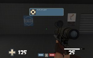
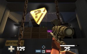
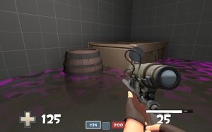
20160615221642_1.jpg
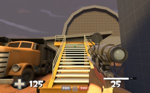
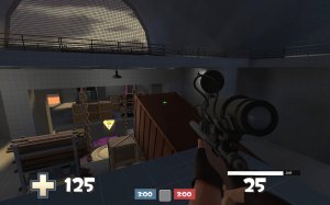
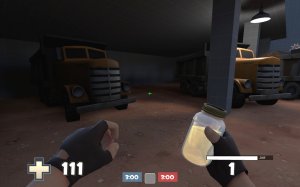
20160615221700_1.jpg
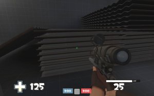
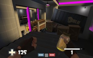
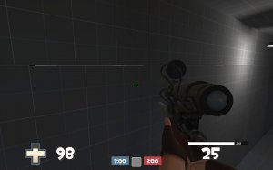
20160615221721_1.jpg
20160615221642_1.jpg
20160615221700_1.jpg
20160615221721_1.jpg
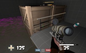
20160615221737_1.jpg
20160615221753_1.jpg
20160615221808_1.jpg
20160615221824_1.jpg
20160615222203_1.jpg
20160615221642_1.jpg
 

nickybakes

You should've played Rumbleverse
aa
Jul 28, 2015
912
1,741
Careful about that name, there is already a ton of maps named Storage. There's actually a king of the hill one just like yours. This will cause errors for people joining the server And downloading your map if they already have a map file with the same name (i.e. these other maps named Storage). So either think of another name, or use a random placeholder. You can check if the name is taken by searching for it on the upper right of the site (make sure to have "search titles" checked).

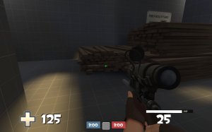
Overall, the map doesn't look half bad for a first map. I like how you told us your theories with designing the map with all classes in mind. Something I know a lot of people will note when this gets play tested, the area/building in your 3rd screenshot looks very dark, making player and team recognition very hard. Try brightening it up with some light entities.
 

ArskaWarrior

L1: Registered
May 31, 2016
31
8
I see , there is much storage named map , i will change it when i get idea about new name.

it's great you like my map
and it's really nice to hear others opinion's about my map
 

Crowbar

aa
Dec 19, 2015
1,455
1,298
really wasn't any idea about demo's advantages
A demoman takes advantage of sneaky sticky spots, places where he can attack from a corner and things he could lob grenades over.
Though your approach of pleasing every class is strange, map should be based on teamwork, and you can very easily overpower a class because there is no comparsion if you get it.
 

Crowbar

aa
Dec 19, 2015
1,455
1,298
Another thought: looking at screenshots, most of outdoor space is overly bland, flat and open imo.
 

Nighttime71

L2: Junior Member
Jan 11, 2016
86
40
Wow these screenshots came out dark! Anyway here is my advice.
weird message.jpg
Got this weird message when I spawned in the beginning. Check your tf_gamerules or somethin'.

awkward jumps.jpg
These jumps here felt very awkward probably because the angled roof.

I notice imbalance.
blu_imbalance.jpg
Here is blu side and I couldn't jump onto those metal sheets or whatever. But on the red side...
red_imbalance.jpg
There is a lot more empty space and the planks are jumpable from the sides. This is an imbalance.

disadvantage at mid.jpg height advantage.jpg
I don't really like mid too much. The point itself is at a height disadvantage to almost everywhere else. I feel like in-game you will get a lot of spam happening on the point. (plus it takes a good while to capture)

propspam.jpg
There is sooo many props which I don't like very much for some reason. But you can see I have pink things, those are clip brushes and with many props, there is a lot of awkward collision around the map.

clip.jpg weird barrel.jpg
These areas both have strange collisions. The little fence is getting me stuck (I would remove it or clip it) and this barrel is very awkward to jump on. (I can only jump onto it one way and not diagonally) Also the water in pink which isn't really a problem now but prepare to hear a lot of feedback about that.

useless space.jpg
What is the point of this space? Very dark and doesn't have any pickups or nothing. Maybe put ammo and light it up better?
IMPORTANT
seam in brushes.jpg
Pls fix this seam. It looks like your brushes are off-grid or something. Since you have a lot of props, I'm going to assume that you selected a model in hammer, then after that, you created a brush. Make sure you that after selecting a prop, to select a brush before creating another brush. This way, you don't accidentally create an off-grid brush without realizing.

Hope I helped.
 

nickybakes

You should've played Rumbleverse
aa
Jul 28, 2015
912
1,741
One of @Nighttime71 's notes is the sheets of metal not matching with the wood plank piles. He also noted the fact that there are a lot of props just scattered around. I want to advance a bit more on this topic.

It seems almost that you designed the layout out of props, which is never really a good thing. A lot of things in this map, like the corrugated metal sheets, that could just be made easily with the brushes. Not only would this be much more tidy, but it would be easier and quicker to make. Note that people don't like jumping up props (often called prop jumps). Try and turn many of your prop jumps into ramps made with brushes.
 

ArskaWarrior

L1: Registered
May 31, 2016
31
8
now I fixed and changed few things

I fixed message at start

I fixed hole at wall and 1 at floor

I added few light , ammo(small) and medikit(small) at garage
20160616164942_1.jpg

I added 1 small medikid at top of spawn

I made clip brushes at shelving
20160616164917_1.jpg

I made clipping at metal and wood pile and I made less metal so you can get back from that way
20160616164852_1.jpg
20160616164857_1.jpg


I moved lamps out of medi- and ammokits way. no more getting stuck at lamps

I made spotlight at top of office building so it is more brighter
20160616164930_1.jpg


I raised point that much higher that you can jump back , even whit heavy:heavy: and I decreased capture time from 12 sec to 8 sec
20160616164809_1.jpg

at underground I added clipping to railing , easier take medi and ammo
20160616164751_1.jpg
20160616164758_1.jpg


Read the rest of this update entry...
 
Last edited:

nickybakes

You should've played Rumbleverse
aa
Jul 28, 2015
912
1,741
The area in that last screenshot still looks very dark. Try plopping down a "light" entity right in the middle, it should brighten it up. I can say the same for the 3rd and 5th screenshot.

Also, I would suggest renaming the title of your thread to just "Storage" (or whatever the name will be soon), as it looks better than "koth_storage_a1". Just making sure, remember to rename your VMF with the correct version number, and not the bsp file. I bet you have already seen this, but just in case you haven't, I'll post it here:

View: https://m.youtube.com/watch?v=m7YqJ4MyG7w