- Apr 14, 2018
- 5
- 0
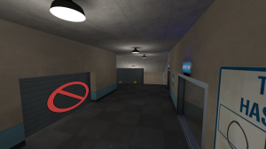
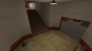
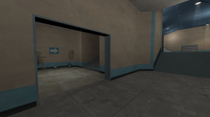
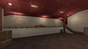
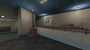
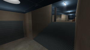
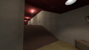
koth_data_base - Simple and Very Basic indoor map.
The mercs are set in a faculty with forts of their own.
An indoor map with the Spytech theme. I had to use references like cp_junction for aesthetics and cp_vanguard for the compartment at middle. The layout being very simple and small made it easy for me to follow up as I am a beginner.
What I think I should improve on:
-Add more props around the map, Middle
-More Details for the map
-Lighting Placement
-How the map and layout plays out
-Too fast to get to middle,its a small map and bots run down middle with an endless spam of rockets.
Conclusion
I did this as a hobby and something for fun so that I can get into mapping more. I do look foward in improving it, making it better and having fun with it. This is my first ever map that I would share so feel free to leave some positive and informative feedback. Thanks and gl further ^^
Last edited:


