Kombu

CP Kombu A16

Zed

Certified Most Crunk™
aa
Aug 7, 2014
1,241
1,025
- Rethemed the map to Autumn as opposed to bleak, boring Red Desert

inb4 Autumn Theme Pack.
 

Zed

Certified Most Crunk™
aa
Aug 7, 2014
1,241
1,025
Oh shit you already made it.
 

Berry

resident homo
aa
Dec 27, 2012
1,056
1,898
A12 - Apr 6th 2015
- Added pickups to the C roof on BLU side to strengthen it's usage as both an attacking and defending point
- One way door in dropdown at C turned to face the seperated room of the building instead of the CP
- Displaced C point mostly
- Restructured first floor of the C point building slightly
- Main doorway into first floor of C point building now shuts after B is capped to make the one way route more covered
 

Berry

resident homo
aa
Dec 27, 2012
1,056
1,898
A13b - Apr 7th 2015
- Added a dropdown in the one way door building at A point
- Added a fence at C point beside the stairs to block a sightline
- Added windows in the dropdown building at C to add more counters to a sentry spot on the roof
- Removed one way door beside the dropdown at C, and elevated the health from it
- Lowest part of cliff beside A point is now reachable by jumping
- Fixed two clipping errors
- Added windows to the building overlooking B to make the area less overpowered
 

Kube

Not the correct way to make lasagna
aa
Aug 31, 2014
1,342
1,850
Unless you re-add the hole in the ceiling, it doesn't mean anything.

a12 in 16 days? Berry, you scoundrel...
 
Apr 14, 2013
662
344
I played this on 2 imps recently, and I really enjoyed it. I wanted to leave some more serious feedback based on playing this, so I'll post it here.
All I'm about to say is just my opinion, nothing more.

First point
First is my favorite point, because it has some great places to be in for both teams.
CFCD5265122A01F45F3344FF672B9B5B93648C65

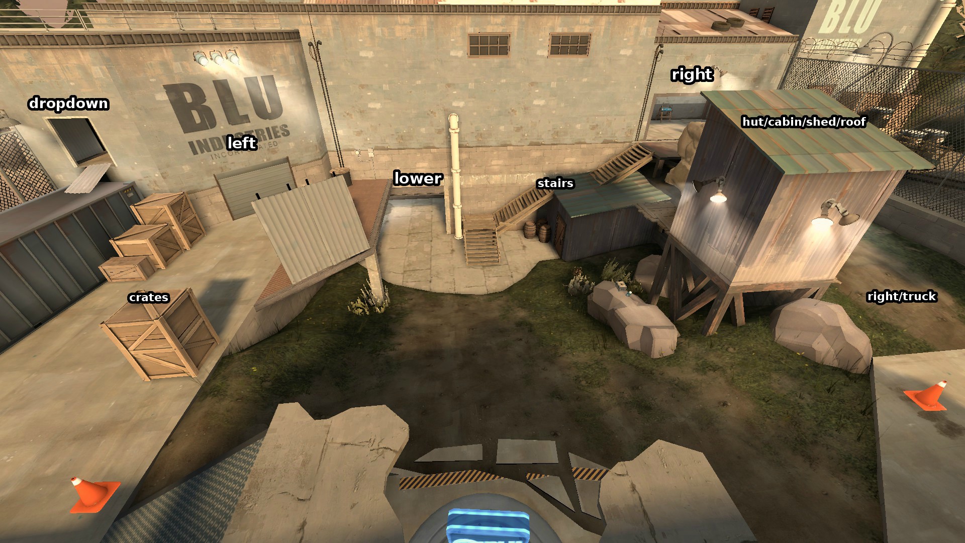
Here I show why I like this point. It has a great anti-spawncamp mechanism- Red can't constantly attack BLU, they can't go through the 1-way yellow door, they can't go that easily through the dropdown. Red has the brown building behind the camera in the pic (not shown) and the dev building with the window, as defense points. Blu has great sightlines into them, but RED doesn't have that good sightlines into BLU places. If BLU has to abort a capture attempt, they can duck behind the crates into the lowered area at the bottom of the pic, and hide there (RED can't get them from the dev building).
I think RED might need a slight advantage for the dev building, I suggest to make the health in there a medium health.

2nd point
I didn't get to be on the 2nd point, not as defense not as offence, so I can't leave valueable specific feedback on it. BLU simply cap it too fast. So make it easier to defend and longer cap time, maybe?

3rd point
This point is good, but it suffers from a major problem- too easy to defend. It seems like you tried to solve this in previous versions, by adding flanks. 3rd point has lots and lots of flanks, and it can be quite overwhelming at first, kind of like the 4th cp of pl_upward. I sometimes still find in upward a a new flank route I never saw before.
While exploring new flanks is fun, (and upward is my favorite pl map) it is still quite problematic for RED. RED doesn't know where BLU will come from, so they block the only place they know for sure BLU will pass through- the CP itself. And that only makes the problem worse- RED's defense is not spread around- it is focused on the point.

AF0A0035755DF3C27FA51D8707E6EDD31BE8FA5C

BLU has a ridiculous advantage of 5 entrances, 2 higherground attacking positions, 2 one way entrances directly into RED defense spots (1 way door in brown building and dropdown in dev building), and another complete flank around the whole thing (the tunnel) YET STILL IT'S NOT ENOUGH!!!

First- I think you need to reduce the flanks amount, and try to solve this by weakening RED, not strengthening BLU.
IMO it might be better to remove path no. 3 or path no. 2. If not, it might be better to completely change off the way the paths work. I think your last is similar to snakewater's last, because both have a leftmost high exit (snakewater's "dropdown" is your's "5"). maybe you should refer to that if you decide on remaking it.
bKYsp.jpg


And I also think that you should remove the tunnel. I know it's cool. But is doesn't help BLU, and I don't think RED needs it either. It just adds to the huge number of passages in 3rd cp.

3rd cp has 2 buildings to it's sides. The interesting thing about those buildings is that they are shared between the 2 teams. RED controls half of each building and BLU control the other half.

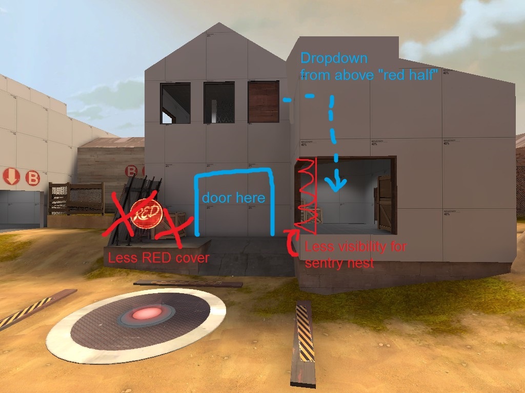
I think that is a great chance to strengthen BLU without adding flanks. You can make the buildings better for BLU, and weaken RED's sentry spots in them.

I'll start with the white dev textured building.
2015-04-11_00012_zps8axjpvij.jpg


Here's my suggestion:
2015-04-11_00008_zpsbwznpebp.jpg


Better for BLU, and less useful as a RED sentry nest or a defense position

I don't have any idea atm for the brown building. (other than the tunnel removal).

But please make this door a yellow gate, like in 1st? it looks bad IMO and really confused me at first.
2015-04-11_00002_zps342cdsgl.jpg


I really want to see this map finished!
 

Berry

resident homo
aa
Dec 27, 2012
1,056
1,898
suggestions/comments

Thank you, I've been sat on A13B for a few days because I feel like it's nearing the point of beta and needs all these things ironing out (such as what you've suggested) so I'm focusing more on these than my usual quick fix approach.

My plans for A14 separate to your comments:
  • Another forward spawn for RED after A is capped, to allow them to flow on to B *or* no forward spawns for RED, but respawn times adjusted to make reaching A the same time and reaching B faster than current
  • A fix for the horrible sightline from the left route into C over the CP to RED spawn
  • The fence on the stairway at the cliffside being turned into a doorway that is only open after B is capped so BLU can get around that way better (rather than taking the entire stairway and walking back in the other direction)
  • Fixes for the craze that would be the new C point (it was expected for it to need at least one major overhaul as it was only added in somewhere around 2-3 versions ago)

And counters/my thoughts on your comments:
  • I like your idea for the A point, I haven't felt much of an issue with it (besides the sightline allowing BLU to snipe from inside the spawn room which will also be fixed). I might however "transfer" health, by lowering one of the other packs as well as upgrading the dev shed one, but I'm not 100% sure.
  • I've already addressed my plans for B above, but to reiterate I plan to adjust RED's flow by either having RED a new forward spawn for B, or by having no forward spawns altogether and faster respawns (meaning after A is capped, REDs are still around and can easily be retreating to B if they did not reach A)
  • C is the interesting one now. Firstly, I am going to cut out route #3 in your picture, and possibly replace it with a route allowing BLU to switch between sides (as I think there may be a grouping issue for BLU attacking C
  • I definitely like your idea for a doorway out to the CP too, and I think I may try that out
  • I agree a nerf to some of these positions is necessary, I'll apply the change to the corner doorway you suggested and possibly do something about the roof position behind the fence (not sure what)
  • I'll also be removing the sewer. It was a nice addition to the old C and stepped it in the right direction, but I don't think it works so much for the new one. If I add a new forward spawn for RED for them defending B, this is where it will reside at

Again, thank you for your suggestions. I've not "given up on this" (as I've not updated in around 4 or 5 days [which is a long time for me, considering this reached a13 in two~ weeks]), and I will be doing an A14 this weekend sometime.

A few people were also asking the status on Theo artpassing this or not. I can't speak for him entirely, but it sounds like Theo will play some part in this, whether it's art passing or not. I stated to him I'd like to have a go at artpassing this, but he did a great job of Maple Ridge (which of course is in a similar theme) and I'd love to see a CP map detailed in a similar light to that. I may of course just have a stab at artpassing this (when it reaches the time) and see how that turns out, and if it goes badly I'll let Theo decide if he wants to artpass the map.

Edit:
We are also looking for a modeler to make some new autumnal trees for both KotH Maple Ridge and CP Kombu. Should we use your model you'd also be credited in both maps and you will have the choice for your model to be included in the Autumnal Pack (which I swear I have plans to do more on) and if either map were to go in-game you would of course get cuts. Contact me on Steam if you have any interest.
 
Last edited:

Berry

resident homo
aa
Dec 27, 2012
1,056
1,898
After a brief session I've managed to make a whole bunch of changes so far (more to come), including:
  • Displacements on B point area
  • New doorway to C on cliffside
  • Removed a route into C to tighten things up
  • Added a doorway down to C from the dropdown
  • Closed off the sentry spot left (from BLU) of C a little
  • Fixed up that one really crappy sightline over C
  • The small health kit change taka suggested
 

Berry

resident homo
aa
Dec 27, 2012
1,056
1,898
A14 - Mar 24th 2015
- made the dropdown at c more convenient to use
- added a second forward spawn for red that enables after a is capped
- one way door into c changed from a shutter to one of the setup gates so it's clearer it is a one way door
- blocked major bad sightline at c
- blocked annoying sightline at a
- more displacements
 

Berry

resident homo
aa
Dec 27, 2012
1,056
1,898
A15 - May 9th 2015
- Slightly lowered RED respawn time at C
- Lowered time to capture C from 26 seconds to 22 seconds
- Majorly restructured the B point
- Added an upstairs area to the left route into B (looking from BLU's side)
- Fixed some seams
- Added a window above the door next to the dropdown at C so RED can see if anyone is camping there

New B:
1836d1efc9.jpg

b8ccd58da9.jpg
 

ethosaur

L4: Comfortable Member
Sep 18, 2010
186
58
Reminds a lot of koth_harvest in theme style. I like it!
 

Berry

resident homo
aa
Dec 27, 2012
1,056
1,898
A16 - June 7th 2015
- Two rooms directly next to B point now connect by a doorway
- Removed medium ammopack in large room beside B point
- Fixed poor sightline out of BLU's forward spawn
- Fixed being able to block the second RED forward spawn with teleporters
- The two routes from A into B now connect together in the centre
- Slightly extended fencing at B to block some of a poor sightline
- Adjusted HP in the B-C hall and at the deathpit shortcut
- Reduced HP on the roof at C
- Opened one of the windows in the dropdown room at A-B
- Heightened fence to accomodate the previous change in the log
- Added some cover to the second floor sentry spot overlooking B
- Reduced sightline outside of BLU spawn
- Removed fencing behind B point

Minor:
- Clipped spawn rooms a little more
- Changed moonbase ramp to sawmill stairs at A
- Modified clipping in some very unnoticable places
- Fixed minor displacement issues
 

DrLambda

L69: Teeheehee, Member
aa
Feb 18, 2015
458
475
As i said in the imp yesterday, i liked the gameplay on B and C, didn't get much playtime on A. My biggest problem right now is the HUGE amount of health kits. I first realized it when i got behind enemy lines while defending and got back from B to C over the left flank (the one next to the cliffs) as a pyro. While i was walking there, a minisentry at B was shooting at me for 80% of the time, but i was still able to survive easily because i literally was able to walk over 3 medium health kits while stll in the range of the minisentry. Same about C. There is a medium on the left building, a small one on the right, another medium in the glass house (which is like 3 seconds away from the first medium) etc. There weren't that many people on the server when we played the map, and most of the guys on the other team were better than me, but i still got along quite nicely because i remembered the health kit placement and was always feeling like i played a Pyro with 350HP.
Oh yeah, and the water texture seems to be missing.
Aside from that, good job!