Hi JP.
I think you have a pretty neat map. It's an inspiration to me visually as well as in terms of layout; there are a few tricks (the 3D skybox!) that I'm really jealous you thought of first. But I don't think it's good. It's not a fun map.
I know you told me (and others in chat a while ago) that while detailing for A5 you let the map get away from you. Well, it really shows. A lot. Though amazing in a technical sense, and sometimes from an aesthetic one too, and even admirable in execution of many of the things you set out to do, the bottom line is that the gameplay isn't good and the map isn't fun. It just isn't. It's not.
I am not sure I can be very nice about this and I apologize in advance. Please remember I do this because I like you. I don't take this kind of time with just anyone.
I don't think you understand TF2 very well. You've got some good ideas about how to make TF2 interesting, and you've definitely grown from Proletariat. I'm sure you think TF2 is at least kinda fun. But you don't get what makes it work, so you can't make it different. You're making first map mistakes, but with a deep technical understanding of Hammer and level design.
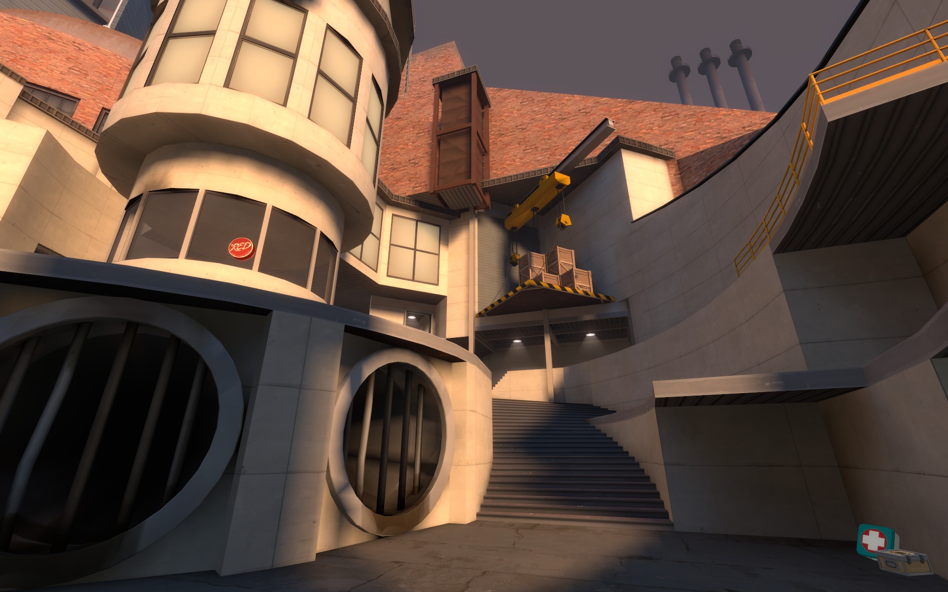
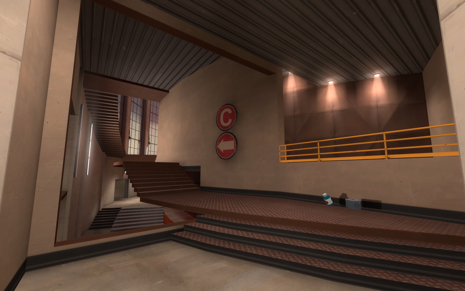
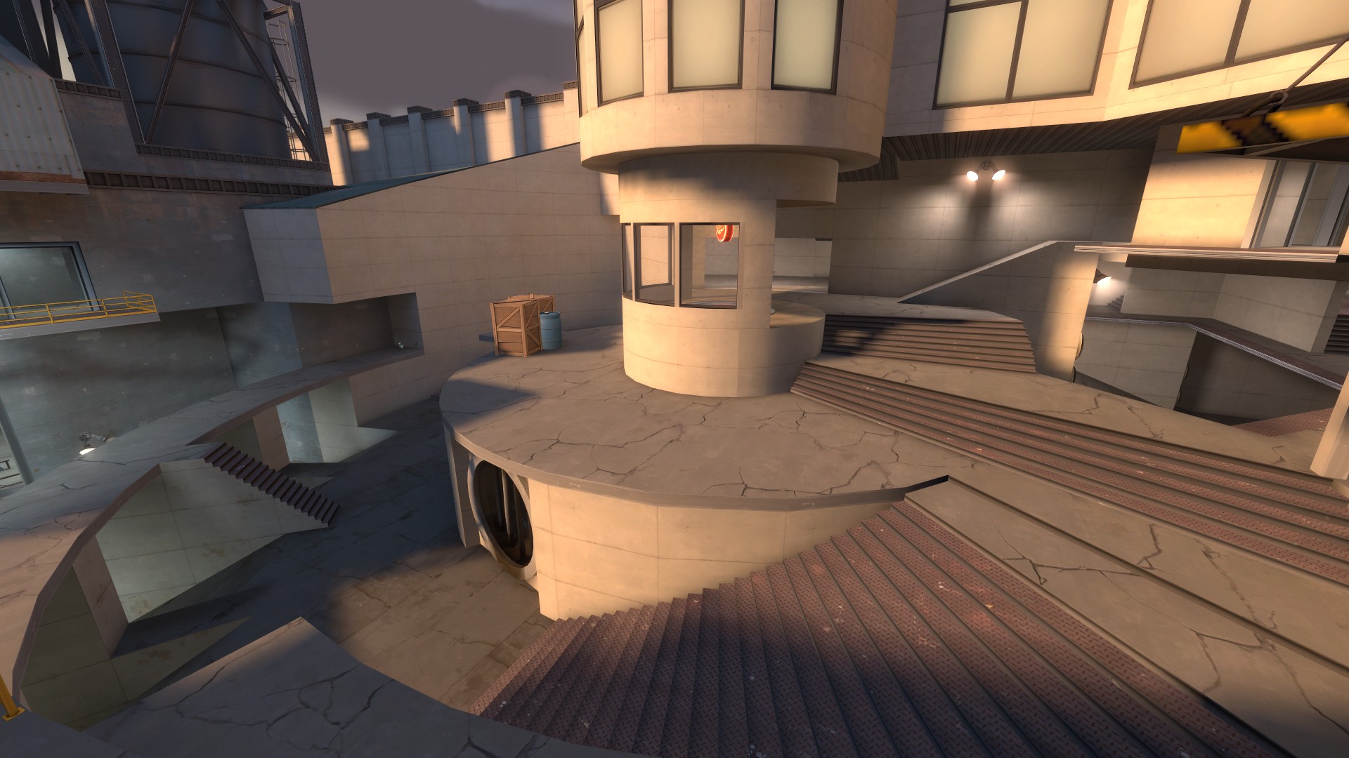
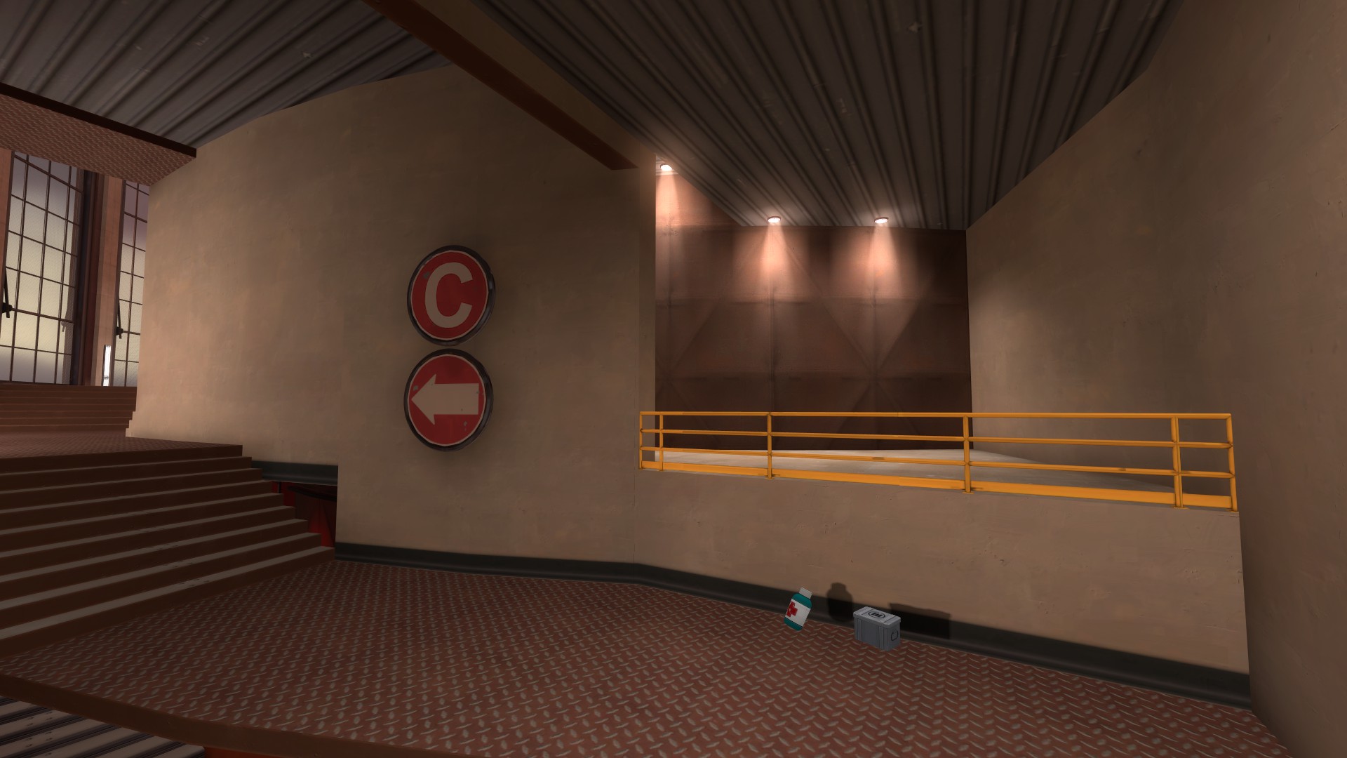
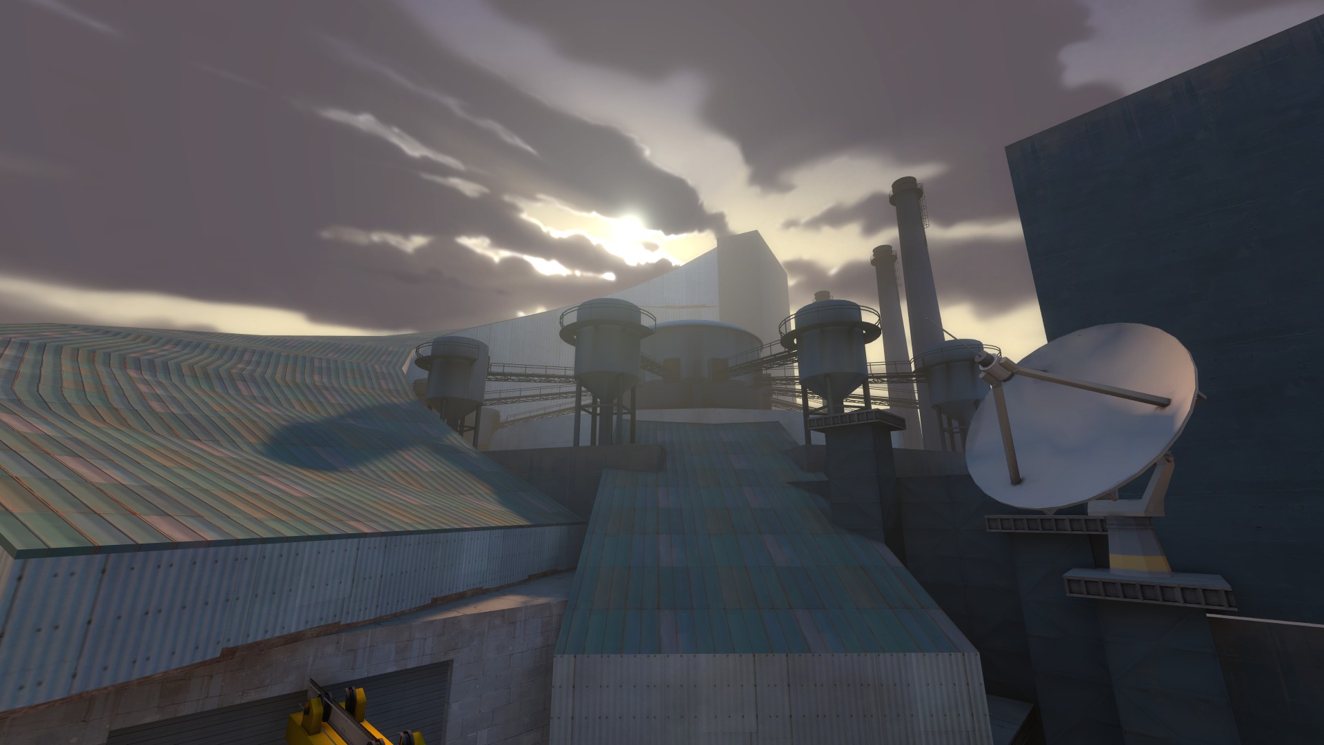
Let's start outside BLU spawn.
Visually, this is a mess. Other than the distant white wall, nothing is highlighted; the forefront is a sea of paths and ramps and things I don't know how to get to. Most people's internal reaction to leaving BLU spawn is probably "Fuck it". How do I get anywhere? Which of these paths will lead me where I want to go? Where do I want to go? Is there any indication of what's happening here? Not really. Nothing is lit to indicate it's important, and the single set of signs tell us something we better damn well already know: A is somewhere off in that direction.
This is a sea of confusion.
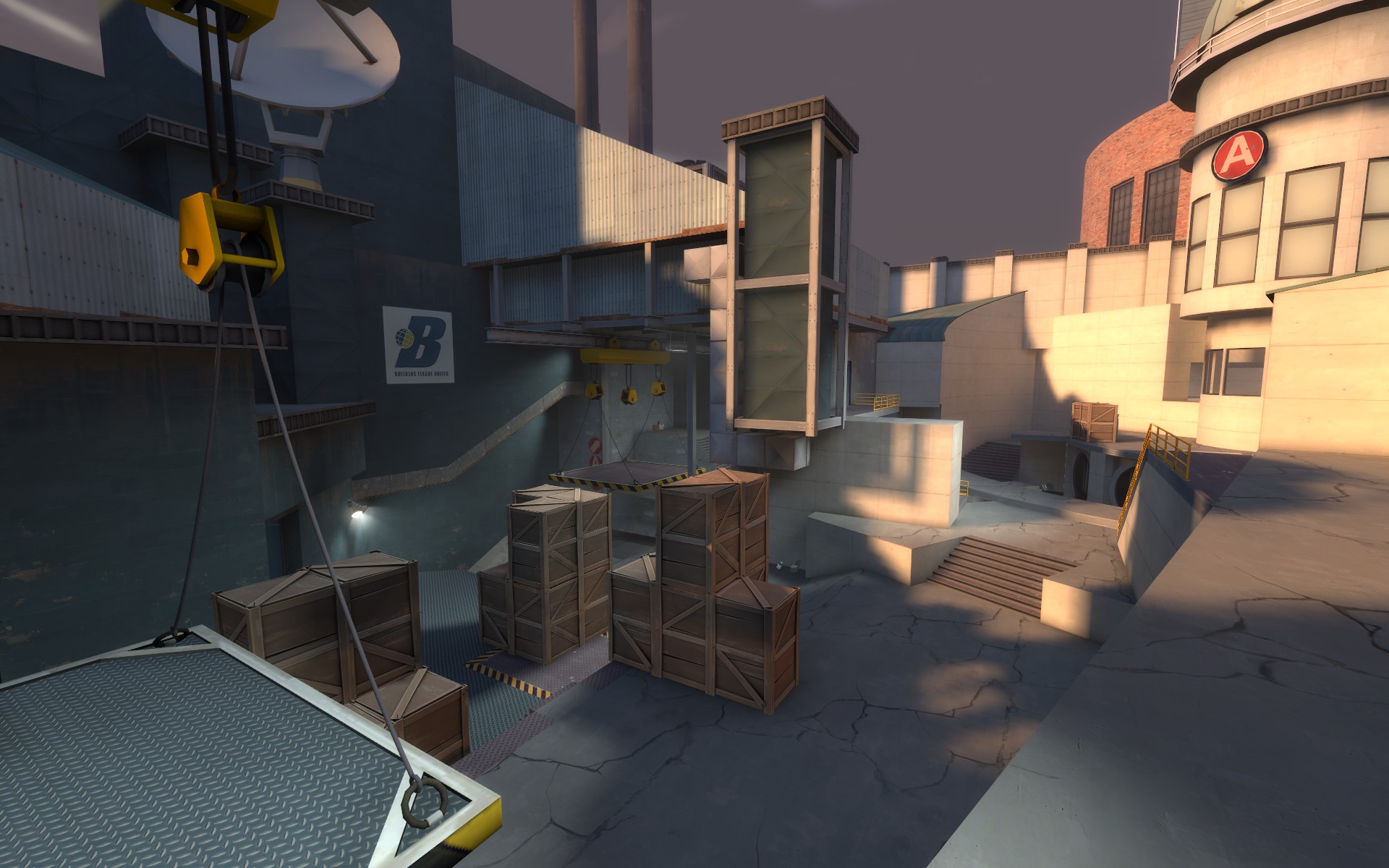
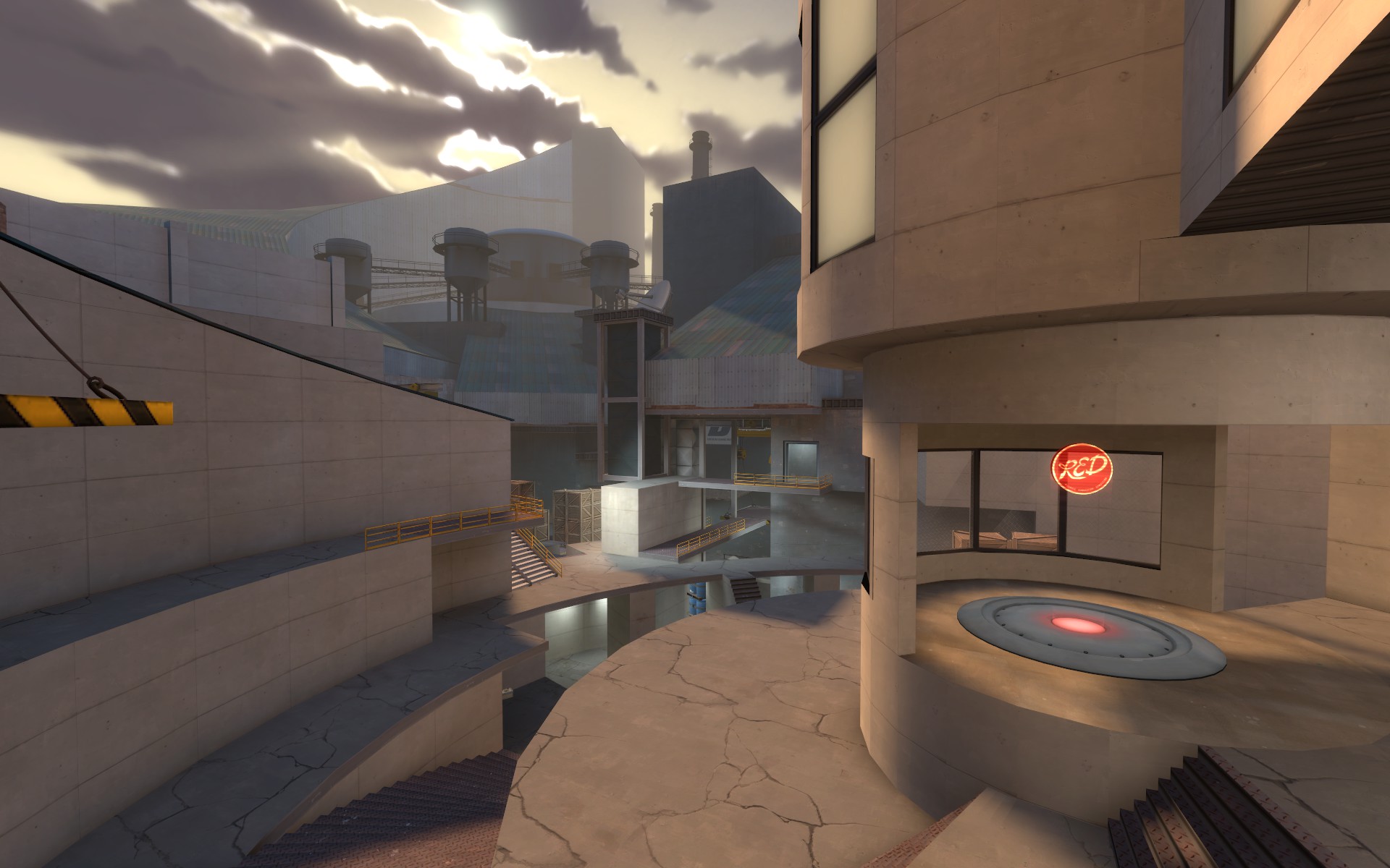
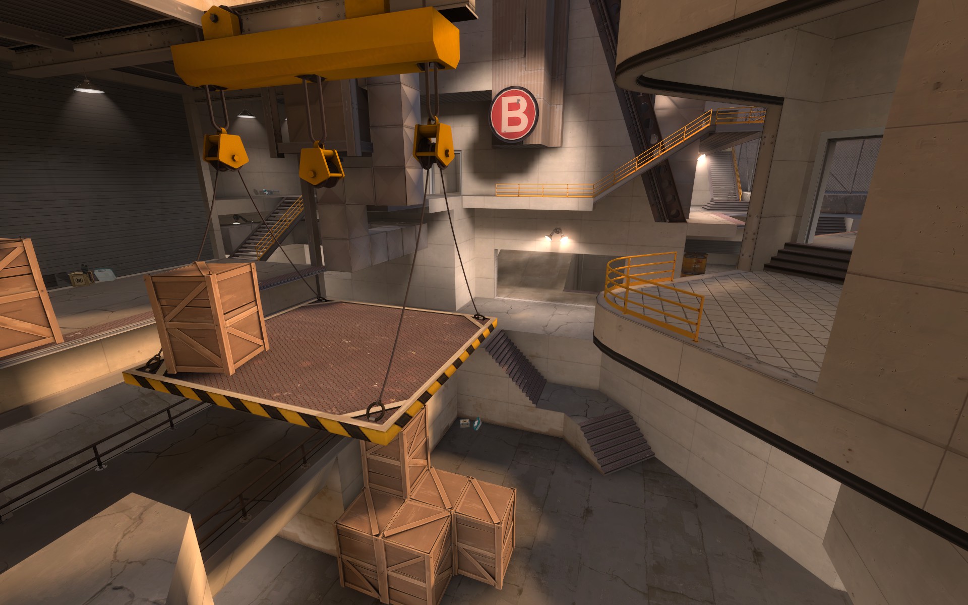
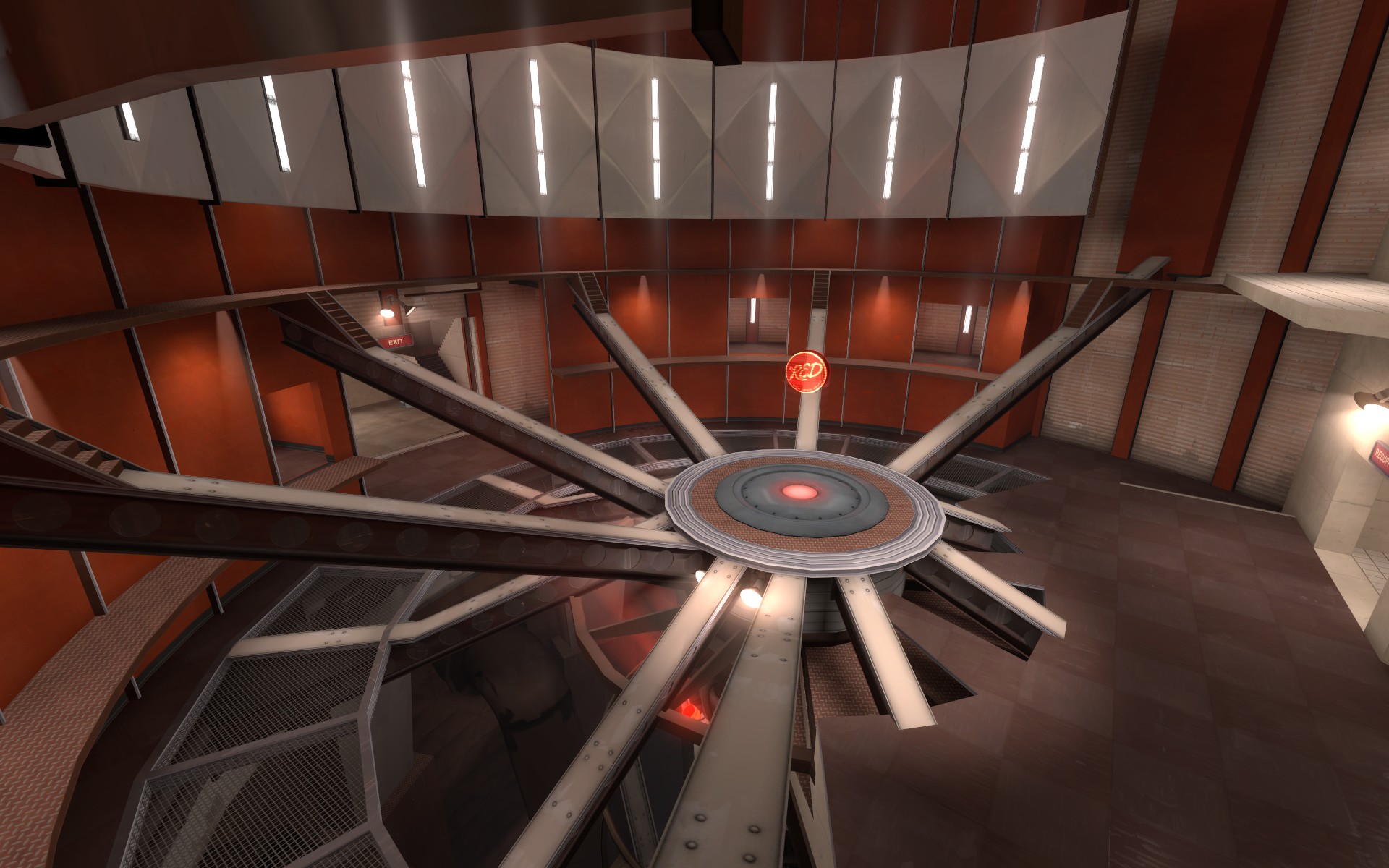
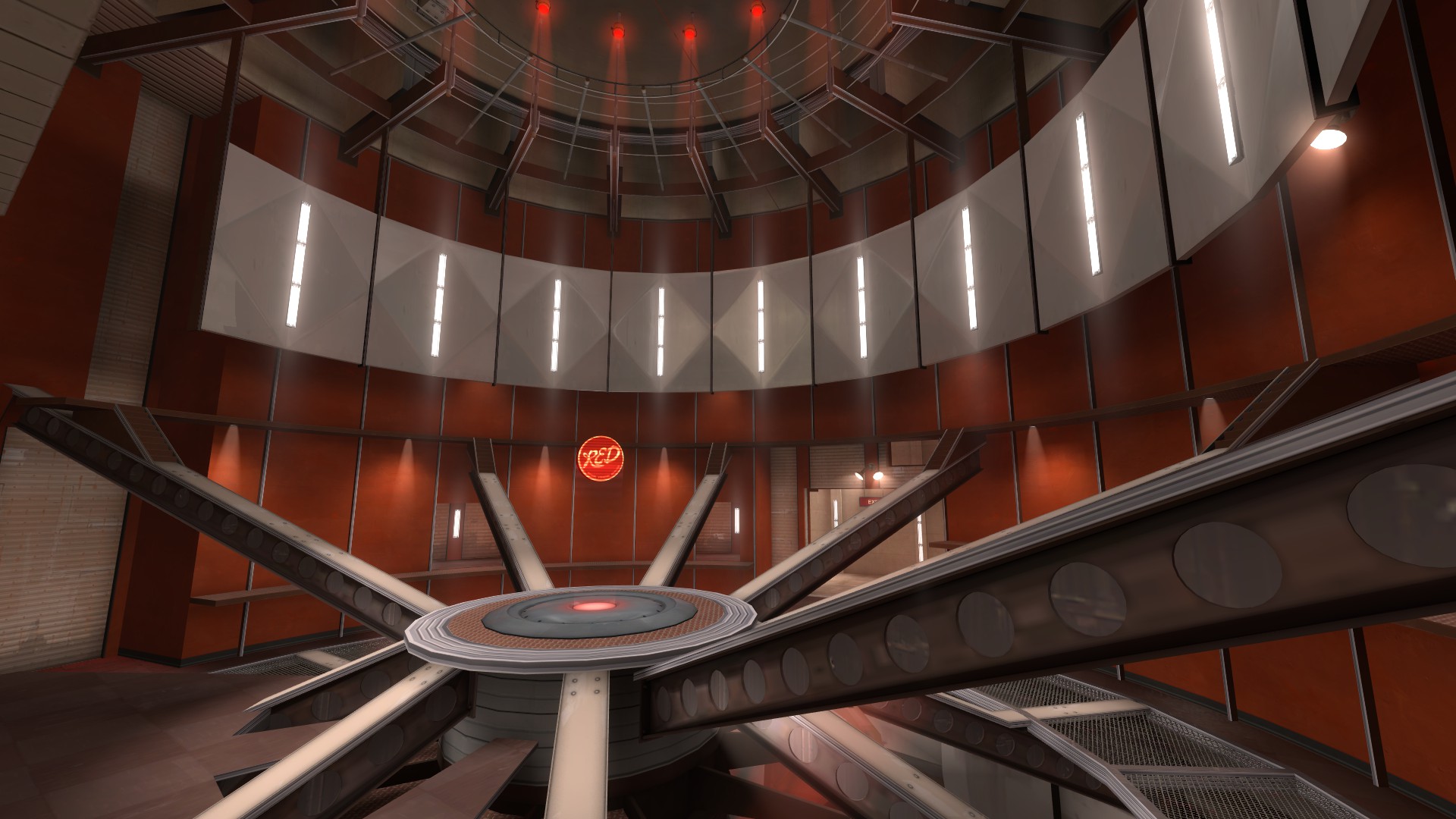
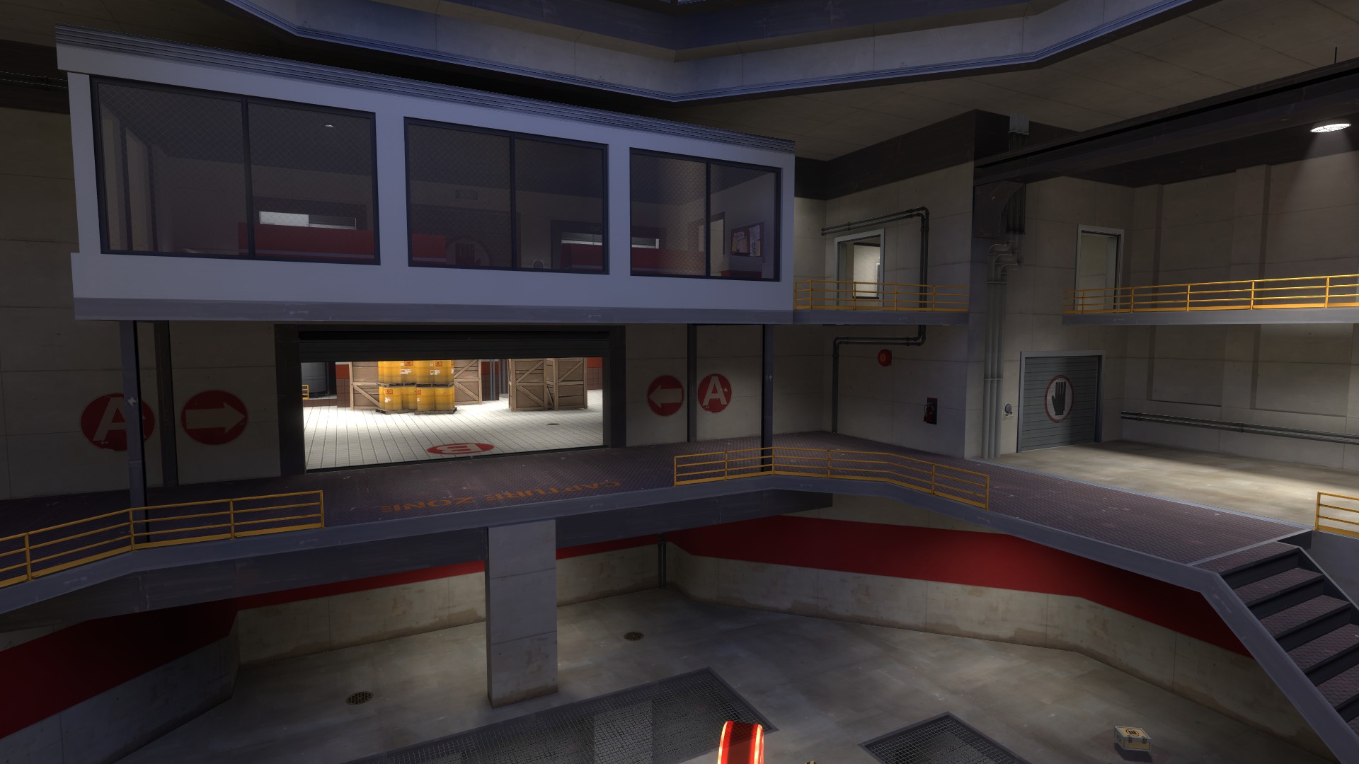
Similarly, attacking A is a clusterfuck. You might
think that by finding the high ground you're going to be taking the high ground to A, but nope. This ring of negative space means you're on the same terms as all the shmucks that took the low ground, except you took a maze there and they took an enclosed path. It is true that BLU could come from the left of this, but that leaves their offense protracted far from the point, exposed, and against a wall so they can easily soak splash damage.
Then there's just a single route onto A itself.
Frankly? That's not terrible. The idea of it, anyway. But if you limit anyone in an A/D map, it needs to be RED, not BLU. And RED has more options onto the point, and beyond that, BLU can't see them coming.
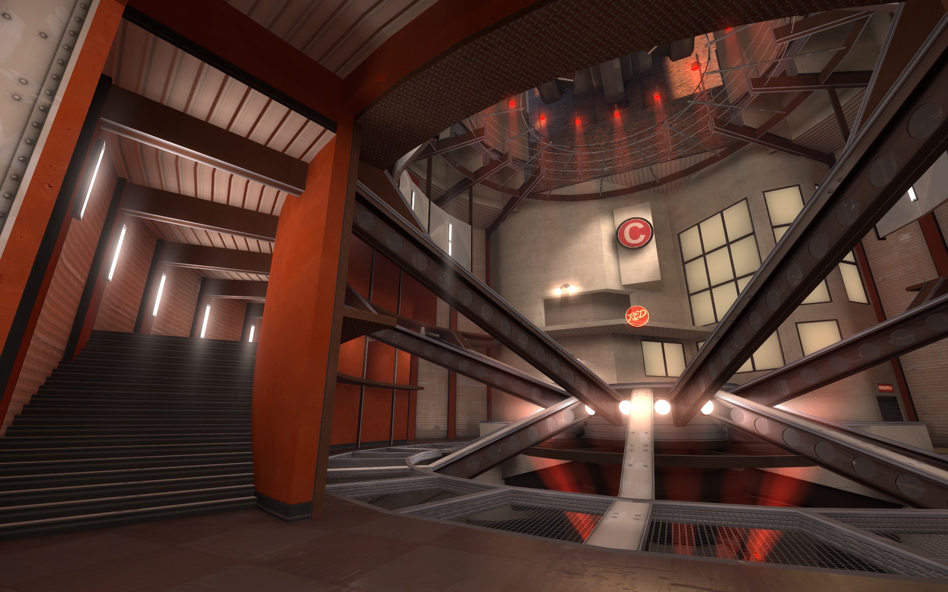
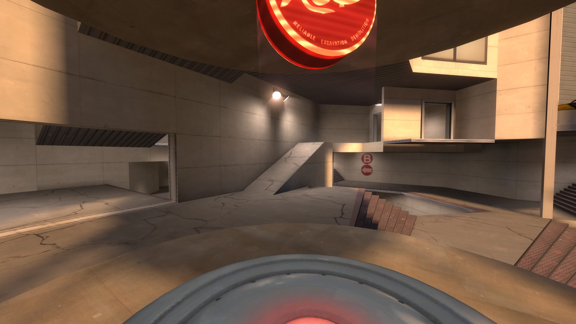
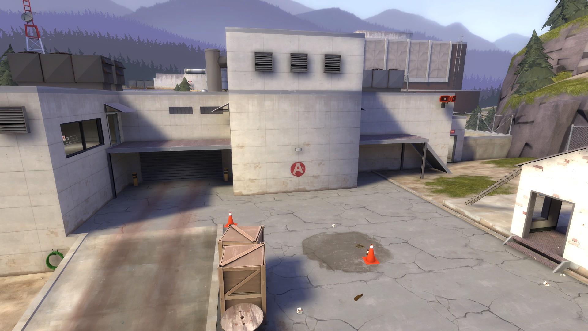
As someone capping this point, where is anyone going to attack
me from? I don't know until they're on top of me. I have nowhere to retreat, because there's a big wall behind me. And the health and ammo placement favors defenders. All that being said, the point itself is cappable... it just takes damn near the entirety of the given time.
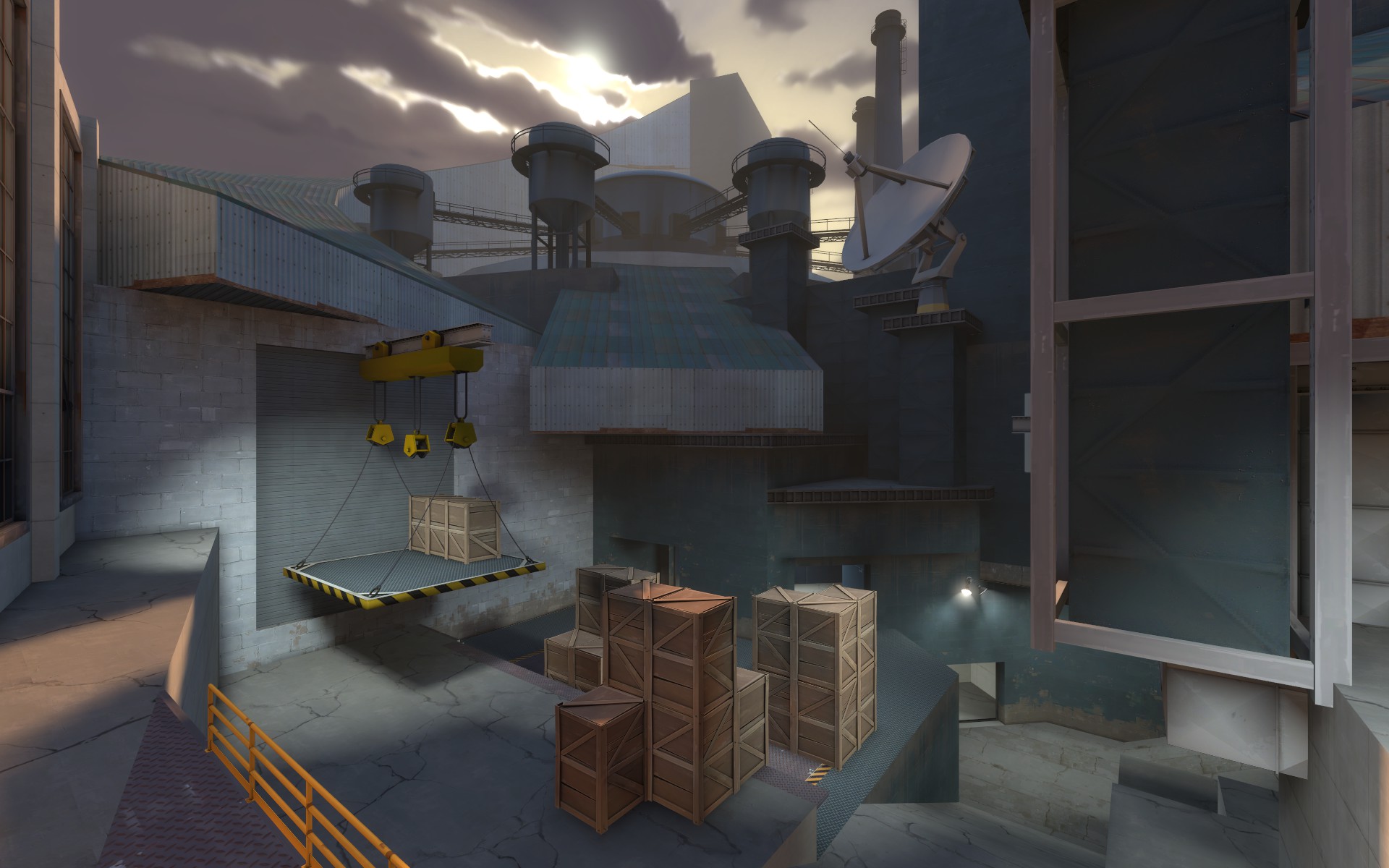
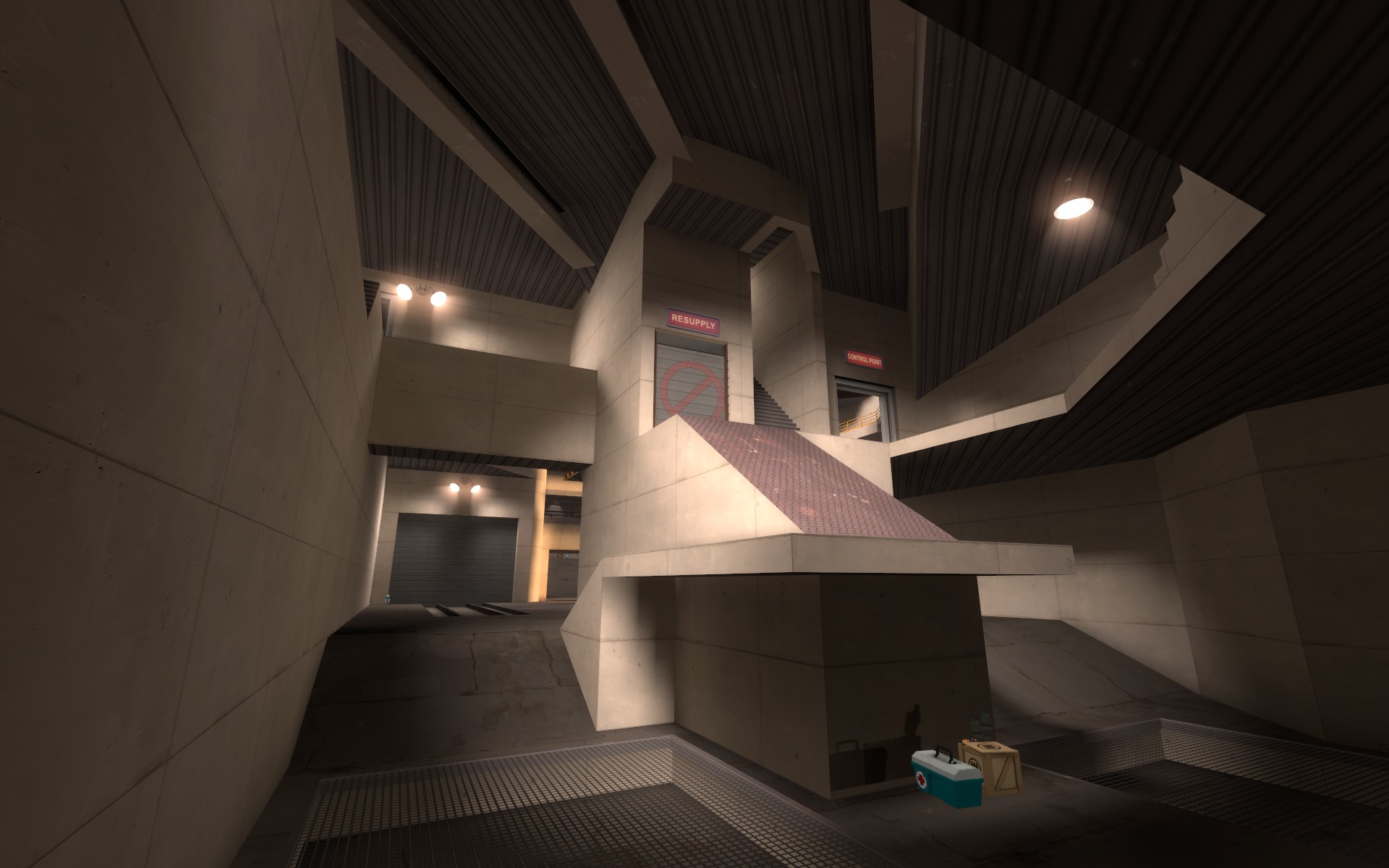
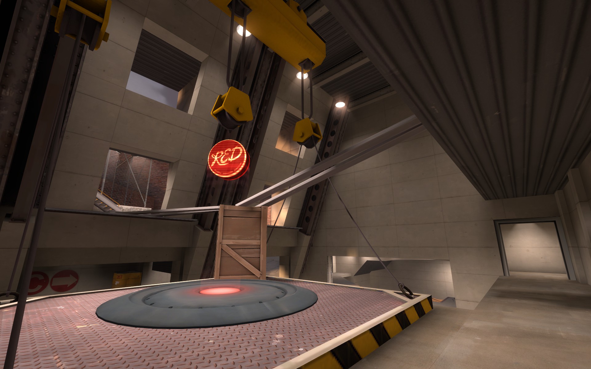
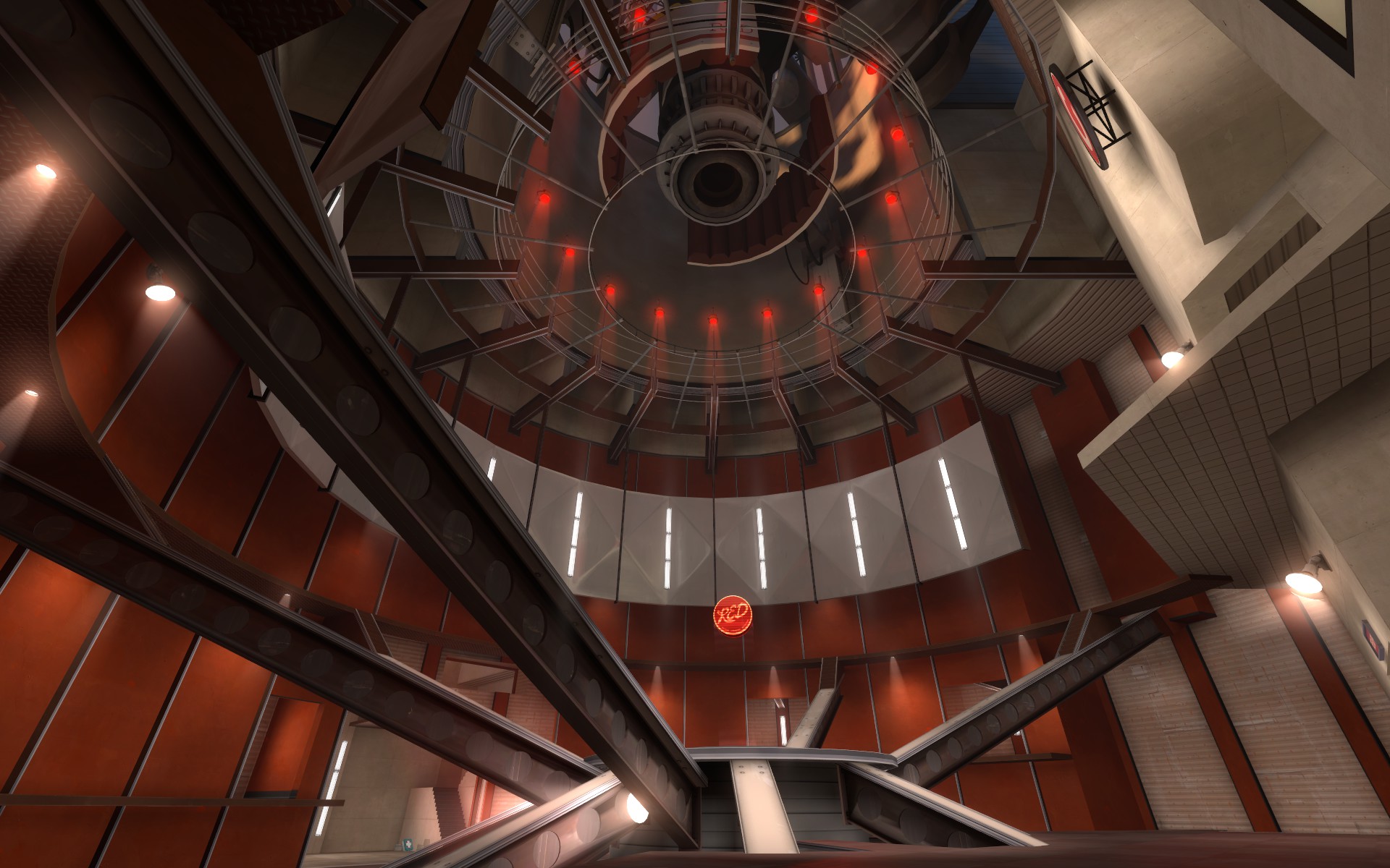
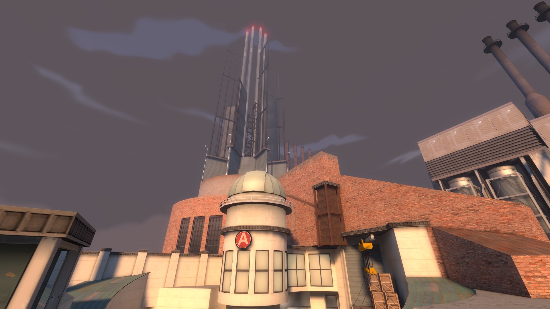
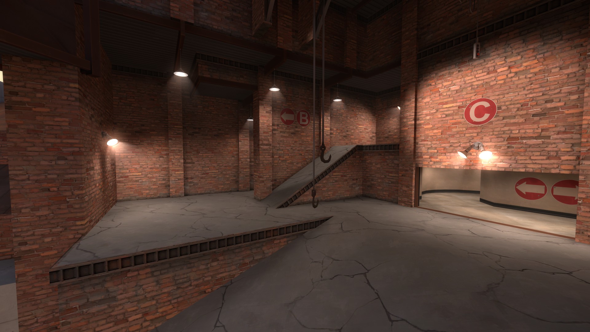
What's after the point?
This wreck of a connector. (Besides the fact that the spawn doors are split, I mean. Why the hell are there two?)
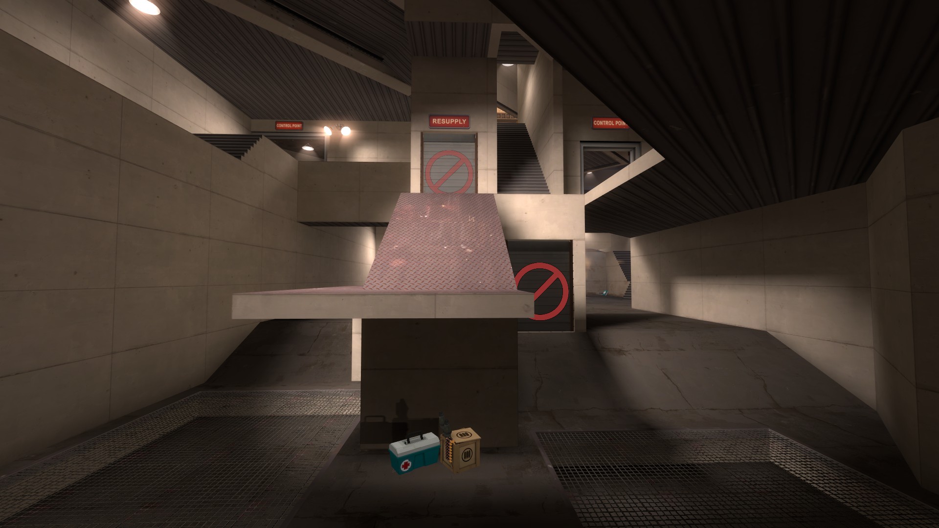
Something I think you're missing, on a very basic level, is scale. Most of your play spaces are scaled correctly, more or less--I mean it's always up to some interpretation--but this is a great example of how when they are not scaled right,
it's bad.
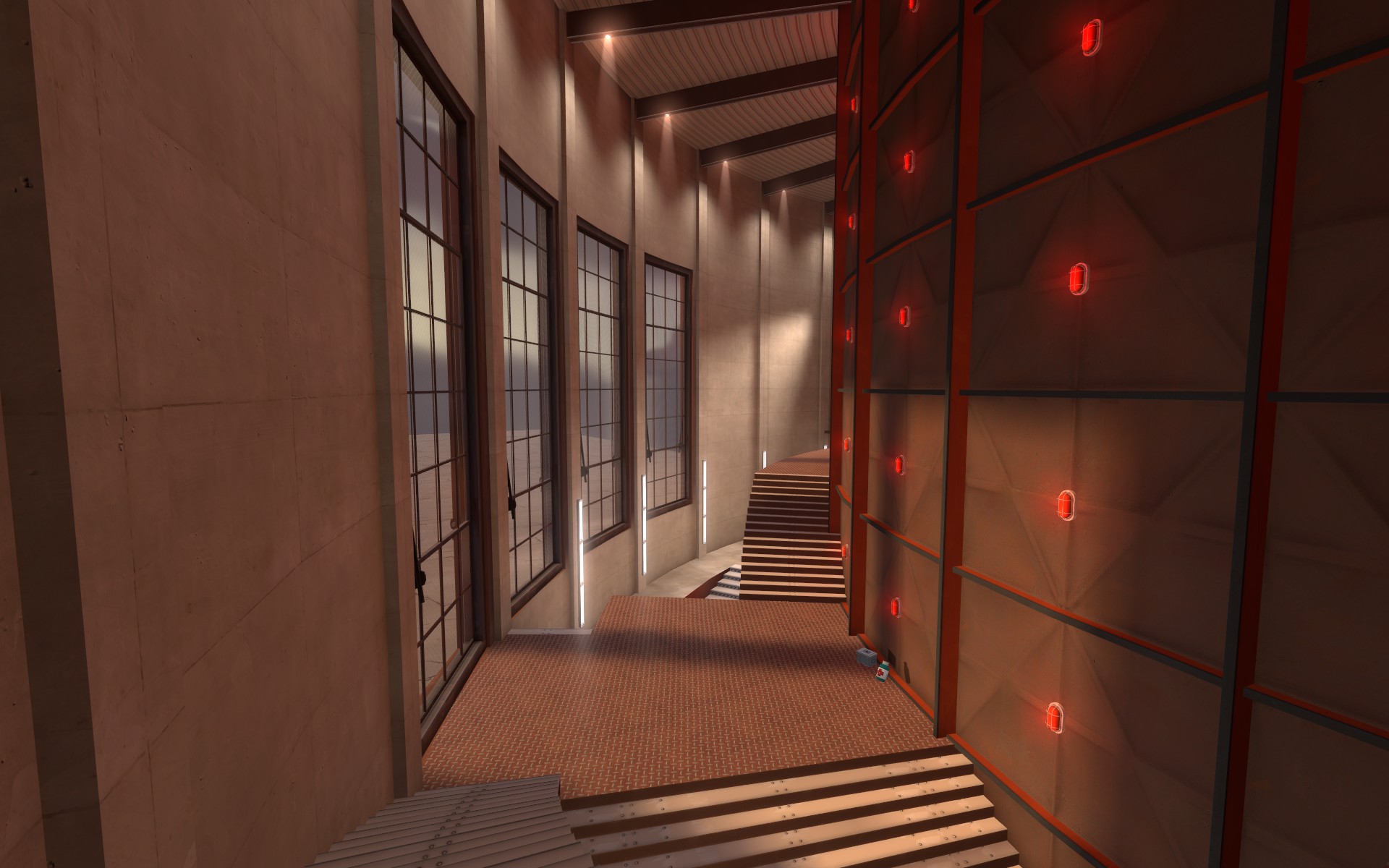
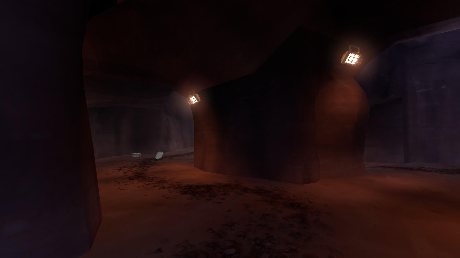
Here's something you changed from A4, but barely. This room is still tiny and easy to camp; the doorways are still miniscule; the pickups still are measly and besides support RED more than BLU. This is a fundamental problem across many areas of your map.
This actually is worse than A4--previously, RED and BLU clashed here; now it's a tiny balcony for BLU to get creamed under. This actually made your problems in A4 worse and is a basic indicator to me that you don't know what you're doing anymore.
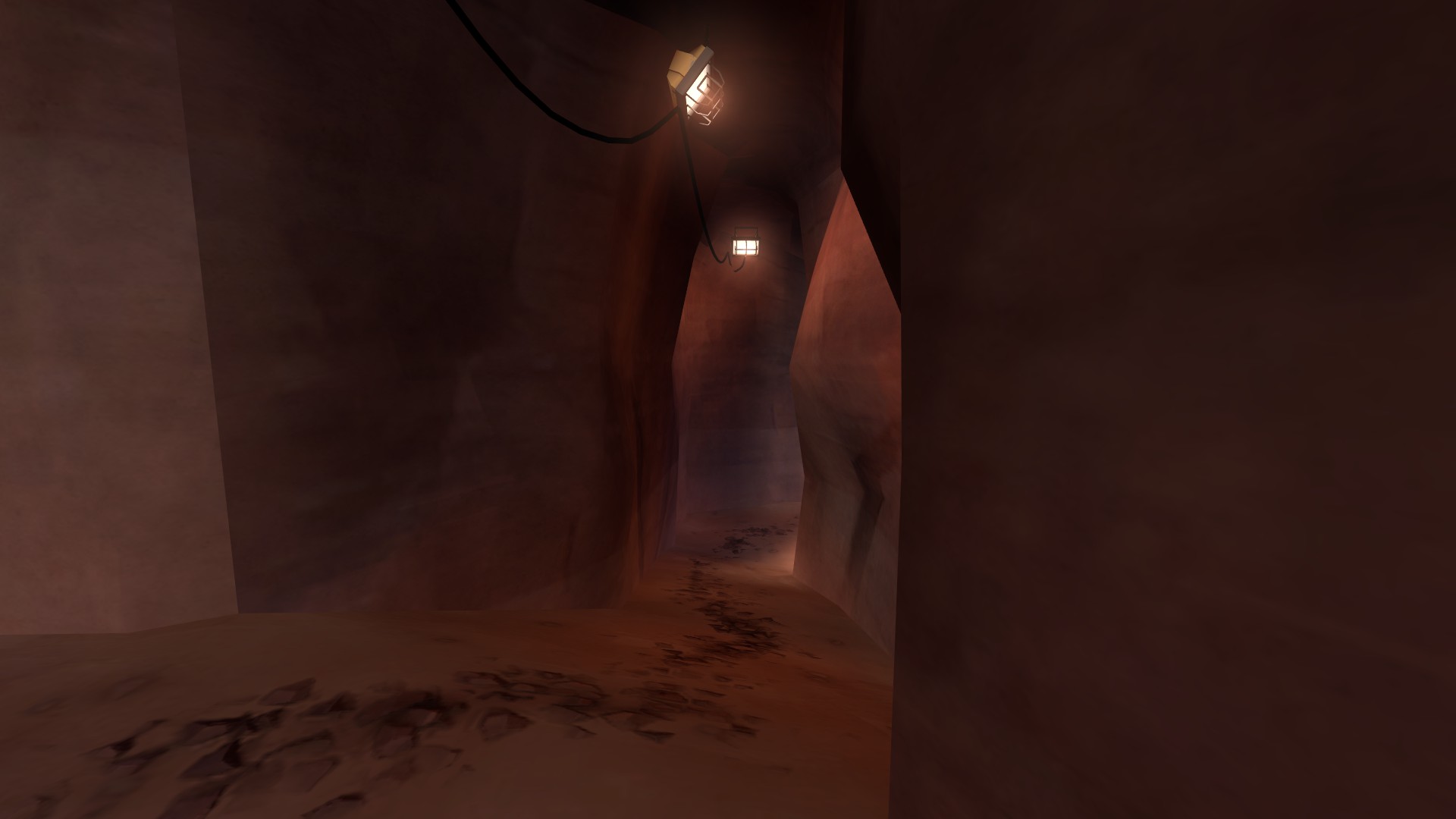
Look at Hydro--a map long lambasted for it's tiny, winding caves.
For the most part, Hydro's caves are
larger than the paths in your map. And those caves are part of the main reason few people like it and matches are stalematey.
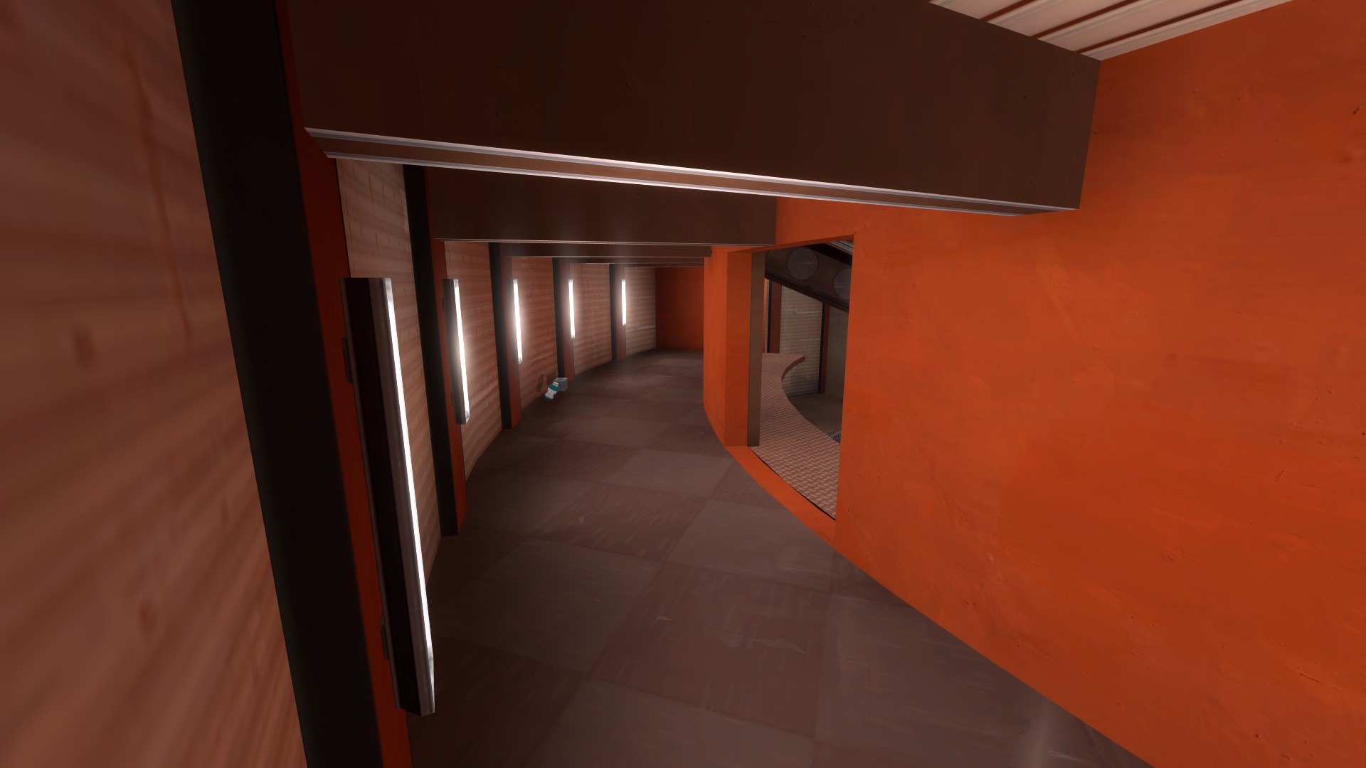
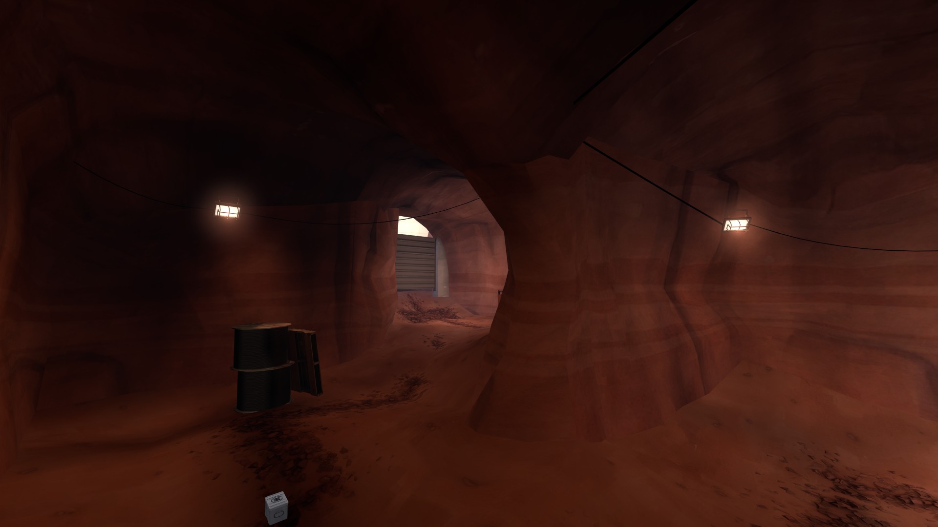
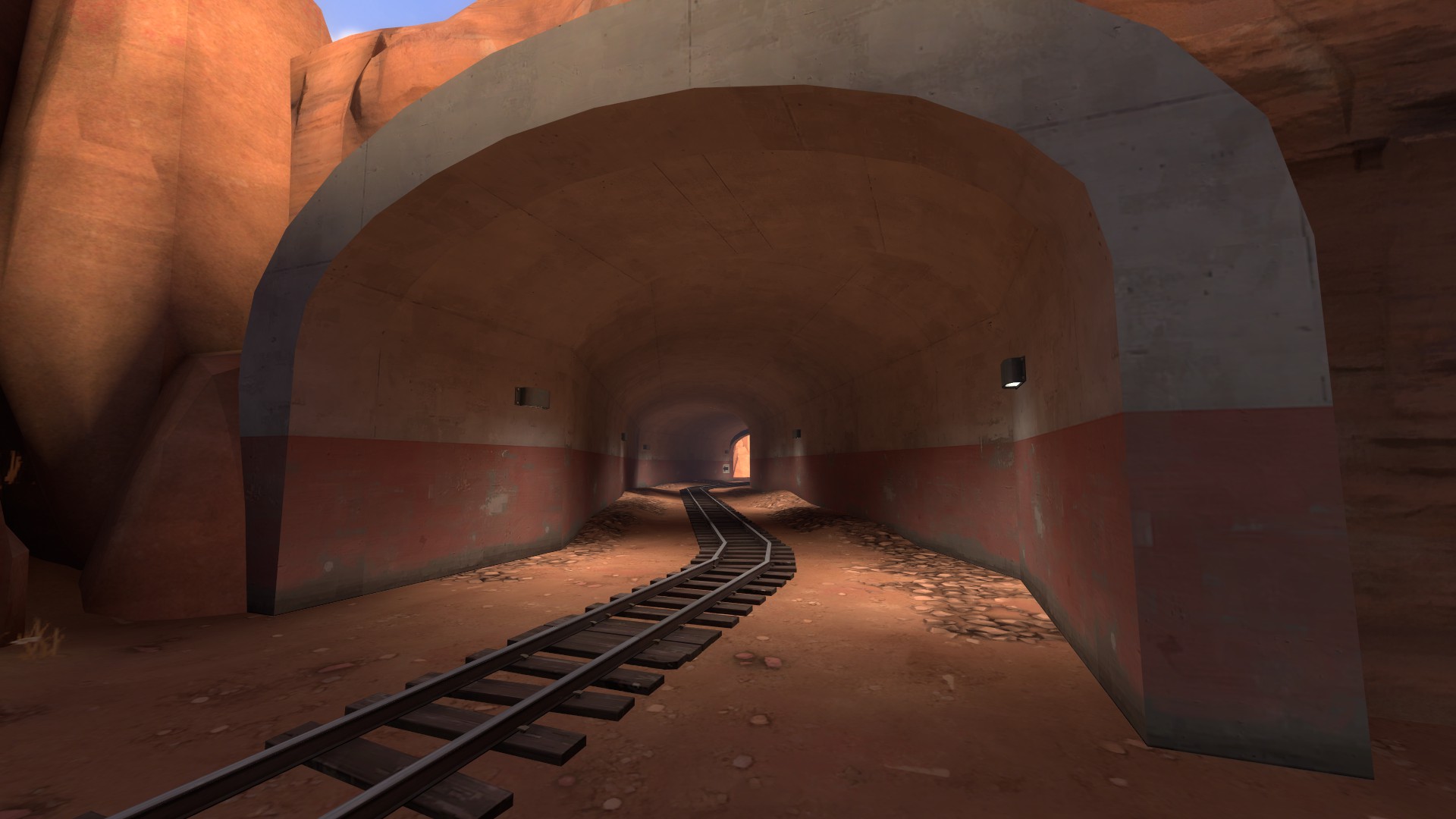
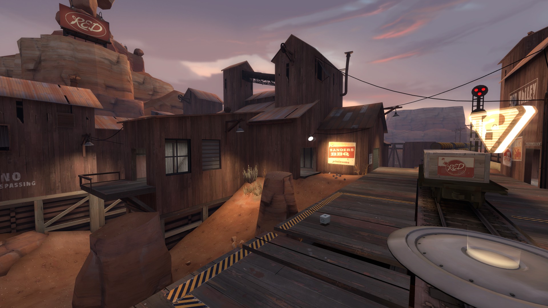
Look at the tunnel on Badwater.
This is meant to be a tight area that is overcome by support above the tunnel. It's literally meant to be small (especially with the payload). And it's wider than all your halls.
You don't seem to understand basic maneuverability: how classes move, how weapons affect that, what weapons are good and bad in these quarters, what classes shine in hallways versus open areas.
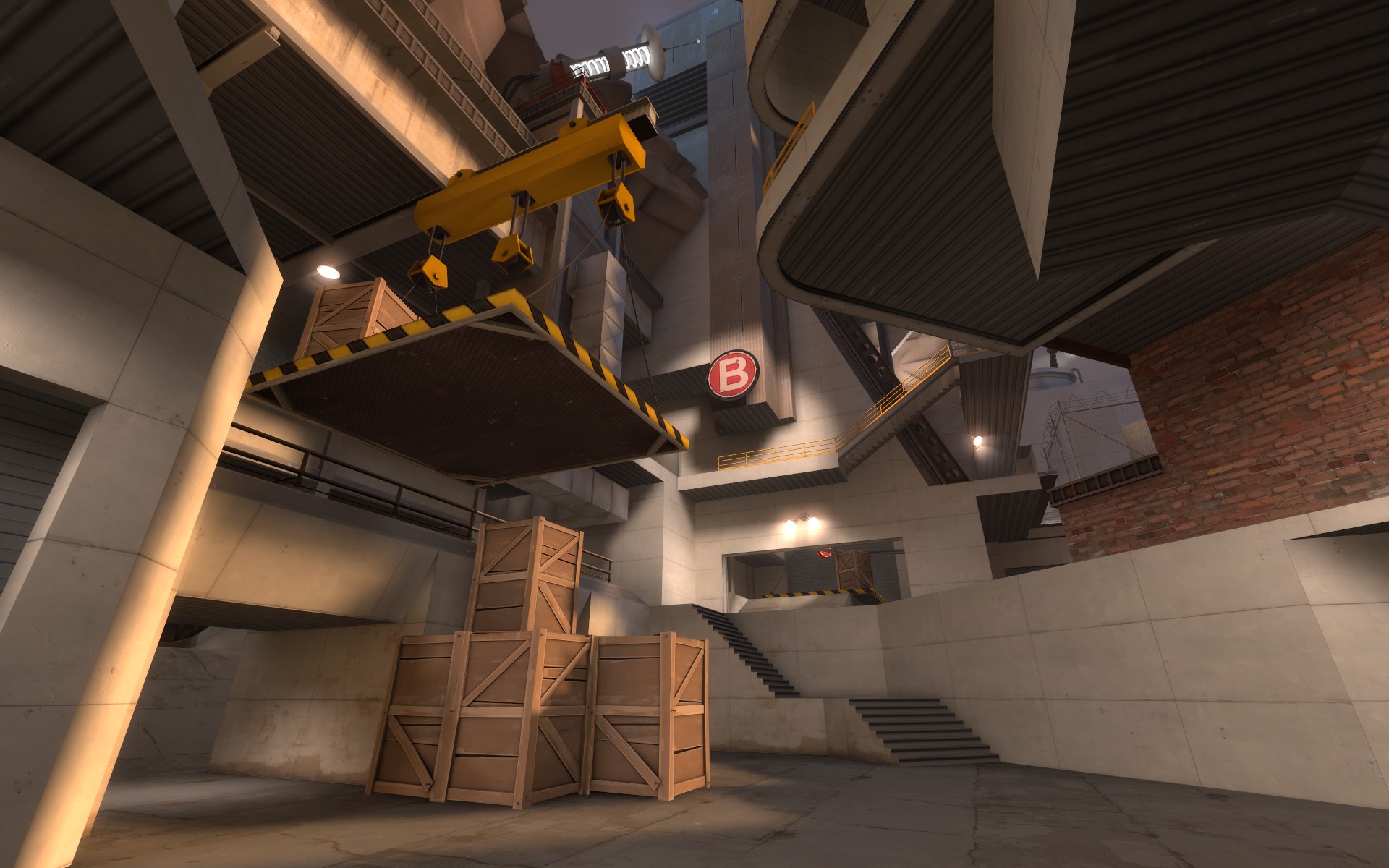
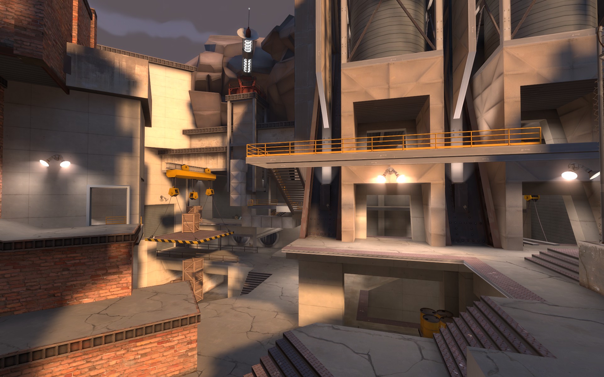
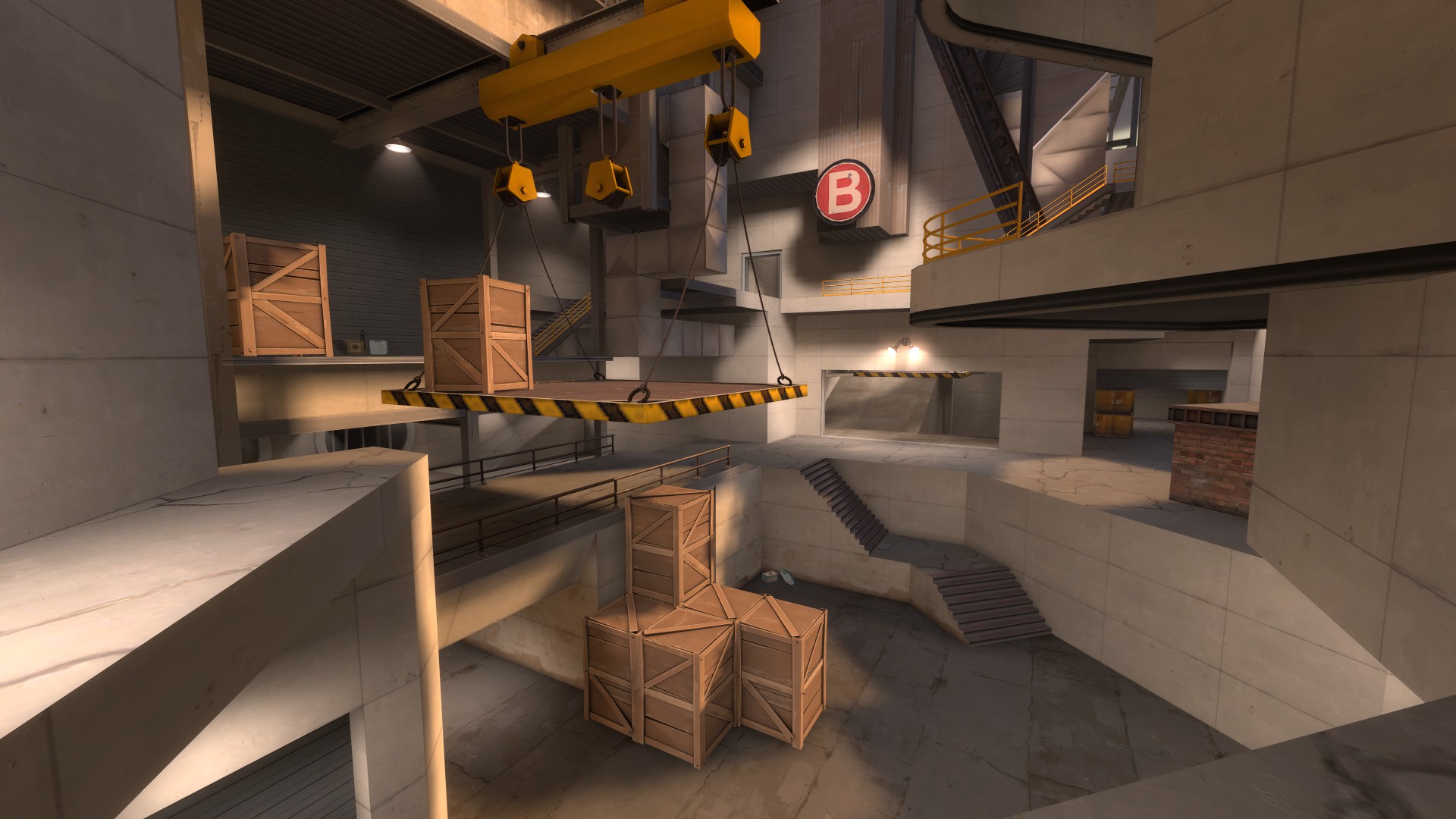
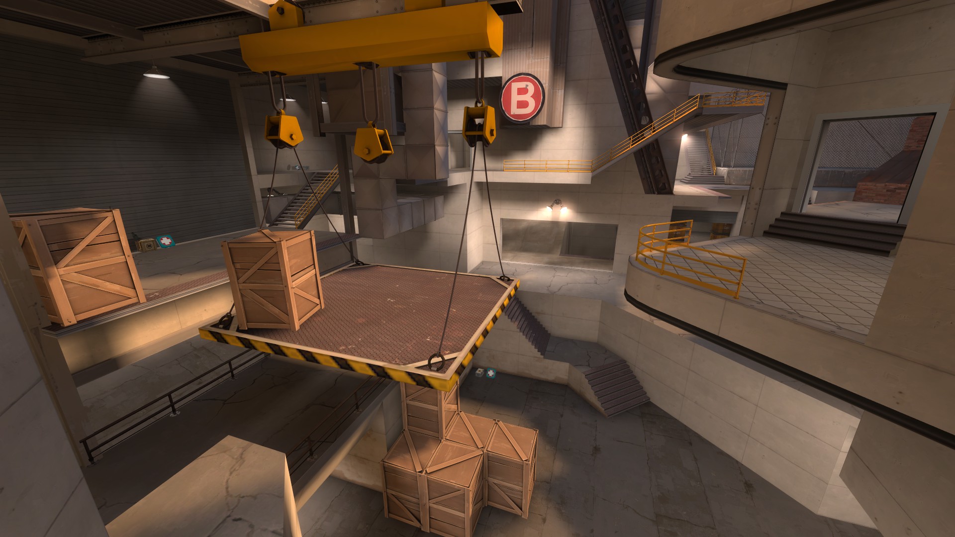
And I'm not trying to say you don't have large open areas for combat to contrast this--these hallways are not the sole reason the map isn't fun (though C turns into a terrible fucking slog at the end as BLU tries to grind through tiny, spread out holes while fighting sentries shooting above and behind them to cap a tiny point raised above a death pit with a bunch of shit in the way of their fire). You do have large combat areas. They are just confusing, like the one at A.
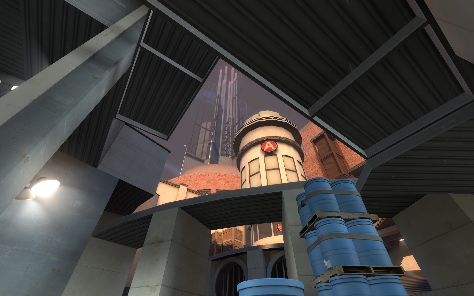
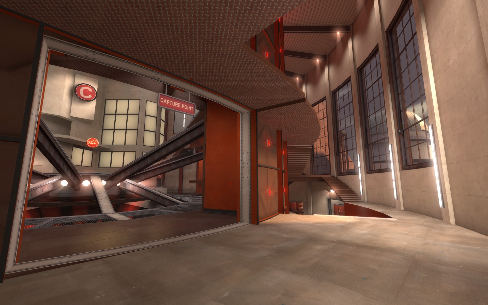
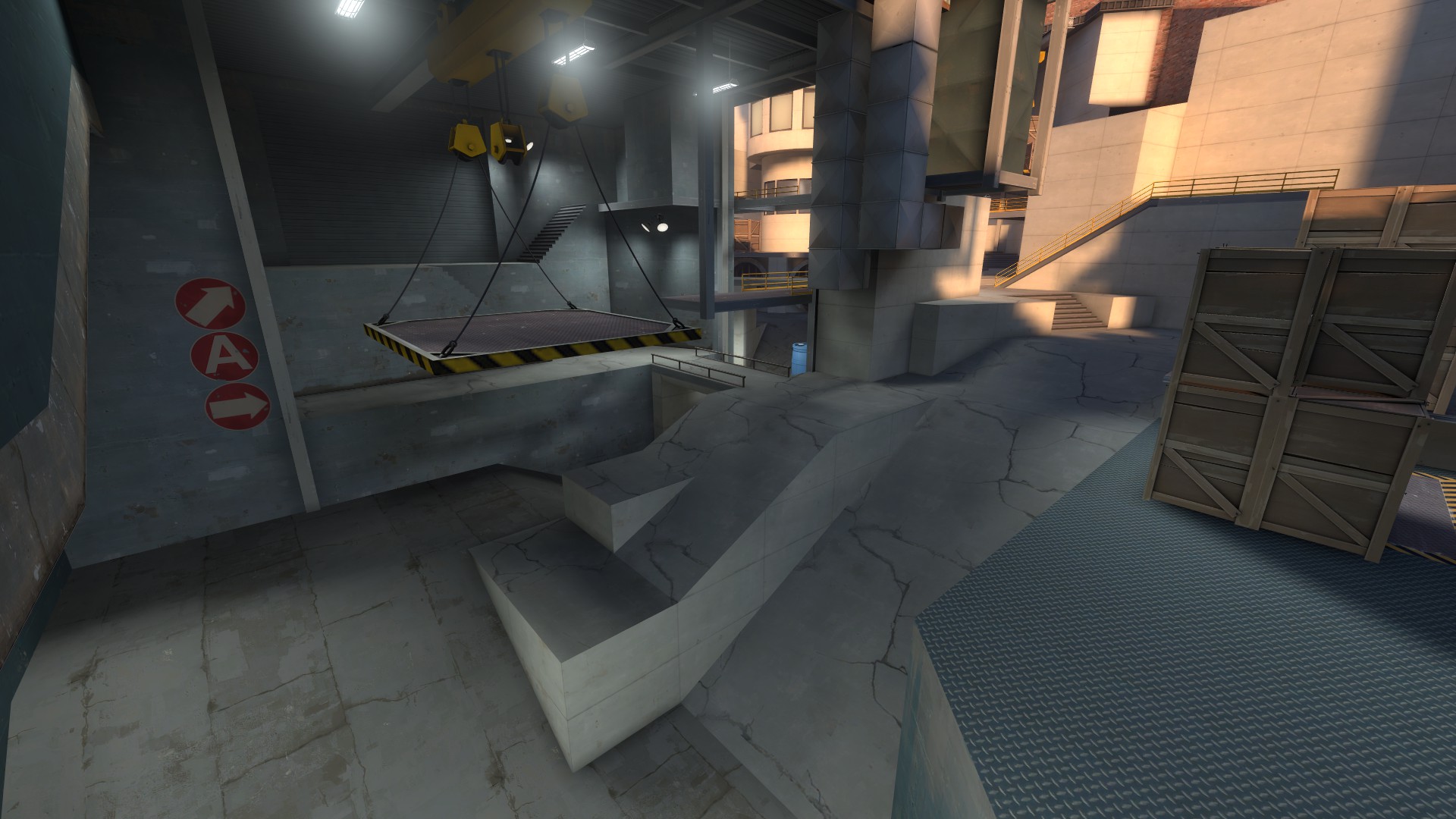
Or this one.
In a picture? It's not that hard to see what's going on. In game? I don't know where I came from because of the previous connector, I didn't know where I was going, and now I'm looking at an Escher drawing. Again, nothing is highlighted. Again, there are no useful directional signs. It's not clear how I can move from one area to another, or why I would and where that next area would take me.
It's totally a shame.
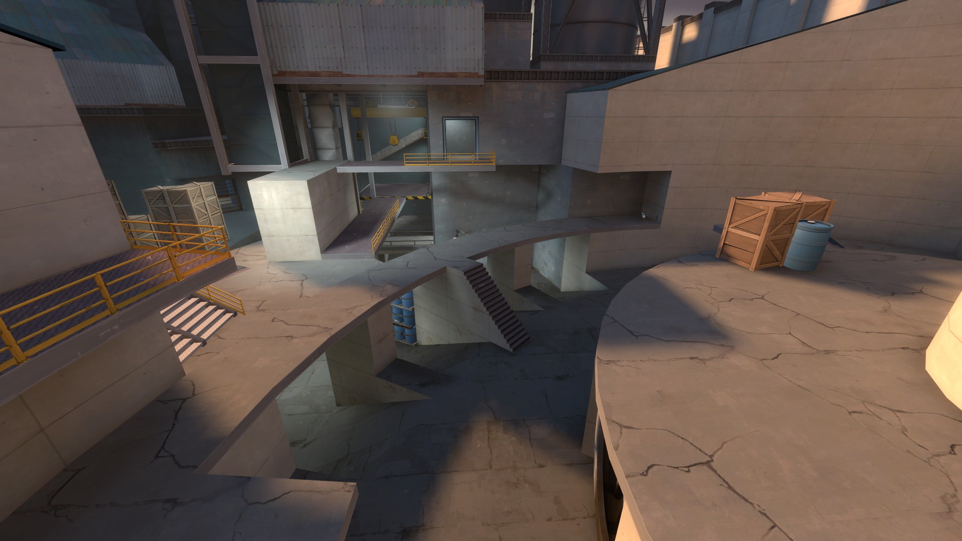
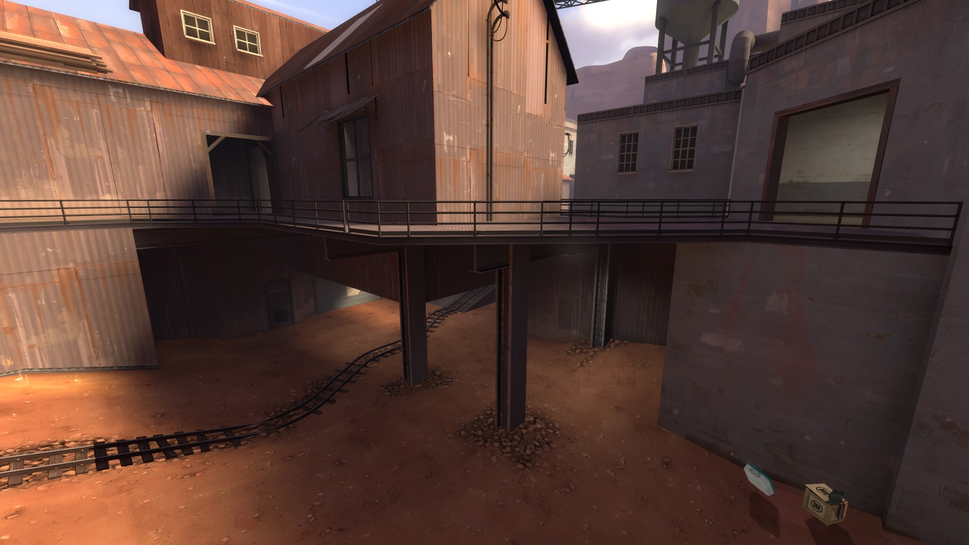
Can we look at Badwater again? Here's the same basic area as you have--low ground going under a high ground. More or less.
Completely different, but it's even using the same architectural themes. The beams are there, the catwalk, everything. See how simple it is? Why can't this be Imbricatus? Why does Imbricatus have to feel like a soup of brushwork and props?
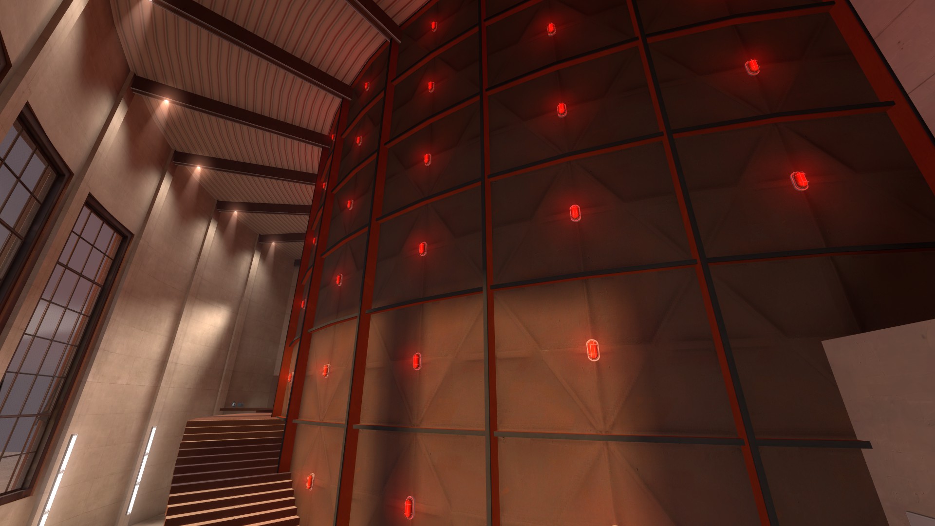
I know you want something evocative, and you definitely hit that. You hit that a lot. You wanted to make a map that hits someone on an emotional level, and you have.
Look at those! Those are amazing! Some of them look
nothing like existing TF2, and that is awesome. That's especially awesome to me, because I've been playing it for 5 years and been testing new maps for over 3 years and I've never seen something so
new that's still identifiably TF2. This is like TF2 on PCP or something. I like it.
But then we play the map, and we figure out you don't know what you're doing gameplay wise, at all. I mean, frankly, I'm surprised you've gone this far with it at this point, because all anyone ever says is "Cool! But..." And here we are.
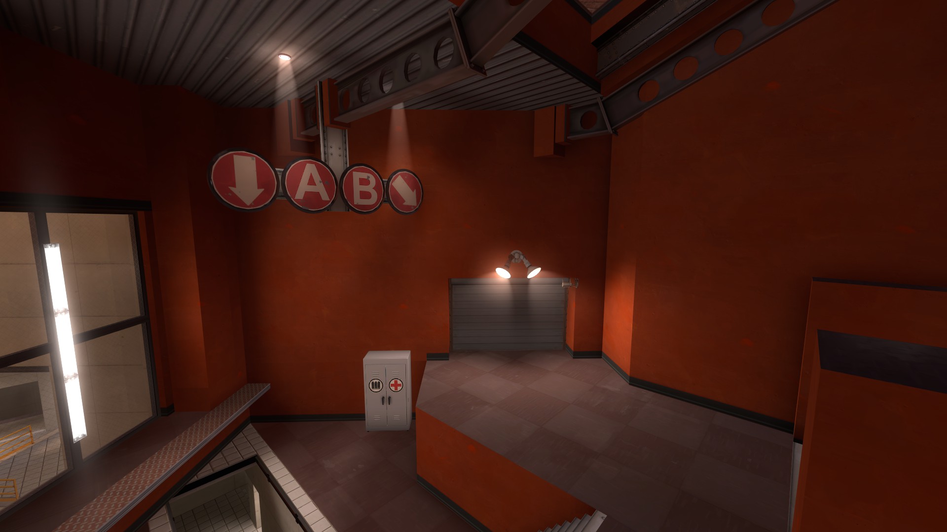
I know people have pointed this out to you a lot. There's a BLU forward spawn exit here, and it requires you do a 180, and there's no sign. It relies on the memory and instant judgment of the player. That just doesn't work! It's nice to give an average player credit, but you can't.
Similarly, like in this instance--
--you've got a big door going to B, and a tiny hole going to A, which because of the weird double spawn doors ends up feeling like going down an anthill. Where do you think most people go? After they've taken the wrong door once or twice, do you think they remember that after every death? After every round? And why can't I go from this spawn to C?
They connect. It'd make abandoning B safer and let me set up faster.
Think about that, and the spawn exit, and the initial BLU spawn area, and then look at Gorge.
Or look at Badlands.
Or Dustbowl. Or Well. Or Mountain Lab, or Gravel Pit, or Gold Rush, or any number of community maps. The objective is
instantly clear. The paths are indicative of where they go
immediately. No amount of learning or remembering matters in the split second when you are fighting an enemy and need to decide where to run, or if you should chase them, or if time is low and you need to get to a point.
People don't always think about their past experiences on a map and overall layout before committing; that's why having clear paths and only a couple areas to look at before moving or firing is very important.
I don't think the basic idea of your layout is bad. I don't think the idea of the map is bad, or any of the single points are bad. But the way paths intertwine, the way you implement verticality, the way levels are separated--that's all terrible. It shows me that you don't really know what people are going to be doing, which is ok, because no one does. But you don't seem to be trying to plan for it, either, or know how to adjust what players do, because A5 is somehow worse than A4.
You don't seem to know why your skinny halls are bad, or the connectors are bad, or the individual areas don't work. I can't tell you why, either. If you don't know why TF2's combat areas are simple, the doors are wide, and the paths are spacious, I probably can't tell you anything.
And the idea that someone should play a few rounds before judging the map and providing feedback? Yeah, that's true. But will it happen? No. You want to know why? People are opinionated, especially here. But beyond that, if some other server community wants to throw this into rotation, you know what they'll do? Play it once or twice. For you or me, remembering the layout of the map we make might be easy. For you or me, remembering the layout of a map we play a few times is probably also easy. For someone that doesn't give half a shit about level design, plays TF2 on Friday nights with their Ultimate Furry Gaming clan, and does bong hits between lives--aka, pretty much every TF2 player, in whole or in part--this kind of shit doesn't work. It just doesn't, and it won't ever, and no amount of your testing groups learning the map will make it a success later on.
I remember when you asked me, or maybe the chat in general, I dunno, what you should do with this. My opinion? Either detail it completely and never touch it again--you're pretty close--or drop it altogether. Fixing this will take more energy than it's worth, and I think if you just move on and try something new, you'll be better equipped to solve the issues in Imbricatus and try new ideas. Not every map needs to be finished. You've done a good job, but as any artist knows, you have to know when something doesn't work and drop it to avoid burning out entirely and going insane with frustration.
Hope this helps.
You know what? Try making a map that uses a lot of displacements.