- Aug 5, 2010
- 307
- 288
This is awesome because its what I have wanted (feedback wise) since I started posting again on this website. All of these points are fantastic too. I am going to specifically respond to each bit from everyone and post my solution to all these problems later today. I have a whole new spawn layout that should fix these.
Thanks brah.
This is fair and not fair. Its an alpha. The thematic ideas I have are in my head so wait till beta to let me know what you think about this.")
______________________________________________________________
Okay so here are my solutions for alpha 4, tell me what you guys think!
Alpha 3 stage 1.
Problems:
-shit red spawn
-maybe a little open for sentries to be effective
Alpha 3 stage 2
Problems:
-shit red spawn
-some extraneous paths
-a little large in parts
Alpha 3 stage 3
Problems:
-complex paths to get to final point
-kind of a long walk for blue, resulting in less action at the point
-not super readable from red's standpoint
The solutions
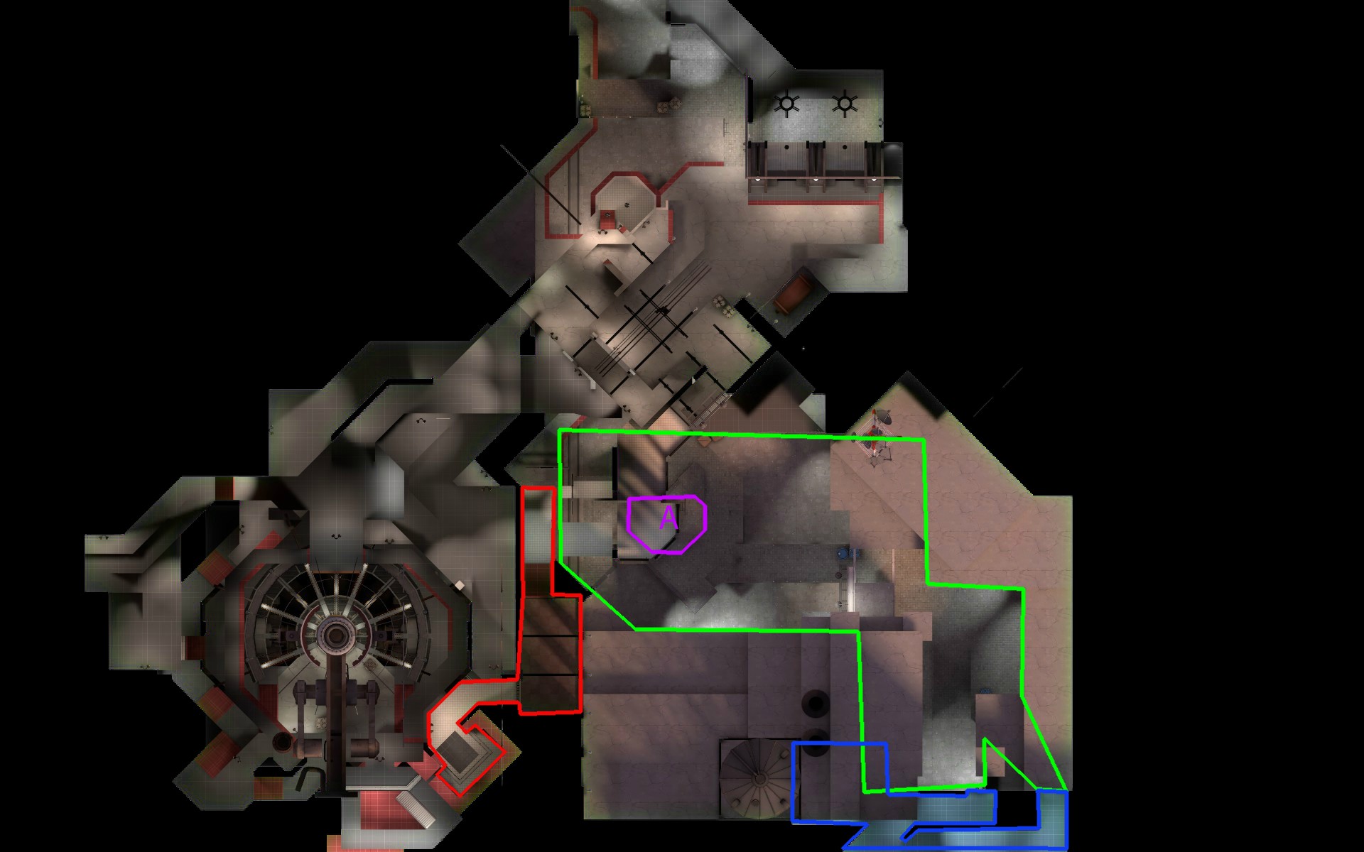
Alpha 4 stage 1
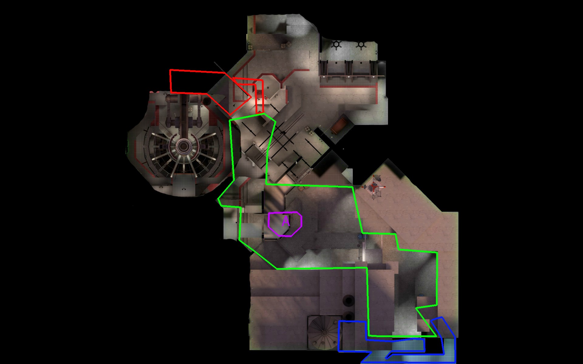
Fixes:
-red doesnt spawn on top of A and now have to go up a hill to get to A, so if A is being capped by a large part of the team, red's best option is to start defense on B
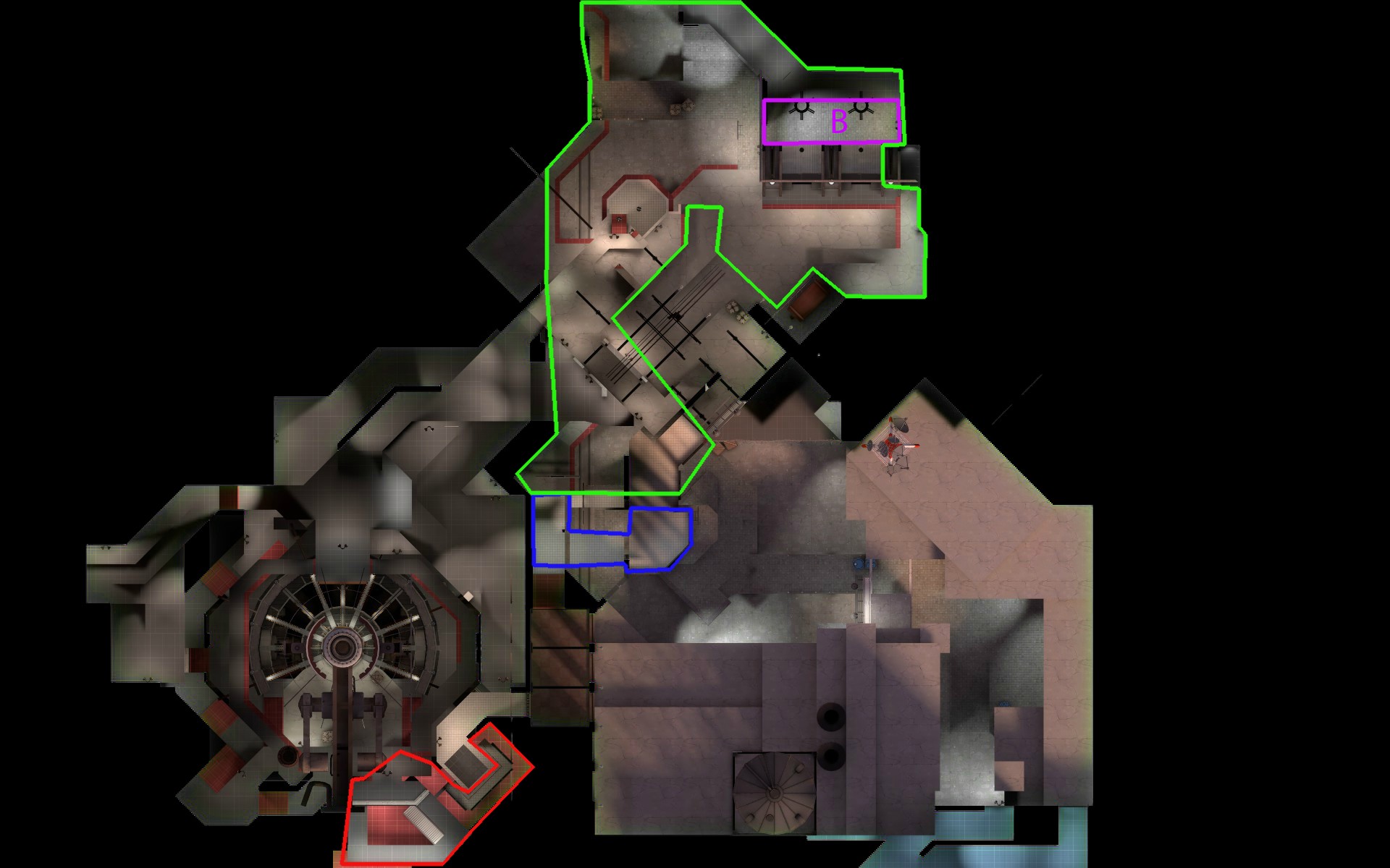
Alpha 4 stage 2
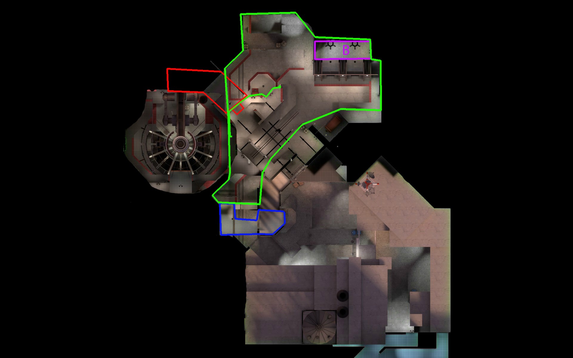
Fixes:
-red will now be immediately near B
-blue spawns and runs down a hill and underneath red spawn and is immediately at B
-more cohesive so players know where blue and red are coming from
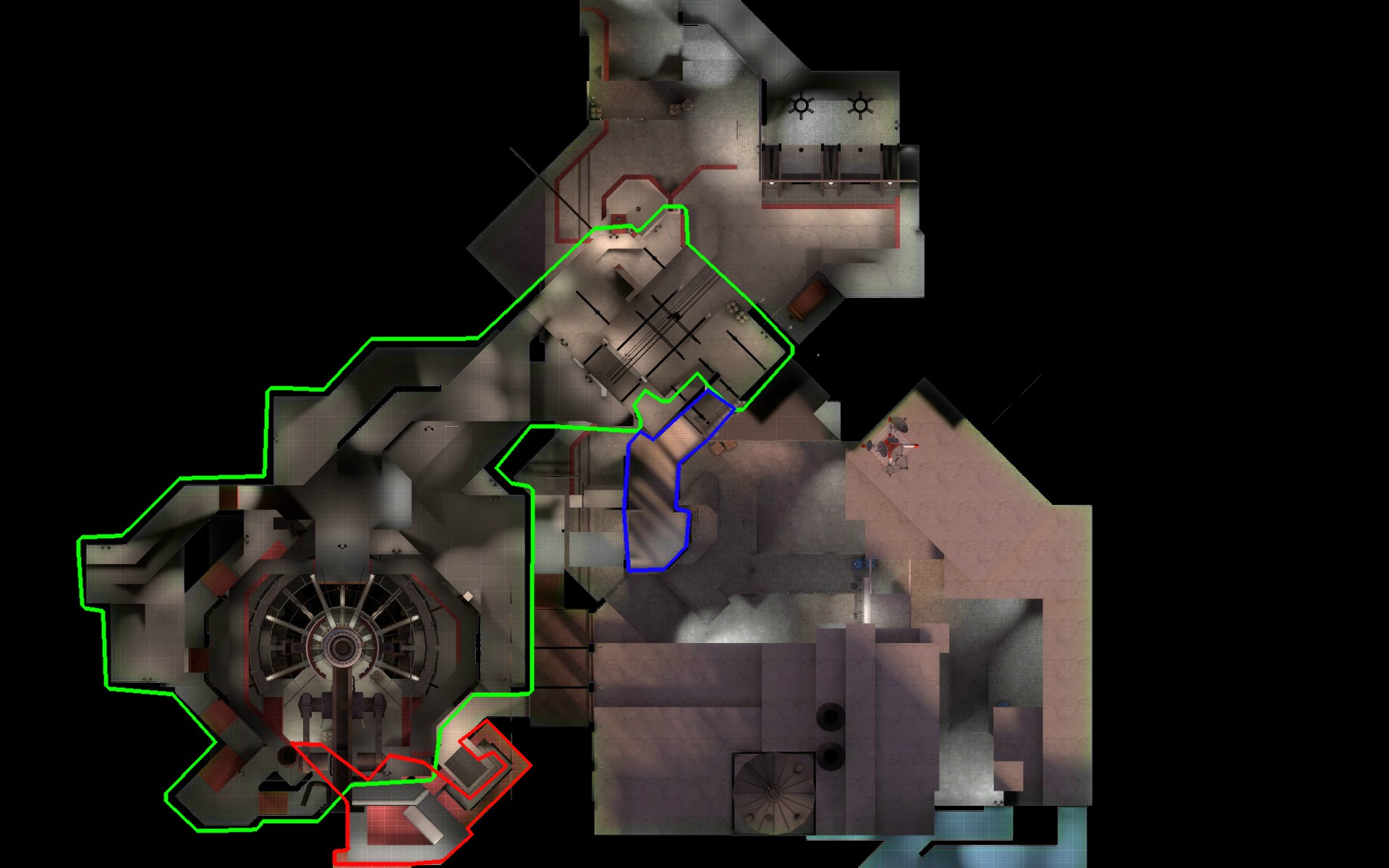
Alpha 4 stage 3
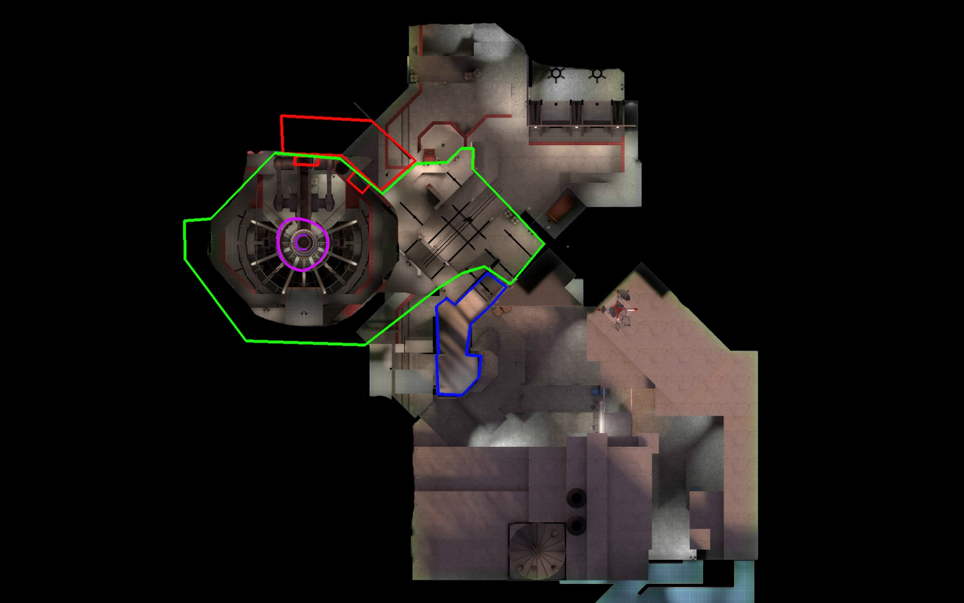
Fixes:
-blu has now captured B and therefore doesnt need to go down a hill again and instead just cuts right over to C
-blue has a lot shorter of a walk
-C will be more easily readable
Whole map:
-red now has only one spawn and upon the start of the round will have large vista views of both B and C via one way windows. Dont worry, they wont both be visible at the same time, Ive got things to optimize you know!
-going to condense certain areas a little and maybe add some more cover to make sentries a little more effective. I still want to test sentries more though.
-improving player direction by adding some signs and shit
So, what do you guys think?
All of this feedback is from a single test; twice as BLU and once as RED.
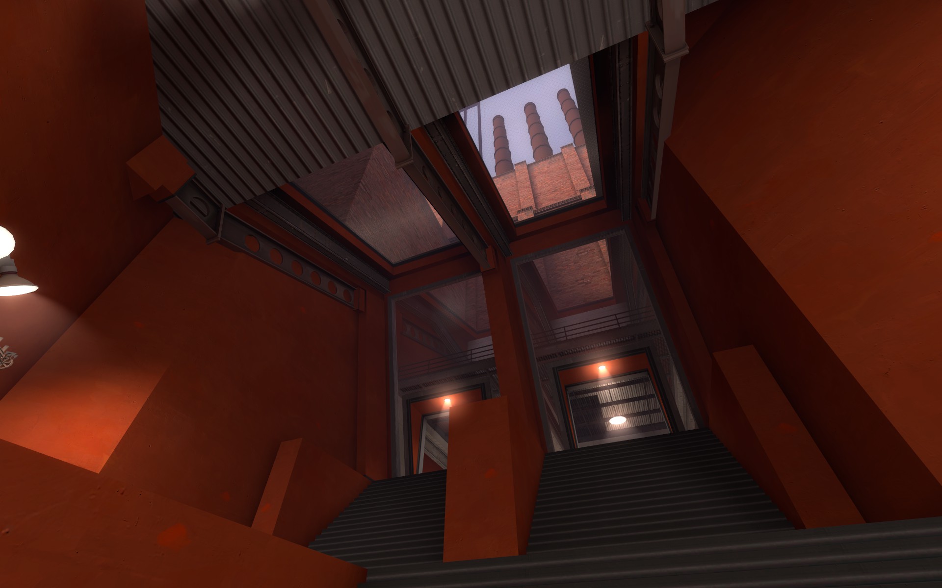
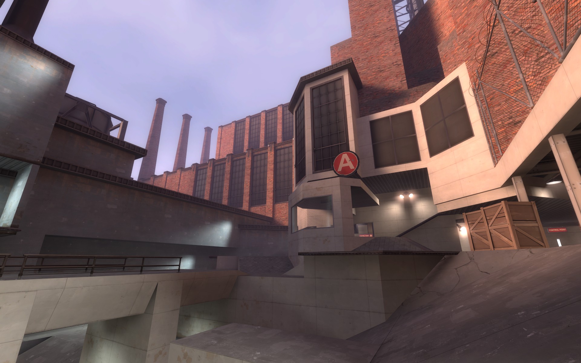
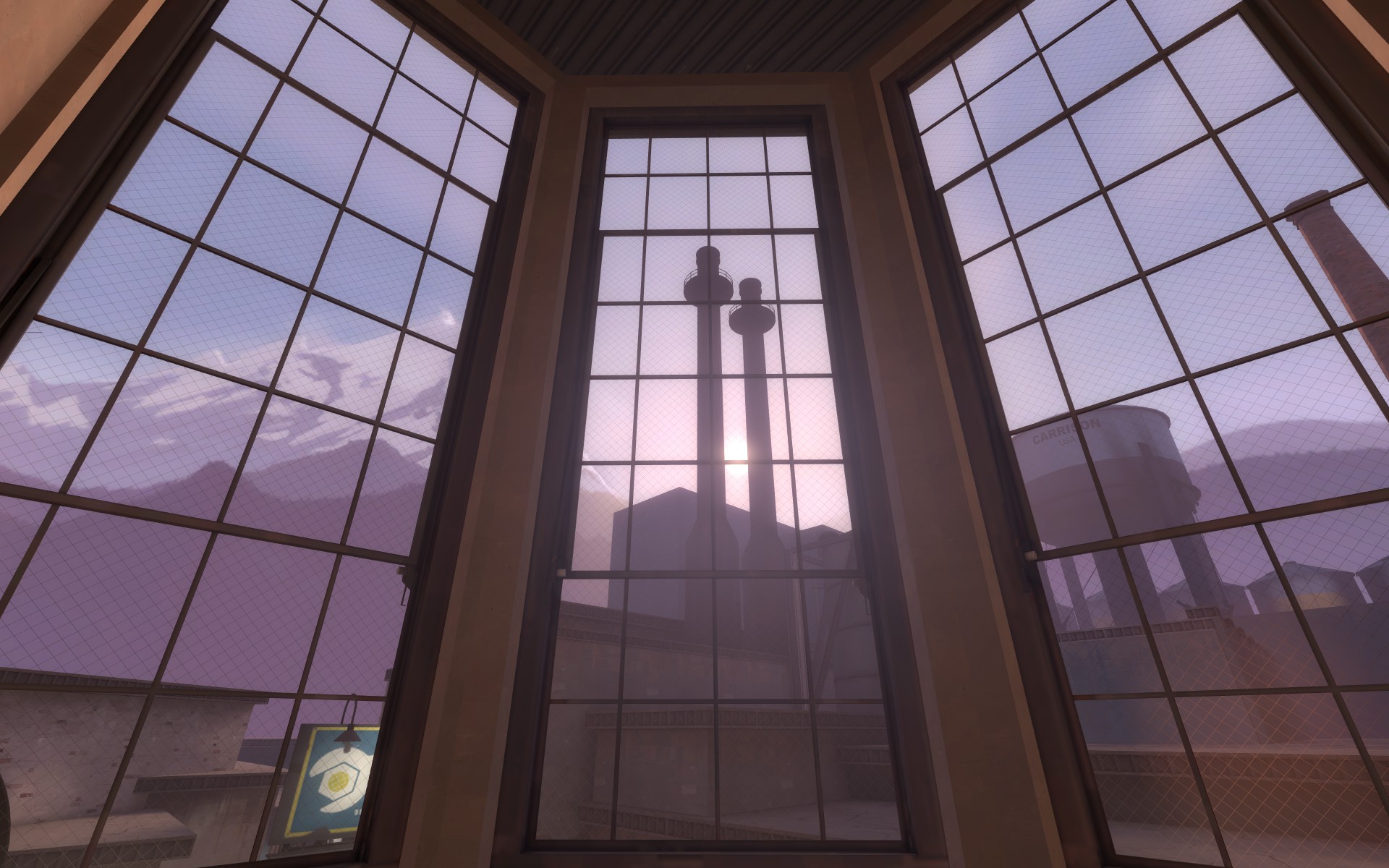
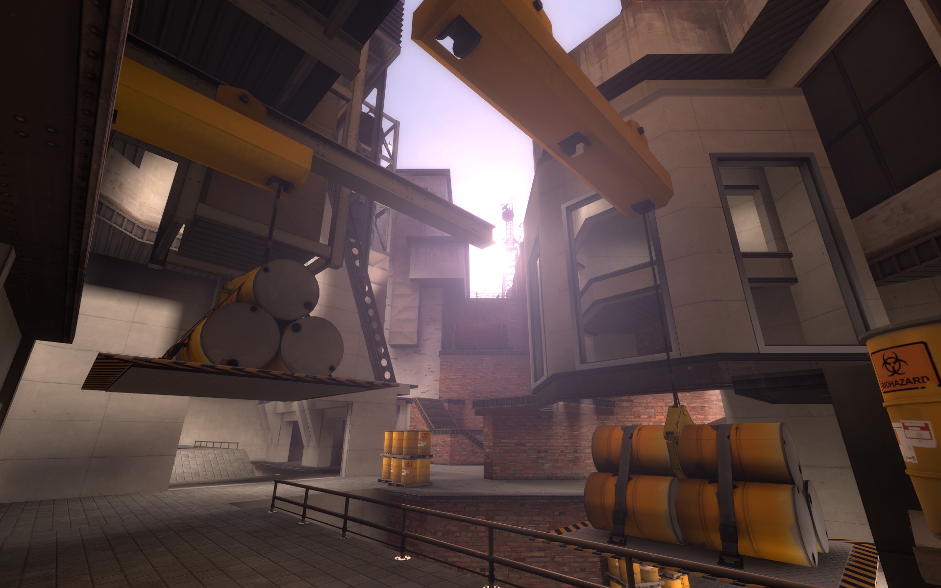
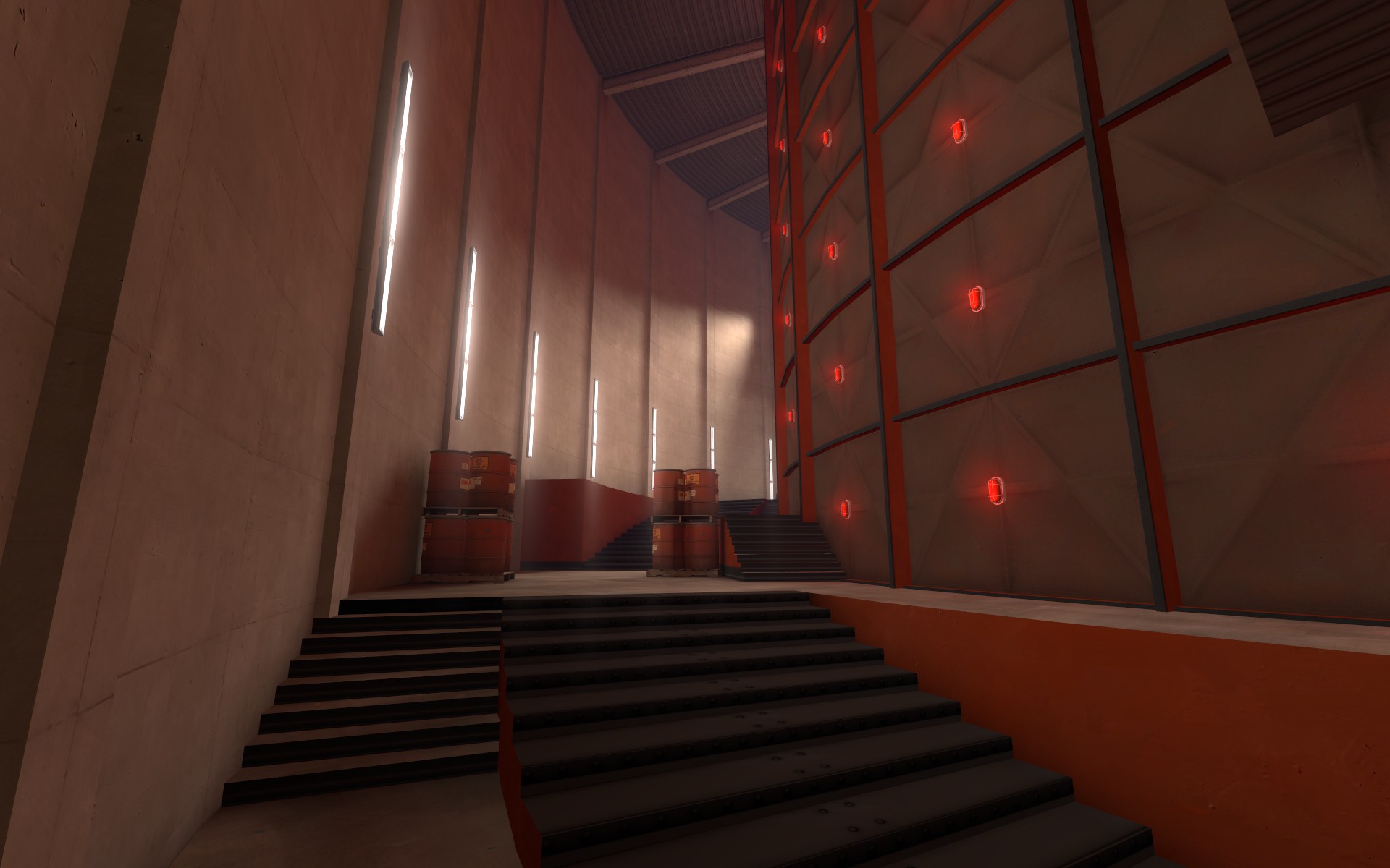
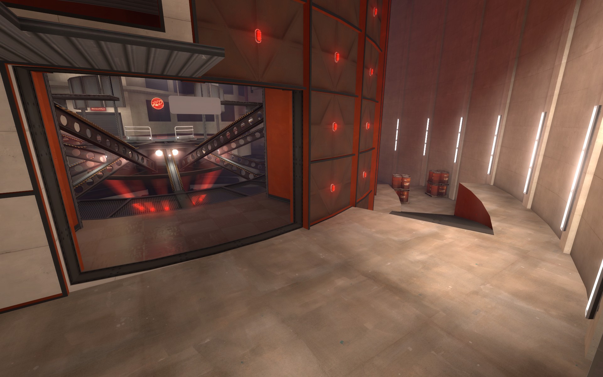
A is okay. I personally didn't use the far corner room thing as BLU, but that's probably because I played Scout for most of the map. I like the approach to it, there's good cover in the low ground which prevents spam from doing too much damage. As yyler pointed out during the test, there's no good place for a sentry, especially to defend A. The small platform off to the side of the point isn't completely covered, which makes it so much easier to snipe buildings with a rocket launcher. The first point in a 3CP shouldn't be as easy as 1-1 of a 3stage, and I think you've pulled that off well; I just think that sentries are useless here and throughout the rest of the map. I have this feeling that the captime for A should be decreased slightly, it feels like Gorge's first point. I think that you should simplify a bit of the geometry around BLU spawn though - the top of the third picture up there looks awesome with the bright sun and various equipment and then you look down to see the assloads of small slopes and silly extrusions. I know you're not looking for detailing feedback right now, but I think that you should consider the final product even as you do brushwork in an alpha.
Okay, I will lower that wall around the upper area next to A to make sentries a little better. I will also see what I can do be about sentries in the other areas of A. Honestly though, no one really put any sentries down near blue spawn of A so I would like to test this more. Ill see what I can do about simplifying the first area a little.
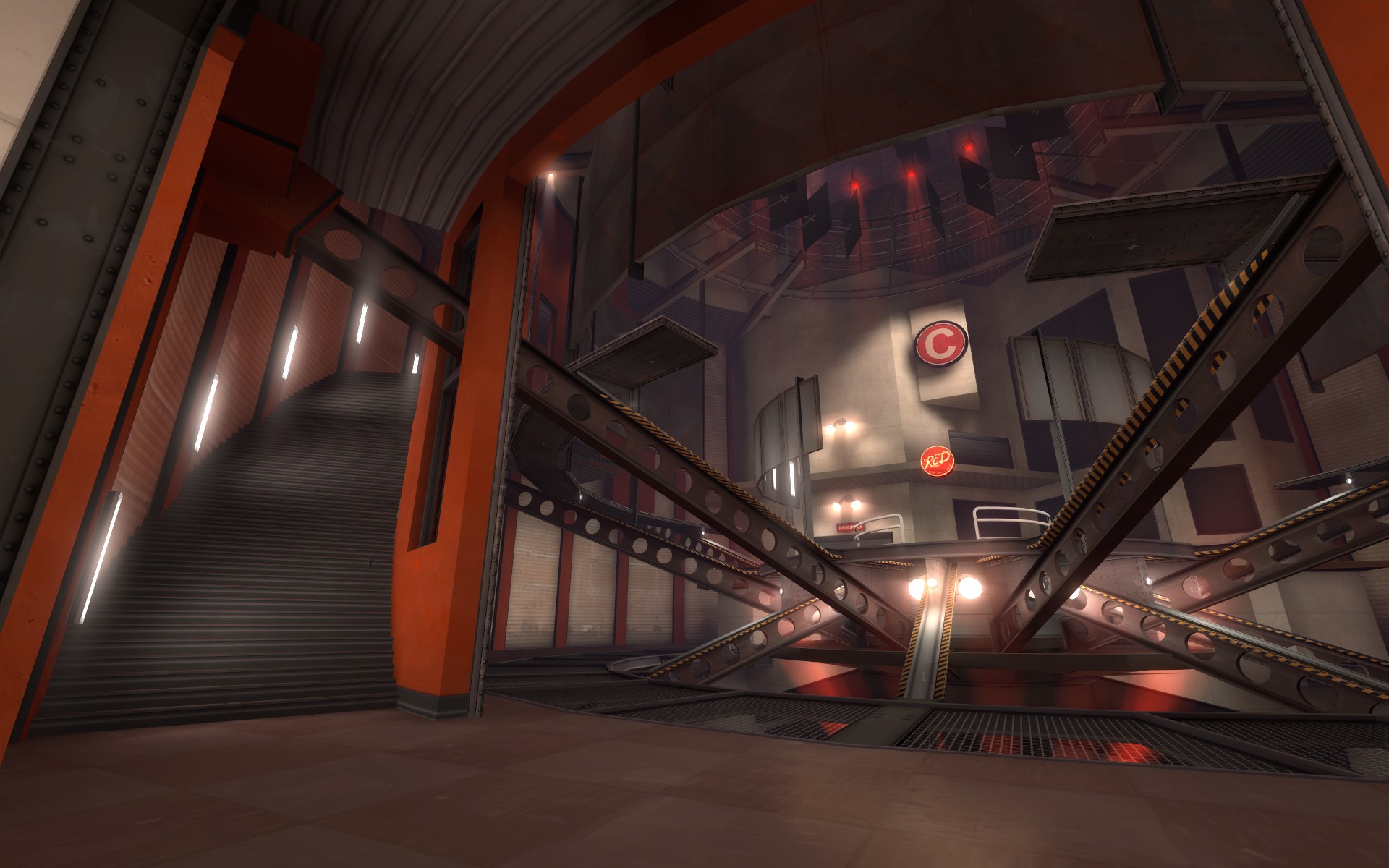
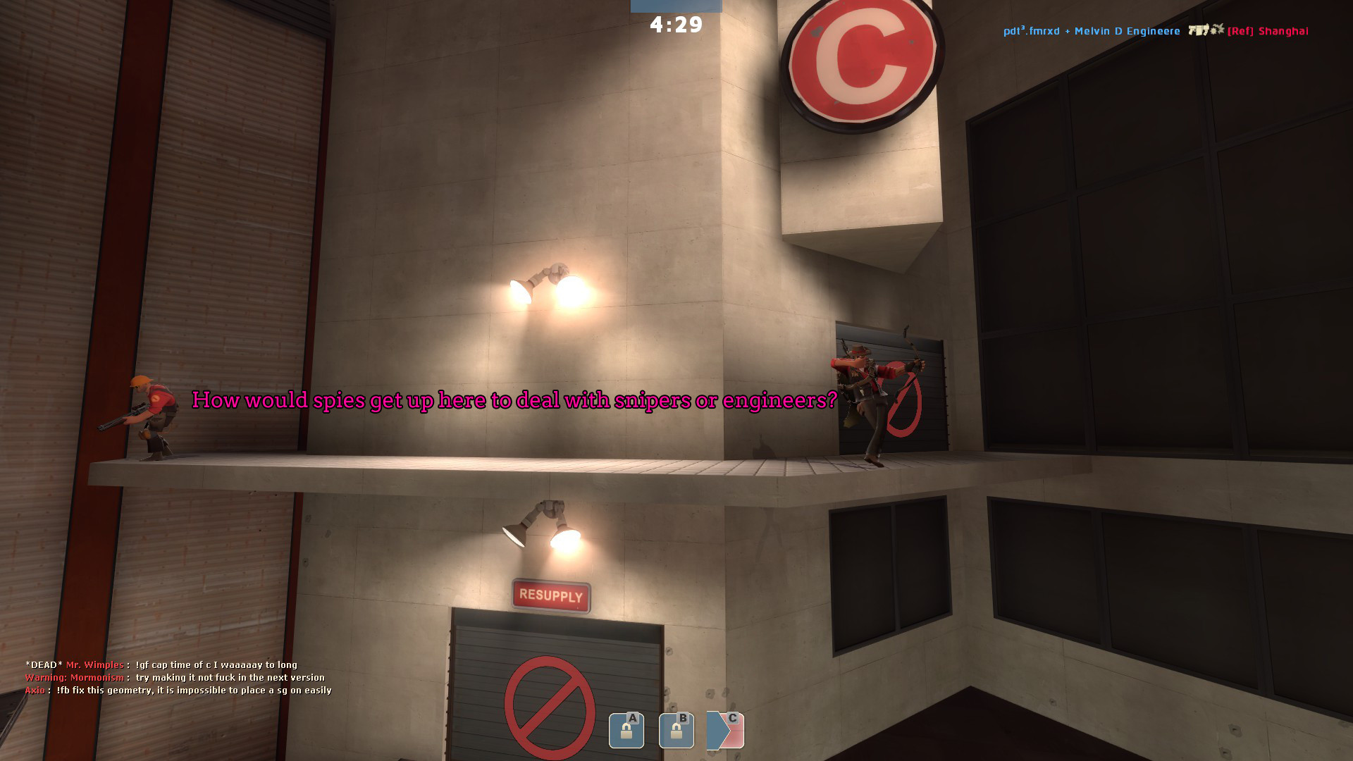
I absolutely hate RED's spawn for A. They spawn literally right behind it: during testing, seven BLU were on the point, about to cap, when all of RED respawned and obliterated the entire enemy team. This shouldn't happen. Also the platform outside of spawn is the only good sentry spot on the entire map, it's so easy to overlook once A is capped. Move the spawn further back and don't create sentry cubbies right outside.
Me too, its terrible, but I had to test to make sure. This is getting a big change, youll see further down in the post.
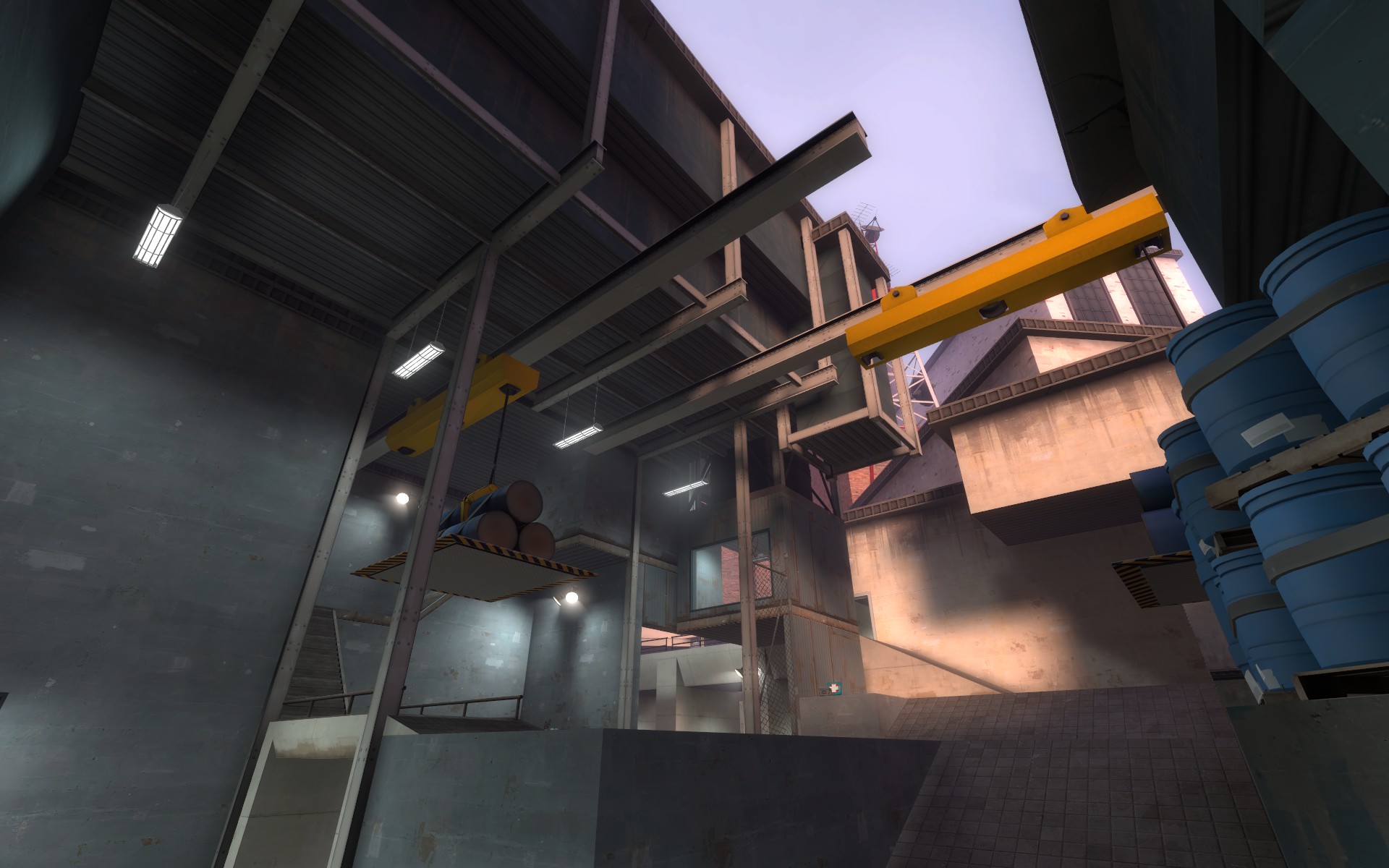
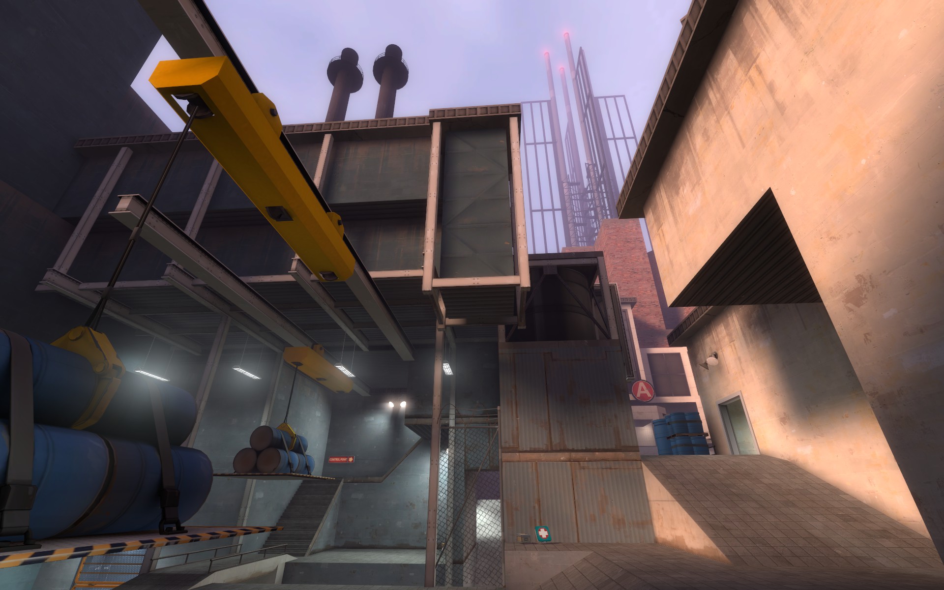
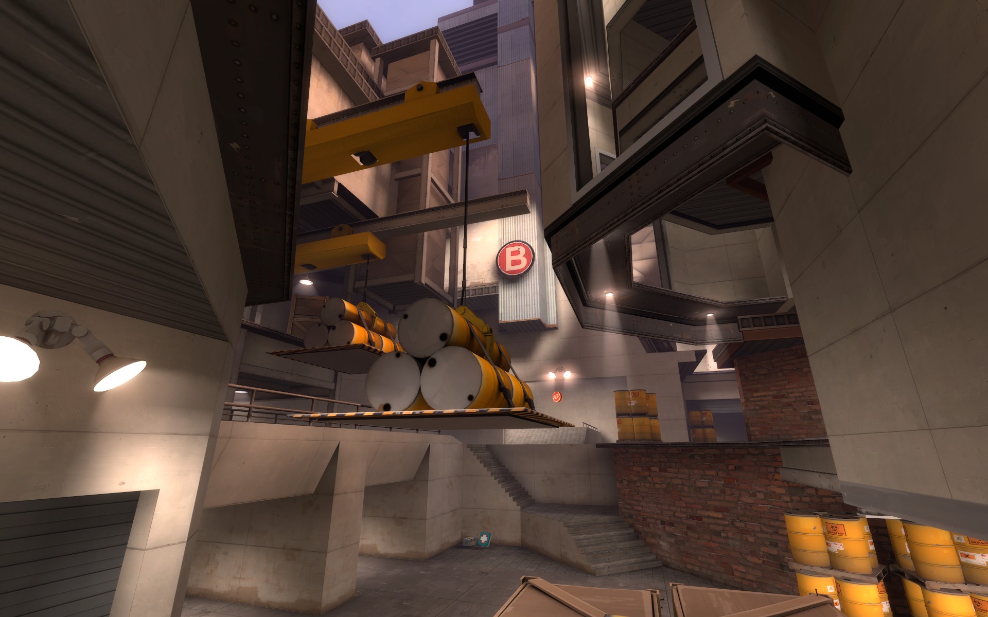
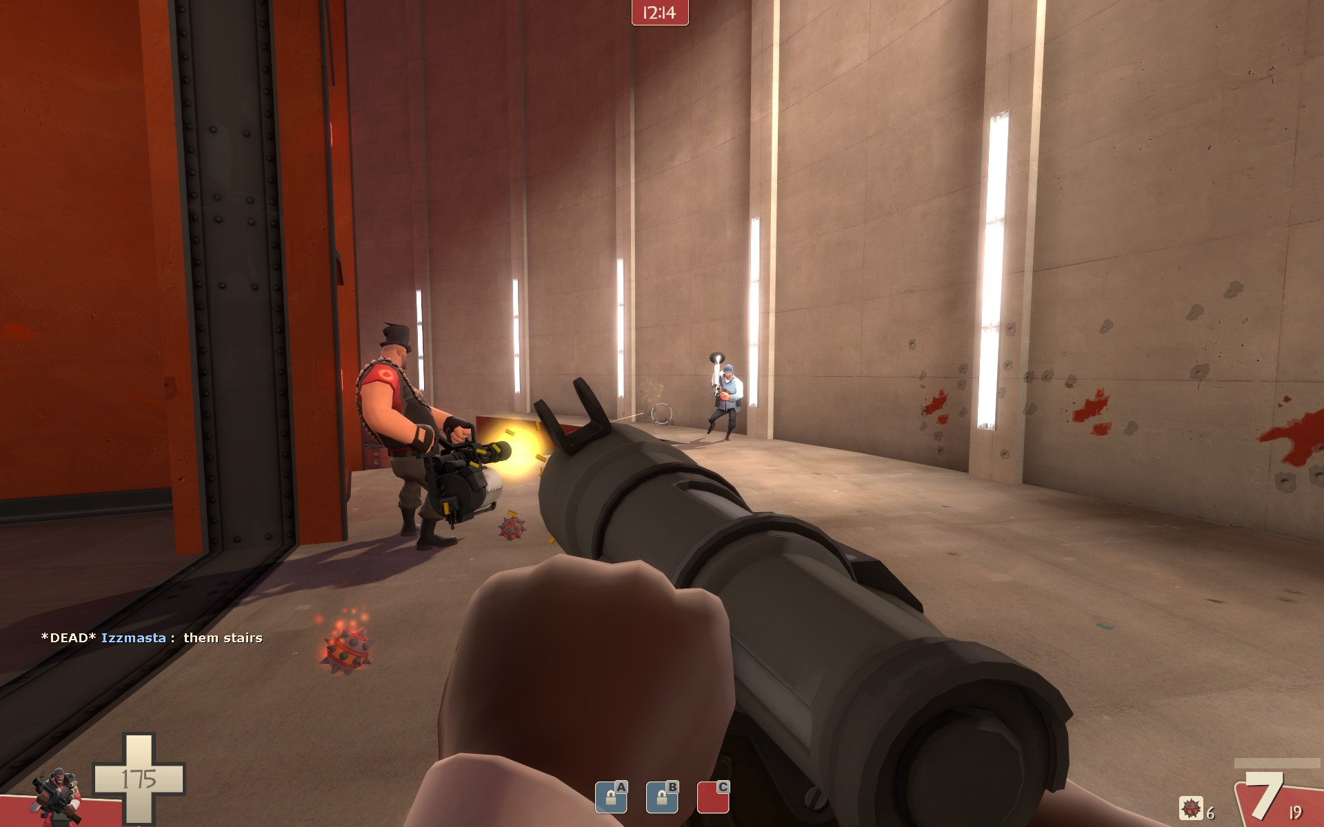
B is the worst point on the map imo. RED has literally no way to defend it: there is one way to defend the point (I know there's a ledge but I ignored that because the only person I saw up there was a BLU engie building minisentries), the windows above the deathpit are too exposed, and it gets rushed almost instantly after A every time. RED has some really long respawn times overall, I noticed. The only thing that saves RED is the ginormously long captimes, on both A and B. Make this one easier to defend IMO, that ledge would be perfect for a RED-only sentry spot.
B isnt only the worst, its just nothing. blue can cap it before any red players even get there. I am going to add cover to the area above the deathpit, I think I had that planned for alpha 3 but I forgot. I will also be removing the back entrance way for blue to this point to give it a little more of a choking point.
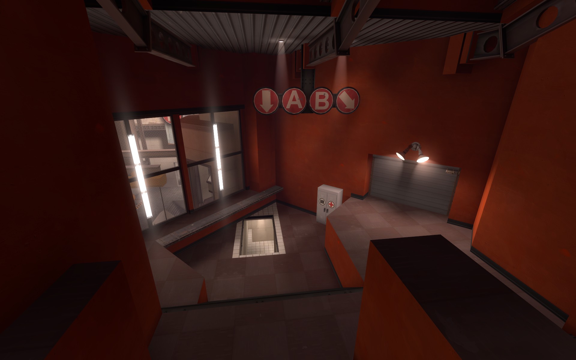
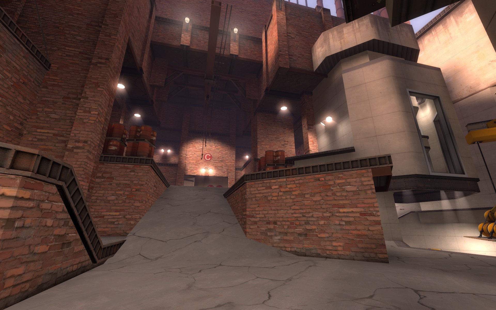
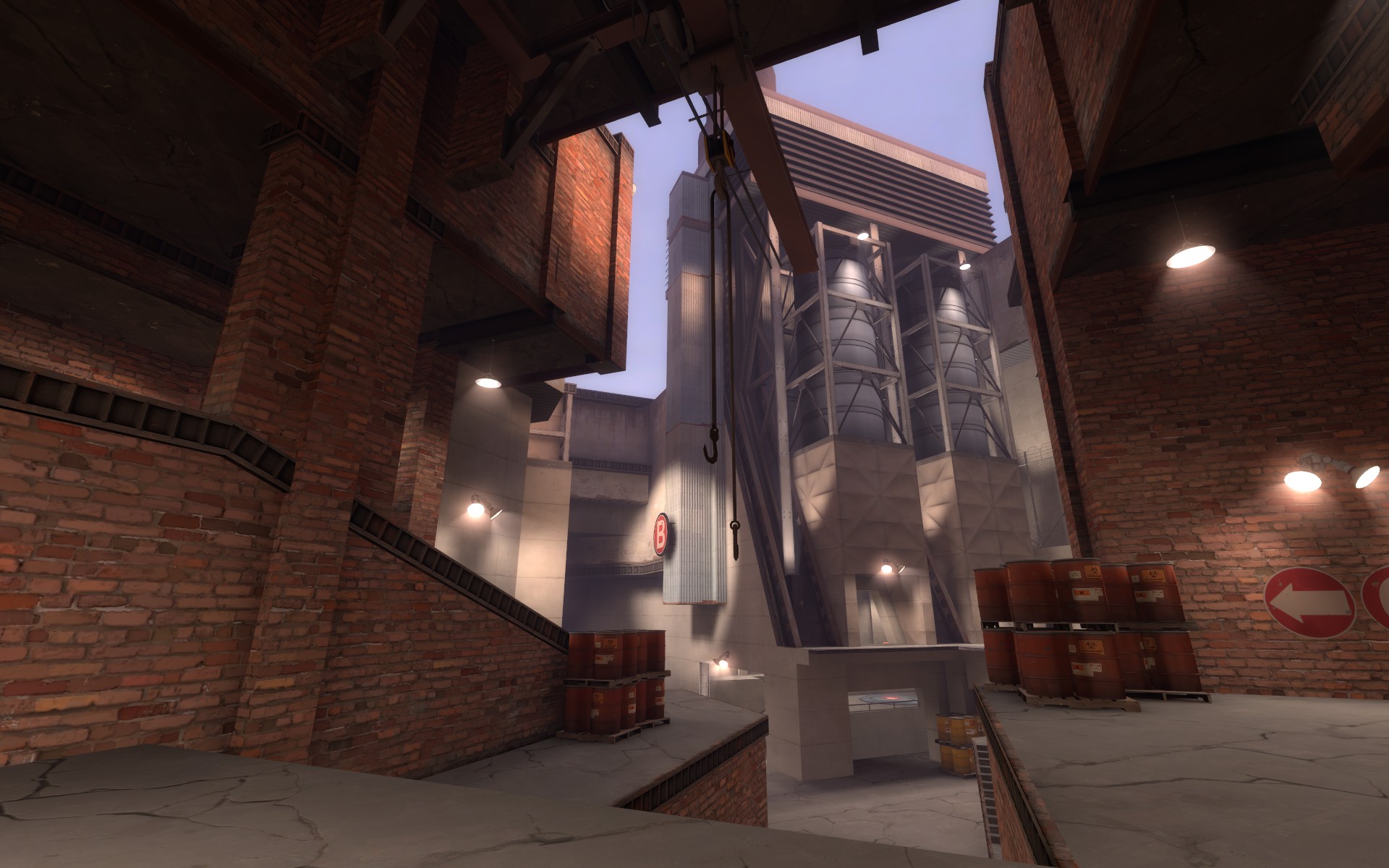
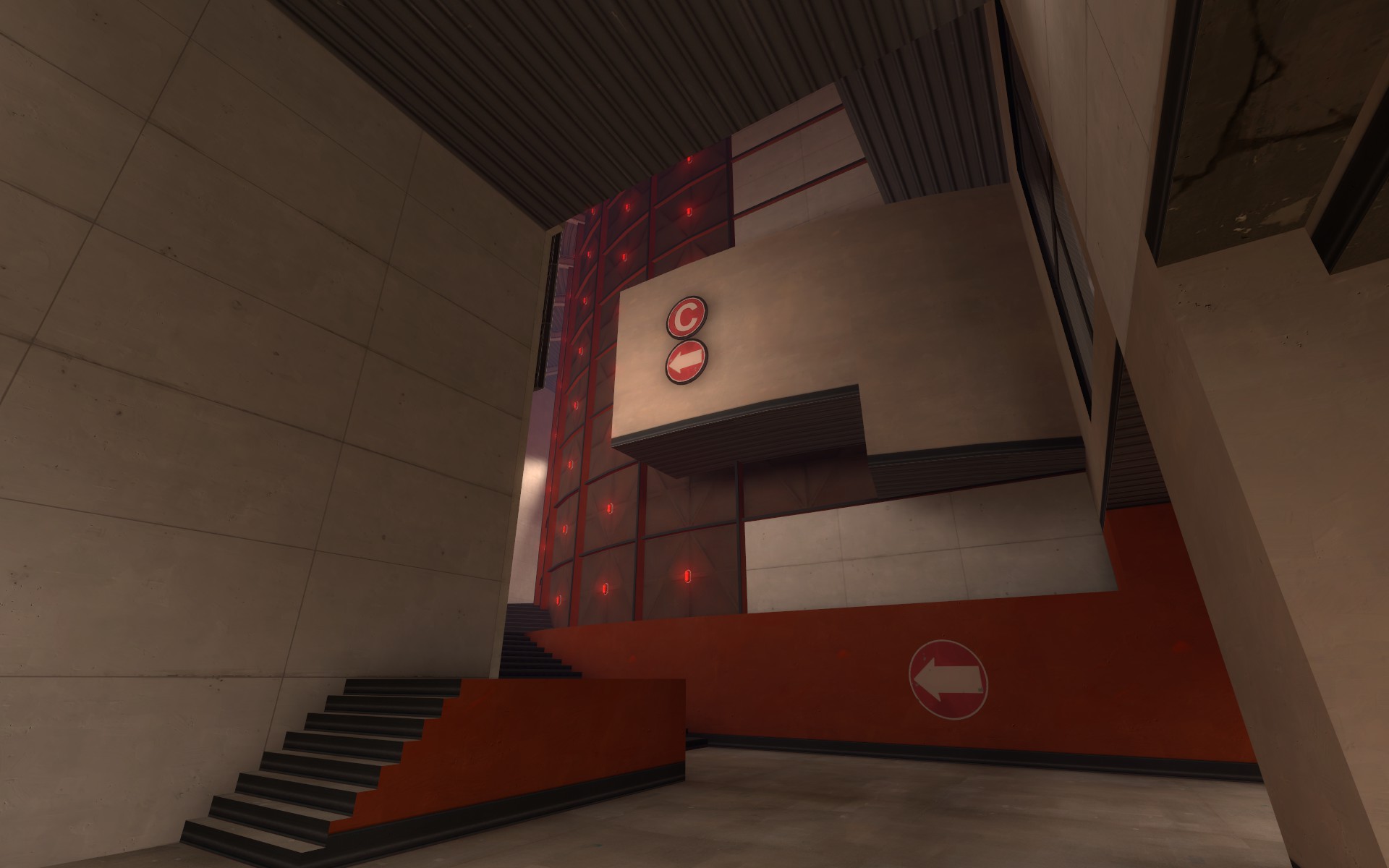
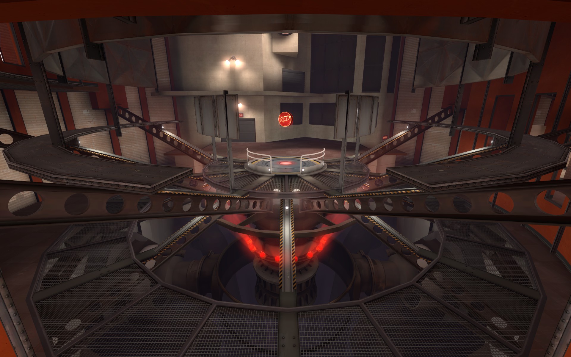
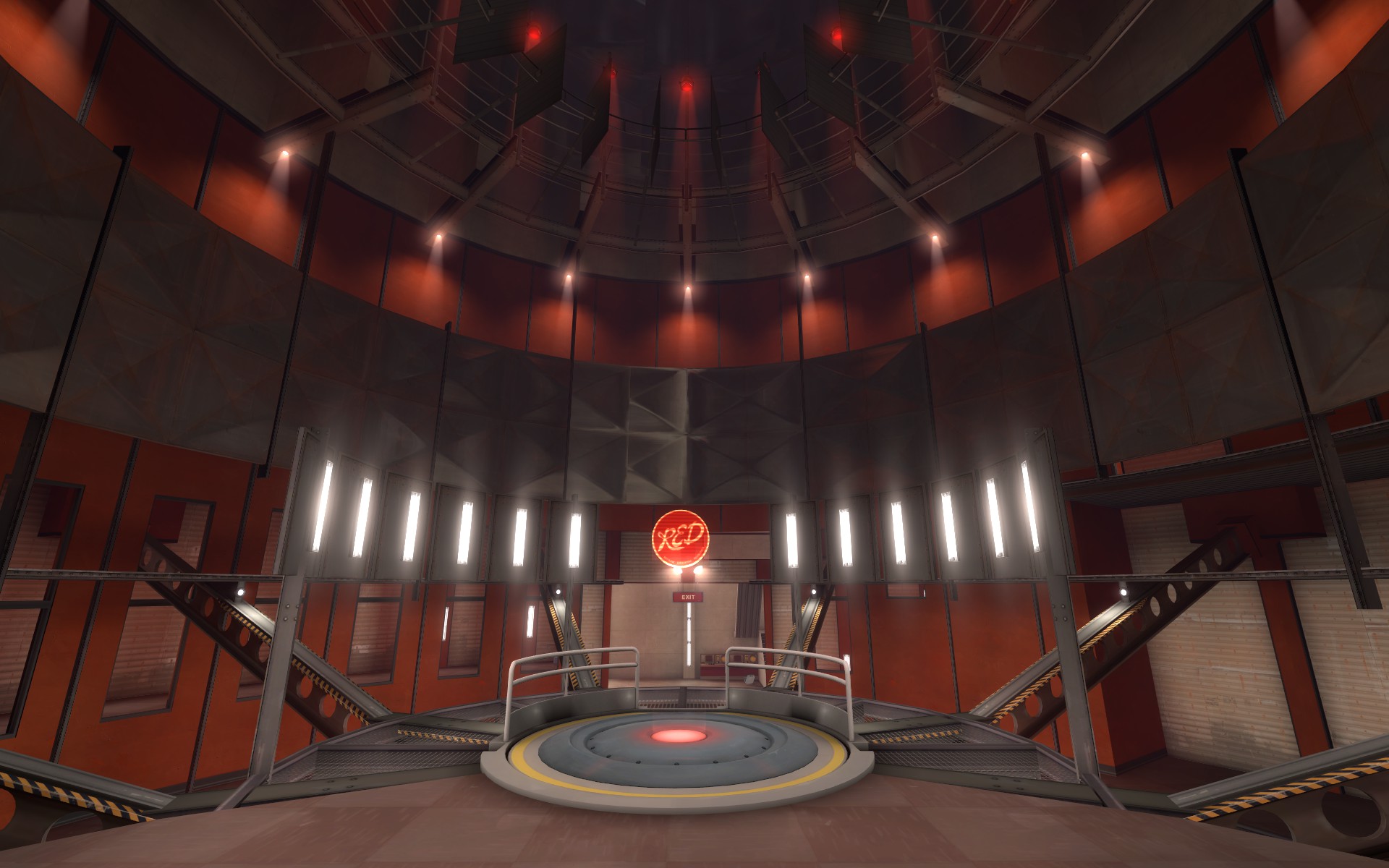
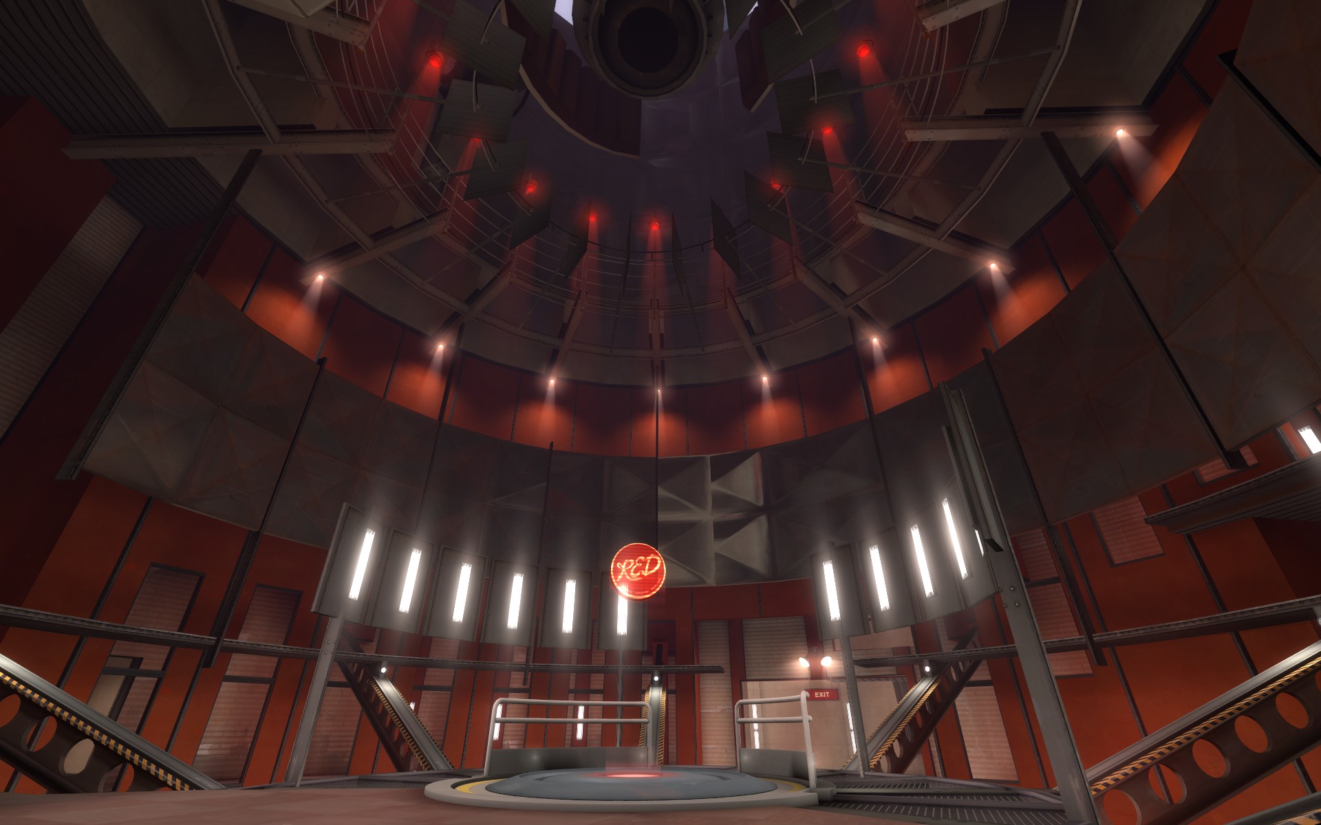
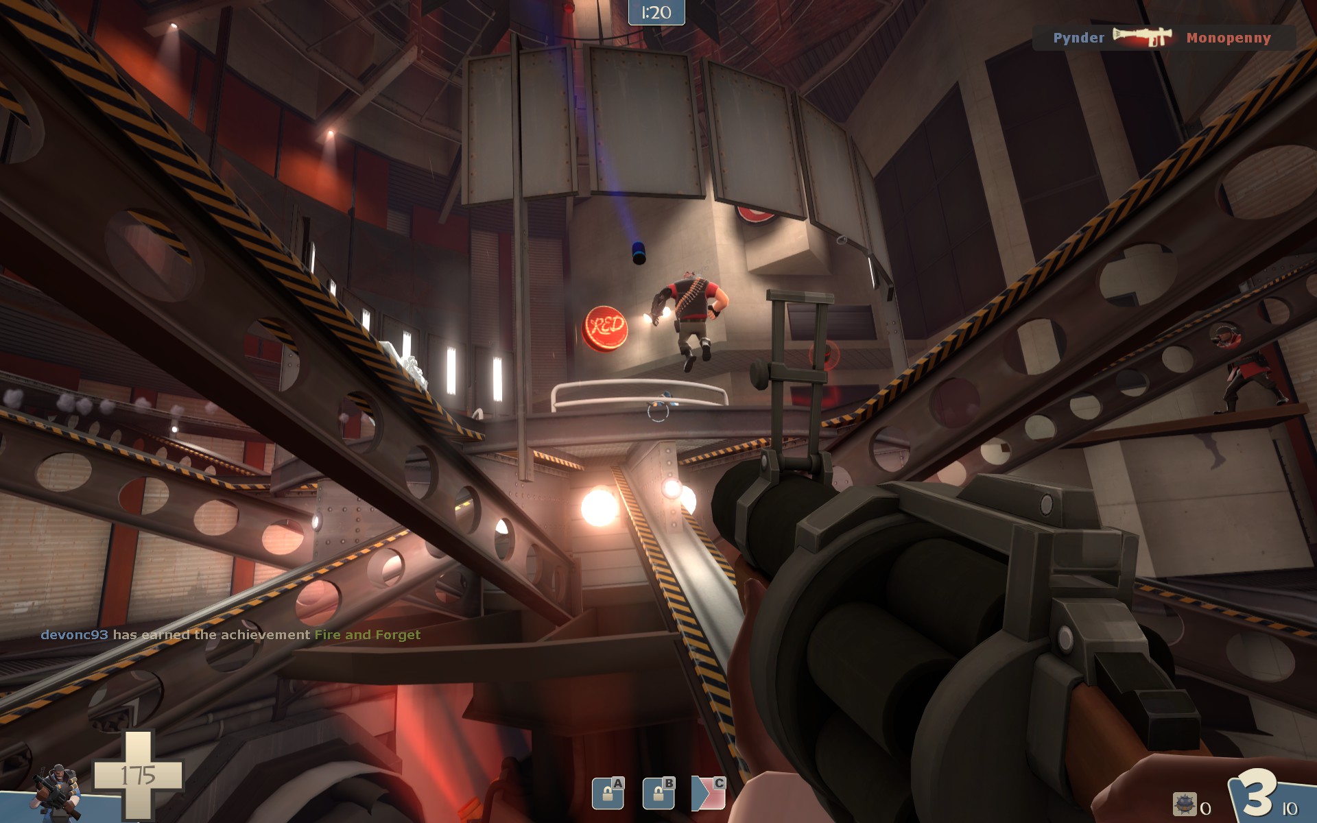
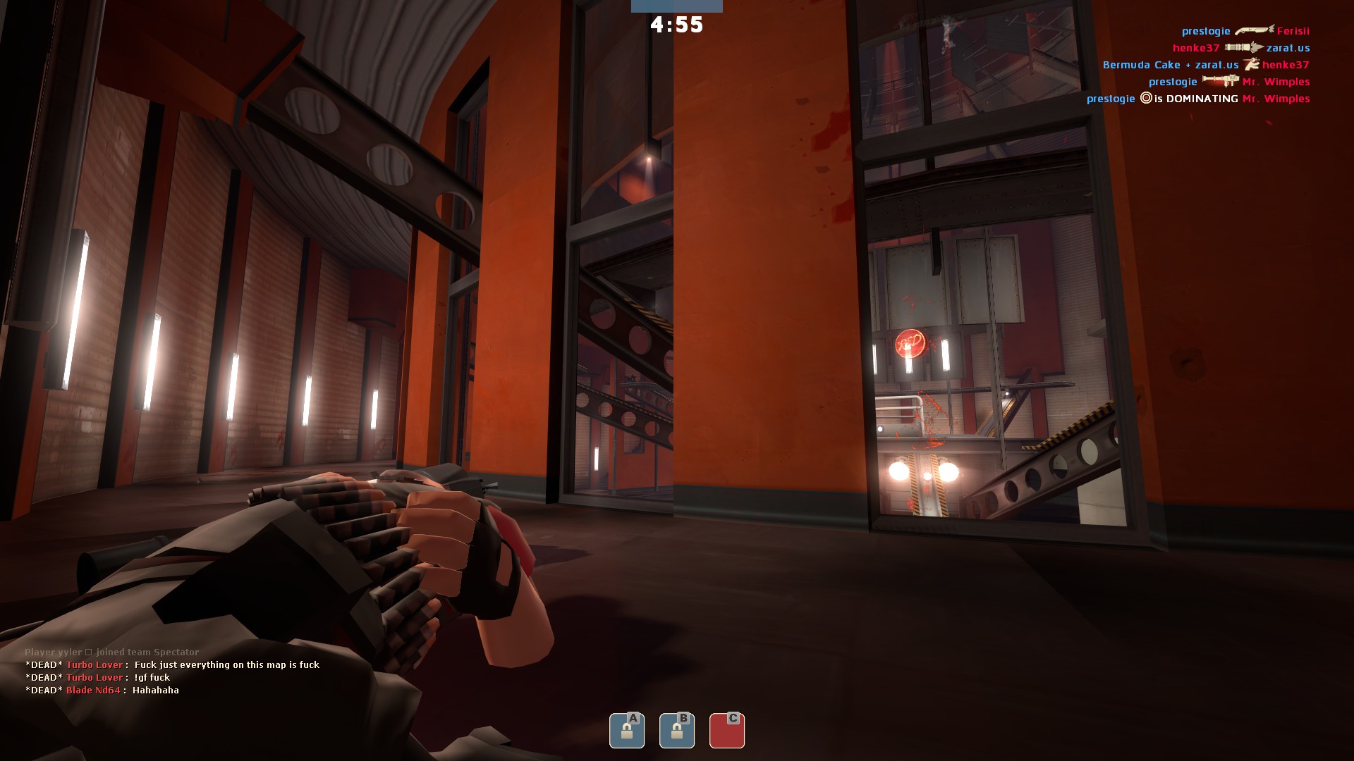
C sucks because there is a shitload of paths leading to and around it. As BLU I got to the point by blindly running forward; I don't think I actually memorised the layout (granted, this was two playthroughs). There are tunnels around it, above it, behind it, in front of it, through it, you get my point. Someone said they have no idea where BLU is comign from: that's because they're coming from literally everywhere and no exit is clearly marked. You compared this to Manor and Mountainlab, but those maps at least have clearly defined exits for BLU - they don't pop in and out of view everywhere. Also the top door was broken, which most likely put RED at a disadvantage. My main gripe with C is its stupidly short captime. You go from A, which takes an eternity, to B, which takes an eternity, and get to C, which caps in like seven seconds. The fact that BLU are pouring in from everywhere doesn't help to stop them from flooding the point with sheer numbers and explosive spam from up top. I also get the feeling that the top platform was too high up. And I think it'd be easier to defend if you removed the handrails around the point.
C is getting the most changes, just look at my solution at the end of the post. I will simplify the area and make sure you can more easily tell where players are coming from. Also I will make the cap time a little longer. I will also remove some sightlines as its a bit large in this area. Do you think I should remove those railings around the point? Maybe add a little housing for the point? I dont know what do you guys think?
I suggest you read the whole wall of text, even though I haven't played TF2 in months and don't recognise most of the map from the above pics - you can always pull something useful out of any kind of feedback. Keep in mind that others may (do) have different expectations from maps; try to combine their opinions with yours or ask why they think what they do.
I haven't written feedback this long in a while, you're welcome.
Thanks brah.
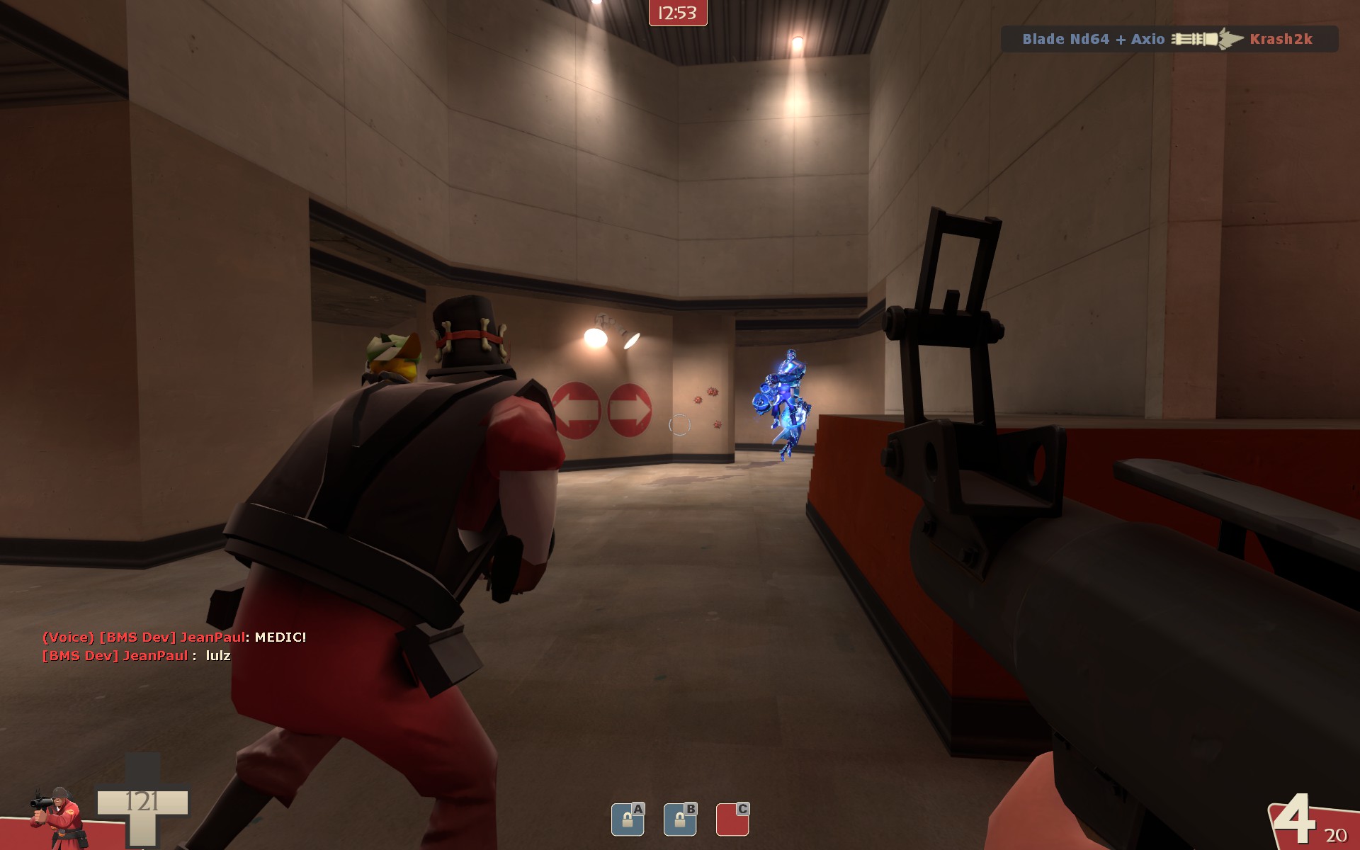
I played few round with bots.
At first I was totally confused. The layout is kinda wonky
You should add more hints as what is game area and what is not.
Will do
In some parts of the map there were ledges high above in some very peculiar places that just caught me off guard. Minisentries will be very irritating because of these ledges.
Ill see what I can do. Keep in mind minisentries are annoying as piss regardless of the map
The lastpoint lacked focus, but was also the funniest point to play.
Yup, Ill have to focus it a little more.
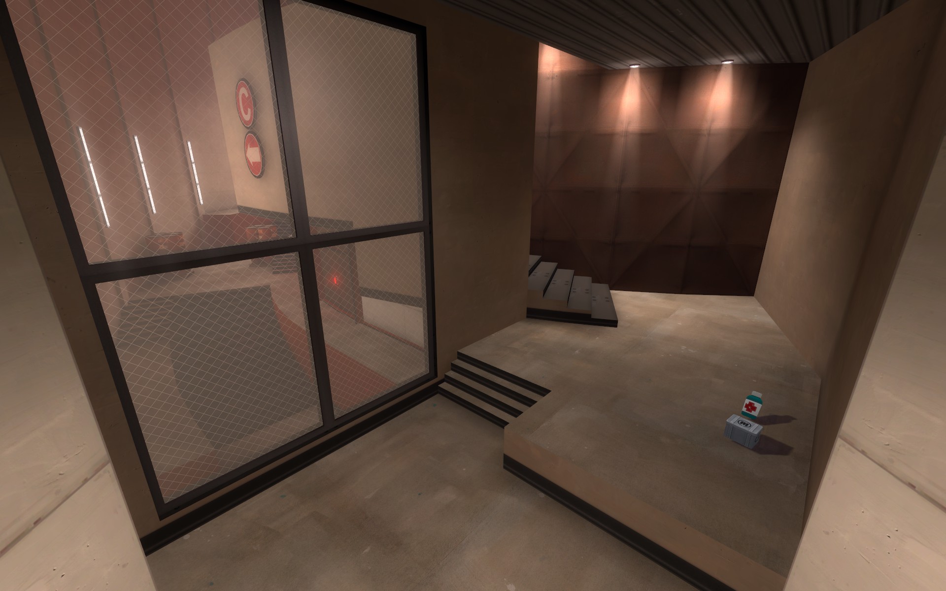
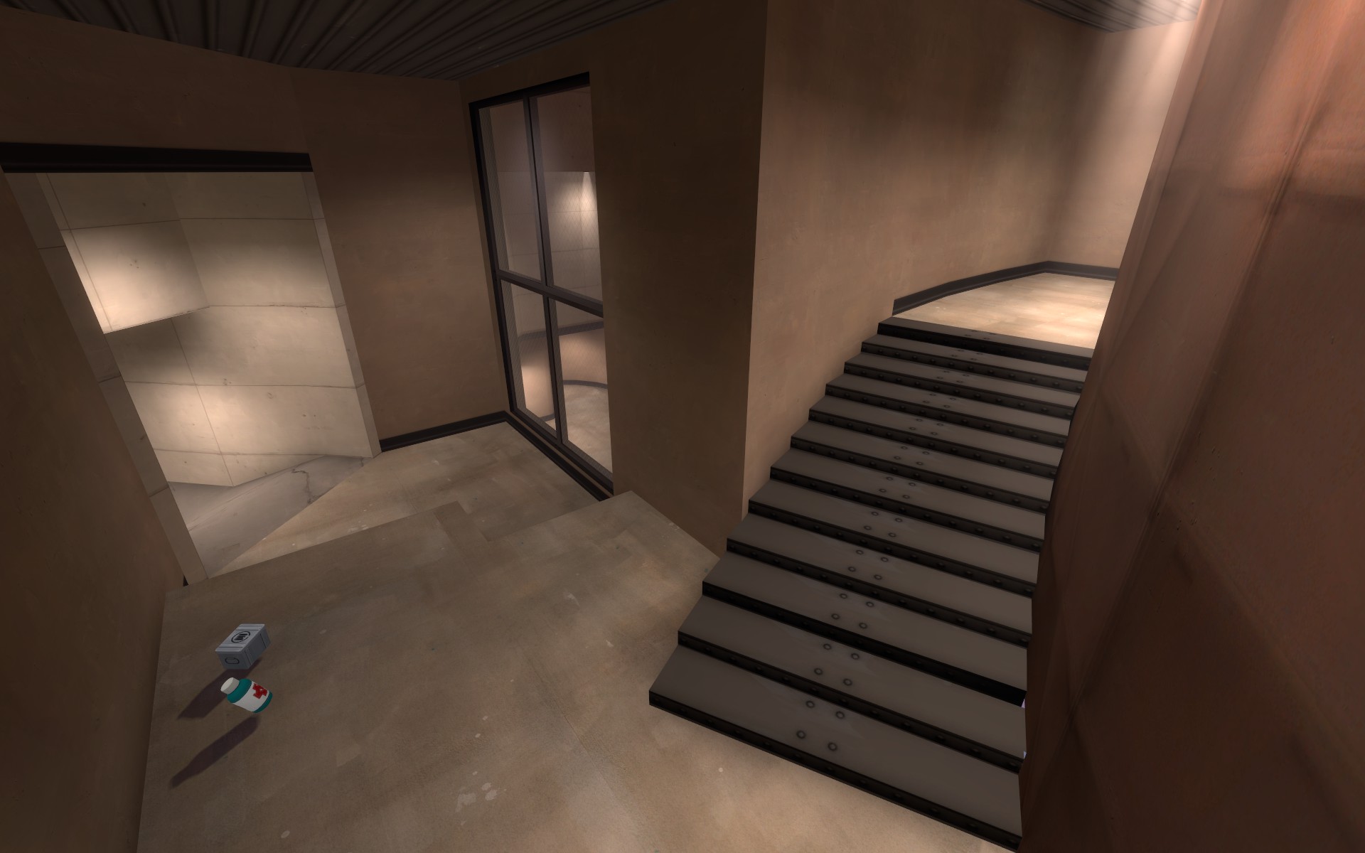
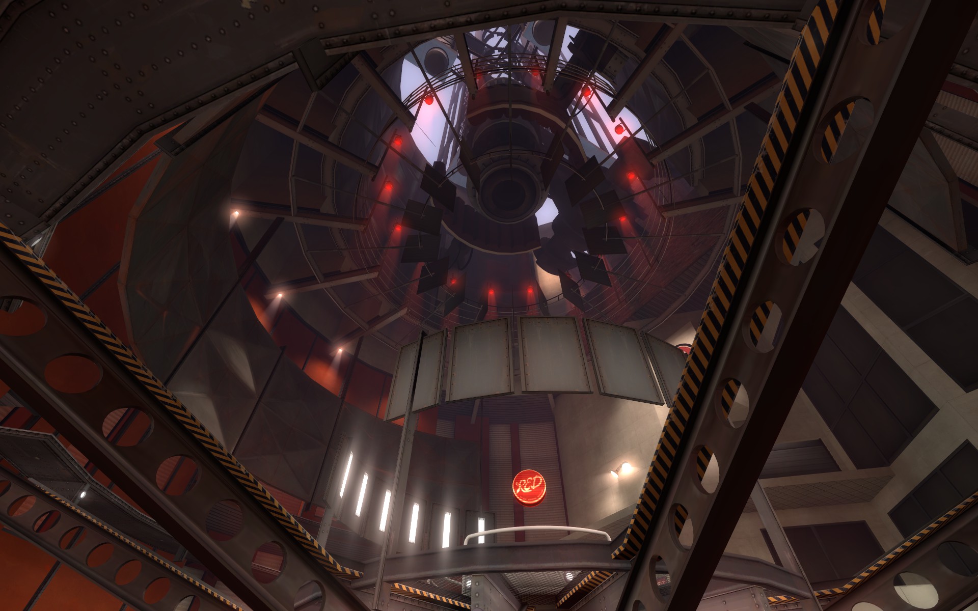
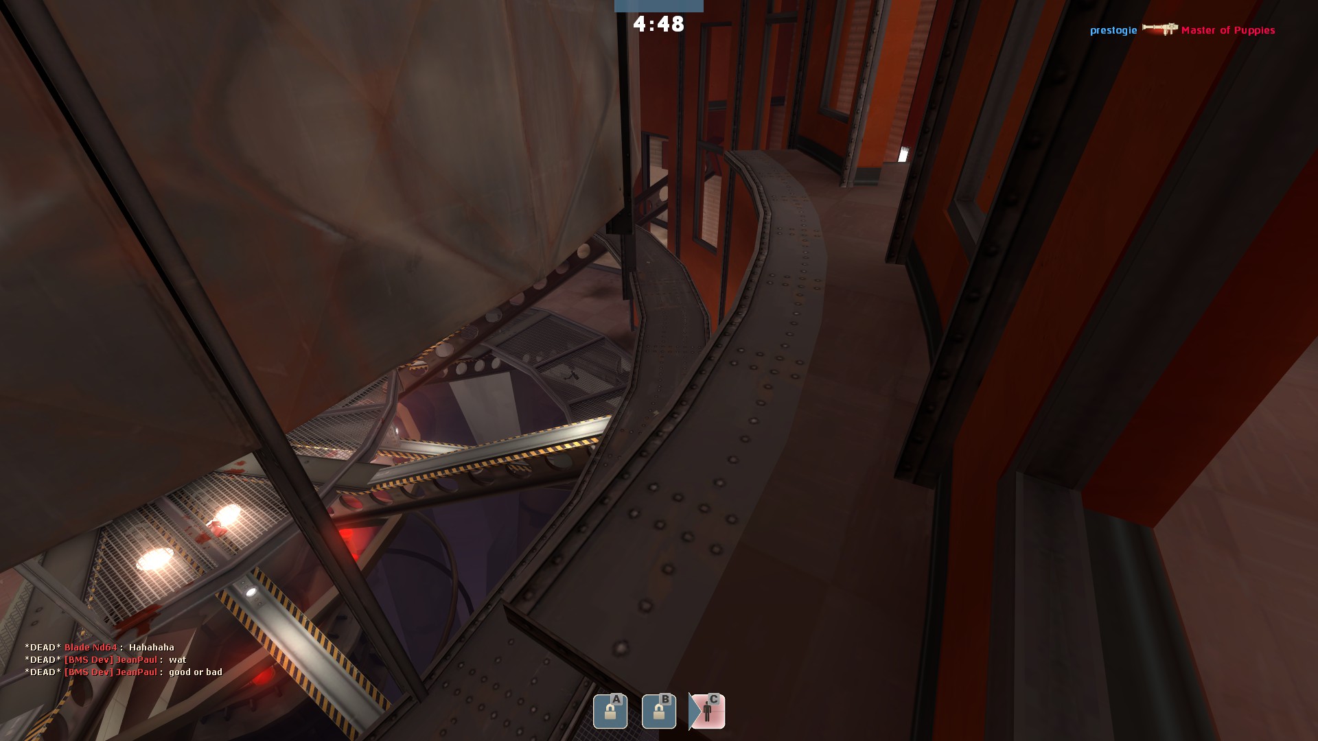
The geometry reminds me of bad minecraft map seeds. The geometry doesn't make much sense. I have no problem with the angles, but random hanging pieces of building, particularly as seen in http://i.imgur.com/AWKRM.jpg make me think this map passed through a black hole and was reassmbled in a "daft" and "impractical" universe.
I guess part of the problem is also that there doesn't seem to be a particular theme to the map. It's not desert or alpine, it's not snowy or swamp. The closest it is is industrial but it's so ambiguous it's like a sandwhich with the thinnest layer of jam ever spread on a slice of bread. A map doesn't need to be mid-beta for players to understand the environment they're in is either a steel mill, a dockyard, and train depot, etc.
Choose a theme, look up some reference material and work from that. TF2 may be silly, but it's not that silly.
This is fair and not fair. Its an alpha. The thematic ideas I have are in my head so wait till beta to let me know what you think about this.
______________________________________________________________
Okay so here are my solutions for alpha 4, tell me what you guys think!
Alpha 3 stage 1.
Problems:
-shit red spawn
-maybe a little open for sentries to be effective
Alpha 3 stage 2
Problems:
-shit red spawn
-some extraneous paths
-a little large in parts
Alpha 3 stage 3
Problems:
-complex paths to get to final point
-kind of a long walk for blue, resulting in less action at the point
-not super readable from red's standpoint
The solutions
Alpha 4 stage 1
Fixes:
-red doesnt spawn on top of A and now have to go up a hill to get to A, so if A is being capped by a large part of the team, red's best option is to start defense on B
Alpha 4 stage 2
Fixes:
-red will now be immediately near B
-blue spawns and runs down a hill and underneath red spawn and is immediately at B
-more cohesive so players know where blue and red are coming from
Alpha 4 stage 3
Fixes:
-blu has now captured B and therefore doesnt need to go down a hill again and instead just cuts right over to C
-blue has a lot shorter of a walk
-C will be more easily readable
Whole map:
-red now has only one spawn and upon the start of the round will have large vista views of both B and C via one way windows. Dont worry, they wont both be visible at the same time, Ive got things to optimize you know!
-going to condense certain areas a little and maybe add some more cover to make sentries a little more effective. I still want to test sentries more though.
-improving player direction by adding some signs and shit
So, what do you guys think?