Imbricatus

CP Imbricatus a5

JeanPaul

L6: Sharp Member
Aug 5, 2010
289
280
These last two posts are some great comments/critiques. Im shot for the weekend, but I will make a post in response showing my planned changes for a5 sometime tomorrow.

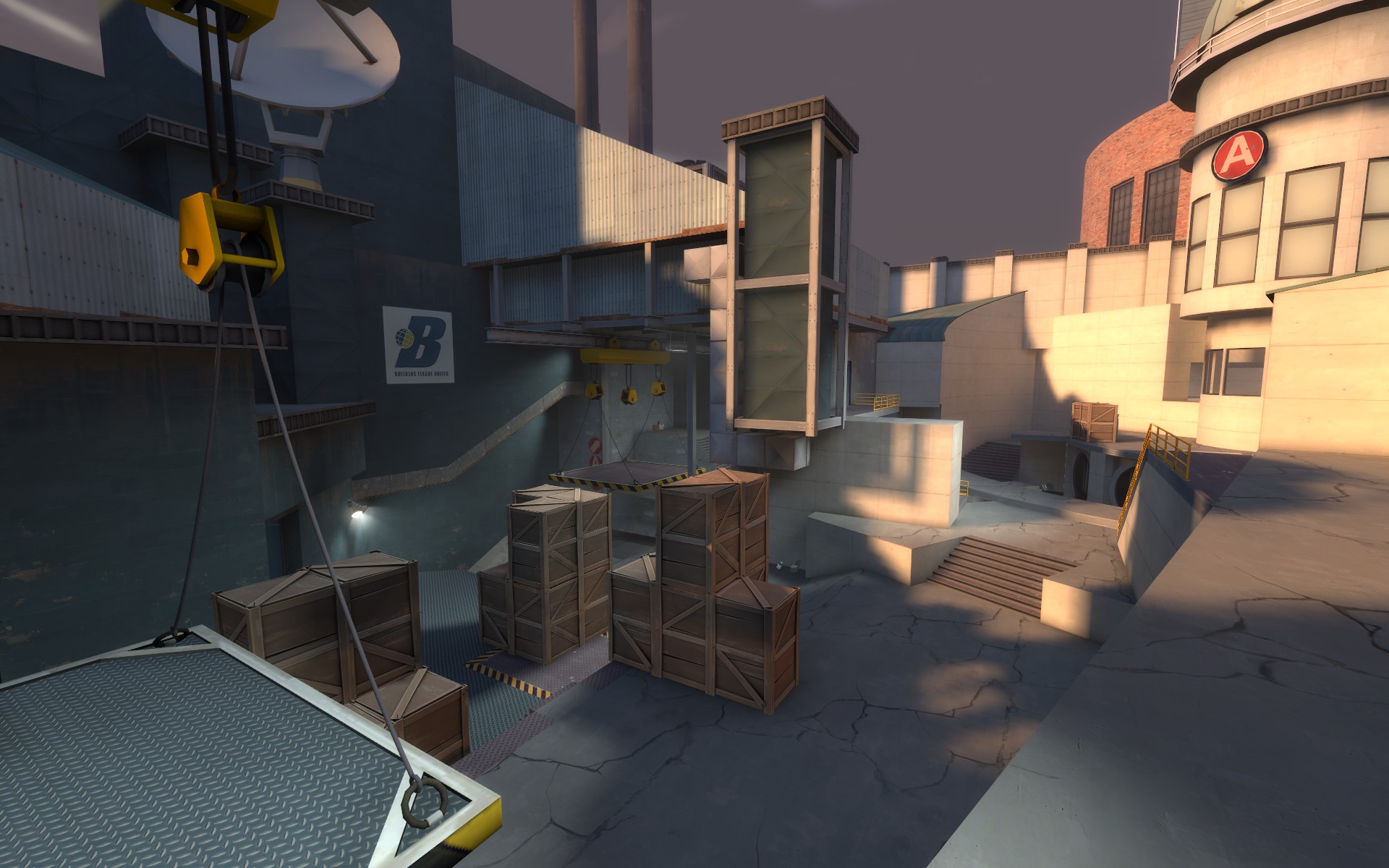
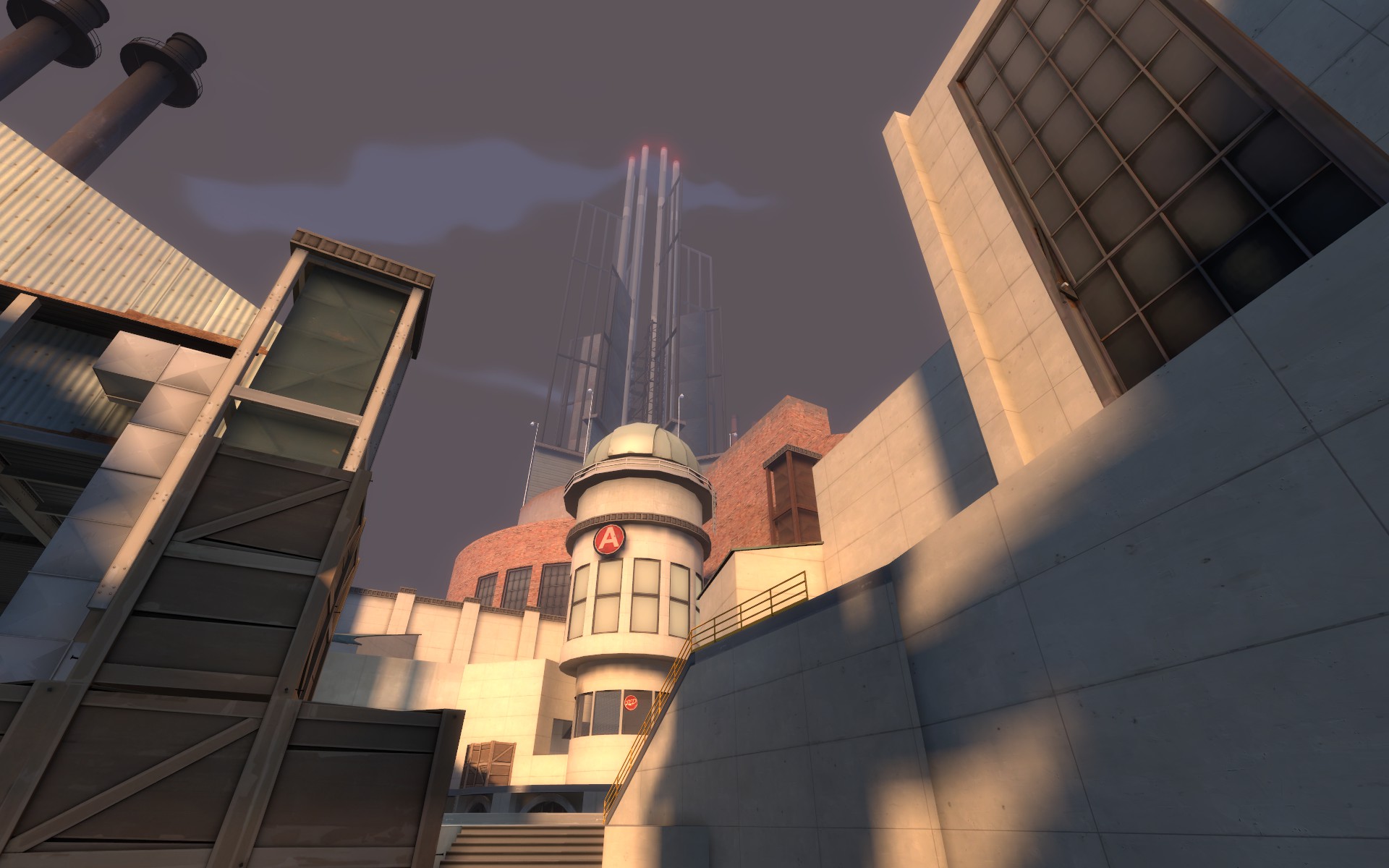
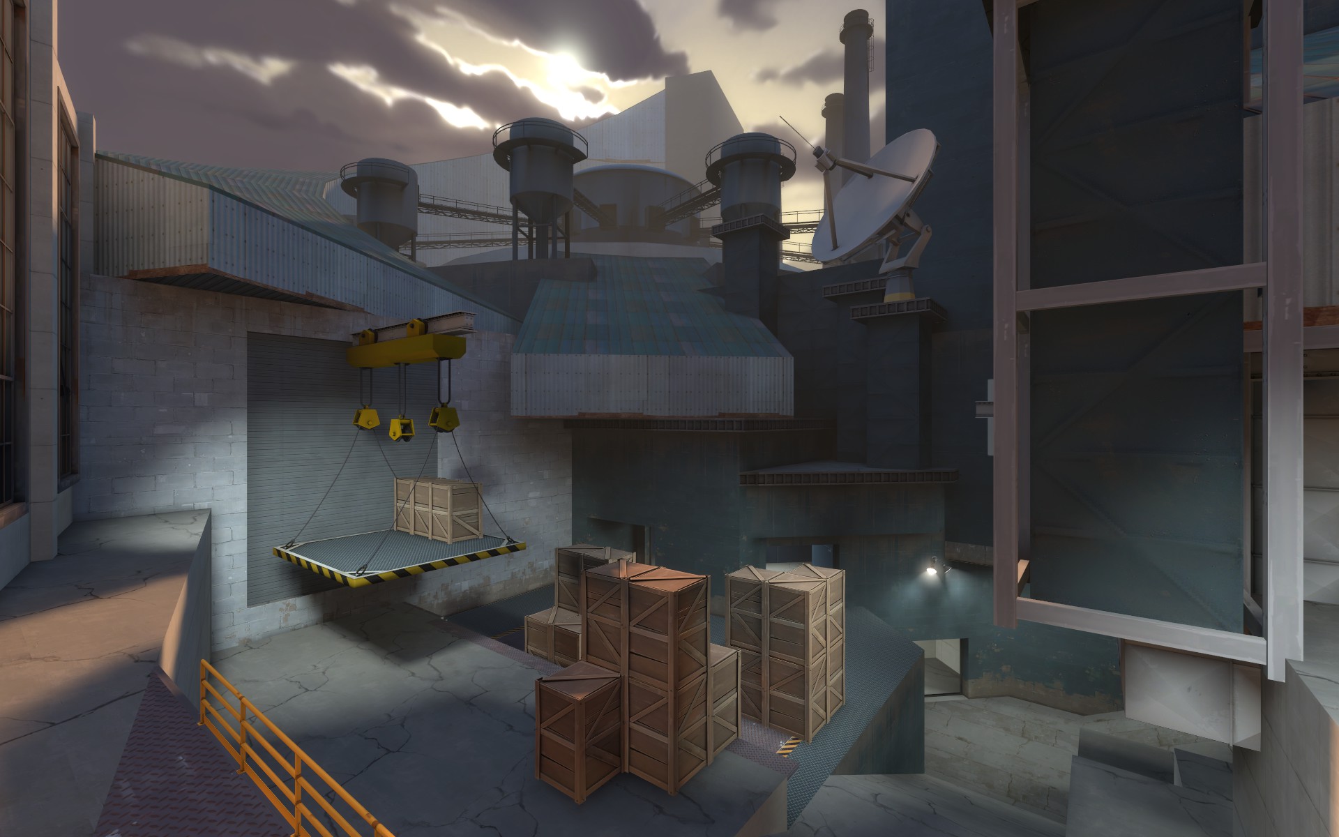
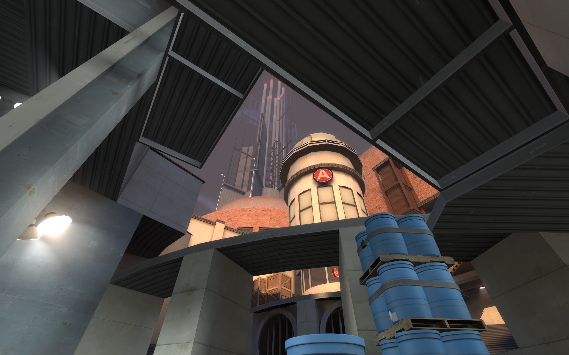
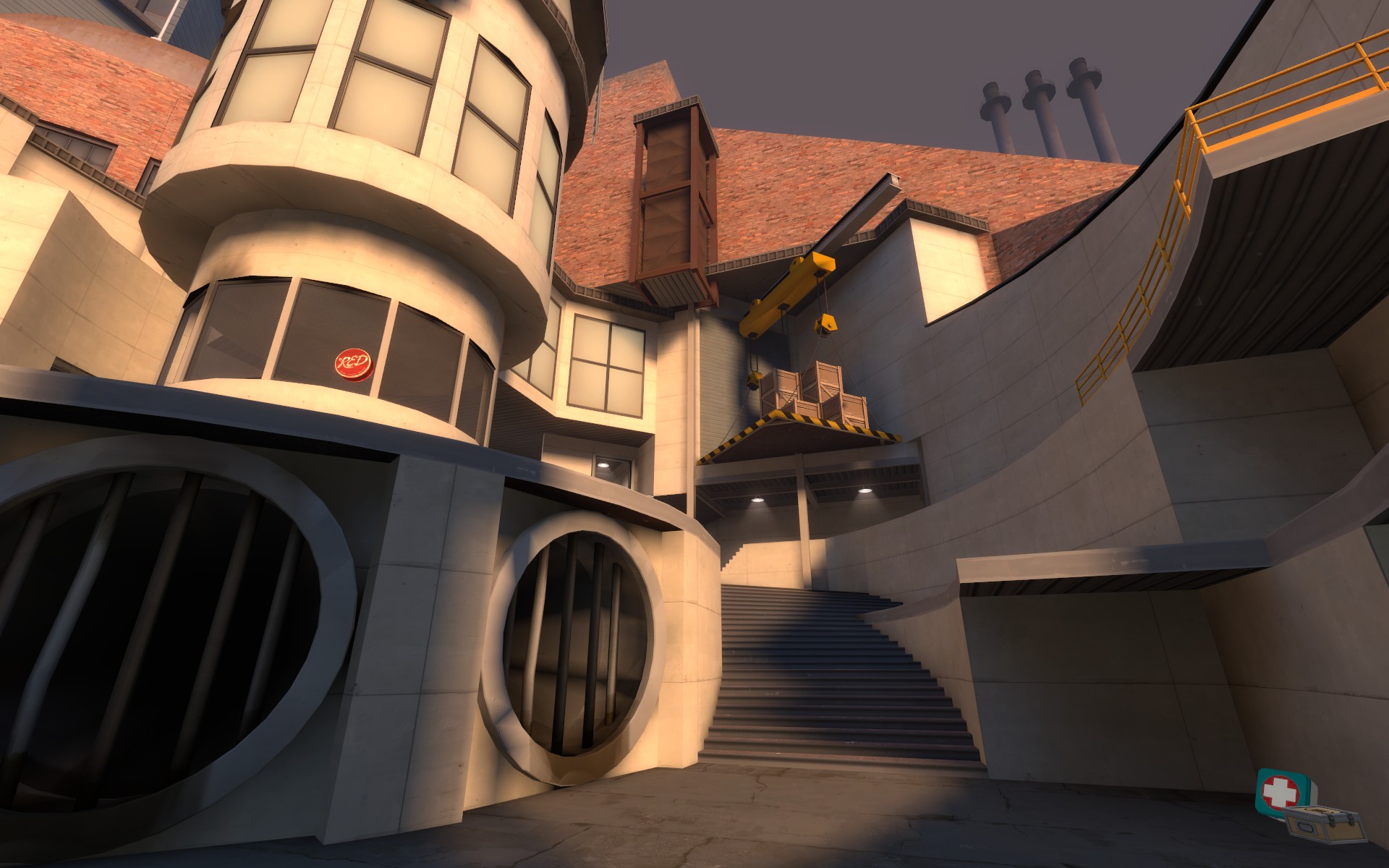
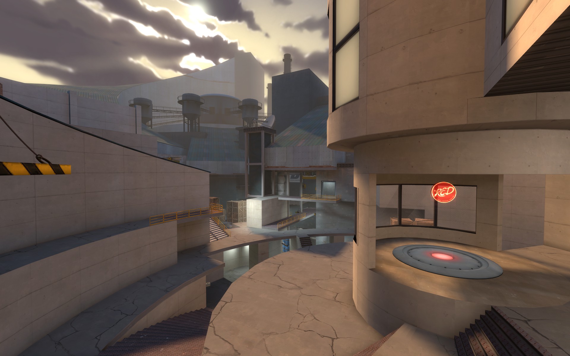
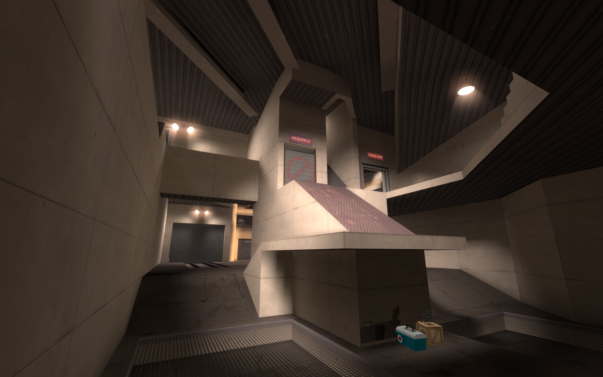
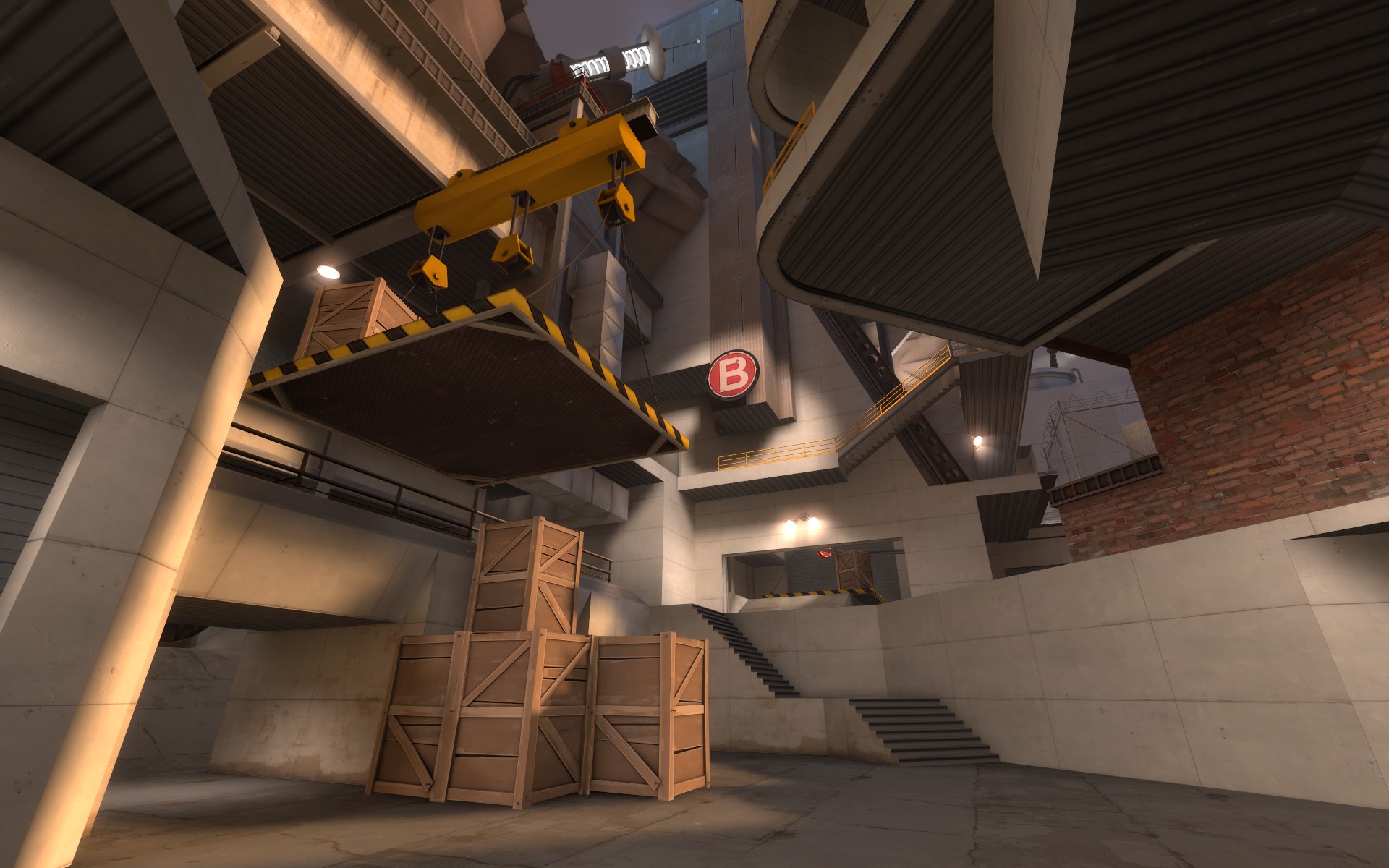
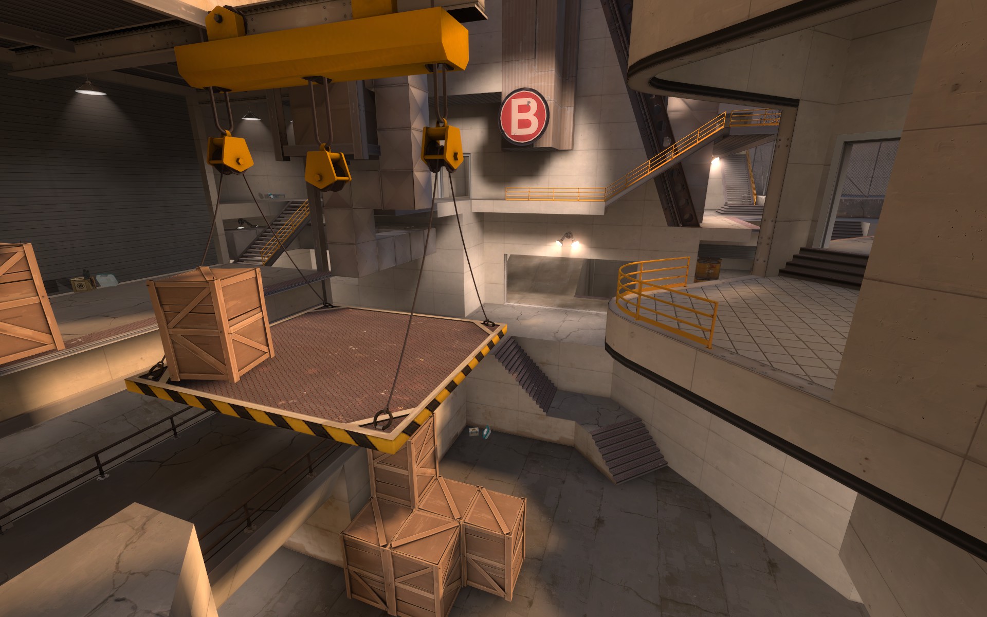
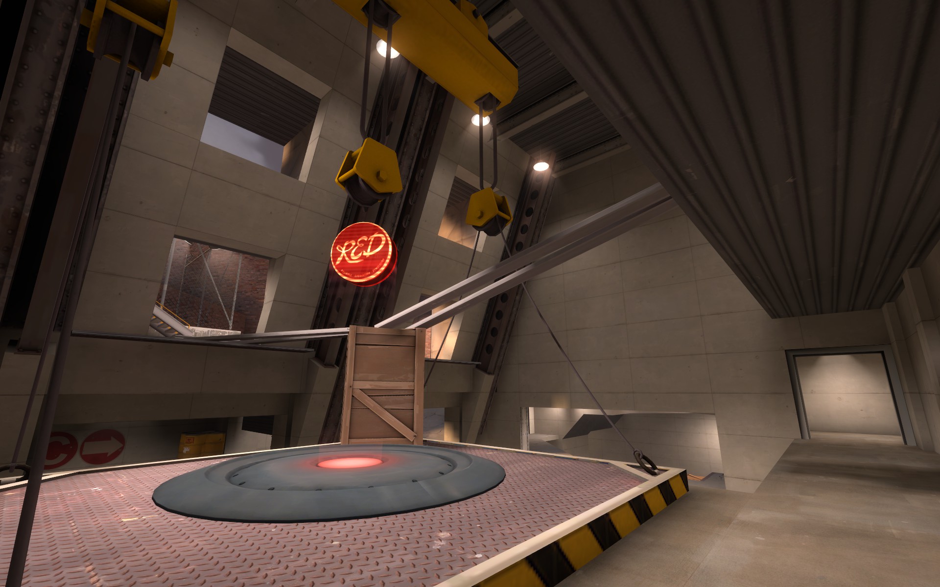
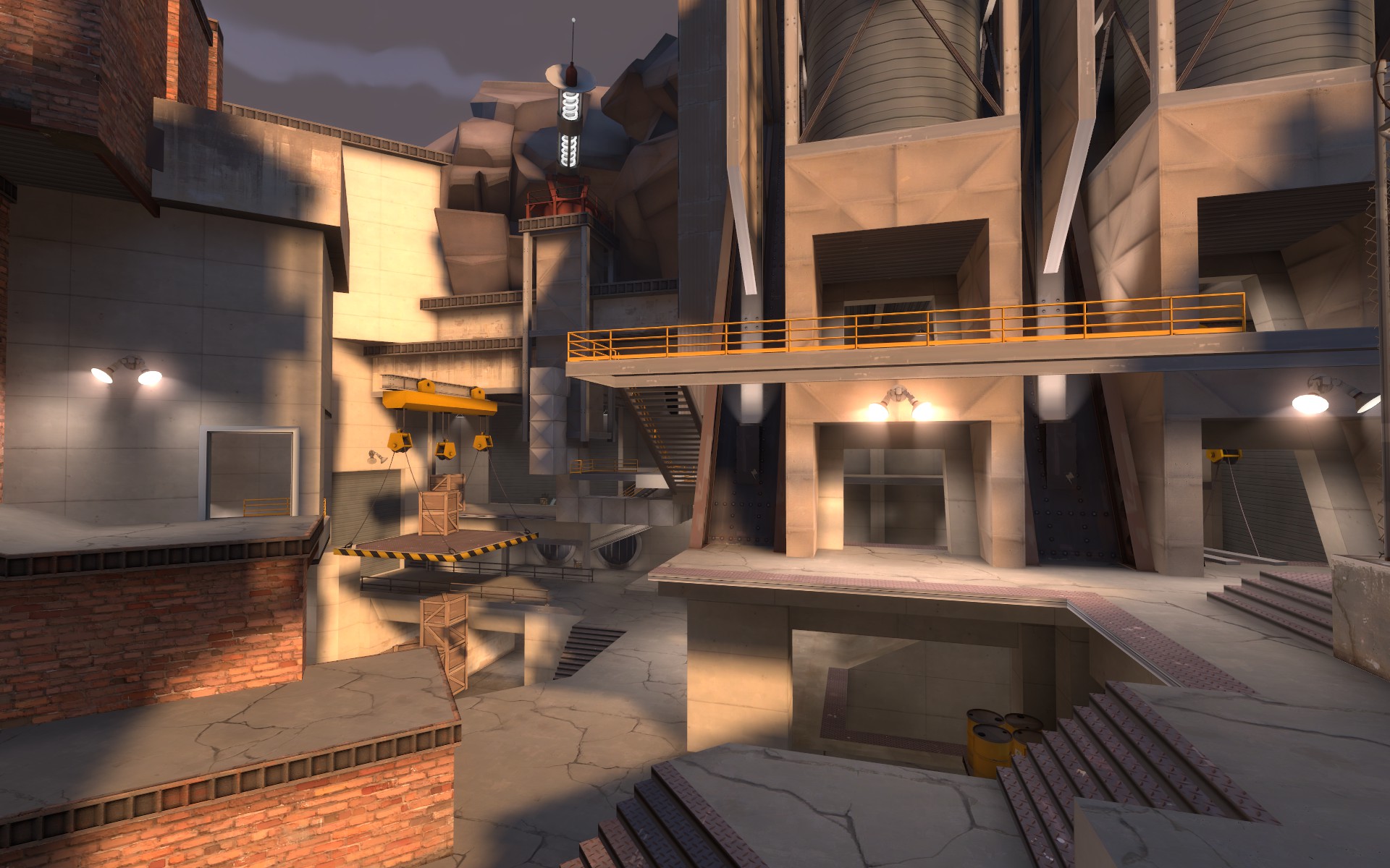
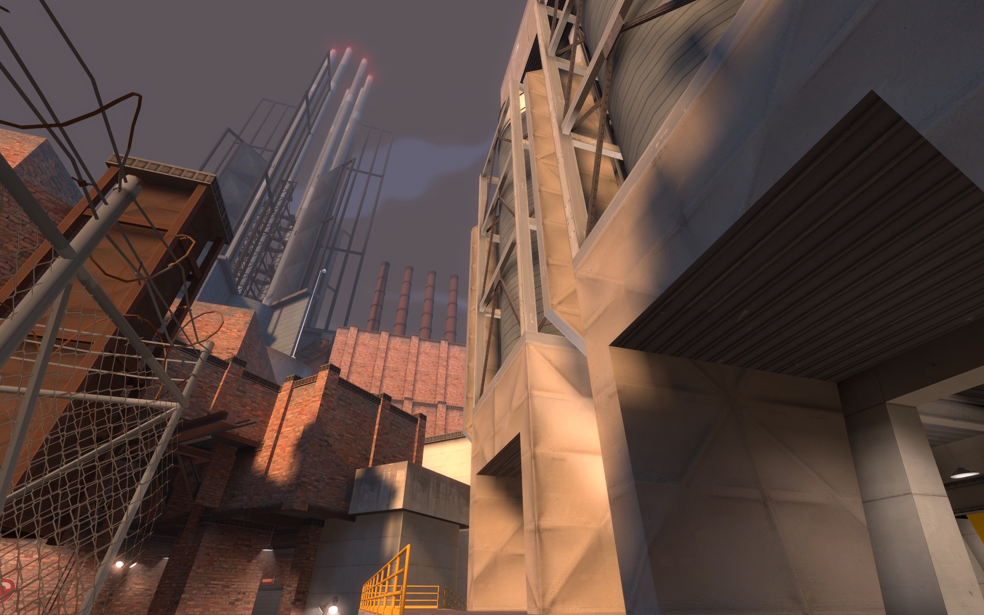
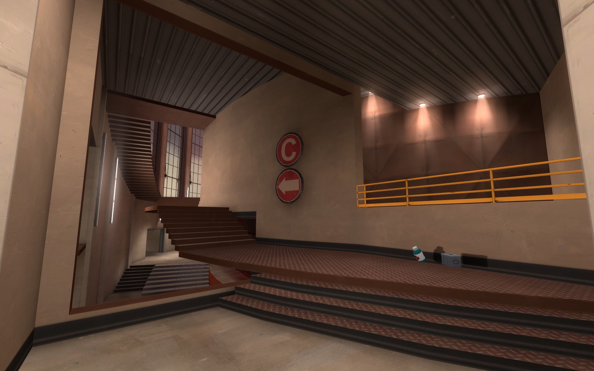
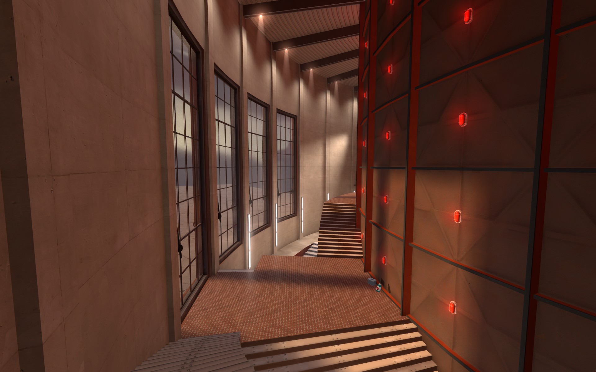
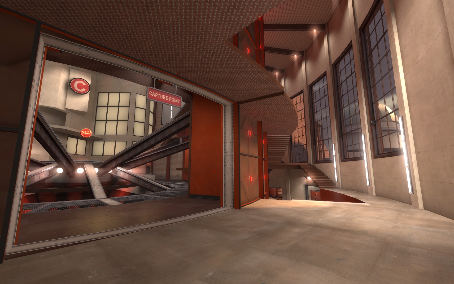
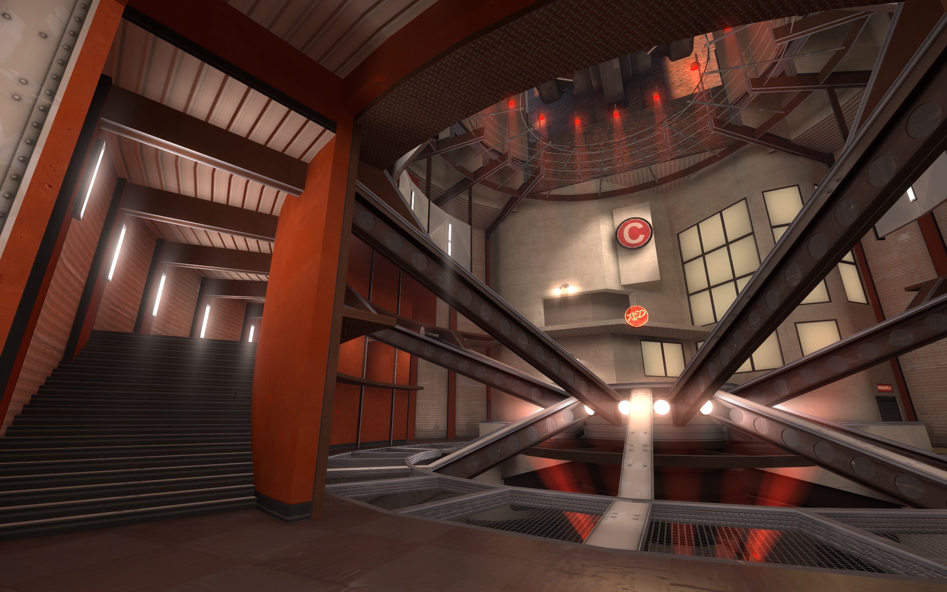
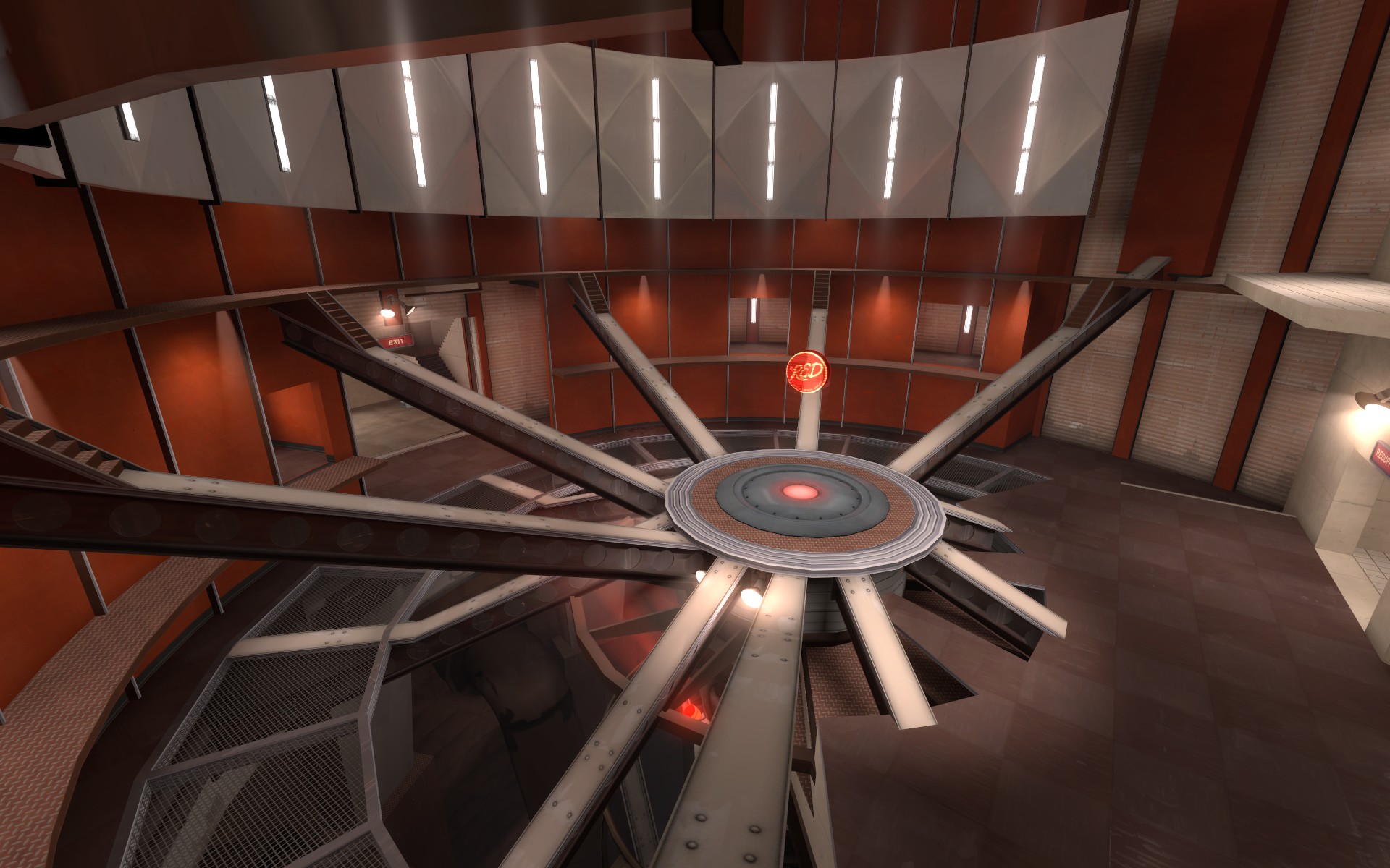
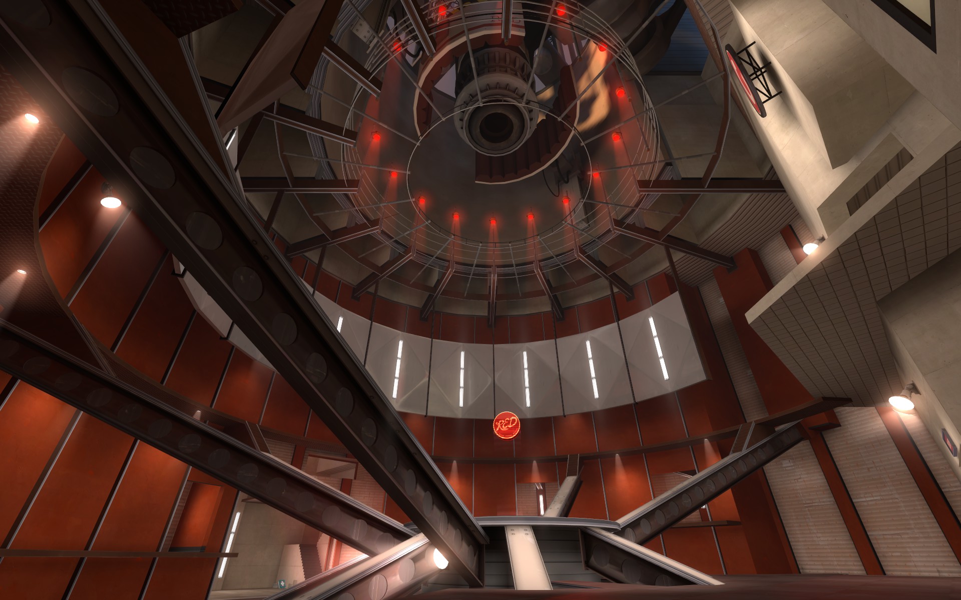
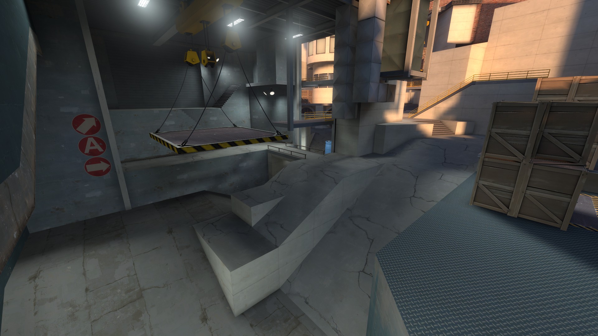
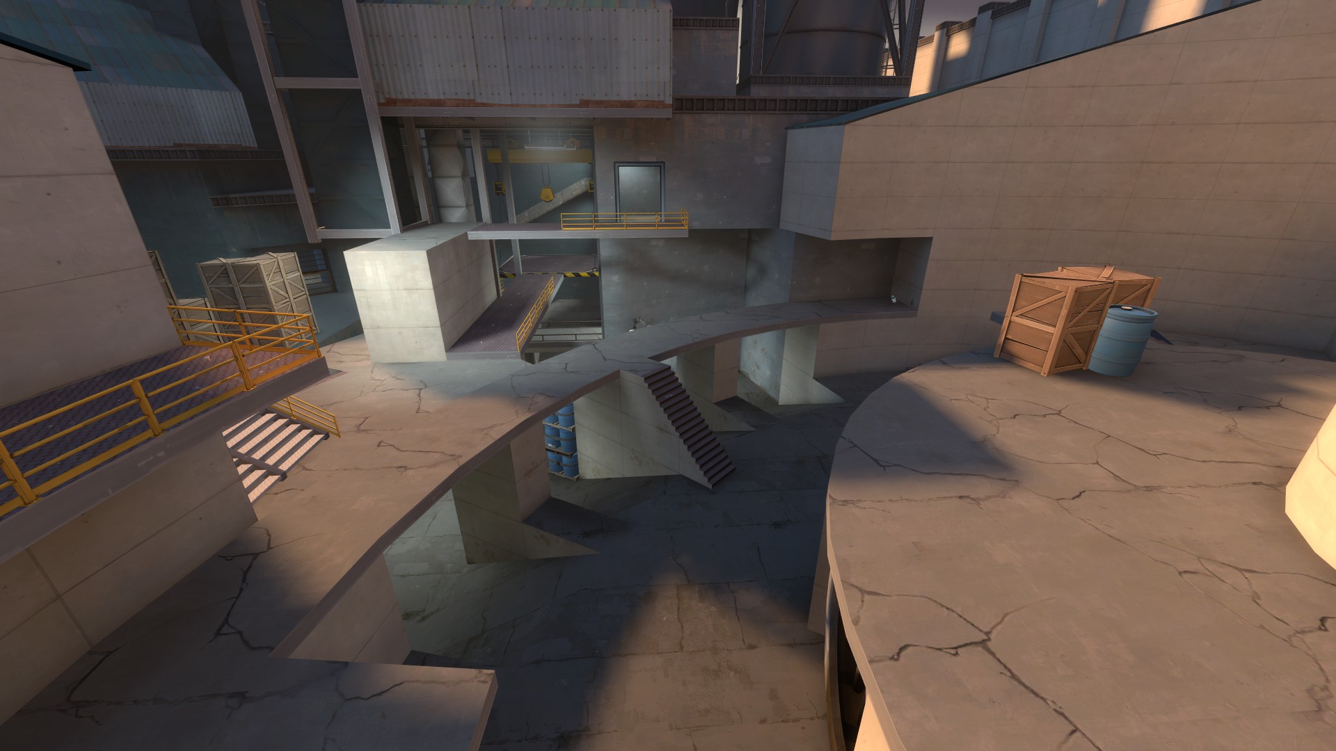
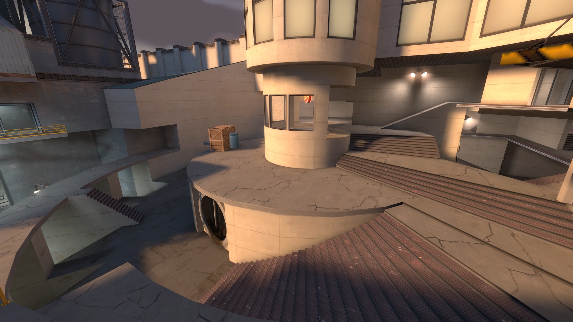
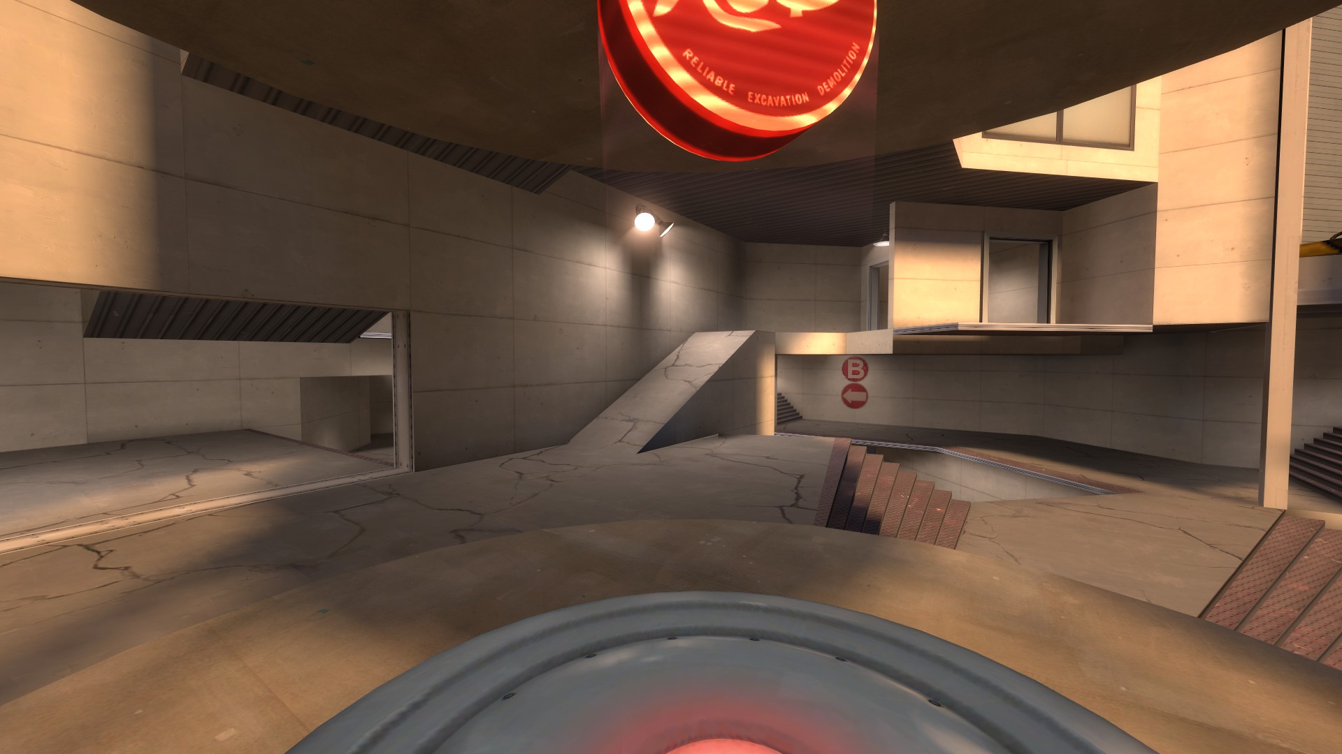
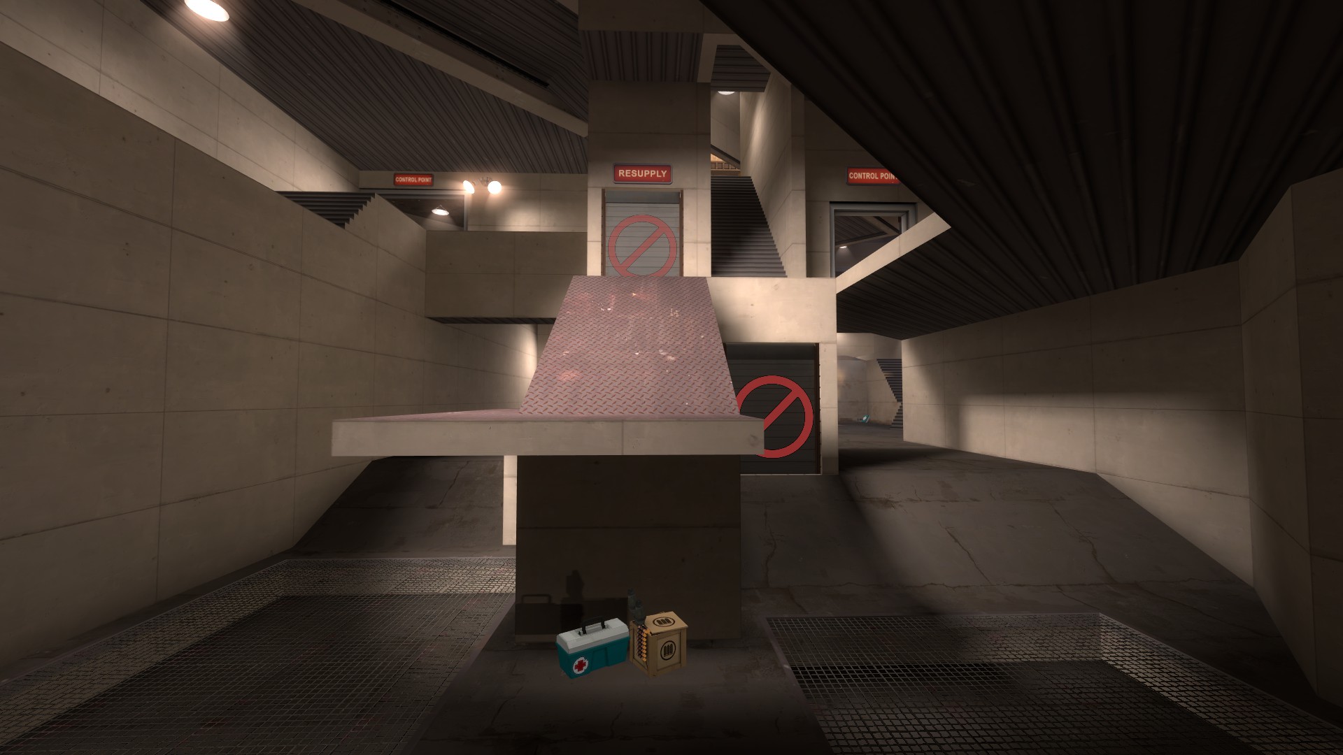
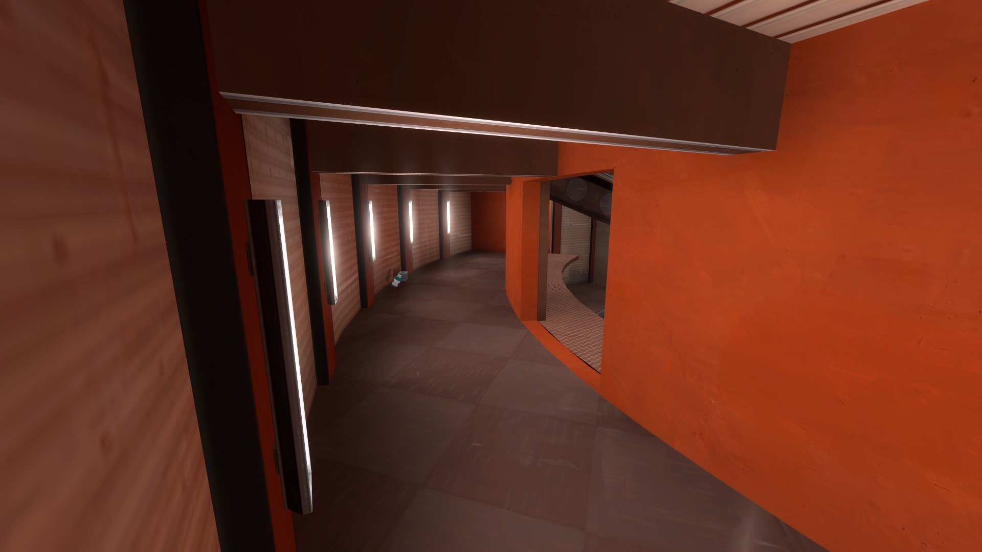
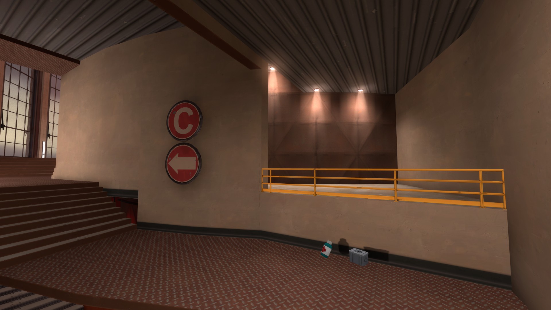
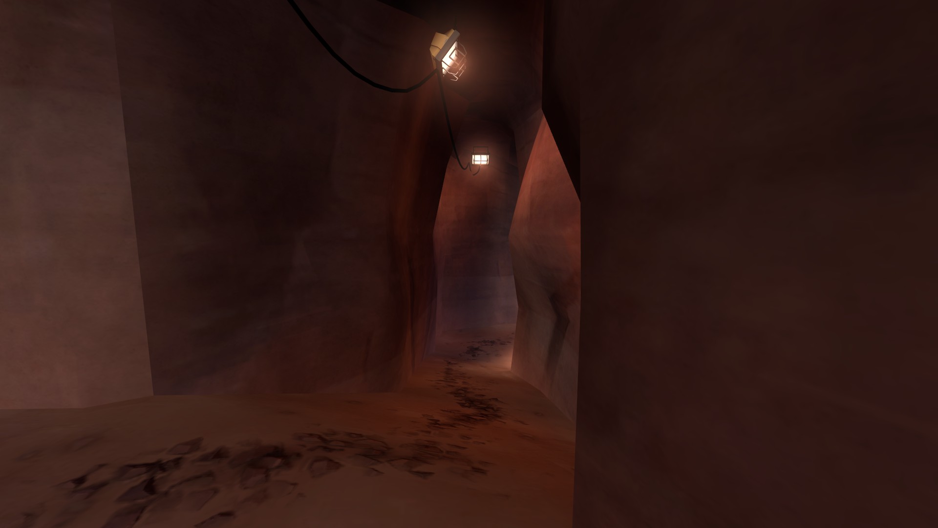
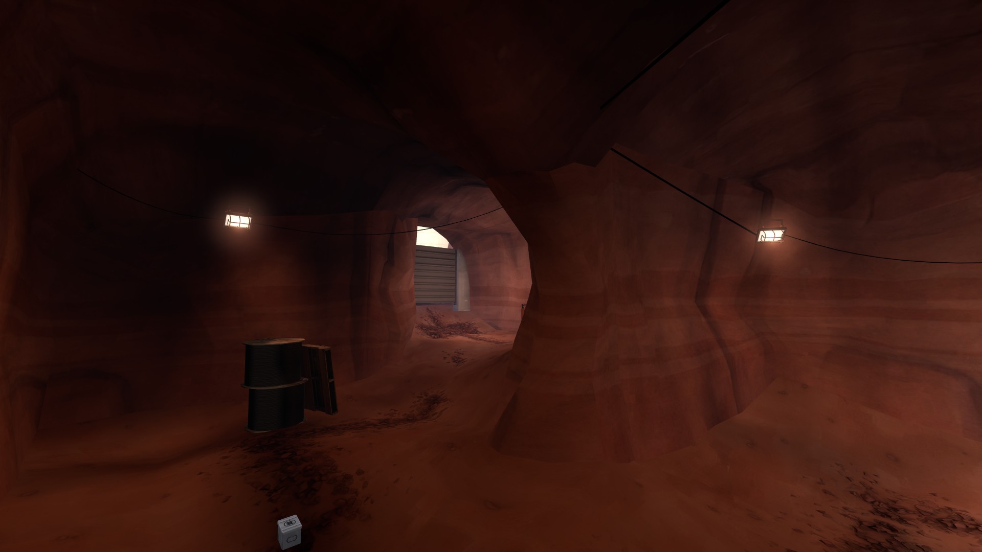
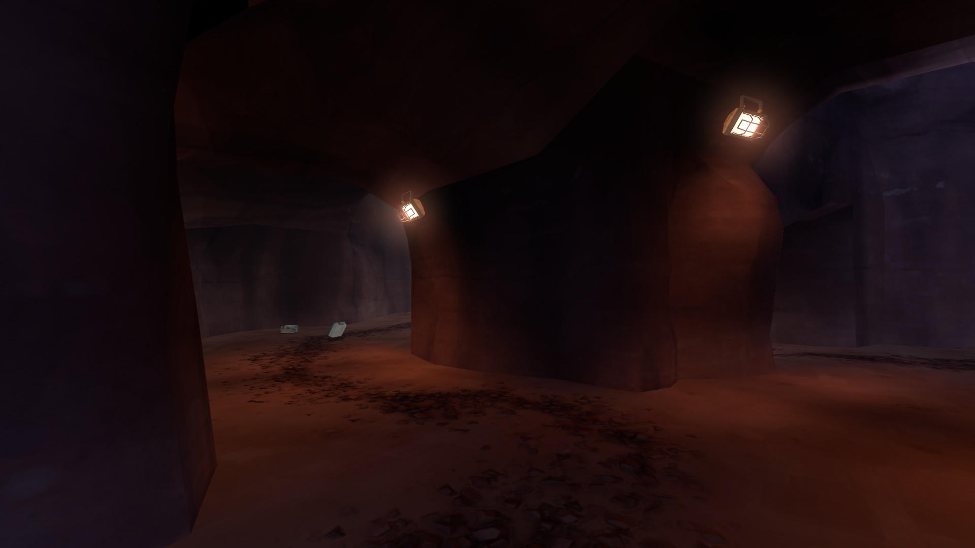
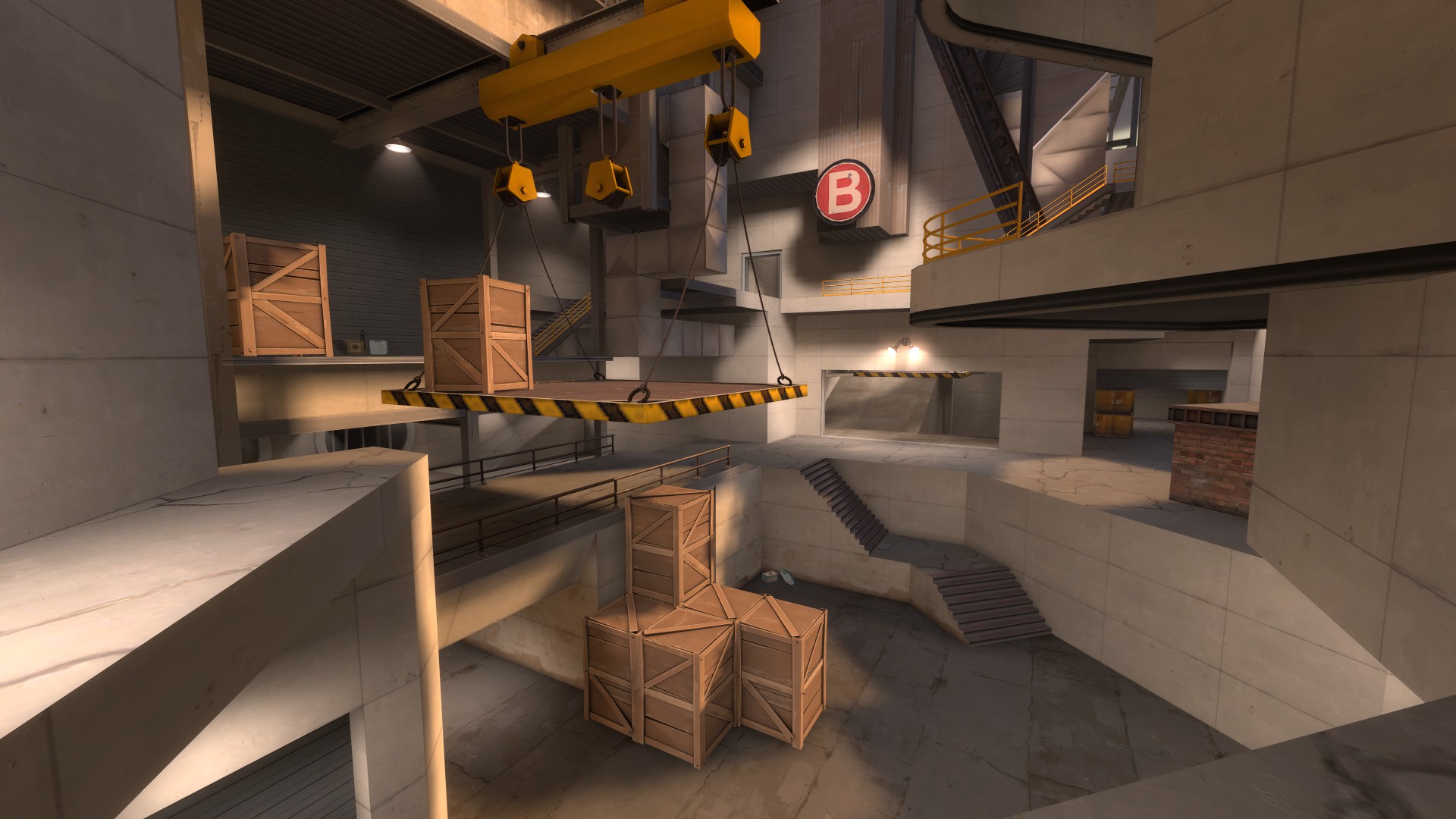
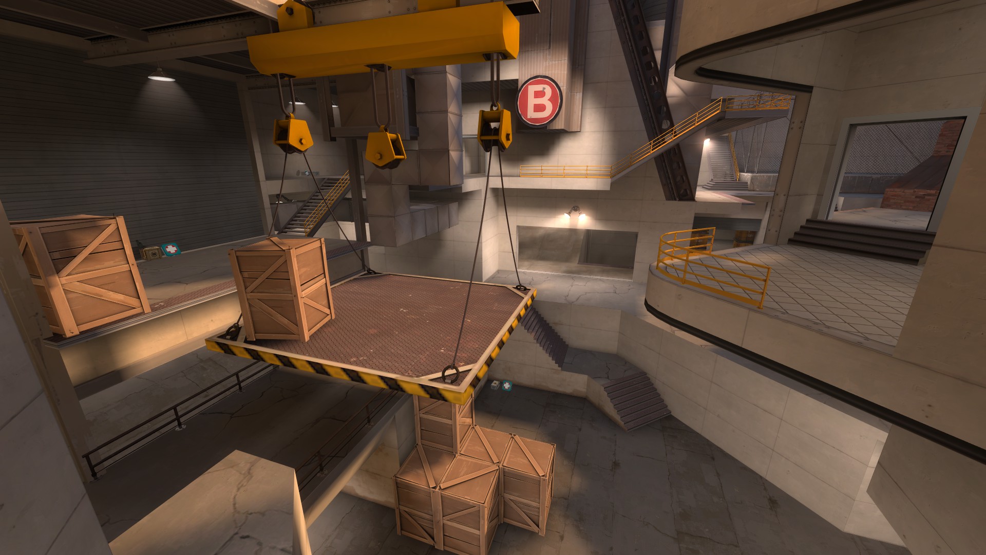
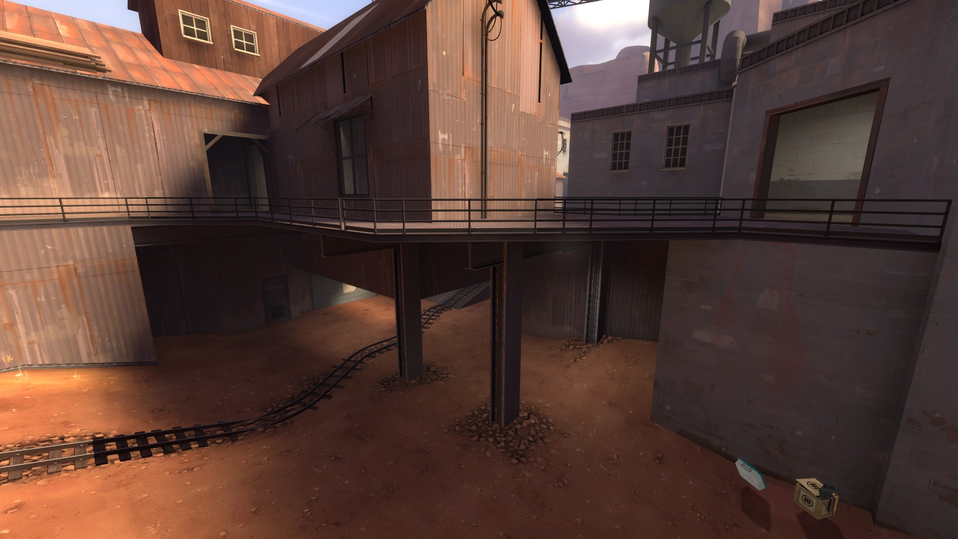
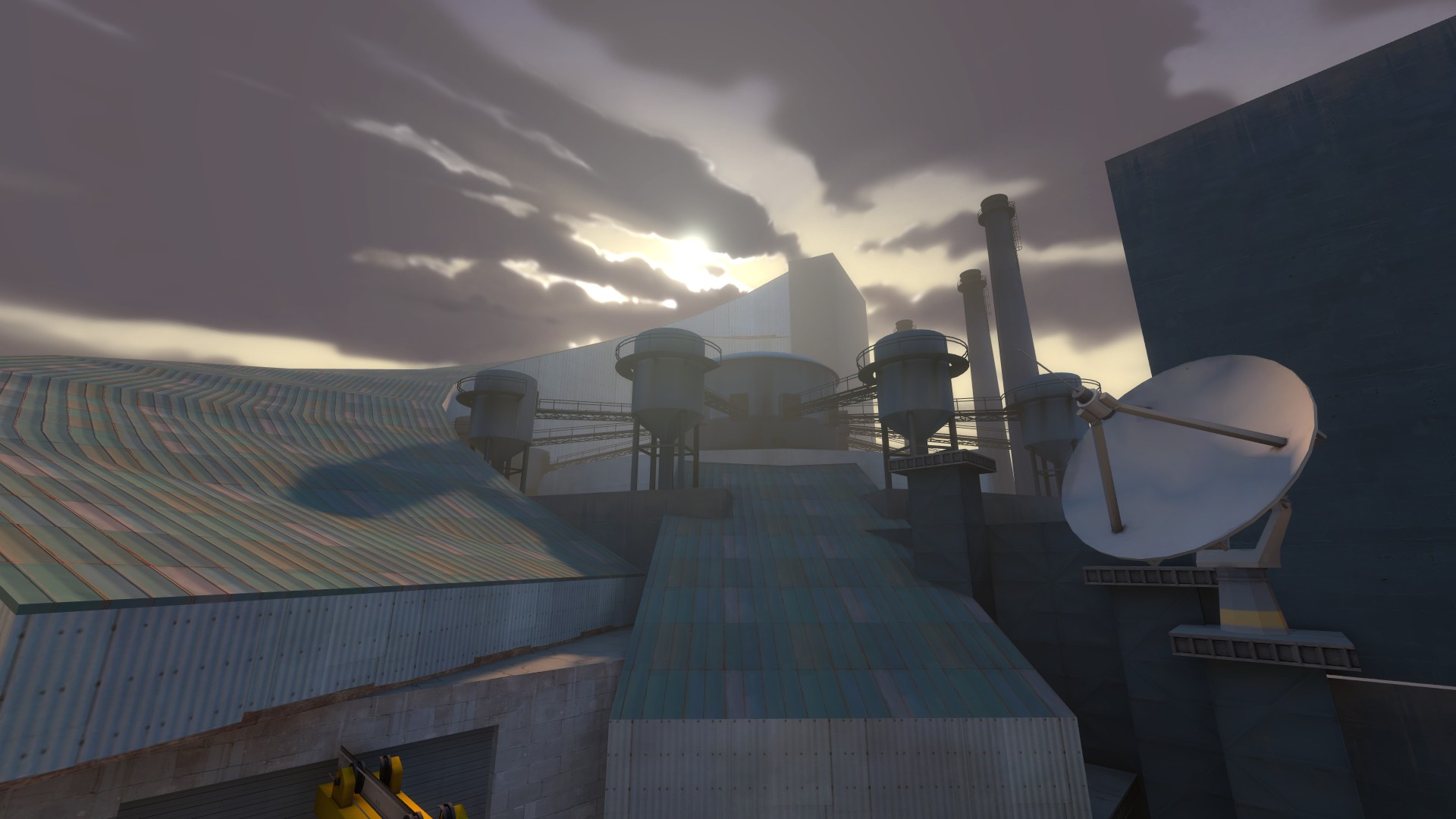
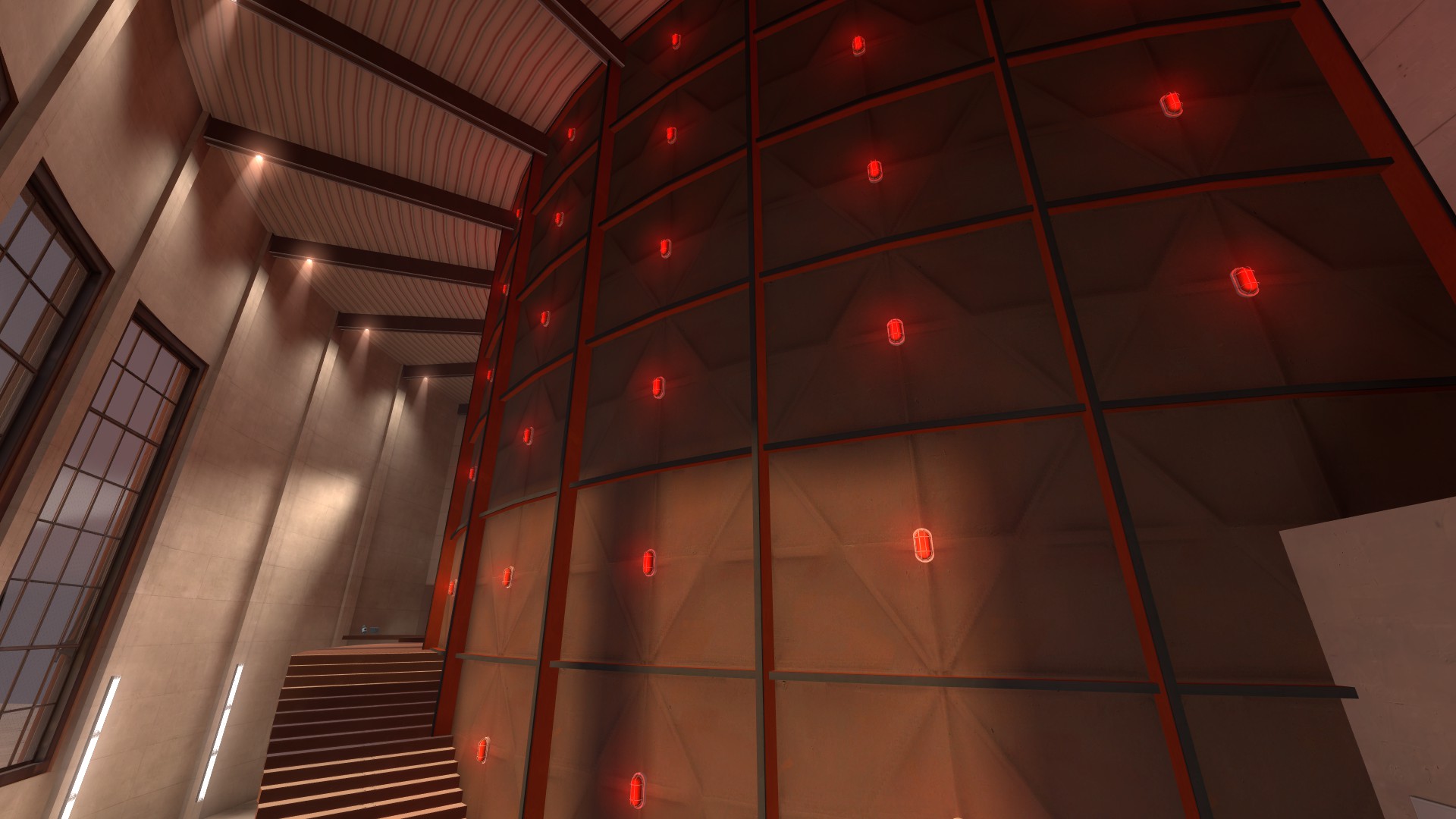
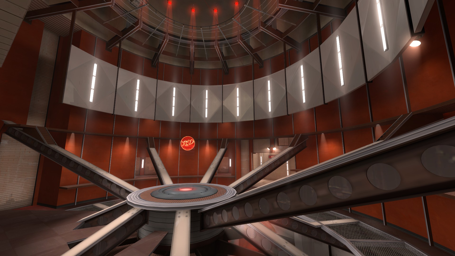
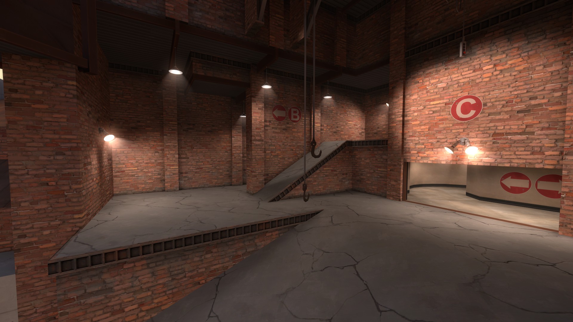
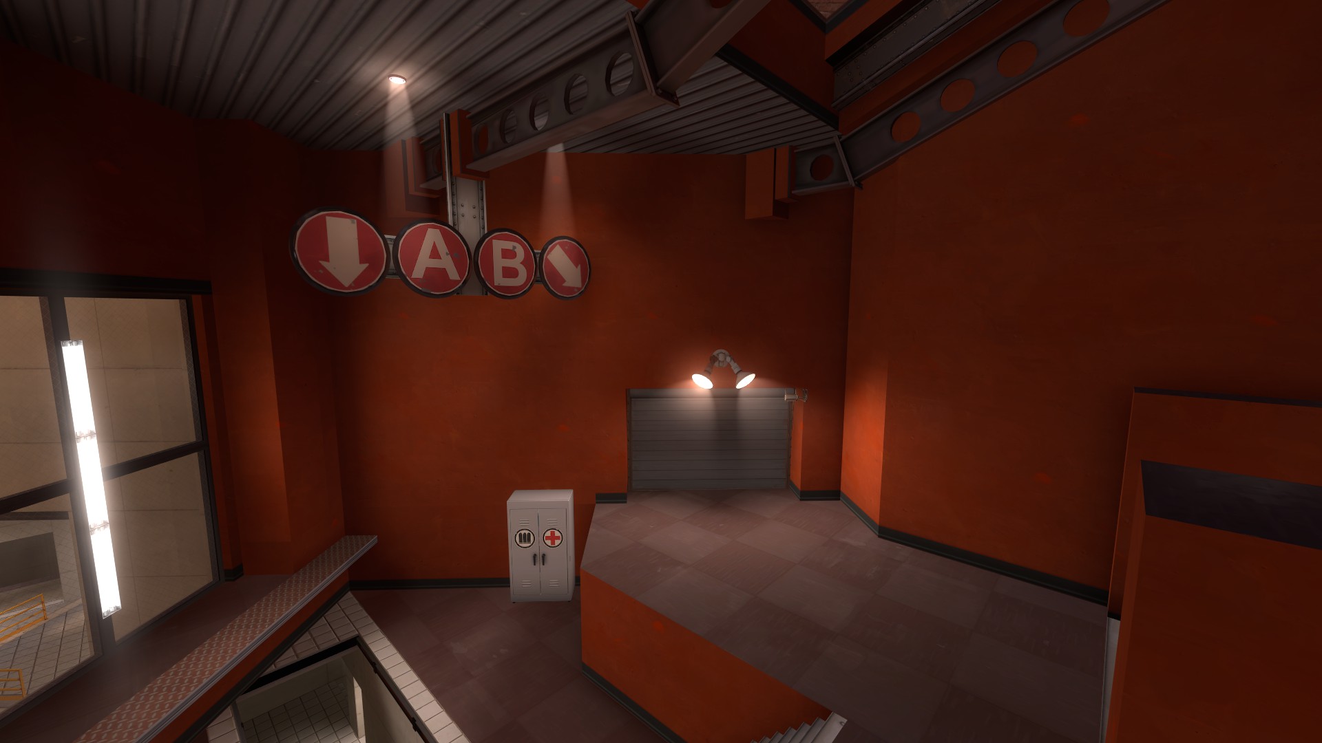
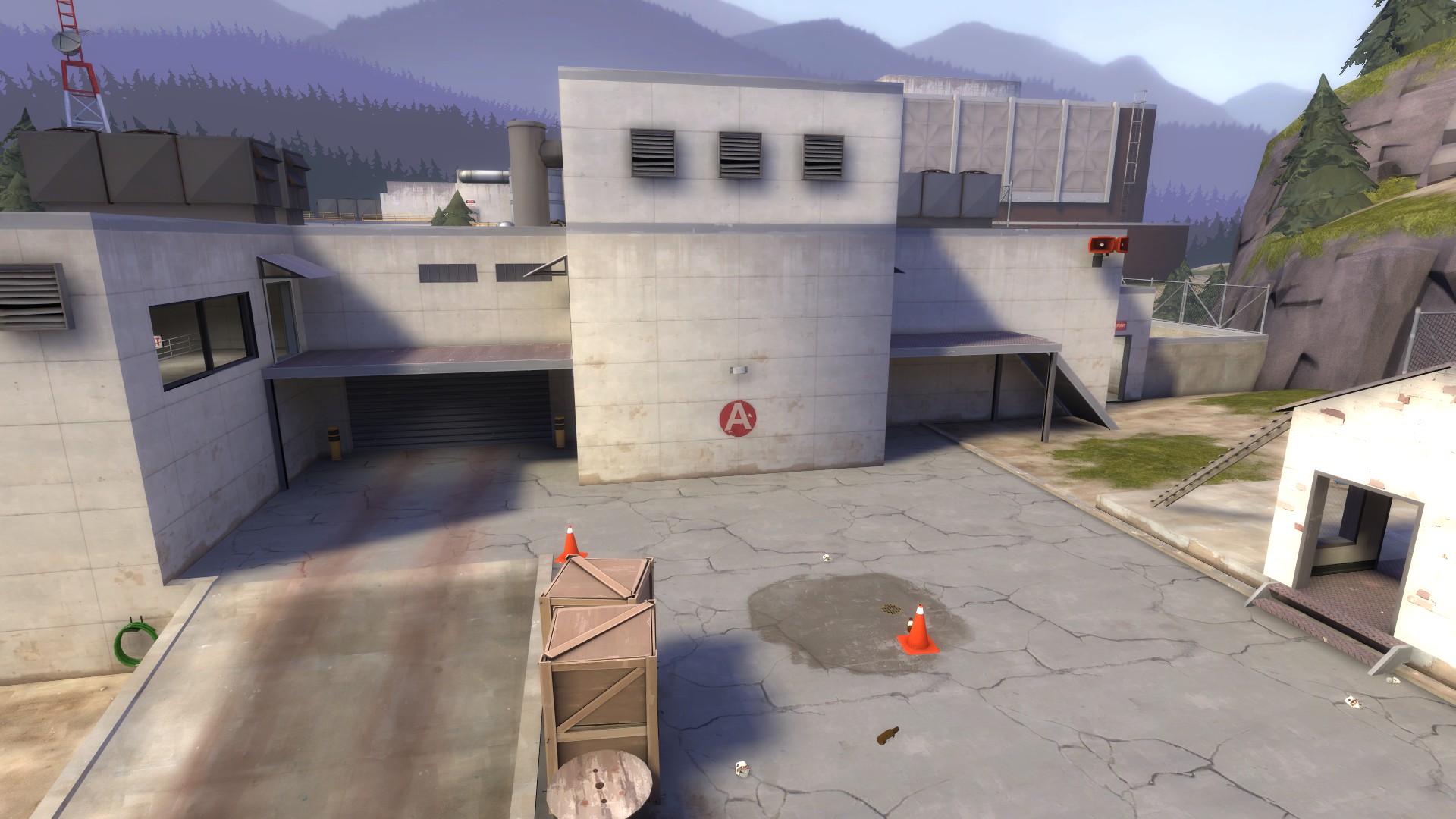
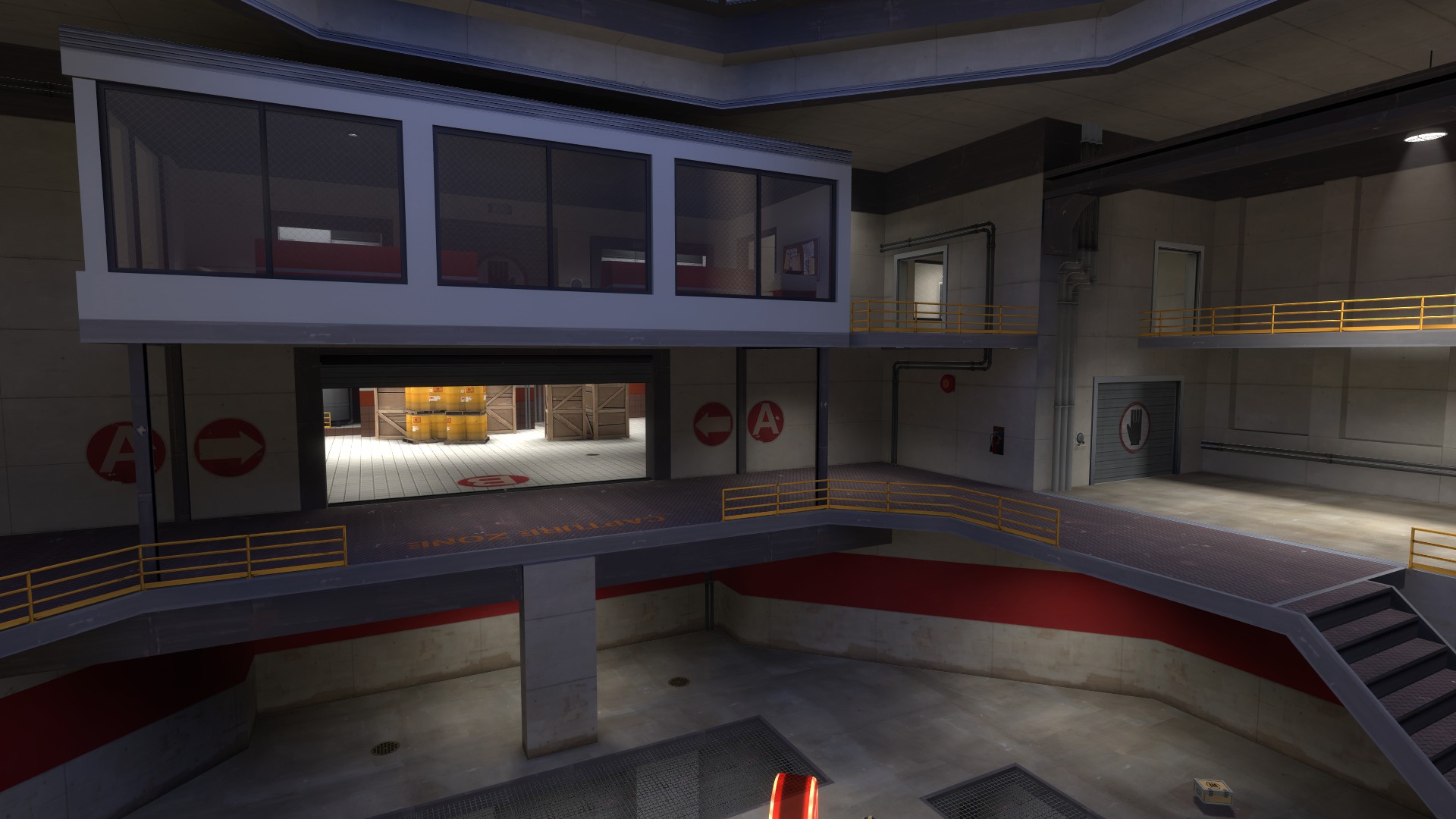
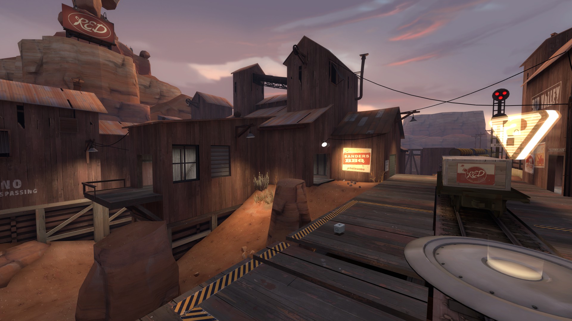
Shots from today's test: (and some from yesterday's)

http://imgur.com/a/4kJb8
 

JeanPaul

L6: Sharp Member
Aug 5, 2010
289
280
So I have spent the last month or so on alpha 5 and I dont know what to say.

I think I might scrap the entire map.

I set out to create a fast paced 3cp A/D map with an emphasis on height advantages and vertical gameplay. For the most part I feel I accomplished that but I also feel this beast has slipped out of my control and went on its own rampage down frankenmap road. Ive spent over a thousand hours on this map since I started it mid august so this is no small investment in time. My main problem with the map is its apparent feeling of no direction.

Im making this post to see what other's think. Should I scrap it? Am I being too critical of myself? Should I just take the lessons I have learned in this map and start a new project? Would it be a total shame to see this map go to waste? Am I just becoming tired of this project?

Help! :(
 
Last edited:

tyler

aa
Sep 11, 2013
5,102
4,621
It's like what I said in chat last night: you're just doing things. When is the last time we played an up to date version? You're just changing geometry now to do it, I don't think you're really considering anything. It doesn't seem that way, anyway.

You could take a break and make something new, then return to this later. Release what you have now, though, don't do all this and abandon it without release.
 
Sep 7, 2012
638
501
It's still beautiful. I feel the layout is too complex and the geometry is centered on "This would be fun to look at / play on" rather than "This is something people would build". Your detailing makes this map look epic, though, so promise me that if you drop this one you'll manage to fit that awesome style into a new one.
 

Sergis

L666: ])oo]v[
aa
Jul 22, 2009
1,874
1,258
If you're tired, take a break. Go a week without opening Hammer. See if you can make it :p

I'm confident the map can be saved rather painlessly. ( then again, it took me a year to save my own map :p )

In any case, you're not helping yourself by doing this much detailing on a layout you're not confident in.
 

JeanPaul

L6: Sharp Member
Aug 5, 2010
289
280
It's like what I said in chat last night: you're just doing things. When is the last time we played an up to date version? You're just changing geometry now to do it, I don't think you're really considering anything. It doesn't seem that way, anyway.

You could take a break and make something new, then return to this later. Release what you have now, though, don't do all this and abandon it without release.

I think this is true I changed TOO much in between tests. I think I am going to take a break over christmas from this map and come back to it with some fresh ideas.

Or maybe I should get a quickly playable version up and test what I have now?
 

JeanPaul

L6: Sharp Member
Aug 5, 2010
289
280
Well after many trials and tribulations here we are at another release :D

This alpha should be really intense and super fun. I emphasized the verticality in this version and I really urge people to give it a few rounds before criticizing the layout. I want this map to be an epic uphill push for blue.

Note - its not optimized yet, so I can almost promise you some parts will be laggy.

Alpha 5

zKX99.jpg


jYFEo.jpg


IhJBT.jpg


fNmlg.jpg


Gi9B5.jpg


i7UVd.jpg


ykgSz.jpg


Kkaf1.jpg


4ke7O.jpg


Qvd3q.jpg


yVtQ2.jpg


ir9CD.jpg


CLYVF.jpg


HVtKP.jpg


CtRh8.jpg


hiB5s.jpg


MU0ga.jpg


CiUI7.jpg


Download:

http://jeanpaultron.com/maps/cp_imbricatus_a5.zip
 
Last edited:

tyler

aa
Sep 11, 2013
5,102
4,621
Hi JP.

I think you have a pretty neat map. It's an inspiration to me visually as well as in terms of layout; there are a few tricks (the 3D skybox!) that I'm really jealous you thought of first. But I don't think it's good. It's not a fun map.

I know you told me (and others in chat a while ago) that while detailing for A5 you let the map get away from you. Well, it really shows. A lot. Though amazing in a technical sense, and sometimes from an aesthetic one too, and even admirable in execution of many of the things you set out to do, the bottom line is that the gameplay isn't good and the map isn't fun. It just isn't. It's not.

I am not sure I can be very nice about this and I apologize in advance. Please remember I do this because I like you. I don't take this kind of time with just anyone.

I don't think you understand TF2 very well. You've got some good ideas about how to make TF2 interesting, and you've definitely grown from Proletariat. I'm sure you think TF2 is at least kinda fun. But you don't get what makes it work, so you can't make it different. You're making first map mistakes, but with a deep technical understanding of Hammer and level design.

Let's start outside BLU spawn.

nAyt8.jpg


Visually, this is a mess. Other than the distant white wall, nothing is highlighted; the forefront is a sea of paths and ramps and things I don't know how to get to. Most people's internal reaction to leaving BLU spawn is probably "Fuck it". How do I get anywhere? Which of these paths will lead me where I want to go? Where do I want to go? Is there any indication of what's happening here? Not really. Nothing is lit to indicate it's important, and the single set of signs tell us something we better damn well already know: A is somewhere off in that direction. This is a sea of confusion.

wNaAP.jpg


Similarly, attacking A is a clusterfuck. You might think that by finding the high ground you're going to be taking the high ground to A, but nope. This ring of negative space means you're on the same terms as all the shmucks that took the low ground, except you took a maze there and they took an enclosed path. It is true that BLU could come from the left of this, but that leaves their offense protracted far from the point, exposed, and against a wall so they can easily soak splash damage.

Then there's just a single route onto A itself.

P3eAa.jpg


Frankly? That's not terrible. The idea of it, anyway. But if you limit anyone in an A/D map, it needs to be RED, not BLU. And RED has more options onto the point, and beyond that, BLU can't see them coming.

8DtTo.jpg


As someone capping this point, where is anyone going to attack me from? I don't know until they're on top of me. I have nowhere to retreat, because there's a big wall behind me. And the health and ammo placement favors defenders. All that being said, the point itself is cappable... it just takes damn near the entirety of the given time.

What's after the point?

lAn4q.jpg


This wreck of a connector. (Besides the fact that the spawn doors are split, I mean. Why the hell are there two?)

Something I think you're missing, on a very basic level, is scale. Most of your play spaces are scaled correctly, more or less--I mean it's always up to some interpretation--but this is a great example of how when they are not scaled right, it's bad.

SB263.jpg


Here's something you changed from A4, but barely. This room is still tiny and easy to camp; the doorways are still miniscule; the pickups still are measly and besides support RED more than BLU. This is a fundamental problem across many areas of your map.

p58l8.jpg


This actually is worse than A4--previously, RED and BLU clashed here; now it's a tiny balcony for BLU to get creamed under. This actually made your problems in A4 worse and is a basic indicator to me that you don't know what you're doing anymore.

Look at Hydro--a map long lambasted for it's tiny, winding caves.

iJm8k.jpg

1TfSE.jpg

YhF6M.jpg


For the most part, Hydro's caves are larger than the paths in your map. And those caves are part of the main reason few people like it and matches are stalematey.

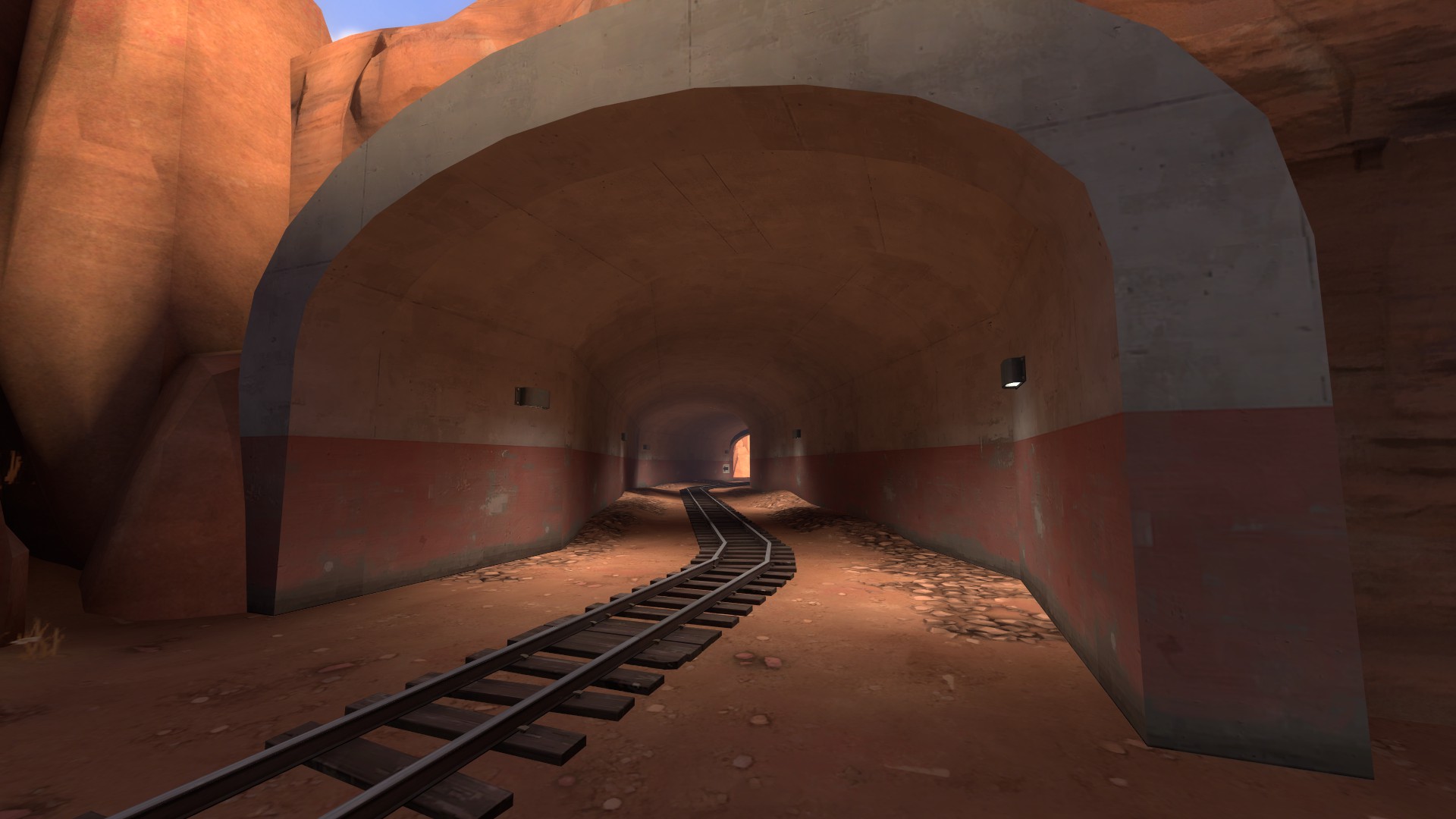
Look at the tunnel on Badwater.

ROPJk.jpg


This is meant to be a tight area that is overcome by support above the tunnel. It's literally meant to be small (especially with the payload). And it's wider than all your halls.

You don't seem to understand basic maneuverability: how classes move, how weapons affect that, what weapons are good and bad in these quarters, what classes shine in hallways versus open areas.

And I'm not trying to say you don't have large open areas for combat to contrast this--these hallways are not the sole reason the map isn't fun (though C turns into a terrible fucking slog at the end as BLU tries to grind through tiny, spread out holes while fighting sentries shooting above and behind them to cap a tiny point raised above a death pit with a bunch of shit in the way of their fire). You do have large combat areas. They are just confusing, like the one at A.

Or this one.

PrxhF.jpg

pJrZu.jpg


In a picture? It's not that hard to see what's going on. In game? I don't know where I came from because of the previous connector, I didn't know where I was going, and now I'm looking at an Escher drawing. Again, nothing is highlighted. Again, there are no useful directional signs. It's not clear how I can move from one area to another, or why I would and where that next area would take me.

It's totally a shame.

Can we look at Badwater again? Here's the same basic area as you have--low ground going under a high ground. More or less.

Qyemn.jpg


Completely different, but it's even using the same architectural themes. The beams are there, the catwalk, everything. See how simple it is? Why can't this be Imbricatus? Why does Imbricatus have to feel like a soup of brushwork and props?

I know you want something evocative, and you definitely hit that. You hit that a lot. You wanted to make a map that hits someone on an emotional level, and you have.

KOnCY.jpg

xjzW3.jpg

olRvp.jpg

KPb96.jpg

tlxK7.jpg


Look at those! Those are amazing! Some of them look nothing like existing TF2, and that is awesome. That's especially awesome to me, because I've been playing it for 5 years and been testing new maps for over 3 years and I've never seen something so new that's still identifiably TF2. This is like TF2 on PCP or something. I like it.

But then we play the map, and we figure out you don't know what you're doing gameplay wise, at all. I mean, frankly, I'm surprised you've gone this far with it at this point, because all anyone ever says is "Cool! But..." And here we are.

dOHTC.jpg


I know people have pointed this out to you a lot. There's a BLU forward spawn exit here, and it requires you do a 180, and there's no sign. It relies on the memory and instant judgment of the player. That just doesn't work! It's nice to give an average player credit, but you can't.

Similarly, like in this instance--

Yt0WL.jpg


--you've got a big door going to B, and a tiny hole going to A, which because of the weird double spawn doors ends up feeling like going down an anthill. Where do you think most people go? After they've taken the wrong door once or twice, do you think they remember that after every death? After every round? And why can't I go from this spawn to C? They connect. It'd make abandoning B safer and let me set up faster.

Think about that, and the spawn exit, and the initial BLU spawn area, and then look at Gorge.

ZPxW9.jpg

2cnyl.jpg


Or look at Badlands.

1pDLd.jpg


Or Dustbowl. Or Well. Or Mountain Lab, or Gravel Pit, or Gold Rush, or any number of community maps. The objective is instantly clear. The paths are indicative of where they go immediately. No amount of learning or remembering matters in the split second when you are fighting an enemy and need to decide where to run, or if you should chase them, or if time is low and you need to get to a point. People don't always think about their past experiences on a map and overall layout before committing; that's why having clear paths and only a couple areas to look at before moving or firing is very important.

I don't think the basic idea of your layout is bad. I don't think the idea of the map is bad, or any of the single points are bad. But the way paths intertwine, the way you implement verticality, the way levels are separated--that's all terrible. It shows me that you don't really know what people are going to be doing, which is ok, because no one does. But you don't seem to be trying to plan for it, either, or know how to adjust what players do, because A5 is somehow worse than A4.

You don't seem to know why your skinny halls are bad, or the connectors are bad, or the individual areas don't work. I can't tell you why, either. If you don't know why TF2's combat areas are simple, the doors are wide, and the paths are spacious, I probably can't tell you anything.

And the idea that someone should play a few rounds before judging the map and providing feedback? Yeah, that's true. But will it happen? No. You want to know why? People are opinionated, especially here. But beyond that, if some other server community wants to throw this into rotation, you know what they'll do? Play it once or twice. For you or me, remembering the layout of the map we make might be easy. For you or me, remembering the layout of a map we play a few times is probably also easy. For someone that doesn't give half a shit about level design, plays TF2 on Friday nights with their Ultimate Furry Gaming clan, and does bong hits between lives--aka, pretty much every TF2 player, in whole or in part--this kind of shit doesn't work. It just doesn't, and it won't ever, and no amount of your testing groups learning the map will make it a success later on.

I remember when you asked me, or maybe the chat in general, I dunno, what you should do with this. My opinion? Either detail it completely and never touch it again--you're pretty close--or drop it altogether. Fixing this will take more energy than it's worth, and I think if you just move on and try something new, you'll be better equipped to solve the issues in Imbricatus and try new ideas. Not every map needs to be finished. You've done a good job, but as any artist knows, you have to know when something doesn't work and drop it to avoid burning out entirely and going insane with frustration.

Hope this helps.

You know what? Try making a map that uses a lot of displacements.
 
Last edited by a moderator:

WolfKit

L3: Member
Jun 26, 2012
128
83
I'd recommend looking at Upward. It also has a constant uphill battle and a focus on height variation, but it's also simple and easy to learn. The main path is really big and obvious and simple and direct, and there are also flanking paths which provide various advantages but require you to seperate from the objective, and there is a focus on controlling the high ground.
About the one unobvious thing is the shortcut from red's final spawn to 3rd point, because it requires taking the high route which is not the major path and then taking a 180. I only found out about it after rocket jumping into it as a blu. So that bit is actually a good example of how not to make something obvious.
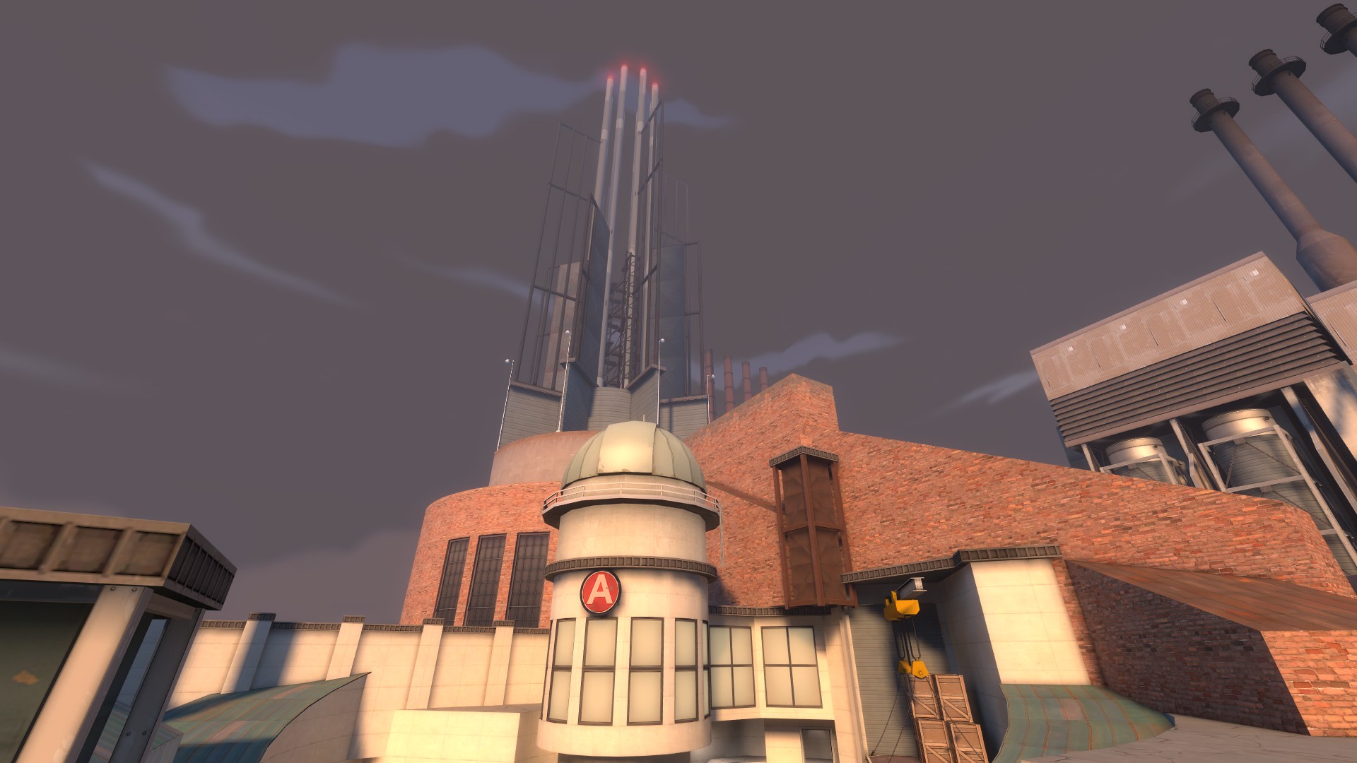
 

JeanPaul

L6: Sharp Member
Aug 5, 2010
289
280
Yyler I pretty much agree with all your points, those are basically all my reasons for wanting to abandon it a few weeks ago. I think I am going to start a fresh layout but use some existing work from this map.
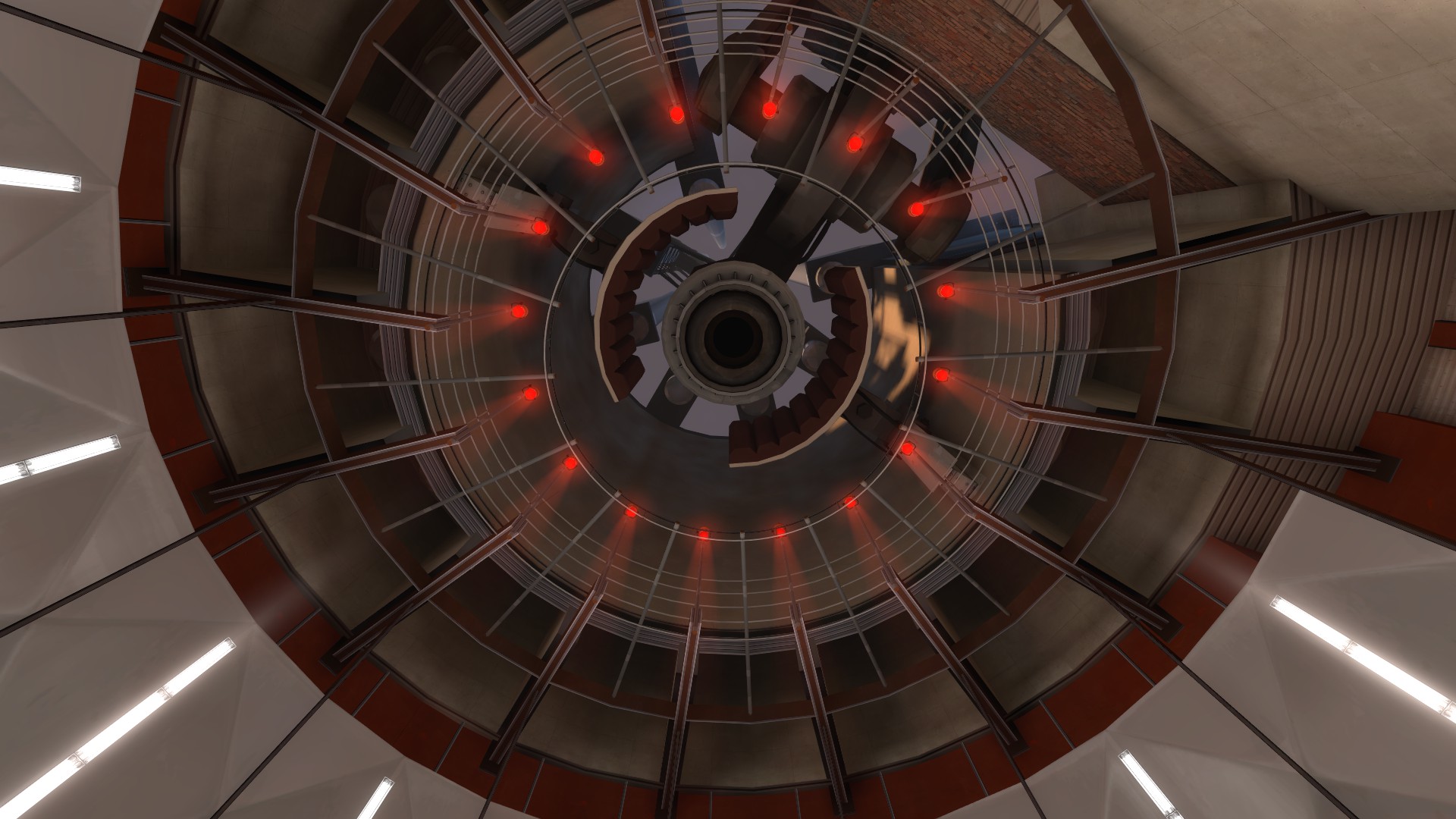
I knew I let myself get carried away on basically all design levels of this map but I really wanted to release a5 just to be absolutely sure it should be scrapped. Some of my design ideas just got too complicated.

Anyone else have any thoughts or does everyone pretty much agree with yyler? :p
 
Last edited:
Sep 7, 2012
638
501
I have to say that I really liked the way that area outside point C was turning into a fighting area (the hallway with the barrels on skids and the short flights of stairs). I feel like that could have worked better without the mess of catwalks/platforms above it and if it opened more directly onto the point. However I loved how it curved around the point and gave you a sort of preview what the point room was going to be like when you got inside.
 

RaVaGe

aa
Jun 23, 2010
733
1,210
I played the map only once, but I agree with yyler, your map is way too complicated. I did the same errors by the past, putting details on everything. I consider the brushwork as detail when it's like yours, forget the basics you have from every others games when you are mapping in tf2, it's different.

You have to start by drawing a ROUGH layout first when you design the map, but a really rough one, showing only the paths, and a basic sketch of the point. Focus on three different paths first, one need to lead to the low level, one or two to the mid, one to the high. The gameplay on tf2 play like this

Chokepoint -> wide area + CP -> chokepoint -> wide area + CP -> ...

Don't be too focused by the emphasis of the height like you said, actually 3 differents highs are REALLY enough. Use 128 - 192 - 256 for your heights, and avoid the fall damages, nobody like that.

This is actually the very basic for the gameplay in tf2.

Don't forget to use the lighting to highlight the doors and importants objectives, you must make them more bright than the rest of the map, this way it's really easy to focus the eye of the player on what you want.

And about your theme, I like it, but not that much, I feel crushed by everything around me, everything is too heavy, use more space between your buildings, let some blank space in your detail, especially where the player don't have to look.
 

Tarry H Sruman

Large Orphanage Proprietor
aa
Jul 31, 2011
872
1,021
I enjoyed it quite a bit actually, when we weren't fighting over A. A is really miserable to attack and boring to defend. I actually really like B (I may be alone, I don't know) and the area between B and C. C itself was pretty bad though, all those beams are just a mess as far as gameplay goes. I don't think it's scrap-worthy, but that decision's up to you. I really enjoy playing it; it's nice to have some really bizarre experimentation to break up the formulaic maps.
 

Verno

L2: Junior Member
Jul 17, 2010
80
34
As everyone else is saying, this map needs too be less complicated. I do have a few things to add, but hopefully I won't be too redundant. Also note I've never made a map before, so please feel free to take my advice with a grain of salt.

Chokepoint -> wide area + CP -> chokepoint -> wide area + CP -> ...

This times a thousand. Going off this point, you also need to make clear where the exit of these chock points are when you are in the open area. for example look at Egypt , Egypt, Gravel Pit, and Gravel Pit.

Notice how in all these images, the entrances into the open area are very clear and the open area stays open despite buildings, rocks, and walls. These obstructions make the gameplay interesting, without compromising the unity of the open area. I think the problem with your map is your over complication creates too many "entrances" and turns your wide area into multiple medium areas. So instead of

Chokepoint -> wide area + CP -> chokepoint -> wide area + CP -> ...

you get

Chokepoint -> maze + CP -> chokepoint ->maze + CP -> ...

Like in this image of your map. While the main entrance from the attacker spawn is clear, your wide area is marred by all these extra narrow pathways shooting out in different directions and large portions of the pathways that are hidden to the defenders, further dividing what should be a fairly wide open area. The next time you edit this map remove as many redundant pathways as you can and create very open areas in front of all your CPs.

Another problem with your map, which has to do with how complicated it is, is that none of the buildings look functional and Its hard to tell where buildings begin and end. The artpass on the map looks really nice and is well done, but at the same time doesn't make any since. I think when you get a chance to simplify the gameplay geometry of the map, it will be easier to create architecture that looks functional.

Also does A & B connect at all? If they do, that needs to be made 100 times more obvious and if they don't, make them connect.

With point C, I would highly recommend getting rid of the upward beams (or at the very least get rid of the tiny stairs on the upward beams, they're kind of silly). The upward beams makes the last point extremely over complicated, hard to shoot people, especially with projectiles, and hard to explosive jump with the Demoman and Solider. Also here, make the ramp to the CP from the defenders side a single solid ramp vs. multiple beams. It will probably look better and be less of a pain to get up to. Actually, maybe even get rid of all the beams, point C may be better off without them.

I wouldn't make a comment this large if I didn't like the map though. It's really quite unique and I see a lot of potential in the map, It just needs to be less complicated.

It's probably best that you drop this map for now, but just remember that, despite not getting this map fully released, it was probably one hell of a learning experience. And remember to make your next map as simple as possible.