Heart of the Oak

CP Heart of the Oak b13

Pocket

Half a Lambert is better than one.
aa
Nov 14, 2009
4,696
2,580
So wait, is that tiled floor completely 3D? Is it a model or something?
 
Nov 13, 2015
138
512
View attachment 45237
So wait, is that tiled floor completely 3D? Is it a model or something?

left is brush, right is static mesh
currently they are tiled in 256 and 128, might add a 64 to keep it neat, and a few more variations to break it up,

displace_model.JPG
 

Pocket

Half a Lambert is better than one.
aa
Nov 14, 2009
4,696
2,580
What is the purpose of doing that? It's a lot more effort than is necessary considering how little detail there actually is and how unlikely anyone is to notice it during gameplay.
 
Nov 13, 2015
138
512
What is the purpose of doing that? It's a lot more effort than is necessary considering how little detail there actually is and how unlikely anyone is to notice it during gameplay.

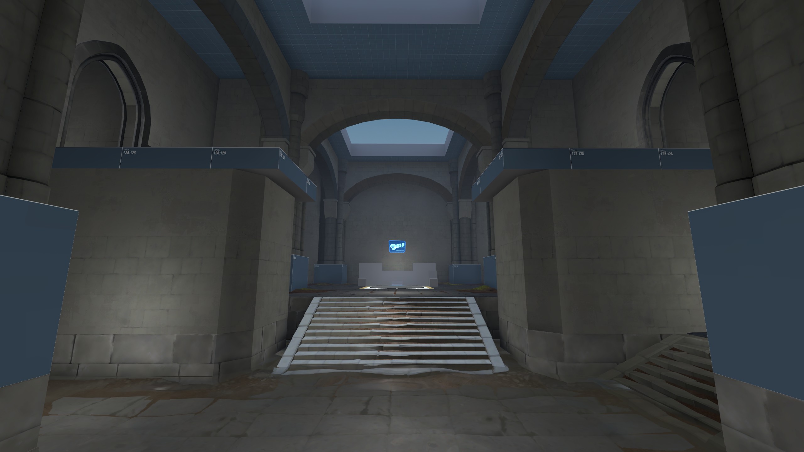
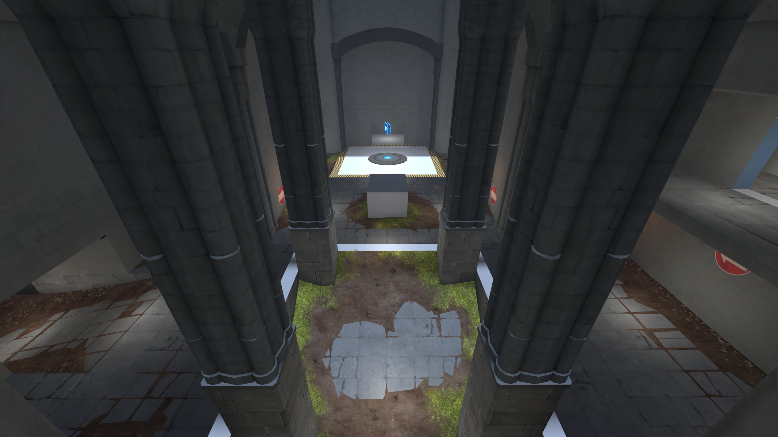
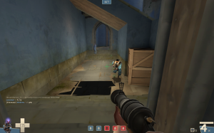
had a idea and wanted to try it out, the most essential; in a early stage to see if it would work to have players running on static mesh without having collision issues,

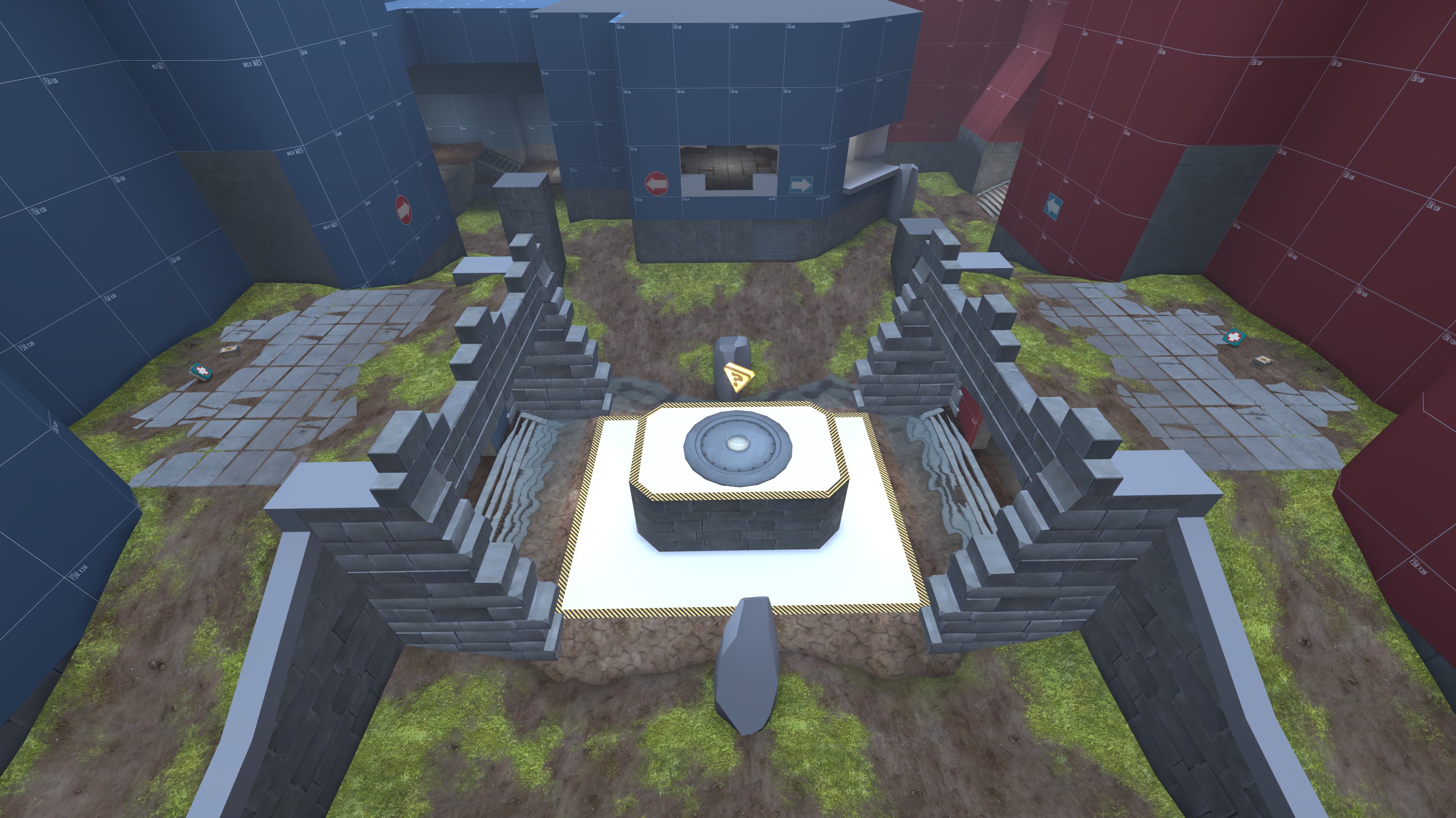
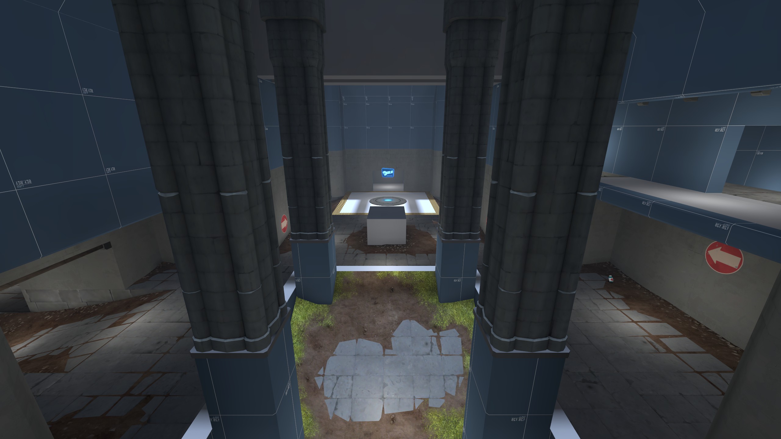
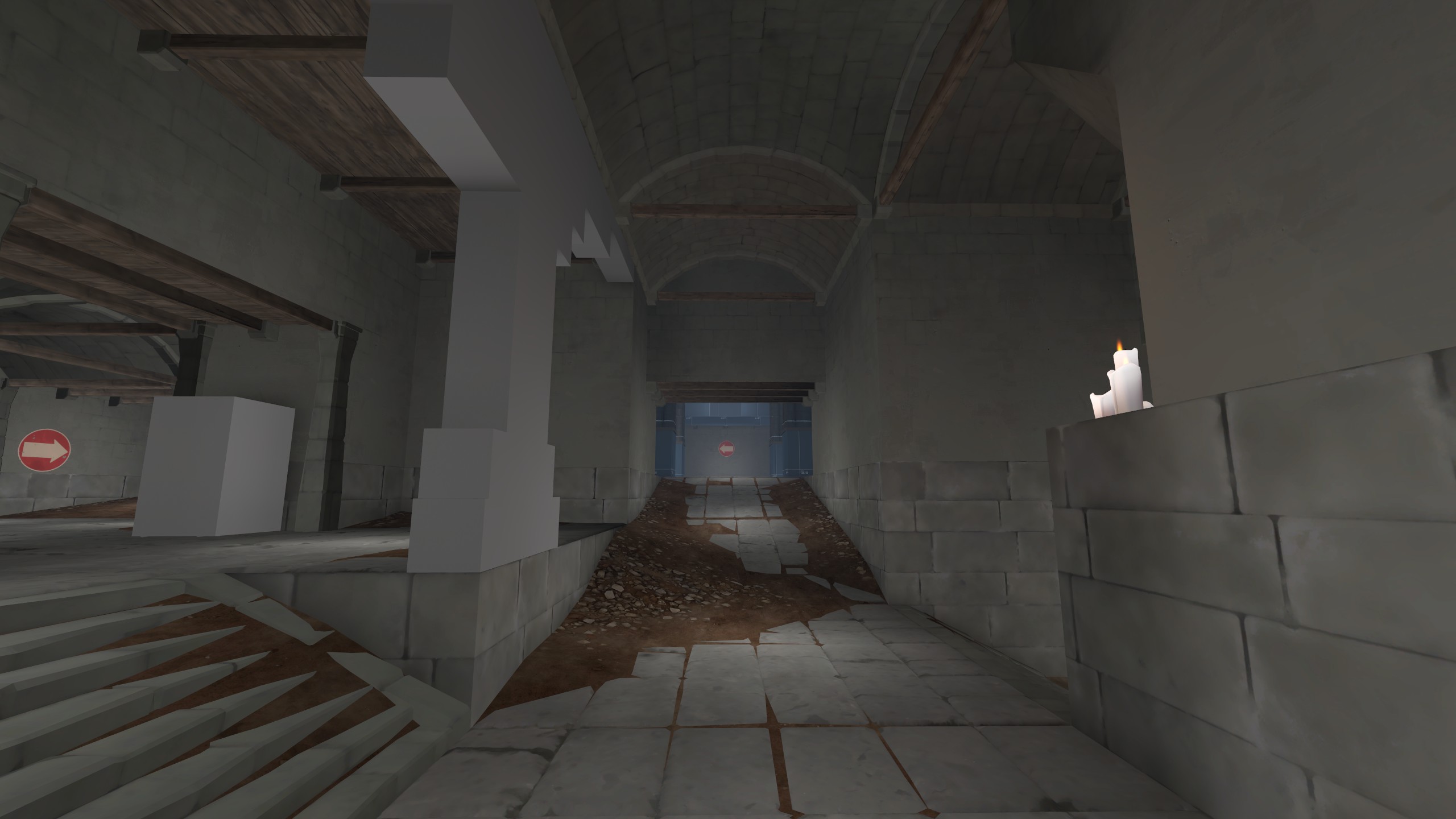
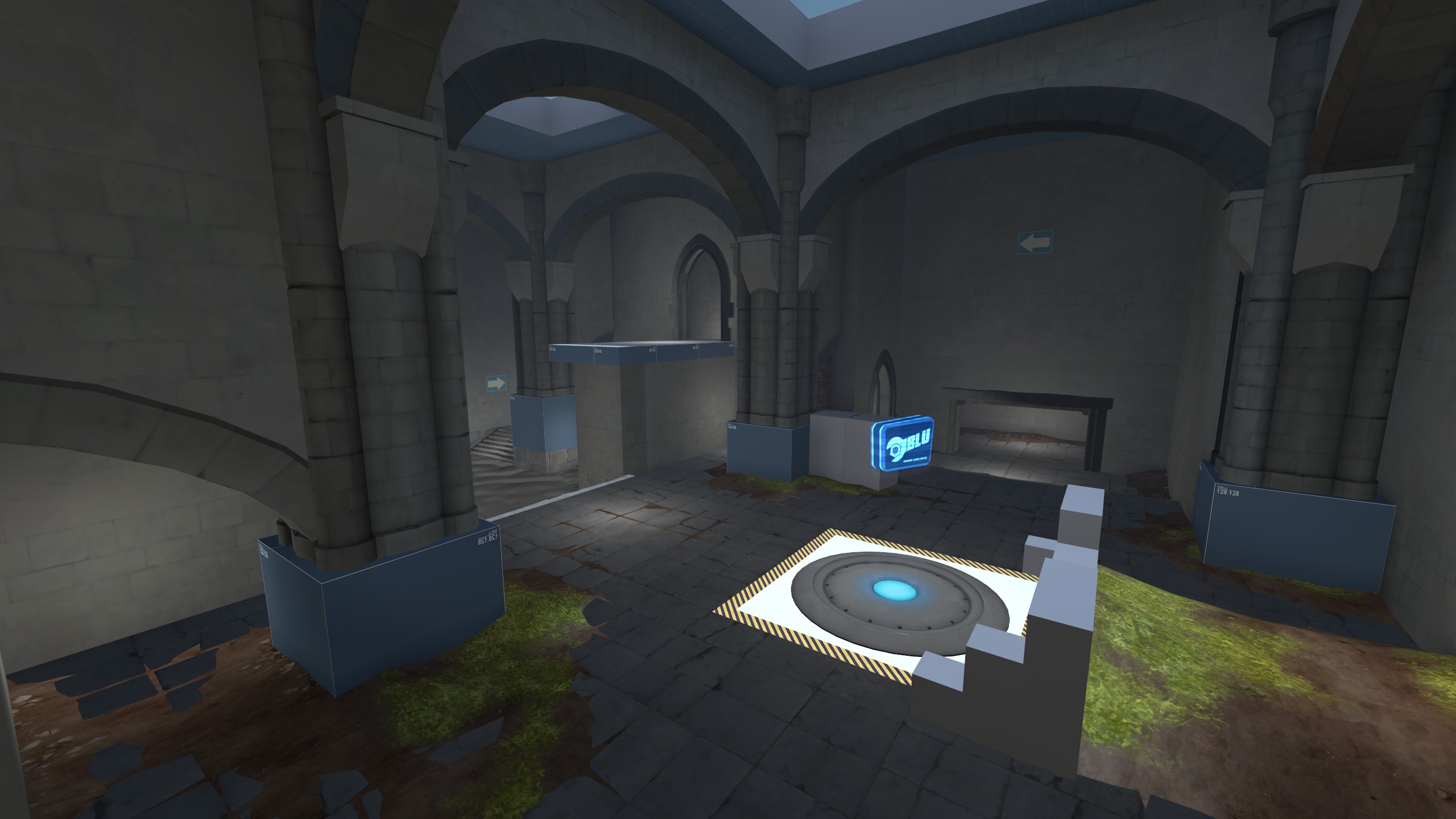
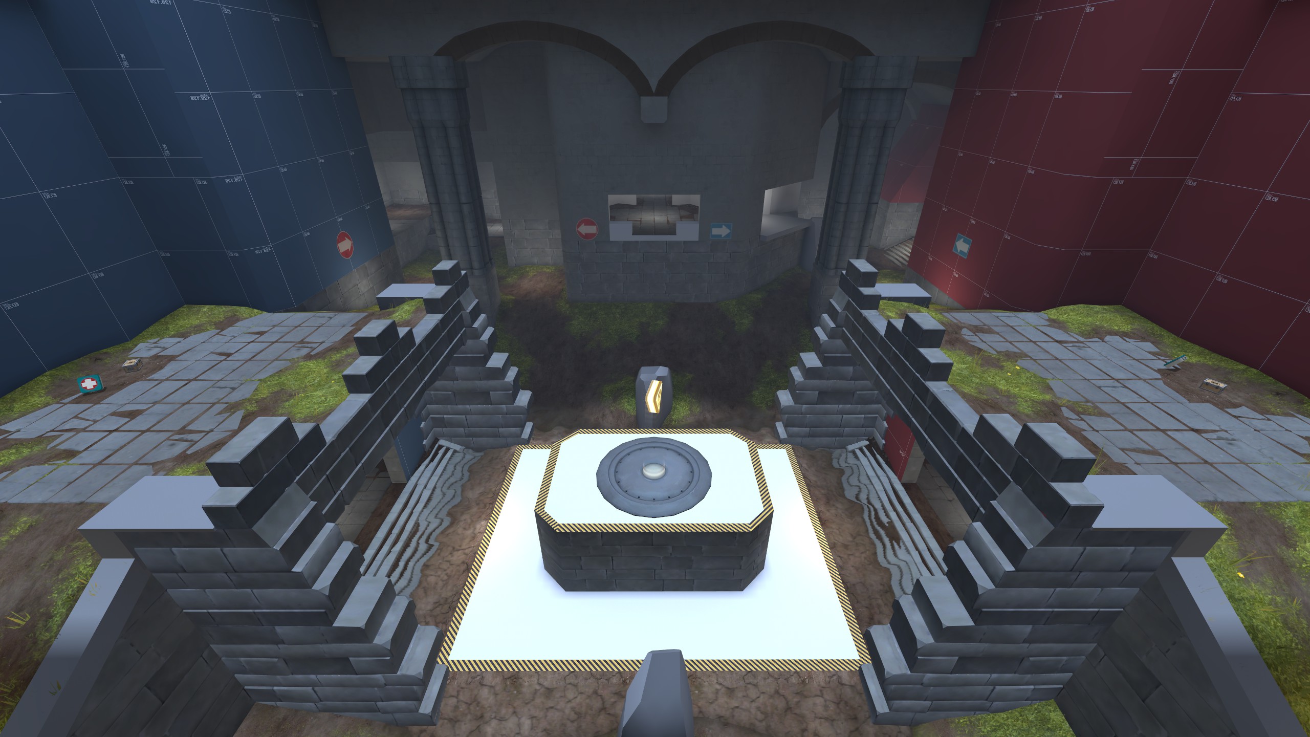
the subtle effect I'm after is having sand, dirt or snow gathering in the cracks between the stones and in corners, in addition to break up the tiling and get rid of sharp edges near "L"-shapes (i.e where wall meets floor),

the goal is to keep this effect subtle enough to not distracted players or to hinder gameplay, yet adding a level of detail that blends in naturally,

the only performance change I've seen is increased fps in some areas after replacing bsp with meshes, that was no surprise, but will continue to test hot spots as development continues, the big tile is 512 polys over 256x256 units with a 1024x1024 texture, it can be lodded down to ~40 polys which will save ~2-3k polys in some areas,

its a little bit more effort doing it like this, but thats what makes it fun
 

Tuaam

L6: Sharp Member
Jun 26, 2015
376
248
Well this looks like something to me so it should be called Something not Nothing.
 

Diva Dan

hello!
aa
Mar 20, 2016
1,025
1,953
Hold on. What's the editor called? Sounds kinda neat to have.


It's a weird source 2 editor thing IIRC that makes mesh based stuff much more practical instead of brushes, which is why nick has so many props. He said what he uses earlier in the WIP thread when he was working on dewm
 
Last edited:
Nov 13, 2015
138
512
beta 1 update,

- minor updates to layout last
- minor updates to layout mid
- minor updates to layout 2nd
- increased capture zone mid
- increased height of doors at last (noticed a lot of scouts gettin stuck)
- added textures to brushes (wip)
- added some props (wip)
- added experimental doors second/third forwards spawn (you will get pushed up, might be shit or just annoying...if so fb and it will be reverted back)

please gf of style, setting, feeling...I have no idea what I'm doing anymore D:
 
Last edited:
Nov 13, 2015
138
512
some b1 screens:

middle
0638324A51C84CB7E6397C0E9091E038E7CE96B2


second
9C0E28DA319DDE6B2EE57E8D682EB194B85A59C9


last
F2E15BF67AEFF7C495C121228279555ED4901E10


as of right now I have no idea where this map is heading, it does not represent anything of the art style I wanted when I started, and it feels like its pushing it own agenda wo me being apart of it...wtf, Z.z
 

Trianon

L1: Registered
Feb 25, 2015
15
14
Some bugs I found:
1) Bad shadow near blu spawn, right side.
2) You can jump outside the map at mid

Great map overall, I like your unique style.
 

Attachments

  • bug3.png
    bug3.png
    2 MB · Views: 145
  • bug333.png
    bug333.png
    1.6 MB · Views: 173

Moonrat

nothing left
aa
Jul 30, 2014
932
585
This map has a neat idea and looks pretty good. I really like mid but other than that, the whole map is SUPER cramped. Way, way too cramped.
I think the map is fine both height and width wise. Though a lot of paths are hidden behind walls so the main rooms look cramped in comparison.