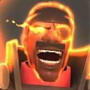
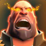
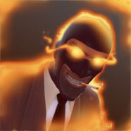
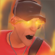
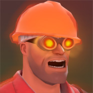
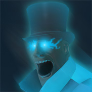
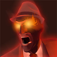
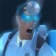
Glowing Hot Avatars

Fearlezz

L10: Glamorous Member
May 4, 2008
787
476
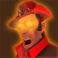
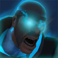
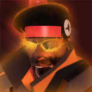
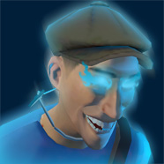
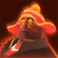
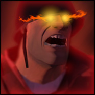
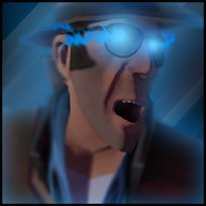
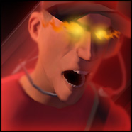
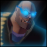
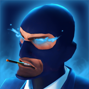
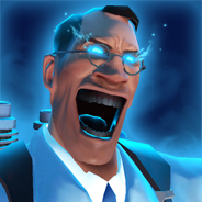
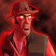
This is just a nice little project of mine, I fell in love with robins and finols avatar when I saw them. So why not make a avatar pack? Not sure if anyone else from valve has one of these but please post if there are any.

Official:
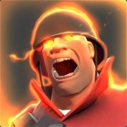
glowingsoldier.jpg
|
glowingdemo.jpg
|
081e3c57005dcf9d01290fd980c542fa754f94bc_full.jpg
|
maybeglowingheavy.jpg


My Custom:
glowingspy.jpg
|
glowingscoutv3avatar.jpg
|
glowingengineeravatar.jpg
|
glowingsoldierbluesmall.jpg
|
buringspysmall.jpg
|
firemedic_bluesmall.jpg
|
firesnipersmall.jpg
|
burningdemomansmall.jpg
|
burningdemo_redsmall.jpg
|
laughingscoutsmall.jpg
|
cryingheavysmall.jpg
|
soldier_small.jpg
|
sniper_small.jpg
|
scout_small.jpg
|
heavy_small.jpg


Different Styles:
attachment.php
|
673eb4ab63aec3323140370.png
|
spyglowblue_small.png
|
medicglowblue_small.png
|
95e400bluheavyragesteam.png
|
3a01872e03492262885e5871cdc693666730ecab_full.jpg


I will keep adding as I finish new ones. Any requests?
Also please come with improvements if there are any :)
 
Last edited:

Phobos

L3: Member
Feb 22, 2009
130
50
is that the Overhealer,looks like the medigun to me.
Placeholder material for the ongoing beta. For example the spy supposedly has a crowbar to represent his new suits.

I would love to see an overheal effect like shown on the avatars. They look great.
 

Fraz

Blu Hatte, Greyscale Backdrop.
aa
Dec 28, 2008
944
1,152
The microphone on the scout looks awkward, and around the hat. maybe make it a little thinner/closer to the edge of actual images.
 

Smetzle

L3: Member
May 20, 2009
112
51
I've had an attempt at these, and here are the results:

Red:
Engineer_glowing1.png


Engineer_glowing.png


Blu:
Engineer_glowing_blu1.png


Engineer_glowing_blu.png


I couldn't decide which kind of flame around the eyes I liked better, so I just uploaded them both :p
 

YM

LVL100 YM
aa
Dec 5, 2007
7,158
6,079
Why did you blurr the scout SO much? I'd say both your scout and spy look like they're in really painfull positions to hold, they don't really look angry like valve's do either (the scout is in pain... it looks like someone is... well.. I'll just say he's bending over and someone is behind him)

Smetzle yours don't really capture the style valve's hve either, your glow is largely on the outside of the character(excepting the eyes, where there is too much glow) I think you need to have the glow seeping into the inside of the outline and definitely do something about those solid, aliased edges!! Try to make your 'flame' more flame like and less blotchy, it really looks like the highlights on some shrinkwrap instead of a flaming character! You should also try using some of the cooling filters for the blue ones, I found they worked quite well since they removed the strongly contrasting colours like the yellow of the hardhat, which only fits in the red version.

/end ultra critique mode