I ran around in your map for a bit, so here's some scattered feedback.
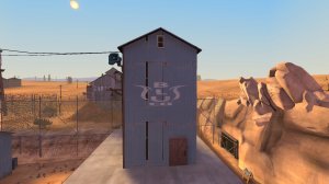
This logo is really stretched. (BLU Spawn)
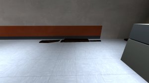
This model from the cliff below is poking through the floor above. It's only barely visible from the playable area, but it should still be fixed. (RED Spawn, possibly BLU spawn too)
More of a suggestion than feedback, but you should definitely re-add
the scrapped path through this room. It would probably work better in CTF anyway, seeing as Turbine also has a drop-down in the flag room. (Both sides, near the flag house)
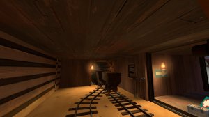
You should probably remove some of the health packs in this area, or at least put them all down a size. Having this many large health packs so close together is going to make fights here last forever, or at least be really frustrating. (Mid)
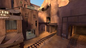
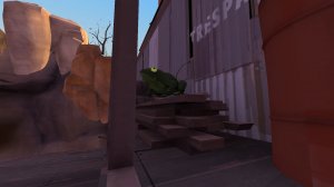
This hidden frog is floating. (Outside of RED spawn)
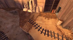
The alpha on these displacements are not lined up at all. Can you make it look more natural? (Mid)
Finally, and I don't have a screenshot for this one, the respawn visualizers aren't scaled and centered properly at BLU spawn. The same might be true at RED spawn, but I didn't check.