cp_basetop

CP cp_basetop a10b

League_Heavy

L1: Registered
Jan 5, 2018
37
6
cp_basetop - 2 bases in a mountain.

cp_basetop. A 5cp map that takes place on top of a mountain with 2 bases in it. It took 1 and a half month to create. This is my first map.
 
Last edited:

League_Heavy

L1: Registered
Jan 5, 2018
37
6
UPDATE LOG 2:

- Removed big front doors leading to first control points (both bases)
- Added walls from sniper posts that can jump into their first control points (both bases)
- Changed skybox
- Removed small pickups that were in middle of bases (both bases)
- Moved pickups that were in long hallways to be next to each other (both bases)
- Removed dumb lamp posts that were outside (both bases)
- Added lighting to new sniper posts (both bases)
TRYING TO FIX 1:

- Red's sniper post won't transmit lighting into the post (red base)

Read the rest of this update entry...
 

League_Heavy

L1: Registered
Jan 5, 2018
37
6
UPDATE LOG 3:

I'm beginning to add props to make the bases look like mining facultys, so far there is only props in the entrances, but more will be added soon. (The prop locations are being looked on so they may be moved.)

- Changed light_env sun direction so light can be in equal directions.

Read the rest of this update entry...
 

League_Heavy

L1: Registered
Jan 5, 2018
37
6
UPDATE LOG 4:

- Added mine related props (map is going to be mining facility's.)
- Changed env_lighting
(Ok so the lighting is up my ass right now because of the direction of the shadows, if one base has it, they may have a advantage over a player because they will not be seen better, so i'm hoping this is good.)

Read the rest of this update entry...
 

HQDefault

...what
aa
Aug 6, 2014
1,056
536
*FEEDBACK INTENSIFIES*
Okay, I did a run-around and played on the map with some bots for a bit.

First impressions:
Well, first of all, this happened. Remember to pack your textures (I saw an error model somewhere, too)

More importantly:
SIGHTLINES
SIGHTLINES
SIGHTLINES
SIGHTLINES
Cut down your sightlines!

When you stretch your sightlines out too much, it tends to make snipers woefully overpowered, and just generally makes the map's flow fairly poor. Also, this really screws over engineers, because it makes it next to impossible to build anything, and since the sentry gun's firing radius is only 1100 hammer units, that means anyone can quite easily shoot at the poor defenseless sentry.

I think your sightline issue stems from two major things:
One- the layout is a rectangle, let's be real here. Now, every new mapper does something like this early on, but trust me, your map will be much better if you think of a more interesting layout. (When I was still learning, what I did was I forced myself to make sure as few of my rooms were basic boxes as possible. That's not the best way to do it, but it's a start) Even putting in something as simple as a 90 degree turn after 2nd would help a lot.
Two- Overscaling. You could honestly get away with shrinking the width of this map by 75% and the height by as much as 50%, and it would probably feel a lot better (after you adjust some doorways, obviously). But yeah, overscaling really messes with sightlines bad. Put in a few prop_statics of player models so you get a feel for how big a merc will be while walking around the place.

Moving onto more specific things...
No forward spawns. Why. Whyyyyy. This is honestly the worst thing you could do for the balance of a 5cp map, it makes it so hard to push anywhere past mid. Especially with the aforementioned overscaling.

Mid is a cesspit of spam, snipers, and misery. Put in some proper flanks (you kind of have some, but they honestly do absolutely nothing), more height variation, and most importantly a bit of cover on the point so it's possible to cap without getting headshot immediately. This combined with the lack of forward spawns makes this map incredibly stalemate-y.

Second is... slightly better. There's still no cover on the point, but there at least feels like some
semblance of height variation (even if it is just two levels). It's just way too easy to defend. Here's what I would do: Take that pile of dirt you have up against the wall, turn that around, and attach a platform to the back of it, and put the point on that. Add a bit of cover, and whammo, you have a somewhat sensible 2nd point (though it still might be too easy to defend).

I didn't get a chance to play on last, nobody got there. But it looks like a carbon copy of 2nd, just closer to spawn, I can't imagine it would be much fun to play on. Just put something... interesting there. Anything. It's alpha, you can do whatever you want, so put in something weird and inventive as a wild card, and you'll have a good jumping off point.


Oh, and I nearly forgot: Put the actual version of your map in the filename, it makes it easier for people to download updates, and it's also better for archival purposes. It's just generally more helpful.

Anywho, hopefully my giant wall of text helps you out. I'm interested in seeing how you improve the map.
 

League_Heavy

L1: Registered
Jan 5, 2018
37
6
*FEEDBACK INTENSIFIES*
Okay, I did a run-around and played on the map with some bots for a bit.

First impressions:
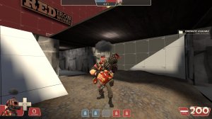
Well, first of all, this happened. Remember to pack your textures (I saw an error model somewhere, too)

More importantly:
SIGHTLINES
SIGHTLINES
SIGHTLINES
SIGHTLINES
Cut down your sightlines!

When you stretch your sightlines out too much, it tends to make snipers woefully overpowered, and just generally makes the map's flow fairly poor. Also, this really screws over engineers, because it makes it next to impossible to build anything, and since the sentry gun's firing radius is only 1100 hammer units, that means anyone can quite easily shoot at the poor defenseless sentry.

I think your sightline issue stems from two major things:
One- the layout is a rectangle, let's be real here. Now, every new mapper does something like this early on, but trust me, your map will be much better if you think of a more interesting layout. (When I was still learning, what I did was I forced myself to make sure as few of my rooms were basic boxes as possible. That's not the best way to do it, but it's a start) Even putting in something as simple as a 90 degree turn after 2nd would help a lot.
Two- Overscaling. You could honestly get away with shrinking the width of this map by 75% and the height by as much as 50%, and it would probably feel a lot better (after you adjust some doorways, obviously). But yeah, overscaling really messes with sightlines bad. Put in a few prop_statics of player models so you get a feel for how big a merc will be while walking around the place.

Moving onto more specific things...
No forward spawns. Why. Whyyyyy. This is honestly the worst thing you could do for the balance of a 5cp map, it makes it so hard to push anywhere past mid. Especially with the aforementioned overscaling.

Mid is a cesspit of spam, snipers, and misery. Put in some proper flanks (you kind of have some, but they honestly do absolutely nothing), more height variation, and most importantly a bit of cover on the point so it's possible to cap without getting headshot immediately. This combined with the lack of forward spawns makes this map incredibly stalemate-y.

Second is... slightly better. There's still no cover on the point, but there at least feels like some
semblance of height variation (even if it is just two levels). It's just way too easy to defend. Here's what I would do: Take that pile of dirt you have up against the wall, turn that around, and attach a platform to the back of it, and put the point on that. Add a bit of cover, and whammo, you have a somewhat sensible 2nd point (though it still might be too easy to defend).

I didn't get a chance to play on last, nobody got there. But it looks like a carbon copy of 2nd, just closer to spawn, I can't imagine it would be much fun to play on. Just put something... interesting there. Anything. It's alpha, you can do whatever you want, so put in something weird and inventive as a wild card, and you'll have a good jumping off point.


Oh, and I nearly forgot: Put the actual version of your map in the filename, it makes it easier for people to download updates, and it's also better for archival purposes. It's just generally more helpful.

Anywho, hopefully my giant wall of text helps you out. I'm interested in seeing how you improve the map.

FINALLY! criticism, and some pretty good info as well. might do some of these changes when its not much of school work for me alot. other than that thanks!
 

HQDefault

...what
aa
Aug 6, 2014
1,056
536
FINALLY! criticism, and some pretty good info as well. might do some of these changes when its not much of school work for me alot. other than that thanks!
Don't forget you can hop onto the discord server and upload your map if you want to get it actually playtested.
 

League_Heavy

L1: Registered
Jan 5, 2018
37
6
UPDATE LOG 5:

After some thinking and help, this is my test version of alpha 3

- There are NOW forward spawns ( i need help on how to link and activate rooms/spawns when mid is capped. so they are where they are located for now.)
- changed the first base cap point. (screenshots soon.)
- added 2 different bridges so attackers can have more than one way to get to the enemy base.
-there are walls at the forward spawns so defenders of mid don't get easy passes with resupply.
-added wood walls so attackers that spawn at mid son't get sniped by snipers (mostly.)

TRYING TO FIX 2:

- trying to make forward spawns linked to mid.
- thinking for second cap look idea.
- walls for first cap.
- packing textures

Read the rest of this update entry...
 

League_Heavy

L1: Registered
Jan 5, 2018
37
6
UPDATE LOG 6:

- This update mainly focuses on the forward spawn linking, they are only at mid, but they finally work. (I'm just excited because it took weeks to find out how to do 5cp forward spawns!) Any glitches in them? say them in the discussions.

- Added tall wall at final points (both bases)

Read the rest of this update entry...
 

League_Heavy

L1: Registered
Jan 5, 2018
37
6
UPDATE LOG 8:

- Both red and blu have 90 degree angle turns after the first point of their bases is captured! The angles took half as long as how long it took for me to make the forward spawns! The new angles are in a big testing phase!

- added props to tell control points (and in forward spawns.)

Read the rest of this update entry...
 

League_Heavy

L1: Registered
Jan 5, 2018
37
6
UPDATE LOG 9:
Snow in PA almost made me lose power twice, but that doesn't mean the map is late.

- Added hurt_triggers to forward spawns so a team that lost the point won't be stuck in spawn rooms (or kill the other team in them.)
- moved first cp in both bases a little back (almost where the 2 windows are.) also added props to cover point.
- Starting to add textures (thankfully they should be packed)
- Adding nodraw and func_detail to certain blocks.

Read the rest of this update entry...
 

League_Heavy

L1: Registered
Jan 5, 2018
37
6

Attachments

  • 20180330111709_1.jpg
    20180330111709_1.jpg
    313 KB · Views: 185

HQDefault

...what
aa
Aug 6, 2014
1,056
536
Hey, have you gotten this map tested on the TF2maps server yet? I checked the feedback it looks like you haven't done that.

If you aren't aware, you need to go on the TF2maps discord, go to the bot section, then type !add <map> <download link>

Testing your map is far and away the most important part of making a map... besides... well... making it.