cp_apollo

CP cp_apollo A6

cupcaaakes

L1: Registered
May 25, 2020
19
6
cp_apollo - My very first map.

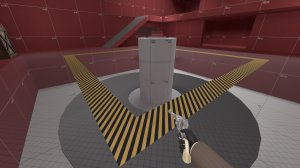
cp_apollo is a (currently) moonbase-themed Attack/Defend map which I made to get back into making creative things with my PC.
I'm very sorry for everyone that is going to play this, this is my very first map and I haven't worked with 3D software in quite a while.
Critical feedback wanted, don't hugbox me but also don't be rude, I'm aware that the map sucks.
 

Twist.vmf

L420: High Member
Jul 29, 2016
439
208
screenshots and a thumbnail would be nice.
gives people a chance to see what kind of map they are getting first.
 

cupcaaakes

L1: Registered
May 25, 2020
19
6
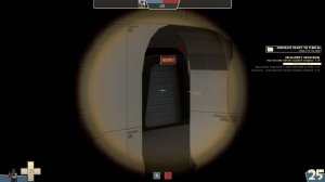
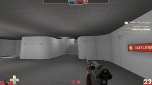
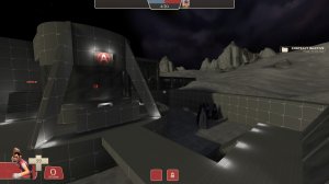
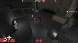
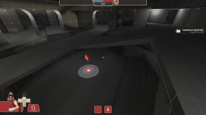
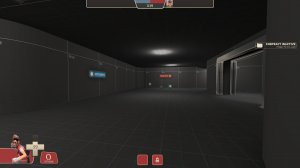
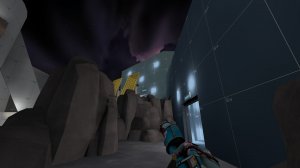
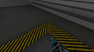
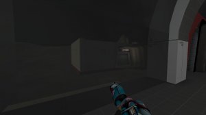
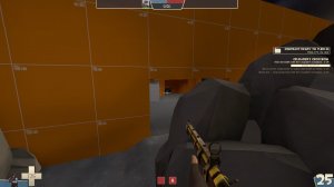
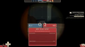
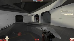
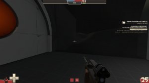
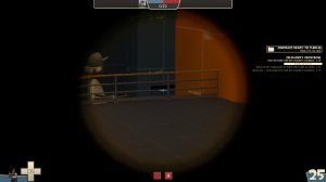
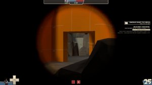
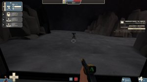
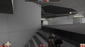
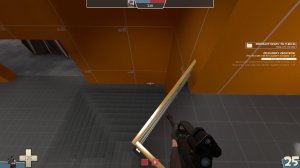
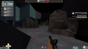
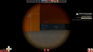
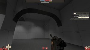
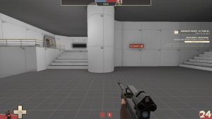
Here are some screenshots of the map. I just added a little bit of quick lighting so people can see what is going on, I will add fitting lighting once the map layout is properly balanced.
 

Attachments

  • 20200525203831_1.jpg
    20200525203831_1.jpg
    220.3 KB · Views: 159
  • 20200525203849_1.jpg
    20200525203849_1.jpg
    199.8 KB · Views: 162
  • 20200525203858_1.jpg
    20200525203858_1.jpg
    202.4 KB · Views: 158
  • 20200525203916_1.jpg
    20200525203916_1.jpg
    151 KB · Views: 155

cupcaaakes

L1: Registered
May 25, 2020
19
6
-Completely reworked Control Point A. Hopefully it is easier for BLU to cap now.
-Completely reworked BLU Spawn.
-Figured out how to use overlays. They actually show up now and are much easier done than how I thought I had to do them before.
-Fixed loads of visibility bugs.
-Edited some of the stairs to be 32x16hu in size rather than 16x16hu.
-Fixed setup doors.

Read the rest of this update entry...
 

cupcaaakes

L1: Registered
May 25, 2020
19
6
-Completely reworked the indoor area, new glass parts and arches. Hopefully it will impact performance positively.
-Replaced 99% of gray dev textures with white ones for better visibility.
-Added an experimental sentry spot for the first point.
-Made the catwalk around last transparent.
-Remade the round parts on first.
-Added hazard stripes around all the control points and made all capture areas larger.
-Added a new room after the first point for easier access to the upper area.

Read the rest of this update entry...
 

SirkyDevoir

L1: Registered
Nov 19, 2017
37
7
This map certainly has that "the mapper has passion for this project" kinda feel. The brushwork is very nice, and not something you'd expect from a first map. I do have some minor things to say though, just cosmetically because imps will always be better for gameplay feedback.

- It seems like you spammed regular "light" entities all around to try and brighten the map. While I do enjoy the moody grey feel of this map, the random light spots everywhere are quite distracting:
20200530101812_1.jpg
I just recently figured this out myself, but you should move over to "light_spot" entities instead of just "light" entities. light_spot gives you a lot more freedom with how the light moves, which reduces the need for so many lights. Just play around with them until you kinda figure out how they work.

- The hazard stripes on the control points seem to be brushes. This is not a big problem, but making them decals would make them look a lot nicer, I think, and they'll seamlessly fit. I'm including a screenshot of my own map as a comparison. This might just be a preference thing though.
20200530101748_1.jpg
Compared to:
20200530102814_1.jpg

- Finally, there's this part at red spawn that seems very exploitable for sticky traps, as you can just see through their wall with the glass.
20200530101910_1.jpg

Overall, it's looking like an interesting map though, certainly for a first map. As said earlier, I'm really liking that moody, abandoned space station kinda feel.
 

cupcaaakes

L1: Registered
May 25, 2020
19
6
-Completely reworked lighting on the map. While it's still far from perfect (and looks somewhat fullbright on some parts), it doesn't look like paint splooges anymore.
-Reworked Control Point B. Catwalk no longer goes up. Right-hand side from attacking view is now on ground level. RED respawns are now both on the same side.
-Added large Hydro arrows that point the player into the direction they should go.
-Sealed off some rarely-used flank routes to test what would improve gameplay flow.
-Removed the wooden control point signs and replaced them with decals that are more in-theme.

Read the rest of this update entry...
 

cupcaaakes

L1: Registered
May 25, 2020
19
6
University's been kicking my ass, but I got myself some help.
My friend @lucky has been an IMMENSE help with completely revamping the area before the first portal.
No guarantee that I'll be able to push more updates in the near future, but the map's not abandoned and I will continue working on it whenever I got some time!

Biggest Changes:

  • COMPLETELY revamped area before the first point. Now featuring a bigger outside portion, a building between the point and the spawn, a death pit, a brand-new BLU spawn and more!
  • Added some areaportals!
  • Removed some old, inaccessible flank routes!
  • Changed the skybox a little!
  • General optimizations!

Read the rest of this update entry...
 

Punn Ames Ardum

L1: Registered
Jan 16, 2021
46
26
Oh, this look cool I've downloaded it right now; tomorrow I'll play it with a friend of mine so hopefully you'll be able to get some detailed feedback other than me just shooting bots.
(it'll probably be me market gardened from a point but oh well)
 

cupcaaakes

L1: Registered
May 25, 2020
19
6
  • Reworked the first point a little to possibly give RED a little more of an edge.
  • More lights!
  • New flooded vent-ish flank route to last.
  • A new glass bridge.
  • Reworked some health & ammo pickups
  • Blocked off the window from the right-hand side on last from RED's site to prevent RED from easily accessing that area
  • Reworked the little cubby to make two entrance points and added a little window
Hopefully this plays better!

Read the rest of this update entry...
 

Punn Ames Ardum

L1: Registered
Jan 16, 2021
46
26
I haven't played with my friend yet; however there seems to be two main problems, you really need to include info_observer_points (you can see a tutorial by clicking this) so dying won't equal crashing the game in some instances (and to get rid of menu being weird when you first boot up the map), and adding the nav_mesh to the download (if you don't know about them click this), I actually would love to help you on it if you haven't made one for it yet because I like working on them.

Here is some stuff I noticed with sightlines while walking around and suggestions I have:
The red team seems to be easy to camp with just two snipers shown in these two pictures,
redteamcamp1.jpgredteamcamp2.jpg
This seems like it could really be a problem; partially due to not being able to pick which spawn you come out of if you are on red and how if you where to try to counter-snipe them you would have to remember what angle they are firing at (and hope that they didn't slightly move) -- I have an idea though that you might like, and that is adding a vent path from the two spawns, connecting them but also adding in another exit that shouldn't be so easy to camp:
ventideadropoff.jpg It could have a vent drop down from the ceiling near here, letting you flank at least one of the possible camping snipers; possibly also adding some water to the floor here so health isn't lost dropping down?
ventidea.jpg and you would be able to see some vents peak out from here, if you decide to add a route​


Now for some of the sniping spots that you may not like at the blue spawn:
AnyConv.com__cp_apollo_a60000.jpgproblematic_orange_sightline.jpg
blueteamcamp.jpgblueteamcamp2.jpg
The top two I would say are problematic sightlines for the blue team; I would recommend adding some sort of doors here (which was probably going to be added anyway) so the sightline at least isn't always so open like it is now (the first picture actually goes all the way into the blue spawn exit). The last two picture may be wanted but it seems like they may also be a bit farther back than you would of hoped them to be -
- and a word about the deathpit and sentry camping near it, in my opinion the death pit should actually be extended over to the leftmost entrance from the blue spawn, and make it to where it is behind this sentry, shown below:
sentrycampspot.jpg
which I think the death pit should be behind the sentry, due to it being the furthest away you would place it if you wanted to camp the people coming out of blue spawn. Also, if you extend the death pit to behind the sentry placement, blu pyros can airblast enemies (that for some reason want to camp this flank route).
crouchingtohealsentry.jpg also if you crouch right here (I wasn't due to trying to take a screenshot) you can rescue ranger your sentry without seemingly able to be headshot.


Now there are two sightlines from/to the first cap that could catch players off guard (and not in a good way);
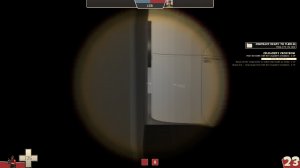
sightline_from_firstcap.jpg(from 1st cap) sightline_to_firstcap.jpg(to 1st cap)
I would recommend adding a crate here so it could be fixed perhapsaddcratehere.jpg

I really don't want you to take this as me being ungrateful for an awesome first map; because it really is an awesome first map (or map in general)! I'm still working on mine and I'm trying to act how I would want other people to critic mine, so hopefully your okay with my feedback for this great map.​
 

Attachments

  • redteamcamp1.jpg
    redteamcamp1.jpg
    125.3 KB · Views: 106
  • redteamcamp2.jpg
    redteamcamp2.jpg
    80.9 KB · Views: 108
  • ventidea.jpg
    ventidea.jpg
    81.3 KB · Views: 140
  • ventideadropoff.jpg
    ventideadropoff.jpg
    91.5 KB · Views: 126
  • blueteamcamp2.jpg
    blueteamcamp2.jpg
    79.1 KB · Views: 105
  • blueteamcamp.jpg
    blueteamcamp.jpg
    93.2 KB · Views: 128
  • okaysightline.jpg
    okaysightline.jpg
    79.4 KB · Views: 130
  • sentrycampspot.jpg
    sentrycampspot.jpg
    128.1 KB · Views: 105
  • problematic_orange_sightline.jpg
    problematic_orange_sightline.jpg
    115.9 KB · Views: 122
  • slightlineofflank.jpg
    slightlineofflank.jpg
    105.6 KB · Views: 93
  • peculiar_corner.jpg
    peculiar_corner.jpg
    131 KB · Views: 103
  • crouchingtohealsentry.jpg
    crouchingtohealsentry.jpg
    126.1 KB · Views: 139
  • AnyConv.com__cp_apollo_a60000.jpg
    AnyConv.com__cp_apollo_a60000.jpg
    75.8 KB · Views: 93
  • sightline_from_firstcap.jpg
    sightline_from_firstcap.jpg
    68.3 KB · Views: 137

Punn Ames Ardum

L1: Registered
Jan 16, 2021
46
26
Also the lighting look really good now, so good on that
(though you may want to make swimming in the water more transparent now that I think about it, it's pretty murky for a space base)
 

Punn Ames Ardum

L1: Registered
Jan 16, 2021
46
26
Hey! I remembered this cool map and hope your university activities are going well! If you are still working on this and want some signs for it I found this pack right here that you may like for it, hope it's all going well!