Feedback time:
Firstly, I love the pun in the name
Secondly, your custom bread monster sounds aren't packed correctly as they come up as missing in the console
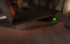
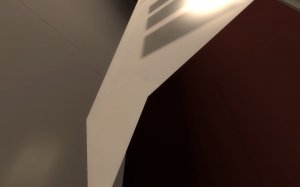
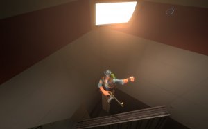
now for screenshots


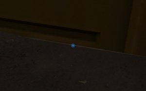
-lil seam by some of these barriers

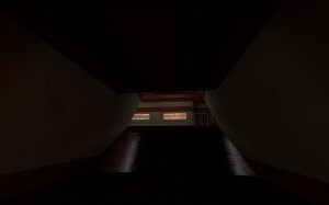
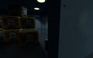
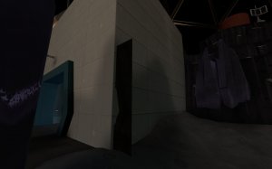
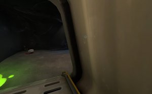
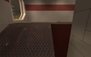
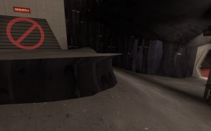
-dark hallway in red final spawn

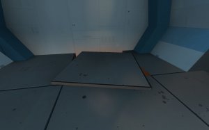
-clip this smooth in blu first spawn

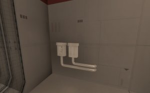
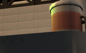
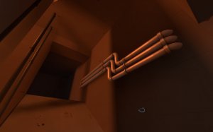
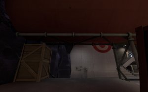
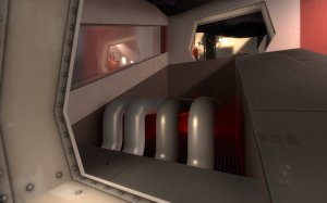
-incorrect reflections here, the pipes could also use some more angles to appear rounder

-clip these things smooth. They stick out too much to just remove collision but can cause me to bump into them

-I can get here? Just...floating in the corner

-also the corner textures are all messed up


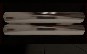
-these things not only appear and disappear based on how you look at them, they also don't look very...TF2y. Looks like something from Ratchet and Clank

-clip it smooth

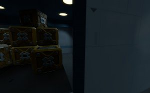
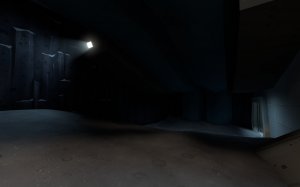
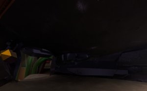
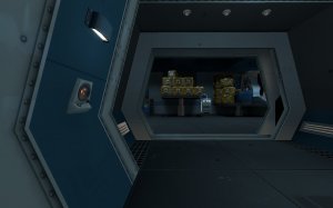
-dark

-prop clipping out of wall

-clip it smooth

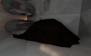
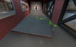
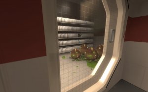
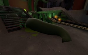
-what is this pile? It looks like....manure? Why is there manure here in this stainless steel room?


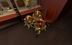
-the bread monster pumpkin bombs just disappear when they explode, no effects or anything.

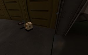
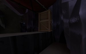
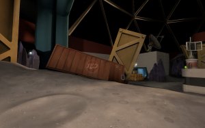
-floating crate sticking into the wall

-clip it smooth. May just want to make it a square to make things easy on yourself

-very low ceiling here

-reset these pipes into the wall so they don't block player movment

-clip

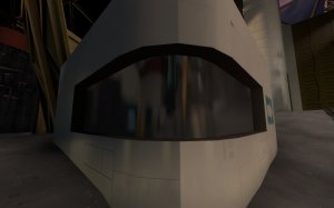
-should probably put one cubemap at the corner and asign it to all the brush faces for the reflective window here. Also maybe up the scale for some nicer reflections if the map can handle the extra file size

-clip the props

-low ceiling again

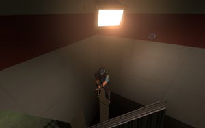
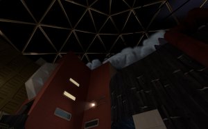
-This smoke is a bit much. I get it's sorta coming from the rocket up there but that's difficult to tell from anywhere ground level

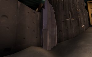
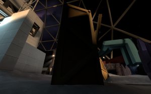
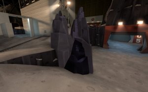
-clip the rock smooth

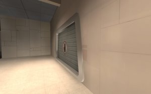
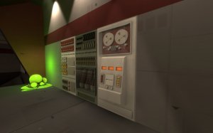
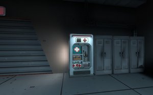
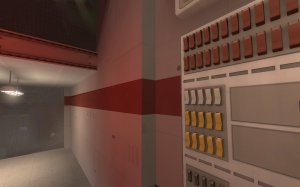
-I think these resupply cabinets are from koth_dewm's assets and, while they are nice, that stuff never really fit TF2 to me. They stand out a lot next to the games stock props.

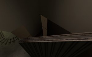
-these railings just stop and start without any explanation. There's nothing even under them on the right side to hold them up

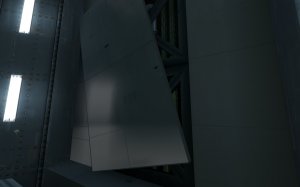
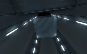
-while the out of control elevator is neat, it just kinda disappears and reappears out of nowhere. Elongate the shaft so light naturally darkens farther away and hides the trick.

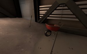
-wheelbarrow in space? Something about it just feels out of place to me.

-clip it smooth

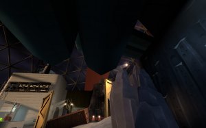
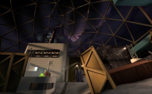
-something weird going on with the skybox here by blu's first spawn

-if it bleeds, you can kill it

-The bread monster doesn't have a collision mesh, so ragdolls just go through it

-say it with me, clip it smooth

-this displacement looks very weird

-hey look, a pixel sightline right to blu's spawn points.

-also works the other way but not as useful

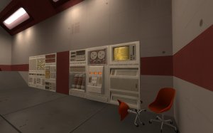
-really dark panel compared to the surrounding environment

.

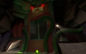
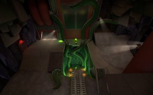
-the tentacles at last are neat. The map could use more stuff like this
.

-most of the interesting things in the map, being the bread monsters, are sparse and hidden away. TF2's space assets are rather bland so more of this stuff around could help spice it up a little

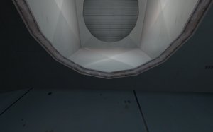
-clip the pipes smooth on the sides and top

-I feel like maybe the stars/clouds/stuff in the skybox should just slightly rotate to help the map feel a bit more alive. Not by much, mind you, but just a tad as time goes on

-Clip this wall lip smooth

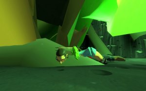
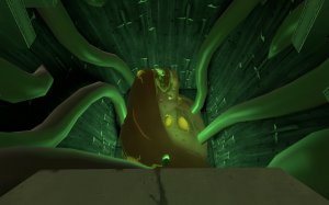
-Going to be honest here, the monster already looks dead. It's got a basic breathing animation which is nice but it's just kinda flopped down there looking like a sad dog in a kennel


-navigating around this tendril is kind of annoying since you can only walk onto it from the front

-use an info_lighting on the dark rock here

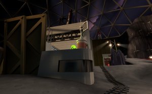
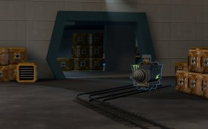
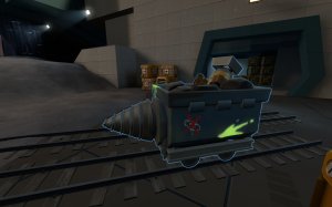
-The drill cart is neat.

-this shipping container feels out of place in space. I mean, this map is in space, can't we get a tad bit more interesting than your bog standard and dull shipping container that's used all over the place in other maps?


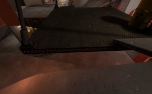
-these little gaps between the ground and platform are just large enough to fall into, but small enough to think you'll walk over it. Maybe close them up some more so players can't fall through?
That's it for now. Looking forward to seeing how this map develops when the next version is bready.


