Bloodshed

KotH Bloodshed A3

DrLambda

L69: Teeheehee, Member
aa
Feb 18, 2015
458
475
Bloodshed - This is war

Bloodshed is my entry into the 72 hour contest. I wouldn't go as far as to call it the spiritual successor to Akuchi, because Akuchi isn't dead and the layout is quite different, but i took a lot of lessons from failed experiments with Akuchi and hope to fix them here.

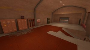
Right now, Bloodshed is a bit overdetailed for an A1, especially the spawns, but i want to get the map as close to RC1 as somehow possible in those 72 hours, so i started early. Some parts are still butt-ugly, so it evens out.

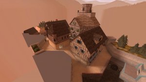
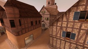
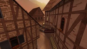
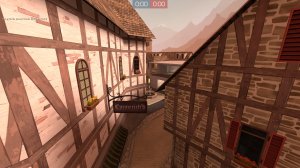
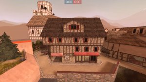
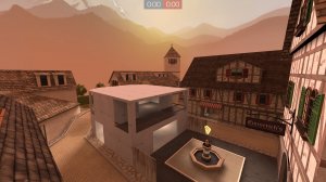
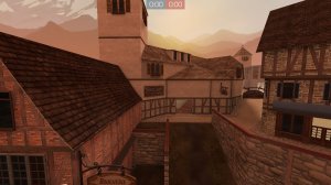
Bloodshed makes use of the Frontline pack and is supposed to take place in an west-european style mountain village.

It's pretty gimmick-less, because my first goal is to finally be able to finish a map within the 72hour timeframe, which is something i haven't done since GoldSrc stopped to be the engine of choice.

Please take note that the flat low roofs are probably not going to stay for later versions. I know that they might impact gameplay in a minimal way, especially in a map that takes the word "hill" from king of the hill literally, but i don't think it'll be much of a problem.

Hope you enjoy it, see you in an imp soon.

PS: I already redid the OOB area of the spawns because i didn't like it one bit. Hope i'll be able to push A2 within the 72 hours.
 
Last edited:

DrLambda

L69: Teeheehee, Member
aa
Feb 18, 2015
458
475
I wanted my first Jam map to look pretty. So i made it pretty.

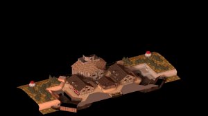
No real gameplay changes except for the capture zone, which is now quite a bit larger, almost Overwatch-big if you want to say so.

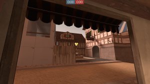
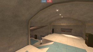
I gave most of the buildings an early artpass. I had no time for most OOB areas, so it's a bit lacking there, and i'm still unhappy with the outside of the spawn bunkers.

I also wasn't really able to implement cubemaps, HDR lighting, and at least one of the buildings still looks like ass, but that is gonna change in the near future... when i got some sleep.

So, A2 is my final version for the jam. I had a great time, learned a whole bunch of things. Almost gave up on day 2, but i'm really happy that i pulled through. Spent at least 30 hours, probably more. I'm not the fastest guy on earth. The ladies like it.

a2_01.jpg a2_02.jpg a2_03.jpg a2_04.jpg a2_05.jpg a2_06.jpg a2_ov.jpg

Read the rest of this update entry...
 

DrLambda

L69: Teeheehee, Member
aa
Feb 18, 2015
458
475
Hey, some of you probably already know that i tend to get quite excessive when replying to imp feedback, so here we go!

I'm thankful that you guys gave so much feedback, i can't remember when i got that many notes on a not-gameday test before. A lot of the things that were commented the most boil down to "I didn't have time to finish this up during the 72 hours but it'll happen soon-ish," but i'll try to give individual feedback to your feedback anyways.

Skybox on the inside flank route
(as noted by @Umaroth-24, @Kreg, @The Mun, and Jork )
I know this is weird. I'm still unsure about what i want to do with the area. The original plan was to add some kind of balcony with an overlook over a war-torn OOB area, but i didn't have time for any of that during the jam, and i might completely change that area over. I thought about adding some kind of wall, but i thought it'd be good enough if i just clip it off there. Sorry for causing the confusion.

The lighting is too red
(as noted by @Muddy, @chin, @TriPPey, @Wilson, @Layl)
As we all found out during the jam, the suggested lighting of the early-morning sky in the Frontline pack is quite red. It seems like a lot of people decided to use that sky and as such a lot of maps ended up with very red lighting. I'm also unhappy with how red it is, but left it in for the moment because finding good lighting always makes me compile like 10 times, which would've cut a considerable amount of mapping time. Please be assured that i know about the problem and am already trying to fix it while keeping up the general mood. I think that the problem is the ambient, which is basically ruby-colored in the suggested light_env.

The FPS are bad and you should feel bad
(as noted by @Muddy, @zahndah, @Dragonisser, Jork)
I seriously didn't consider this to be a problem at this point in development, i didn't get any out-of-the-ordinary values when checking. But yeah, optimization on this map is still in quite an early state. It basically only consists of correct nodraws and func_details, areaportals at every door and a single Hint texture cutting vertical visleafs at the highest visblocking place of the mirrored building (192hu above the point.) There already has been additional optimization for A3, and im planning on fixing up the roads, especially the trims that are currently still solid brushes, at a later point as well.

Detailing in and around spawn is kinda weird
(as noted by @chin, @Kreg, @Muddy, Flavio)
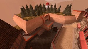
The current detailing of the bunker, especially the outside, happened because of a personal breakdown of mine on day 2. The original plan i had for the area didn't work out at all (eyewitnesses of the horrific event still weren't able to be interviewed,) so i improvised, and for some reason unbeknown to mankind improvising with almost no sleep often ends in bad decisions. I'm really unhappy with the spawns at the moment, but haven't found a solution for them. I'm considering deleting them and starting over, which probably would be less work and look better than anything i might do to fix this.

Why is your pickup(-placing) game so bad?
(as noted by @chin, @Wilson, @Kreg)
The big health on the flank was an experiment. From what i can read from the feedback (sadly, i still don't have any working demos and wasn't able to play yet) that experiment seems to have failed. I will tone down that area. i will also try to improve the pickup placement in the other areas, but i'd still like to hear suggestions on where you'd put them.

Why would a reasonable mapper add curbs to his roads and then not bulletblock them?
(as noted by @chin, @Tumbolisu, @The Mun)
When i did the original brushwork for A1, i wanted to already have the curbs in place, because that was work that i didn't really want to do during crunchtime. I thought i'd still have time to bulletblock them. By now i realized that i also have to func_detail them, and obviously i didn't have the time i thought i would, so i would've been better off without them. But yeah, bulletblocks are going to be in there for A3.

Mid doesn't have high ground, the building with the tower is cramped
(as noted by @Wilson, @TriPPey, @zahndah)
Originally i planned for the route that goes through the buildings from the side exit of the spawns to take a different route which didn't wrap to the road as closely, which would then also have an additional exit at the upper level of the buildings with the two towers on mid. I realized that the path i planned would be so long compared to the other routes to mid that noone would take it, and the high ground on mid kinda was killed with that route. I think you bring up a very good point here, and i'll consider big changes on the tower building and the "big health kit" flank to make mid more interesting, especially because i think both of these areas are the weak spot of the map right now.


Ravings of a madman AKA individual feedback
@chin - "stupid roamer spot"
Oh shit, i totally missed that. Thanks!

@Bakscratch - "2 shutters for 1 window?"
Nooo, somebody saw it. I have to admit that the first time i realized it was when i mirrored the building. I'll probably try out the small shutters and move the windows around a bit.

@TriPPey - "too much fighting in flank routes and not on the hill"
On the contrary to many things i did during the jam, this was a conscious decision. I'm a fan of the tactical "who controls the flanks controls the hill" gameplay rather than trying to funnel the gameplay through there. I also don't like maps where i have to walk straight through mid to be able to flank my enemies. While i wanted the flank with the big healthkit to look different from how it looks now, the flank-heavy gameplay is on purpose.

@Wilson - "What is point of this area"
That area is basically fluff. There will be *something* there before the map is finished. I also like how the walls around the ramp look.

@TriPPey - "getting stuck on door frames"
Thanks, i missed that too.

@TriPPey - "massive sightlines for snipers around the point"
As the feedback didn't show me the sightline - Could you tell me where it is? Right now i can't find a single sniper sightline i'd consider unfair, but while i tried to have no sightline that could be abused or is too hard to flank, i'm also not the best sniper, so i might have missed something that is obvious to others.

The other things @Kreg said
Thanks for giving me that much feedback. For a lot of notes you left, i consider this map to be in an too early state to refine on these. I know this map is already pretty detailed for an A2, but that is because i really wanted to use the jam to get some experience on detailing. Some things also come down to "I completely agree, but it wasn't possible... yet." Like the blue and red trims on the spawn. Should i for some reason decide to leave the spawn as it is, which i consider unlikely at this point, i'd also like the trims to have colors closer to the original team colors, but i didn't have this option for the jam because i didn't have time for texture work, so i took what i had from the Frontline pack.


So, thanks everyone for letting me know what you liked or didn't like about the map. I hope you had a good time anyway, and i'll try to improve Bloodshed through the feedback you gave me. Although i'm seeing quite a few weaknesses, i like what i was able to create during the jam and will try make this the kickass map you deserve.
 

DrLambda

L69: Teeheehee, Member
aa
Feb 18, 2015
458
475
Changelog
  • Rotated some props i forgot when mirroring
  • Further detailing
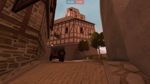
  • Moved car on left further away from the wall to make it possible to walk on the right side
  • Rebuilt eastern mid building and flank
  • Replaced shutters with smaller ones where applicable
  • Func_detail ALL the curbs
  • Bulletblock ALL the curbs
  • More hinting (ugh, i'm bad at this)
  • Redid the lighting while trying to keep the same mood (desaturate light_env, darken ambient)

Things that'll change
  • Completely rework the spawn
  • Finish detailing
  • Optimization
Man, this map takes AGES to compile and upload, and i'm not even in HDR/Cubemap-land yet. Next jam, i'll make a map huge enough that i won't be able to even think about detailing

Screenshots
1.jpg 2.jpg 3.jpg 4.jpg 5.jpg 6.jpg 7.jpg


Read the rest of this update entry...
 

DrLambda

L69: Teeheehee, Member
aa
Feb 18, 2015
458
475
Another imp, another round of feedback-feedback.

@Ynders - You gave a lot of feedback, so i'll try to put them together.
"the exact borders of the point aren't immediately obvious, I thought it was the light concrete at first"
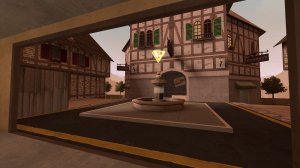
Are the big yellow stripes not enough? I'm just wondering. I might lower the fountain platform so it is the same height as the dark concrete.
"it feels like there aren't really 'yards' other than mid; it's just spawn->route->point"
"there are 4.5 routes to mid, so people aren't really focused on any area other than mid at any given time"
"my route feedback and stuff is mostly viaduct meta stuff so you can ignore it if you want i guess"

I have been a bit lax on the viaduct formula on bloodshed. I mean, it starts out like it normally should, with a yard behind spawn and 3+ routes going away from it, but after that, you only could describe the parallel roads next to mid as a "yard." (I mean, its wide enough that it's only a few units less wide than the second viaduct yard.) I have way bigger flanking areas to account for this though.
I'm still a bit sceptic, but for now i like how it plays out.
"imo the orange in red spawn is rly ugly"
I'll completely rebuild the spawn in a later version, maybe even a4. I'm not happy with it, and it's a leftover from an area when the whole map was supposed to look way more war-torn than it looks now. It'll be replaced by something that looks nicer in the current "studwork village" style.
You also said during the game that you don't like how people put a lot of Frontline assets in alpha, and i mostly agree. I really wanted to get some work done on the Frontline pack during the 72h contest, and i think i succeeded with that, but the fact that this map is now 60mb in an early alpha stage (aside from the fact that there still is a lot of room for vis optimization which makes each compile take a total of 15 minutes) really screws up my preferred release schedule, especially considering that i'm behind a 1024kbit upload at home.

@phi, @Trippey and everyone involved in finding the clipping bug
I can only say: Oops, sorry, i missed that when i mirrored. Won't be in the next version.

@Trippey
"add more battlements to attack the point from above"
"add more stairways to get to the balcony on the point"

I'm a bit scared that this will cause the gameplay to get more chaotic, considering there already are that many flanks and paths. What i don't want is to make mid uncontrollable. I'm listening, but i currently won't add even more angles of attack to mid.

ruthless behavior (how is your forum name D:)
"why does this even use cubemaps here wtf"
First of all: I haven't done cubemaps at all for this version, i'm trying to add them for a4. There also seems to be a problem with my tf2 config, because whatever i try, i can't see the pink checkers that people where reporting anywhere. On the coordinates of the feedback, i don't see anything that should use cubemaps.

@MegapiemanPHD
"lighting is very very red"
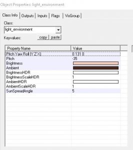
Is it still? I desaturated it a lot since a2. There are still a few spots that look kinda red, but i think that is mostly because of the red-ish adobe texture at red spawn that will be gone soon, and some of it because of the skybox. As you can see here, the lighting settings aren't red at all.
env.JPG

I'm still trying to figure out the correct lighting, but because i detailed that early and every compile takes 15 minutes, experimenting becomes quite a bit harder.
... and now that i'm talking about it, i'm realizing that creating a small texture zoo map just to test the lighting wouldve been WAY TOO EASY.
*edit: I also checked and found out that i have two light_environment in the map right now. That would explain why it didn't change as much as i wanted it too. Cleaning after 72h jam me is hard.
 

DrLambda

L69: Teeheehee, Member
aa
Feb 18, 2015
458
475
Another imp, another round of feedback-feedback.

@Ynders - You gave a lot of feedback, so i'll try to put them together.
"the exact borders of the point aren't immediately obvious, I thought it was the light concrete at first"
Are the big yellow stripes not enough? I'm just wondering. I might lower the fountain platform so it is the same height as the dark concrete

I just realized that for some reason the big yellow stripes aren't there on a3. So, yeah, i agree. Sorry for that.
 

MegapiemanPHD

Doctorate in Deliciousness
aa
Mar 31, 2012
2,002
1,311
Another imp, another round of feedback-feedback.

@MegapiemanPHD
"lighting is very very red"
Is it still? I desaturated it a lot since a2. There are still a few spots that look kinda red, but i think that is mostly because of the red-ish adobe texture at red spawn that will be gone soon, and some of it because of the skybox. As you can see here, the lighting settings aren't red at all.
env.JPG

I'm still trying to figure out the correct lighting, but because i detailed that early and every compile takes 15 minutes, experimenting becomes quite a bit harder.
... and now that i'm talking about it, i'm realizing that creating a small texture zoo map just to test the lighting wouldve been WAY TOO EASY.
*edit: I also checked and found out that i have two light_environment in the map right now. That would explain why it didn't change as much as i wanted it too. Cleaning after 72h jam me is hard.

I don't know how others felt about it but the lighting was a bit too red in my opinion. I didn't play any of the previous versions of the map so idk how it was before.