artpass_whark
- Thread starter Whark
- Start date
You are using an out of date browser. It may not display this or other websites correctly.
You should upgrade or use an alternative browser.
You should upgrade or use an alternative browser.
pedropaulo
L1: Registered
- Jul 17, 2010
- 3
- 1
- Jul 26, 2010
- 112
- 39
Team Fortress 2 in the middle east?
Thinking about it, could be epic if done correctly. It all relies on YOU!
No pressure there!
Efhan
L2: Junior Member
- Jun 13, 2009
- 82
- 19
No pressure there!
Don't worry, you don't have any competetors. Yet.
- Jul 26, 2010
- 112
- 39
artpass_whark Progress
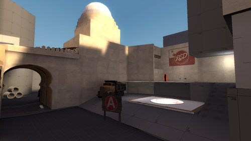
Making more progress. Took time to track down stealthy compile log bugs and more drawing and planning. Finally solidified the assets list and general narrative theme for the level as Blue moves from the desert city entrance into the city and residential area through and into the market where Red has taken up residence. Got some great models and textures from Chemical Alia as well as some textures and other art asset support from Tuan Tran. I've spent alot of time getting feedback and bouncing ideas off of them as well and I encourage anyone to chime in with any feedback even though the brushwork is quite rough and early, others may be able to suggest better approaches or interesting ideas. Enjoy.
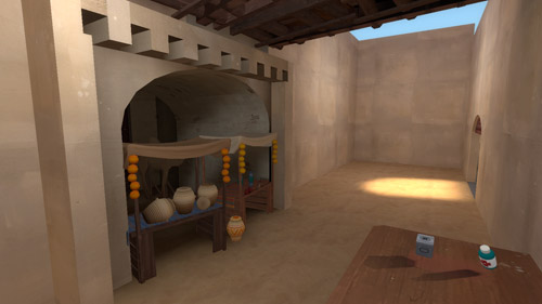
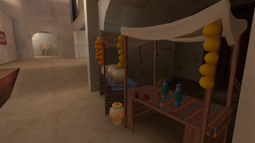
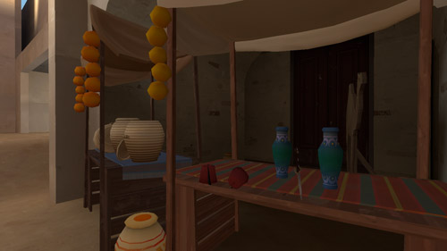
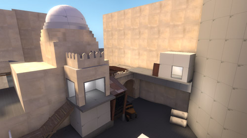
Making more progress. Took time to track down stealthy compile log bugs and more drawing and planning. Finally solidified the assets list and general narrative theme for the level as Blue moves from the desert city entrance into the city and residential area through and into the market where Red has taken up residence. Got some great models and textures from Chemical Alia as well as some textures and other art asset support from Tuan Tran. I've spent alot of time getting feedback and bouncing ideas off of them as well and I encourage anyone to chime in with any feedback even though the brushwork is quite rough and early, others may be able to suggest better approaches or interesting ideas. Enjoy.


Pc_Madness
L4: Comfortable Member
- Aug 31, 2009
- 164
- 51
Chemical Alia
L2: Junior Member
- Jul 22, 2010
- 98
- 52
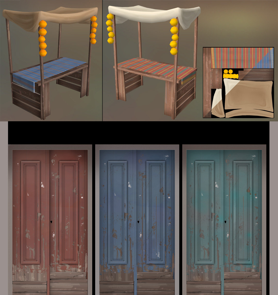
Hey guys, I'll be providing Whark with custom props and textures throughout this project, so I'll use this thread as a dump for sharing renders and details of those as well. Any thoughts and suggestions would be greatly appreciated.
I'll have to modify the scale on some stuff already, the fez and some of the pottery in particular. There's a pretty big difference in how the scale appears in 1st person in relation to how the characters look next to them on screen, so it'll require some balancing.

I'll have to modify the scale on some stuff already, the fez and some of the pottery in particular. There's a pretty big difference in how the scale appears in 1st person in relation to how the characters look next to them on screen, so it'll require some balancing.


I'll have to modify the scale on some stuff already, the fez and some of the pottery in particular. There's a pretty big difference in how the scale appears in 1st person in relation to how the characters look next to them on screen, so it'll require some balancing.
I know, I'm constantly amazed at how low the bottom of a window needs to be in order to see through it. 40 units! (or so) In real life that's 2.5 feet (around the middle of your thigh).
Chemical Alia
L2: Junior Member
- Jul 22, 2010
- 98
- 52
saw these on your site. great stylized stuff. especially liking these door textures. camel is brillant too.
just be careful to not steal wharks thread with these
Haha, thanks. I'm not too worried about that, he's a pretty badass level designer and he has some awesome ideas going on for his map. It just requires looooootsa new art.
Leminnes
aa
- Jan 20, 2010
- 1,317
- 902
I hope there's something over the top in this map. Like a secret base of some sort, something that red and blue are fighting for. The two of them fighting in a random Arabian market seems kind of weird to me, for some reason.
Also need to be able to distinguish between Red and Blue areas with different models/textures.
Also need to be able to distinguish between Red and Blue areas with different models/textures.
- Jul 26, 2010
- 112
- 39
I hope there's something over the top in this map. Like a secret base of some sort, something that red and blue are fighting for. The two of them fighting in a random Arabian market seems kind of weird to me, for some reason.
Absolutely. I've been kicking around some ideas for this. Currently the final CP is a dangling mass of explosives that Red is hoisting out of a hole in a courtyard. Of course, that means that when Blue wins it falls into the pit and EXPLODES!
Also need to be able to distinguish between Red and Blue areas with different models/textures.
Currently the idea is to have Blue be more on the fringe of the desert and Red be within the market area. Like you say though, taking extra care to make that absolutely clear is important. I'll have to keep that in mind.
Leminnes
aa
- Jan 20, 2010
- 1,317
- 902
Absolutely. I've been kicking around some ideas for this. Currently the final CP is a dangling mass of explosives that Red is hoisting out of a hole in a courtyard. Of course, that means that when Blue wins it falls into the pit and EXPLODES!
Currently the idea is to have Blue be more on the fringe of the desert and Red be within the market area. Like you say though, taking extra care to make that absolutely clear is important. I'll have to keep that in mind.
Good to hear.
I think the main thing you need to do is make sure you have good texture variation as well. Currently, it's very bland. The architecture is nice, but the textures are repeated quite a lot. I assume you have a plan for that. Also, just a suggestion, but I think those arabesque doorways would look much better as models instead of brushes. The curves are very blocky currently, which looks a little odd to me. Making a smoother model that fits in the doorframe might be a good way to go.
Chemical Alia
L2: Junior Member
- Jul 22, 2010
- 98
- 52
I think the main thing you need to do is make sure you have good texture variation as well. Currently, it's very bland. The architecture is nice, but the textures are repeated quite a lot. I assume you have a plan for that. Also, just a suggestion, but I think those arabesque doorways would look much better as models instead of brushes. The curves are very blocky currently, which looks a little odd to me. Making a smoother model that fits in the doorframe might be a good way to go.
We've got a lot of new textures in progress right now, either painted from scratch or modifying the values of the original ones. It'll look a little ghetto until we get a little more variety, but that's one of my next big priorities.
We also have texture skins working fine already, with variations implemented for a few assets. I'd like to see a gradual transition from BLU to RED with a neutral-ish marketplace, sort of like in Hydro or Well, and incorporate more red elements as you go farther in. It seems a little less cheesy that way, but it all depends on how readable everything is and how it affects the flow. Fortunately, color variations are fairly easy to test out and create.
@whark, I think there's some RED/BLU wood plank/brick textures that might be suitable, especially on the outskirts of each base. It might help to get a little team color in early on.
- Jul 26, 2010
- 112
- 39
The curves are very blocky currently, which looks a little odd to me. Making a smoother model that fits in the doorframe might be a good way to go.
That's a good point. I've played around with smoothing groups and have toyed with converting the func_detail back to world brushes and then to displacement. I honestly haven't spent much time on polishing yet as I'd like to have a proper block out in place first but that is something that will become a bottleneck pretty soon. We'll see how it goes
Chemical Alia
L2: Junior Member
- Jul 22, 2010
- 98
- 52
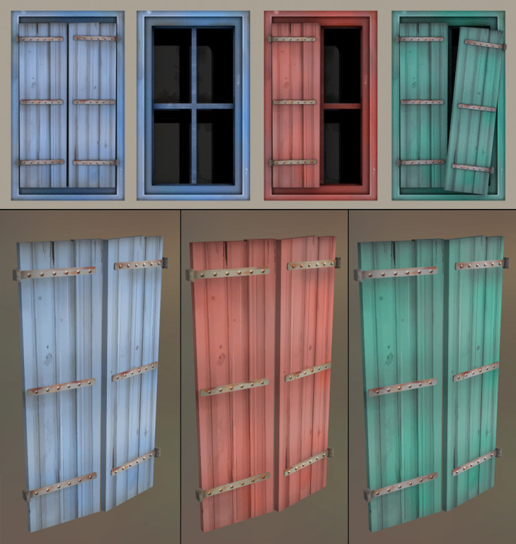
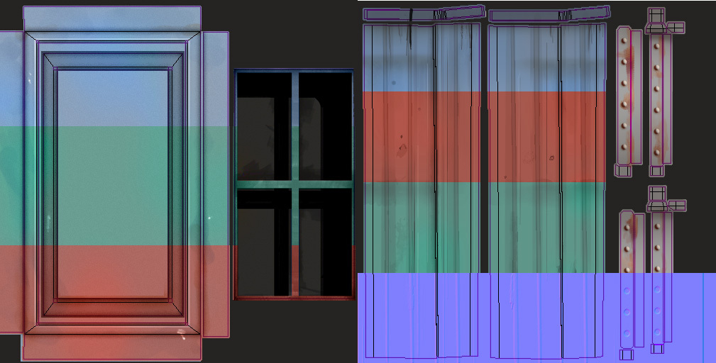
Here's a couple more props I made last night. The window frame/window is a separate mesh from the shutters, and I included a variation of the shutters with just the left panel.
I've also made some modular stuff out of other meshes, like a table from the stand with slightly changed textures and some new environmental textures, but I'll keep it to the slightly less boring stuff here v:
I've also made some modular stuff out of other meshes, like a table from the stand with slightly changed textures and some new environmental textures, but I'll keep it to the slightly less boring stuff here v:


Will you release these things to the public even if the map doesn't win?Here's a couple more props I made last night. The window frame/window is a separate mesh from the shutters, and I included a variation of the shutters with just the left panel.
I've also made some modular stuff out of other meshes, like a table from the stand with slightly changed textures and some new environmental textures, but I'll keep it to the slightly less boring stuff here v:


(No offense meant to your mapping friend
I do wish him the best of luck, but it would be awful to see such fine models go to waste if his entry didn't get picked.
Last edited:

