Artpass Timberghost

timberghost_paintball

L2: Junior Member
Dec 19, 2007
77
200
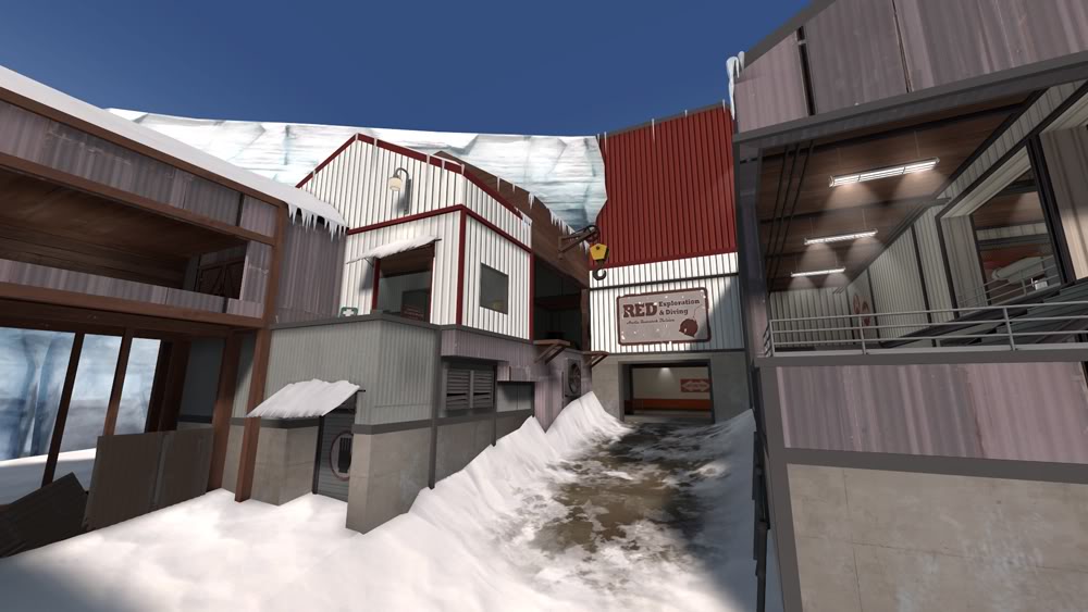
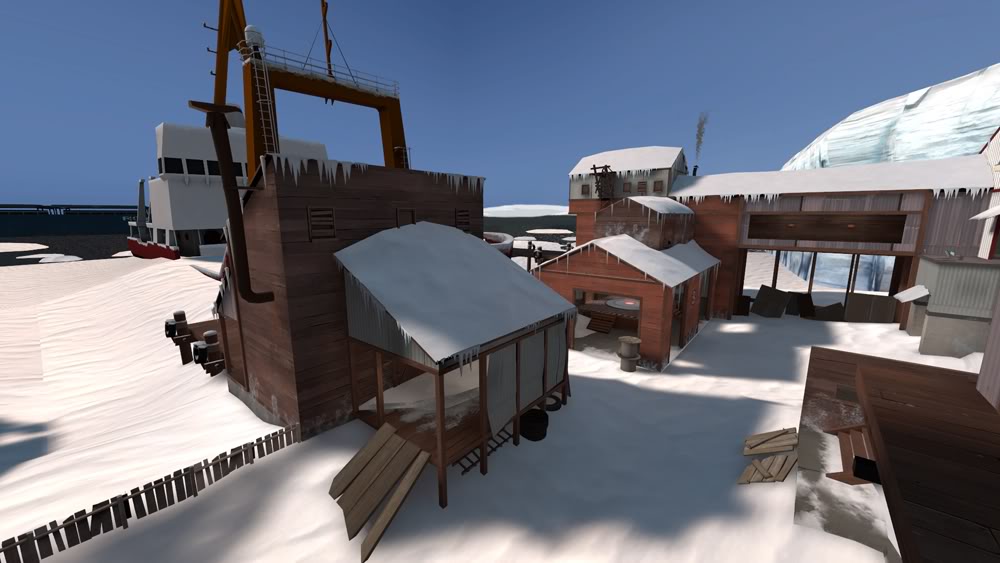
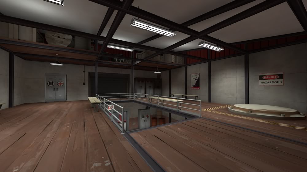
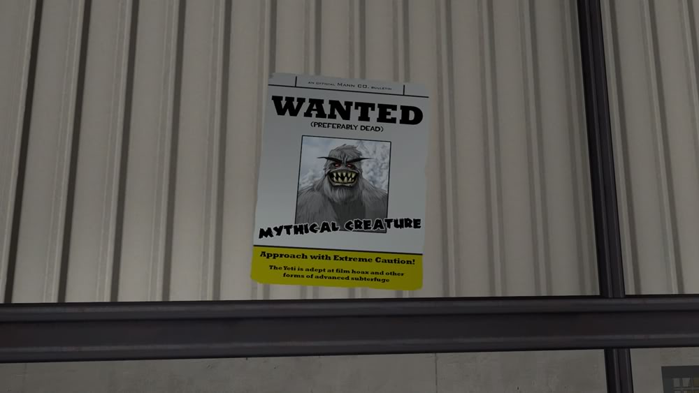
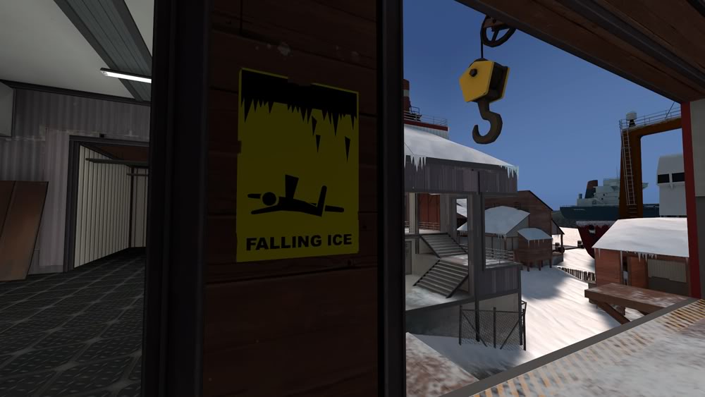
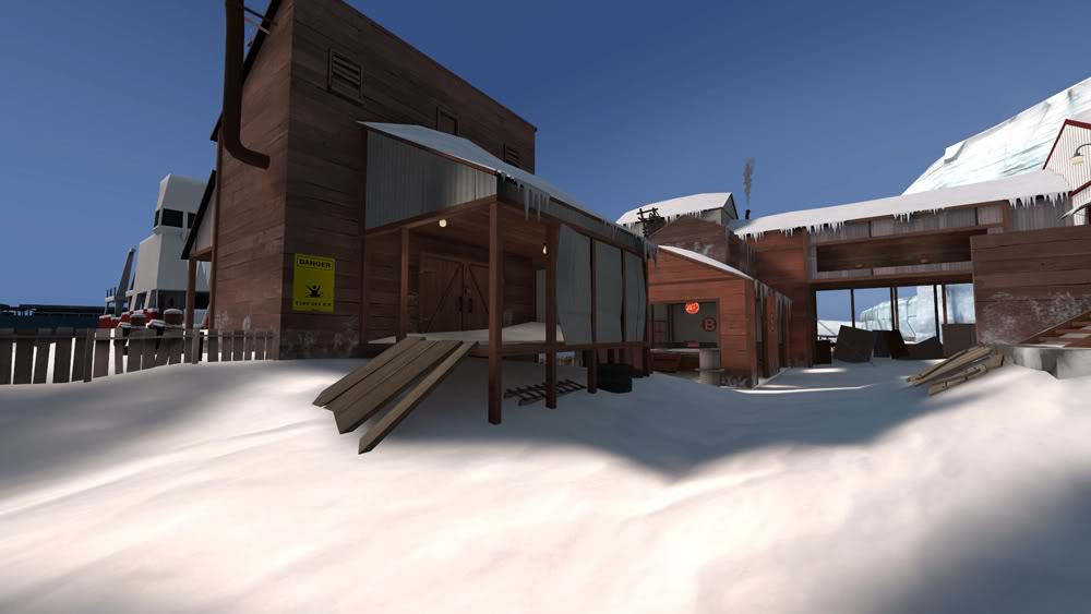
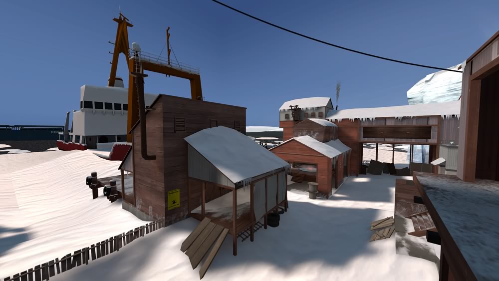
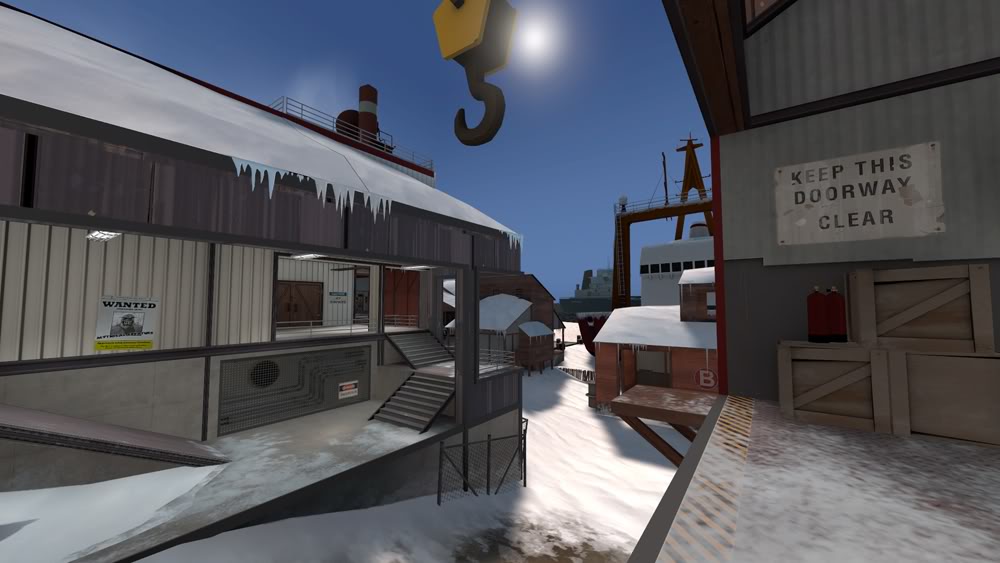
thanks for the crits. Another set of eyes can be useful. I find that I keep playing with the icicles. The first pass I did on them was not so great and I've been slowly replacing / reducing them. I really should go through and replace them more carefully to limit repetition and form them in a sensible way.

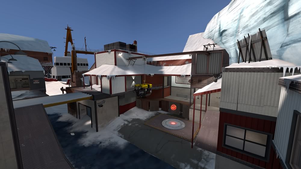
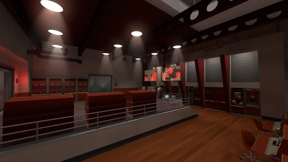
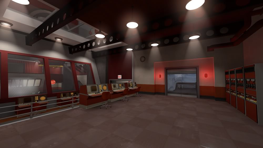
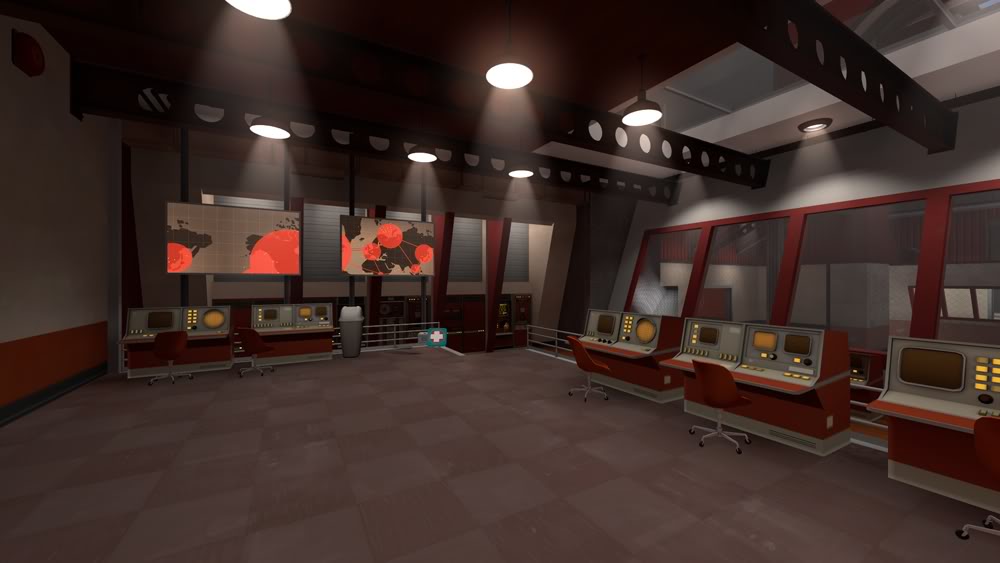
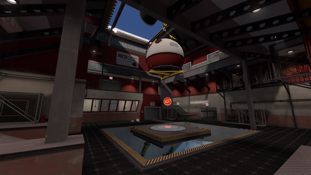
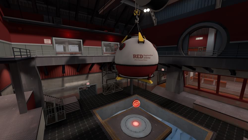
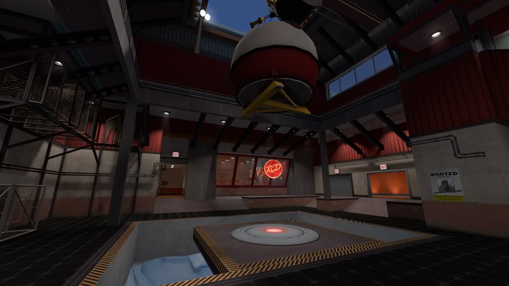
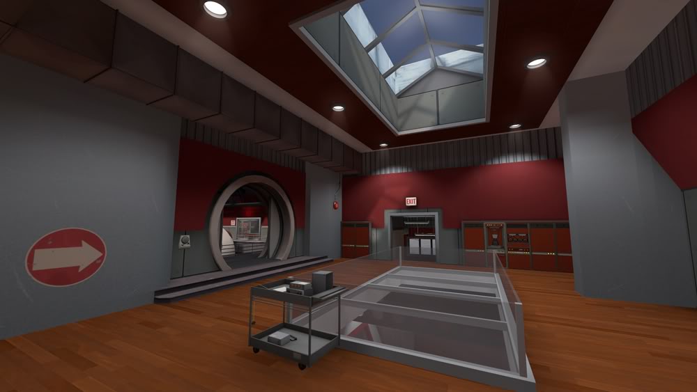
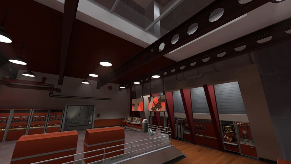
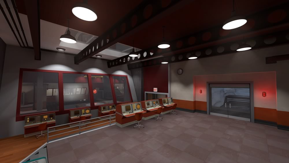
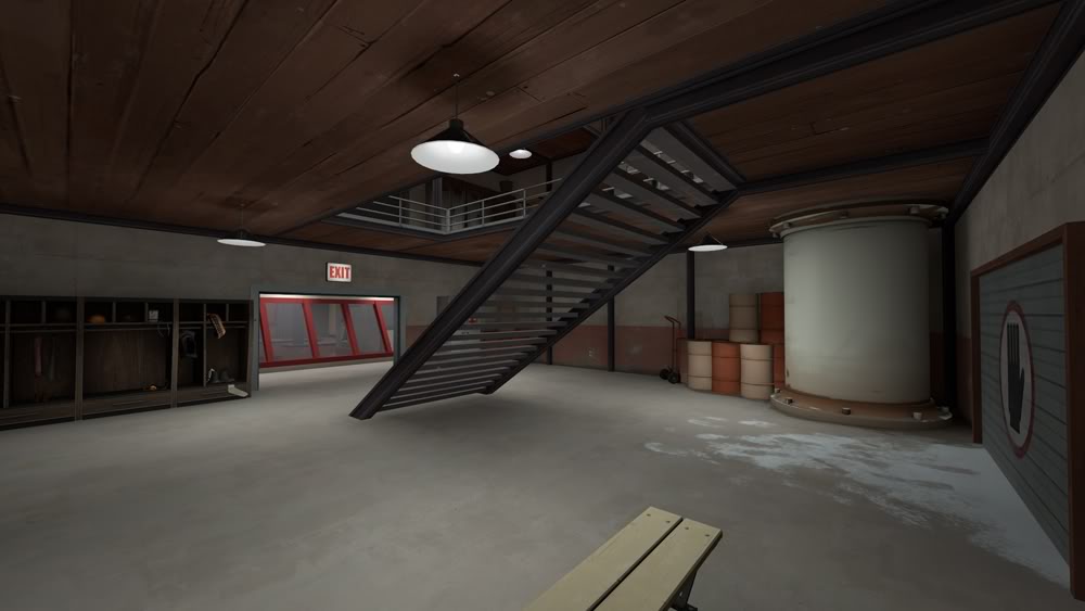
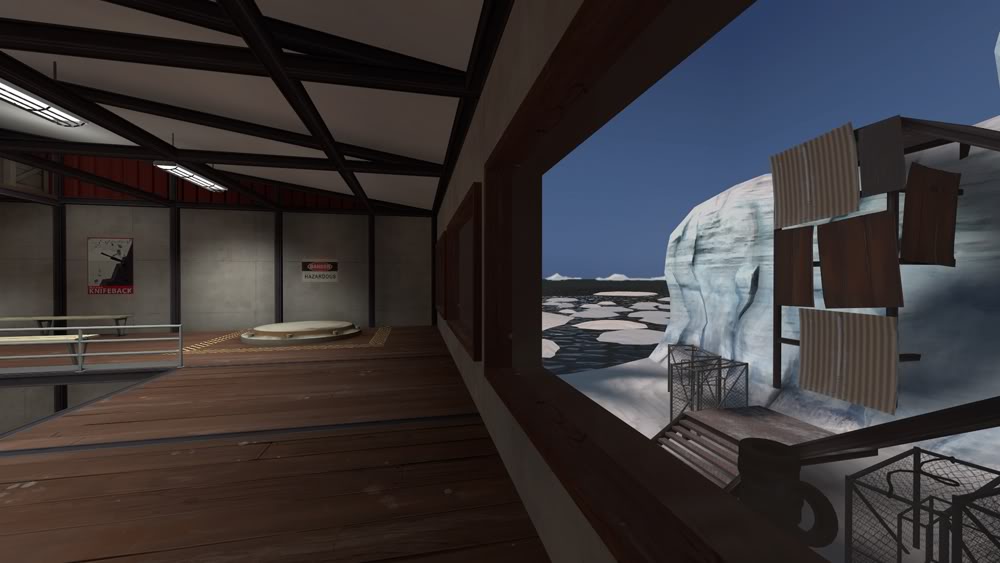
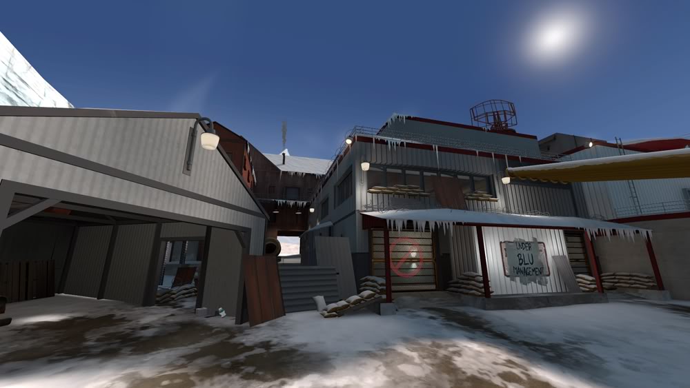
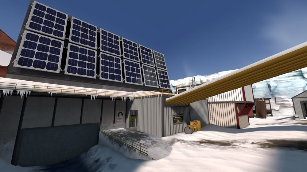
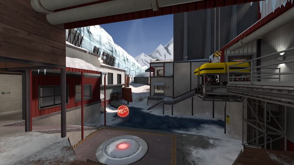
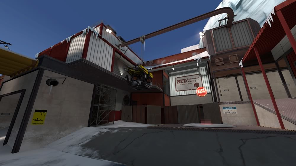
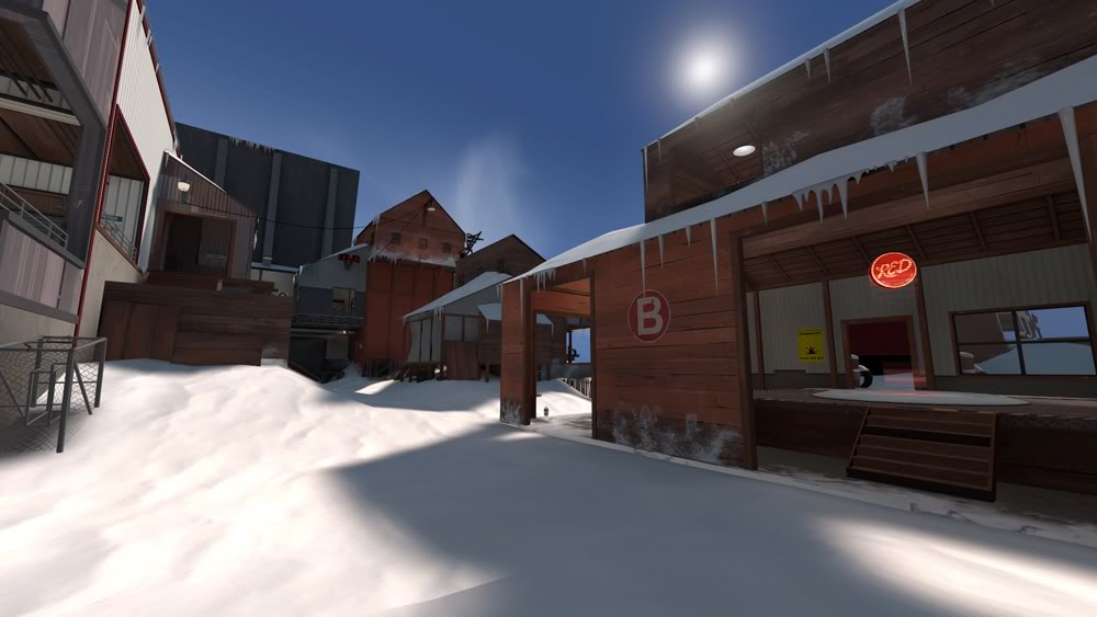
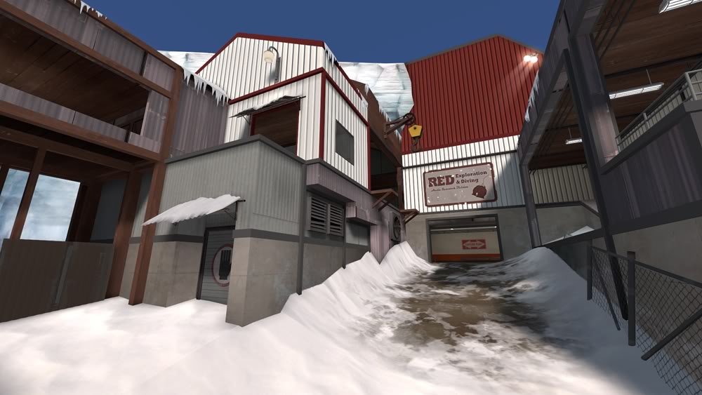
As for the textures it wouldn't be too hard to try out a desaturated version. I personally kinda like the deep contrast between the man made construction and the world. Right now the red metal panel's color is pretty close to the red on the spytech computers. Perhaps I'll desaturate it so its closer to the boat's color or even adding some wear might be nice. I don't know right now, it doesn't bother me too much but I'll think about it. Any body else have an opinion on this?
maybe I'll post a side by side photo of some color variations later today.
 
Last edited:

Draco18s

L9: Fashionable Member
Sep 19, 2009
622
136
Does the ground here really need such a dark blue texture? It looks like someone built a base directly on top of a frozen lake. :S Using the dirt like you have at the entrance to C would make more sense imo. :)

I think they did build on top of miles-thick ice, yes. That's what happens when you build on a glacier. ;)
 

Pc_Madness

L4: Comfortable Member
Aug 31, 2009
164
51
I think they did build on top of miles-thick ice, yes. That's what happens when you build on a glacier. ;)

Well, it doesn't look miles thick. It looks like a frozen pond, combined with the heavy concrete buildings around it = OH NOES! :p
 

timberghost_paintball

L2: Junior Member
Dec 19, 2007
77
200
yeah I thought about that some. The places I put the blue ice texture are generally areas near the bottom of slopes where water that might melt would run off before freezing so I was going for a bit of a frozen puddle/pond look Also the installation is meant to look like its on the edge of areas of land and miles thick ice so either way I suppose. Practically speaking, using concrete as a material makes limited sense in the arctic but then again most of the architectural choices in this game make little sense so I took a bit of artistic license. If I was truly faithful to typical arctic construction the entire map would be flat snow and a bunch of rectangular metal prefab boxes.
 
Last edited:

timberghost_paintball

L2: Junior Member
Dec 19, 2007
77
200
made a few changes today

For one I reduced the saturation of the red paneling by about 10 points in photoshop. While the change might not seem super apparent it does make a difference in reducing the Joseph Albers style visual vibration highly saturated colors can cause when juxtaposed. Either way, for now its as far as I want to go with the desaturation. I tried less saturated versions as well and didn't like how they looked. especially in relation to the other colors in the world it just looked muddy

The other major change was that I greatly reduced the amount of icicles. There may still be too many for some tastes but I think the most egregious abuse has been removed ;)
I completely stopped using the really dense sticky icicles models and have far less of the others. Sometimes its hard to cut something you spent time on if its not working but I have to force my self to make the map as the whole the priority and not the individual pieces
you can see the modified red here, it is the same color as the outdoor spytech props like the radar now
artpass_timberghost_v24_006.jpg

and these photos should give an idea of the current state of the icicle apocalypse
artpass_timberghost_v24_004.jpg

artpass_timberghost_v24_002.jpg


I also started detail passes on some of the interior areas around point C today
artpass_timberghost_v24_008.jpg

artpass_timberghost_v24_010.jpg

artpass_timberghost_v24_012.jpg

artpass_timberghost_v24_014.jpg


thanks again to all for your useful feedback.
 

StuartPB

L1: Registered
Nov 20, 2009
21
10
A note on the "Under BLU Management" paint: One impression I've gotten is that Valve maps tend to shy away from plot-related English text, because it alienates users in other locales.
 

FeartheMango

L69: Deviant Member
Sep 8, 2009
69
25
To me, the exterior of blues spawn looks too busy, those metal sheets (on the wall, not as the barrier) look bad.
 

Scotland Tom

L6: Sharp Member
Jan 19, 2008
332
64
I'd ditch even more icicles. Think about where water would run off when it melts and put your icicles there, and not on the top edges of the roofs (green: good, red: bad).

Not sure I quite agree with this. As snow and ice pile up on rooftops it becomes more and more difficult for the runoff water to actually make it down to the bottom edge without being forced off the side by the blockage; thereby creating icicles on the angled sides. It happens. Not a lot, but it happens. Honestly, I think it looks pretty good right now.

My other notes are in regards to some of your lighting.

- The number of hanging lights in some of the rooms around point C seems to me to be a bit too many. It may look cool in screenshots, but especially with all the point_spotlights I think they might become a bit distracting during actual gameplay.

- Speaking of point_spotlights, on your long florescent lights you're using two of those on each light. I know Valve has pulled this, but it looks really unnatural and I'd suggest investigating ways to change it. I know there's a good way to do it, but I can't remember how right off the top of my head.

- Regarding light beams in general, based on how crystal clear your sky is and the fact that I can't see much if any fog in any of your screens, I wonder if you should even be using point_spotlights at all. There really doesn't seem to be any haze that a light beam would reflect off of to make those light beams visible. This point may actually render my previous two suggestions moot, but you may consider replacing all your point_spotlights with simple env_sprites instead.

I'm still really enjoying this theme. The red/white/blue contrasts may be pretty bold, but they work for the environment and really give the map a unique flavor. I'm really anxious to see this one completed.
 

Penguin

Clinically Diagnosed with Small Mapper's Syndrome
aa
May 21, 2009
2,039
1,484
That wooden floor is godly.
 

Tinker

aa
Oct 30, 2008
672
334
Not sure I quite agree with this. As snow and ice pile up on rooftops it becomes more and more difficult for the runoff water to actually make it down to the bottom edge without being forced off the side by the blockage; thereby creating icicles on the angled sides. It happens. Not a lot, but it happens. Honestly, I think it looks pretty good right now.

roof-icicles.jpg


He's quite right, actually. Snow and ice piles up diagonally on the roof in the same shape as the roof, which means water still goes down and the icicles at the edges get longer, but no icicles at the front or back ends get created. That's why roofs have that triangular prism shape in the first place, to let water flow off at the side. Just google "icicle roof" and you don't see icicles in a spot like that anywhere.

I guess it's pretty minor though, all in all.
 

timberghost_paintball

L2: Junior Member
Dec 19, 2007
77
200
thanks all for the feedback. I'd tend to agree with a lot of the comments all around.

I might go ahead and kill the icicles on the edges, I'm not sure. While logically they probably aren't necessary in some cases I think they help break up spaces visually, Still for performance reasons if nothing else I might go ahead and trim a few more away.

As for the light beams I'm a bit conflicted. In one sense I agree that they probably aren't necessary given the clear atmosphere but I do find them visually appealing in some areas especially where they are used with spotlights shining toward key areas.
I might go ahead and reduce their opacity though. and as for how they are used on the normal ceiling lights... yeah that might be an overkill that would get old during gameplay, I'll take another look at that.

The English sign issue is also a good point but I don't think its critical enough to the map for me to worry about too much at this point, but I can definitely see why purely visual communicate is preferable.

interesting factoid on the wooden floor. It actually was made for another map I'm working on that I have not shown publicly yet. The map itself is a variation of the mountain theme and takes place on a cliff sculpture of Saxton Hale's head (mount Rushmore style) and inside the cliff behind the head is the Man Co corporate "headquarter" (get it :p) Anywho its a Koth map and from my testing with fellow students while I was in school it was really fun. I just haven't shown it off yet. Hopefully I'll get back to finishing it next month.
 

timberghost_paintball

L2: Junior Member
Dec 19, 2007
77
200
Final update

Well my first try at a final wrap-up post failed when the site appeared to go down last night so it goes take two.

First off thanks to all and congratulations to the many of you who have amazing entries. I've always wanted to see something like this where a bunch of people take different art directions on the same map layout and have really enjoyed watching the collective progress over the past two months.

The areas that saw the most change since were Point C and the areas around it. so I'll post some pics of that area in its final state first.

artpass_timberghost_small_014.jpg

artpass_timberghost_small_015.jpg

artpass_timberghost_small_023.jpg

artpass_timberghost_small_024.jpg

artpass_timberghost_small_011.jpg

artpass_timberghost_small_012.jpg

artpass_timberghost_small_013.jpg


the red spawn was also detailed since my last post. the biggest change was the area in the back that looks out over the bay.
artpass_timberghost_small_020.jpg

artpass_timberghost_small_022.jpg

artpass_timberghost_small_021.jpg


I also had a chance to add a scuba tank and crabpot models as well as a few posters. Hopefully those elements will help support the theme's visual identity and sense of purpose and function.

here are some pics of a few of the posters
artpass_timberghost_small_039.jpg

the yeti was painted by a friend of mine. you can see his work at
http://www.davidkeggillustration.com/gallery.php?gallery=Main_Gallery

I also made a few warning signs
artpass_timberghost_small_040.jpg

artpass_timberghost_small_007.jpg


and lastly here are some final shots of areas you've seen more of earlier

blue spawn
artpass_timberghost_small_002.jpg

artpass_timberghost_small_035.jpg

artpass_timberghost_small_036.jpg

artpass_timberghost_small_037.jpg


artpass_timberghost_small_028.jpg

artpass_timberghost_small_001.jpg

artpass_timberghost_small_004.jpg


artpass_timberghost_small_006.jpg

artpass_timberghost_small_008.jpg

artpass_timberghost_small_009.jpg

artpass_timberghost_small_010.jpg


here is the download link if anyone want to take a further look for themselves
http://forums.tf2maps.net/downloads.php?do=file&id=4175