CP artpass Huckle

Huckle

L3: Member
May 31, 2010
149
101
Time for another picture spam update. This time it's mostly polish and not a lot of big changes to geometry. My next step just has to be the 3d skybox, I can't really finish up my custom skybox texture when I don't know what the horizon line should look like.

Blue spawn outside: added some props. The dark panels look better with higher compilation but I think I'll add some info_lighting because I get angry on normal compiles. The switch might be a bit out of place but I still don't know what to do here.
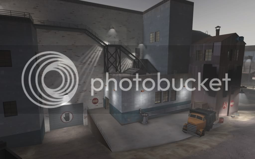
artpass_huckle0000-1.jpg


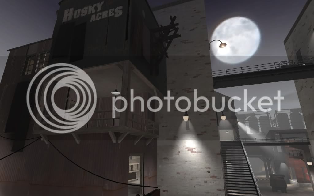
The balcony overlooking A: made it into a small house of itself because the big wall was just too flat with that texture. (same panel problem)
artpass_huckle0001-4.jpg


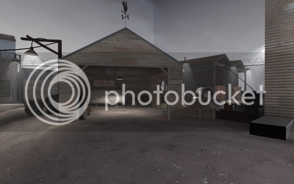
Side exit from blue spawn: I've mostly added a couple of props here. Some small work on the skybox areas.
artpass_huckle0002-3.jpg


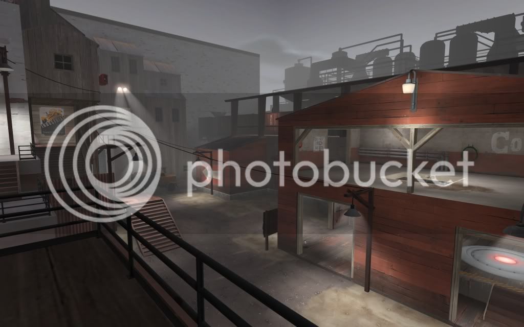
B: again mostly added a few props and some wires. It looks a bit empty.
artpass_huckle0003-2.jpg


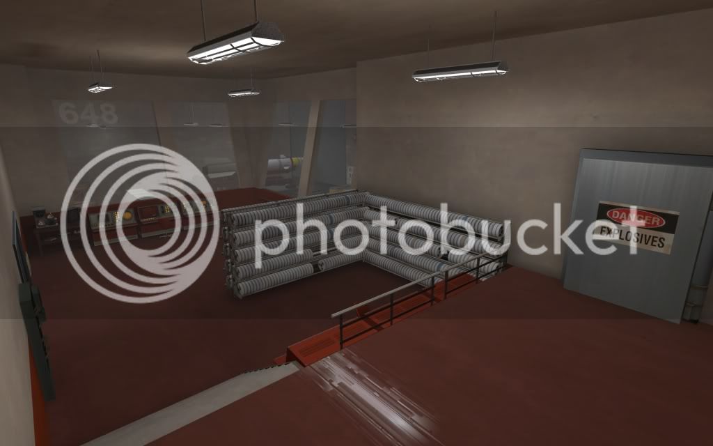
C downstairs far entrance. I moved the office area to C upper balconies and made a small rocket-construction area here instead. Not quite sure if it looks any better.
artpass_huckle0004-4.jpg


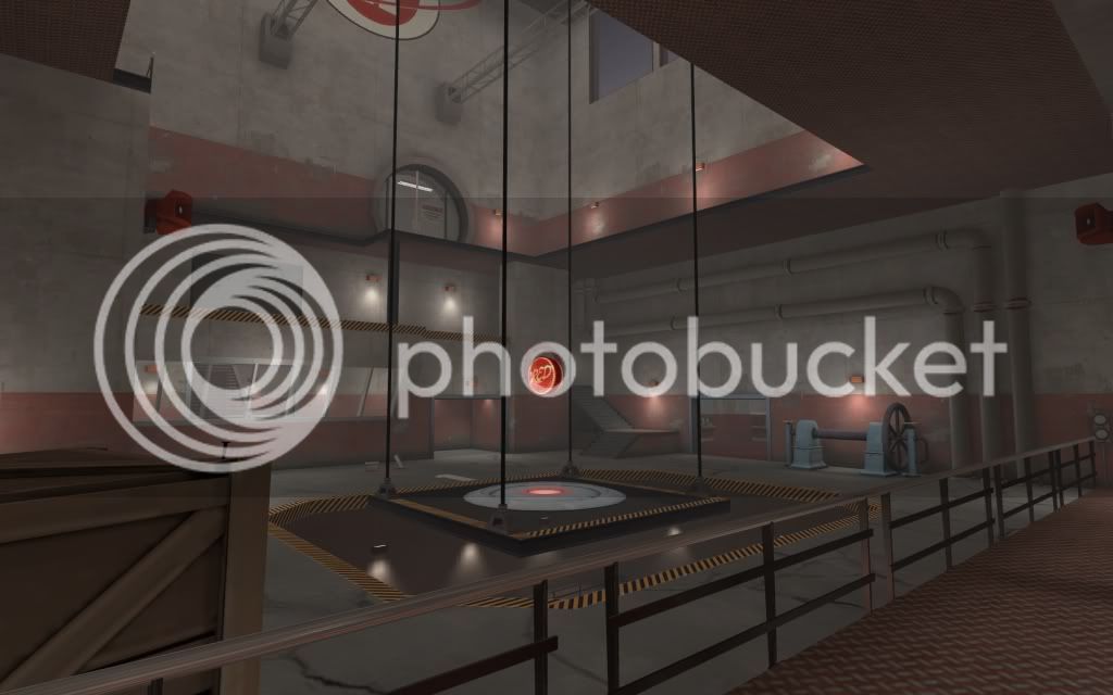
C itself. The office is behind the vault glass doors. The tall ropes for the elevator are a bit too tall making them look like just black lines. It's currently a bit too bright but I'll fix that for next post.
artpass_huckle0010.jpg


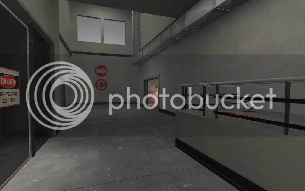
C downstairs close entrance. Raised this part of the roof and added a window. Too bad the only thing you can see is a dull part of the skybox. I'll probably be adding one of the props I have at B outside here.
artpass_huckle0006-2.jpg


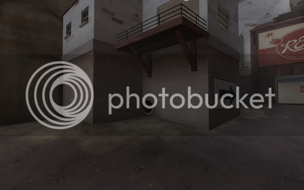
Also: everyone who comes up with a good idea of what to do with the concrete foundations in this picture will recieve a cookie if I win.
artpass_huckle0009-3.jpg
 
Last edited:

Huckle

L3: Member
May 31, 2010
149
101
In case anyone is interested, I'm now running my map on my own laptop server. If you're interested in checking it out, connect to 83.176.206.248. It's unlikely you'll ever see any other players though.

If you just want to run around on your own, the map is available via download here.

The skybox still looks mostly like crap but I'm getting quite desperate about getting feedback on the rest of my map, I've been looking at it long enough to go blind.

edit: apparently I forgot to turn tool brushes on during the last compile so there are a lot of places you can get to that you shouldn't. Clips are missing all over the map.
 
Last edited:

Scotland Tom

L6: Sharp Member
Jan 19, 2008
332
64
A few things:

1. In the second screenshot the moon in your skybox looks like it's suffering from some kind of compression artifacting (like a highly compressed/low rez .jpg or something). Dunno what might be causing it, but it might be worth looking into.

2. In the third screenshot your skybox has a very obvious corner to it. Again, worth looking into.

3. Echoing Swordz comment, you did make some significant changes to the structure above B. Are they enough to get you DQ'd? I don't know. It just seems like a pretty drastic change.

4. Finally, I'd suggest adding just a tinge of color to your fog and skybox. Right now they look like a pretty solid gray, which is ok, but I think just a slight shift into the deeper blues would really add some depth to the map. It doesn't have to be much of a shift, but the gray just seems to flatten things out a bit too much - which is a shame because it dulls the effects of some of your lighting.
 

Draco18s

L9: Fashionable Member
Sep 19, 2009
622
136
3. Echoing Swordz comment, you did make some significant changes to the structure above B. Are they enough to get you DQ'd? I don't know. It just seems like a pretty drastic change.

I don't think so. The same basic areas are there. I bet the hole between the upper floor and the point is the same size as the copula in the original barn-like structure.

Significant change would be if the hole wasn't there, or if you couldn't get up there at all (removed the ladder-ramp).
 

Huckle

L3: Member
May 31, 2010
149
101
A few things:

1. In the second screenshot the moon in your skybox looks like it's suffering from some kind of compression artifacting (like a highly compressed/low rez .jpg or something). Dunno what might be causing it, but it might be worth looking into.

2. In the third screenshot your skybox has a very obvious corner to it. Again, worth looking into.

3. Echoing Swordz comment, you did make some significant changes to the structure above B. Are they enough to get you DQ'd? I don't know. It just seems like a pretty drastic change.

4. Finally, I'd suggest adding just a tinge of color to your fog and skybox. Right now they look like a pretty solid gray, which is ok, but I think just a slight shift into the deeper blues would really add some depth to the map. It doesn't have to be much of a shift, but the gray just seems to flatten things out a bit too much - which is a shame because it dulls the effects of some of your lighting.

1,2. Yes both this and the edges between the four sides of the skybox is due to the fact that I'm not at all friends with VTFEdit (and can't get the photoshop plugin to do anything). I just have no clue about what settings to use, the .png's look much better. In my experience the best way to work though is to do gameplay area -> 3d skybox -> 2d skybox so I'll be doing more work on that.

3. While I have changed the area, the change isn't as big as some people would believe. The hole is the same size, the cover from the front wall is as big as the top structure was before. There are only two significant changes: the angle a sentry built upstairs can cover B and the wall covering the stairs up to the second floor. It would surprise me if those changes were significant enough to make or break the map since it can be fixed in less than ten minutes.

If you want to, go read Nineaxis' post here "When we said layout changes would be disqualified, we meant if you submit 2fort to the contest. Major changes. If your map's layout doesn't resemble the base vmf's layout, you will be disqualified. We will not be nitpicking wall heights, 32 unit changes in doorway widths, small things that have little relevence to the overall layout and flow of the map."

Read: unless you're adding or removing paths, or significantly altering where they go, your changes are FINE.


4. This is actually a great point. I haven't done much with the fog color at all since I started seriously detailing the map and adding a yellowish tint on the moon side and dark blue on the others will probably help out a lot.

That moon is HUGE. Is that a stock skybox?

Yup, it's the pipeline skybox. The only thing I've done to it is to add a gray gradient and a blur.
 
Last edited:

IrishTaxIDriver

L6: Sharp Member
Sep 27, 2008
271
149
As an addition, those extra spotlights (in the first screenshot) you've got aiming specifically at the stairs are pretty obvious.
 

Huckle

L3: Member
May 31, 2010
149
101
But fix it so its not so obvious.

The problem is that if I turn the brightness down they're really hard to notice while playing (some testers haven't seen it at all) and if I point the spotlights straight down, the walls themselves become insanely bright. It's a narrow line to walk I guess but I prefer to have it higher at the moment so that I don't forget them later. :)

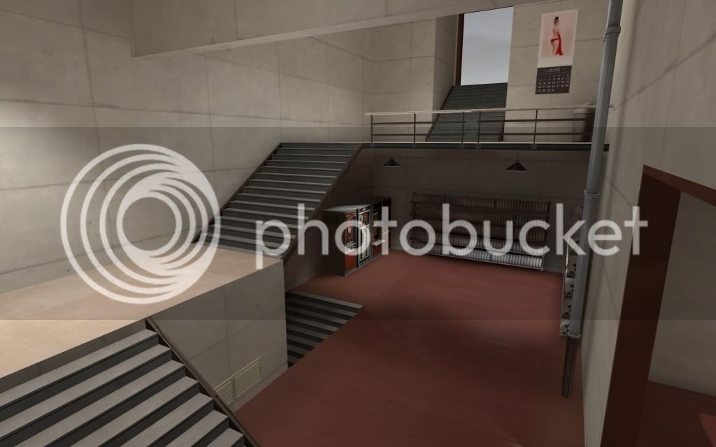
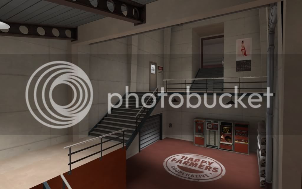
Here's also a new screenshot from today of the staircase area. I was a bit too tired to come up with good architecture for the rest of my rooms so I went a bit overboard here. I've basically only mirrored the area and opened up a room below the balcony but if I'm just going to revert the changes I can post a picture to remember it.

artpass_huckle0000-2.jpg
 

Draco18s

L9: Fashionable Member
Sep 19, 2009
622
136
Side from creating a "new path" (even if it doesn't go anywhere) it looks nice. If you can find a way to block off that downward stairway I think you'd have something.
 

Huckle

L3: Member
May 31, 2010
149
101
Even though it may sound stupid, I've been trying to do a less art-pass lately where I've been trying to remove details in areas where there's going to be a lot of action. Instead of a lot of models, I've been working on doing more detail geometry with brushes. I'm not sure if it's a good idea or not, likely a high-detail map is going to win but I'd rather make something that plays well than something just looking good on screenshots. Looking at the official maps, nearly everyone should tone down the detail to look similar.

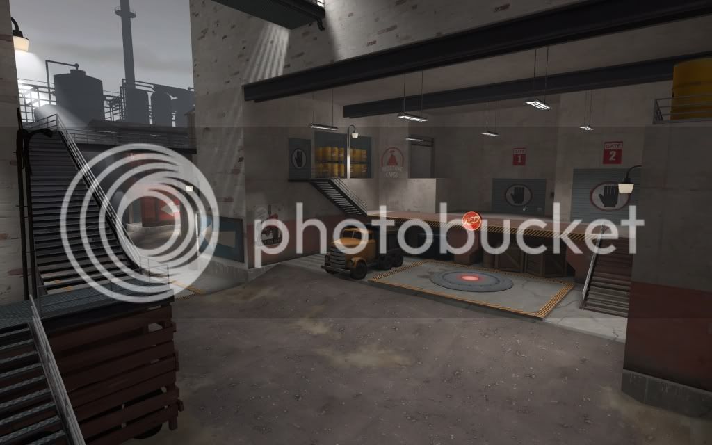
A: just done some work on the loading dock to make it more interesting than a flat wall. I've considered reverting this because the point is going to be where a lot of the fighting goes on and should be less detailed.
artpass_huckle0000-3.jpg


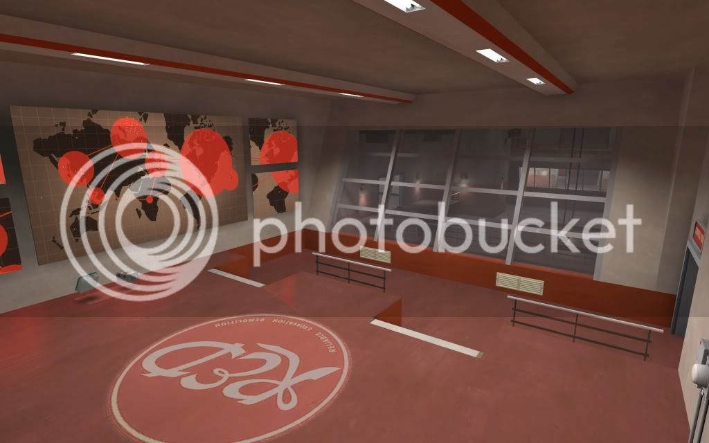
Big window-room just got a bit smaller as well as a new light ramp setup.
artpass_huckle00012.jpg


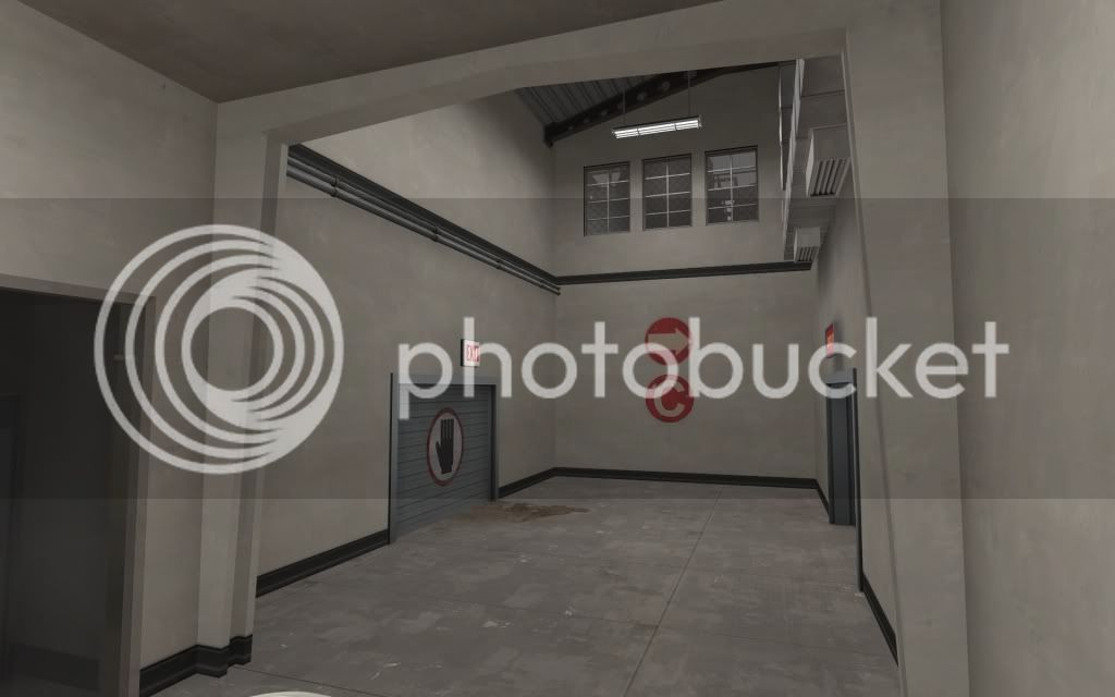
Long corridor got some extra beams, window props and a slanted roof. The props in the 3D skybox makes a lot of difference.
artpass_huckle0001-5.jpg


Staircase room came out OK with the change, I actually like this better now so I'll keep it as it is. Debatable if it's a big gameplay change or not, I don't think it matters much.
artpass_huckle0003-3.jpg


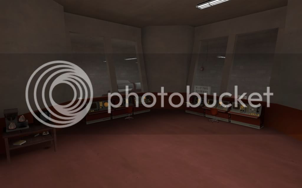
Continuing down the stairs I tried to create some interesting geometry with the windows but it still looks too empty. I also need to turn some things out of details to get better lighting. Maybe an overlay on the ground would help.
artpass_huckle0002-4.jpg


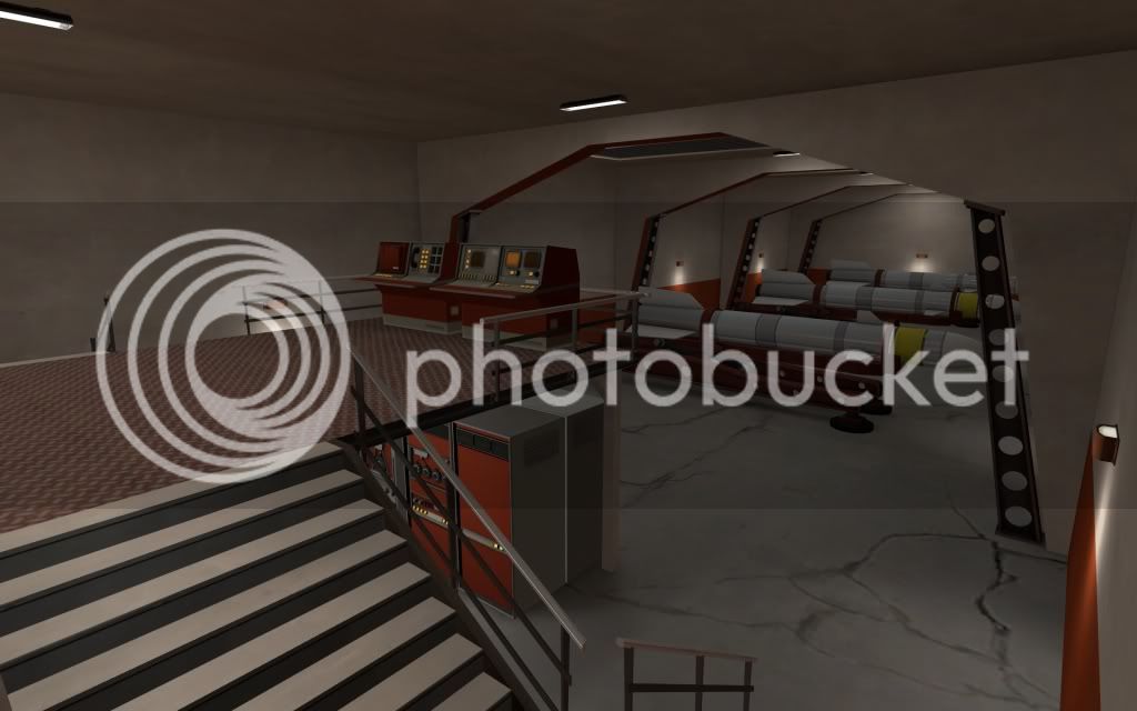
The level 2 area that the C elevator goes to after BLU wins. Just some rockets, nothing to write home about. I don't expect people to spend much time here anyway.
artpass_huckle0004-5.jpg


It's hard to say if this looks better or not. High amounts of detail obviously looks better while just looking at screenshots but it's hard to get the kind of distance from my own map where I can just play and not look at details.