CP Artpass GoobaTheViking

Draco18s

L9: Fashionable Member
Sep 19, 2009
622
136
Thanks. Very interesting.

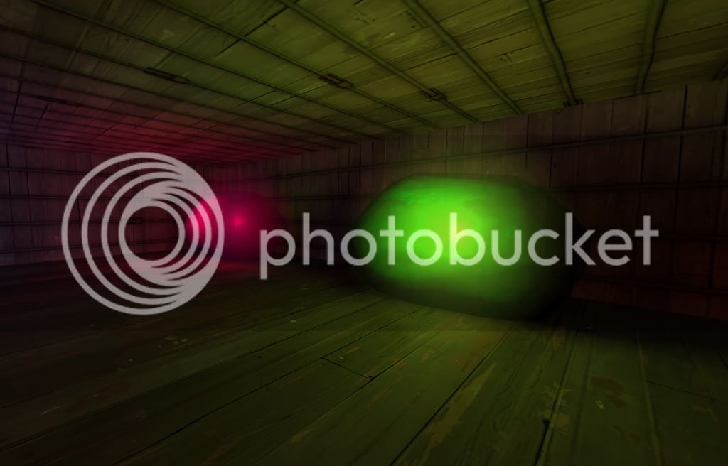
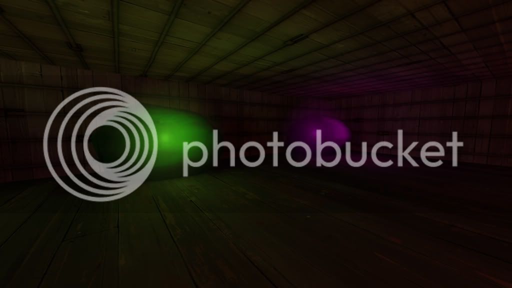
I second the idea of maybe trying green, but I love green to an irrational degree similar to rain.

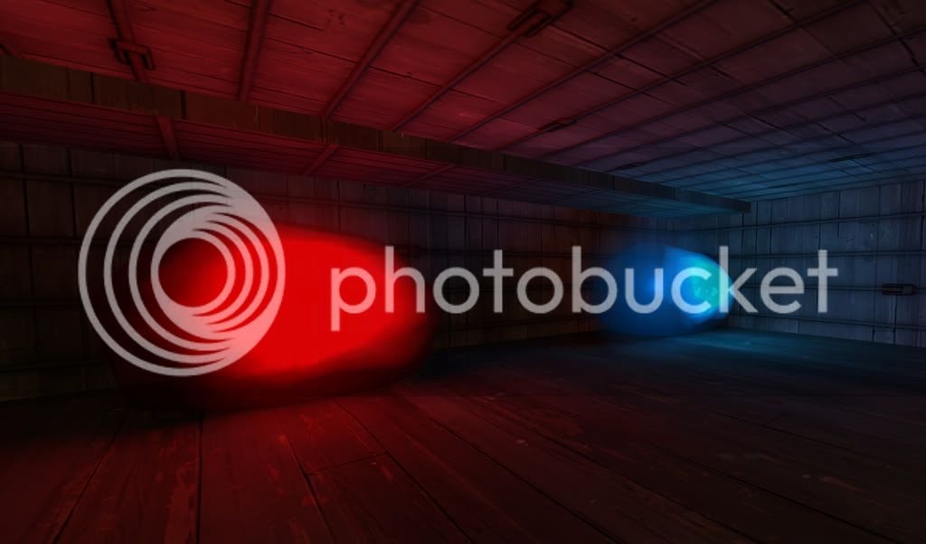
Green would be one of my last choice, just for fear of making it a bright, radioactive green. The blue, as it is, is almost a "cold fire" blue: too rich in color and too bright.

But a deep emerald would look good.
 

Gooba

L2: Junior Member
Jul 24, 2010
72
66
Here are some quick test shots of different gem colors, Let me know if you guys like/dislike any of them.

The red didn't turn out the greatest but I think that was the lightings fault. I dunno.
Gemtest3.jpg

Gemtest2.jpg

Gemtest1.jpg
 

Draco18s

L9: Fashionable Member
Sep 19, 2009
622
136
Blue, bottom green and purple are my favorites.

This, only I would choose them in the reverse order. And brighten up the purple just a tad, its pretty deep at the moment.

The red is too bight and the middle magenta one just looks "off." The bright green one (middle) is too "radioactive."
 

Vergil

L1: Registered
Jul 31, 2010
23
9
Bottom green seems right to me. But I'm biased towards green, as I said. Darker blue, perhaps.
 

Gooba

L2: Junior Member
Jul 24, 2010
72
66
Hey folks, Sorry I've been absent. I was at my Grandfathers funeral for the last couple of days. I don't really have much to show but here are the areas I've been working on. Plus I'm still not totally done with the purple glow (no env_sprites, lightglows)

9.jpg


10.jpg


15.jpg


8.jpg


14.jpg


11.jpg


12.jpg


13.jpg
 

Tinker

aa
Oct 30, 2008
672
334
Why not combine the lights you made? You could have each heap of stones be another colour, making it much more interesting to look at altogether.
 
Jan 20, 2010
1,317
902
Don't go too crazy with colored lights. They really screw with recognizing which team is which when running through those areas. The area with the colored lights above seems REALLY dark to me. I'd suggest amping up the ambient a bit or adding some hanging lightbulbs.
 

Draco18s

L9: Fashionable Member
Sep 19, 2009
622
136
Why not combine the lights you made? You could have each heap of stones be another colour, making it much more interesting to look at altogether.

You have to be careful with that. A red light next to a green will make an icky yellow.
 

Gooba

L2: Junior Member
Jul 24, 2010
72
66
Just like Draco said, that many different lights next to each other creates some really
icky colors. Does it really look that bad right now?

Leminnes are you talking about the purple area? If so, that is the death pit at C.

16.jpg


No one is going to be down there so I don't think I have to worry about player visibility. I still might raise the brightness down there just so its more easily viewed from above. :D
 

Goombac

L4: Comfortable Member
Mar 27, 2010
172
84
I'd say the only problem with the purple lights is that it looks too much like you haven't built your cubemaps.
 

Draco18s

L9: Fashionable Member
Sep 19, 2009
622
136
Ooh, clever spot to put the mines, very cool.

Personally I'd up the visibility just a bit and have some cool stuff just off the sides, as people will see it when they fall down into the pit. Doesn't need to be hugely complicated, but it'll make the map that much better.
 

Gooba

L2: Junior Member
Jul 24, 2010
72
66
I think I can fix the cubemap issue once I add the sprites and stuff, and I can definitely add more stuff down there, I've just been too busy working on the lights to get around to it. :D Thanks guys.
 
Last edited:
Jan 20, 2010
1,317
902
Just like Draco said, that many different lights next to each other creates some really
icky colors. Does it really look that bad right now?

Leminnes are you talking about the purple area? If so, that is the death pit at C.

16.jpg


No one is going to be down there so I don't think I have to worry about player visibility. I still might raise the brightness down there just so its more easily viewed from above. :D

Oh no, had no idea it is the death pit. In that case, the glow is a GREAT idea. :p The better the glow, the more obvious it is that you'll die from dropping down there. (Radioactivity maybe? XD)
 

Simski

L2: Junior Member
May 17, 2010
57
11
I don't like the Purple lights.
It looks way too out of place with TF2's art style.

It looks too "fantasy" like.
Like something you'd see in an RPG like Warcraft.
 
Last edited:

TerabyteST

L4: Comfortable Member
Aug 18, 2009
181
82
I don't like the Purple lights.
It looks way too out of place with TF2's art style.

It looks too "fantasy" like.
Like something you'd see in an RPG like Warcraft.

They are not purple lights, they are broken cubemaps
EDIT: actually not D:
 
Last edited:

Tautal

L1: Registered
Jul 19, 2010
15
4
=D Terabytest get first look on Gooba's mineral..
By the way it's realy looks strange.
 

Nineaxis

Quack Doctor
aa
May 19, 2008
1,767
2,820
if I were to do that theme, I'd make the crystals a light blue (almost white) color and make the light they give off (if any) very soft.