CP Acegikmo's Artpass Thread

KarmaPolice

L3: Member
Jul 25, 2009
108
52
Did you see nine's thread clarifying that "Anything goes, but the more you change it the more risk you take"?

http://forums.tf2maps.net/showthread.php?t=14498

The point I think grazr and others are making is that it's pretty risky. These are not changes to "wall heights, 32 unit changes in doorway widths, small things that have little relevence to the overall layout and flow of the map." Pretty much the entire structure of the room is significantly different, even more than say Mangy's.
 

MangyCarface

Mapper
aa
Feb 26, 2008
1,626
1,325
The point I think grazr and others are making is that it's pretty risky. These are not changes to "wall heights, 32 unit changes in doorway widths, small things that have little relevence to the overall layout and flow of the map." Pretty much the entire structure of the room is significantly different, even more than say Mangy's.

Ace was relatively strict in his translation. What are you guys talking about? He made a square hole circular : /
IMO strongest contender for winner atm.
 

Chemical Alia

L2: Junior Member
Jul 22, 2010
98
51
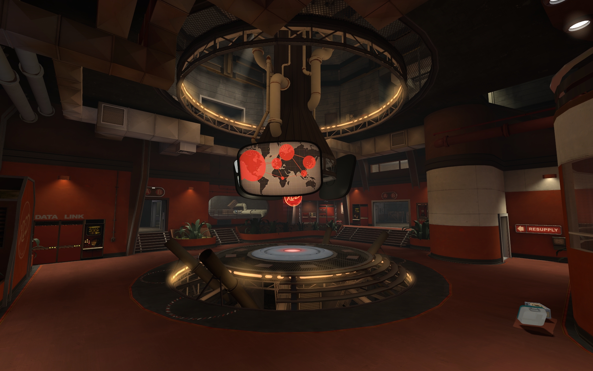
Really pretty map. I love the slightly different approach to the color scheme at C, it's unique but not overly-saturated and still feels really grounded in the TF2 style. The only thing that feels a little silly is what appears to be plumbing pipes in the center for no purpose other than maybe to power the monitors, lol. Though I like the color.

artpass_acegikmo__C_.jpg
 

Lyzak

L2: Junior Member
Aug 17, 2010
75
1
Incredible artpass, but it has already been said, I think that the map layout has been changed quite a bit... that is my major concern. Especially point C- from this screenshot I cannot see all the way around the capture point, but it appears that there is no gap on the other side, which was intended by the artpass base I believe. The idea that the point can only be accessed from one side, the far side. This point is, of course, null if there are in fact NOT stairs on the far side of this screenshot... I can't tell.

Best of luck on the artpass!
-Lyzák
 
Jan 31, 2008
555
1,482
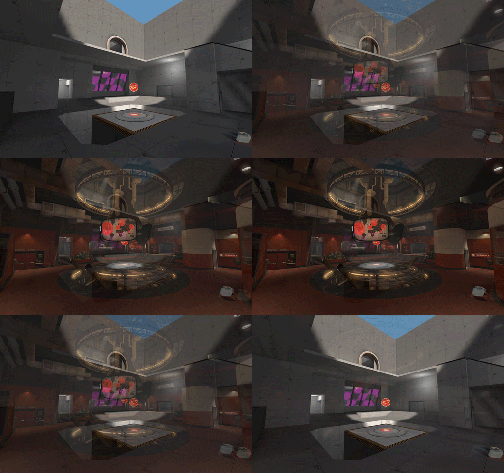
Here's a little comparison animation:

artpass_acegikmo_C_anim.gif


Sure, the change is big, but the core gameplay and pathing of the area should be about the same. And like Y_M said, it's a risk I'm willing to take.
 

tyler

aa
Sep 11, 2013
5,102
4,621
I planned stairs like those straight ones made from brushes in my next map ;_;

Still, this is amazing. This is another I'd love to play whether it wins or loses.
 

Ashy Knuckles

L2: Junior Member
Aug 15, 2009
58
13
There might be a problem with how much you've closed off the top floor from the bottom. Now they're more two separate rooms, instead of one large room. Plus the TV array and supports seem like they would kill any visibility from up top. Maybe keep the layout, but widen the opening so the rooms seem more connected.
 

Nineaxis

Quack Doctor
aa
May 19, 2008
1,767
2,820
When this contest started we said that any changes to the layout are the freedom of the author, and it's a risk they personally run with Valve.

So stop telling Ace he changed the layout. He knows he did. He even said he knows it is a risk, but he's willing to run it.
 
Nov 14, 2009
1,257
378
I respect your post, nine, but I wish valve would have been a bit more concrete on how they were judging the contest, and at what point it becomes a demerit to your "score" when your map has a heavilly changed layout.

Though, I feel bad that I am derailing Ace's thread, so I think we should stop posting about layout, and get back to feedback!
 

Fruity Snacks

Creator of blackholes & memes. Destroyer of forums
aa
Sep 5, 2010
6,394
5,571
From the perspective of someone who has not done a lot of mapping, that looks great, I really like what you've done... This is probably my favorite of all of the artpasses i've seen.

(And yes, the layout is different, but from what I can tell from the shots, it shouldn't be THAT drastic of a change.)
 
Jan 31, 2008
555
1,482
About the flat rooftops at A, previously I haven't been able to make interesting rooftop geometry at A simply because an area right behind the wall is exterior. both sides are detailed as if there is a thick building on the other side, which is not the case. This limits the detail you can put on the rooftop, which is why it looks rather uninteresting. However, I have decided to change this in order to make the rooftop better, and improve the overall look of the map. I've also started studying again, so I probably won't make as much progress as I did before.
 

Mr. Happy

L6: Sharp Member
Jul 16, 2008
320
158
The point at which a layout change is a demerit is when it significantly alters the strategies and balance