TF2Maps.net is getting a new look and new software!
- Thread starter Fruity Snacks
- Start date
You are using an out of date browser. It may not display this or other websites correctly.
You should upgrade or use an alternative browser.
You should upgrade or use an alternative browser.


OK, second question: I was always under the impression that you're supposed to make a new post in the downloads section when you update your map, and I'm sure I'm not the only one. If it's not properly made clear that this isn't the right way to do it, we're going to have people making new threads every time. What do you plan to do about this?You're still able to link to an external offsite file site, that won't change, but it'll be better for new maps to use the resource section and tie it to a thread.
Also, this discussion reminded me of my suggestion to link the feedback system to map threads. Is there any plan to do this, going forward? Seems like this is the best time to work that in.
-snip-
Also, this discussion reminded me of my suggestion to link the feedback system to map threads. Is there any plan to do this, going forward? Seems like this is the best time to work that in.
^
I have a request, and a nitpick ")
request first: could you please have a login bar open on the home page (like it is now), rather than a button to open the login bar please, so auto login actually works.
edit: auto login does work
Nitpick now: I've said this before, but I'll say it here as well: that orange is nasty. I suggest using the orange that valve uses for their achievement icons; It's just nicer. (It's a very subtle difference, but enough for me to find annoying)
Last edited:

Nitpick now: I've said this before, but I'll say it here as well: that orange is nasty. I suggest using the orange that valve uses for their achievement icons; It's just nicer. (It's a very subtle difference, but enough for me to find annoying)
That colour is far too bright, it's literally blinding.
(compared to: http://geit.uk/uploads/sE9MD5.png)
EDIT: Also, autologin should work fine - LastPass logs me in regardless of the form being hidden.
Last edited:
Avaray
L2: Junior Member
- Oct 14, 2011
- 72
- 4
Font size in actual forum engine (vBulletin) is perfect (13px).
I dont like 15px font size in new engine. It's too big. It's good for mobile devices, but not for PC's.
People are making maps on PC's, not on Phones. Please, think about it.
Overall I think its good move to change engine to XenForo.
I dont like 15px font size in new engine. It's too big. It's good for mobile devices, but not for PC's.
People are making maps on PC's, not on Phones. Please, think about it.
Overall I think its good move to change engine to XenForo.
I still don't like that orange, but your right - the achievement one is FAR too bright. Thanks for trying it out though
It would be fine for just the icons, but not the headers. Maybe a color halfway between it and the background would work better for the headers?
So, if all continues going to plan, the site will go down on Saturday Morning (Late Friday night for you Americans) at around 3AM BST and I'm currently estimating that the downtime will last under an hour. This leaves me with plenty of time to try and fix any issues that might come up after the new forum goes live.
I do expect there to be some issues, so there will be a thread on the new forum to report those when the time comes. I'll also make a thread/post here explaining how to transition your maps from the old download system into the new one at some point.
Time converter at worldtimebuddy.com
EDIT: It's worth noting that due to the way Xenforo licensing works, the testbed will not be publicly accessible from a few hours before the release.
Last edited:

If it's not too much trouble, I have a few more nitpicks:
- The "Recent Threads" header on the home page should link to the recent posts page. This section (/find-new/x) should also have a tab for recent posts.
- The "New Profile Posts" and "New Resources" sections on the forum list would fit nicely on the front page imo
- Clicking on the Tutorials tab, instead of selecting something from the drop down list, links to a blank page that should probably list the two sections
- Some tutorial threads might need their titles edited, because the [Video Tutorial] and [Video Quick Tip] labels take up half of the limited title space and make it difficult to see what the tutorial is for
It would be fine for just the icons, but not the headers. Maybe a color halfway between it and the background would work better for the headers?
No, adding more colors is not the solution. Better to keep things consistent.
The Little Ace
L1: Registered
- Jun 27, 2015
- 14
- 5
No, adding more colors is not the solution. Better to keep things consistent.
Agreed; better to use something that works for everything and have the site look professional.
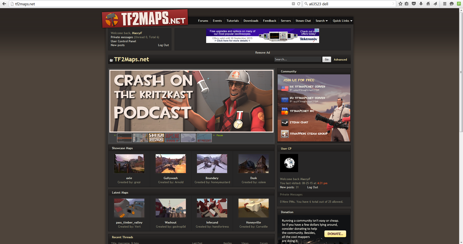
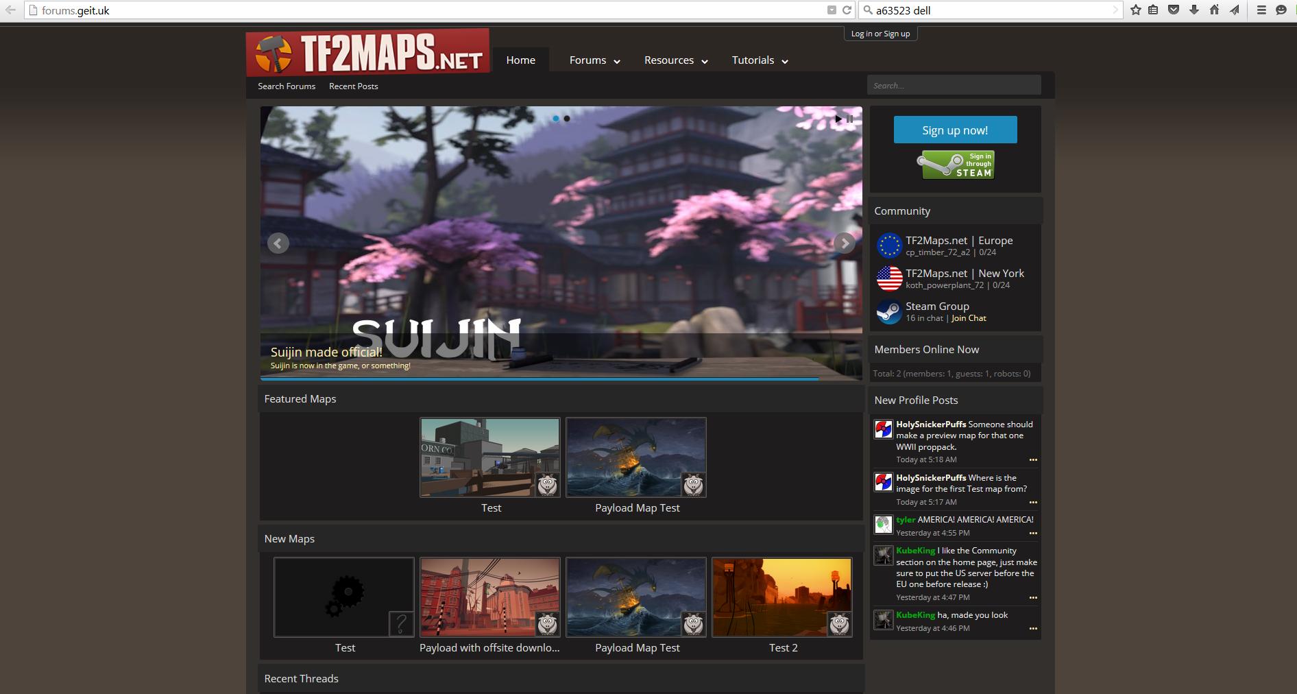
Edit: also, the image header on the front page seems to take up an awful lot of space for something that rarely changes
Edit Edit: are the content pack images supposed to link to the pack? Because at the moment they do nothing
Last edited:
Edit: also, the image header on the front page seems to take up an awful lot of space for something that rarely changes
Edit Edit: are the content pack images supposed to link to the pack? Because at the moment they do nothing
The new feature slider is only marginally larger than the previous one, it's so close in fact that due to the thinner header, the bottom of the old one and the new one are the exact same height down the page. - If you don't like the feature slider, VIPs will be able to disable it locally.
The content pack block isn't done yet, I'm still waiting on some artwork from Seba till I can actually finish it.
quick question.
should we hold off on starting new threads/uploading new maps until this is done? or is it not an issue?
Any map threads/downloads you make will need to be remade on the new system, using the new resources system. Normal threads and posts will carry over fine.
The new feature slider is only marginally larger than the previous one
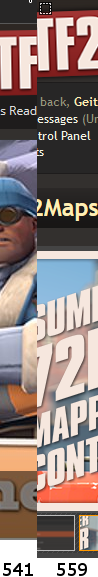
In that case I think the banner must be displaying wrong for me:
I checked the dimensions in photoshop, and the new banner is around 875x400 pixels, whereas the old one was only around 675x250 pixels. That means that the area of the new banner is over double that of the old one.
Edit: I don't want to sound overly critical of the new site, as I've only posted criticism, but i really like all the new features that you've added, and the old site is definitely a bit dated
Last edited:
In that case I think the banner must be displaying wrong for me:
I checked the dimensions in photoshop, and the new banner is around 875x400 pixels, whereas the old one was only around 675x250 pixels. That means that the area of the new banner is over double that of the old one.
Edit: I don't want to sound overly critical of the new site, as I've only posted criticism, but i really like all the new features that you've added, and the old site is definitely a bit dated
I was cheating a bit, I was only going by vertical height - It's quite a bit wider, but that's unavoidable due to the entire content area being wider on the new forums. The actual height of the slider element (including borders and thumbs) is only about 90px taller than the old.
Making it any narrower will just cause a gulf of empty space, and make the aspect ratio even more awkward, IMO.