CP Artpass GoobaTheViking

Scotland Tom

L6: Sharp Member
Jan 19, 2008
332
64
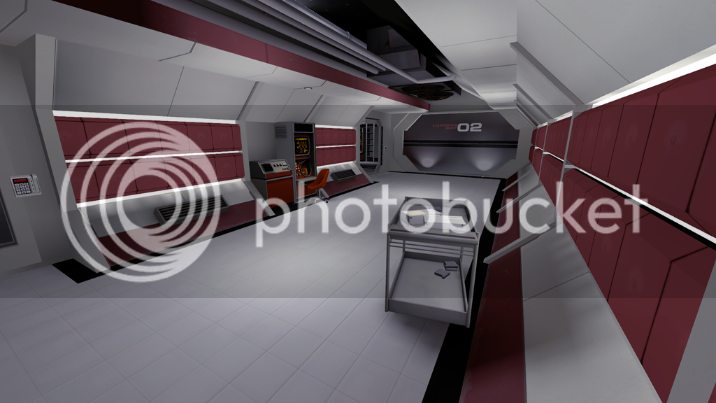
I agree with you on the color thing. One reason I don't have more color variation and such is because I just haven't gotten that far yet. I made this entire area yesterday, and with all the custom textures I had to make it was kinda crazy...

Different materials, definitely...

I think the architecture only needs slight changes, as the modern look is more due to the textures than the architecture...

With all that I think you're basically on the right track. Color and texture is the real key, they'll help the architecture a lot. I'm really looking forward to seeing the area with some more reds, grays and perhaps off-whites.

One note though, in such a pristine environment your signage should probably appear equally pristine. None of this chipped or worn down crap as is seen on so many TF2 overlays and decals. The big round arrows from Hydro (or other similar things) would probably work well.
 
Nov 14, 2009
1,257
378
Gooba, our final points are going to be very similarly themed (we both had the same idea with those black patches in the floor). May the best man win!
 

Gooba

L2: Junior Member
Jul 24, 2010
72
66
Hey, I had a few question for you guys.

1. Do you guys know why the glass is so blue? It seems to be reflecting a blue skybox for some reason. Maybe because I've been compiling in cordon mode?

2. Almost all of my Point_spotlights do not work, what could be the reason for that?
They are not inside any models, and have the exact same settings as the spotlights that do work.

3. Should I change the grey in the hallway screens to a more creme color? I'm thinking I should, but if you guys like it how it is then I don't really need to change it.

4. Is the architecture still not working for you guys?

Here are the screens of what Ive been doing. It has taken me awhile to get this stuff working to a reasonable level, but these are in no way final. I'll probably be changing the tubes to be more angular like the hallways. I dunno. :\
artpass_valvebasec90004.png


A Laboratory for researching the crystals. Maybe they are turning them into rocket fuel. ;)
artpass_valvebasec90006.png


artpass_valvebasec90002.png


I'm not sure why the lighting is so wacky in this one, if you guys have any ideas, they would be appreciated.
artpass_valvebasec90008.png


Hallway.
artpass_valvebasec90001.png

artpass_valvebasec90009.png


Also, heres the textures for acumen. Almost everything you see in the Point C screens(besides the models) are custom made.
textures.png


Here are some pictures I found that I kind of based my theme on. I thougt I'd show you, since most of you thought the black-white was too modern. These were designed in the 70's.

http://www.paleofuture.com/display/....jpg?__SQUARESPACE_CACHEVERSION=1245210765377

http://www.paleofuture.com/display/....jpg?__SQUARESPACE_CACHEVERSION=1245210902357

http://www.paleofuture.com/display/....jpg?__SQUARESPACE_CACHEVERSION=1245210735168

Touché Grim.
 
Last edited:
Jan 20, 2010
1,317
902
It's like Portal and TF2 had a lovebaby. o_O

Also, don't use the Intel models as detail props. They look... odd, as people general view them as gameplay dynamic props.
 

Huckle

L3: Member
May 31, 2010
149
101
Hey, I had a few question for you guys.

1. Do you guys know why the glass is so blue? It seems to be reflecting a blue skybox for some reason. Maybe because I've been compiling in cordon mode?

2. Almost all of my Point_spotlights do not work, what could be the reason for that?
They are not inside any models, and have the exact same settings as the spotlights that do work.

3. Should I change the grey in the hallway screens to a more creme color? I'm thinking I should, but if you guys like it how it is then I don't really need to change it.

4. Is the architecture still not working for you guys?

Here are the screens of what Ive been doing. It has taken me awhile to get this stuff working to a reasonable level, but these are in no way final. I'll probably be changing the tubes to be more angular like the hallways. I dunno. :\

I'm not sure why the lighting is so wacky in this one, if you guys have any ideas, they would be appreciated.

1. This sounds extremely likely, just check your cubemap positions and do a full compile if you want to know for sure.

2. Don't trust the wireframe to be the definition of if point_spotlights are "inside" the model or not. I had to have about 18 units of empty space between the model and the base of the spotlight for them to work. Unless you're using he exact same models, try to move them a bit.

3. I like the way the walls and floors look with the angular style but I think you could use another texture for the ceilings. I don't think the transition between the walls and the ceiling look just right.

4. The architecture of the hallways is awesome. The only place I can see that doesn't look great is the capture point area with the ventilation shafts. They just look a bit out of place being square with the rest of the angular theme. Maybe just use the ventilation caps but make textured angular shafts from func_details?

5?. It's a bit hard to see since your lights aren't visible but I think your lightmap scale is too high compared to the other hallways. You might also want to check out your portal file to see if you have some kind of weird area transition right there.
 

Gooba

L2: Junior Member
Jul 24, 2010
72
66
Well, there aren't many space props, so I had to use other things that would possibly be in a place like that. Propane tanks for welding seems plausible to me. The intel on the other hand...
 

Ashy Knuckles

L2: Junior Member
Aug 15, 2009
58
13
How are you doing that blue energy in the tubes over C? Other than that amazing work so far. If anything I think you should maybe find a middle ground from the stark black and white of your C photos and the amount of red in the later pics. Maybe dirty up the texture (might go against space theme) or pick a less saturated color. The red seems really strong to me.
 

Mr. P. Kiwi

L5: Dapper Member
Nov 22, 2009
244
95
Well I think every part of your map is great, but I still can't see the connection between the desert to a space facility, that from the textures and all looks like the whole place is supposed to be launched into space.
+ remember that TF2 is set in the 50's
++ although I really like point C, I like points A and B more and I mus say that you should completly change point C's style - a normal 2fort's spytech base could have been enough...
Keep that in mind!
 
Nov 14, 2009
1,257
378
Im glad to say that our entries are diversifying. Im emphasising the fact that mine takes place in space, and pipespamming, having a rocket and a doomsday device etc...

Also, my cooridoors are much more subtle.

I have to ask about your textures, how do you make it so they tile well, even with those patches of dirt etc...
 

Acumen

Annoyer
aa
Jun 11, 2009
704
628
hey Gooba, thanks so much for posting these textures ! went straight to my reference folder :)

i think the red you have going on the texture is bit too much on the bordeaux side of things. i think if you sample the red color stripes of the original tf2 textures you'll get a better fitting of the tf2 theme overall.
anyways, i love what you got so far. very special and unique theme on the artpass stuff :)
 

Goombac

L4: Comfortable Member
Mar 27, 2010
172
84
Well, there aren't many space props, so I had to use other things that would possibly be in a place like that. Propane tanks for welding seems plausible to me. The intel on the other hand...

I think he's talking about the blue prop, not the prop itself.

I personally love the tech theme. But my biggest problem would be with the huge change from the mining to the tech.
 

Gooba

L2: Junior Member
Jul 24, 2010
72
66
Ashy Knuckles, I have been trying to change the main area of C to have the same vintage look of the hallways, its just taking me awhile. :\ The blue tubes are a invalid skybox thing I believe.

Kiwi, I guess I should work on the transition areas then huh? :p I'm pretty sure I can make it work.

Grim, yeah, I think the fact that your map is actually out in space is enough to separate our entries from being considered the same idea. To tile the textures easier, I use the offset filter in photoshop, blend the seams, then offset it back. Good luck on your map btw.

Np, acumen. Are you and Ethan still doing the modelling thing? If so, could I possibly have something like one of these guys made ?
botconcepts.jpg

He would just be a friendly helper bot thing. It would probably be best if he was the same style as the spytech computers, I dunno. You'd have to flesh out the ideas more, but thats what you wanted wasn't it? If I need to request it in your other thread I can do that as well.

Goombac, if he's talking about the color, theres only blue propane tanks. :\
Again, I guess I should work on the transitions next. :D

Ooh, and I figured out what was wrong with my spotlights. I had the color too dark... lol :p silly me.
Here's a few updates.
artpass_valvebasec100006.jpg

artpass_valvebasec100007.jpg

artpass_valvebasec100009.jpg


Here's a slideshow of my sweet shiney-sliding-whooshsoundmaking-sci fi-door in action. WIP
artpass_valvebasec100000.jpg
 
Last edited:
Jan 20, 2010
1,317
902
What's up with the reflections on that door? They look *terrible.* (I mean that critically, of course. :p FIXXIT)
 

Void

Local Man Unable To Map, Sources Say
aa
Sep 14, 2008
1,870
2,977
No way to do that besides upping cubemap size. Which may not be possible on some computers. Or something.
 

Pocket

Half a Lambert is better than one.
aa
Nov 14, 2009
4,697
2,581
Shit, man. Shit. You may not win, but if Valve plans to give bonus awards like the Propaganda Contest, I got your Best Use of Original Theme right here. I'm getting a big "Syndrome's lair from The Incredibles" vibe from this base.