Resource icon
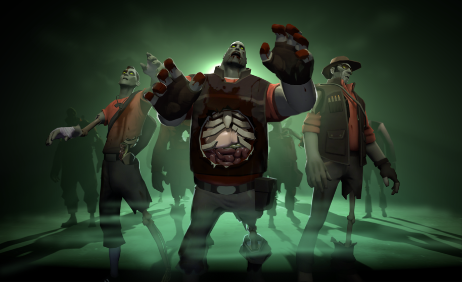
Zombie Horde 2017-02-11
- Thread starter rabscootle
- Start date
You are using an out of date browser. It may not display this or other websites correctly.
You should upgrade or use an alternative browser.
You should upgrade or use an alternative browser.
What did you use to simulate that black shadow at the bottom? Very cool!
Photoshop! Did a gradient on the top layer so it would fade out.
Looks good! All fitting and thematic, I wonder if something could be more prominent in the scene - like middle zombie heavy being a bit bigger & the scout / spy being backup asymmetry angled sideways a bit outwards.
Then you end up with the official art from the tf2 team


