Hi there!
After playing venice a couple of times I come here to provide feedback for the map. It sucks that people view venice as the "worst" of the bunch but it doesnt have to be this way. I thought of a few ways to improve the map. As the creator of pl_eruption which is getting played in competitive as of late I feel like my feedback has value. I learned a ton from this map and I hope I can help you out!
Something that I didn't enjoy about the map is how much it encourages spam and the long sightlines. However I will try to focus on other stuff while providing solutions!
Firstly let's talk about the gameplay which is the most important.
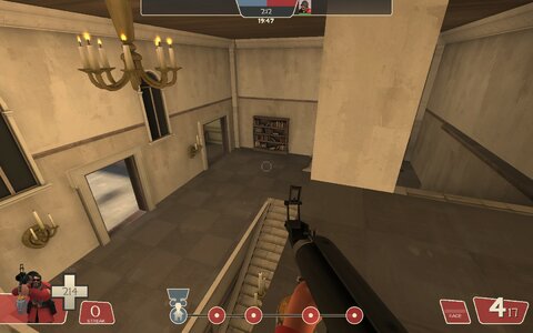
---Point A---- (my favourite point)


There is nowhere to get cover in A if you want to avoid a sniper. The fences are see-through so a sniper can easily predict where I am going. There are only a few planks here and there in the main tracks area.

this spawn exit is problematic In my opinion. I think reworking the exit or getting rid of this wall would help.

this spawn is built a lot better.

I feel like this could be a potentially interesting flank since it's on the lowground making anyone using it hidden from the players above. (just an idea)

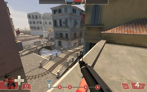
I suppose this is the "Main Hold" of A. Where you want red to hold more. However in practice I haven't seen this area getting used at all. Perhaps the players aren't aware of it. But I like the idea.


the sightlines here are also rather long and I feel like you could replace the fences with something more visually appealing.
so here my idea would be to improve the red hold while making it more obvious to set up there. You can give Blu more cover to push the cart till the bridge. Now the nest is stronger for Red you extend the balcony near the bridge like I show to give blu a way to counter is from a closer angle. You still have more far away angles too. If that's not enough you can also use this "new flank" I proposed. It's not necessary though. Just an idea. You can lower the roof in the new and improved nest area so red can get on top and use it similar to badwater. I want to note that you can keep/change any ideas I have. I am explaining how I would have done it. As the map creator, you know your work better than I do.

This area on the back could also keep this area in check if it gets too powerful.
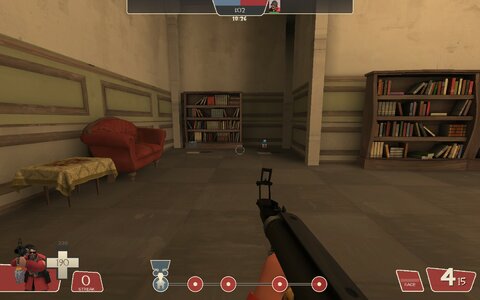
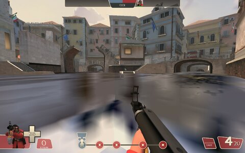
---Point B and C----
Now for those 2 points I will sound a little hursh but I feel like apart from this area here:
The rest were an afterthought. Owing to the fact that the points are either flat

Or they use the same ideas as before as well as buildings and designs.

Or in general feel the same. Point A feels unique. Point C feels like Point B again.

In addition I have no idea where to stand or hold the point in C

Everywhere I go I am exposed there is next to zero cover making the point uncomfortable to play. You can also shoot through the fences on the bridge.
I would strongly advise you to rework some areas to allow for more clear indication of where to set-up and hold. As well as provide more cover. Additionally I believe that C needs a landmark. Point A has the cannals, Point B has the bridges, Point C has....? More bridges? When I first played the map I felt lost, every area looks the same I thought.
A few landmarks that you can take inspiration from area these for instance.
For B and C I don't have much that I can help you with. I don't have a couple of solutions here apart from this:
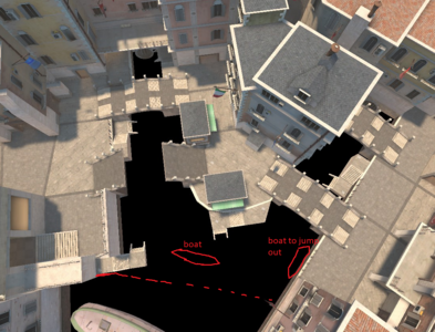
I think Height Varation in this point needs to happen, B could be kept the same but C needs changes. But if I had to change something about C, it would be to give it more cover (Blue lines) and small boats to break the sightlines and provide cover for the fights and allow for Spies to climb up to certain areas. Furthermore I added a new building/connector on C which connects the 2 calconies. You could even give it windows but I am not sure about that. The idea would be to connect the hold areas for Red so as to allow for better and more obvious places to hold and setup.
---Point D---
For last I honestly think there was no plan for it at all.

the track path is narrow which encourages spam (and I don't feel like pushing to last. I would just die).

the only highground route for Blu was removed.


The interior design is all over the place


and the health and ammo packs are an after-thought.
For the finale something more grande could work
Using the last reference Imagine as a way to redesign D this is what I thought of:
obviously it's not the best idea ever. But it's a quick sketch of how everything you have so far could connect to the new Larkmark. Something to make Venice a little more memorable. I also added colors to help illustrate My ideas. But Purple are the buildings and the grey is outdoor areas.
Lastly I would like to touch uppon the lighting and colors of the map. For a map called Venice it's really grey.
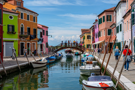
When I think of Venice I think something like that:
of course the arguement can be made that having too many colors would confuse the players even more but I think knowing where and when to use the colors would help a ton. Also the mood of the map is also too saturated for some reason. Making the map sunnier would help imo a lot more. Anyways that's what I got to say.
I spent more than an hour providing you with this feedback because I want to see this map being one of my favourites and not just a map that I might play once a year. It has great potential and I would love to see it succeed and get loved from the community!
Hope I managed to help you guys out and good luck with the map!
Thanks!