Tropico

KotH Tropico A4

Scarfulhu

L1: Registered
Nov 24, 2016
10
7
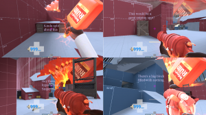
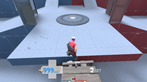
Tropico - A basic KOTH map located on a jungle base

Hello! I've been dabbling with Hammer for a long while, but I never actually got a layout down. So, finally this is the layout I came up with. It's basically my first map - but I have tried several other times to no avail.

It does adhere to the Viaduct-formula, so it's nothing ground-breaking. (I wanted to keep it simple.) And this is still A1. So there's a lot of things to do yet.

Right now, the map uses assets from the Borneo (the skybox) and the Mayann prop pack (the palm trees).

As far as issues I'm aware of and intend to work on:
  • Sheds near the bottom don't add much to the gameplay. Not sure whether they should be removed or replaced.
  • Map may be slightly too large - takes a while to get to the point. Could either decrease spawn time, or shorten map. Whatever people think would be better.
  • Sightlines from lower exit quite powerful - this area has been changed slightly for A2. Will have a barrier.
Credits:

Sean "heyo" Cutino, Matt "vhalin" Leahy - Borneo Assets
The Mayann Project

Again, this is my first real map so I've probably done a lot of things wrong, and I'm looking for advice to improve for future ventures. Cheers!
 

OriGam

L1: Registered
Nov 27, 2016
6
1
So far I like it. Nice flanking routes, alright health pack and ammo placement. Though I dislike the amount of one-way routes that only classes with explosives or triple-jumps can go up. Two are okay, but Ive noticed like four in total. Retreating as a Medic would be impossible like that. Imagine hitting that dead end with 99% and no pocket in sight.

Also the health pack right under the Point is a great addition. Risky to go there, but a good payoff. Make it a large one though. Makes it more rewarding. It could be an interesting addition to maybe even turn around the match with a spun-up Brass Beast or a Medic at low health who almost has full Über. The boxes next to it are completely useless, though. You could sandwich the health pack inbetween those two boxes to make it more risky to get it.

The car in the middle seems kinda useless and out of place. Maybe turn that into another slope that you can walk up like on that rocket map (forgot the name but it's the strongman game in halloween mode. I mean the platform that's right in front of the weird Merasmus fortune teller puppet. Not the rising one; the one with the pumpkin bomb.). It would make those little shacks more useful as well since they are not walled off anymore.

Maybe connect those shacks to the slope mentioned in the previous paragraph so Sollies, Demos and Atomizer or Force-A-Nature Scouts have an advantage (I tested again and couldn't get up as F-A-N Scout. Maybe change that as well.) and can pick off people on the point easier. Maybe not the Scouts though. They could use that for some collateral Mad Milk.

The second set of textured barriers (not the ones surrounding the point) seem kinda puny. Maybe make those a little bigger. Maybe also put them closer to that gate so players coming through are not as likely to be noticed by people on the point.

I also see a bunch of corners on this map with nothing in them. There's one pretty close to the point. Maybe put a small or medium health or ammo pack there. You can be like: Oh no, I'm cornered! But now I have ammo and health again!

This is my first map critique ever so I might be full of crap but I hope that I gave you some good advice and maybe even some inspiration.

Also: I'd like to see some more lights. The map is pretty dark in some places.

LASTLY: It's worth rereading this because I've been editing this text like crazy. Probably because I'm slightly fangirling :p
 
Last edited:

Scarfulhu

L1: Registered
Nov 24, 2016
10
7
I've addressed a few things people pointed out and criticised in this update. Still not sure about some things.

Tropico A2 Change Log:
  • Added barriers at the lower exit to provide cover and lessen sniper sightlines from lower building
  • Increased length of lower walls
  • Added new props of either side of the lower level
  • Removed old lower buildings
  • Replaced with one larger building with a bridge to the point
  • This building contains a large ammo pack
  • Lower health pack by crates replaced with medium size
  • Added new ramps extending from lower ramps to the higher ground
  • Upper flank route has been extended
  • General aesthetic improvements

Read the rest of this update entry...
 

OriGam

L1: Registered
Nov 27, 2016
6
1
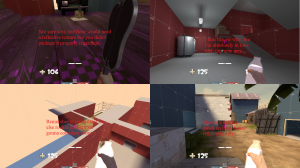
Alright. I played a2 now and I'm really happy with some of the changes but the flanking route on the right (going from red here) still kinda sucks. I don't get why there's a small Health Pack under there if getting it makes you an easier target. Being hunted down all the way to that little pill would require overextending from the enemy team so I guess that's a good thing? It bugs me more than it should because it also influences the choice of your medigun. The Quick-Fix could make that jump if you were pocketing a Solly, but there's no reason for him to go back other than to escort you to safety. (Ill. 1)

Close to the capture point there is a wall with two boxes behind it and if Snipers could get up there it'd be a great spot for them. The question is: Would it be OP? To make it a proper sniping spot you'd need to add a ramp or a pile of smaller props and shorten the wall in front of the big boxes. You can see a lot of the middle area but the barriers next to the point prevent you from seeing the lower routes. (Ill. 2 but not the sight lines)

When coming through the middle you can be easily picked off by a Sniper peaking through that building and I'd recommend putting a barrier on the side or putting that see-through fence closer to the gate. In the old critique it was about people on the point but now it's Snipers. Those Snipers can't be killed from the point in Ill. 2, by the way. (Ill. 3)

And now lastly something that I don't think to be aestethically pleasing. (Ill. 4)

Hope I could help again :)
 

Attachments

  • Tropico a2.png
    Tropico a2.png
    1.4 MB · Views: 189

Scarfulhu

L1: Registered
Nov 24, 2016
10
7
For point 1: I'm not sure about it either. I may change it once I've done a bit more testing.

For point 2: I definitely don't want that to be a Sniper spot. I feel like it would be too easy to abuse for snipers. I have most of the sightlines how I want them right now, but they'll get refined in testing for sure.

For point 3: That window is large and open. The Sniper there is easily seen. (There'll be more lighting there in the next version.) And it's very easily flanked. It's also accessible from the point. No doubt people will try to snipe from there, but it's a riskier spot than it looks in actual play.

For point 4: That'll become a more fleshed out building. It's not aesthetically pleasing because it's an alpha - so there really isn't a lot going on there. If you look inside the flank building that it attaches to, there IS a door leading to it. That entire area is meant to be a small part of a garage (with the big door near the health kit leading to the larger segment.), so I imagine that'd be a room full of filing cabinets and paperwork etc. I may add windows to it when the art pass goes ahead. But yeah. That's all stuff to consider later on. Not this early.

But thank you regardless. I do appreciate the input. The next version will have a working skybox, because apparently I buggered that up. I just need to iron out a few kinks there.
 

OriGam

L1: Registered
Nov 27, 2016
6
1
Also the reflection file for the control point is black and purple squares. I don't know if you put one in yet or plan to do so later but maybe I'm just bugged. I saw the jungle skybox in your screenshots so I assume it's in the file. It's probably my fault somehow.
 

Scarfulhu

L1: Registered
Nov 24, 2016
10
7
Nah it was definitely my bad on that one. The skybox and the trees were supposed to be packaged in with the map, but I guess I didn't package them in properly. I finally worked out how to do the packaging, but it did cause some other issues that I need to iron out. There will likely be a version A2P - between A2 and A3, with minor fixes.

And as far as reflections go, yeah, I need to add cubemaps. I may as well do that as well.
 

Scarfulhu

L1: Registered
Nov 24, 2016
10
7
Okay - here's the fixed version of A2, that I've dubbed A2P (Packaged)

The next version will just be called A3 though.

Changelog:

- Skybox no longer makes you trip balls. (Borneo Skybox Assets Packaged)
- Trees no longer have existential crisis. (Mayann Palm Trees Packaged)
- Lowered trigger area of capture point so it can't be capped atop the barriers
- Added cubemaps

Let me know if I broke anything else!

Read the rest of this update entry...
 

OriGam

L1: Registered
Nov 27, 2016
6
1
I don't think I've ever read a funnier changelog :D
Everything seems to be working, though. No more seizures or error trees. The point looks normal as well. The trigger area of the point still seems to be too large, because I can capture it while on the edge of the bridge.
 

Attachments

  • Lookatthatcap.png
    Lookatthatcap.png
    342.1 KB · Views: 188
Last edited:

Scarfulhu

L1: Registered
Nov 24, 2016
10
7
Tropico A3 Changelog:

- Added some textures and overlays
- Added rocks barrier to improve sightlines at the lower part
- Adjusted size of capture point slightly, and moved the prop back a bit
- Overlays now show the capture zone of the point (roughly speaking)
- Added ramp to previously 1 way route from base
- Added a small ammo pack beneath this balcony as well as the small health pack
- Swapped the tall crate and the ammo pack in the upper route
- Added a dump truck and an extra tree. How exciting!

Read the rest of this update entry...
 

OriGam

L1: Registered
Nov 27, 2016
6
1
I looked at the changelog, then I looked at the corresponding parts of the map, then I said "Nice!"

Though I just noticed that the quote on quote attic of the building connecting to the point via bridge has no reason to be there. It's just another aesthetical problem but making the roof more flat would look much better. Or you could keep it that pointy if you lowered the ceiling of the room below because it has no right to be this high.

Also the boxes under each of the ramps that you added (that I am eternally grateful for by the way) are team coloured. Not sure if it was intentional or not.
 

Scarfulhu

L1: Registered
Nov 24, 2016
10
7
Tropico A4 Changelog

- Redesigned the areas leading up to mid to shorten length
- This removes one of the 3 routes from spawn
- Changed the skybox from Borneo to Goldrush
- However, the middle building now has a lower level that leads outside
- Previously invisible walls at spawn replaced with fence
- Increased size of previously 'cramped' shacks (lower flank)
- More health and ammo leading to the point
- More lighting - still have more to do here I think
- Added displacements
- Added overlays beneath health and ammo
- Added some detailing

And we're back with A4 of Tropico! I've condensed the map by a bit and redesigned the pathways to the point. It's still very similar, but with less large open spaces. I've also been working on sightlines and some detailing because I'm a little bit overeager.

I've also cemented the theme a little more - with some construction elements being added. (See what I did there?) The idea is for it to be an unfinished hydroelectric plant in the jungle. Hence the Gorge/Hydro assets appearing. So yeah - there'll be some stuff from the construction pack as well.

It's also worth noting that I've altered the skybox, to make the map appear less washed out. Let me know what you think of this one.

Read the rest of this update entry...
 

Cytosolic

L5: Dapper Member
May 1, 2015
201
169
Cool idea, but why are there turbines on the roof? Seems like they should be inside. Keep in mind that a hydroelectric plant needs and almost constant source of running water, so you'll need to put a dam somewhere outside the map. That could actually look pretty cool.
 

Scarfulhu

L1: Registered
Nov 24, 2016
10
7
Yeah, I was to-ing and fro-ing about the turbines, honestly. So I do agree that there maybe should be something else up there. And I already have plans for a dam, actually.

Thanks for the advice! :)
 

OriGam

L1: Registered
Nov 27, 2016
6
1
I'm happy about all of these changes and even though the length wasn't really a problem for me I like it better the way it is now. Refer to the picture for some minor mistakes and some approval.
 

Attachments

  • Thereyago.png
    Thereyago.png
    1.4 MB · Views: 179