CTF Tombfort

evanonline

L420: High Member
Mar 15, 2009
485
273
Just a small note--I forgot to pack in a texture. If you downloaded in like, the last hour or so, give it another download. Whoops. Whoops. Whoops
 

evanonline

L420: High Member
Mar 15, 2009
485
273
After gameday, and with a large list of feedback to go down, I've gotten cracking on Tombfort B2. I'm thinking of some pretty radical redesigns to pump out in the future, but I'm gonna keep it simple for B2.

Here's the big changes so far:

dbdB6mW.jpg

j1EB4kI.jpg


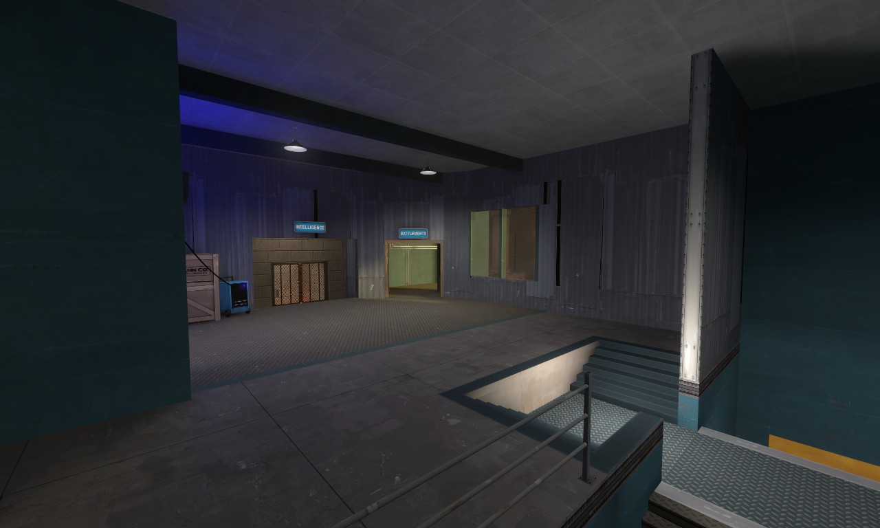
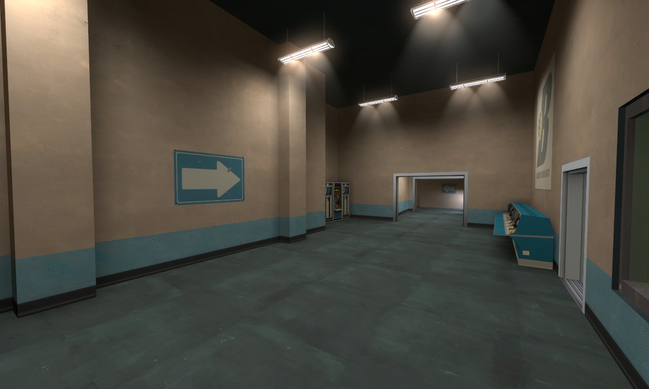
The exit from the spawn has been redone. There's a nice little window to the outside world in front to create a better sense of direction, the passage into the ruins has been made much more blatant, and the walls have been knocked down, opening things up a bit more.

rnbjfvc.jpg

ngtLp5P.jpg


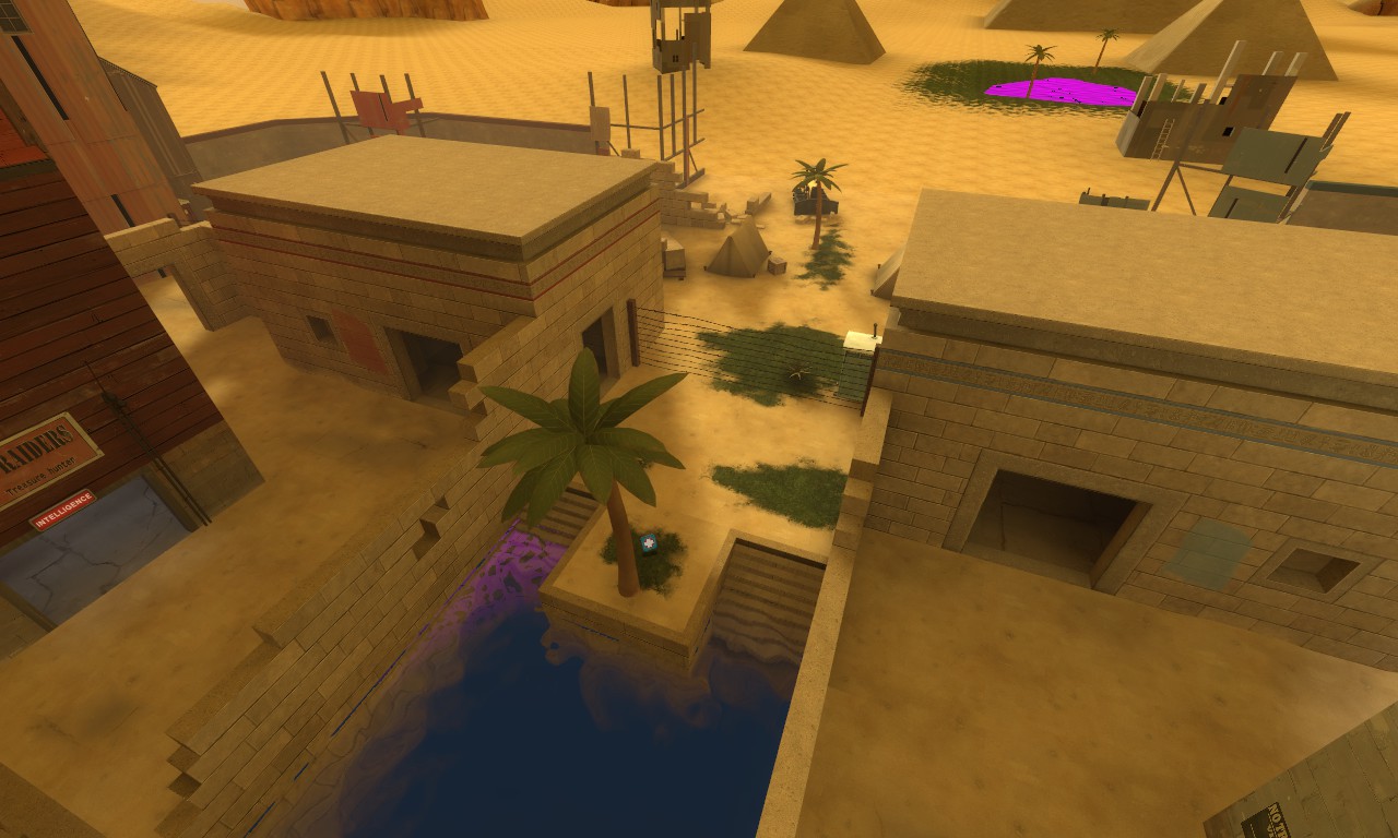
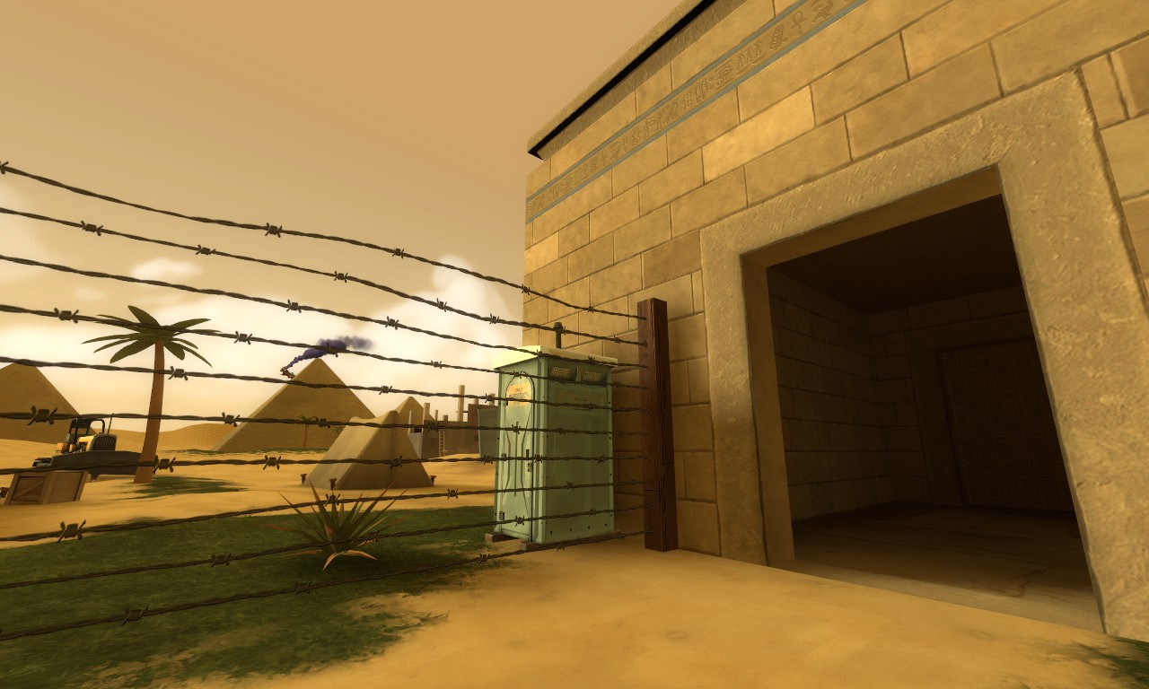
I remembered to put in the Portable Toilet model like I wanted to. Much less importantly, I opened up a passage through the little Egyptian buildings on each side of the pool, with a path leading to the little island. For some reason I didn't put any lighting in there yet. This is a change that's been suggested quite a few times that I've been a bit resistant towards, but I think it makes the back half of the map much more important than it had been and gives another path around the main route that doesn't require you to go through the water.

HcNZFT0.jpg


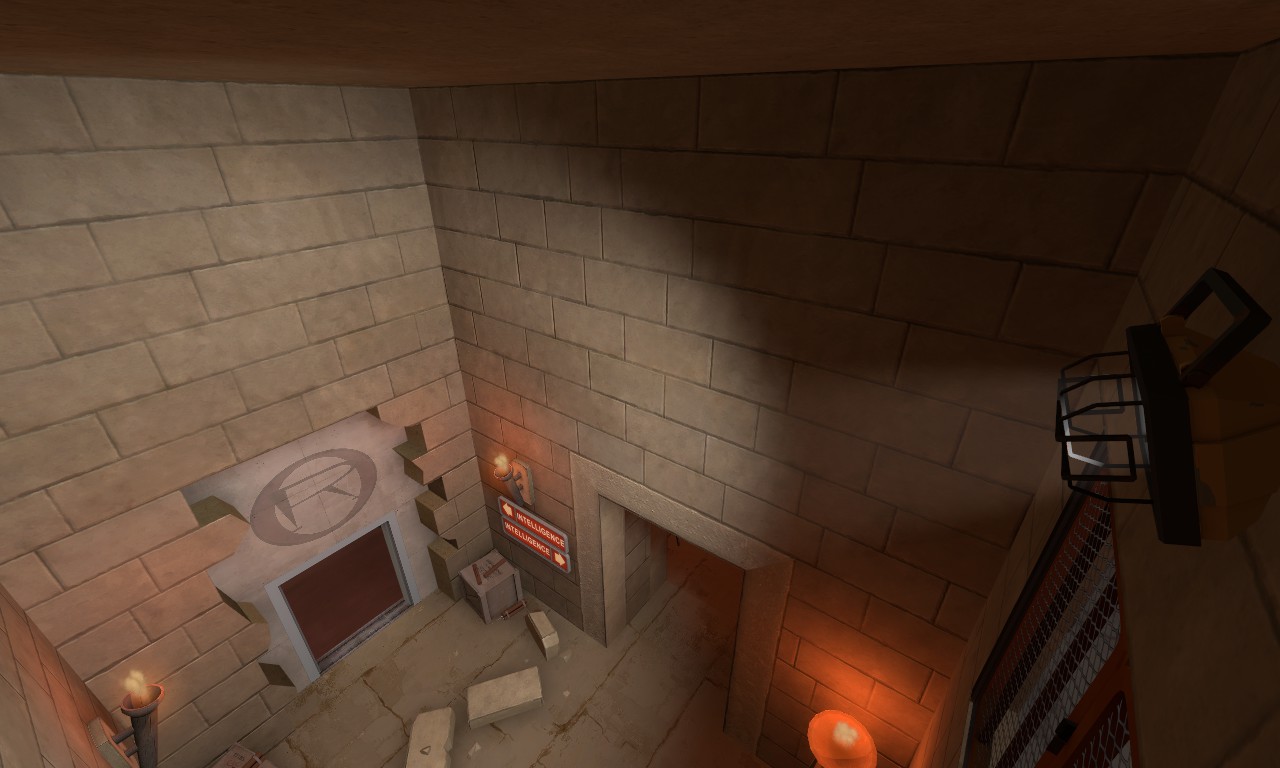
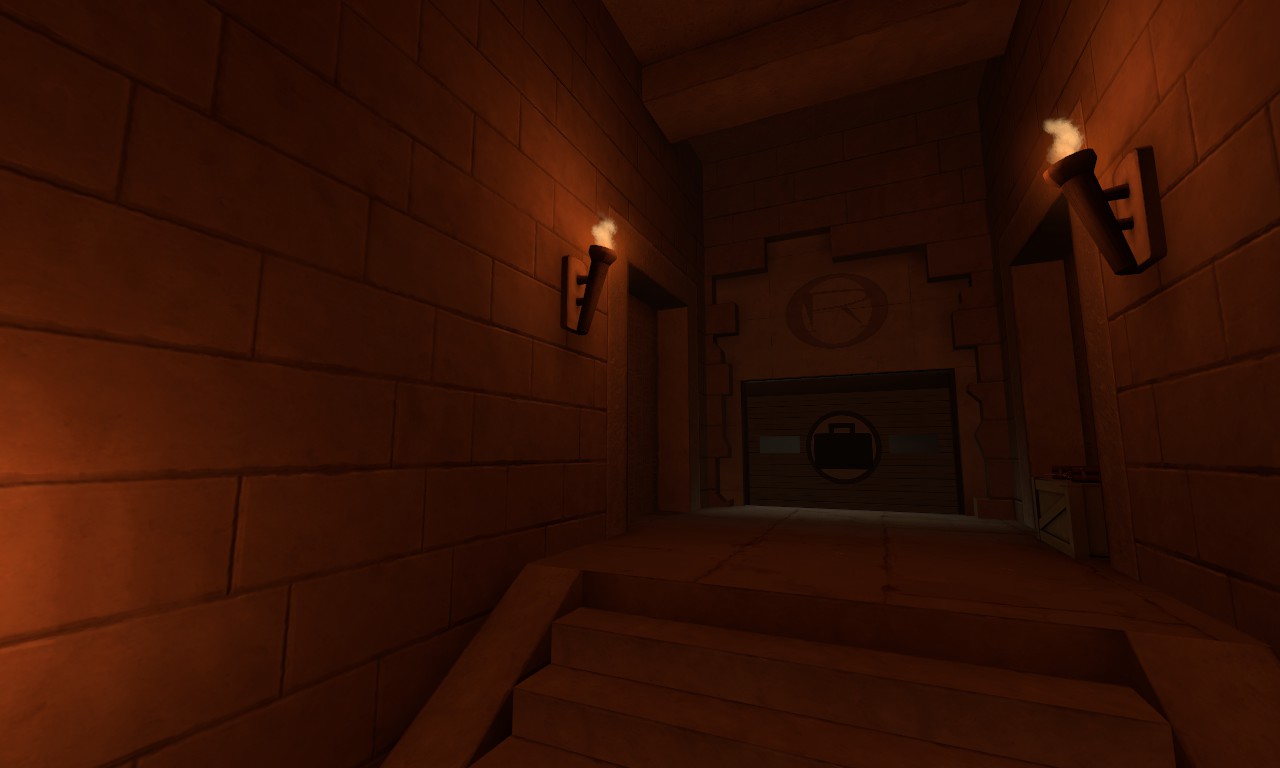
A rather interesting complaint was posed to me at gameday--the darkness of the underground tunnels belies their importance. It's a thin line to walk along; I want the tunnels to be dark because they're...underground tunnels, but it's a very fair point that they look much less useful than they really are. I'm not going to brighten it up too much--this screenshot if anything is way too far in the other direction--but it's something I plan to work on.

R6BEq6l.jpg


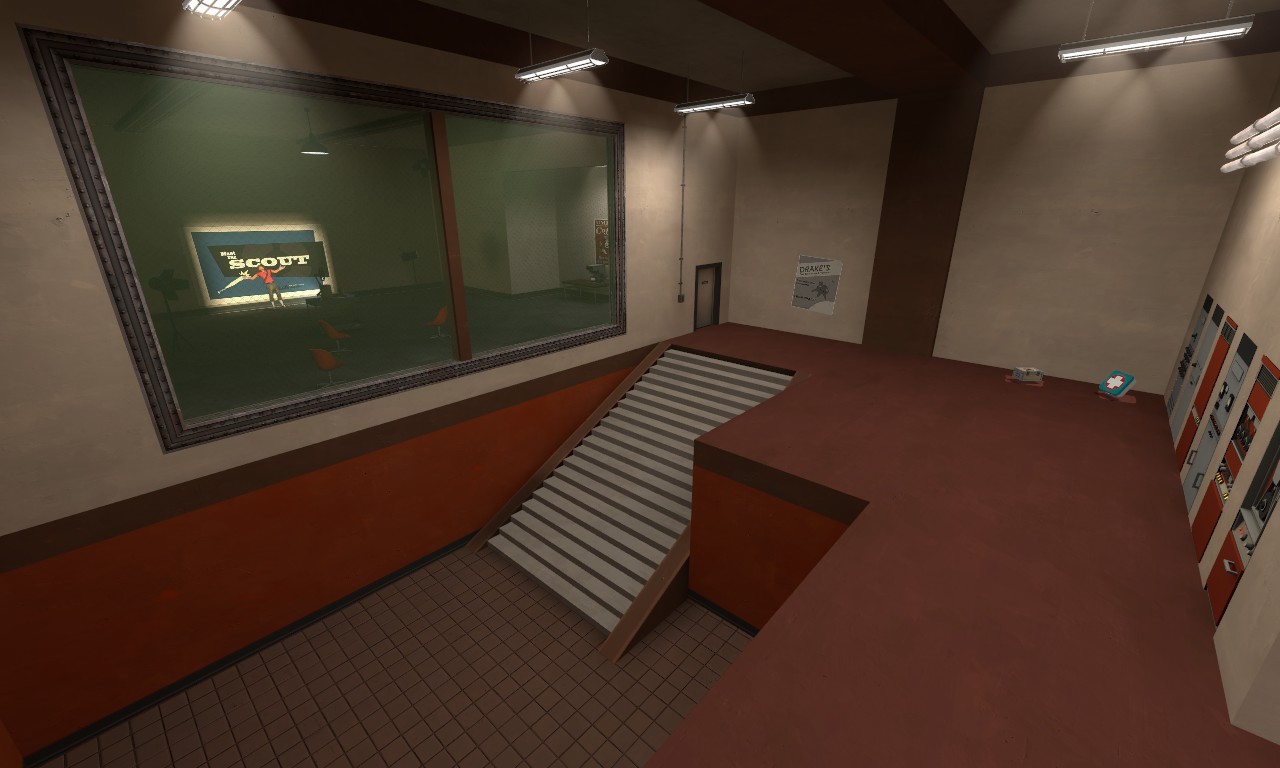
I've never felt too pleased with the first spytech room on the main path. I did a little tinkering around with it to make it a little less bare. More computers, that perilous, stupid-looking stack of wall computers is gone, nice lil wall dinglies. Wall...out...things...wall bumps...makin things less flat...

XiRyMnJ.jpg


I've heard a lot of complaints about the back room of the intel area--namely that it's useless. The reason I have it in place is something I feel is rather crucial though--I wanted the player to have multiple approaches when exiting the vents, given that there's a height advantage for defenders in the intel that could easily be exploited. I wanted the player to have a choice to take the other vent and go around so that a sentry couldn't just be positioned right above the vent and leave you with no option but to turn around.

It's very rare that CTF maps have you turn completely around when you get "stuck"--typically, the maps provide you with a semi-safe "loop" so you can get a different perspective. Examples would be as small as the two hallways into 2fort's intelligence room, or the passage going back down into the sewers from above in Doublecross, As the map stands right now, I feel having this little loop in the vent system is completely crucial, even if it isn't blatantly obvious as to why.
o5ZrSoQ.jpg


What I'd rather re-examine is this hallway into the intel room. It only exists to begin with because players felt it was rather iffy to only have that vent system going into the intel room from the water path, but the vent system, and the main passages through the map on a whole, have changed significantly since then without me really putting more thought into this hallway. My thoughts are that I should rework this room and differentiate its path from the one the vent system takes. Rebuilding this room will give me the opportunity to provide a little more breathing room in the underground ruins as well--it's slightly too cramped down there, I feel, and I've never felt satisfied with how the ruins are essentially just a straightforward series of 3 rooms.

Other changes I want to do are add a little more detail to the interior entrances of each base--I don't know how I was unable to recognize how barren those walls are in the blue base--and I want to add some guiding passages denoted by hazard strips like Badlands has, which Egan recommended to me.

Lengthy post, I'm basically using this thread as my little update diary but who cares!!!! I'm motivated!!!! Gonna get shit DONE!!!!!!
 
Last edited:

evanonline

L420: High Member
Mar 15, 2009
485
273
Whoa, I guess it's been two weeks since my last post.

Long story short, I got distracted taking up another personal project. I plan on taking things up with Tombfort again this week and putting the finishing touches on B2.

No pictures of it yet, but there's gonna be some reasonably large changes to the intel room. After that I don't anticipate having to make any huge layout overhauls again. If all goes according to plan, I should have something to share again by the start of next week! Tombfort has been on a few servers as far as I know (though why TF2stats isn't actually showing them is beyond me), so I'm excited to have a huge slew of improvements ready.
 

evanonline

L420: High Member
Mar 15, 2009
485
273
Guess who's got a B2...just for you...

Featuring a pretty heavily revamped path to intel which is less straightforward...but MORE FUN!! ...I HOPE!!! Definitely the last major layout revision. I wanted to create some differentiation between the two passages from the ruins to the intel so now the old straightforward door goes around into the back room instead of straight into intel.

Version B2 - The Porta-Potty Update

-Put in the portapotties.
-Added server browser thumbnail images--these are separate files located in materials/vgui/maps and are not necessary to play the map
-Changed back entrance from ruins entirely--now goes around through back and into the vista room behind intel
-Removed rubble at the middle of the map to prevent players from using them to obscure visibility
-Fixed some textures up--adjusted water texture to repeat less, fixed some misaligned stuff
-Fixed missing playerclip on window in the intel backroom on RED's side
-Placed nobuild over the small stairs by the main spawn exit to prevent teletrapping
-Redid spawn exit area--tore down some walls to open up the indoors area more, put a window to the outside in place, made exit to underground ruins more obvious
-Opened up the egyptian buildings outside to allow a new path around the back of the pool
-Adjusted main route through intel a little--more stuff in it, and the huge stacked computers are no more
-Improved lighting inside the underground ruins
-Removed crates in intel room that no one ever actually used
-Added arrows pointing the way out from the intel exit of spawn
KNOWN ISSUE: Minor cubemap errors in Red intel

DOWNLOAD

BiFNYpICAAArd9C.jpg
 
Last edited:

evanonline

L420: High Member
Mar 15, 2009
485
273
http://www.youtube.com/watch?v=sq7KMiqNFEo&feature=youtu.be

Tombfort B3 is out! (And Arena Tombfort B1!) This is gonna be the big release I start pushing for server inclusion, I'm very satisfied with the map. Includes the snazzy intro video above!

DOWNLOAD (includes both versions of the map): http://forums.tf2maps.net/downloads.php?do=file&id=5587

Changelog:

-Added new intro movie
-Placed nobuild in the underwater areas
-Clipped the railings in the back room of the intel so you can't walk along the outside
-Fixed misaligned textures in BLU intel room
-Changed wood textures under healthkits by the egyptian ruins to eliminate reflectivity
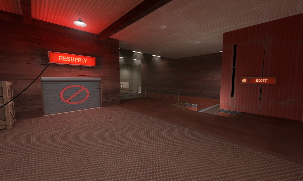
-Removed misleading exit signs in the spawn exit room
-Fixed collisions on wall computers in Red intel
-Removed dumb-looking solitary pipe in each fortress entrance and replaced them with more sensible pipes
-Removed medium healthkit by the tree at mid
-Improved lighting in the treasure hoard in BLU's intel so you can actually tell that the pile of dirt is gold. Eheh.
-Fixed weird metal strip textures in fort entrances
-Fixed weird reflections in red intel and water at mid
-Removed some dev textures I had missed
-Fixed Lil Chew Chew background prop fading out too closely
-Added directional signs in the ruins
 

xzzy

aa
Jan 30, 2010
815
531
This was run on the penny arcade server last night, and everyone was super confused with the layout.

That's pretty typical for a new map but even after two rounds people were still getting lost. I couldn't decide if it was just an issue with visual cues or the actual layout giving too many options, but either way it's something you'll want to look in to.

That said it played well, even sentries couldn't ruin it which is pretty rare for ctf.
 

evanonline

L420: High Member
Mar 15, 2009
485
273
Giving this a little bump to say I'm gonna put out a new version soon with some last little changes within the next month. I have a few bugfixes I've been meaning to make but I was sitting on it until I had enough to warrant a new version.

It'll be an update to both the Arena and CTF editions of the map.
 

evanonline

L420: High Member
Mar 15, 2009
485
273
After 10 months in development I'm finally capping this map off with a Release Candidate version. I've become quite busy as of late so I wanna just put out what I have and be done with it. I'm really proud of my work here! I've updated both the CTF and Arena editions of Tombfort.

Version RC

-Removed hat and weapon props in spawn room
-Changed railings outside spawns to better wall off the top area and prevent sentry spam
-Revamped intel room again--added balcony from main entrance through base, and second-floor connecting corridor between both passages to intel
-Added door to the main hall into intel to accomodate for the newly lengthened sightline
-Redid lighting in intel room
-Fixed some bad shadows across the map
-Added a new friend to the break room
-Fixed standing on "Resupply" sign over the lower RED spawn exit
-Improved ammo/health around mid based on competitive feedback
-Changed roofs of bases at mid from func_brush to func_detail and clipped them properly
 

Egan

aa
Feb 14, 2010
1,378
1,724
ctf_tombfort_rc Showcase Stuff:

Gameplay:
- The scale of the routes of the map felt large overall. In the egypt theme this almost seems necessary for detail purposes, but it felt like teams were being spread thinly around the map - we played a few rounds of 11v11 but it didn't feel like it was 11v11. This may have been because while there were adequate routes of attacking the intel and sections of map, they felt disconnected.
- It was difficult to attack intel carriers as they exited the base and with the small amounts of players using the spaces it didn't feel right, particularly in the outside sections of the map. It may be worth blocking off the lower front exit of the base, making the section underneath the stairs that lead up to the spawns solid - so intel carriers aren't so fast out of the base - so defenders get a better chance defending this way.
- Exiting the spawn felt weird because while there is a back exit nobody noticed it, and the routes immediately out of the front exit went off in very different directions, the tomb route particularly as it's a drop down to an area hard to exit out of quickly. It would be better if players spawned in a cage section in the wall inbetween the stairs and the resupply cabinet facing the current spawnpoint area of the spawn room - when they spawn they immediately see the choice of up or down, battlements or intelligence.

Aesthetics:
- Finding the specific route you want out of the intelligence room wasn't possible since all exits look the same, got confusing. No hints of where a route goes.
- The detail in the intel rooms were very stale, the walls felt bare, the intel platform is just geometry. The lighting in these deep spytech locations should feel dramatic since it is an important section of the map - and it gets confusing from other sections of the map which use the same style of detail & lighting.
- The vent at the bottom of the intel area felt odd - it's set up in the room implying it's a definitive part of the structure, but it is a ventilation shaft with an exit having a missing vent panel on the floor, seems a bit weird in the intel context.
- The bright white construction lights in the tombs mixed with the dark red torches and the dark blue water against the super bright yellow lighting outside felt weird. Contrasting saturation of colors, hard to focus on anything in particular, generally felt odd.
- There is a door leading from the front routes to the intel area with a breifcase symbol on it, which we assume represents that the intel is in this direction, but the sign is also on the other side of the door too so it was confusing for people coming from the intel through this route.
- There are arrow signs in the color of the team's base they are in that point towards the team's intel room. Generally in maps team colored signs point to the objective the players on that team should be going towards, so it's confusing in this case. Especially when leading players out of the base when they are first wandering the halls dazed and confused.


While the detail on the map was overall okay, a lot of it felt like it was placed in to fill up space - that it wasn't creating an interesting composition in each area of the map. The routes of the map should have better flow; for a lot of people the first few rounds they were getting very lost traversing around the many routes around the intel room. We're not going to add this to the showcase yet, but if you can make it feel better in terms of gameplay flow (players getting lost and being confused), letting player defend the outside section of the map better (blocking low front exit under stairs, enclosing outside a bit more for splash damage), and by making the aesthetics feel better then we'd like to see where it ends up and might go over it again.

CTF is a hard balance of making it easy for teams to get in and out but also hard to get in and out. Too easy and it feels cheap for defenders, too hard and it feels annoying for offense.

Feedback from the server.
 
Last edited:

Egan

aa
Feb 14, 2010
1,378
1,724
arena_tombfort_rc Showcase Stuff:

Gameplay:
- The first route out of the spawn - the battlements - is also the best route since it has height above all of mid and you can rocket jump from it to the enemy battlements for easy control over their base also. If you go to the lower exit of spawn instead then you are forced to defend with as many players are left after the enemy team destroyed them having less players for the first onslaught over battlement control (typically you will then lose).
- The flat area below the battlements was not particularly interesting for combat since it was a big flat place.
- Typically you want to have at least a few equal routes in arena so that it comes down to prediction of choice from one team to another, nucleus & offblast do this well for arena mode. In maps like this where there is one dominant strategy the gameplay tends to be the same every round and there isn't much replayability.

Aesthetics:
- The medium healthpack in the middle of the map wasn't obvious enough, perhaps you could make a grate in the floor/ceiling above it to show that below is the healthpack of the map.
- The weird team signs from the ctf version of the map are still present here - pointing to the closed off intel location which is confusing and weird.
- The egypt sections of the map felt fine but the other indoor sections felt like filler detail, not particularly interesting things: textures on walls and some props and signs here and there to fill up the space.

You should try to make the other routes of the map useful to take - the pyramid sections & side/lower routes. At the moment the only route that matters is the top battlements: low front and you are just late to the battlements fight, side route and your team that went battlements loses battlements and now enemy has height advantage on you at side, pyramid and you have no advantage over anything. For these reasons we aren't going to add this to the showcase yet.

Feedback from the server.
 
Last edited:

evanonline

L420: High Member
Mar 15, 2009
485
273
It's been 6 or 7 years and I'm back into TF2 and I'm going to update this freaking map. Looking at it with fresh eyes there's a lot I genuinely really like with Tombfort and I'm very proud of it, but I want to improve it. A lot of the criticism listed above by Egan stands out a lot to me now - I took it to heart back then too, but I was really losing interest in the game and wanted to consider the map done.

Things I want to change revisiting this:

1) Biggest thing I notice is that bots suck ass on this map. They suck ass on a lot of maps. But I'm running a community server now and having bots active is a huge boon to us when the rest of the game is suffocating, what with the... different, breed of bots infesting the official servers. I really need to add some bot hints, haha.

2) Coming back to the map, I'm a little bothered by how lacking the elevation is. The center in particular feels flat, and I want to add a little bit of displacement to the center area here and there. A suggestion above that stands out to me for the Arena variant is the notion of adding a little grate to view down into the healthkit chamber underwater; I feel like that'd be a good change in general for both forms of the map to add some dimensionality.

3) Better lighting!!! It's so dark in places.

4) One of the criticisms listed above is that the intel area is lacking in detail, revisiting it now with a different perspective I can see what I was going for but it is a bit lacking in the "impact" of the other intel areas of TF2. I'd like to touch it up and make it have a bit more of that "wow" factor, and make the direction of the many paths that cut through the intel room make a little more sense.

I don't really need to bump this to tell everyone "hey, I want to work on this again" per se, but I'm hoping that waking this up might get me a few outside thoughts - I'd appreciate some fresh opinions if anyone were to happen to have any. A lot has changed for me personally but even all these years later TF2 is getting my creative juices flowing. My little community server also really likes the map, which is very validating, and I wanna blow the cobwebs out of it for them.
 
Last edited:
Oct 15, 2018
252
135
Legendary return after nearly 6 years, epic. The map kinda reminds me of Egypt and Turbine, which is quite good.