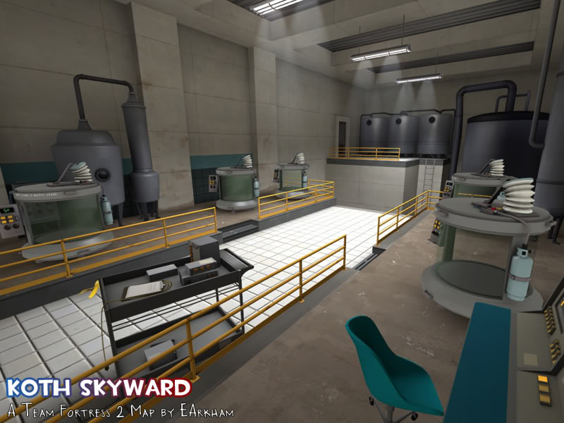
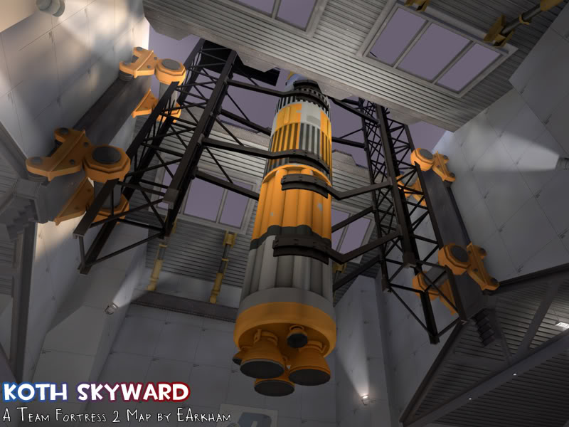
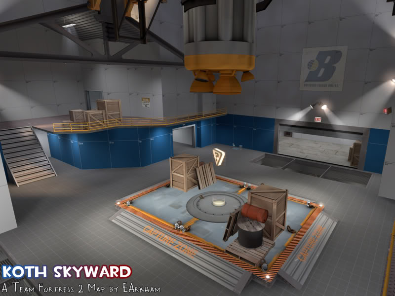
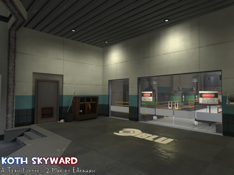
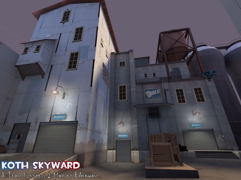
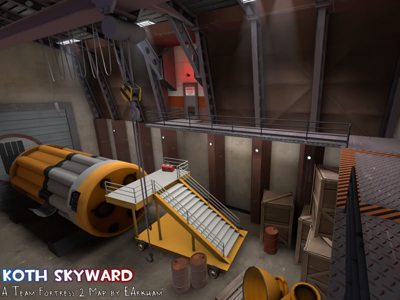
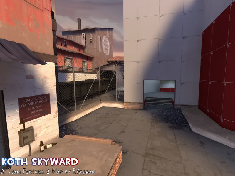
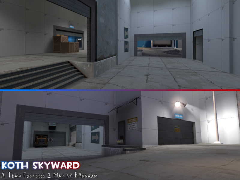
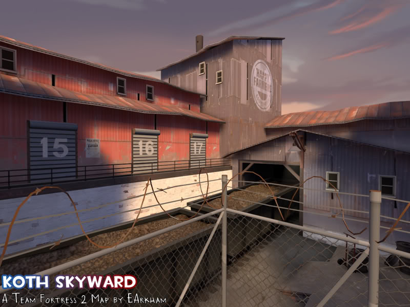
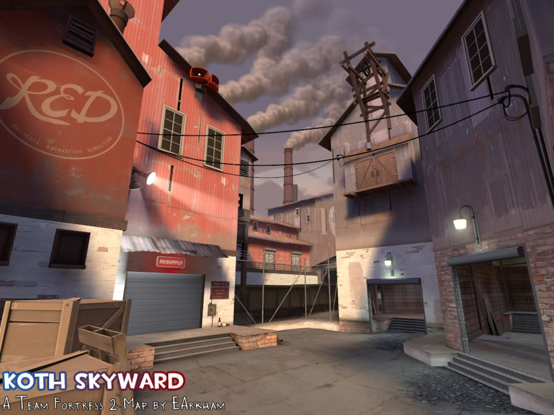
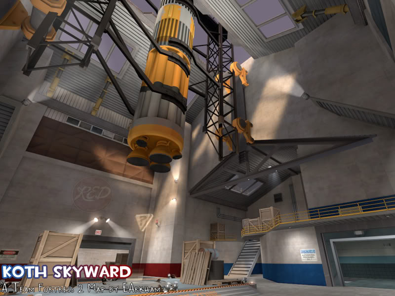
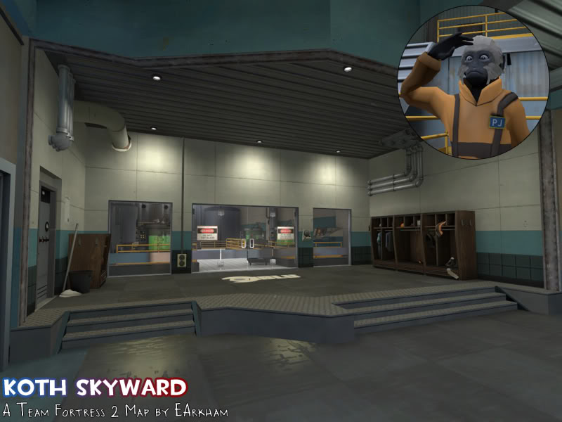
Skyward

KotH skyward b2

  • This map is featured! Our best maps, all together in one place for your viewing pleasure.

EArkham

Necromancer
aa
Aug 14, 2009
1,625
2,774
Reservifying the name. for the STAR_ contest!

According to googlefu, there's a quake map by the same name, but I'm not worried about it since that's a different game.

Version B2 -- Corrected various issues based on feedback.

Now on the TF2 Map Workshop: KOTH SKYWARD B2
 
Last edited:

EArkham

Necromancer
aa
Aug 14, 2009
1,625
2,774
Game day bump.

Known issue is how the balcony and door get spammed, making the point more difficult to recapture.

Would having better access in the yard to health/ammo and less access to it near the point help? Because this is one thing I'm planning for A2. Also looking at layout/geometry changes.

Also, newest pic:

koth_skyward_a2_01.jpg
 
Aug 23, 2008
404
380
Hey, we pugged this tonight in 6v6. Have to say, I personally really liked it (I'm a sucker for foundry set ups) but some people in the pug didn't really dig it (grumpy mofos!). I think your layout has some problems, but if you tinkered with them you could probably have something pretty fun.

Demo: https://dl.dropbox.com/u/3492731/spacesaver/20120715-0310-koth_skyward_a1.dem

1) Holding mid is way too easy. In fact, unlike a lot of other koth maps, the setup here makes holding the middle building much easier and correct than pushing out and assaulting the enemy team. That might be just how the map plays and not a hug problem, but many of the players did mention it and its the sort of thing a 6v6 player wouldn't really be to excited about. They really prefer agressive pushing and attacking, rather than holing up in some base and burning down the clock. We definitely had some moments where we pushed out and attacked the enemy team, but it always felt pretty hard to do that without getting wrecked.

I think what you really need to do is to set up another flank area on the other side of the map. Basically, your map has half a yard (think gran) but its missing the other half, so players end up bunched into one crazy little corner and hoping for the best on the push. You could either open up the left side (that displacement up to the top, and have another half of yard over there that extends towards the enemy team and then winds into the building again making this nice surround on the central structure.

Or you could extend the opposite side of the map. So, instead of the garage with the drop down you have another windy bit of yard that snakes through where the garage is, and then comes into the opposite side of the shutter door area ala warmfront. You'd have to get rid of the garage and slim down the building that leads to the center of yard, but you would end up with a lot more space on that side of the map, and a new way to push into the point that would help make the enemy team a bit more scared of just holding doors. If they don't hold forward they might not know which direction your coming from. (here is a picture because I am crazy as fuck) If you did plan to make either of these changes, one of our players suggested moving the spawn over to be a bit more in the center of that huge area in the bottom.

2) The platforms up top seemed pretty neat, but might be a bit too strong to hold. I remember my demo was complaining a bit about lack of ammo. Maybe throw a medium ammo up besides the medium health up there? Its pretty dangerous to walk into that room, but he might risk it if he really needs stickies.

3) Okay sewers. No offense, but the sewers probably need to go. :( I know its probably the part you liked the best, but they are just confusing and poorly positioned for comp. You can't really use them to do anything major, as it takes forever to navigate them and then you just end up getting stuffed in the door, spammed to death by the enemy team. They really screw up the flow of the map, without offering anything particularly exciting. If you are going to keep the sewers, I feel like you need to really simplify them, make them pretty much a straight shot to the stairs + door and don't have them wind around into each other so you can push the enemy side. I could see a scout just running around down there forever without doing anything. The other part that should probably be on your mind, is that having a spy down there capable of going from his side of the map to enemy spawn is probably not so good. Takes all the stealth out of being a spy. If you did the red changes in the screenshot above, you'd probably have to get rid of sewers anyway, but like i said, if you must keep them, keep them simple.
 
Last edited:

EArkham

Necromancer
aa
Aug 14, 2009
1,625
2,774
Awesome, thanks very much for the feedback. :)

Interestingly enough, I've actually got purple dev brushes in version A2 as I worked out a route in that exact same spot you have noted in red. Heh. However I'm liking the green idea a LOT better. I will need to do some measuring and speed estimates before I pick one, but A2 will likely try the green route.

I'm not particularly in love with the sewers, but they're important to the theme of the map (which will be clearer later I hope). I personally found them either useless (that side route leading to the point is a spam magnet if someone spots movement there) or an insanely easy way to ambush the medics/snipers at the rear. I plan to simplify them, but keep them for now.

Should the garage doors go or stay? In our TF2maps playtest, they were stickied too effectively IMO, but since I'm adding another route I wonder if that may not matter.

What I'm doing for A2:

* Widening the doors on the balcony at the point to make them less spammy
* Moving health/ammo from garage to outside in the yard (to make them less useful to those holding the point room)
* Removing small health/ammo directly next to the point
* Widening the main point room by 256 units
* Adding another entrance from buffer zone to yard (right where the water tank is)
* Simplify the sewers
* Garage doors will open once and stay open
 
Aug 23, 2008
404
380
If you were to do the red route, I think you would want to keep the garage doors, but if you plan to do green getting rid of them might be good.

Looking at the picture again, I feel like the map might be possible with both a red and green route, but I'm not really sure. Try green for now if thats what looks best to you, but keep red in mind.
 

EArkham

Necromancer
aa
Aug 14, 2009
1,625
2,774
If I did both, I'd probably want to shorten the red route, too. For example, kill the drop down, extend that back wall, and put in the other entrance to mid. Basically where you have the circled red X and the top arrow.

I think I'll just do the green for A2 and add in the top of red for A3 if the green route + other changes don't help. I don't want get too crazy in one revision since that'd make it harder to tell which change impacted the balance & playability.
 
Last edited:

EArkham

Necromancer
aa
Aug 14, 2009
1,625
2,774
Version A2 available.

  • Widened doors on balcony
  • Widened area around point
  • Moved med health/ammo to yard
  • Simplified sewer, removed long path
  • Changed one small health to med health in sewers
  • Added secondary route to balcony
  • Garage doors now open and stay open
  • Some detailing on BLU & RED spawns
  • Added important props to control point

I'm fairly sure that for A3 I'll be using ScorpioRising's suggestion of making a side route left from the spawns. This will remove the vents leading to the sewers, but not the sewers themselves. I feel like this route will be very important to ensure that the yard is not too easy to hold for the team that has captured the point.

For now, I'd like some feedback on the changes made thus far. :)

And here, have some WIP shots (or "Oh, so THAT's why it's called Skyward"):

koth_skyward_a2_02.jpg


koth_skyward_a2_03.jpg


koth_skyward_a2_05.jpg
 

EArkham

Necromancer
aa
Aug 14, 2009
1,625
2,774
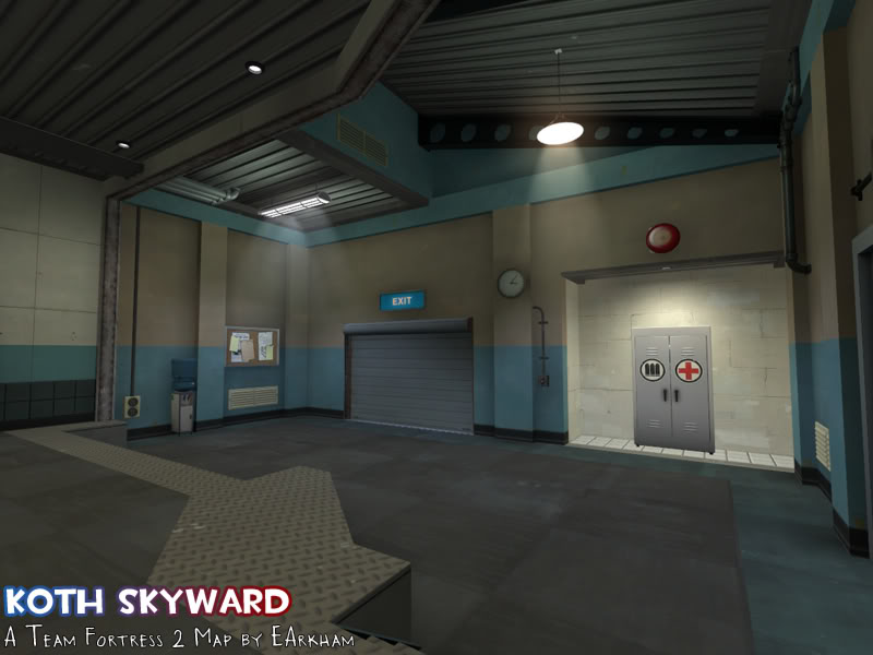
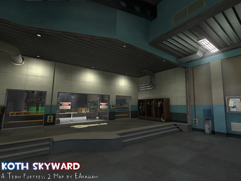
Another test to see where I need lights, this time on BLU spawn:

koth_skyward_a3_01b.jpg


As you can see there's no exterior lights and they're badly needed.

And the interior:

koth_skyward_a3_02.jpg

koth_skyward_a3_02b.jpg


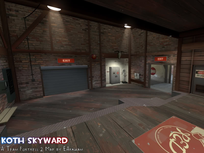
And for comparison, RED's spawn and an out-of-bounds area in RED spawn:

koth_skyward_a3_03.jpg

koth_skyward_a3_04b.jpg


Both spawns are almost fully detailed now, so I can't really do any more until I get further testing done on the rest of the map.
 
Last edited:
Aug 23, 2008
404
380
Okay played A2. Very similar to how it played before. The new pathway is nice, and I think the simplification of the lower area is good.

Demo: https://dl.dropbox.com/u/3492731/spacesaver/20120721-0532-koth_skyward_a2.dem

Couple observations:

1) The grates you have that show the lower area are a bit of a problem. Those textures are very specifically set up to allow splash damage to go through them. Its (sort of) a bug, but it can have some really nasty consequences, especially if a demo puts stickies on the bottom side. Now, all the sudden you have an unengageable sticky trap, that could immediately kill you and no way to get rid of it. It also works for rockets and pipes, but not for any other bullet weapons. I would consider using either the chicken wire (which doesn't allow splash through), a glass window, or to come up with a thin bullet block layer that covers the bottom half of the grate. You have to be careful though, bullet block has a tendency to screw with visuals a bit, so make sure you leave tiny gaps at the edges so the game knows it needs to render the grate texture, instead of nodrawing it.

2) Medium healthpack in the yard feels okay, but I'm not sure on the location. Having a med be able to dodge around the corner and snag the healthpack out of your vision seems a bit odd, and leads to some kills stolen from you for reasons you may not like. I would consider putting it over near the hut, so its a bit more central and you have the opportunity to tag the med as they run for the healthpack.

3) The new room pathway you added is fine, but I would caution you a bit in terms of how the layout of that area is set up. One of the things comp players don't really enjoy is lots of tiny rooms clumped together with narrow hallways. Every door you walk through is essentially another place you would have to check for sticky traps, which really slows down the pace of combat, and makes it much more likely that you'll be discovered. For that room area, I would reccomend opening up the area a bit, making it more of one longhall, and if you need to break up a sightline for snipers try some props. I would also say you should stretch it out a bit, with a higher and lower area, so scouts coming in there can jump around and dodge a bit more, maybe jump onto a prop to shortcut up to the upper area.

4) I'm not sure about the change of position of the medium healthpack on that flank area. If you make the changes I said, then I could see you having it in that larger room, but I do admit I feel like its missing in that other room as well. That could just be me missing it, because it was there before and I'd gotten accustomed to having it there, and that it actually plays better without it. Not sure, will have to play some more.

5) One thing about the lower area, my immediate reaction to how its set up is that I'm not quite sure where the enemy team is going to be coming up when they use that area. Now, thats mostly from a first couple of times playing it perspective, and I'm sure I'll have a pretty good idea where teams can flank from in the future, but it is the sort of thing I think you want to make clear as you start to detail more. Make sure that room has the proper team color inside it, so people know which half of the map the sewer is going to lead to. I'm still not sure how it plays, but I think you could still make it work.

6) Still think you need that additional yard change that i mentioned in the last post. The map still feels a bit one dimensional, with everyone funneled into that single yard. If you made those changes to that side, I feel like things might really open up a bit more, and have a bit more unpredictable flow.

Still looking good, that blue base looks sick. Not a huge fan of the metal rim in reds spawn. Feel like a wood texture would match up better with whats behind it.
 

EArkham

Necromancer
aa
Aug 14, 2009
1,625
2,774
Awesome, I always look forward to your feedback. Have yet to watch the demo but will do so later today after errands. :)

1) You know, I saw a demoman do this on the first demo and totally forgot to fix it. It'll be fixed in A3.

2) Good point. I'll leave the ammo there because it makes sense to me to have cover running for ammo, but will move the health out towards the shed. But see #6 below.

3) The new pathway was shaped as it is for optimization more so than sniper lines... Hmm, maybe I can do something to address it. On the other hand, you have a nice medium healthkit there and a good overlook of the point and main entrance once you come out, so I'm wondering if the trade off of going through essentially three doorways will balance out. I'll take a closer look at the entire path and give it more thought. But this leads to the next point sort of...

4) I'm not sure about the medium healthkit spot either. In theory, I like the new placement better -- longer path gets the health as a trade off -- but I noticed I was having a harder time sticky/rocket jumping to the balcony area from spawn without it. Seems more natural to jump towards the door with the ammo (where the health used to be). I did manage to get an extremely fast rollout to the balcony a few times at near full health when the healthkit was in the other location, so that did affect the choice to move it. And I'm a pretty crap demoman, so I figured that a pro would be able to turn that into a powerful early round position. I dunno, needs more testing.

5) There's only one route now in the sewers, and you can't get behind the entire team without crossing some part of mid. I think 'wait and see what happens with more testing' is the way to go on this one. Noted about team colours though, I guess I went a little too spartan with the dev textures.

6) A3 will see the route from spawn to the sewer entrance (replacing the vents). I think I will probably go ahead and add the secondary yard as well for A3. May as well see how it plays. However this may impact #2, since with a secondary yard you need that pack to address players at both yards. Or add more health/ammo, which I'm not sure about. There's already quite a bit more than other KOTH maps. Maybe a small ammo/health in the yard expansion.

I think overall A3 will play so much better with the other spawn-to-sewers and secondary yard routes.
 

EArkham

Necromancer
aa
Aug 14, 2009
1,625
2,774
Watched the demo, and I think it already is starting to play better just from the addition of that one route. I'm wondering if it's still as hard to push back to the point once it's been capped. The changes to A3 will probably help even more.

Updated to A3:

* Added new route from spawn -> sewer
* Added new secondary (smaller) area to approach main mid entrance
* Set the main door back to automatically open/close again due to above change
* Moved health in yard
* Added small health/ammo to new area
* More out-of-bounds & spawn room detailing
* Various other small tweaks & fixes

New route (spawn -> sewer):

koth_skyward_a3_06b.jpg


New area to approach mid:

koth_skyward_a3_06.jpg


And here's the part where I shamelessly mimic foundry's art style:

koth_skyward_a3_05.jpg
 

Pocket

Half a Lambert is better than one.
aa
Nov 14, 2009
4,701
2,583
A word of advice: If you're going to put vents way up by the ceiling, make the area directly behind them toolsblack. Otherwise, people can see that it's clearly just a wall behind the prop. Ironically, the only official map to bother with this was 2fort, whose vents were too low for even a crouching player to see behind.