Siege

PL Siege b6

PC's_Frank

L4: Comfortable Member
Aug 29, 2012
178
24
The Painted Vandalism Overlays seen in this map were made by Sikyanakotik.

EDIT: 11/5/14
*I fixed some clipping issues and re-uploaded the map.

EDIT 9/7/14: Once again, I'd like to thank everyone who playtested this map, which has been given another total overhaul as a result of your feedback.

EDIT 8/22/14: I'd like to thank everyone who played on this map on the 8/16/14 gameday. Your feedback has been greatly appreciated and has gone a long way in making this map fun to play in. Consequently, many aspects of PL_Siege have been changed, particularly the final area which has been almost completely re-done (so the last screenshot on this page is now null and void, and will be removed as soon as I find the time to replace it). The new semester of graduate courses has begun, so I don't know how long it will be until I can update this map again. But, thank you all very much all the same and please let me know what in this current version may be improved upon.

After working on this map for nearly two years, it is finally in alpha stage. While I am hoping that people download the map and test it out so I can know what to change, I'm not sure if I will be able to. I am currently taking masters classes and writing a thesis, so while I do want to receive feedback on my map, I don't if I'll have enough time to make any suggested changes. I apologize for the inconvenience, but would like to once again thank everyone on tf2maps.net for being so supportive and helpful.

My two biggest influences in this map have been Badwater Basin and Barnblitz, particularly the latter. The premise of this map is that a BLU factory responsible for the manufacturing of bombs on rail carts has come under siege by RED, who have placed a ray gun at the opposite end of the complex. In order to win, BLU must escort a bomb on a rail cart to the ray gun so it may be destroyed. They must do so before the timer runs out, or the factory will be destroyed by the ray gun and RED will win.
 
Last edited:

PC's_Frank

L4: Comfortable Member
Aug 29, 2012
178
24
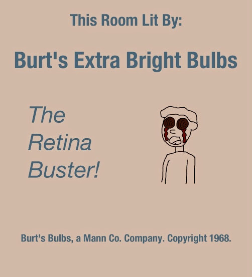
I just updated this map to widen certain doorways that players were having trouble fitting through during the map's previous iteration. As I mentioned above, I wanted to add a poster that mocked how painfully bright I had accidently made RED's initial spawnroom in the older version. But, I couldn't get vtex.exe to work, nor could I get the GIMP VTF plugin to work, nor VTF edit due to some "side by side" error I'm still trying to figure out. Anyway, for the sake of laughs, here's the poster I wanted to place.
burtsbulbs.jpg
 
Last edited:

Egan

aa
Feb 14, 2010
1,378
1,724
Hey, so we playtested a8 in the gameday today, and I wanted to give some extended feedback of some of the things I saw wrong with the map as we played it - so I created this video for you (It may be still processing for the following bit after I post this, but I have to go to bed now). I could have done it with text + images, but I wanted to put more enunciation into my reasoning behind the complaints I had with the map since a couple points were more nitpicky stuff instead of evidence-supported methodologies.

Edit: I just thought of something else you could do for that upper window looking onto point 2 - just block the window off with bulletproof glass (the gravelpit window texture). so attackers may still use it to get an observation on the area, but are still forced to use the lower route to attack / get past. That would also make the area feel more unique. It's up to you though, it may be a dumb idea. :p
 
Last edited:

PC's_Frank

L4: Comfortable Member
Aug 29, 2012
178
24
Thank you very much! I agree, some of these areas could use a lot of re-working. I'll be sure to make the needed changes and, hopefully, I will have something new to present in the near future.

I also agree that many areas in the map are too open. I did that intentionally as a means by which to accommodate blast jumpers, scouts, spies, and snipers, though now I see that this has largely either backfired or worked too well. I also like your idea for the window at cp2. I think that area is stacked too heavily in BLU's favor, and an observation point could be a nice compromise.

That, and I agree that the third chokepoint is too easy for BLU to get through. I am on the fence about what to do with the rocket. When I was first planning the layout of the map, I was inspired by the "dish" control point on hydro, and thought it would be fun to have a part of a map where the cart would travel across a pit, through a relatively small cylindrical shaped structure, and to the control point on the other side. When I stumbled across a model of a rocket missing its middle section in the game files, I thought this would work well. I figured both teams could use it for cover, to one extent or another it would break up sightlines, and the cart could pass through it. On top of that, it had slightly irked me that these models of rockets existed in tf2, but were essentially relegated to being decorations adorning a map rather than a part of them. I also figured that it would fit the theme of the map well: a BLU factory complex that is under siege by RED, who have set up a laser gun that is slowly eating its way into the BLU bomb factory; which it will destroy if the bomb doesn't blow up the laser gun first. The assumption being that if this place builds bombs, perhaps they build rockets as well; I even placed brushwork in the middle of the model to suggest that this rocket is still under construction. Yet, it would seem that the rocket, and the death pit have had little impact on RED's ability to defend. If the rocket stacked the area into BLU's favor, then BLU certainly doesn't seem to notice or make use of it, as they tend to simply steamroll across to the checkpoint. I'm not so sure I'm willing to part with the rocket, or the concept of the cart passing through such a structure, just yet. However, I do think I should make the RED side of the pit smaller and easier to defend.

Anyway, thank you again! :)
 

PC's_Frank

L4: Comfortable Member
Aug 29, 2012
178
24
Just made a new version of the map. I'm still doing some schoolwork, so it might not be until late tonight or early tomorrow morning that I'll have pictures of the changes up. Sorry.
 

HQDefault

...what
aa
Aug 6, 2014
1,056
536
I just need to reccomend one thing: Make it a 3cp payload map. Last is long, confusing and is overall just a giant mess of brushes and geometry. I recommend just cutting it off at the rocket. It's ominous, it's climactic, and it's balanced. I personally think it would make a very memorable last :)
 

PC's_Frank

L4: Comfortable Member
Aug 29, 2012
178
24
Thanks for the feedback man. The more I think about it, the more I agree with you regarding the third checkpoint. Still, I have my misgivings about a payload map with but three checkpoints. I want to give the final checkpoint one final series of tweaks before I decide whether or not to remove it.

Another area I am concerned about is the first checkpoint. I never intended the roof access to be that area's primary sentry spot. In fact, I had given the area with the full ammo pack that designation, even providing a large wall for use as cover. But now, after reviewing the demo footage, it would seem that this area has become to easy for BLU to plow through after its removal. In all honesty, I am at quite a quandary regarding what I should do with this map, and with my own ability to mold it into anything even halfway acceptable.
 

HQDefault

...what
aa
Aug 6, 2014
1,056
536
Thanks for the feedback man. The more I think about it, the more I agree with you regarding the third checkpoint. Still, I have my misgivings about a payload map with but three checkpoints. I want to give the final checkpoint one final series of tweaks before I decide whether or not to remove it.

Another area I am concerned about is the first checkpoint. I never intended the roof access to be that area's primary sentry spot. In fact, I had given the area with the full ammo pack that designation, even providing a large wall for use as cover. But now, after reviewing the demo footage, it would seem that this area has become to easy for BLU to plow through after its removal. In all honesty, I am at quite a quandary regarding what I should do with this map, and with my own ability to mold it into anything even halfway acceptable.

Put back the sentry spot, but with a nerf, and a back route around it.
 

PC's_Frank

L4: Comfortable Member
Aug 29, 2012
178
24
I thought about doing that, but one of the biggest complaints I received is that the map is too large and complicated. I'm worried such an act would hamper things even more to this end.

At the moment, I'm working on a partial re-design of the second chokepoint, moving RED's initial spawn back as to discourage spawn camping. It might be a while before I have something to show, however, I have a full plate of classwork ahead of me.
 

PC's_Frank

L4: Comfortable Member
Aug 29, 2012
178
24
As of right now, that sentry spot is back. Hopefully, I'll have some pictures of the major changes I made to the map tomorrow.
 

PC's_Frank

L4: Comfortable Member
Aug 29, 2012
178
24
Here it is! The beta version of pl_siege. Next version should hopefully have a better rocket for the cart to pass through, along with any needed adjustments.
 

PC's_Frank

L4: Comfortable Member
Aug 29, 2012
178
24
Bad news regarding the custom model of a rocket with two holes in it. I couldn't get the collision mesh to work right. Also, I cant get the texture to load. Even worse, the model lengthens compile time and, upon being compiled, all the soundscapes cease to function (again, it only seems to do this when the custom model is on the map). So, the lackadaisical version half-made with brush work is going to have to stand until I learn how to model and stop my custom model from negating soundscapes.