I took a look around the map and it seems promising. Although I do have a few comments.
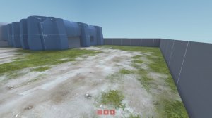
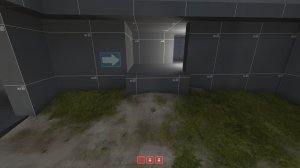
In blue spawn having the spawn cabinet lying on the ground was interesting but seemed out of place, maybe It will look better when you detail. It also might confuse some players. Same thing with the windows, they look like they can be jumped though but can't, you could try adding something to suggest they're unreachable.

This space outside outside Blue spawn is far too flat and wide. shorten it and add some height variation or something.
Blue > A
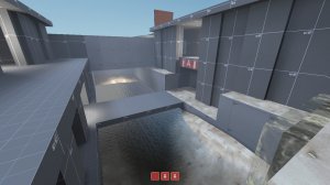
This area could use a lot of work. The drop in to the water is one way and players are then forced to go though an ugly choke point, the water tunnel, into the death pit. The death pit is fine in idea but it's going to be spammed out. The only way to get out of said death pit is though two cramped stairs that can also be spammed down. The only alternative to this is another cramped stair way.
A
seemed fine, not much too mention.
A>B
These connectors look a lot better, if not a bit long.

Turn this jump into a ramp. It'll be the favorite path so accommodate for that.

This sight line is a bit long. Maybe you could move the far shore closer to the bridge. Also, there's only one way out of the water.
B
Seemed pretty decent you'll have to play test for solid feedback though.
B > C
Overall I found this part of the part just too long. With some expanding you probably could add another capture point if you wanted.
C
It looks like a capture point. Probably will play okay. It is fairly far from blue's forward spawn however.
Generally some of the weaker points of the map need some work and some of the spacing is too big. The map is correctly scaled though, so that's a great start. You should also add a forward spawn for red if you keep the current map size.
Keep in mind I was just running around the level. Solid feedback comes from loads of play testing.


