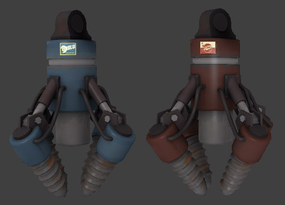
Drill - 3 skins (red, blue and neutral)

Model [REQUEST] Drill & laser (images inside) 2015-08-30

Acumen

Annoyer
aa
Jun 11, 2009
704
630
that's a max viewport shot, Aly :)

hey there, i have 2 questions. these names you guys threw around in here, on what tf2-models can similar writings be seen ? just so i can compare and research a bit.
or does one just put the "B.A.D."-tag on it, and the full name is just for organic description ?

and then, do you plan to use it just like the mockup image i posted ? because then i'd bake the shadows from the nucleus arms in the texturemap - cause i started working on the uv's today !
 

Shaar

L3: Junior Member<BR>toboruin
Aug 7, 2008
231
206
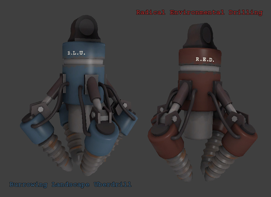
I'd just put "B.L.U." on it, the full name will be for the description page of the map

and yeah I intend to use it like that
 

Acumen

Annoyer
aa
Jun 11, 2009
704
630
man, i had no idea how huge the nucleus model is - i just scaled the drill to match the nucleus arms and loaded the model up in hammer and omg it's enormous..... O_O

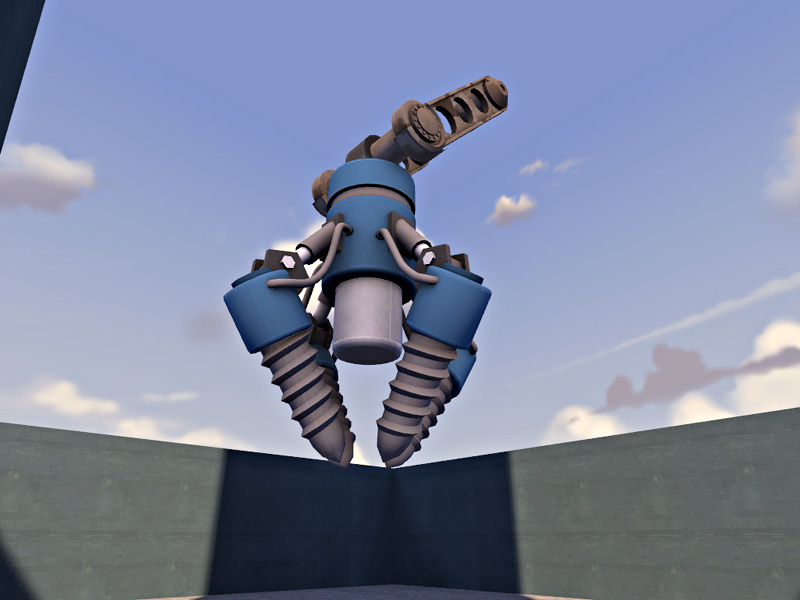
anyways, here's a test compile :)
i figured out that i need to change the uv's once more (must be the quadrillionth time :D) to get rid of the seams - they're too visible

drill2_ingame1.jpg
 
Last edited:

Shaar

L3: Junior Member<BR>toboruin
Aug 7, 2008
231
206
SO MUCH WIN.

Seriously though, that looks amazing
 

Terr

Cranky Coder
aa
Jul 31, 2009
1,590
410
Sized to the Nucleus arms? Holy moly indeed.

I'd suggest having a half-size and 1/16th-size version, for smaller areas and skyboxes, respectively.

Now I'll have nightmares of that magnificent monster piercing the Mohorovicic discontinuity under my house.
 

Shaar

L3: Junior Member<BR>toboruin
Aug 7, 2008
231
206
Sized to the Nucleus arms? Holy moly indeed.

I'd suggest having a half-size and 1/16th-size version, for smaller areas and skyboxes, respectively.

Now I'll have nightmares of that magnificent monster piercing the Mohorovicic discontinuity under my house.

Do I smell a fellow Geologist?


Anyway, I wanted it that big, so that it's got the epic final cap feel too it
 

Acumen

Annoyer
aa
Jun 11, 2009
704
630
well i certainly won't do it :D
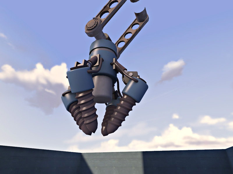
today i experimented with the color scheme again and put some text on it. not so sure about that, right now. so i removed it when compiling - but i activated some phong stuff to
i hope to (almost) finish it tomorrow now

drill2_ingame2.jpg
 

Shaar

L3: Junior Member<BR>toboruin
Aug 7, 2008
231
206
well i certainly won't do it :D
today i experimented with the color scheme again and put some text on it. not so sure about that, right now. so i removed it when compiling - but i activated some phong stuff to
i hope to (almost) finish it tomorrow now

drill2_ingame2.jpg


oh wow, that looks niicee (y)


dont worry about animation , I dont need it animated.

anyway, thanks for your help with this, truely amazing work =D
 

Psyphil

L3: Member
Nov 6, 2007
125
60
I'd suggest having a half-size and 1/16th-size version, for smaller areas and skyboxes, respectively.

This is a good idea, the nucleus arms are very big and more people could get use of it if it was half that big aswell..

anyway, AWESOME! :eek:hmy: I still think you should finish your first drill aswell, would be WIN x2 :D

EDIT: and don't forgett a red skin
 
Last edited:

Acumen

Annoyer
aa
Jun 11, 2009
704
630
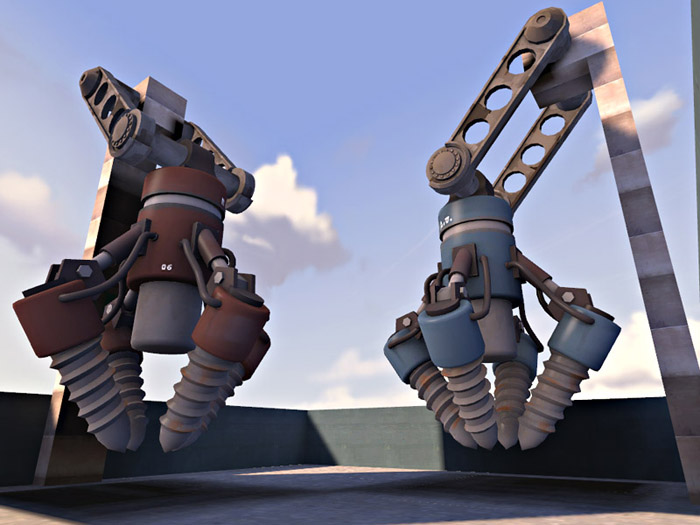
Done ?

drill2_ingame3.jpg


on the next picture, i'd like you to focus on my extremely powerful mapping skills which which i crafted the holding brushes :D

drill2_ingame4.jpg
 
Last edited:

Terr

Cranky Coder
aa
Jul 31, 2009
1,590
410
Something about the "RED"/"BLU" lettering looks a bit too crisp compared to the overall shading, but other than that it looks great.
 

Acumen

Annoyer
aa
Jun 11, 2009
704
630
yeh, i was not sure about the text, either.
i'll wait for toboruin, whatever he prefers, will be final :)
 

Acumen

Annoyer
aa
Jun 11, 2009
704
630
alright, changed text to logos, like void suggested and i'd have to say i like it much better.
if toboruin doesn't have anything to add or crit i'd release the model with the various sizes you wished for, included.

drill2_ingame5.jpg
 

Rexy

The Kwisatz Haderach
aa
Dec 22, 2008
1,798
2,533
Acumen, try using a soft light layer mode on those logos so they don't appear full-bright. Right now they look like they're self-illuminating.