Proplant

KotH Proplant v8

hondjo

L2: Junior Member
Feb 20, 2016
84
39
Proplant - Coalplant but pro?

"pro" version of coalplant by ScorpioUprising
all credit to Scorpio for making coalplant

uploading by request of ETF2L/RGL paying interest in these map changes

major changes include;

-changing lighting to something more bright
-nobuild shutter
-wider under + medium ammopack
-improved clipping across the entire map making splash/movement a little more consistant

most changes were inspired by ashville and it's current pro remake

the thumbnail image is slightly outdated, didnt have anything else at hand :)
 

hondjo

L2: Junior Member
Feb 20, 2016
84
39
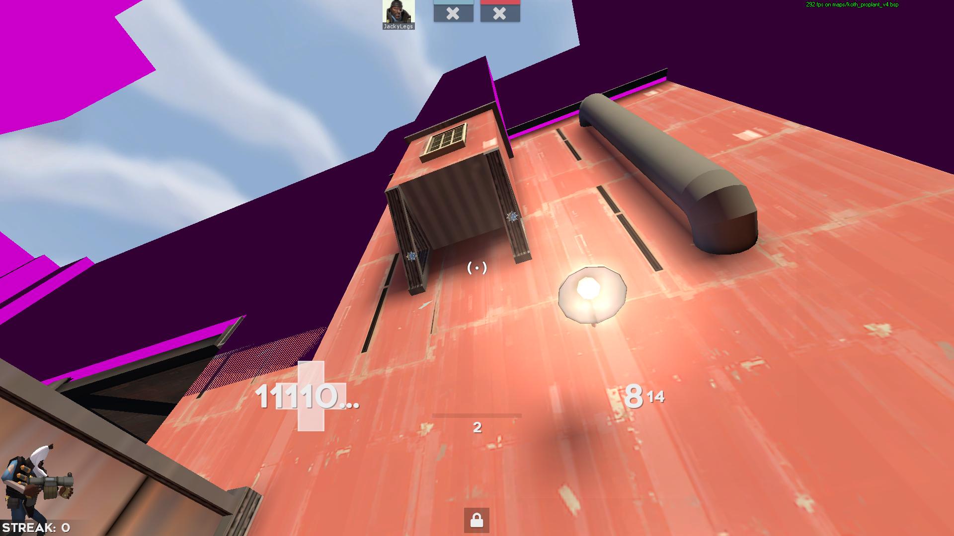
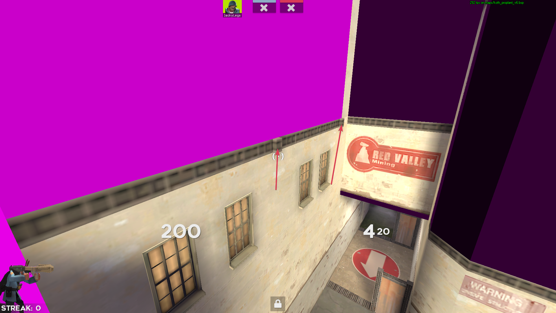
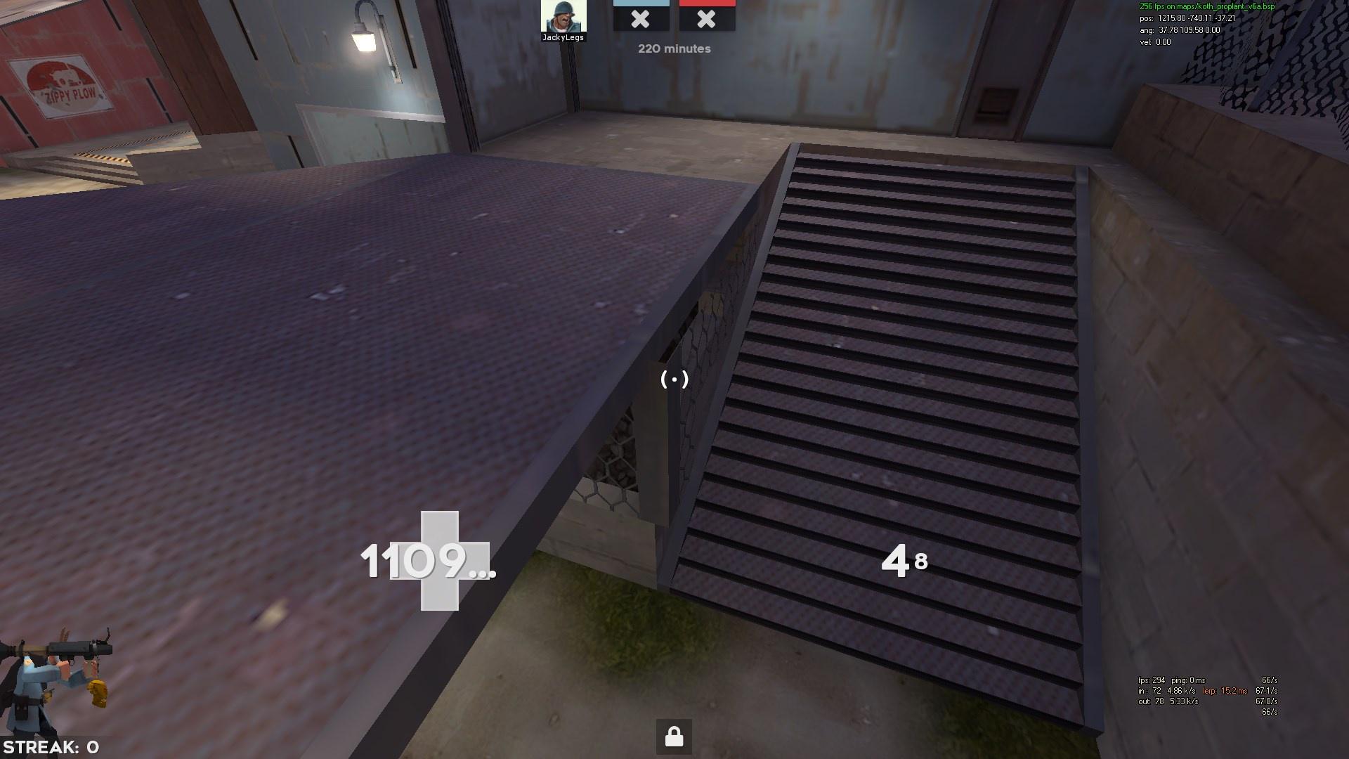
fixed some broken overlays
removed bits sticking out of the wall near batts
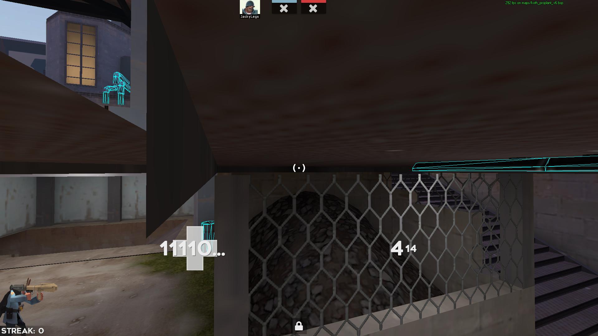
removed collision on the pipes under
removed collision on the support beam for the little thing above batts
QKLeGrh.jpg

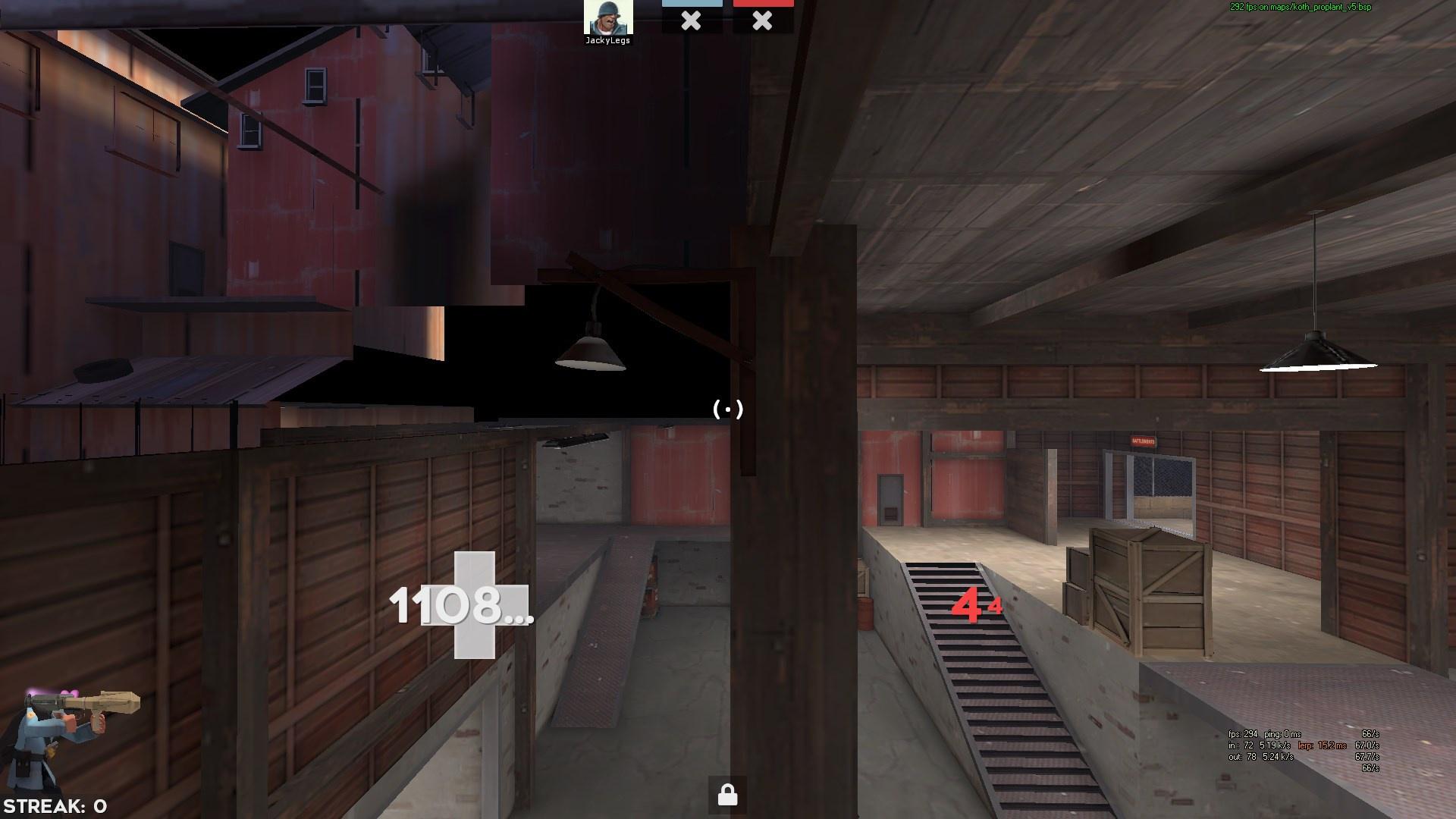
removed a sneaky lamp hidden in the wall
qv1n1N1.jpg


thanks @jackylegs & the refresh team for screenshots/feedback

Read the rest of this update entry...
 

Lem Mem

L3: Member
Nov 1, 2020
125
31
I personally like Asheville or Coalplant or whatever I should call this map. It’s a masterpiece of game design and one of the best Highlander maps of all time imo. BUT what I don’t like is POINTLESS ALPINE ARTPASSES FOR “pro” VERSIONS OF MAPS.

I understand this for snow maps. While Valve literally has a feature for turning off Weather Effects, You can make an argument for removing the snow off the roofs and calling it a day. BUT on average maps like Coalplant, Steel, and Harvest, there is absolutely no reason you need to change the ground texture to grass, and the skybox to sky_trainyard_01.

Originally, I was going to refute the skybox + blend changes by saying that you don't need to change the entire skybox to change the "lighting to something more bright," But after looking between some screenshots, I don't think thats what you were referring to with that line.

20210512175901_1.jpg 20210512175351_1.jpg
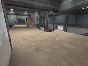
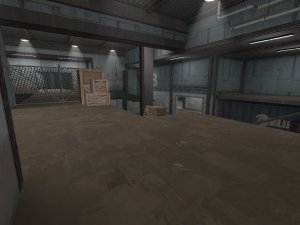
Coalplant is more flatly lit while Proplant is more variant in brightness. I'd argue that Coalplant's lighting is actually MORE beneficial to competitive play, but that's just my opinion. I think you were referring to the indoors sections and such, as shown in these screenshots

20210512181111_1.jpg 20210512181034_1.jpg
Proplant is on the left. This just adds to my point. There is absolutely NO reason the map needs an alpine artpass. If you can name me one good reason, I will retract this opinion. Other than that, as long as you asked Scorpio for permission, I see no problems with “Refreshing” Coalplant for the new generation of comp.

And if you are reading this review and ever want to make a pro version of a map, please DO NOT change the theme. If you have to, change the theme as little as possible. If we don’t keep all the maps unique, they all start to blend together and lose identity. I fear a future where every competitive (or even non-competitive in the case of harvest alpine) is a process lookalike.
 

hondjo

L2: Junior Member
Feb 20, 2016
84
39
I personally like Asheville or Coalplant or whatever I should call this map. It’s a masterpiece of game design and one of the best Highlander maps of all time imo. BUT what I don’t like is POINTLESS ALPINE ARTPASSES FOR “pro” VERSIONS OF MAPS.

I understand this for snow maps. While Valve literally has a feature for turning off Weather Effects, You can make an argument for removing the snow off the roofs and calling it a day. BUT on average maps like Coalplant, Steel, and Harvest, there is absolutely no reason you need to change the ground texture to grass, and the skybox to sky_trainyard_01.

Originally, I was going to refute the skybox + blend changes by saying that you don't need to change the entire skybox to change the "lighting to something more bright," But after looking between some screenshots, I don't think thats what you were referring to with that line.

20210512175901_1.jpg 20210512175351_1.jpg
Coalplant is more flatly lit while Proplant is more variant in brightness. I'd argue that Coalplant's lighting is actually MORE beneficial to competitive play, but that's just my opinion. I think you were referring to the indoors sections and such, as shown in these screenshots

20210512181111_1.jpg 20210512181034_1.jpg
Proplant is on the left. This just adds to my point. There is absolutely NO reason the map needs an alpine artpass. If you can name me one good reason, I will retract this opinion. Other than that, as long as you asked Scorpio for permission, I see no problems with “Refreshing” Coalplant for the new generation of comp.

And if you are reading this review and ever want to make a pro version of a map, please DO NOT change the theme. If you have to, change the theme as little as possible. If we don’t keep all the maps unique, they all start to blend together and lose identity. I fear a future where every competitive (or even non-competitive in the case of harvest alpine) is a process lookalike.

yo i did the grassy artstyle as a test to see if it "worked" and tried it in a few pick up games / lobbies and people really seemed to enjoy it. i work closely with etf2l's admin team & premiership division asking for feedback on both the theme and other decisions. nobody seems to be bothered at all by the grassy artpass. i even forwarded the idea of making 2 versions, one for each theme which was rejected for being too confusing for newer players. as for the name, i agree that coalplant_pro could and would have probably been a better name but any ideas to rename would likely also get rejected as it has already seen significant playtime here in eu. good observations on the lighting eitherway, if i had known this sooner i may have tried taking a different approach all together so ill keep that in mind.

to further cement my initial "test to see if it worked" meme, if you are ever on serveme feel free to check out koth_colaplant_b8 which i made as a joke map to test my initial ideas which could improve coalplant. see it as the ancestor of the ideas now carried over to the map played on etf2l.

eitherway, thanks for your attentive comment and feedback even though i felt like it had a sort of aggressive tone to it, intended or not. i do believe that hard criticism like this is healthy and keeps everyone's maps up to standards.
 
Last edited:

Lem Mem

L3: Member
Nov 1, 2020
125
31
sorry, i'm just very passionate about this subject (for some reason.) if the people like it more, I guess you should keep it. Keep up the good work with this map, and congrats on getting it into ETF2L.