Decided to give some feedback today. Basing this off how I feel moving around the map.
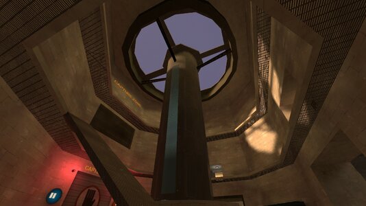
I think the way this is currently built is really restrictive on movement. (A bad thing in a DM gamemode, where movement is key) I think you can remove the guardrail entirely, as it does nothing but restrict you from dodging. I think you could make the doorway here a bit taller and wider, as the current one feels very claustrophobic and annoying to navigate around. I think you should add some more walkable space on this upper area of the floor, as it would make traversal here less claustrophobic and would allow for more fighting to be had. (what you want to happen in a PD map)
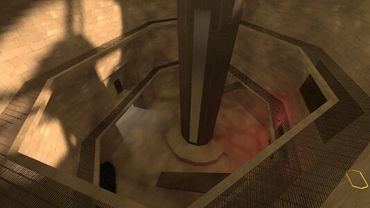
There is inherent risk when positioning yourself down here so I think you could reward risky plays trapping yourself with a medium health kit.
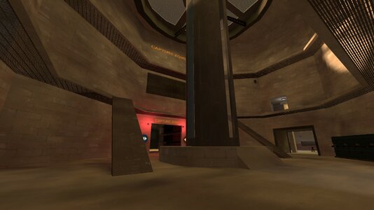
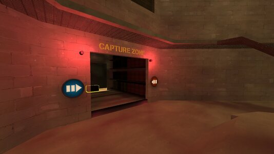
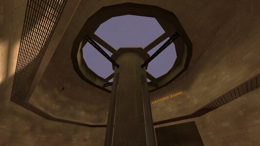
As far as I can tell there's no real indication for how long the Capture Zone is open? I understand you have the factory alarms to telegraph that but I really dislike the fact that I can't outright tell how long I've got left until I have to gtfo, or how long it is until the capture zone opens in the first place. I don't think the length of the morgue helps with this either, because the capture zone is all the way at the end of it, and very thin.
Why is this room asymmetrical...?
This is a lot of ammo and health for a single room. I think the pair of kits on the right (next to the doorway) should be removed.
Asymmetrical oddities like this are what cause maps to be unbalanced and skewed towards one team or the other. It's not fun when I can't retreat to my half of the map to get health as easy as the other team can.
Again, these weird asymm bits are just not fun in a gameplay sense. Because one side is longer than the other, it ends up creating weird maneuverability issues on the BLU side of the map. It's fine if you want asymmetrical detailing but if that interferes with the actual gameplay of the map then you need to step back and fix that.
These little bits of geometry that don't connect up right to other walls are just odd. They take away from your detailing imo.
It's a really bad idea to have your ammo/health be in a dead end in a high-traffic part of the map. People will be running to and away from the capture zone when it opens, so you need to make sure your kits are seen and safe to use around here. I think you should move the kits to where the blue mark is.
I'm not sure how fixable this is but it's similar critique from my first image on this feedback. It's just claustrophobic and feels bad to move around in.
If you want my honest opinion,
I don't think this map is good. It doesn't achieve what PD needs to be a successful map in my eyes, that being a moving capture zone. I understand this sounds cruel, but I just do not think the map works given its current layout. The asymmetricality of the map is very off-putting and tells me the game will result in even more unfair matches than a normally imbalanced match would. I think the concept of the theme itself is interesting, but I do not think PD was a good gamemode for it. The incessant whistles of the capture zone opening and closing is getting annoying.
What I am trying to provide you is what I feel would improve your map with the current design philosophy you have in mind. You don't have to listen to any of this, but please give it a chance.
this is a bad map, il admit it
after multiple people have said in some comments and messages, it is a bad map
which is why itle no longer get anymore updates
im working on a new map, so this is the end of brewery
If this is your first time logging in after the migration (Feb 8, 2022), you must reset your password to log in. Follow this guide if you're having trouble