- Jul 22, 2009
- 1,874
- 1,258
First off, version your mapname unless you want people to get "your map differs from server's" errors.

You're still doing...what you shouldn't be. Take a look at official maps and how they put skybrushes above the cliffs to cut visibility.

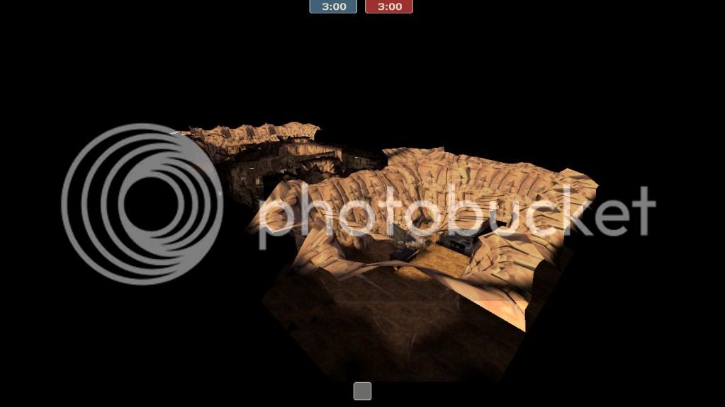
This line of sight goes across the entire map, unobstructed by solid geometry. That is inviting performance problems.

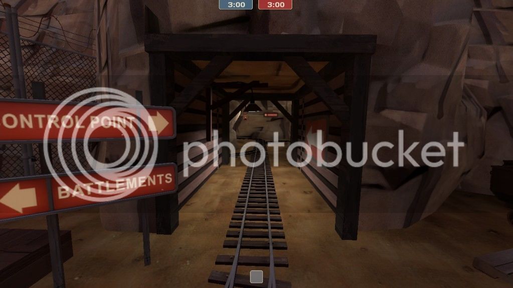
A forward-ish spawn exit, while helpful against spawncamping, might be quite un-fun for any attacker that happens to be near the area. Or, it might not.

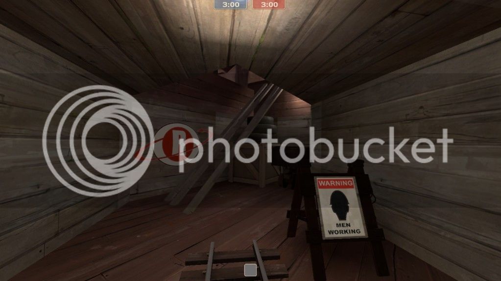
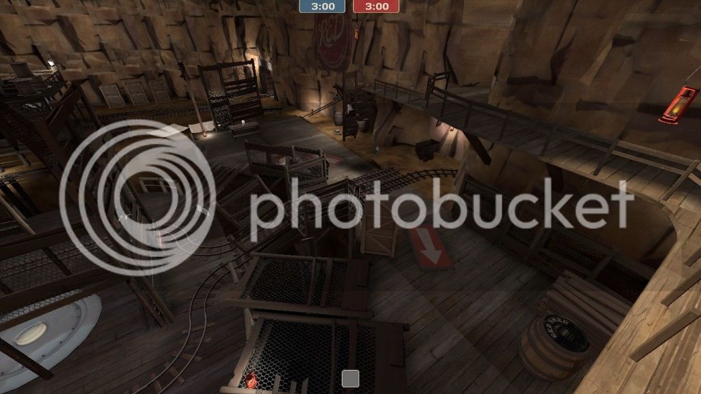
Avoid making dead ends, especially ones that a player new to the map cannot instantly recognize as such.

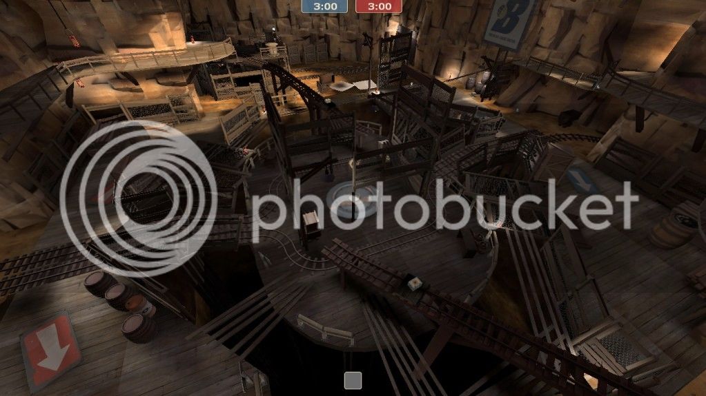
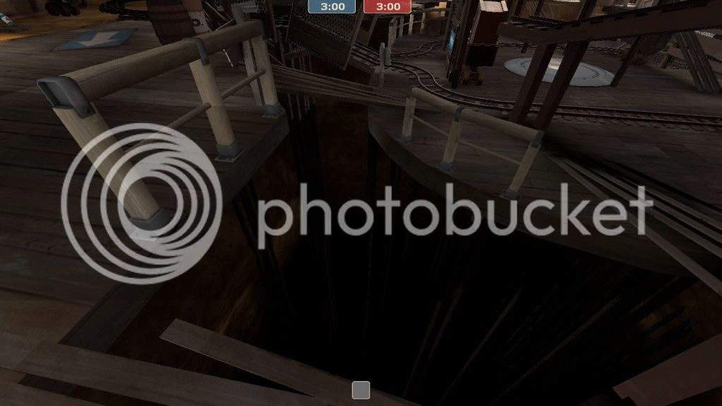
The point is narrow and constricting, the approaches to the point are narrow, and the deathpit is huge. It really should be the other way around. On a point like this, you basically either become a stationary target, or risk 93% chance of falling off.

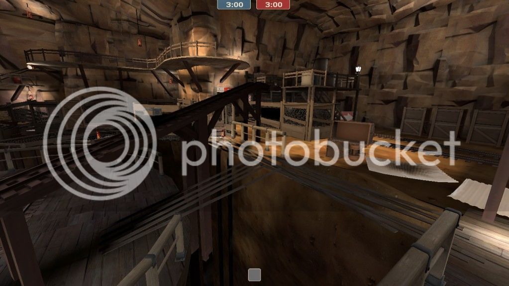
The whole map is narrow, actually. Narrow, narrow, narrow. Narrow means no space for dodging and maneuvering, no space for dodging means uncomfortable, uncomfortable means annoying and annoying means I don't want to play the map. The map would really benefit from becoming 1.5 times bigger, twice bigger in its' most narrow places.

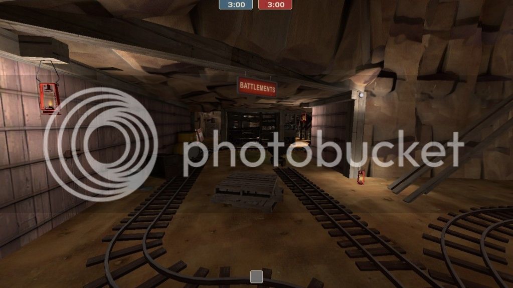
The map would also benefit from having a less noisy cliff texture. I feel like I'm looking at a very effective camouflage.

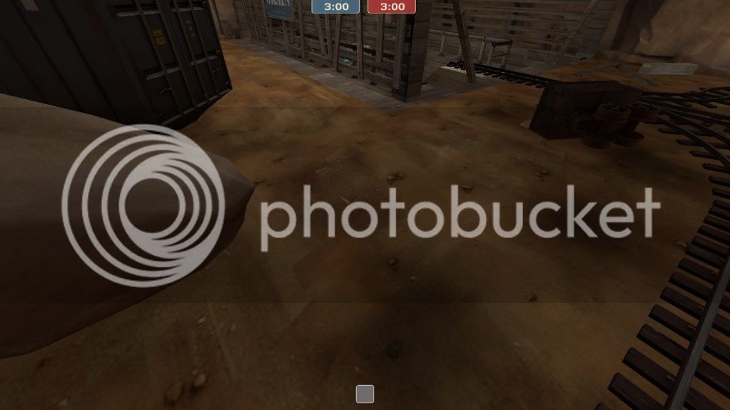
Put some overlays or planks or whatever under your pickups, so that players can easily find them without having to learn the map in and out.

The deathpit should really look more deeper than that.
Overall, the map, while requiring a small ton of work, does look like it has some potential. It's just hidden very, very deep at the moment
You're still doing...what you shouldn't be. Take a look at official maps and how they put skybrushes above the cliffs to cut visibility.
This line of sight goes across the entire map, unobstructed by solid geometry. That is inviting performance problems.
A forward-ish spawn exit, while helpful against spawncamping, might be quite un-fun for any attacker that happens to be near the area. Or, it might not.
Avoid making dead ends, especially ones that a player new to the map cannot instantly recognize as such.
The point is narrow and constricting, the approaches to the point are narrow, and the deathpit is huge. It really should be the other way around. On a point like this, you basically either become a stationary target, or risk 93% chance of falling off.
The whole map is narrow, actually. Narrow, narrow, narrow. Narrow means no space for dodging and maneuvering, no space for dodging means uncomfortable, uncomfortable means annoying and annoying means I don't want to play the map. The map would really benefit from becoming 1.5 times bigger, twice bigger in its' most narrow places.
The map would also benefit from having a less noisy cliff texture. I feel like I'm looking at a very effective camouflage.
Put some overlays or planks or whatever under your pickups, so that players can easily find them without having to learn the map in and out.
The deathpit should really look more deeper than that.
Overall, the map, while requiring a small ton of work, does look like it has some potential. It's just hidden very, very deep at the moment