Lighting Cues and Gameplay: A visual example. [ARTICLE]
This is not a tutorial about having adequetely proper lighting in the gameplay area. It is assumed that you already have this. This tutorial is about using lighting cues as a way to help direct players to important things without the use of signs. This is not hard or complicated, it is very simple, but understanding the concept of lighting cues can be a powerful tool to help guide and alert players to certain aspects of their map.
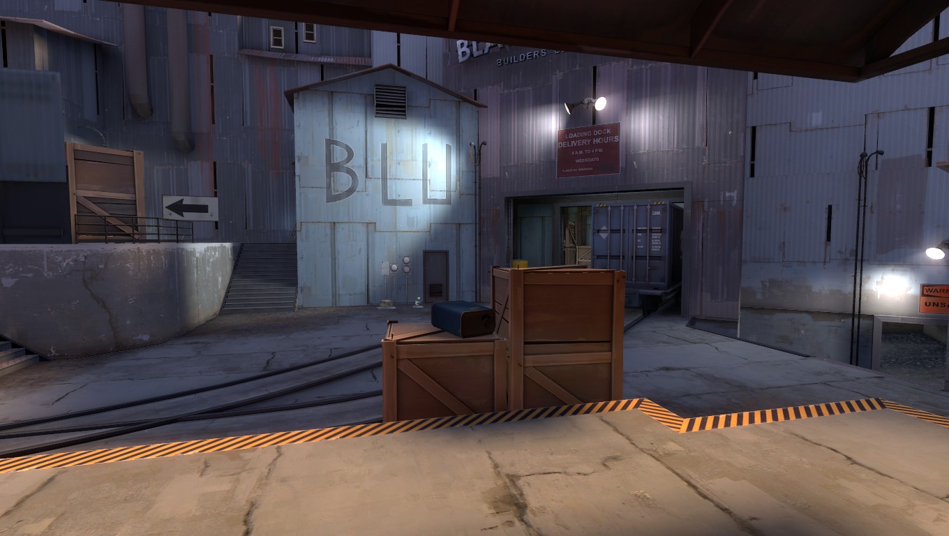
Team fortress 2 is fast paced. Players can not spend time looking around for a hiding spot, or an exit route, or health and ammo. They need to see it as soon as possible. There are ways to direct players with signs. TF2 uses signs to direct players along major, main routes... But lets take a look at this shot of the central control point from Team Fortress 2's 5CP map, cp_foundry:

When you take a quick glance, pretending as if you were a player scanning for enemies, you can see that there is a sign to the upper left (noteing that there is a route up there) and that there is a major route in the middle garage. But you should also see the lower route. It's lower, out of the way, and usually out of the plane of vision, but the lighting around it draws the eye to it. This lighting helps acknowledge that, "yes, there is a route down here." Acknowledging that there is now a third route helps the player make better decisions quickly on the best possible way to attack or defend.
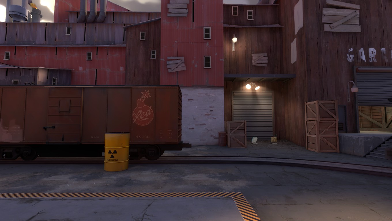
Lets look at this image now, also of cp_foundry, but of the second point (that is, the first point past the central point).

This image shows that there are infact two visible routes coming into this yard. The far right, under the "GARAGE" sign and and from the upper route, just to the right of the middle of the image. How can you tell though? There is a light up there. The player might not know for sure if that area is a route that enemies may be coming through, but at least they know that it is a point of interest. Showing that the area is a point of interest, rather than just leaving it dark, is much better for the player than them getting a nastey surprise when an enemy pours out of there. **Note: As it turns out, this upper route is a major push route for competitive Team Fortress 2. So this is very important**
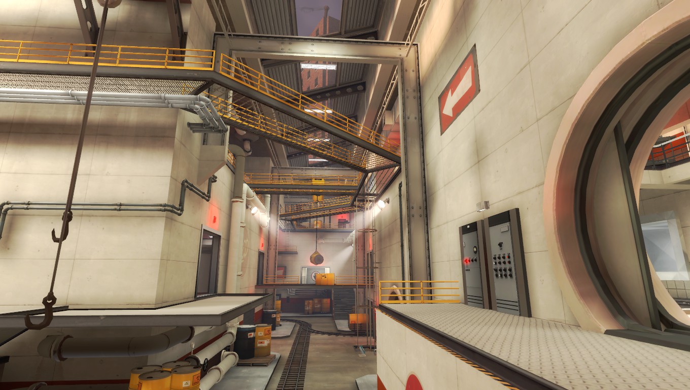
Now, lets look at an example of lighting that isn't at its best. This is an image of pl_manngrove, towards the final part of the map:

You can easily see some possible routes into this main hallway. They are denoted by red lights over the doorway. This is a common way to denote a route of interest, but look at how many red lights there are in this image. There is about seven. Four of these actually denote possible routes. Another notable lighting error is the white spot lights that are shown. Based of the visuals of the cones, you'd expect the map to be a lot more brighter than it actually is. Not only are the spot lights providing basically no light, it just adds to the visual noise and they are not highlighting anything.
Looking from a lighting perspective, there is no real direct point of interest here. Players are going to have to actually be looking for movement everywhere, rather than at the visually highlighted areas. Along with a high density of detail in this area and poor lighting, I consider this area to be a poorly designed visual gameplay space. Testing showed that this area played poorly too. I believe that better lighting technique, in conjunction with lower detailing density, this area could have played much better.
**For the full analysis of lighting of this map, please see my post here.
These examples show simple it is to use lighting as a way to direct and assist players throughout a map, but also how simple it is to go overboard. Understanding how lighting can affect gameplay and how players view and survey their surroundings can go a long way in designing better maps.
tl;dr: You can use lights to denote routes of interest for players, even during day-time maps!
This is my first tutorial of this nature (analysis and such)... I've done similar things for maps, but never on a general scale like this, so feedback welcome.
Last edited:


