KotH koth_vandex_v2
- Thread starter Vandooz
- Start date
You are using an out of date browser. It may not display this or other websites correctly.
You should upgrade or use an alternative browser.
You should upgrade or use an alternative browser.
Hey there, Vandoz,
I have not downloaded it et, but from what I can tell from your 2 screens is that the map is a little over scaled. The mid cap point room looks to be a tad large, with a lot of sightlines for snipers. You may want to consider adding cover around that point, and maybe 2 more ways onto the cap point.
Also as a heads up, "surprises" when a point is captured are tricky to pull off. Tricky as in if it kills the capper(s) or prevents the other team from being able to cap immediately, people become a tad upset and it throws off gameplay.
If i get a chance I'll DL the map and see what else I can find.
Good start though, don't let this discourage you.
- Jan 6, 2011
- 5
- 0
Hey there, Vandoz,
I have not downloaded it et, but from what I can tell from your 2 screens is that the map is a little over scaled. The mid cap point room looks to be a tad large, with a lot of sightlines for snipers. You may want to consider adding cover around that point, and maybe 2 more ways onto the cap point.
Also as a heads up, "surprises" when a point is captured are tricky to pull off. Tricky as in if it kills the capper(s) or prevents the other team from being able to cap immediately, people become a tad upset and it throws off gameplay.
If i get a chance I'll DL the map and see what else I can find.
Good start though, don't let this discourage you.
Thanks for the tips, i was already thinking of some low cover walls around the point.
Here are some ideas for you to make this better:
Anyway, if you want to finish this as a learning exercise, I think you are doing okay. If you want to turn it into a map that a lot of people want to play, your next version should not be considered the final version.
- Make it so that you can't basically see into the respawn rooms
- Add intermediate areas between the spawn area/surrounding area and the point
- Scale your textures so the repeat is less noticeable, and add brush, overlay and model based detail pieces
Anyway, if you want to finish this as a learning exercise, I think you are doing okay. If you want to turn it into a map that a lot of people want to play, your next version should not be considered the final version.
- Jan 6, 2011
- 5
- 0
Here are some ideas for you to make this better:
It also looks like there's a 2nd and 3rd floor to the map for reasons I can't figure out from the screenshot. If health and ammo are up there, no one is going to run up there with spawn so close. If there's nothing up there, why is it there at all?
- Make it so that you can't basically see into the respawn rooms
- Add intermediate areas between the spawn area/surrounding area and the point
- Scale your textures so the repeat is less noticeable, and add brush, overlay and model based detail pieces
Well nr1 i dont understood so well, what you mean? maybe that the enemy cant see the doors to the respawnroom?
nr2: excuse me, whats intermediate?
nr3: still learning, but i will try.
and your last thing: Well, its how you play there.
Thnx
- Jan 6, 2011
- 5
- 0
He says that you can see into the enemys spawnroom. This is bad, because spawnrooms are meant to be safe.
Thanks for explaining
I was wrong about the spawn rooms. I see you have metal doors. That's good. However, make them move faster so you don't get caught on them.
Here are some things I found about your map.
The top of the map, over the point, is useless. You can't use it to shoot at people on the point, and there's nothing else up there, so there is no reason to go there. Players won't fight up there because it isn't on the way to the point, and the spawn room is so close that they can just go to the spawn room to heal or get ammo.
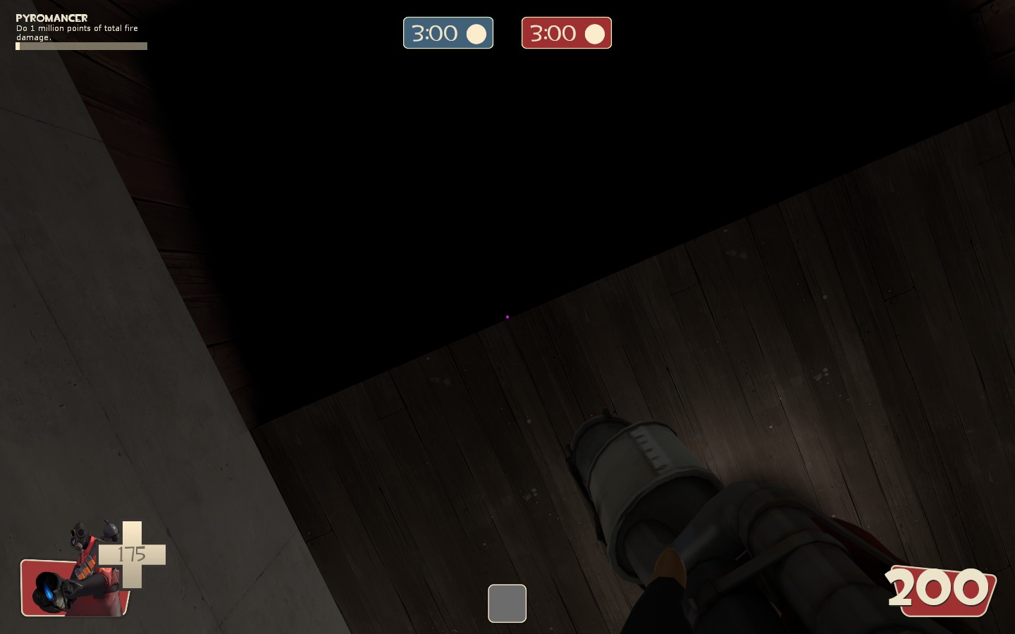
Something is wrong with the ceiling.
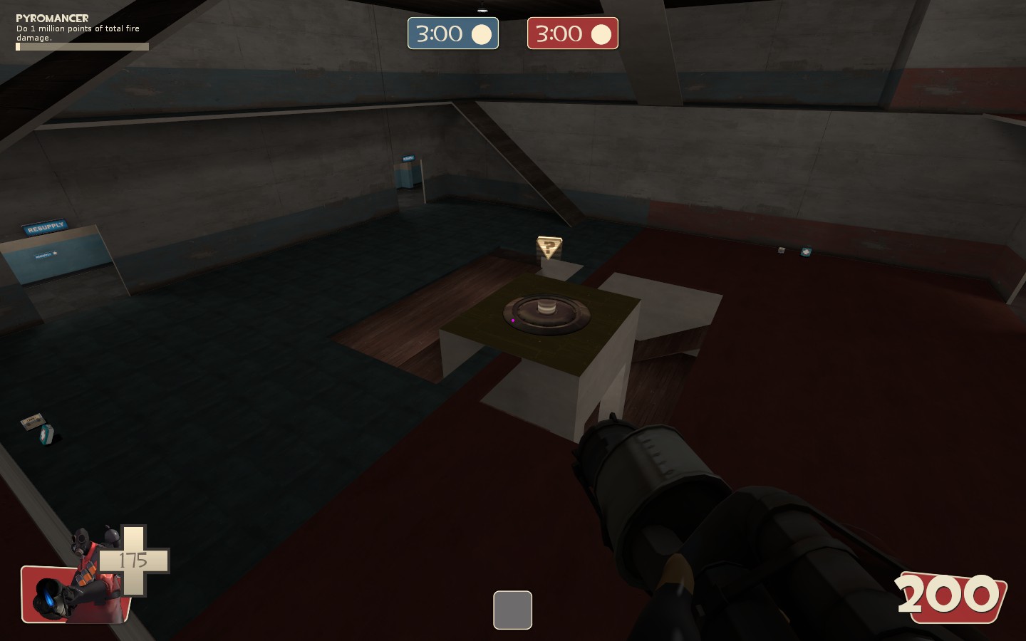
Your rooms are way too large and open. There is no cover anywhere from long range classes. Pyros and scouts will be impossible to play on this map. When you don't have large open rooms, you have long narrow hallways, which are also good for long range classes.
Another thing about your large rooms is you have very high ramps. Generally you do not want high ramps because the higher the player is, the more power they have on players below them and the more damage they take from falling. Keep players close together.
Also, when you make areas of different height, make sure there are plenty of ways between them. Usually you have 1 ramp for each team. Try to add 1 or 2 neutral ramps or more. Make them shorter, both in length and height.
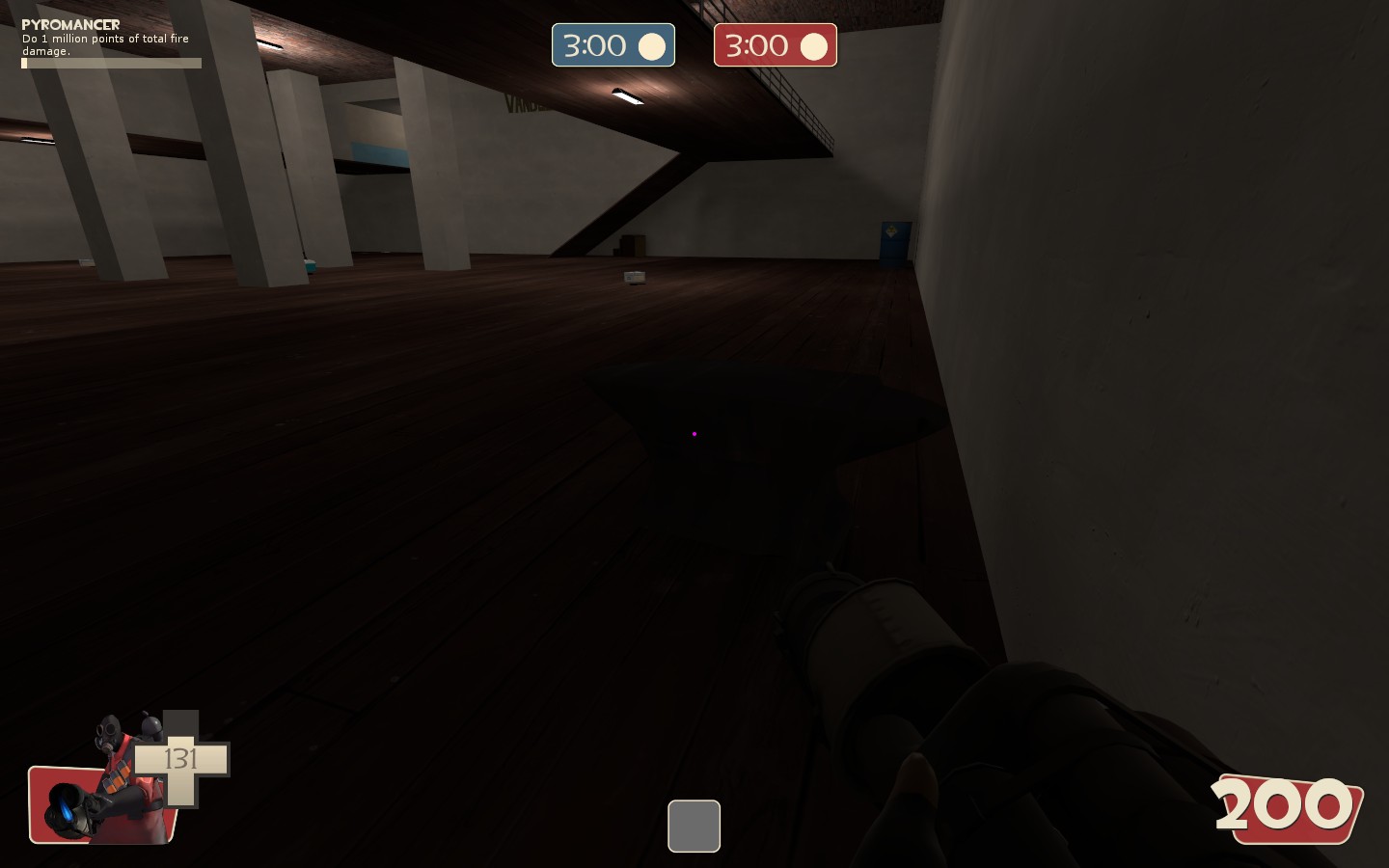
This room is way too dark in the corners. Add more lights. Also, why is there an anvil here? When you place props, you should think about why they are there. If you are putting down tires, is there a truck or tire tracks nearby? If you put down train wheels, are there trains or tracks nearby?
There's no reason to go to the bottom area either, unless you get knocked down there. If you do, you take a lot of fall damage and then it takes quite a long time to get back to the main room. Make the walk time shorter and more interesting with more opportunities to meet players in a setting that isn't a narrow hallway.
Finally, put your func_respawnroomvisualizer over the metal door instead of in empty doorways. This will make your rooms a bit more fluid.
You don't have to do this all on your first map. You've already done a lot more than most first time mappers. Just remember these tips for your next map.
Here are some things I found about your map.
The top of the map, over the point, is useless. You can't use it to shoot at people on the point, and there's nothing else up there, so there is no reason to go there. Players won't fight up there because it isn't on the way to the point, and the spawn room is so close that they can just go to the spawn room to heal or get ammo.

Something is wrong with the ceiling.

Your rooms are way too large and open. There is no cover anywhere from long range classes. Pyros and scouts will be impossible to play on this map. When you don't have large open rooms, you have long narrow hallways, which are also good for long range classes.
Another thing about your large rooms is you have very high ramps. Generally you do not want high ramps because the higher the player is, the more power they have on players below them and the more damage they take from falling. Keep players close together.
Also, when you make areas of different height, make sure there are plenty of ways between them. Usually you have 1 ramp for each team. Try to add 1 or 2 neutral ramps or more. Make them shorter, both in length and height.

This room is way too dark in the corners. Add more lights. Also, why is there an anvil here? When you place props, you should think about why they are there. If you are putting down tires, is there a truck or tire tracks nearby? If you put down train wheels, are there trains or tracks nearby?
There's no reason to go to the bottom area either, unless you get knocked down there. If you do, you take a lot of fall damage and then it takes quite a long time to get back to the main room. Make the walk time shorter and more interesting with more opportunities to meet players in a setting that isn't a narrow hallway.
Finally, put your func_respawnroomvisualizer over the metal door instead of in empty doorways. This will make your rooms a bit more fluid.
You don't have to do this all on your first map. You've already done a lot more than most first time mappers. Just remember these tips for your next map.
- Jan 6, 2011
- 5
- 0
Because you sauid that i need gates, i made it and then it began to bug, good that i have a backup.I was wrong about the spawn rooms. I see you have metal doors. That's good. However, make them move faster so you don't get caught on them.
OkeyHere are some things I found about your map...
i tested the map before, the room above is not empty because theres a secret. On the ammo packages: sometimes they are useless.The top of the map, over the point, is useless. You can't use it to shoot at people on the point, and there's nothing else up there, so there is no reason to go there. Players won't fight up there because it isn't on the way to the point, and the spawn room is so close that they can just go to the spawn room to heal or get ammo.
No, just an aborted thingy, which does not effect on the gameplay.
Something is wrong with the ceiling.
Already said, look to the future version to-do list.
Your rooms are way too large and open. There is no cover anywhere from long range classes. Pyros and scouts will be impossible to play on this map. When you don't have large open rooms, you have long narrow hallways, which are also good for long range classes.
Gonna change that too.Another thing about your large rooms is you have very high ramps. Generally you do not want high ramps because the higher the player is, the more power they have on players below them and the more damage they take from falling. Keep players close together.
Yes i will.Also, when you make areas of different height, make sure there are plenty of ways between them. Usually you have 1 ramp for each team. Try to add 1 or 2 neutral ramps or more. Make them shorter, both in length and height.
This dark is now gone in v3.
An anvil can be everywhere.why is there an anvil here? When you place props, you should think about why they are there. If you are putting down tires, is there a truck or tire tracks nearby? If you put down train wheels, are there trains or tracks nearby?
hmmhmmhm, i got an idea for this room.There's no reason to go to the bottom area either, unless you get knocked down there. If you do, you take a lot of fall damage and then it takes quite a long time to get back to the main room. Make the walk time shorter and more interesting with more opportunities to meet players in a setting that isn't a narrow hallway.
Well, i see about that.Finally, put your func_respawnroomvisualizer over the metal door instead of in empty doorways. This will make your rooms a bit more fluid.
I know, i made some maps before, but never in TF2 style and connecting them togheter.You don't have to do this all on your first map. You've already done a lot more than most first time mappers. Just remember these tips for your next map.


