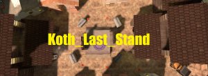
Koth_Last_Stand

KotH Koth_Last_Stand 2016-02-12

Billo

aa
Feb 8, 2016
921
405
Koth_Last_Stand - King Of The Hill

Do You Like Killing?
Do You Hate Being Killed?
Do You Like Koth Maps?
Then This Map Made for You!
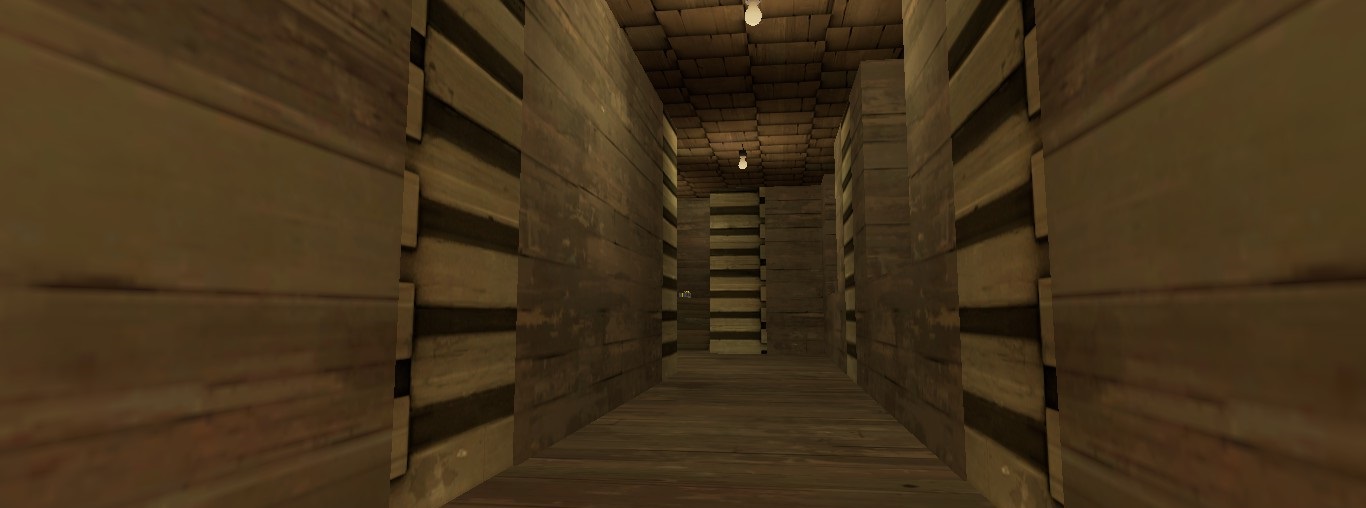
2016-02-12_00003.jpg
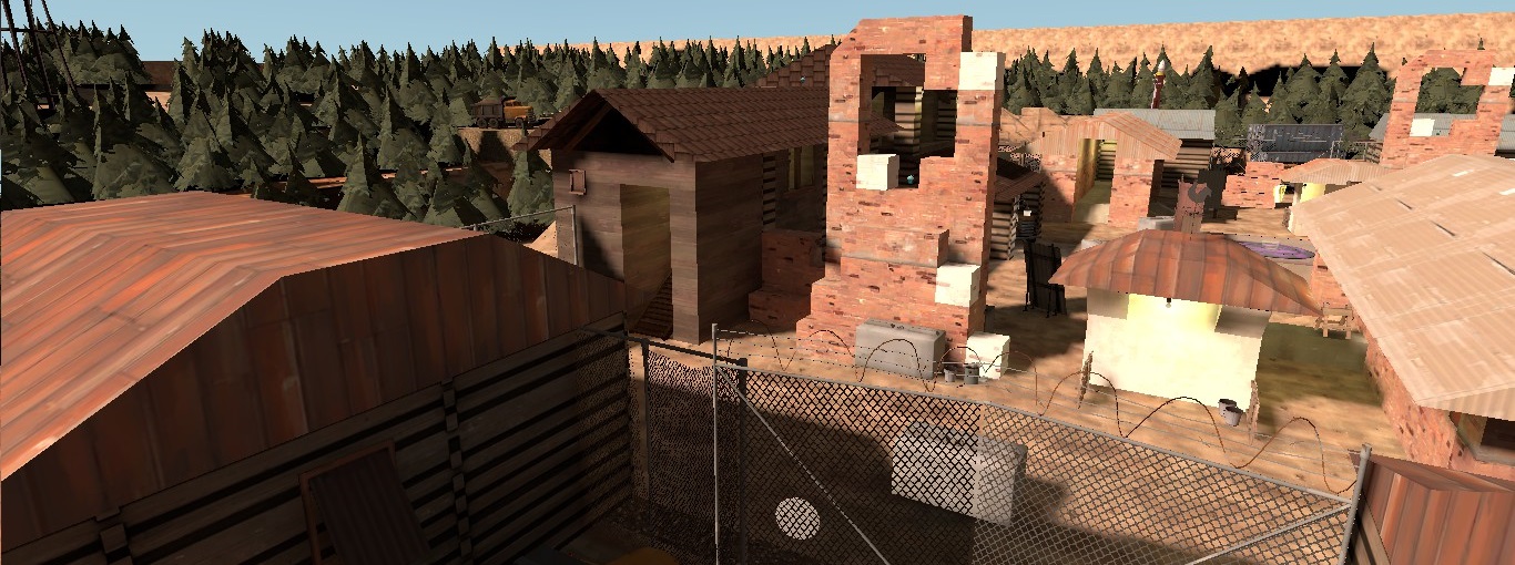
2016-02-12_00006.jpg
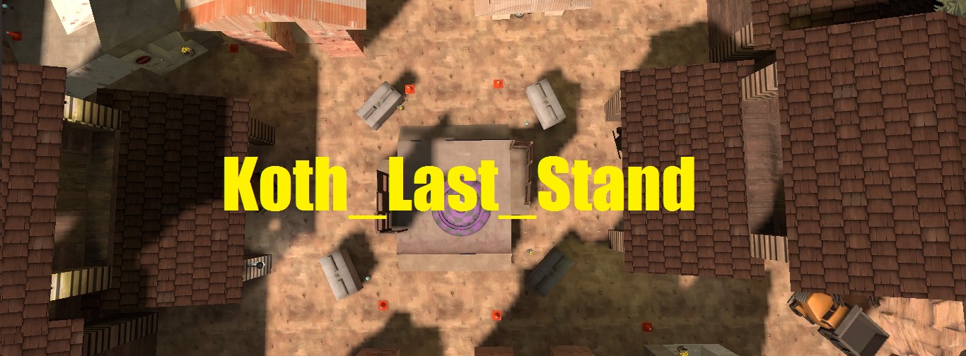
2016-02-12_00005.jpg
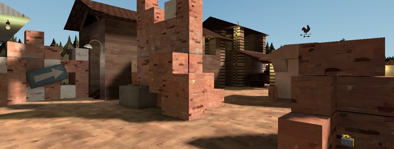
2016-02-12_00001.jpg
2016-02-12_00002.jpg
2016-02-12_00001.jpg
 

sooshey

:3c
aa
Jan 7, 2015
514
410
I just took a look at your map, and:
  • Avoid having such a large space outside the playing area. A much better way to do this would be to make a 3D skybox. Here's a guide for making one, but it's not necessary to worry about them for maps that are early in development.
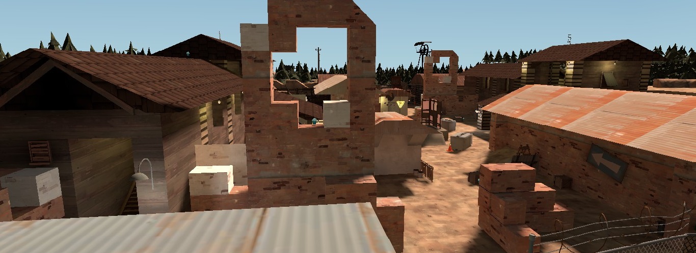
  • Your ground is 100% flat with not even the tiniest hill. To make gameplay more interesting, I suggest making hills/valleys alongside your buildings and props. Height variation is important for a map to be fun!
  • I'd also consider simplifying the gameplay area in general. There are just lots of props and bricks placed everywhere with no real reasoning.
  • Another thing you should do is make it clearer which side of the map is RED and which is BLU. If players get disoriented they may end up running to the wrong spawn.
  • However your scaling is great, and I personally like the theme you chose!
 

Anguish

L2: Junior Member
Jan 24, 2016
94
4
I agree with the hill stuff stated above. Go on the brush face editor and create a displacement with a power of 2 or 3 on your ground, then paint the geometry to what you see fits.
 

Billo

aa
Feb 8, 2016
921
405
where is that?
btw i created one other copy of the map thats finished check it out if you want :D
 

Crowbar

aa
Dec 19, 2015
1,455
1,298
That thing if 1st and 3rd screenshots, last one. Also these walls on 2nd look bad too. Well, there are probably sth looking good that is not in screenshots.
 

Anguish

L2: Junior Member
Jan 24, 2016
94
4
Some general improvement feedback:
The koth in your title is a little unecessary because it's already tagged
Please include a version number (a1, b3, rc7 etc)
I hope your BSP doesn't have any capitals in its name, as that causes issues with servers trying to run it.
Assuming this is a1 of your first map, I think you have gone a little overboard with detailing, considering usually it's standard practice to create the first version using pretty much only dev textures, ESPECIALLY before having tested the map publicly.
Also, your tagline is "King of The Hill" when it could be something like "Mann Co's Last Stand" or something to get the viewer interested.
 

Billo

aa
Feb 8, 2016
921
405
This Is The Last Stand From MannCo To win and this map is all about red vs blu
Red Wants to Explode Blu
But Blu Are Having The Same Idea


I Am Thinking to Make Something Like Trailer-Small Movie 1 min about that do you want?
 

killohurtz

Distinction in Applied Carving
aa
Feb 22, 2014
1,016
1,277
@Another Crowbar if you cared enough to post nope.avi in response to the trailer, then surely you can put in the effort to give constructive criticism :/

Personally I think the trailer could use some more cinematic transitions between images so it doesn't look so much like a slideshow, and better timing of the transitions so they sync up with the music. The End of the Line trailer is a nice example of both of these things.
 

Crowbar

aa
Dec 19, 2015
1,455
1,298
Well, it's better to create a great map with no trailer and anything such then create less than average map with even worse trailer.
I'm sorry for nope.avi.
 

Anguish

L2: Junior Member
Jan 24, 2016
94
4
That's uh, well it's a good start, I was just talking about the tagline people see in the downloads section..
 

Zed

Certified Most Crunk™
aa
Aug 7, 2014
1,241
1,025
Why are you using Comic Sans?