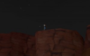
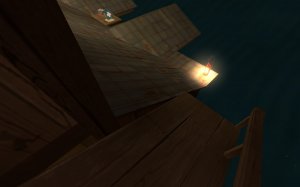
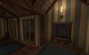
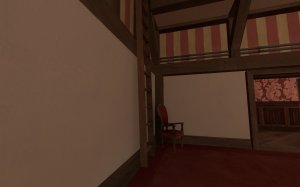
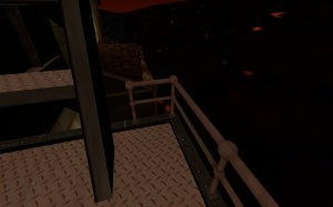
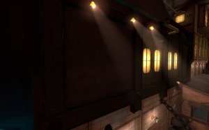
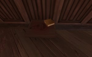
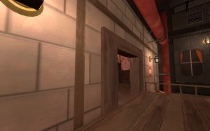
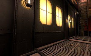
Hearth

CTF Hearth rc5

Jul 5, 2016
503
296
Hearth (CTF) - Improved CTF helltrain

------------------------------------------------------------------------------------------
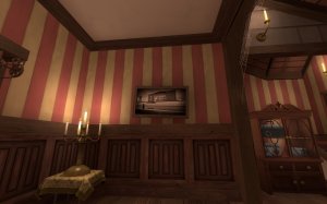
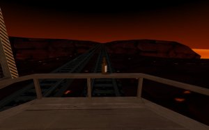
CTF Hearth is the new and improved version of CTF Helltrain from 2018
------------------------------------------------------------------------------------------

What's new:
-Layout improvements
-New artpass
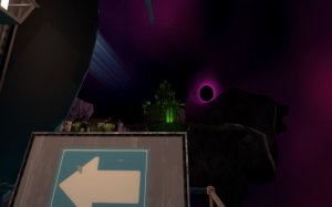
-The skybox now has fully 3D environments instead of just sliding textures
-Better optimization
 

MegapiemanPHD

Doctorate in Deliciousness
aa
Mar 31, 2012
2,004
1,313
I always enjoyed the idea of helltrain and I'm glad you gave it another shot. This map is overall pretty great and much improved in my opinion. Still, I've got some feedback for ya so here ya go.
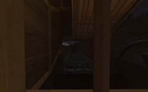
20200820021040_1.jpg
-I'm not sure what all can be done about this but while the moving skybox is impressive, it's textures are very crispy. Maybe try to up the resolution or something?
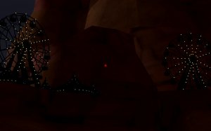
20200820021936_1.jpg
-These props only really work on a black background due to being fully black themselves. Diva Dan's released some assets from koth_slaughter_event that may work as a good replacement
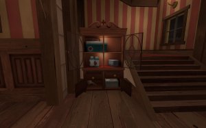
20200820021019_1.jpg
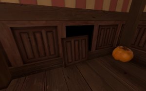
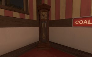
-this cabinet looks fantastic
20200820021648_1.jpg
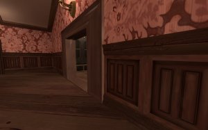
-clip the doorway smooth
20200820021258_1.jpg
-either remove collision on these panels or clip them smooth
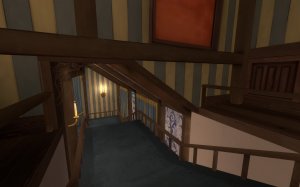
20200820022041_1.jpg
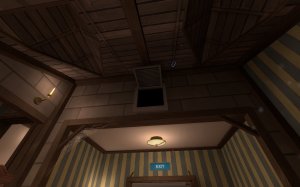
-this angled roof makes walking under it kind of funky. If you're too far on the right you can bump the ceiling. maybe raise it up a tad if you can?
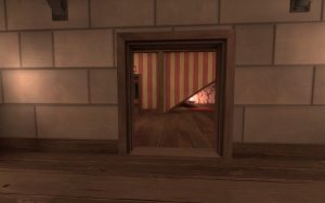
20200820021108_1.jpg
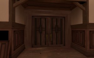
-These doorways feel too small
20200820022304_1.jpg
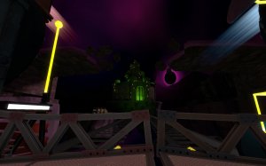
-Love how this looks like the castle from monsterbash
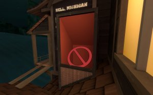
20200820021529_1.jpg 20200820021829_1.jpg
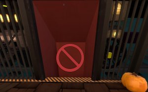
not sure why these resapawnroom visualizer textures are here. They look out of place and whatever they are meant to do can probably be done a different way
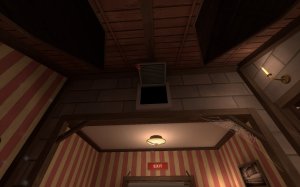
20200820021345_1.jpg
-the teleporter exit for this vent knocks you around in an odd way opposed to the other vents\
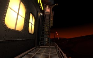
20200820021204_1.jpg
-jumping up these stairs is horrid. Perhaps replace it with a jump pad up to the higher level?
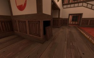
20200820021639_1.jpg
-again, clip or remove collision
20200820022634_1.jpg
-is that an image of balloon race? Why? It looks odd to have a screenshot of that map with it's basic detailing since it doesn't look like a real place. Maybe see if you can find someone to do a fancy paintover of it to make it feel more like an image of a place than a screenshot
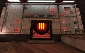
20200820022408_1.jpg
-I'm not sure about having the flag and capture zone it 2 different areas. I understand why you did this so that players don't have to go all the way through the train to capture the flag but I imagine it will confuse players since they are so used to going back to the flag to score.
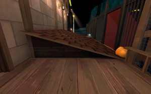
20200820021906_1.jpg
-getting on this roof is kinda wonky. Not sure what can be done about it but something to smooth it out and make it less awkward would be good
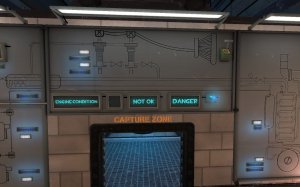
20200820022552_1.jpg
-are both of these lights supposed to be on at the same time? I like how they turn on and off based on score but it looks like Not OK is for 2 points and Danger is for 3 when the boiler explodes opposed to both at the same time.
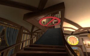
20200820022120_1.jpg
-This spawn exit is right in the flag room and kind of awkward in itself. I'd suggest pushing it back some.
 

Attachments

  • 20200820022233_1.jpg
    20200820022233_1.jpg
    117.6 KB · Views: 213
  • 20200820021419_1.jpg
    20200820021419_1.jpg
    151.3 KB · Views: 217
Jul 5, 2016
503
296
Changelog rc2:
-New skybox texture
-New "coal core" and "boiler room" signs
-Darker environment lighting
-Added fog
-Soundscape adjustments
-Tweaked arrow signs
-Fixed hdr bloom on brass texture
-Fixed weirdly lit boiler window
-Fixed blue boiler pipe not boosting invisible spies

Read the rest of this update entry...
 

MegapiemanPHD

Doctorate in Deliciousness
aa
Mar 31, 2012
2,004
1,313
New update means new feedback. Here's some more:
20200826205728_1.jpg
-while the skybox textures are improved, they are still pretty crispy. There's got to be some better middle ground to find for them where there's enough detail to not look stretched while still doing what they need to do.
20200826205711_1.jpg
-the lighting on this widmill doesn't match the ground around it. Feels like it should be darker.
20200826205746_1.jpg
-love the shadows here with the bridge and wheel. It makes me wonder though, is the train a vampire? It doesn't have a shadow.
20200826205618_1.jpg
-this transition between the wood and roof could use some better clipping
20200826205025_1.jpg
-while this wall is only in the spawn room, it still could use some clipping
20200826210356_1.jpg
-ladder clip smooth
20200826210641_1.jpg
-I can get stuck while trying to get into this lil nook here
20200826210123_1.jpg
-I can't help but feel like the metal textures on the trains don't fit TF2 all that well. They're too grungy and realistic. Id suggest taking another pass at them to really get that TF2 art style down.
20200826205843_1.jpg
-kinda weird that you're using blu reskins of the red manor props for all of blu side, but these tables still have the red logo
20200826210423_1.jpg
-clock doesn't tick
20200826210328_1.jpg
-clip smooth
20200826210600_1.jpg
-some weird movement on this ash pile
20200826205054_1.jpg
-this vent still shoots me to the right when I leave it
20200826210305_1.jpg
-the invisable wall here is odd. There doesn't seem to be much of a reason for it nor much to indicate that it's there. Either leave it open or close in the space.
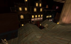
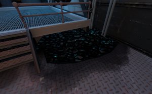
20200826205804_1.jpg
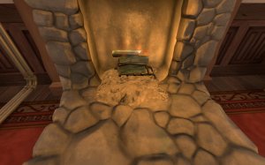
-the coal in the boiler rooms give off some odd reflections. I don't know if it's the texture itself or the blue light above but somethign just doesn't look right.
20200826210714_1.jpg
-clip doorway smooth
20200826210654_1.jpg
-probably should clip these sticking out pillars smooth

That's all for now. Good work so far :D
 
Jul 5, 2016
503
296
Thanks for the feedback MegapiemanPHD, it was very useful! I would have thanked you earlier but we were sooooo busy getting rc3 done (I have blisters from using my mouse lol).
 

TheMightyGerbil

L2: Junior Member
Dec 23, 2012
79
21
It looks great and is totally worth the file size but at 136 mb I've got to ask are you repacking it or using compile pal to do so? Just checking keep up the great work :) .
 

TheMightyGerbil

L2: Junior Member
Dec 23, 2012
79
21
Thanks @TheMightyGerbil! By the way, the map is repacked, but the file size is very large because of all the custom assets we made.
Nods, it is worth it :).

On another note however I just tested the updated rc3 version (before putting it up for my small group) and that static beeping is no bueno. You hear it everywhere (you can tell there are multiple sources but it is everywhere), continuous, and it's quite frankly maddening. I think it is some problem with the train sound file loop. On rc2 the train sounds fine. On this one it's like the loop has been cut really short and there is static at the end of it going "bzz". I'll have to stick with rc2 until that's fixed. Just a friendly heads up.
 
Last edited: