Hey pugged this for 6v6 tonight. The pug fell apart due to team imbalance, as one of the captains made some pretty odd picks.
Demo: https://dl.dropbox.com/u/3492731/spacesaver/20120721-0611-koth_flake_a5.dem
A couple of things I noticed.
Yes that is a problem I will be working on, although seeing that the height difference isn't that big the adjustments probably won't have to be too dramatic, I'll just try to balance the areas out. (I'll fix the grate also)
Small adjustments of the metal cover was something I had also considered but playtesting helps me the most in that regard.
I might widen the doors to the metal building a little, as far as the looks go i'm still working on them although I don't think they are ugly at the moment but they aren't believable.
risk reward would be a good thing but I'll keep my eye on it. It has more health placed around the map than viaduct but it is bigger so I might have to place some thingd around.
Yes I agree spawn feels odd, and I think that's mostly because you exit a door and very quickly descend. I'll try to think of something to make it less uneasy.
Thanks for the playtest!
Demo: https://dl.dropbox.com/u/3492731/spacesaver/20120721-0611-koth_flake_a5.dem
A couple of things I noticed.
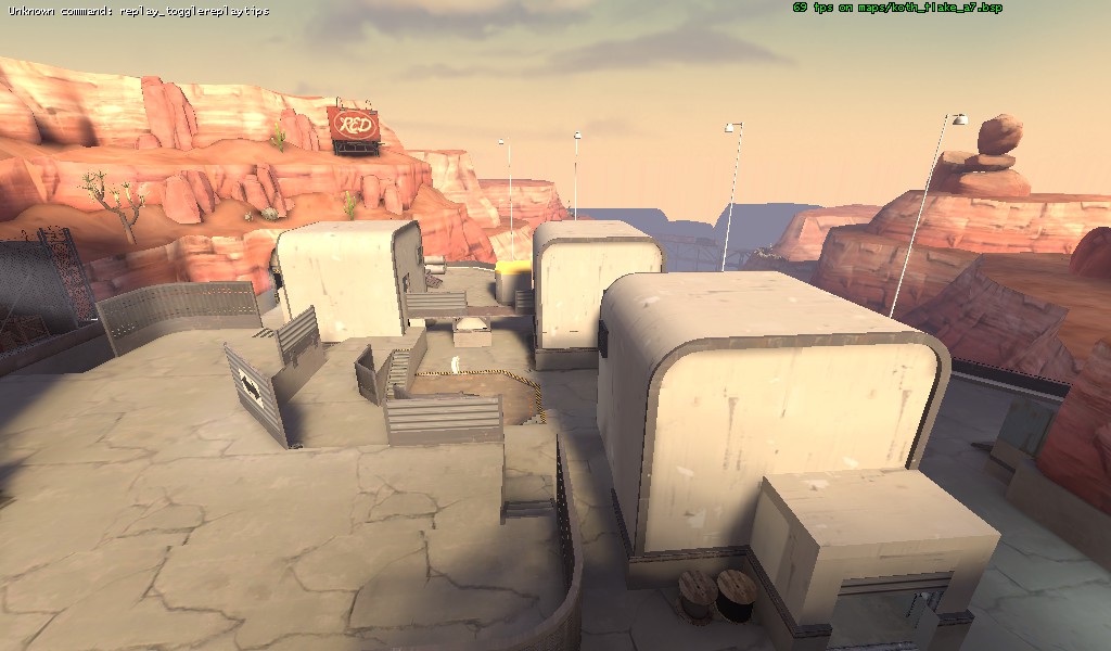
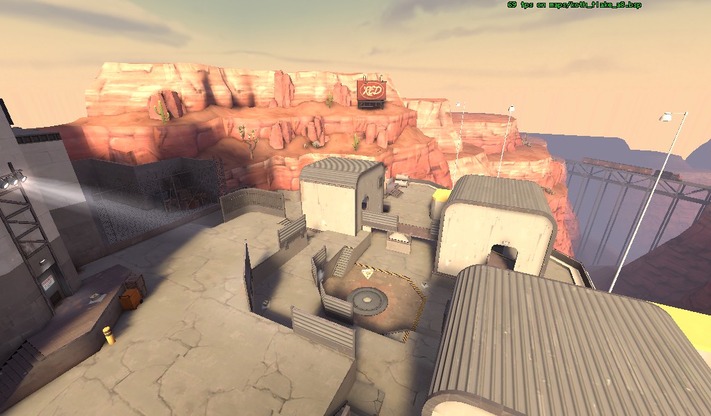
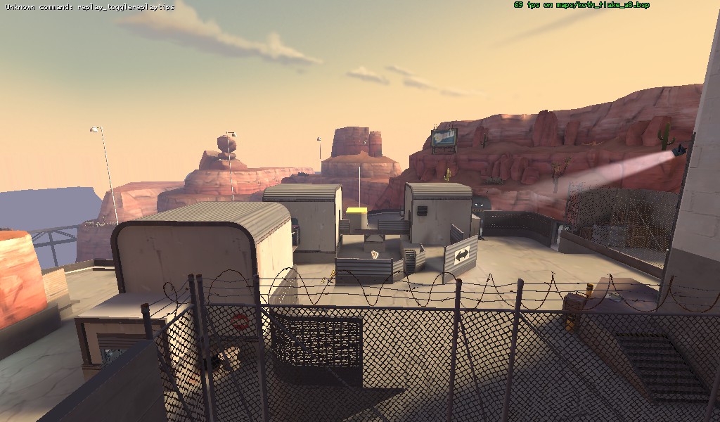
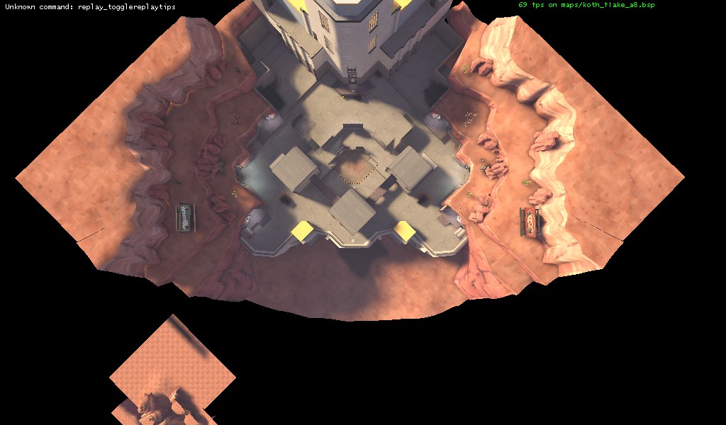
1) Seems like you have a similar problem to geiger. The upper area is incredibly strong, so much so that it really neutralizes all other aspects of the map. Holding up top seemed like the ultimate strat and there doesn't seem to be much to do other than push up through the narrow ramp and bully them off the upper area. It also seems like demo can hold that area very well, and can set up some nasty sticky traps (the grates you are using for that curved wall allow splash damage through, which means a demo can sit up behind the fence and anyone walking in gets detted upon without any way to shoot the stickies).
I feel like you need to either lower that back area, or raise up some significant area on the other side in order to make sure combat is more balanced across the map, offering players the chance to get up high without having to walk or jump into a very safe hold.
Yes that is a problem I will be working on, although seeing that the height difference isn't that big the adjustments probably won't have to be too dramatic, I'll just try to balance the areas out. (I'll fix the grate also)
2) Obviously you've been keeping sniper sightlines in mind, but I think you may have overdone it. Those metal walls that you have scattered everywhere really seem to hamper combat throughout the map. It felt like a lot of times we would just sit around somewhere, completely safe from any sort of long ranged attack. The enemy team would have to either jump into us up top, or walk onto the point in order to initiate an engagement, and then we could just jump on them and destroy them. I think you need to rethink how you have those walls set up, maybe adjust some of them to allow certain spam lines.
Small adjustments of the metal cover was something I had also considered but playtesting helps me the most in that regard.
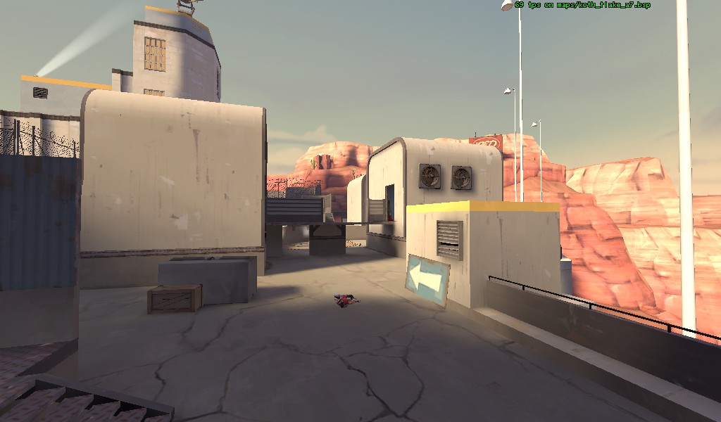
3) The buildings are incredibly small. They do give you some sort of flank access, but I feel like the chokey nature of them makes it very difficult to see how you would properly use them. Also, not a huge fan of the look. They appear very blunt and rectangular, without having the hallmarks of the sort of venting or electrical structure that they seem to want to be. I guess you could tinker around with stuff on top of them, but I'm really not sure how that would all work out.
I might widen the doors to the metal building a little, as far as the looks go i'm still working on them although I don't think they are ugly at the moment but they aren't believable.
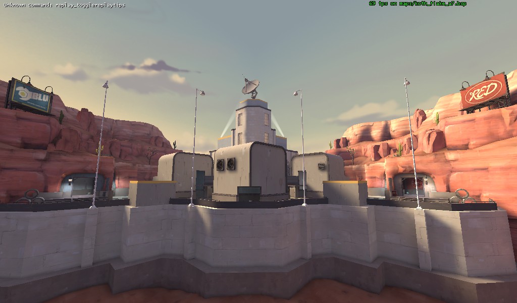
4) The health seems very very sparse in this map. With how the upper area is set up, you obviously don't want to put much health on or near there, but I think that is a problem with the height set up more than anything. The medium seems like its in a very hard and out of the way place to get to, and it seems very dangerous to try for it, given how chokey that whole area is.
risk reward would be a good thing but I'll keep my eye on it. It has more health placed around the map than viaduct but it is bigger so I might have to place some thingd around.
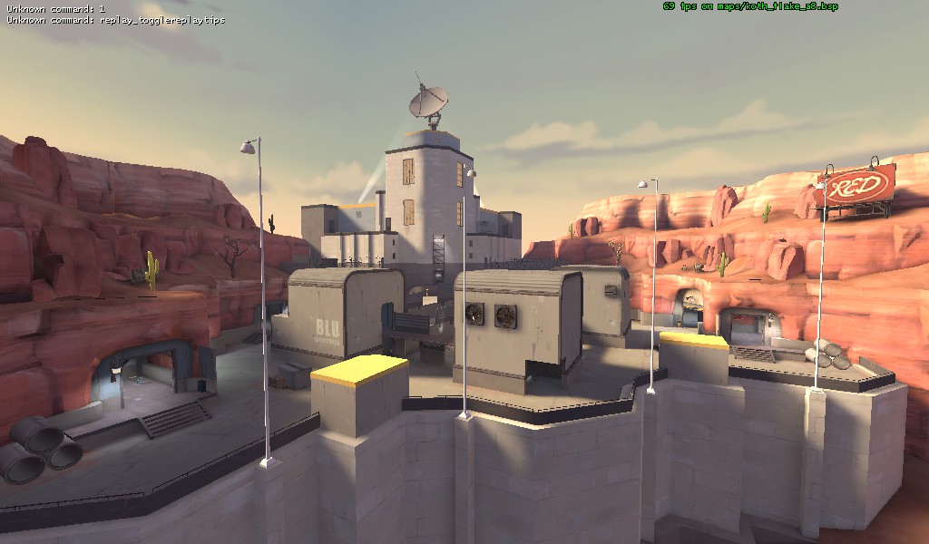
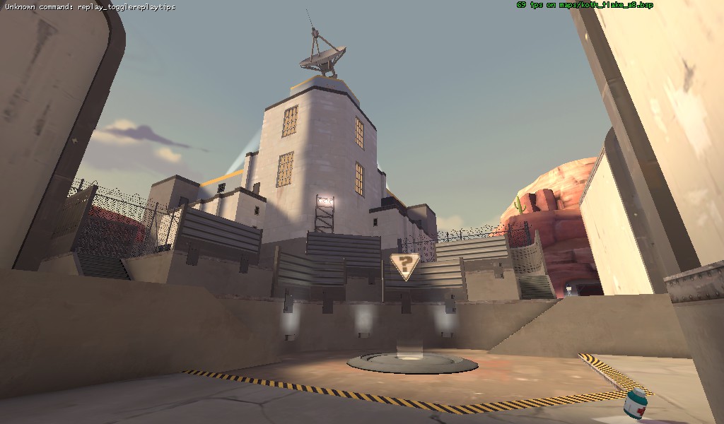
5) Spawn feels odd. Having the spawn area be SO high up there made coming out of spawn feel weird. I get that its meant to be an anti spawn camping mechanic, blocking sightlines and so forth, but its still weird. Also, I feel like the chokes out to the combat space are a bit to narrow. Feels like you could get spammed out pretty easily by a single soldier without any room to dodge.
Yes I agree spawn feels odd, and I think that's mostly because you exit a door and very quickly descend. I'll try to think of something to make it less uneasy.
Thanks for the playtest!
Last edited: