Resource icon

KotH Epiphany B1

Aug 30, 2015
359
451

Attachments

  • Epiphany A02.jpg
    Epiphany A02.jpg
    260.6 KB · Views: 51
Last edited:
Aug 30, 2015
359
451
Beef Bucket updated Epiphany with a new update entry:

Epiphany A2

In an effort to make the point easier to take, opens up the 'house' overlooking the point and removes all blockers from the set piece. In their place, I have changed the set piece into something that I am informed is called a 'nipple point.'

Complete changes:
  • Opened up the house overlooking the point. Raised the north purple and orange secret routes so they do not require a jump to get up.
  • Removed barriers around capture point. Added a central spire to cap zone. This can...

Read the rest of this update entry...
 
Aug 30, 2015
359
451
Beef Bucket updated Epiphany with a new update entry:

A3

This was supposed to go up last night but I decided it was absolutely essential that I start detailing in Alpha 3. Lol.
Reworked the layout with these goals:
Changed from a mirrored symmetry to rotated. This removes the pit, and adds a House for each team. Teams can attack their opponent's House at range. It is also my hope that this allays comparisons to Lakeside.
Adds an underground route underneath the point. This area also has a spike pit because I was sad that the pit got taken out...

Read the rest of this update entry...
 

Katsu! :3

Veteran Cat
aa
Jul 30, 2021
616
337
Feedback time.
20230328180350_1.jpg

Clipping - Clip that little lip outside of spawn as a ramp. A staircase there wouldn't make sense imo so just having it clipped would be fine.
Layout Update - Replace the brush jump with a normal staircase. Jumping is not cool and as it is, it's slower than the "main" route.
20230328181440_1.jpg

Claustraphobia - Expand this doorway to around this size, and raise the indoor roof. Feels really small.
20230328181528_1.jpg

Pickups - Decrease the size of this ammo kit to a medium. The rotate time from this to the closest pack (near mid) is too short for this to be reasonable.
Layout Update - Please widen the staircase a bit.
20230328182638_1.jpg

Claustrophobia - Widen out the doorway on the right and raise its roof a bit.
Claustrophobia - Add some more walking room on the 2nd floor in here. Rotate route back down to 1st floor stays the exact same pretty much.
20230328183740_1.jpg

Layout Update - Add a connection between the current two respawn locations and put a single spawn in that area. Put your spawns there, and add a window in front of that.
 
Aug 30, 2015
359
451

Katsu! :3

Veteran Cat
aa
Jul 30, 2021
616
337
This is shaping up pretty well now! I think if you have a good playtest with this you're probably ready for Beta 1 here. Gonna leave a bit more feedback now but I do hope you know: I like a lot of your changes! Map feels a lot better.

20230415234818_1.jpg

Gameplay Flow - I feel like you were a bit over-ambitious with this sightline blocker here; Its wideness makes my turns here feel a bit weird, and it'd be cool if it were shortened a bit to both add a bit of better gameplay flow as well as, potentially, some more interesting sniping angles.
20230415235118_1.jpg

Prop LODs - The distance from this bucket and when its different LODs come into effect is really, really small; I'm standing quite close to it, yet it's only in its 2nd LOD; This is pretty distracting.
20230415235305_1.jpg

Questions and Comments - I'm.... not entirely sure what the purpose of this room is? It's got health and ammo in here, but I feel like it's rather sectioned off from the rest of where a team would hold safely to be effective as a retreat area, since it's a "hole in the wall" room. I think if you added a doorway where the room was, you'd make the playspace a lot more interesting and have a bit more fluid combat around mid. Would love some more insight from you if possible!
20230415235649_1.jpg

Clipping - This was recently pointed out to me by a friend of mine, but clipping on these little health and ammo "plates" I'll call them, are really annoying. It's just noticeable enough to make me feel weird when moving around the map, and I think making these non-solid (or even better, using an overlay! :D) would do you some wonders.
20230415235959_1.jpg

Pickups - I think downsizing this ammo kit by 1 would be reasonable. The main thing I'm concerned about here is that an engineer could pretty readily abuse the +100 ammo right here and have a mostly uncampable spot, due to the lack of sniper sights directly onto this middle route here. This might be something I'd ask for in the playtest notes though, to see if it's actually effective.

As a Summary: I'm loving this new version of the map! It looks like a lot of fun, and while I'm confused about a few things, I think if you give it a real good jab, you'll make it! >:D
I'd really like to recommend trying out one of two themes: A stormy, jungle industry theme, like in MVM Affinity, or a standard Hydroelectric theme like in TC Hydro or CP Powerhouse. The decision is up to you, but I think with your layout, either would be cool! I'm looking forward to what you do with this map :3
 
Aug 30, 2015
359
451
Aug 30, 2015
359
451
Thanks for the feedback. With regards to the side rooms near the point, I am hesitant to open them up completely. It was my vision to create a layout similar to Viaduct, with no easily accessible side routes to the enemy territory. As for why I made the rooms that big... lol, just doing a little silly I guess. There's no need for it at all!
I will also concede your point about the pickups. To make development easier, I instantiated all my pickups with dev-textured brushes underneath instead of patches. Replacing them with context-appropriate overlays will be my first priority when I get ready to move to Beta.
Hope you all enjoy it, thanks again!
 
Aug 30, 2015
359
451
Thanks to everyone who came out and tested. Since feedback was mostly pretty positive, I'm going to work on moving to Beta.
 
Aug 30, 2015
359
451

Katsu! :3

Veteran Cat
aa
Jul 30, 2021
616
337
It is feedback time once more! I'm gonna try and focus on some more "nitpicky" or smaller issues now, so bear with me lol

20230618124823_1.jpg

Clipping - It's generally good practice to have smoother clipping with ramps. Players don't really pay attention to how high they are up in relation to the stairs themselves unless it's drastically different, so having a smoother ramp followed by flat ground would work wonders here. It also just leads to more fluid combat.
20230618124839_1.jpg

Clipping - More of the same from the previous fb, just something I find important.
20230618124923_1.jpg

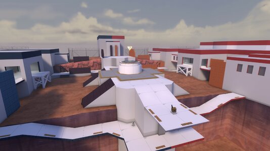
Pickups - I think you could afford to size this pack up that's in front of the Control Point. It's in a risky enough spot where if you're playing around there you could definitely try your luck at grabbing some ammo there, and it's in a place that still wouldn't encourage Engineers to get too pushy with their building placement unless they already have a big advantage over the other team.
20230618124929_1.jpg

Detailing Suggestion - This looks like it's shaping up to be a sort of observation deck kind of area? Like a bunch of BLU SpyTech stuff inside this upper bit of the area would be a really cool touch.
20230618125144_1.jpg

Detailing Suggestion - I think it would be a good idea to try and telegraph that this is a no-fly zone somehow. This can often be done by just making a building taller, but I get the feeling it wouldn't come out right give then area is indoors. I think you could maybe take a more subtle approach, and have some catwalks here perhaps? It gets the idea across that the area is out of bounds, since maps like gorge have those up high in their indoor areas.
20230618134006_1.jpg

Clipping - These metal pipes are fully clipped, however the roof right next to them is not. It would present a camping problem if that roof were walkable, so I think you should just make the pipes non-solid.
20230618151233_1.jpg

Gameplay - The whole area to the right of the red line is a huge hiding spot for players and I'm just gonna be honest that shit is the most infuriating thing to fight against in TF2 right next to the Wrangler. If there's some way that the hidey spot could be organically removed, that would be most appreciated.
20230618152950_1.jpg

Detailing Suggestion - Call me a bit silly if you want but I think you could introduce some hydro theming into this map maybe? For example, you could have a large puddle of water here and have a dam right behind it serving as the out of bounds wall.
20230618153614_1.jpg

Bugfix - You have some weird z-fighting error going on here? Not sure what's cause it but hey, bugfix is a bugfix!
20230618153744_1.jpg

Detailing Suggestion - Continuing from a previous suggestion, maybe you could make the outer areas of mid have some huge hydro station-like things around it? I'm thinking maps like tc_hydro (duh) but also something like ctf_vector perhaps? Would be worth looking into imo.
20230618153942_1.jpg

Detailing Suggestion - I absolutely adore this skylight in the map but imo I think it would be cool to have something more than just these "bumps" at the top of the map too. There's this one prop on Hydro's RED last that I think would be really cool but I cannot for the life of me remember the name.
20230618154125_1.jpg

Clipping - I really dig the detail right here of an extra stripe on the floor, I think it's cool, but I also think it could be de-clipped. It just adds an extra hump in height which messes with aiming a bit. So like, the detail itself stays the same, it's just that it's a non-solid brush.
20230618154513_1.jpg

1687117623128.png

Detailing Suggestion - I don't think these planks should be team-coloured. I think using some of the construction wood textures from the Construction Pack would be really nice for it! (If you need some better visuals, look at cp_vanguard)
20230618154820_1.jpg

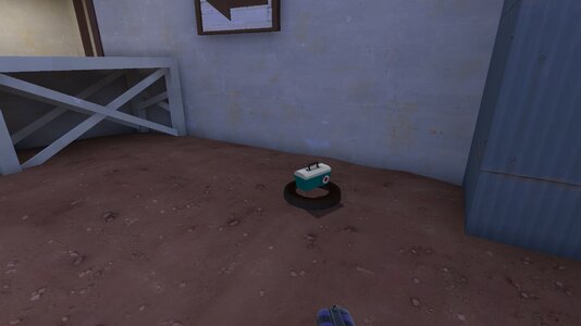
Pickups - I think this health kit should be raised to a medium HP kit to reflect its location in the map. You always want some good health to fall back to if things get ugly, and this imo is the perfect spot for a medium HP kit. Keep the ammo kit here as a small one. Also, please make the patches overlays!!!! :( Would also be worth considering moving hp/ammo closer together but that's up to you.
20230618155431_1.jpg

Bugfix - This crate texture appears fully black for some reason. Dunno if it's a bug but if it is, maybe add some artificial, invisible light?
20230618155704_1.jpg

Clipping - Please make these little lip... things highlighted in red non-solid. Like a previous comment, they add a bit of extra height in the middle of a fight which is just a big no-no.
20230618160405_1.jpg

Pickups - grmble grmble grmble I guess it's FINE it's not in the main play area so it doesn't have any real significance on the fights it's just WEIRD (this is a joke, it's probably fine. Just needed a bit of reprieve from reviewing the map for 2 hours lol)
20230618161823_1.jpg

Detailing Suggestion - Overlays, overlays, overlays! Please put overlays under this lil guy...

I think that finally wraps it up for my feedback on koth_epiphany_b1! It took 2 hours to really digest it all, but I think once some of this is implemented you will have an even higher-quality map under your wing! I am really, really looking forward to Beta 2 and onward, I have adored this map so far and I'm excited for its future!!!!!!
 

Attachments

  • 20230618160405_1.jpg
    20230618160405_1.jpg
    204 KB · Views: 24