Draft

Lord Ned

L420: High Member
Feb 11, 2008
421
174
ARENA Draft
From Matt "Lord Ned" Hoffman and Ben "Nerdboy" Waters comes:
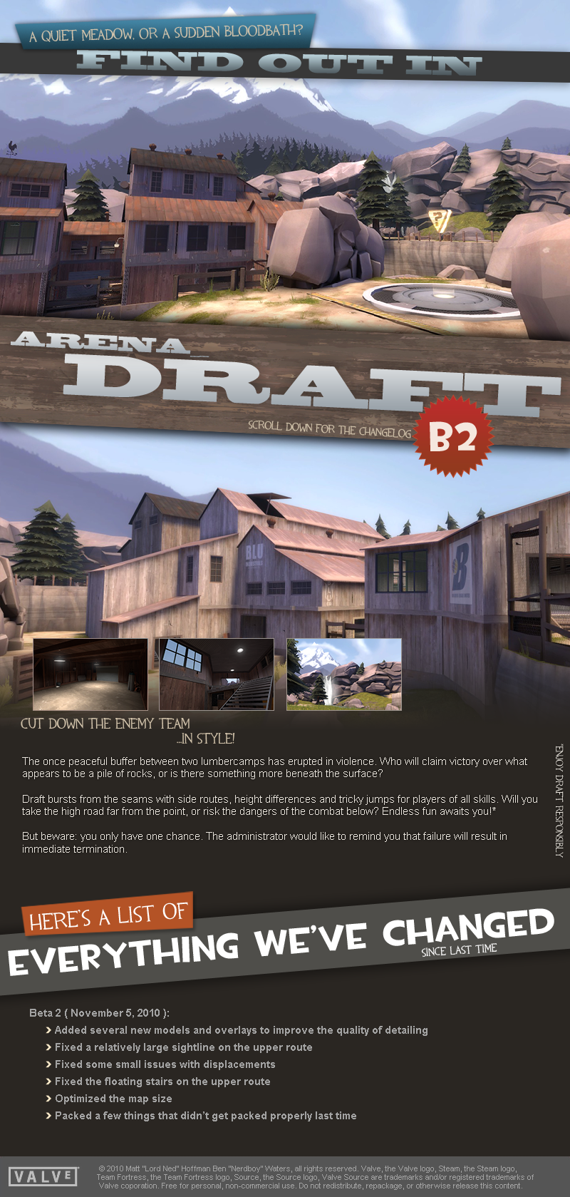
draft_promo.png


So there you have it. Leave a post if you're running it on your server or enjoy it. :)

Extra Thanks:
Thanks to A Boojum Snark and Seba for help with server-list thumbs.
Thanks to Snacks for uncomplicated some displacements.

And really thanks to Nerdboy. Even though it's half his map, this guy has just been amazing to work with. I'd close the map in frustration over something and go to bed, and I'd wake up in the morning and Nerdboy would have fixed or detailed or taken care of whatever it was, without me even mentioning it.

The dream began one quiet August night as Lord Ned prepared to resurrect Hydroelectric. The very same night, Nerdboy, master of time and space, challenged him. "Lord Ned, good sir," he commented amidst the glow of the Livestream client, "I do believe it is preposterous for such an arena map to feature a sight line straight across both spawns." Insulted, Lord Ned challenged him to produce a layout that would be better than Hydroelectric's. And so, Nerdboy was off to produce such a layout in under 80 days. He took two hours. The rest is history.

Produced over the course of a months and eight iterations comes Draft, a new and exciting arena map from the creators of Hydroelectric and Drybed! A mega-fusion of height and options make this map more addicting than Gorge.

Full Change log available here!
 
Last edited:

Seba

DR. BIG FUCKER, PHD
aa
Jun 9, 2009
2,364
2,728
As I said in-game, the whole map can be dominated by a single Havvy+Medic. There's tons of height variation which breaks up sightlines, but also allows Pyros and Havvies to drop down and eat everything below them. I recommend opening the battlezones up a bit, and putting health closer to the middle; currently if you get lit up by a Pyro you're dead in ten seconds unless you get to the healthkit, which is usually in the center of the battle area.
 
Aug 10, 2009
1,240
399
Played it yesterday too, good fun map, it kind of grew on me as the game went on. I only have a few complaints for it though.

This corner is kind of awkward as no one goes there and it tapers off into the upper platform. I suggest expanding the upper platform out at a more comfortable angle.
arena_draft_a10001.jpg


I suggest you put a ramp over the stump on the right, and at times it was just a bit awkward to get up on the middle of the map.
arena_draft_a10002.jpg


Past the pictures, all I have to say is that while the map is fun, it's pretty cramped so it plays comfortably at 10 players, when 24 is the optimal number.
 

lana

Currently On: ?????
aa
Sep 28, 2009
3,075
2,778
Problems we know:
- Rocks are dark
- You can walk through the rock on the control point
- There are strange shadows on the upper path
 
Last edited:

owly-oop

im birb
aa
Apr 14, 2009
819
1,217
There are a bunch of seethrough windows and fences. You don't have to cover them all, get a nice balance between what you can see through and what you can't. It creates a bunch of dumb fighting where both enemies see eachother, but no one wants to walk around the wall, which ends up as a staring contest

The lower area infront of the point does not feel safe whatsoever. You have it surrounded completely by higher ground and no cover. The raised areas have cover while the lower does not. The only use for the lower area are for demoman to arc their nades.

not a suggestion but an idea. possibly could spawn new ideas i dont know. didnt finish the building to the left because i didnt know what to do


YeAh_mAn_SlAm_A_FaYgO.png
 
Last edited:

lana

Currently On: ?????
aa
Sep 28, 2009
3,075
2,778
It is a very impressive blurry screencap.
 

Penguin

Clinically Diagnosed with Small Mapper's Syndrome
aa
May 21, 2009
2,039
1,484
I like the waterfall, Nerd.
 

Penguin

Clinically Diagnosed with Small Mapper's Syndrome
aa
May 21, 2009
2,039
1,484
super clearly forgot to wear his hardhat
 

Gerbil

aa
Feb 6, 2009
573
846
As an arena fan I would like to say shutup super you're a pie.

Anyway, I hate blurry hype pictures. They're not that hype-inducing. Unless you're valve.