Hi
First things first; In terms of
design this map looks
promising, I like the
Italian castle aesthetic it seems to be going for. Obviously this looks to be still in
VERY early development and with more detailing i'm sure the design is going to stick out a lot more
clearly.
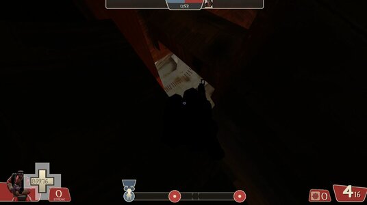
I did come across a few
slightly more glaring issues than the still WIP map geometry and sealing;
1: On
Stage 1 it is very easy for RED to
spam stickies (and the odd rocket if you jump up far enough) straight into BLU's spawn location.
Addendum 1.a:
2: At the
end of Stage 1,
2nd CP it is incredibly easy to begin spawn-trapping and spawn-killing the entirety of RED if BLU makes an effective enough push or a demoman sneaks by.
3: The BLU spawn in
Stage 2 of the map has the big gate which is
properly closed and doesn't let anyone on BLU leave the spawn, the same
cannot be said for the smaller exit out of spawn. It does show the no-entrance symbol but
BLU is able to simply walk out and head towards the CPs through this exit. In addition to
how quickly CP1 on stage 2 can be capped, it gives BLU a huge head-start.
4:
RED spawn on stage 2 is completely open to all manners of Spawncamping from the ground level and the shutter door on the balcony above opens for both teams, allowing BLU to become very oppressive given the right circumstances.
Addendum 4.a:
Additionally to the issues shown and described above I gotta
personally say that the
layout for Stage 2 is kind of confusing and I got myself lost on the first look around. The whole
back section which is probably intended as a flank route for BLU to approach CP2 from a different angle
catches the eye more as the main path with how big it is. Some of the buildings along this route
could use with some more doors and opportunities to reach the open middle section neighbouring CP2 under RED's spawn.
All in all; I like the design idea you've had here and the general aesthetic is definitely starting to sprout and convey itself, there's still quite a bit of work left to do no doubt. Looks promising however!