Cp_LimeStone

CP Cp_LimeStone Cp_LimeStone Final Versio

Billo

aa
Feb 8, 2016
921
405
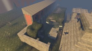
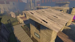
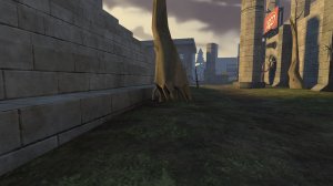
Cp_LimeStone (Finished Version) - The Mayann Project

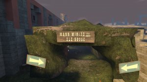
Greetings From Cp_LimeStone!
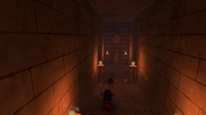
This is A Mayann Map which encludes a lot of hidden Secrets and some death traps !
This Is A Attack/Defence Map With Mayann Theme.

I Reuploaded the map because i tested it and saw that it needs more detail.
so the changes are:
2 more walls were added on blu Spawn
more clips were added because players could get out of the map.
more health and ammo was added.
and much more..
 

Lain

lobotomy success story
aa
Jan 8, 2015
723
757
You and I have very different conceptions of what a (Finished Version) should look like.

Also please actually test levels before making them, putting them up to player scrutiny will make the gameplay a lot better.
 

Viemärirotta

sniffer
aa
Feb 5, 2016
1,013
590
It's Mayan, not Mayann. Mayann is a pun from the words Mann and Mayan.
 

Viemärirotta

sniffer
aa
Feb 5, 2016
1,013
590
I Reuploaded the map because i tested it and saw that it needs more detail.
so the changes are:
2 more walls were added on blu Spawn
more clips were added because players could get out of the map.
more health and ammo was added.
and much more..

If this was final, these changes should have been done in alpha, because alpha is making the map actually playable and enjoyable.
 

Jekyllson

L3: Member
Jun 20, 2015
115
67
It's Mayan, not Mayann. Mayann is a pun from the words Mann and Mayan.

It will feature a 6 minute movie with your nine favourite mercenaries; a jungle themed map in an epic quest to steal the Golden Idol of the Mayanns from their temple": http://www.mayannproject.com/

basilhs can call it a Mayann-themed temple if they want to. The SFM will be about the mercs raiding an ancient Mayann temple, after all.
 

Crowbar

aa
Dec 19, 2015
1,455
1,298
So... I've been "challenged" for constructive feedback on this map.
I will not take back my words about it barely deserving a single star, I'm gonna prove it.
Okay, let's begin
20160502203809_1.jpg
It's well known you didn't pack the assets you used, but it's like @EArkham's pack is not the only one you used.

20160502202654_1.jpg

Do not tilted observer points. I understand you just realized what can a rotate tool do, don't do that.

20160502203827_1.jpg

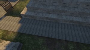
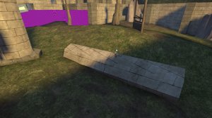
Misaligned planks; also they are too thin and unclipped.

These look rather minecraftish, but it's not how it's done in Source.
20160502203538_1.jpg

20160502204111_1.jpg


20160502204517_1.jpg

B point appears on HUD as C.

20160502204440_1.jpg

There is a very little gap that fucks up visleaves even more than all your columns do. You didnt also func_detail these:
20160502202956_1.jpg
20160502202748_1.jpg


Another thing looking minecraft-ish. This is not show it's done.
20160502202800_1.jpg


A poorly made roof; you don't just make a slope.
20160502202906_1.jpg


These are just smoking without fire. All of ones in the map.
20160502202810_1.jpg


Damn, it's a 2cp map! It's huge, not to say overscaled! And you put the points in 300 units each from other?
20160502203146_1.jpg


NOTHING of this is func_detailed. I did tell you your visleaves are fuck up, and it can be dealed with unless you can't do them better.
20160502203009_1.jpg


This visualizer is painted with no entry sign on each side. Doesn't change anything much, but still, seeing you careless approach to mapping.
20160502203639_1.jpg


There is a button that keeps the texture in its place when rotating and moving brush: :texlock: on upper panel. Also the column has a gap made for reasons unknown to mankind.
20160502202956_1.jpg


Some out of place detailing: it does not fit into the map and/or does not look good.
20160502203105_1.jpg
20160502203614_1.jpg
20160502203121_1.jpg


A death pit because you did not find what to fill the area with, or just because why not?
20160502203426_1.jpg


It's like you cordoned map off/just made a big box over it. That's the worst way of making a skybox.
20160502203907_1.jpg


You have no clue about how to map make displacements. You only turn into them the faces you need, not all the faces of the solid!
20160502202944_1.jpg


Bad clipping: you can stand on the beam, not further. Careless approach... Did I say it?
20160502203059_1.jpg

Well, I had 7 more screenshots of this map being a bad one, but that's enough for any mapper just to scrap and delete it, no offence.

I wanted to say you need to learn to use displacements, or to detail, but you need to learn pretty much everything beyond drawing a brush. I'll link you Tophattwaffle's amazing hammer tutorials and @Crash's, more about TF2.
THW: Channel
UEAKCrash: Playlist


ADMINT EDIT: While you're not wrong with your criticisms, the larger issue (and why you were challenged for better feedback in the first place, probably) is that you're being kind of a dick about it. There's an important difference between "you need to learn the basics before attempting something this ambitious" and "you don't know anything about mapping."

Criticism doesn't have to be nice and friendly. However, being rude in criticism just distracts from the point you want to make, and we don't approve of rude language here anyways.
 

Attachments

  • 20160502203821_1.jpg
    20160502203821_1.jpg
    358.4 KB · Views: 191
  • 20160502203836_2.jpg
    20160502203836_2.jpg
    371.4 KB · Views: 211
  • 20160502203745_1.jpg
    20160502203745_1.jpg
    501.8 KB · Views: 177
  • 20160502204316_1.jpg
    20160502204316_1.jpg
    210.5 KB · Views: 195
  • 20160502202901_1.jpg
    20160502202901_1.jpg
    463.2 KB · Views: 186
  • 20160502202912_1.jpg
    20160502202912_1.jpg
    492 KB · Views: 213
  • 20160502203716_1.jpg
    20160502203716_1.jpg
    320.6 KB · Views: 189

nickybakes

You should've played Rumbleverse
aa
Jul 28, 2015
912
1,741
Please don't take what Crowbar is saying harshly and make you completely quit mapping, I think the whole main point is that the map isn't bad for someone who's new, but definitely not a final version. There is a lot of mistakes in this map (listed in Crowbar's post), a lot of things you need to learn before going into a final version, and I don't remember seeing this get tested in any game days or imps (I may be wrong), but please play test your alpha maps to get the gameplay good and the layout solid before getting into detailing and whatnot.
 

Billo

aa
Feb 8, 2016
921
405
Hey Guys!
I respect your opinions and i am glad to hear them.
But if you don't liked the map is your opinion don't overdoing it.
i will fix as many problems as i can and thanks again for the information.
 

sooshey

:3c
aa
Jan 7, 2015
514
410
The overhead view makes it look very large. You don't have to delete anything, but what you could do is find ways to creatively block off sections of the map that are in the extreme corners or not used much. This can be fallen pillars, trees, fences, anything that fits your theme, and detail the new fenced-off space to make it look out-of-bounds.
 

Viemärirotta

sniffer
aa
Feb 5, 2016
1,013
590
I still kinda like the feel of this one. But it would be better if you moved the points further away from each other and limited the layout to be focused around the points, not the environment.

Looking at how Crowbar mentioned that you haven't packed your map, you can do so with CompilePal/VIDE'S Pakrat. There are tutorial's of VIDE here (someone kind enough to link for me?).

Also helpful, but not necessary you could use the alpha, beta, release candidate (a, b, rc). That's purely optional, but tells a lot:

Alpha is low on detail, main objective is the get the gameplay working
Beta is starting the detailing and also optimization
Release Candidate is basically the final version, however don't be afraid to have multiple versions on a rc

Mapping is quite ambitious (which I know you are!) so don't rush your map to final, instead take the feedback, make the map playable, artpass, then celebrate the final version.
 

Viemärirotta

sniffer
aa
Feb 5, 2016
1,013
590
Also, it be good if you repacked your maps, might be a bit annoying to playtest a 41.7 MB map.

(I do repack in-game and I'll use my own map as an example and you do on the command console)

[bsp_repack maps/ctf_bottleneck_a2a maps/ctf_bottleneck_a2a] (The map on the left is the map to repack, the one on the right is where the repacked map will go and what's going to be its name.)
 

MrBlonde

L1: Registered
Apr 26, 2016
15
2
Just a thought, maybe add a texture or two throughout the map to give it a little variation and make it more pleasing to the eye. Don't get me wrong, it looks good, but an added texture or two may give it a little more pop from an appearance standpoint.

If you do introduce some new textures, be careful though and don't overdo it. It may detract from the overall feel. Try to be subtle about it.
 
Last edited:

Billo

aa
Feb 8, 2016
921
405
question.
i finished the map completely how do i pack it?
and update it with a different download?
because everytime i update it everyone downloads the privious version