Aye! Me bottle o'scrumpy! Anon!

Pocket

Half a Lambert is better than one.
aa
Nov 14, 2009
4,701
2,583
I'm really underwhelmed - almost shocked - about the quality of the new theme's assets. It totally lacks the typical valve love of doing nice thematic additions.

I'm not sure what you mean. They crammed just about as much new stuff as they could into this map without being excessive or breaking the theme. It's not a big map, mind you.

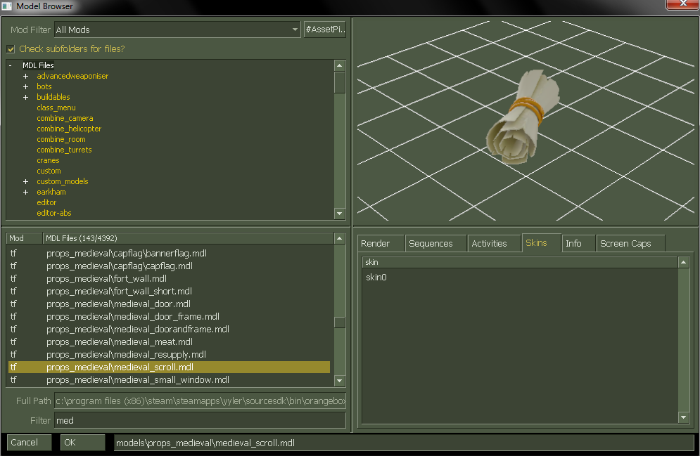
They even added a prop that isn't being used in this map. I haven't seen them do that before except for the australium ingot.
 

tyler

aa
Sep 11, 2013
5,100
4,621
There's an intel model too.

PVW6l.png
 

REEJ

L420: High Member
Aug 26, 2010
437
176
Melee mode is fine, it's just the first map and use of it isn't overwhelmingly brilliant.
 

Acumen

Annoyer
aa
Jun 11, 2009
704
630
I'm not sure what you mean. They crammed just about as much new stuff as they could into this map without being excessive or breaking the theme. It's not a big map, mind you.

They even added a prop that isn't being used in this map. I haven't seen them do that before except for the australium ingot.

Well I said quality not quantity. Guess there's nothing wrong with having the opinion that it doesn't look as lovely as the usual valve style additions.
The wall texture especially just doesn't fit in my tf2world. But that's just me and I decided I could post it in here :)
So far I just loved how Valve managed to keep so many updates coming that somehow magically built a cohesive world, but when I saw the map I wasn't feeling it. The 2 most important textures, floor and wall just screw things up for me. The props are cool (apart from the locker :D) but alltogether it seems to lack my beloved valve love when it comes to attention to detail :/
That's all. World doesn't end because of that ^^
 

Pocket

Half a Lambert is better than one.
aa
Nov 14, 2009
4,701
2,583
The wall texture especially just doesn't fit in my tf2world. But that's just me and I decided I could post it in here :)

Yeah, it does look rather Half-Lifey, especially in Hammer's texture browser. Still better than the cheaply posterized rock wall from Sawmill though. Between it and the new(?) bottomless-pit overlay, I managed to make myself a pretty respectable li'l well.
 
Mar 23, 2010
1,874
1,699
caber & the steak suck (in an OP way). boston basher sucks (in an UP way). the fists of steel are lame as well.
medic weapons are awesome.
 

Untouch

L4: Comfortable Member
Jan 25, 2010
187
48
They get the whole thing minus applicable taxes, which is like 90c in this case. Nineaxis said in chat that he gets ~2 cents per Hoodoo stamp and Void gets ~6 per a Coldfront one.

So what you're saying is I'm NOT a nice person? :-(