Thoughts on this ZF Hospital?
- Thread starter Yhrite
- Start date
You are using an out of date browser. It may not display this or other websites correctly.
You should upgrade or use an alternative browser.
You should upgrade or use an alternative browser.

gamemaster1996
L13: Stunning Member
- Sep 30, 2009
- 1,064
- 134
The blood looks a bit odd. If there's going to be blood the bloog needs to have a sotry, like for instance blood and scratch marks leading into a sewer. Your atmosphere is pretty damn close to Silent Hills looking at that one screenshot so Congrats. However I think the hospital could do with being bigger looking at it.
Also your lighting may be a teeny bit too bright so try to make the shadows bigger, and the light_enviroment a bit less bright.
Other than that I think it's okay, though I'm assuming this is alpha stage and has a bit to go.
Also your lighting may be a teeny bit too bright so try to make the shadows bigger, and the light_enviroment a bit less bright.
Other than that I think it's okay, though I'm assuming this is alpha stage and has a bit to go.
- Aug 20, 2011
- 4
- 0
The blood looks a bit odd. If there's going to be blood the bloog needs to have a sotry, like for instance blood and scratch marks leading into a sewer. Your atmosphere is pretty damn close to Silent Hills looking at that one screenshot so Congrats. However I think the hospital could do with being bigger looking at it.
Also your lighting may be a teeny bit too bright so try to make the shadows bigger, and the light_enviroment a bit less bright.
Other than that I think it's okay, though I'm assuming this is alpha stage and has a bit to go.
Yeah, Im planning on making the Hospital Bigger, It still has alot of work to go, Im making some custom Graffiti (Like the Graffiti from L4D)
The lighting needs fixing, Trying to find the right colour for the night/Twilight look!


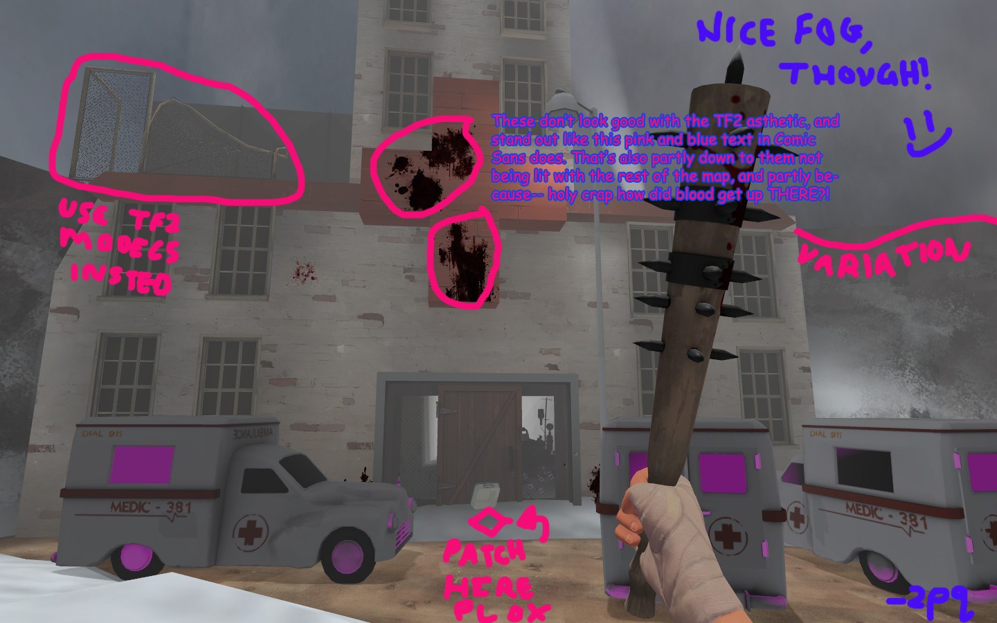
I think that brushwork sign doesn't work. I don't like brushwork like that: Props look nicer. If you must keep brushwork make it thinner, so it looks like thin wood. And make the texture a block colour rather than those planks.
Also, if you can avoid HL2 props, do. They look incongruous. Same reason as the HL2 blood doesn't work. I know this is fairly typical in ZF maps- i've found they vary wildly in quality, from professional-standard to not-giving-a-fuck.
Also, if you can avoid HL2 props, do. They look incongruous. Same reason as the HL2 blood doesn't work. I know this is fairly typical in ZF maps- i've found they vary wildly in quality, from professional-standard to not-giving-a-fuck.
- Aug 20, 2011
- 4
- 0
I think that brushwork sign doesn't work. I don't like brushwork like that: Props look nicer. If you must keep brushwork make it thinner, so it looks like thin wood. And make the texture a block colour rather than those planks.
Also, if you can avoid HL2 props, do. They look incongruous. Same reason as the HL2 blood doesn't work. I know this is fairly typical in ZF maps- i've found they vary wildly in quality, from professional-standard to not-giving-a-fuck.
Yeah, HL2 Blood was in a better variation than TF2 Blood, The big blood streak from HL2 Seemed to useful to not use :>
- Aug 20, 2011
- 4
- 0
Wasn't Expecting that!, Thanks - I'll keep that in Mind!
