Alright, I looked over this map and I have some feedback.
First, though, I have a general piece of advice for your post on here. All the screenshots you posted were taken with anti-aliasing off, which doesn't look as good and isn't quite as flattering for your map, especially one that's entirely about the detail and aesthetics.
Now on to the map itself:
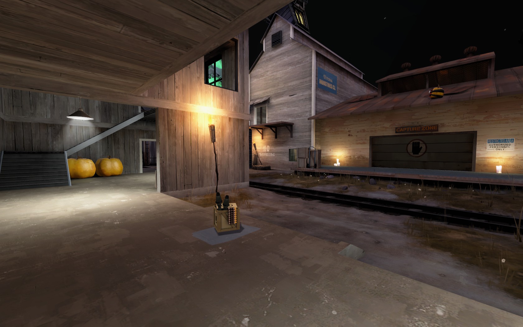
In this first screenshot, you can see my main gripe with the map, its lighting.
We have a two very thematically different light sources positioned right next to each other, the the torch and the lamp, which doesn't really make a lot of sense in terms of theme. Who would decorate a building with lighting so widely varied?
Also, the torch looks to be about as bright as the electric bulb, which doesn't make a lot of sense either and feels rather unrealistic.
And overall, you have a lot of indoor areas in this map illuminated with bright, clean, white, electric lights, which aren't really conducive to a spooky atmosphere in the least. They make the map feel less like lumberyard decorated for Halloween and more like just lumberyard at night.
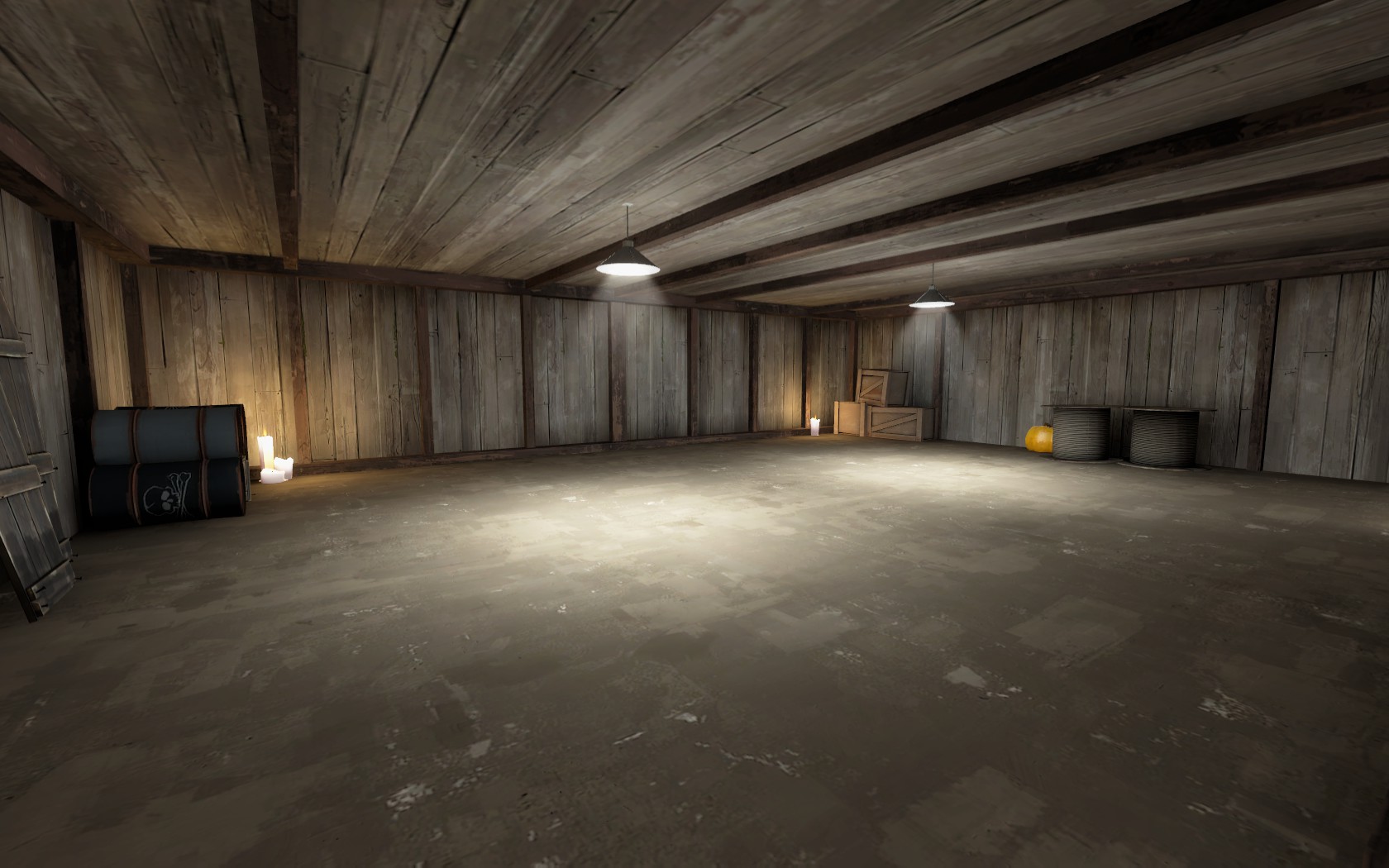
Here's another example of decoration with different light sources in the same area.
It also illustrates just how bright, clean, inviting, and non-spooky most of your indoor areas feel.
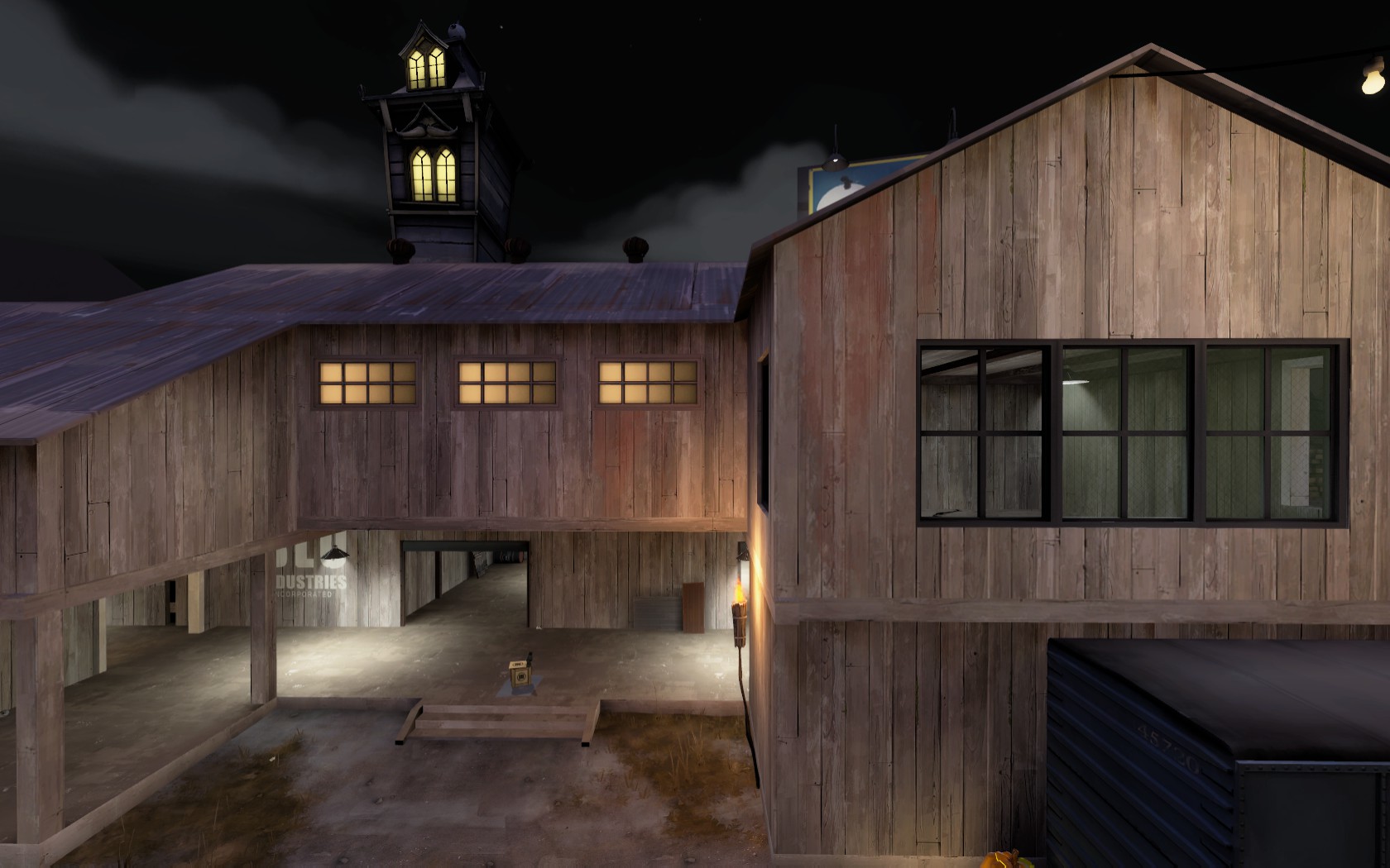
In this third screenshot, you can see another instance of conflicting decorating styles in respect to lighting.
In the room on the upper right, we can see it being well-lit with white light that is plainly visible through the clear glass windows.
But immediately to the left of that in the same building, we see opaque yellow windows, suggesting wildly different lighting conditions in areas literally right next door to each other in the same building.
Now on to something else:
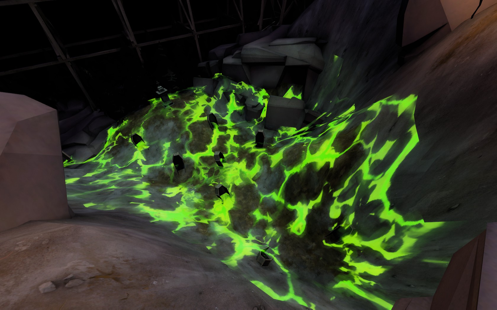
I'm not entirely sure what this is supposed to be. At first the color made me think it was some sort of chemical spill, but that isn't exactly Halloween themed, and the surrounding props didn't exactly suggest that. Then I thought it might the ground glowing due to spooky undead magic stuff because of all the graves around. However, that didn't make sense either when I noticed that the green stuff was actually cutting through the grave props and was actually raised above the ground. That made me think that it might be fog, but it's movement patterns, variety in elevation, and general not-fuzzyness threw that idea out the window. So I have no idea what this actually is or is supposed to resemble.
Also, this is the only instance of this particular glowing green color in the map, and so it feels rather out of place compared to everything else.
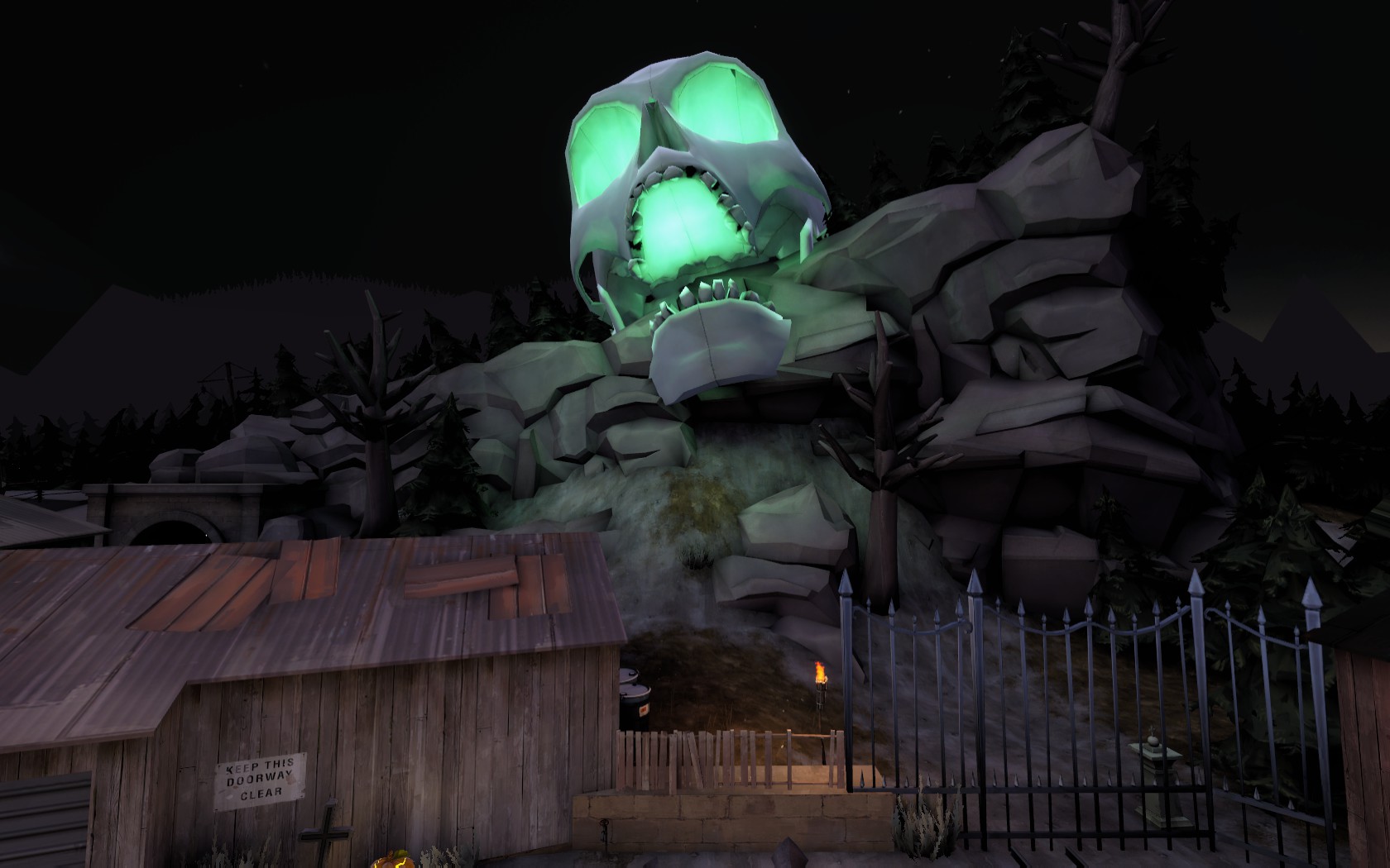
Take a look at something else that seems out of place:
I'm not talking about the skull itself here, but instead the teal glow that is coming from it.
None of the lighting-based glows around the map are all that colorful, they're mostly white or a very bright yellow-orange.
Yet here we have something glowing very teal. This is not just the only instance of a colorful glow in the entire map, but it's also the only instance of the teal color as well. Nothing else is this color, but what's worse is that the green ground-stuff around the graves from is a slightly similar, but very distinct color.
Having a bright green thing in an otherwise dark-ish map and a bright teal thing in an otherwise dark-ish map that don't look anything like each other causes them to sort of clash. They don't look like they both belong in the same environment together.
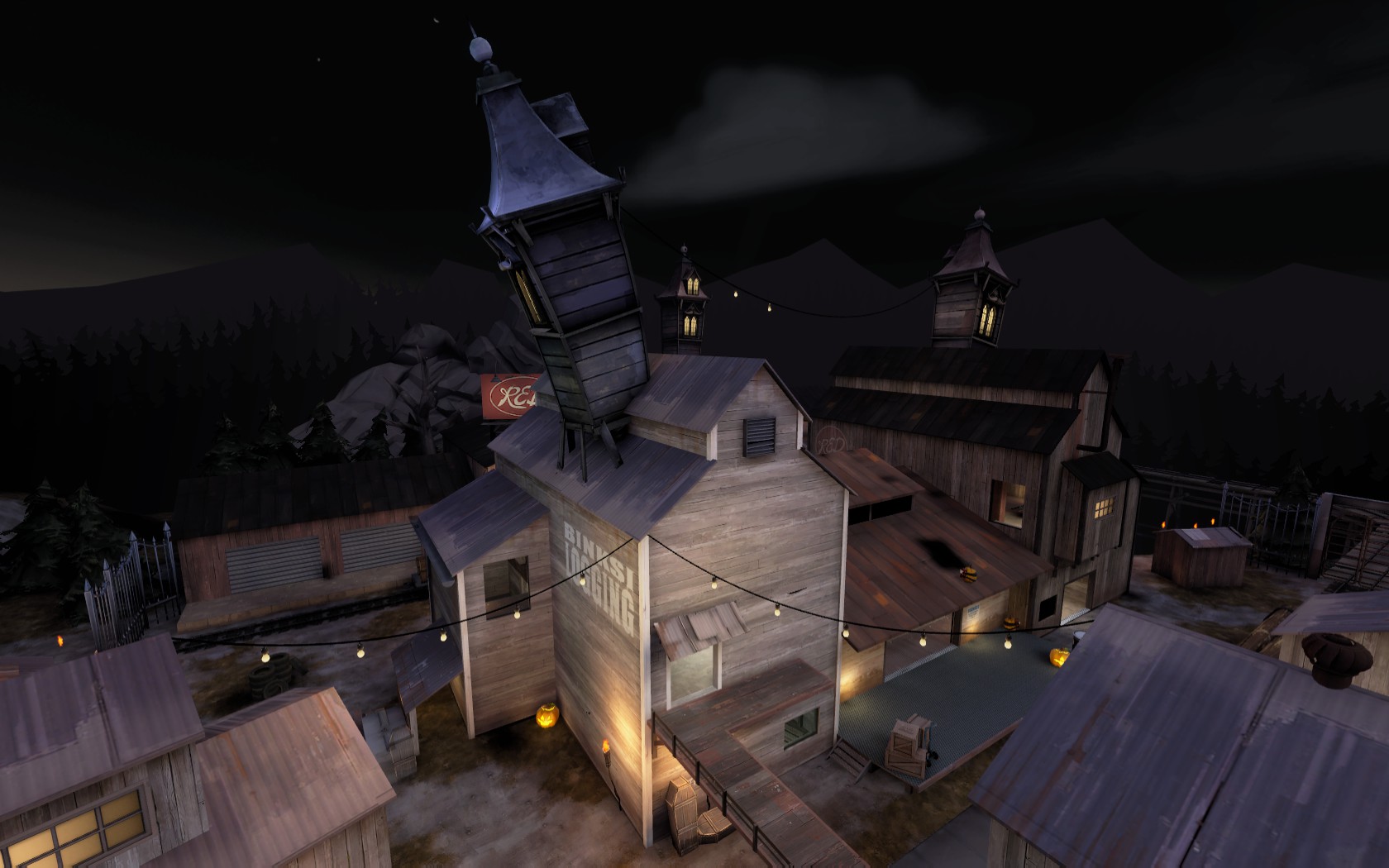
These towers on the roofs may seem like they fit in at first glance, since their colors are relatively close to the rooftops on which they're placed.
However, the texture on the sides of these towers are nothing like the textures on the sides of the building that they're mounted on. This difference is far worse on the blue side.
Additionally, players will never actually see much of the blue-gray rooftops from their perspective on the ground, so the clash between the side textures is more pronounced than it is in this screenshot.
These towers do not look like they belong on these buildings.
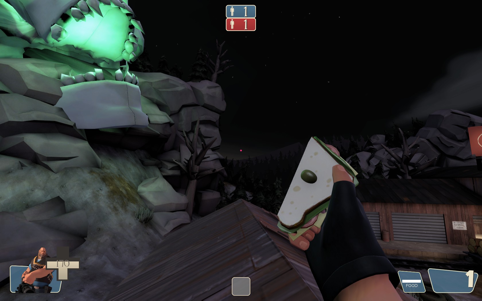
I also found a gameplay-related bug:
Falling in the deathpit by the control point spits you out and lands you on this rooftop, behind the playerclip brushes and locks you out of the gameplay areas.
So, overall, I felt like the map was far too bright and white and really lacked any sort of spooky, Halloweeny-atmosphere, with the lights being the worst offenders. However, I also feel like not enough of the map was re-textured and the light wood decorating the blue-side buildings also did not help the atmosphere any.