You are using an out of date browser. It may not display this or other websites correctly.
You should upgrade or use an alternative browser.
You should upgrade or use an alternative browser.
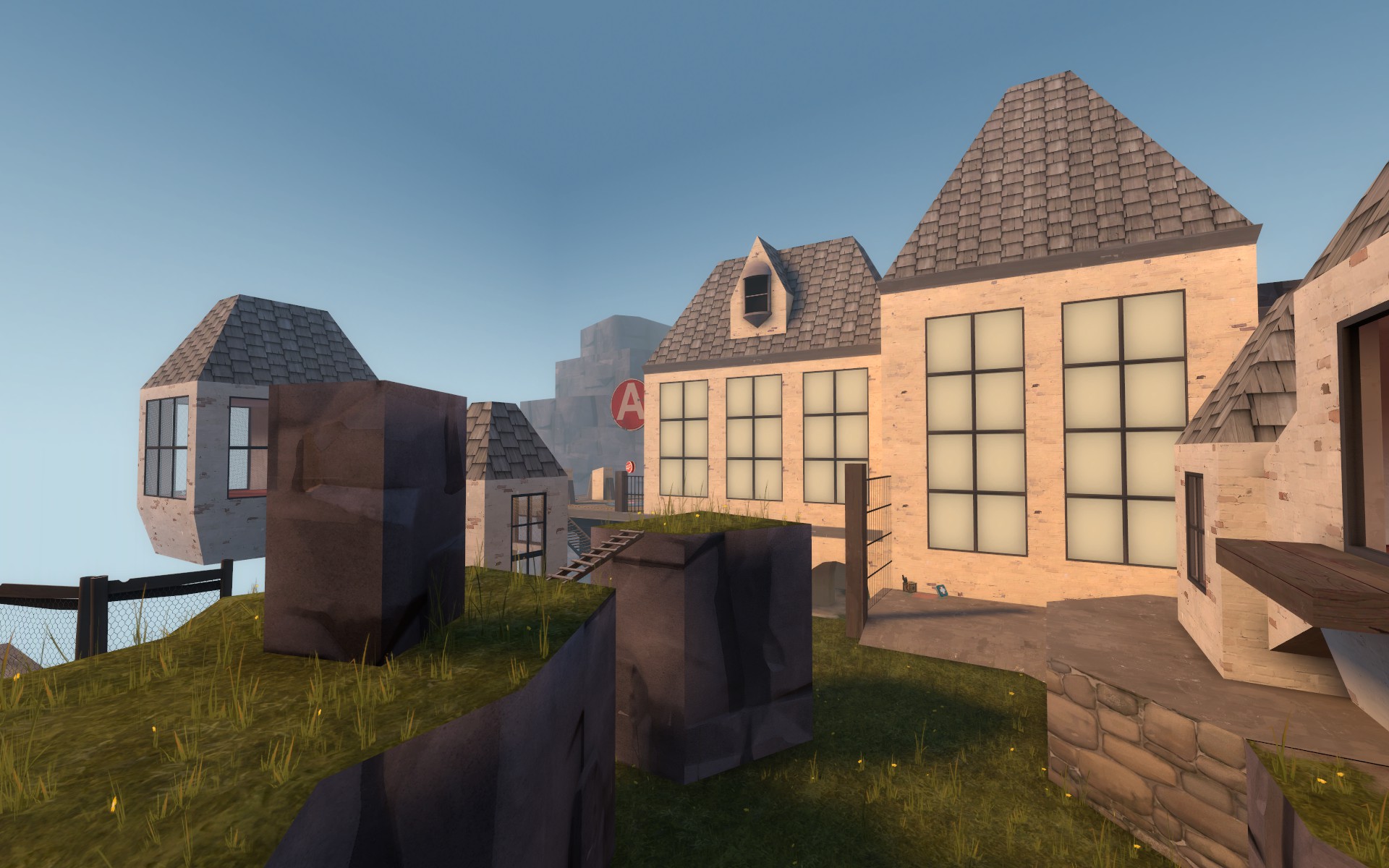
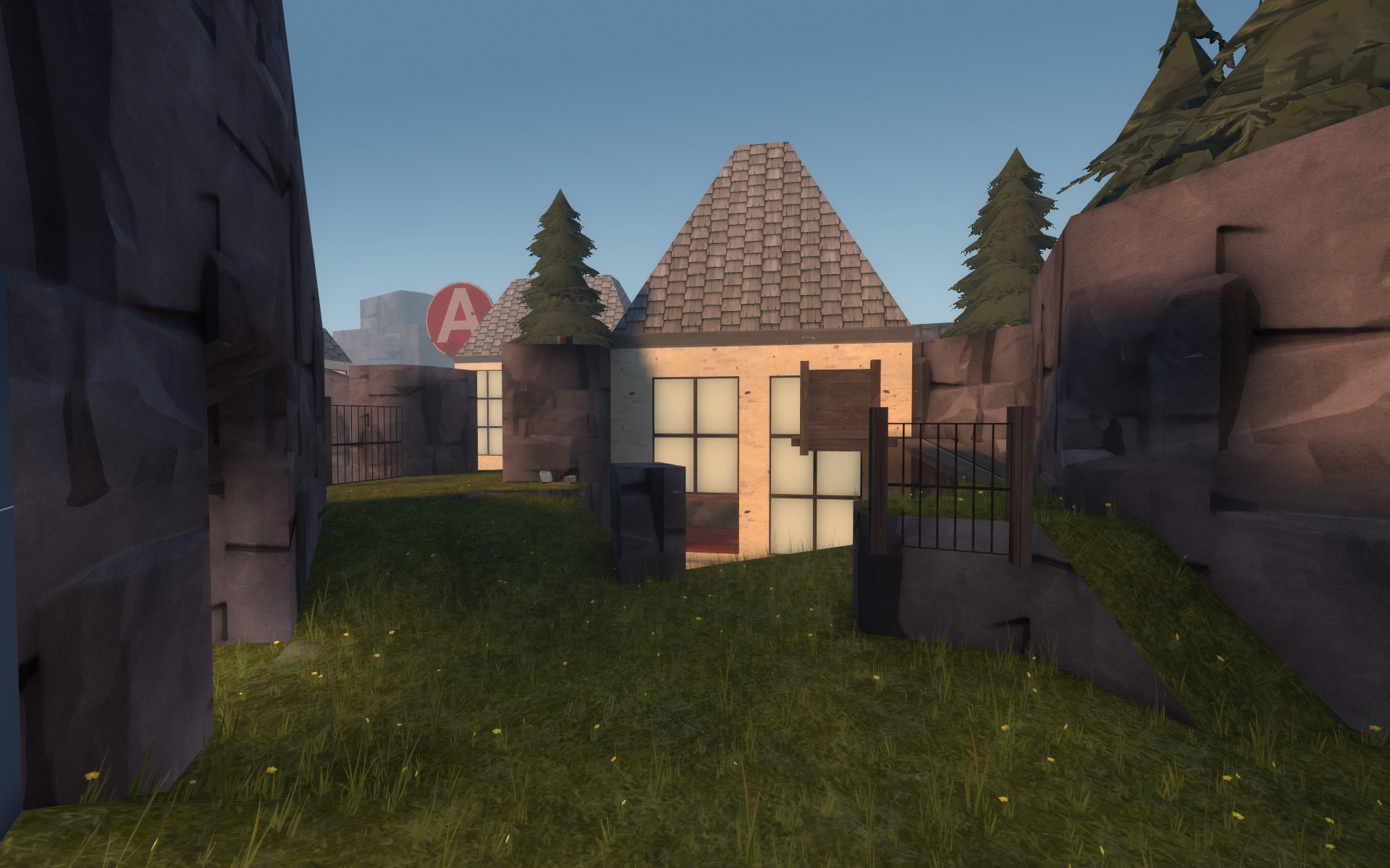
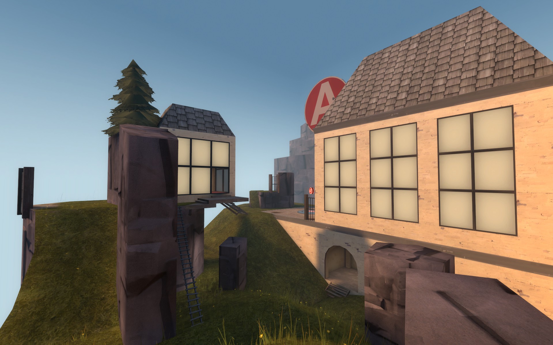
I will eventually revamp A entirely but before I do I figured it would be fun to test a few quick funky versions.
Changes
A
-removed one first blue spawn exit
-clumped the remaining two exits into one area
-removed all of left side (as blu exiting facing A)
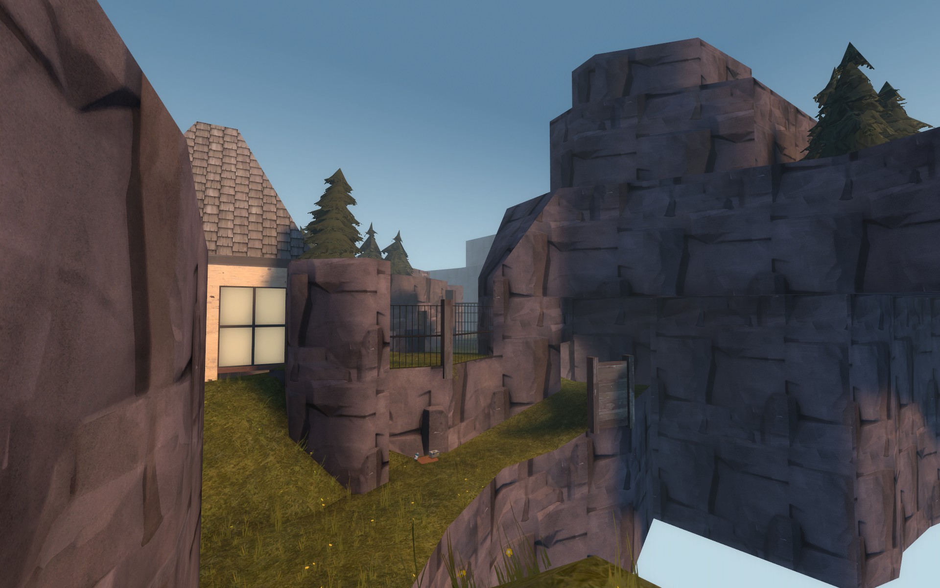
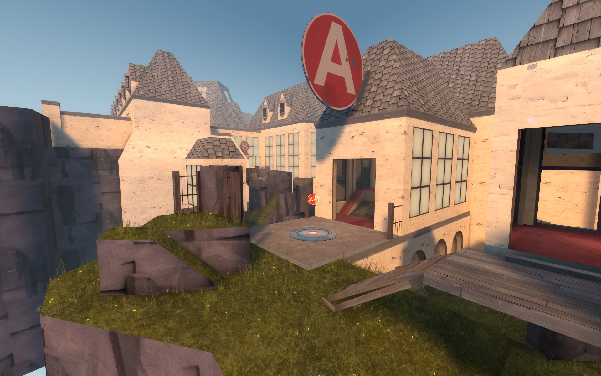
-added lil rock spire next to point
-fenced off left side cliff flank
-added a rock spire behind the point
B
-nothing
Pics of new stuff
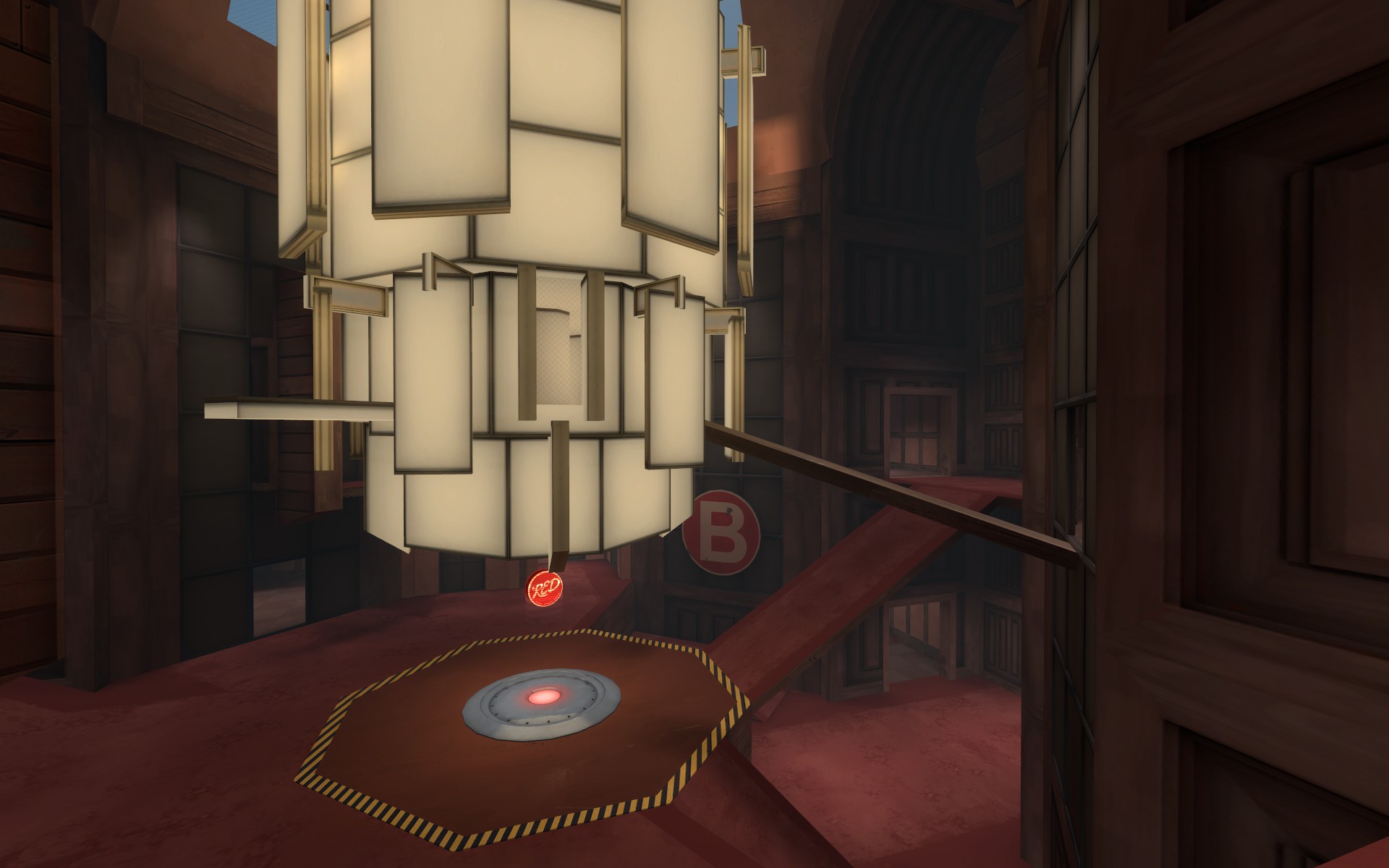
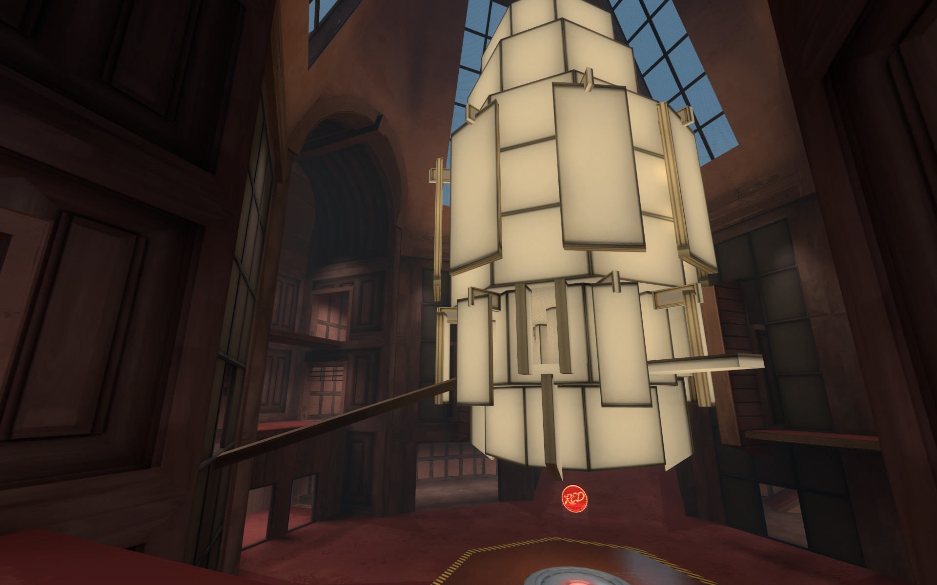
This is a small but hopefully effective update to see if B can have a little of the chaos reduced via some quick simplifications in the layout and visuals.
A
-no changes
B
-removed both pit flanks
-replaced the wooden beam version of the plaster texture with the plaster only version
-retextured some of the main arena walls to help make sense of the room
-removed center pillar inside chandelier
-chandelier ammopack is now medium
This version should reduce the feeling of blu getting constantly flanked, reduce the number of places red can come from while standing on B, and make B easier to cap.
A
-removed entire suspended turret path
-reworked right side chateau entrance and interior space
-added some rock cover to grass main grass path
B
-removed doorway that connected upper room with main hall
-removed holes in the glass for the wooden plank entrances to chandelier
-shifted wooden plank chandelier entrances to give blu slightly better access than red
Pics of new stuff:
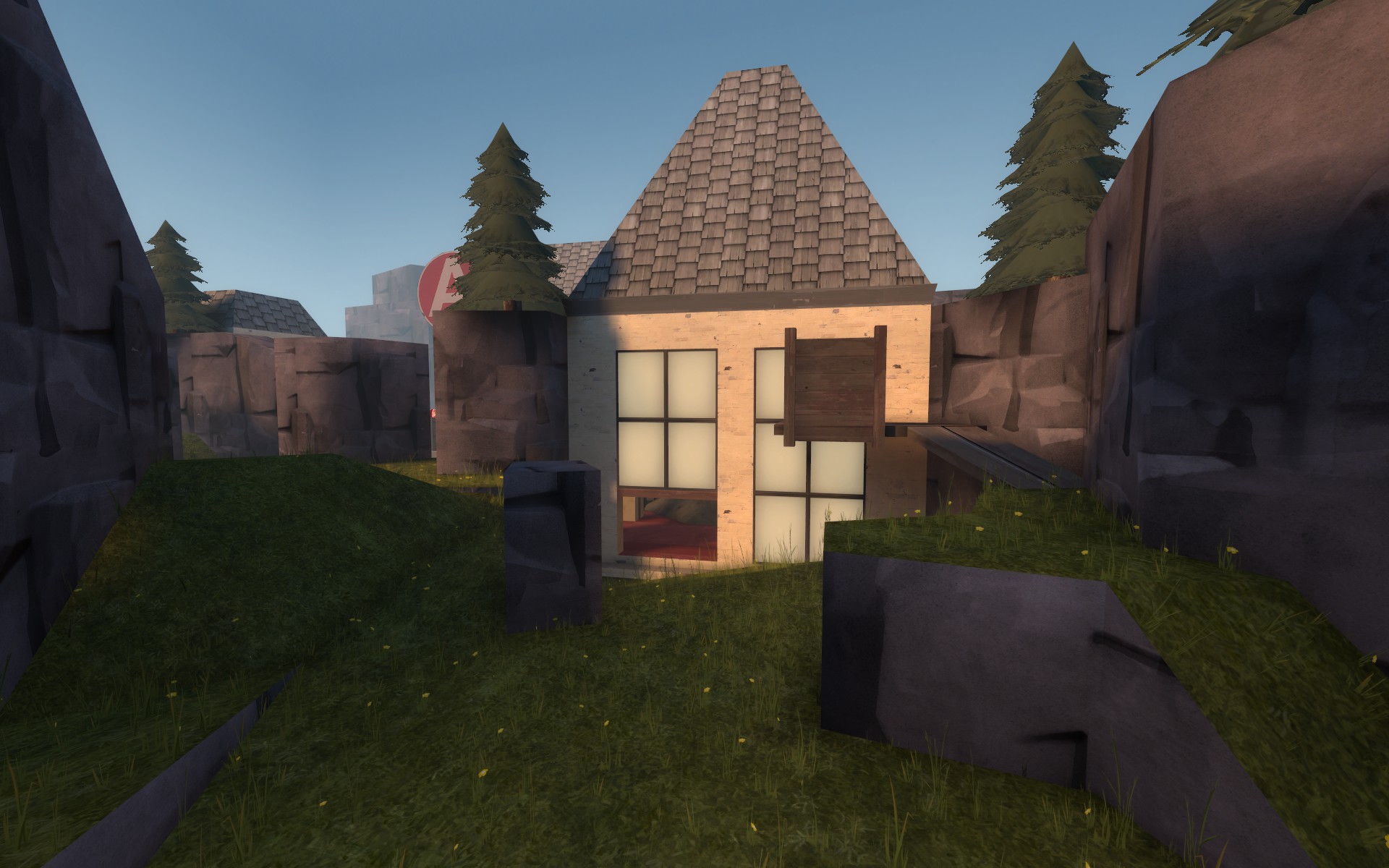
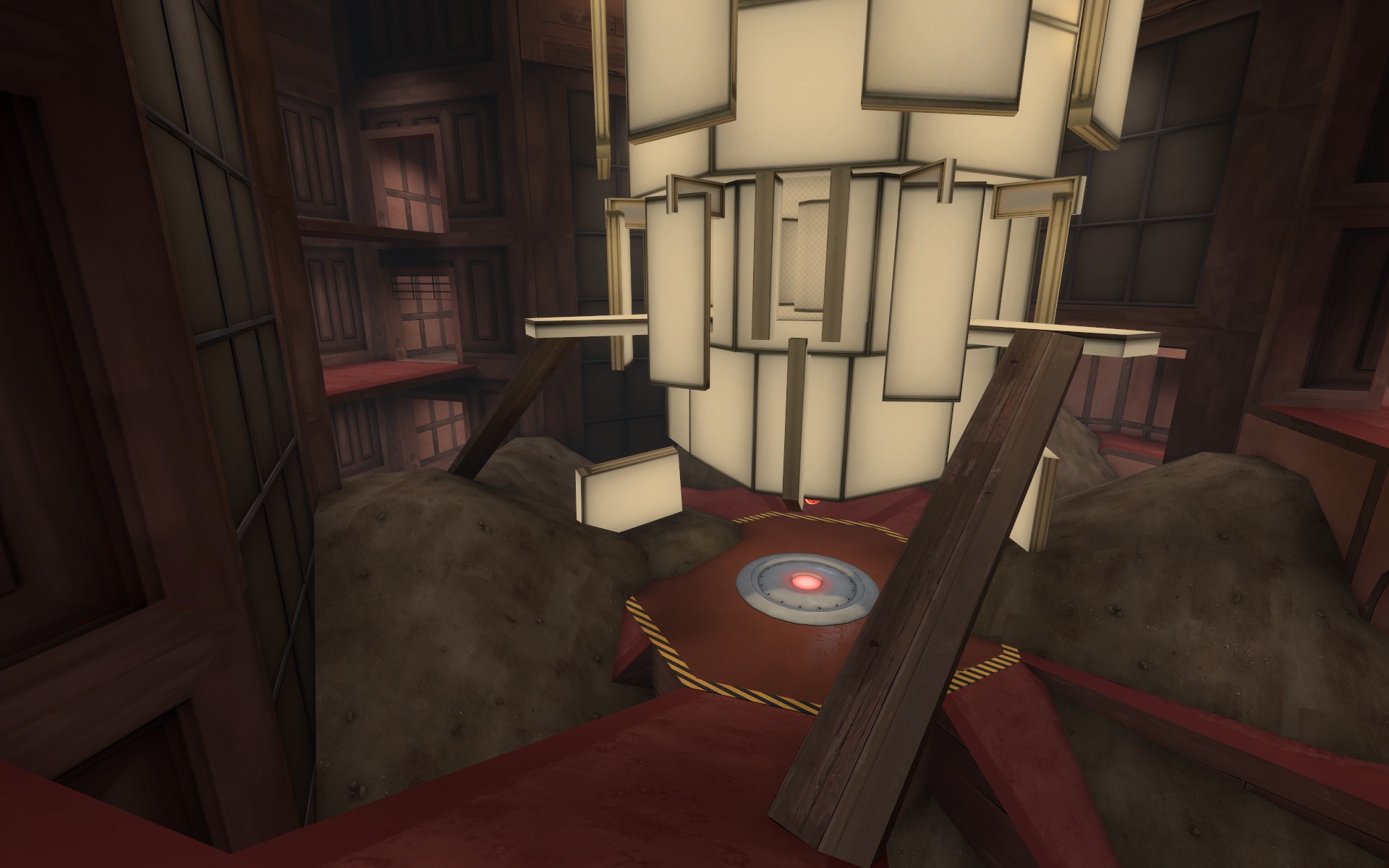
I plan on taking the map in a broken down/abandoned/overgrown direction as it helps me solve a few gameplay issues while providing some opportunities for some interesting walkable space to play on. I added some large dirt piles to spice up some of the flatter areas around B and hopefully provide some cover in spots as well. Overall B should feel a lot more focused now. A now has a cliffside spot closer to blue spawn for red to hold at the beginning of the round. Also ignore the clean textures for now
Changes
A
-enlarged the tiny building on the top of the rock spire
-added a cliff side staircase entrance to the new larger building
-removed lower route around rock spire and converted it into a one way drop down
B
-added new dirt pile displacements to run around on
-removed the entire blu side balcony flank area of the main hallway choke to B
-lowered the lowest part of the chandelier 64 units to block a nasty sightline across the point (I hope the capture area doesnt feel too cramped now)
-removed the back staircase room
-added a sort of sneaky side exit off the main ramp choke into the lower room and covered access to the lower back area of B
-heavily nerfed the red balcony just outside red spawn
Pics of changes
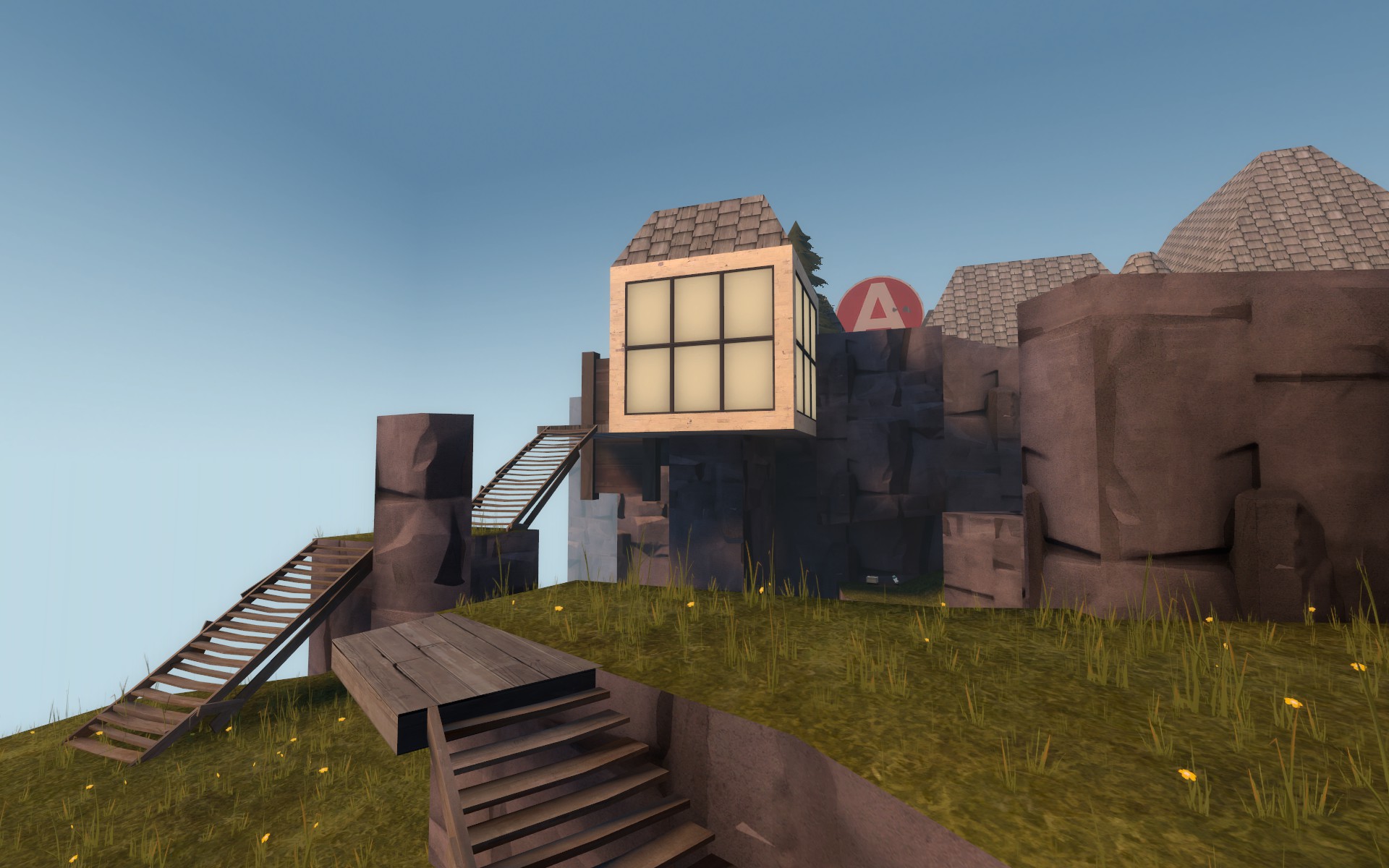
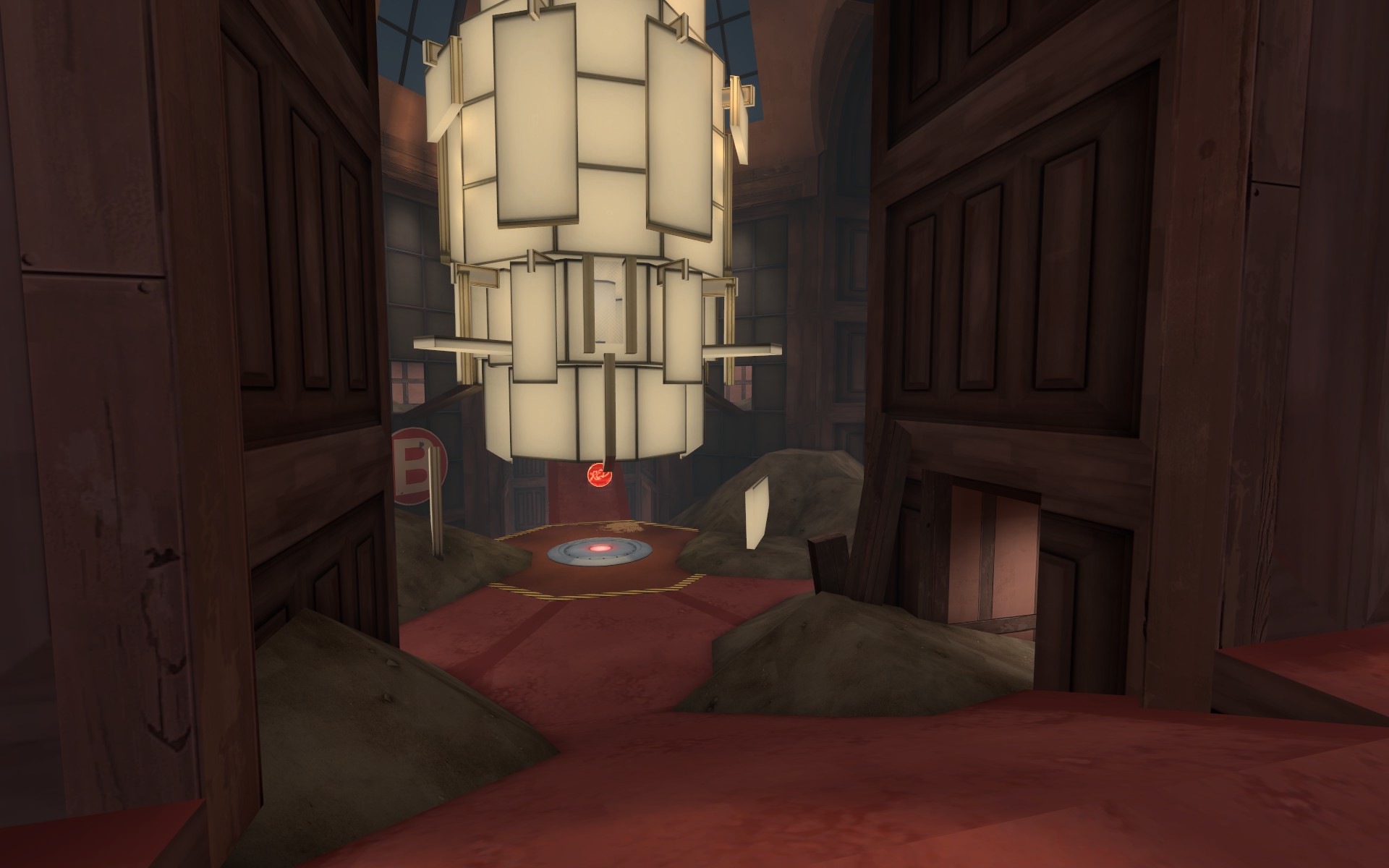
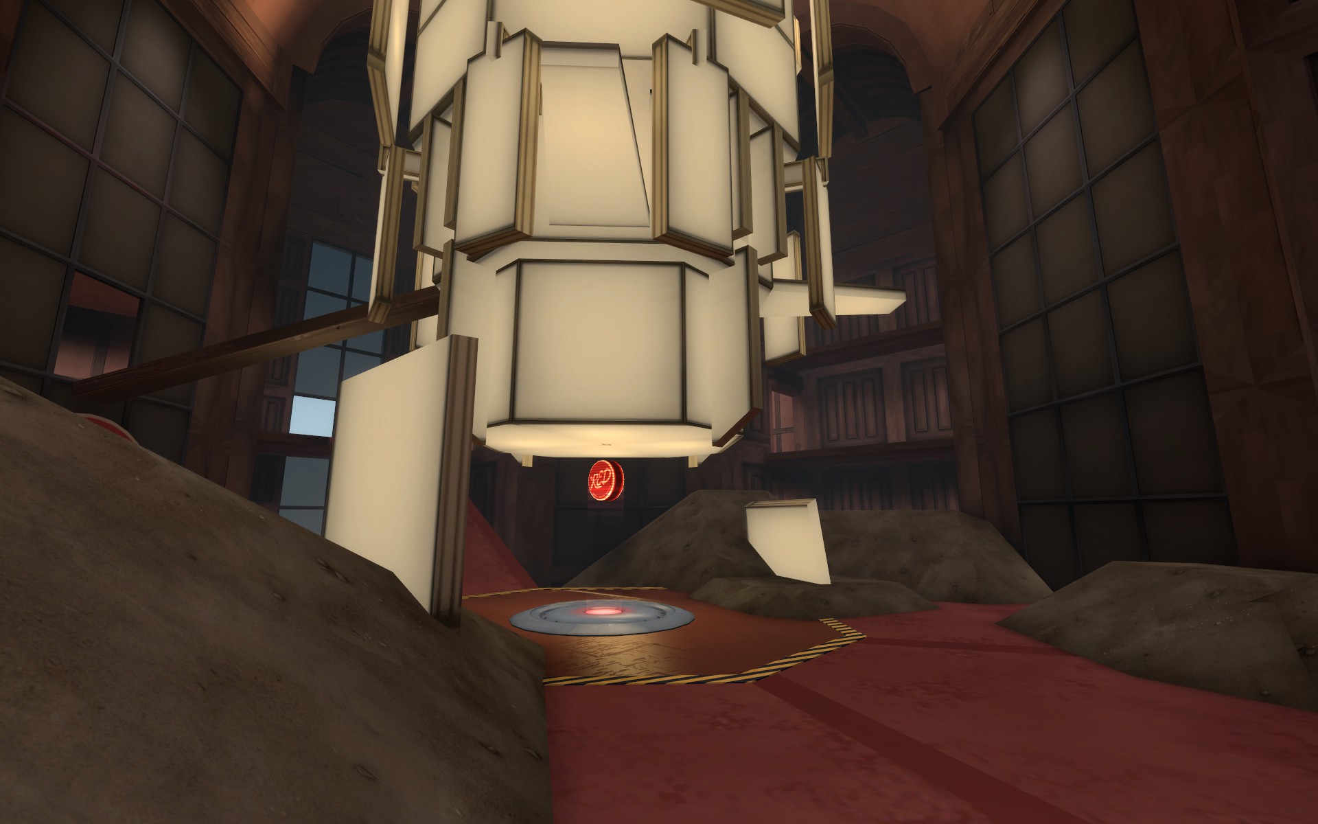
I reworked a lot of A in the hopes to make some interesting terrain shapes to play on while reducing the feeling of the enemy being everywhere. B now gives blu access to the lower area to give some cover to get around the point and provide a potential holding spot for either team. I also simplified a few spots around B to hopefully make it feel less visually confusing.
A
-extended the main building to have a room closer to blu spawn
-simplified main control point building interior space
-added suspended turret flank path
-simplified rock spire area
-blocked lower path under control point
-filled in death pits in front and behind the point with walkable grass terrain areas
B
-removed courtyard choke area
-removed window walls on first area suspended walkway
-connected the front and back outdoor deck areas with a wooden ramp
-reworked the blue holding area window room space
-added a sort of back spiraling flank to lower area so blue has a sniper free option to get around
-removed really small lower hallway that connected two control point rooms
Pics of new stuff:
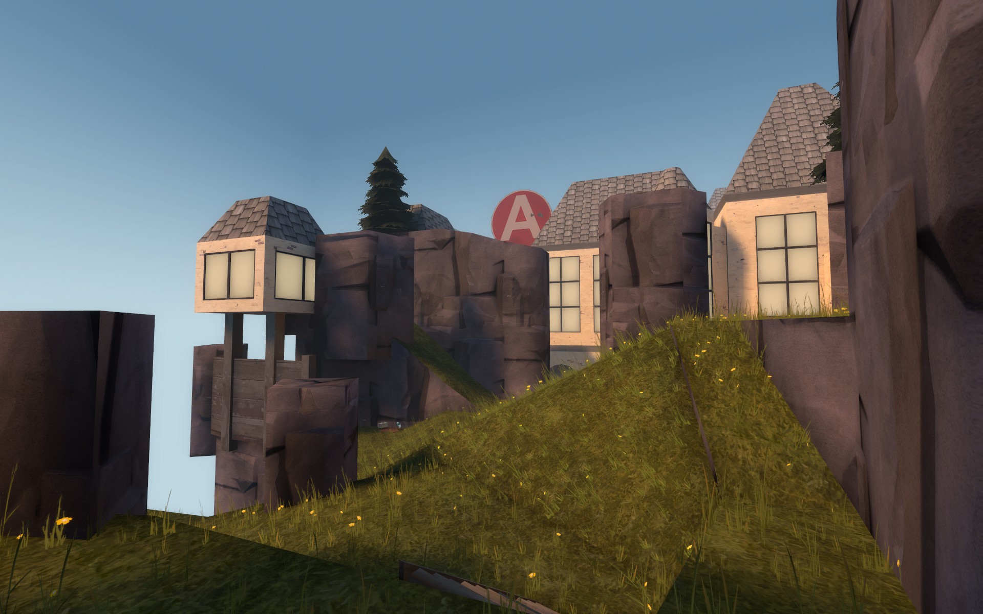
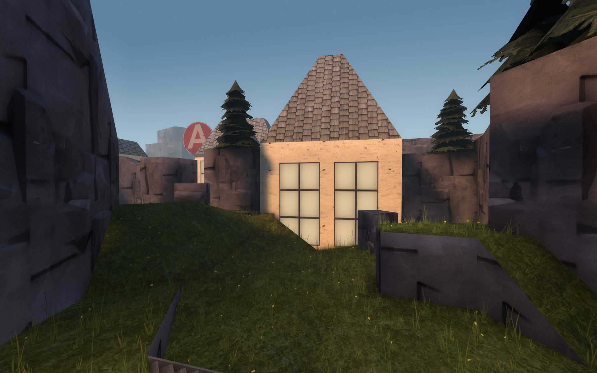
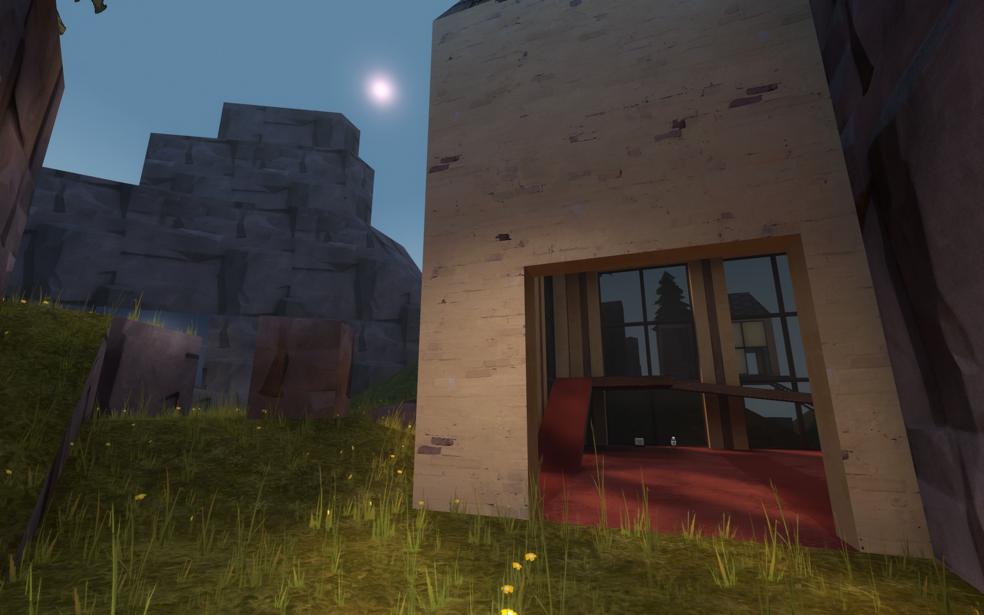
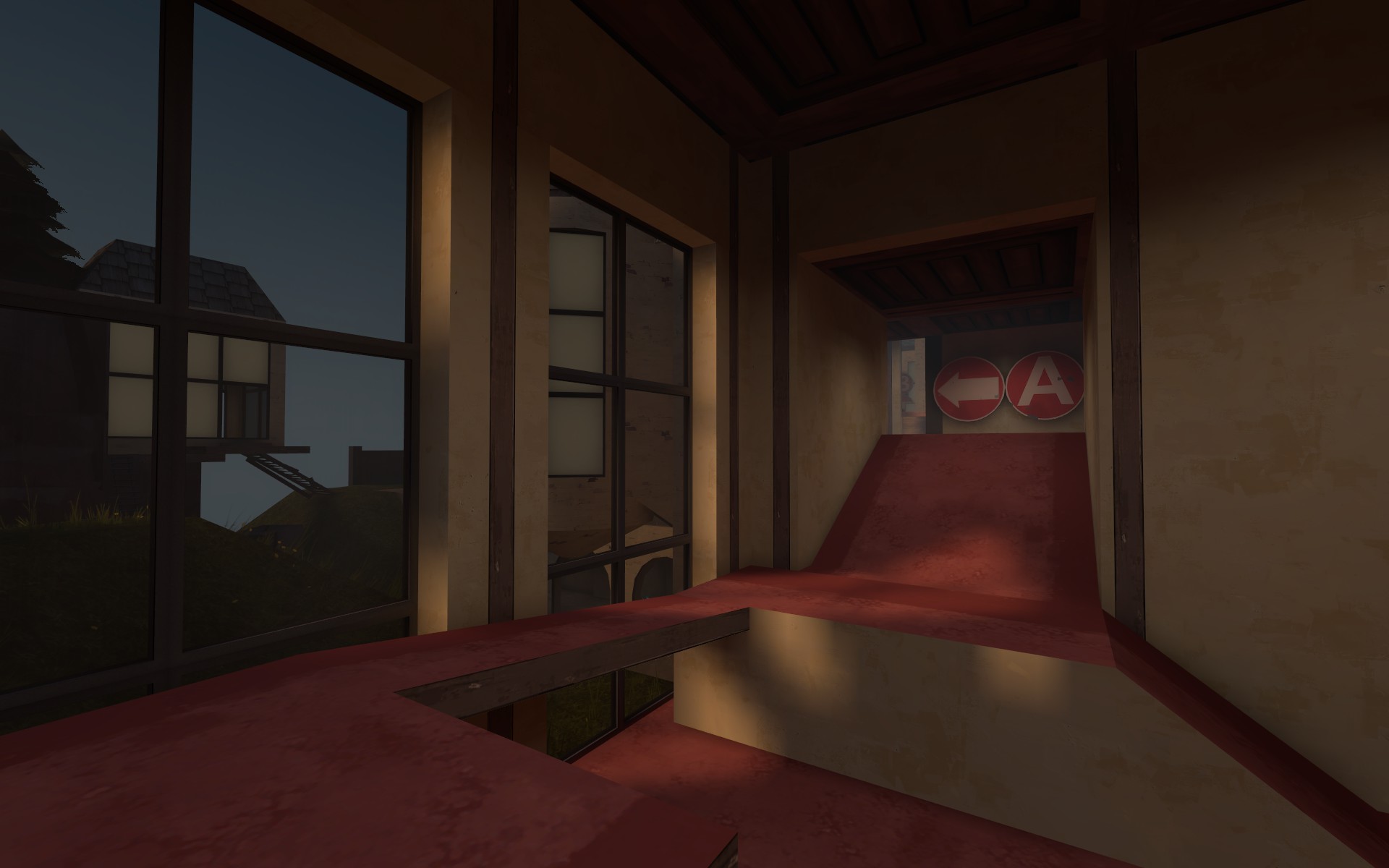
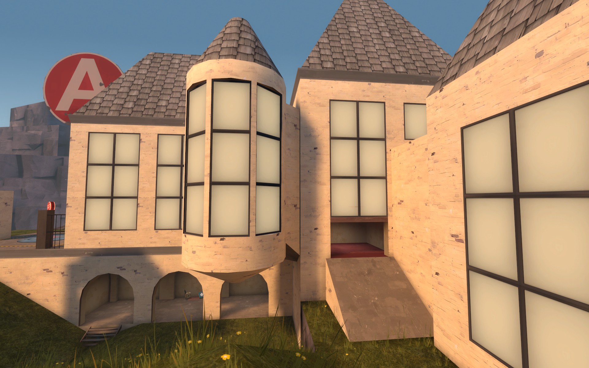
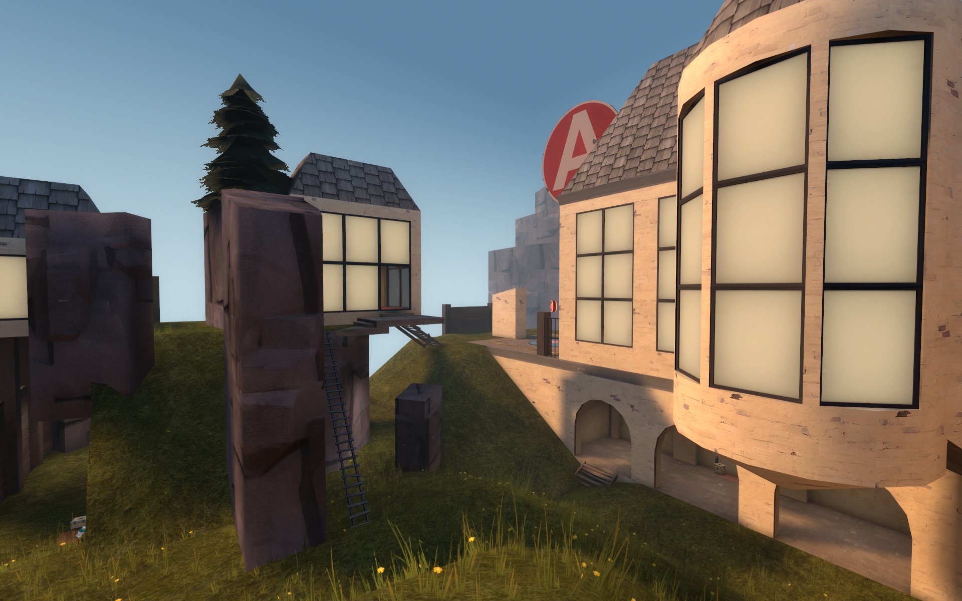
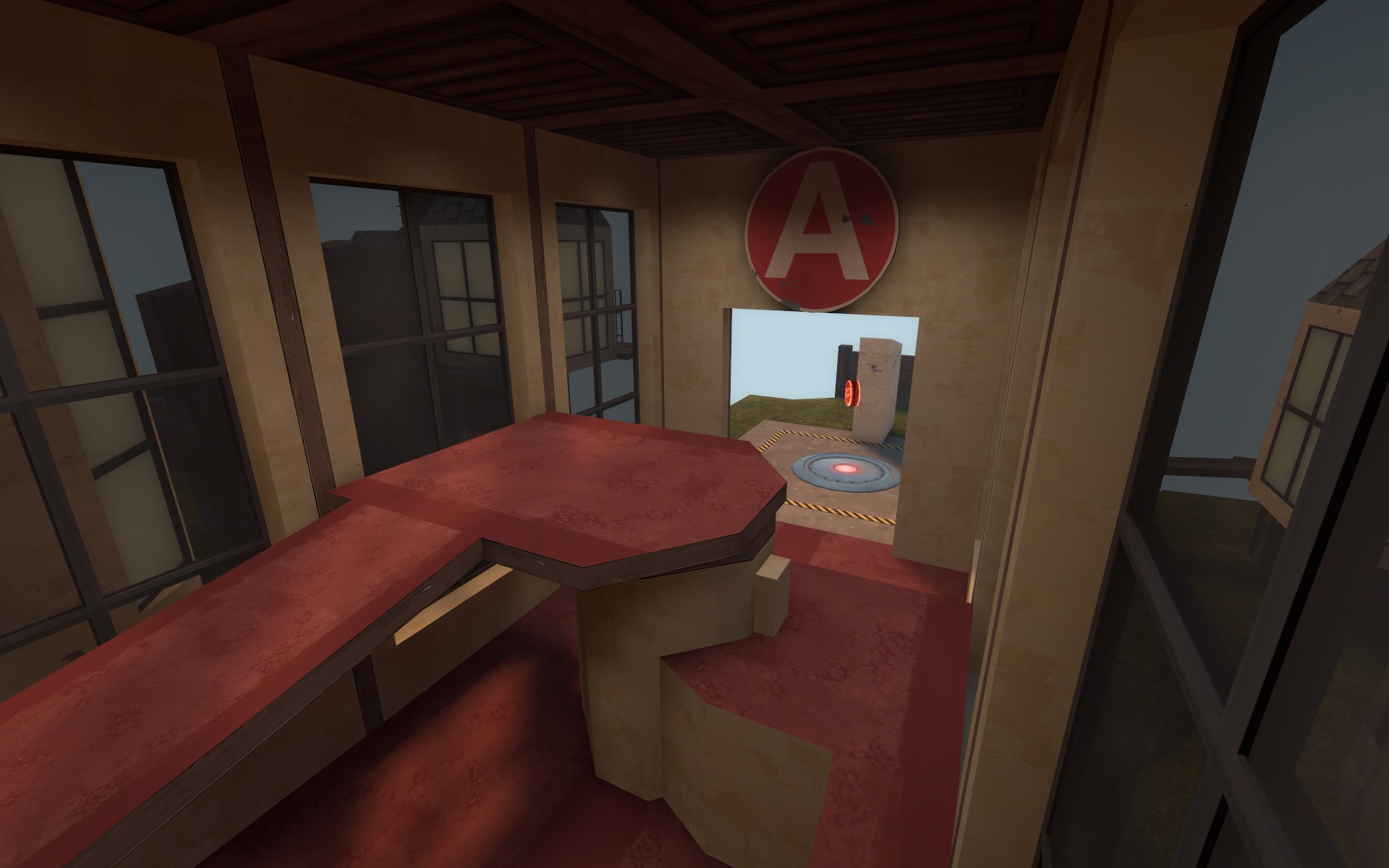
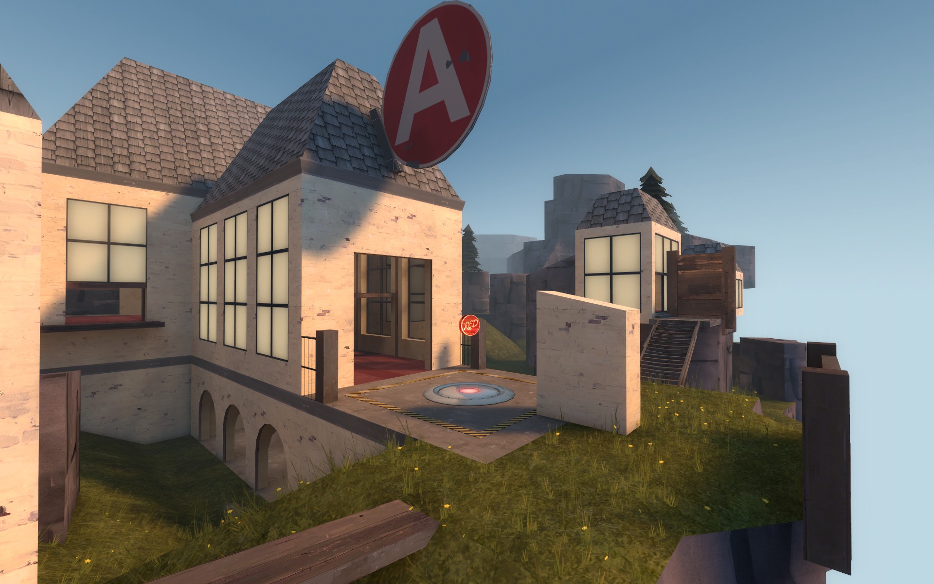
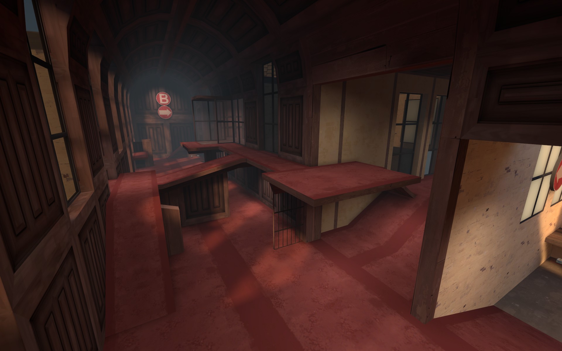
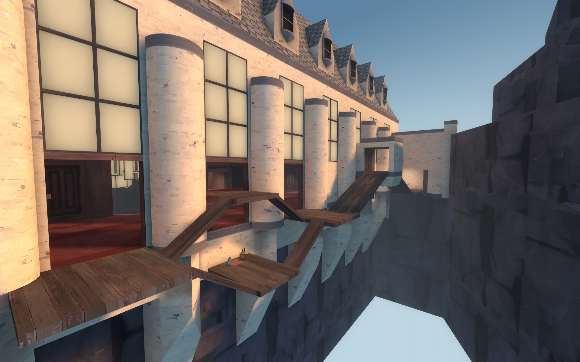
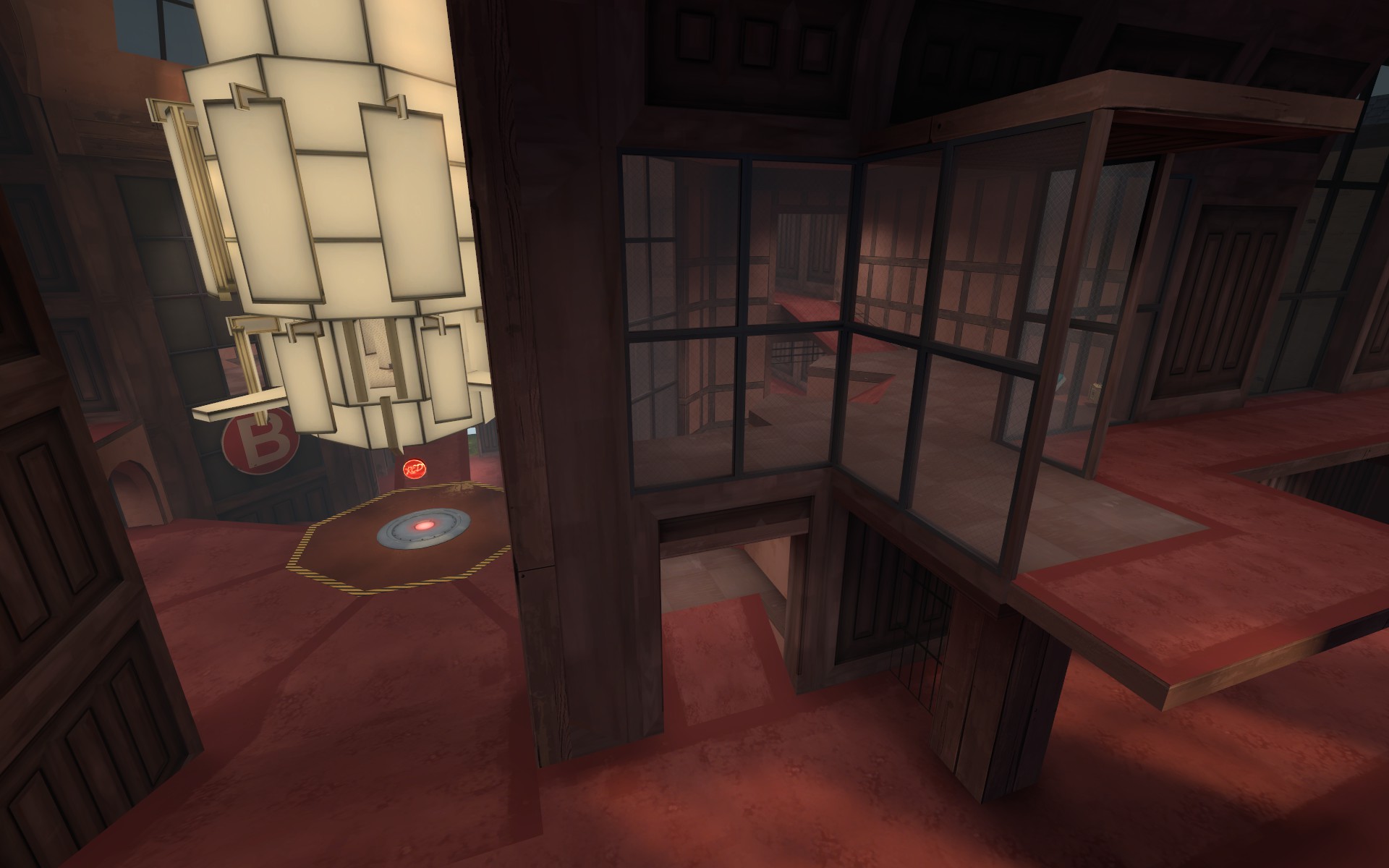
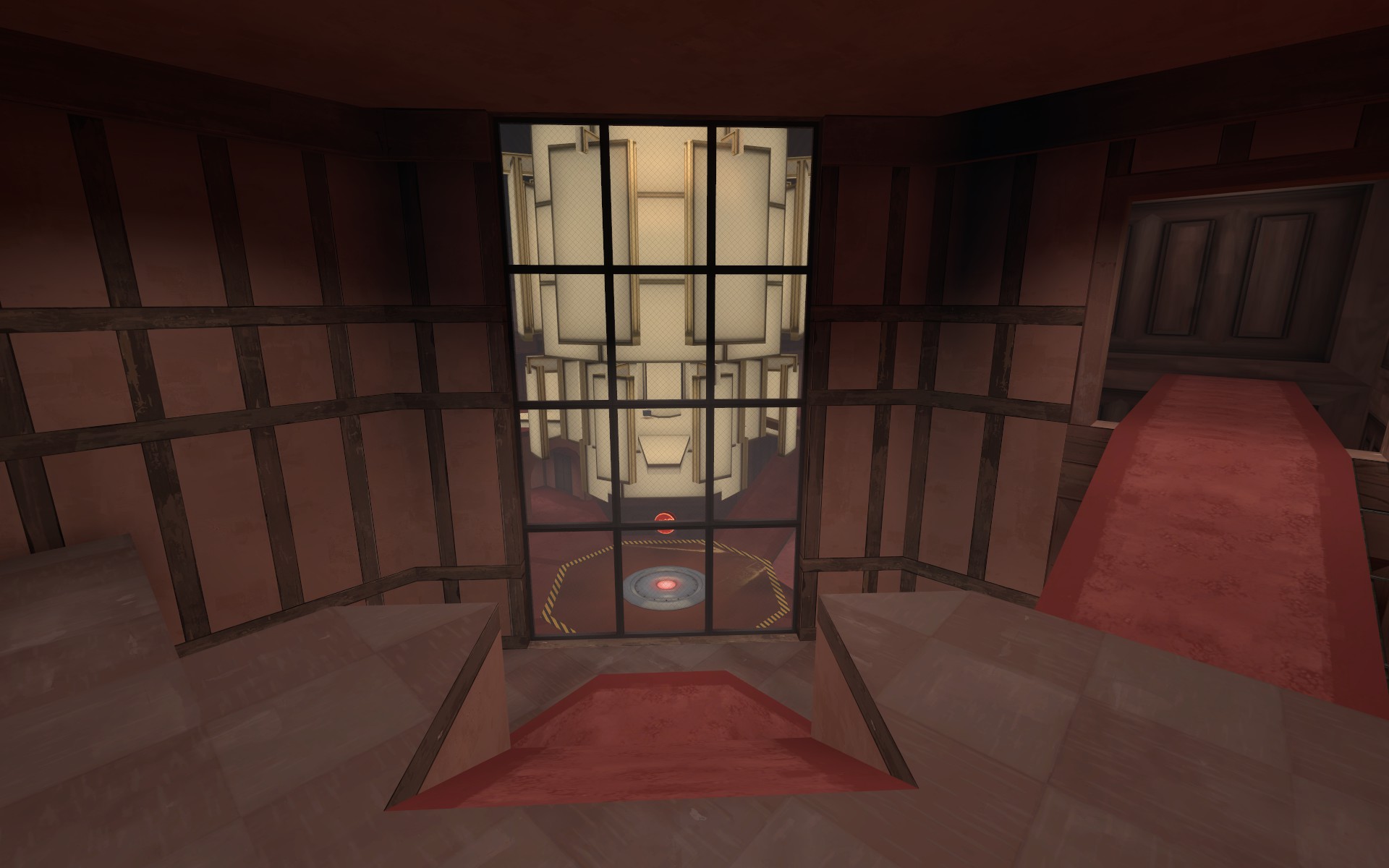
This update is a total redesign of the cliff area in front of A and a map wide interior glass texture change on the large windows to make finding exits easier.
A
-new large spire cliff area redesign
-added a large rock chunk to block some sightlines from the A capture area to the red spawn area
-connected the two stone spire things next to the point
-blocked a few cheap feeling airblast spots new blu spawn
B
-converted small cover piece in main hall choke to a grated see through wall to make the area a smidge less confusing
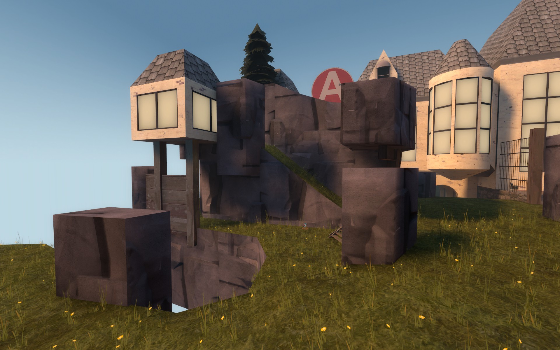
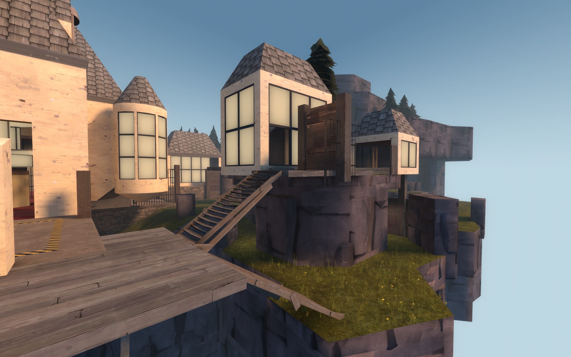
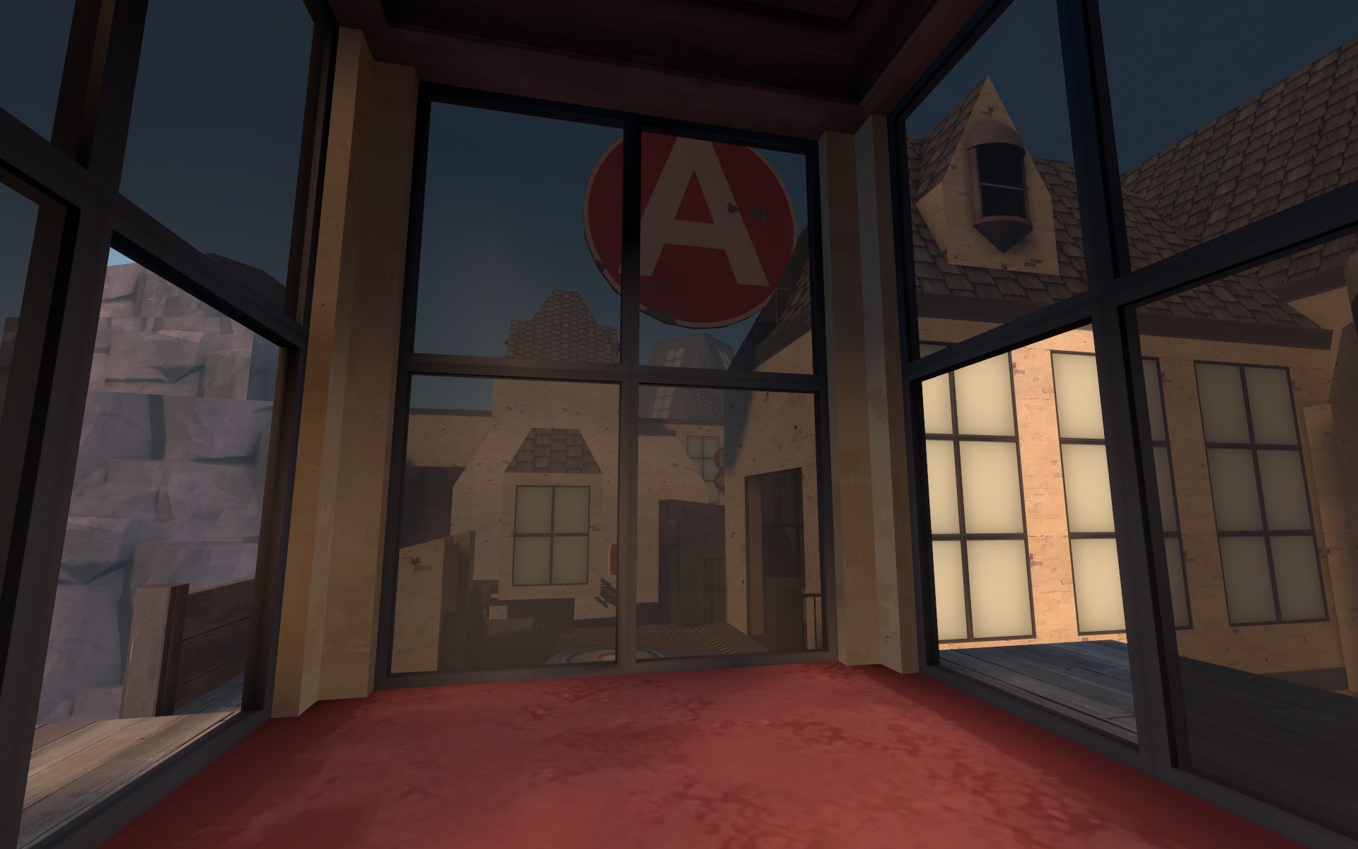
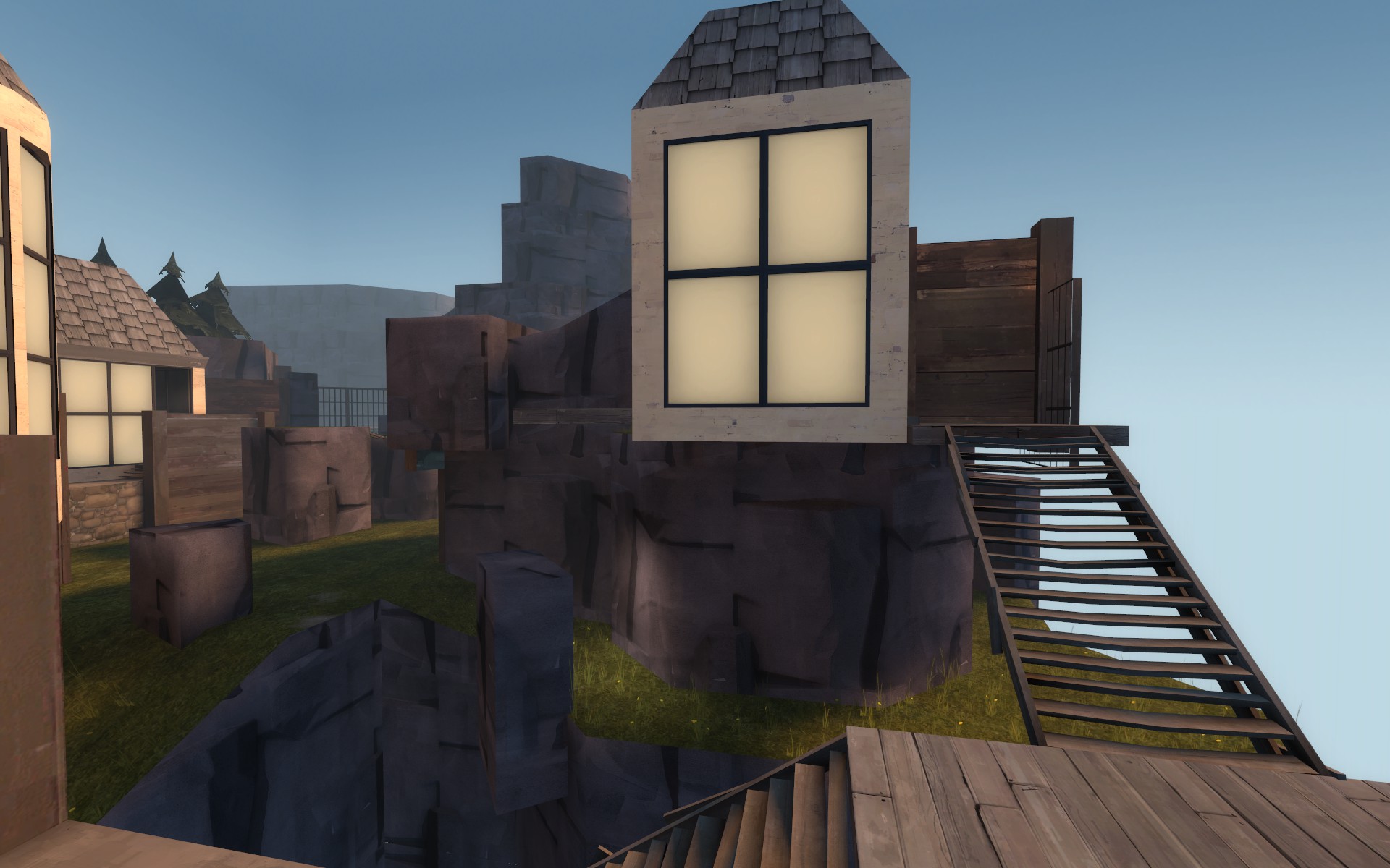
For this update I sort of soft revamped a majority of A which includes a few funky ideas I thought would be fun to try out even if they are a little awkward. Blu has now also been given a few more one way window advantages to balance against red's.
Changes
A
-right side (as blu facing A) has been scaled down
-removed far right side building to simplify blu's access to the main building
-remade the suspended building to give blu closer access to the point
-added a mini chandelier (lel) to give blu closer height advantage access slightly over the point. It might be a little tight but should be interesting
-remade red's area behind the point to provide a little more walking space
B
-nothing
Some pics of new stuffs
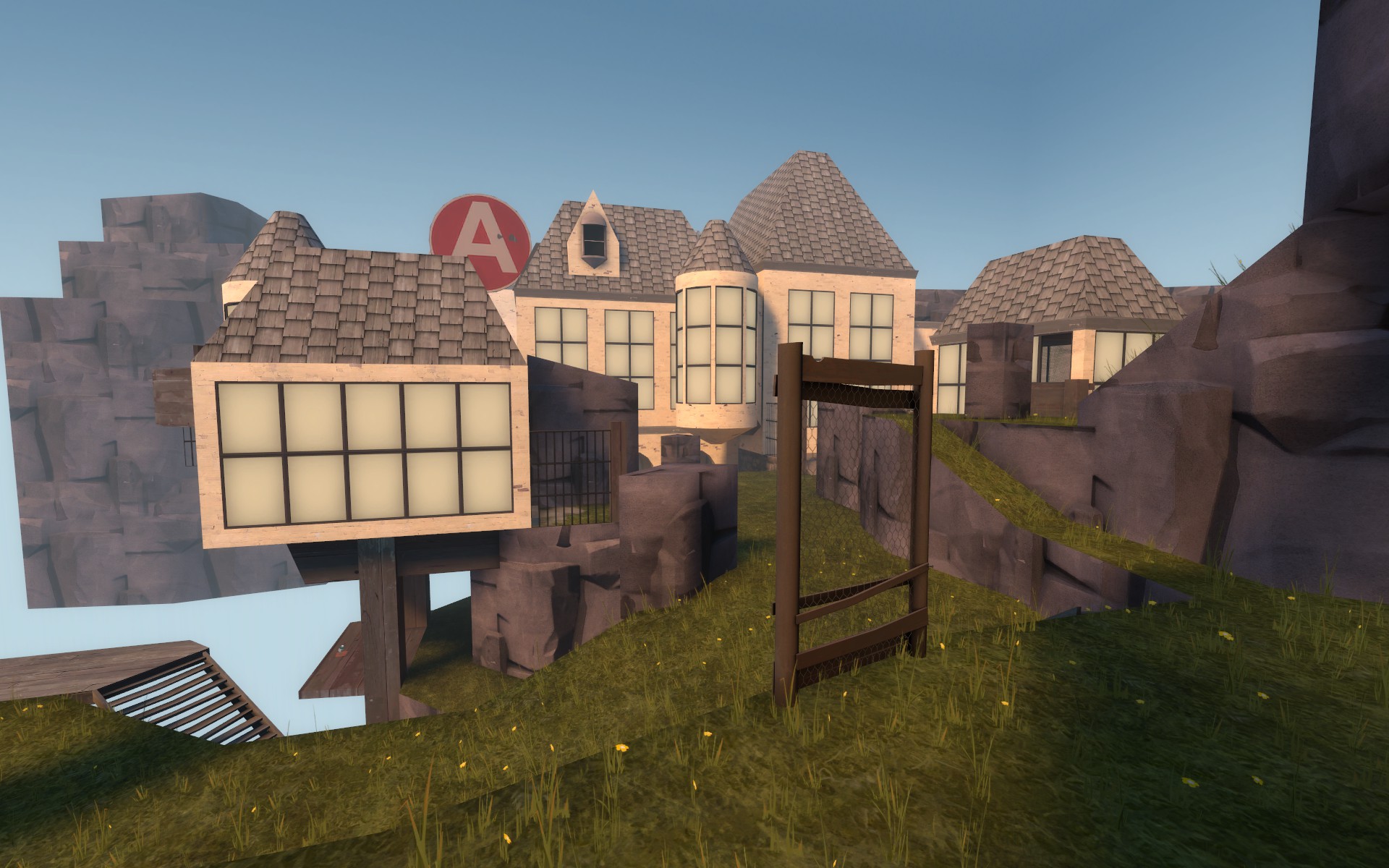
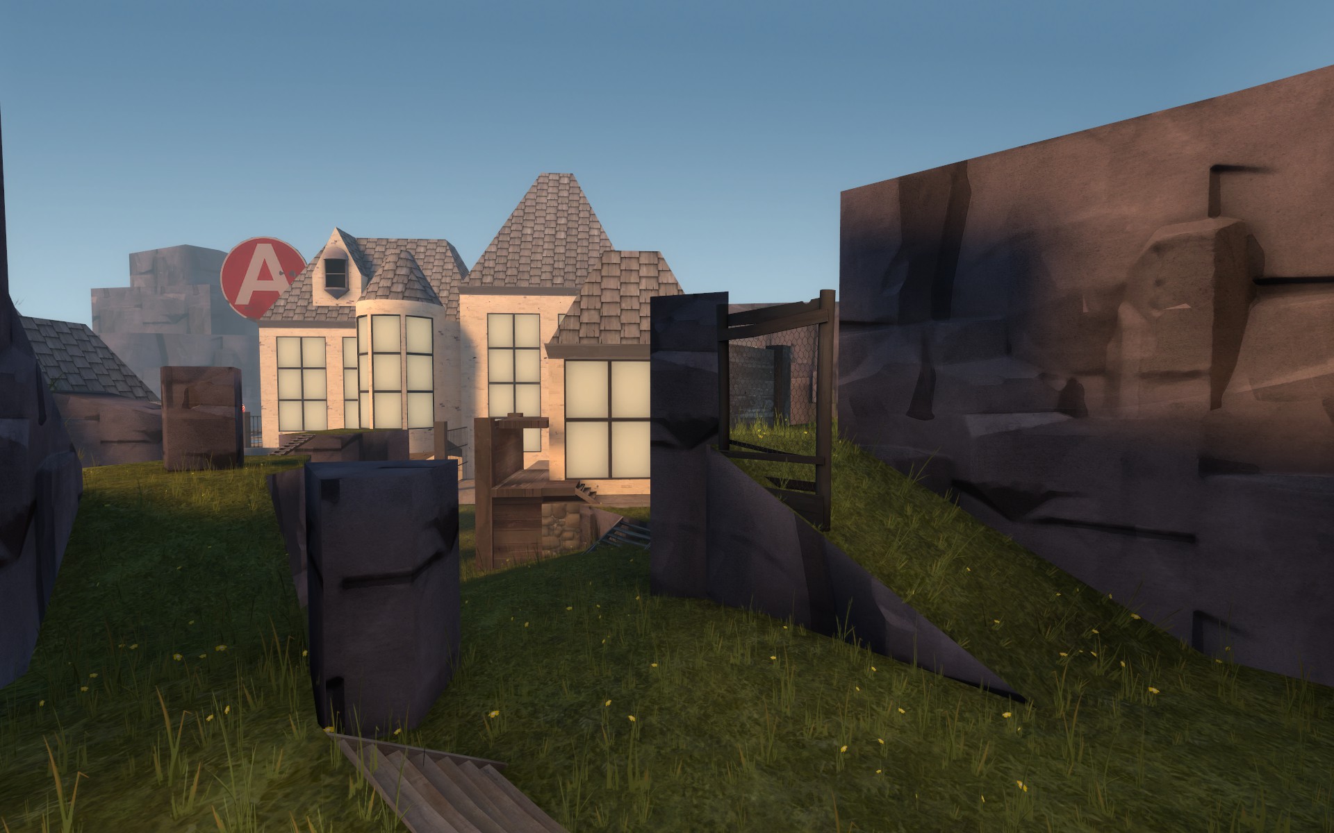
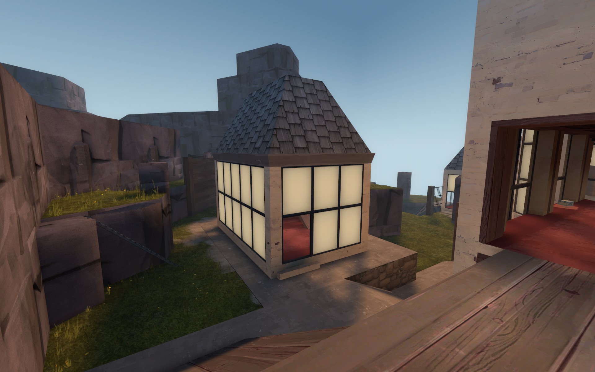
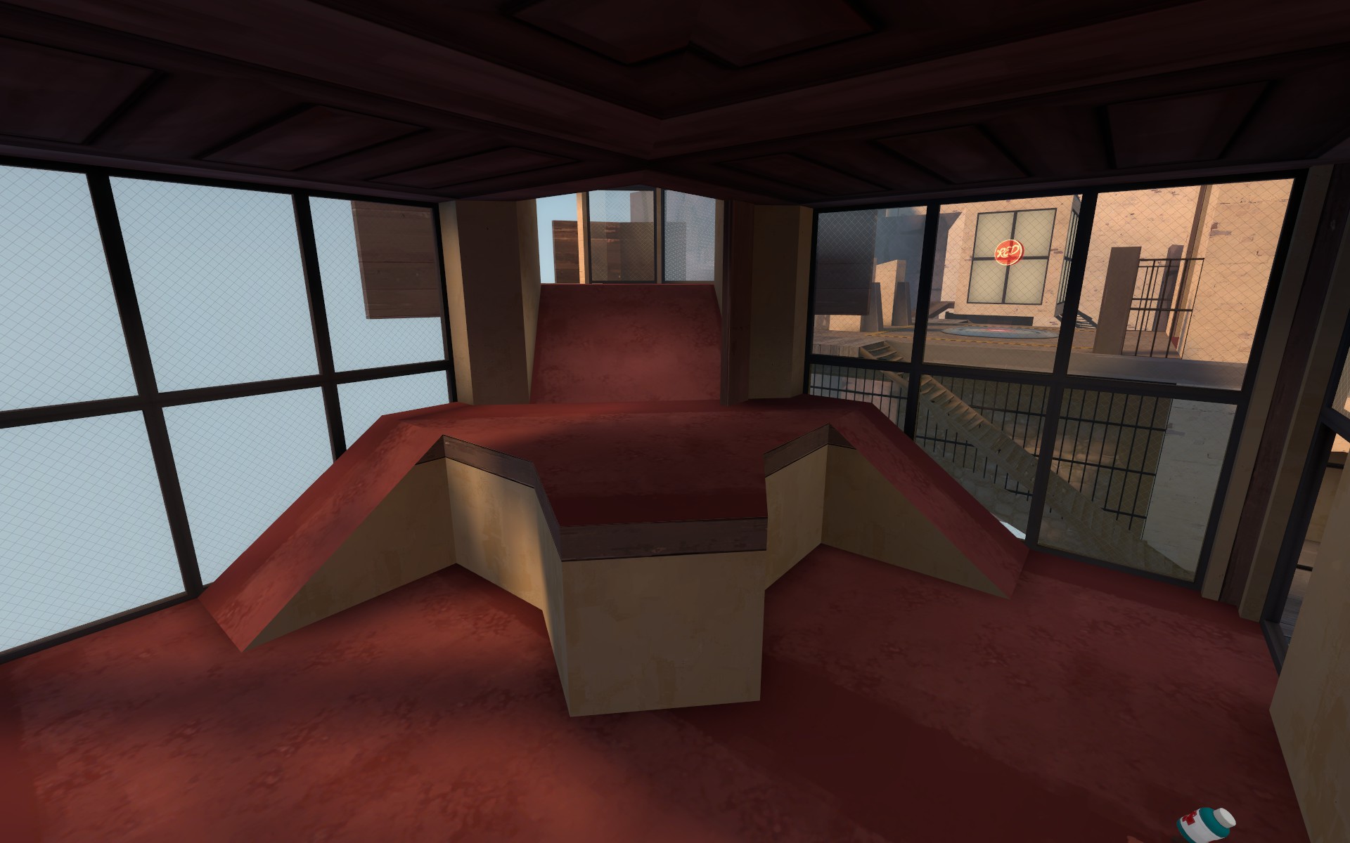
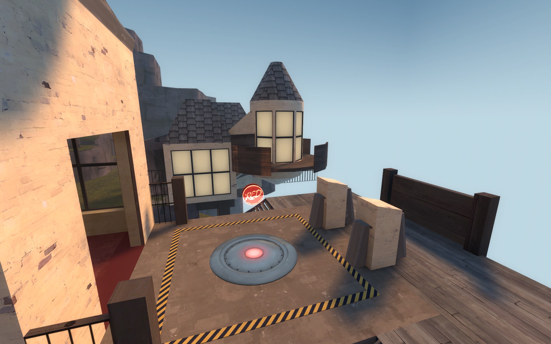
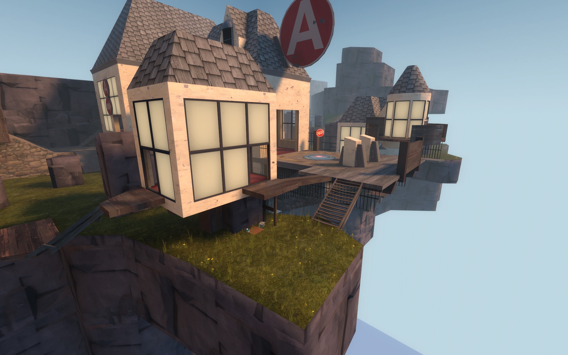
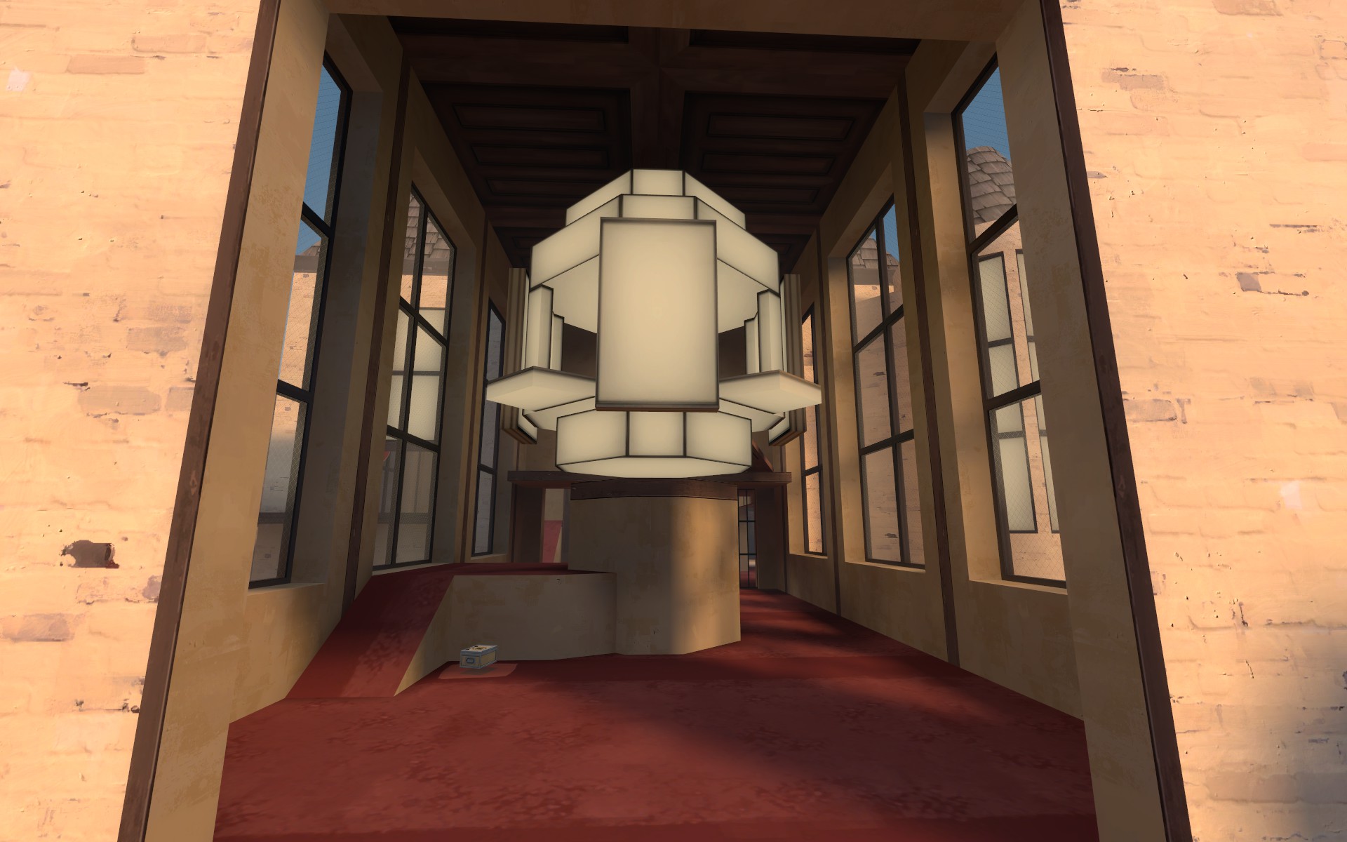
This update is focused entirely on A as the previous test highlighted some balance issues where it was a bit too hard to cap. I also need a few more tests before I can determine if B is too red sided or not. So I figured testing B more will be a little easier if theres some fun new stuff at A. I really hope this new stuff doesnt destroy performance as I think it was teetering before and this update adds about 80 brushes to the outdoor area.
The new A stuff should provide blue with some better forward holding spots, few general nerfs to pyro airblasting directly off the point, and a more obvious way to reach the point without hitting a sniper sightline.
A
-added suspended turret with interior ramps to connect the two blue right side entrances
-covered the interior part of the top right side entrance so blue has cover in an attempt to make a sort of soft holding area for blu. This should allow blue to spam the point without immediate interruption from behind. If red wants to engage with blue in this area they need to drop down and use the turret ramps.
-covered entire capture area with a large porch roof to prevent the really extreme cases of sticky jumping and provide a neat visual
-opened up the suspended building entrance to the capture area via removing the glass in one of the windows and adding a small one way ledge overhang dealio
-widened plank bridge from suspended building
-reworked the back of the A building where red enters the area from their spawn to have more obvious sightlines
-added a large fence blocker near the point to block the easiest airblasting spot.
-converted a main building interior wall to the fencing texture to make the close range route more obvious/easy to understand
-gave red spies access to the suspended blue forward spawn deck
-added visual supports under suspended buildings to stop comments about architectural realism
B
-nothing
Pics of new stuff:
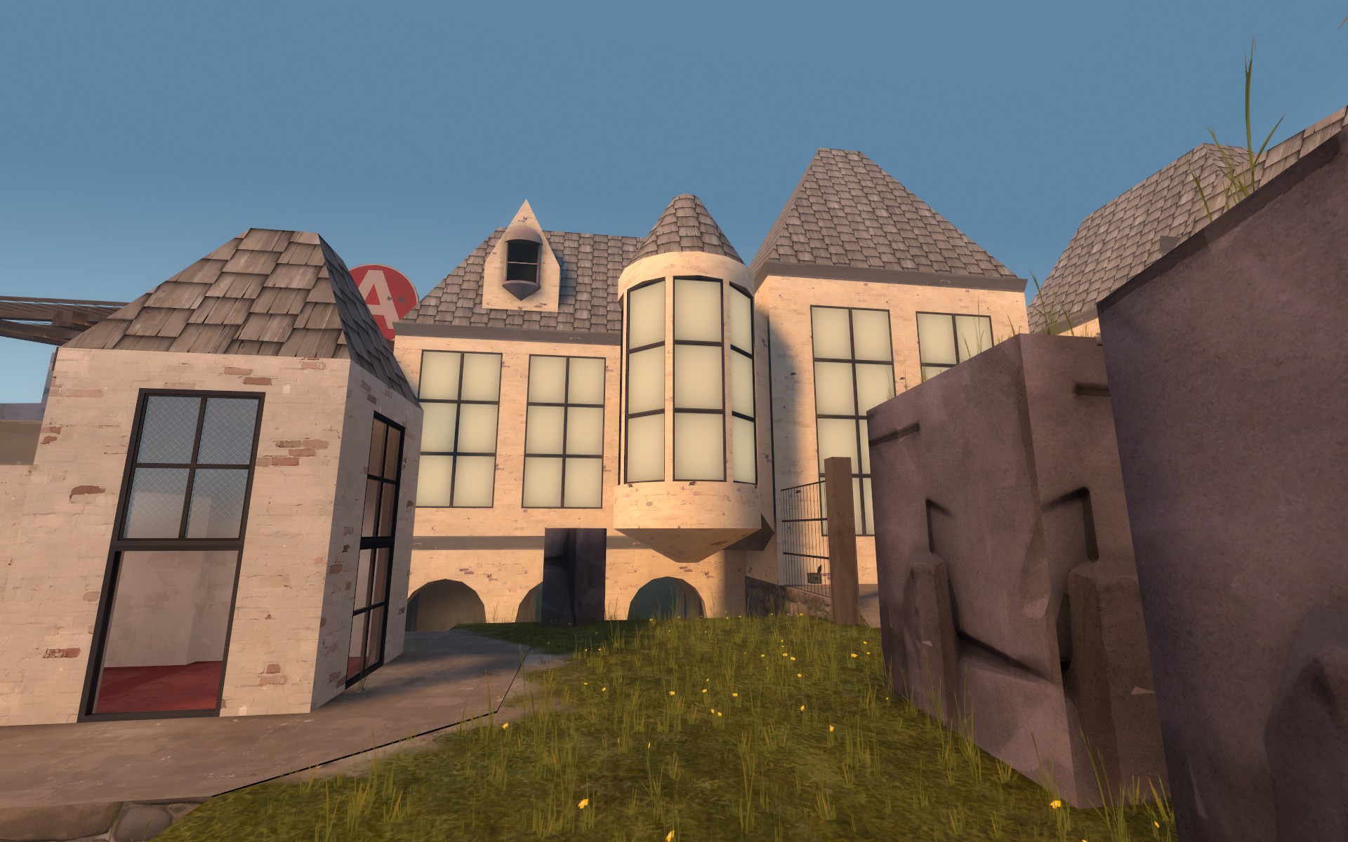
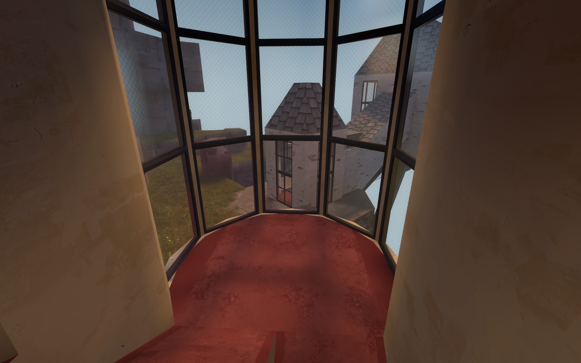
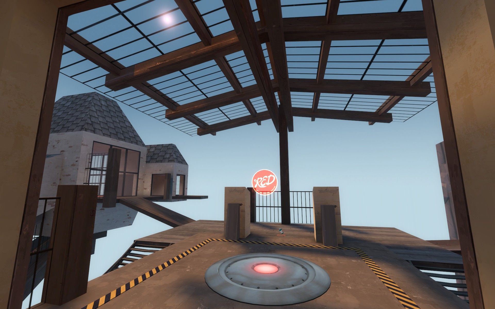
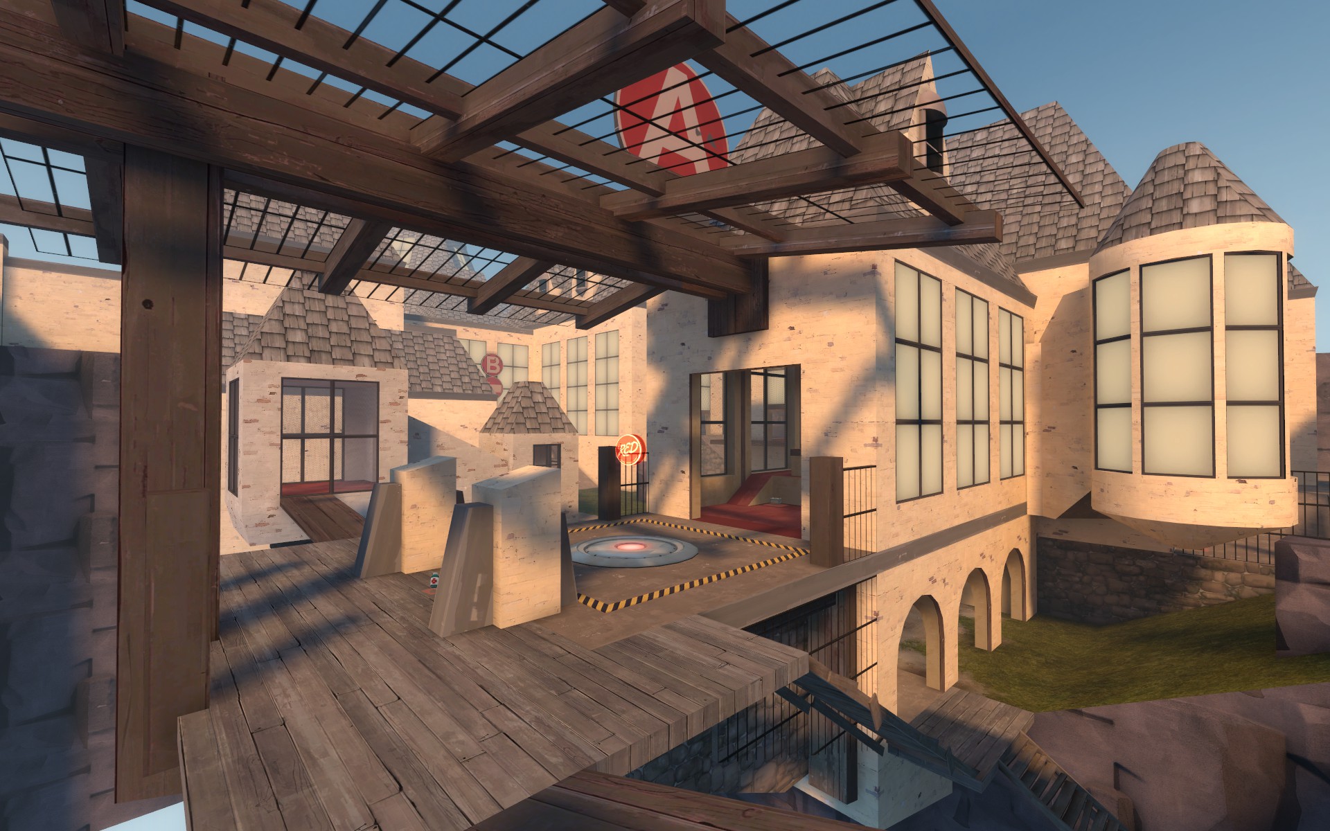
This version should fix the flow issue just after A capture, snipers having a bad time at B and the large number of surprise flanks at B. Blu also seemed to have too much advantage at B so instead of nerfing blues entrances into the area I buffed reds defense points.
A
-converted the first little hallway house thing near blu spawn to a larger single room building with small balcony exits for a slightly better holding spot
-lowered the walkable space inside the suspended building behind the point so it matches the one in front of the point
-extended the suspended building behind the point to be a little further away from the cliff face
B
-removed outer deck flank entrance into main hallway
-opened up the main point area via removing those large wooden vertical beams on the windows, raising the bottom of the chandelier a bit, and adding another sniper window that views main entrance
-added a red side plank entrance to chandelier
-opened the room immediately to the right of the point (as red facing B) to have more advantages for red
-added a sniper perch/very tall drop down to the point just outside red spawn to match blus tall entrance opposite. It rained blu onto the point before now it should rain red as well
-unified the size and shape of the rooms surrounding the main point area
-added a little bit of geometry to walk on and provide cover inside the two top surrounding rooms around B
-removed back staircase (under red spawn)
-blocked the floor windows under blus entrance into the area so its a little less confusing
Pics of new stuff
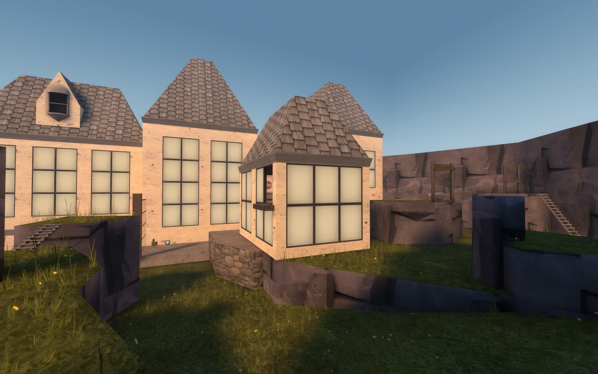

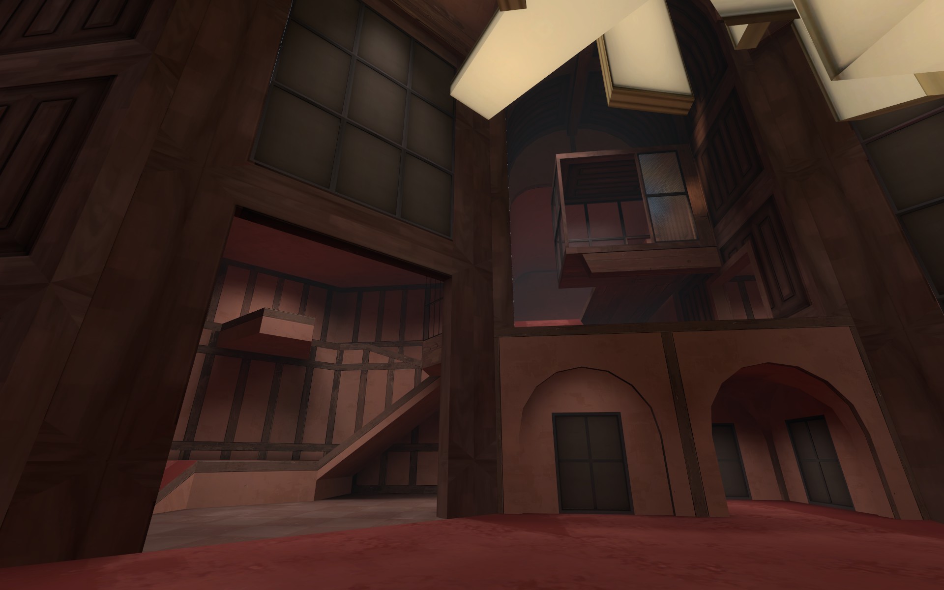
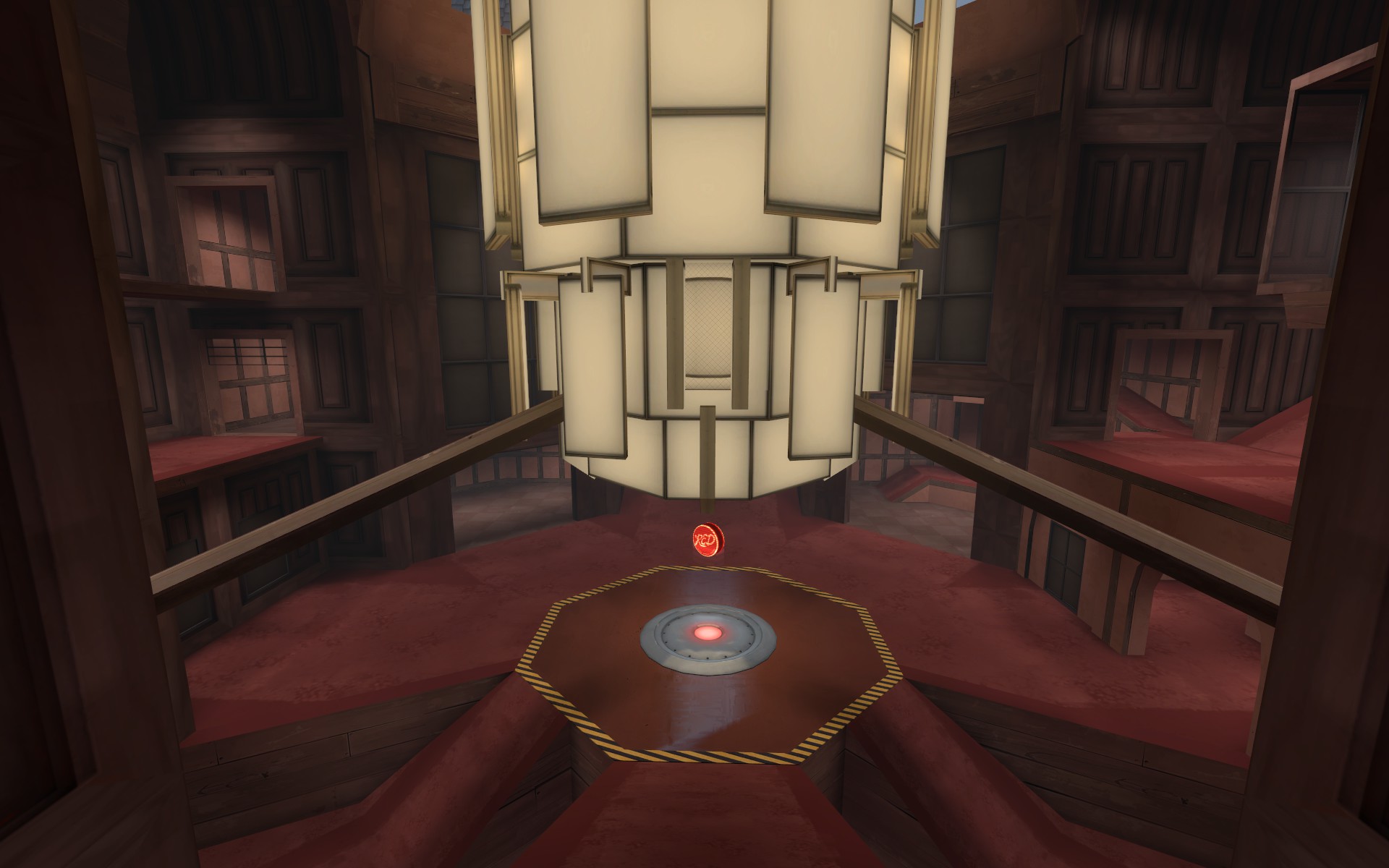
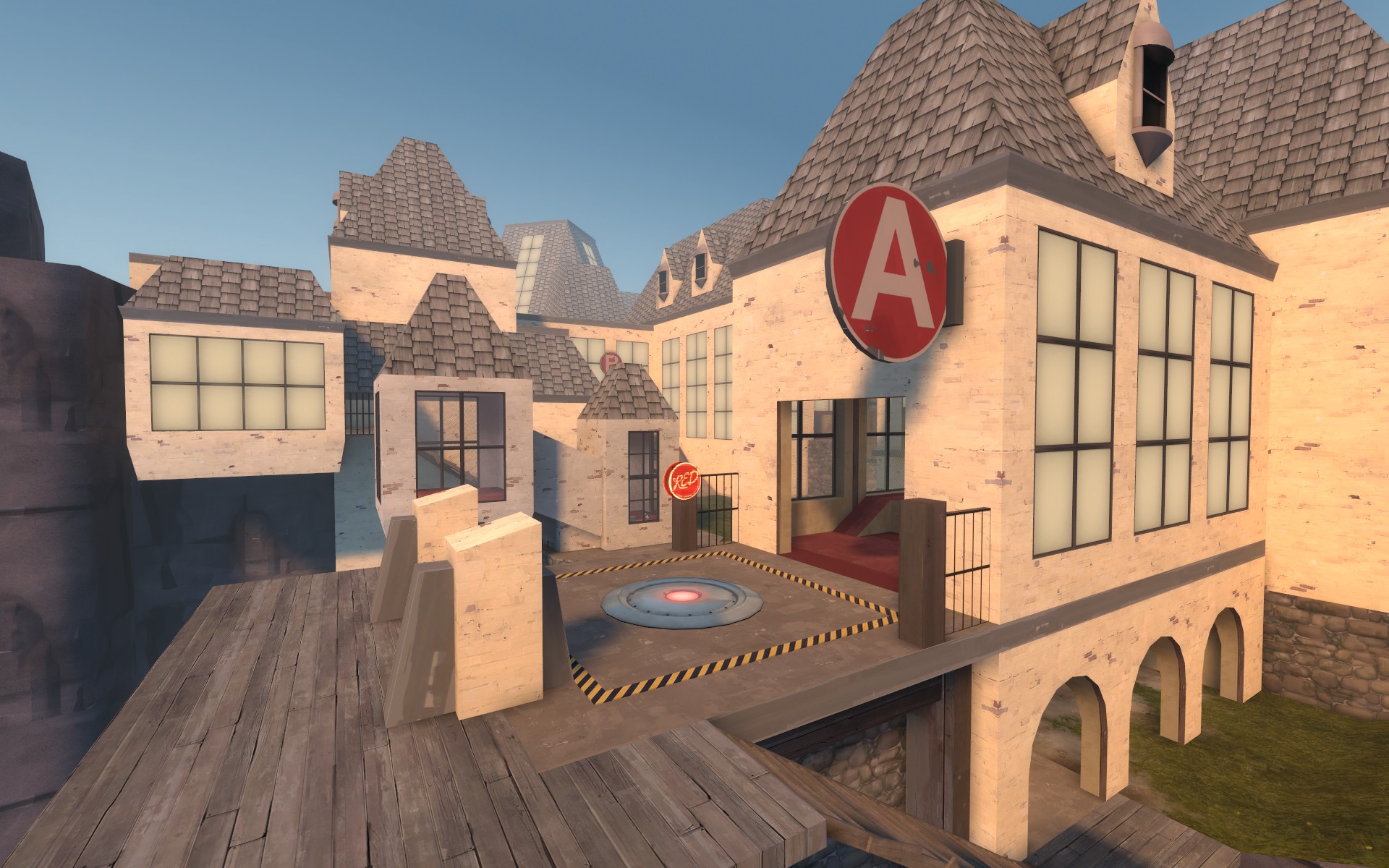
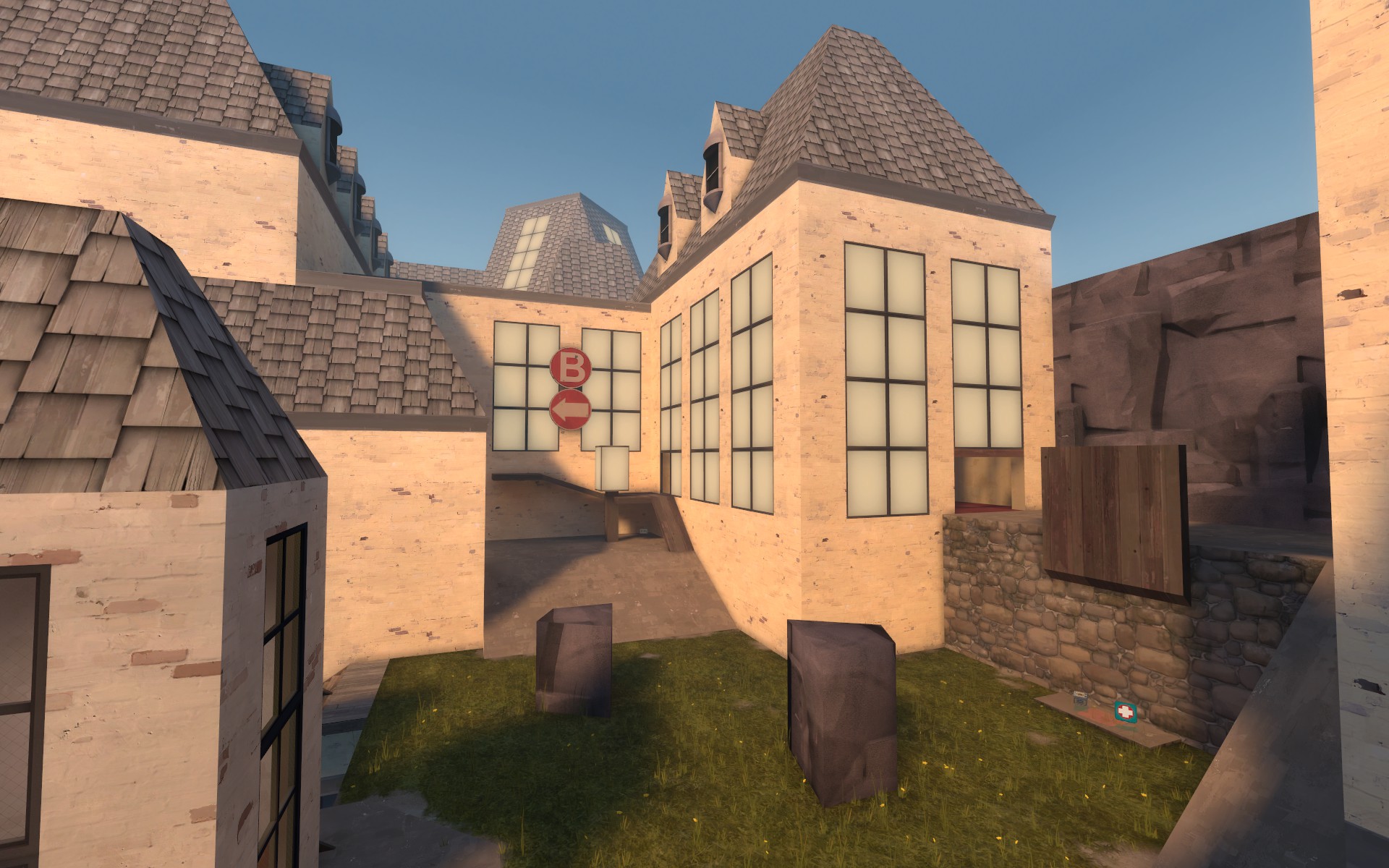
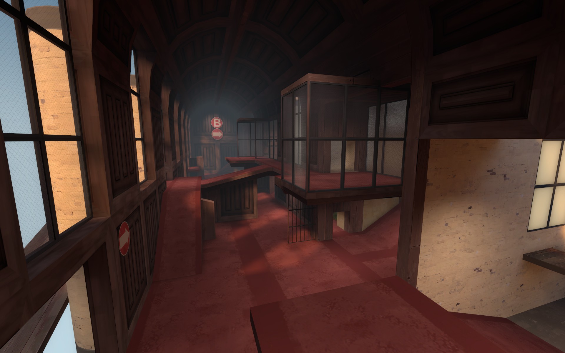
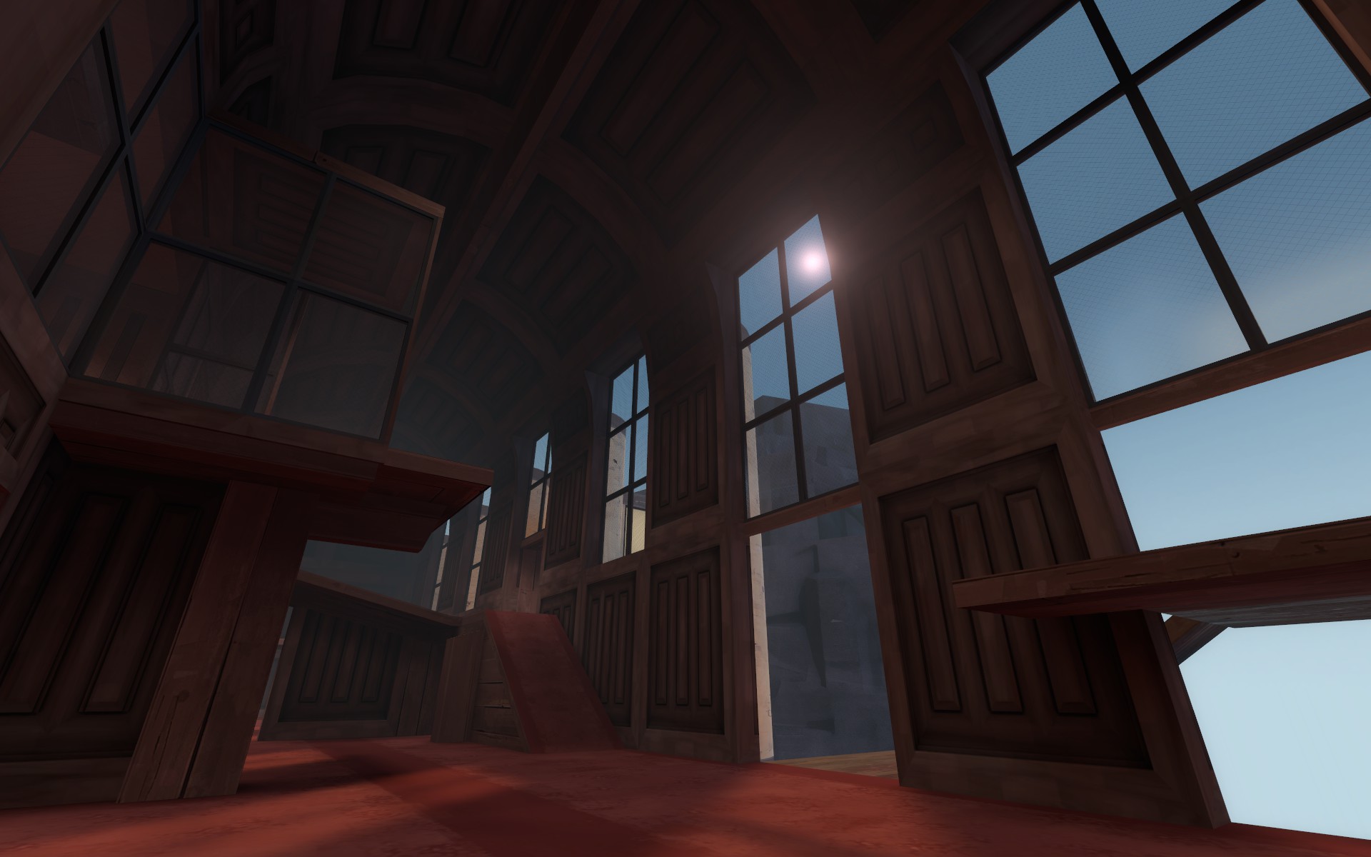
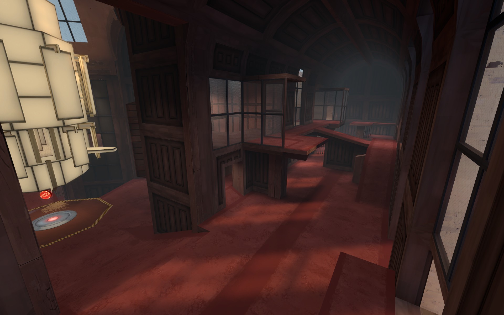
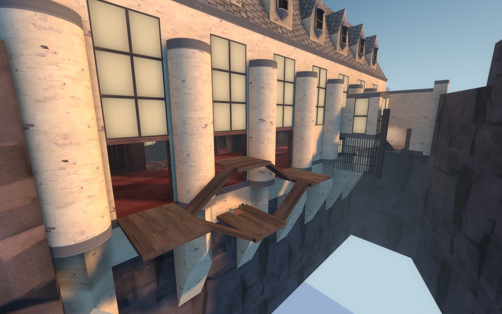
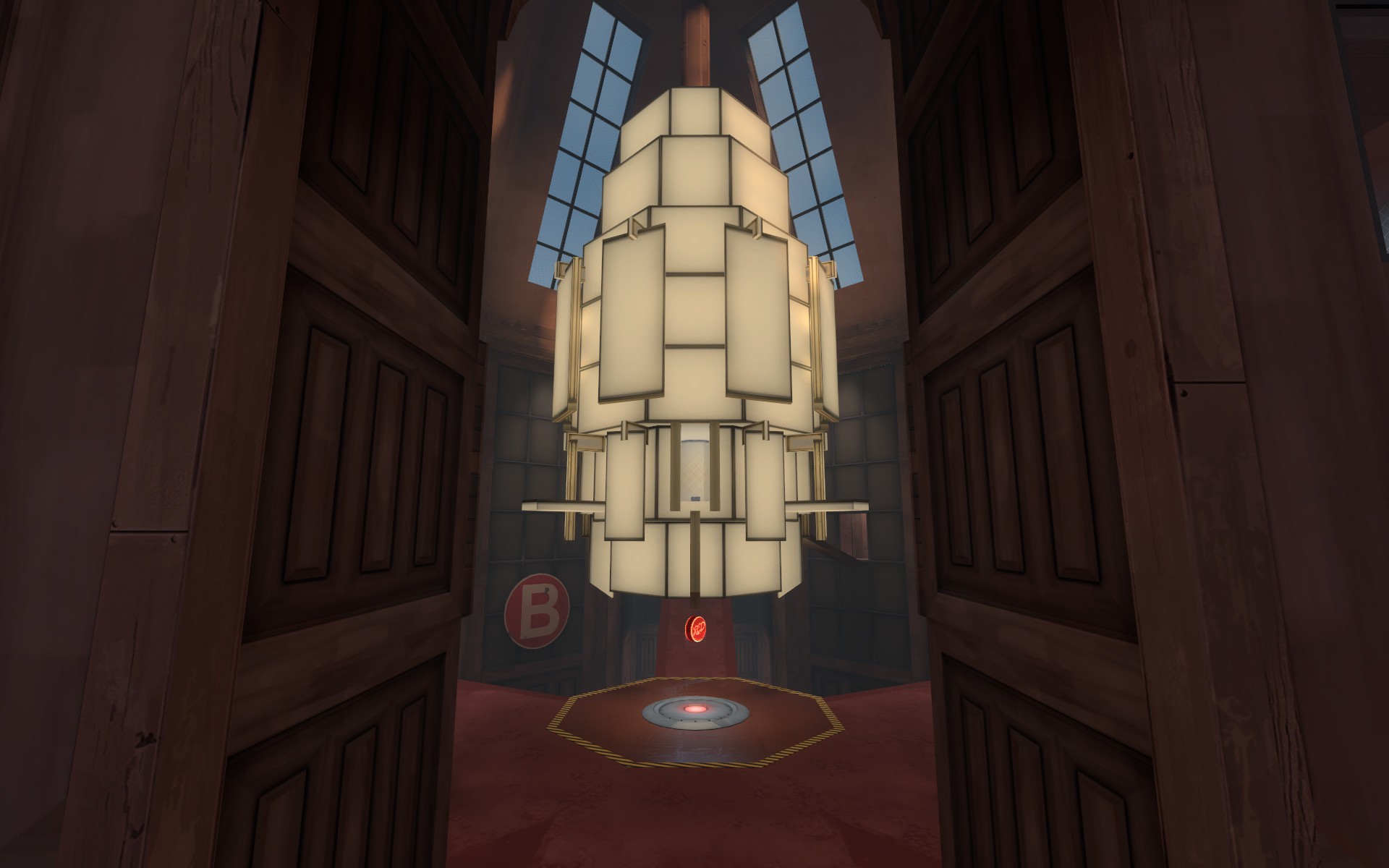
I went ahead and did the first texture pass on the whole map because why not. It should help explain the architecture a little better in addition to helping with players orientation in a few spots. The lighting is still just temp placeholder dev stuff though. I am also still open to any potential pathing reroutes or layout additions if needed. I just wanted to test it a few more times and I figured why not have the general texture concept in during those tests. (back of A area might need some changes but im not sure what yet).
A
-Time given on cap down from 9 to 8 minutes
-Opened up the hallways in the suspended buildings a little bit
-Set all white brick suspended building windows to two way glass
-Added some red cover and height on left side (as red facing blu first spawn) of the first area
-Removed one of the suspended arms off the back of A white brick building
B
-Time to cap down from 10 to 9 seconds
-Simplified outdoor plank area attached to main hall
-Plank area healthpack down from full to medium
-Simplified area just outside red spawn to be a lot less confusing
-Widened secondary spawn exit suspended path area
-Added second resupply cabinet to red spawn
Pictures of shiny newness
