Zhuanguo

KotH Zhuanguo B9

Nov 28, 2017
130
119
Zhuanguo - CHINA

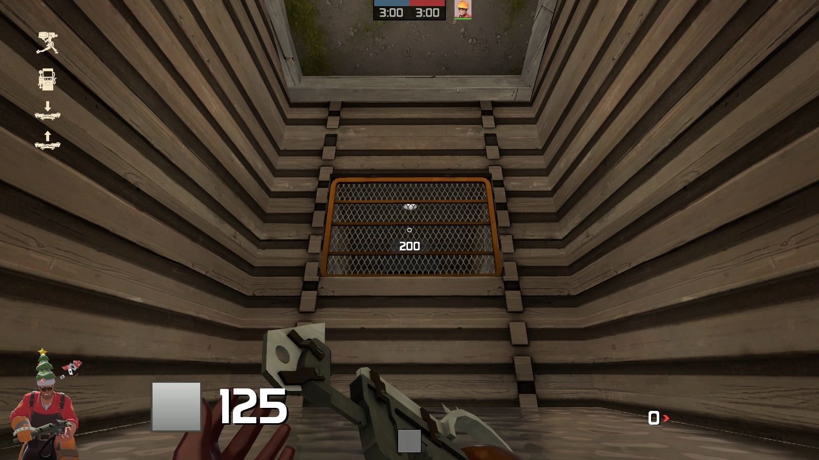
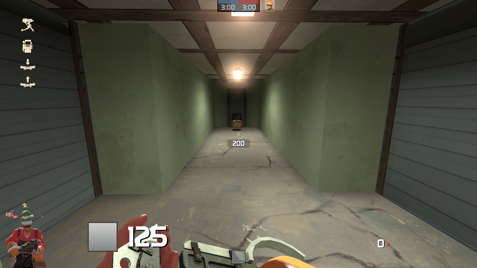
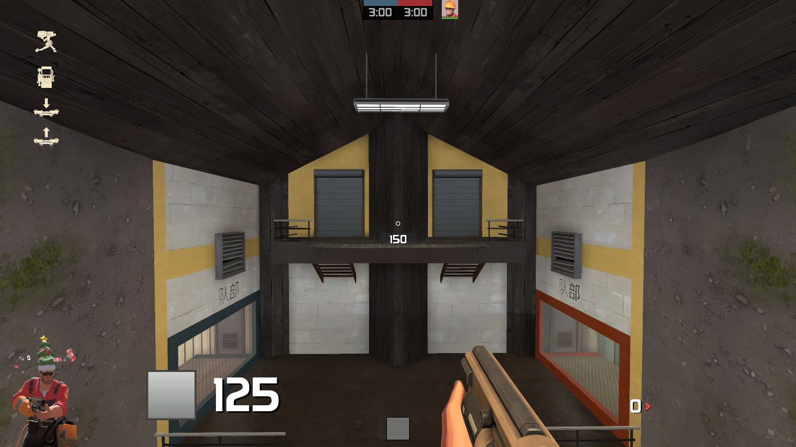
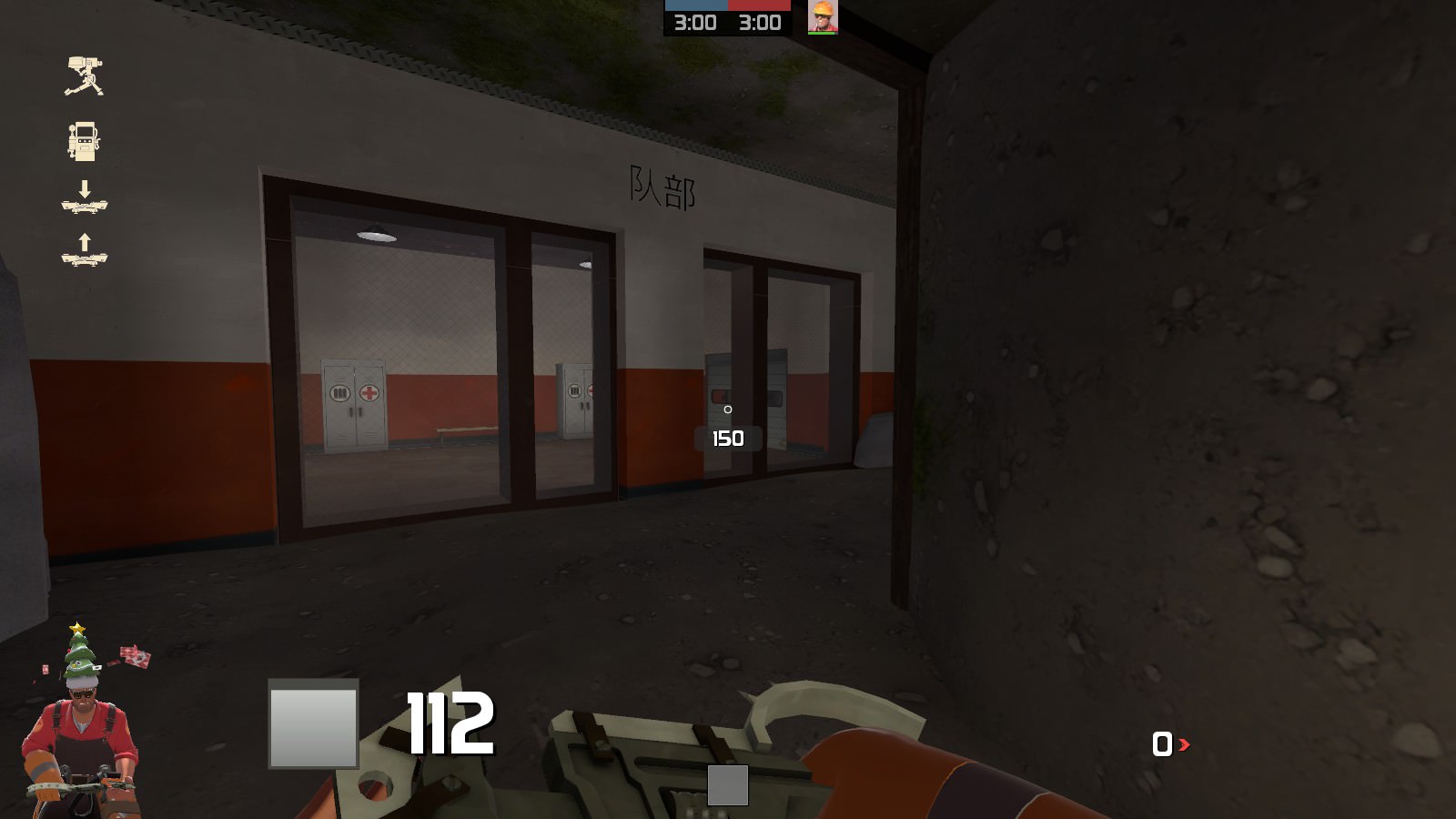
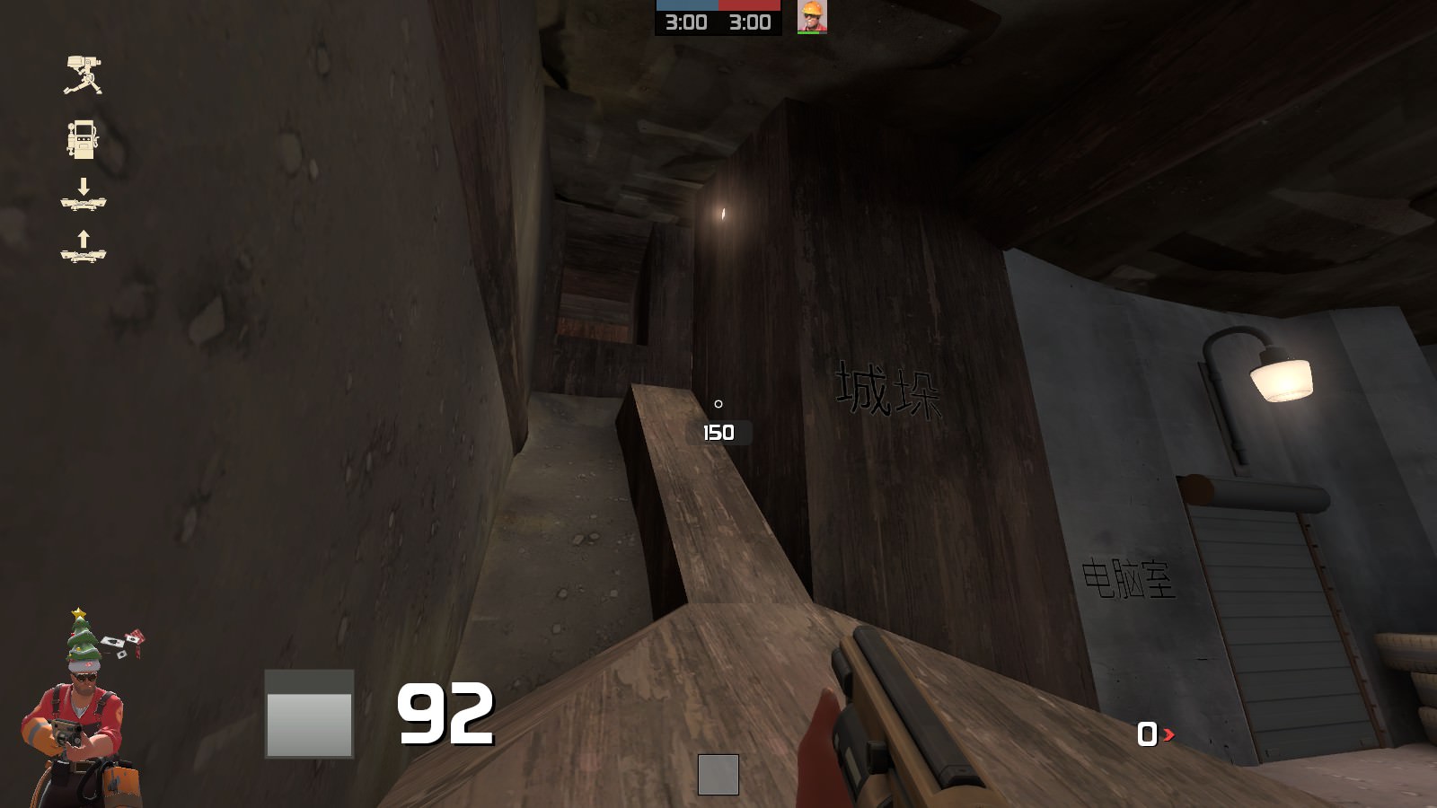
Zhuanguo, or 'Brick Country' is my entry for the Connect 5 contest!

This map has an interesting layout where the control point it north from the middle, and the winner of the control point spawn close to it while the losers spawn south and must attack from 5 different areas. Made with the Construction pack and Japanese (sorry) Content pack. Custom models are also included.
6f3iev2

o17Whqm

pETrF2c

mE8T1GF

QEfbEb2

tqwjm5H

oeKEsjz

6kEMdP4

v7TQ0xl

Xl6rkdj

FqokBVr

qMSE9FC

IwxlGPQ

OYeDsBB
 
Last edited:
Nov 28, 2017
130
119
There was a recent Cave-In that destroyed 2/3rds of the compound, but that doesn't stop the mercenaries from fighting the point nor the smugglers from finding more terracotta warriors! This version follows the recent feedback in a brutal way. This pathway is confusing? POOF, pathway gone. Now this map is straightforward, shorter and compact, making it easier to get to the capture point without going through loops or accidentally ending up in the enemy spawn (Technically you have a 1/5th chance of getting to the enemy spawn in under 2 sticky jumps but that's only if you really want to engage the enemy). This update is not for the contest, that would be b8.

Patch notes:

-Absofuckinglutley destroyed 2/3rds of the map, which is most of the southern portion of the map
-Moved attacker spawn point closer to mid
-Decreased cap rate, cap time and spawn time for attackers.
-Increased spawn time for defenders
-Optimization
-Polish and detailing with more props, buildings, and overlays
-Smaller file size

Future goals:

-Possibly more optimization?
-Decrease possibility of spawn-camping
-Balancing depending on feedback

Read the rest of this update entry...
 

Jack5

L4: Comfortable Member
Apr 6, 2018
189
37
Thanks so much for this update, it makes the map a whole lot less convoluted. Even so, there are still quite a few bugs that need to be addressed, and I will try to do so with as many screenshots as possible.

SJNWFYO.jpg

You've done an OK job of preventing access to cut areas of the map, however this door still opens and can be walked through, making a near impenetrable area that Engineers can place their teleporters in. I suggest removing the door and leaving just a wall.

XDXSZqc.jpg

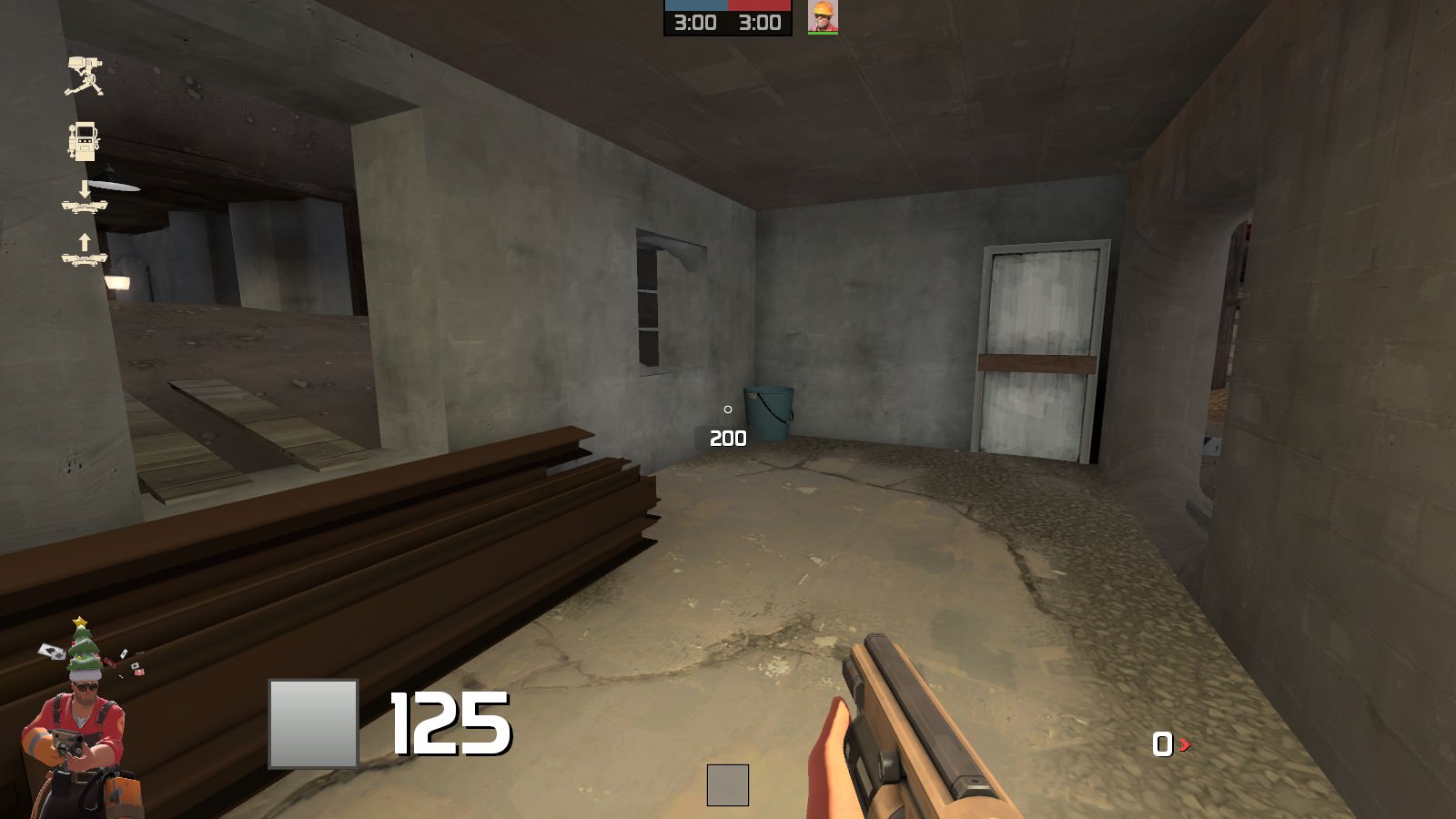
This room is similar to the above, but here it's an actual sentry hell. Cut this room entirely, including its doors, and move the full ammo pack into the room behind the Engineer in the screenshot. I also suggest changing the full ammo pack to a medium one.

ifcaJZ6.jpg

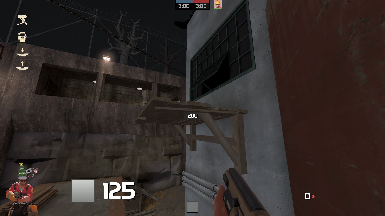
Here's another forgot-to-prevent-access-to-this area. The vent props should be non-solid, and the platform being pointed to should be playerclipped so it is impossible to get on top of it as any class. You should also make it clear to players that these doors cannot be entered.

JhmfVau.jpg

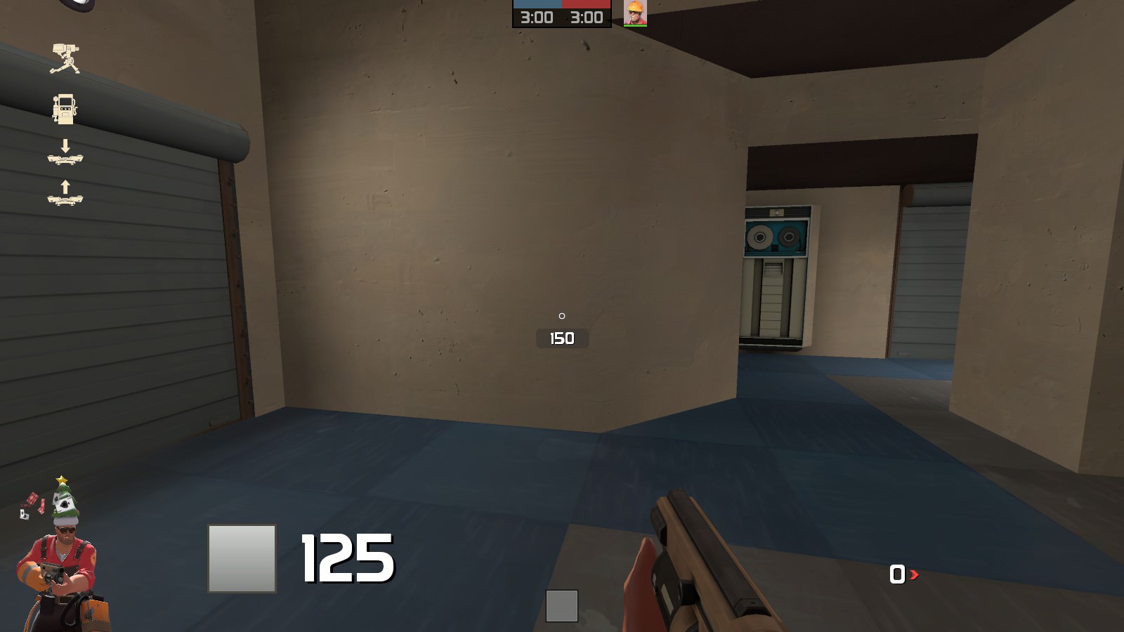
The sideward sliding doors on the map don't open in conjunction with each-other. They instead open at the same speed, meaning one finishes opening/closing before the other. Adjust their speed so they open and shut at the same time.

5jF1jqY.jpg

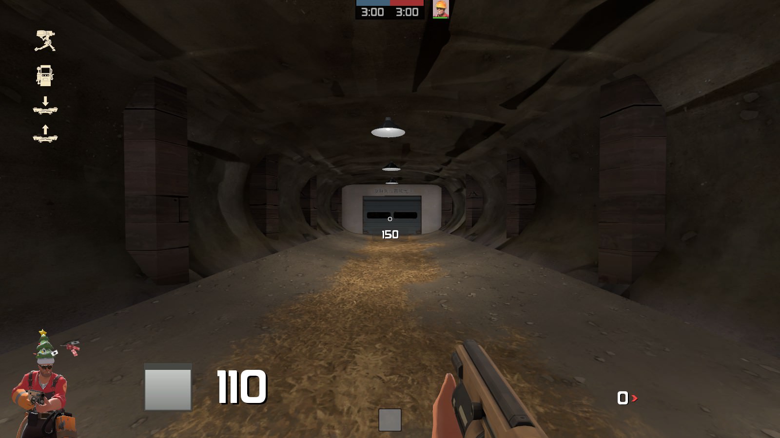
There's no reason for this hallway to even be this long since you've cut the spawn on the other side of that door. You should instead halve the length of this cove. The door, again, needs some skin change or an identifying object placed near it to show that it cannot be entered.

JrPfklt.jpg

The doorways in this room, both the one on the left and the hole on the right, need to be made much wider.

tSkTrpk.jpg

This platform is unnecessary as it cannot be reached by anyone other than jumping classes. Including these kind of platforms in a map is not good design and can cause a multitude of problems in community server gamemodes.

Qk7fiu6.jpg

This room and the RED counterpart near it are very claustrophobic. Try to make the passage wider and change the doors to the wider variety. You should avoid using the small doorways most of the time.

VFYNuGt.jpg

If it's even possible, try revising the passage up to the second floor. It's incredibly steep and doesn't accurately represent the ability for characters in Source to travel up these kinds of slopes at normal along-ground speed. It's also very cramped.

Pu2VOBM.jpg

aHSGpJS.jpg

F6nSaM9.jpg

NK1k8cO.jpg

aUb8d7h.jpg

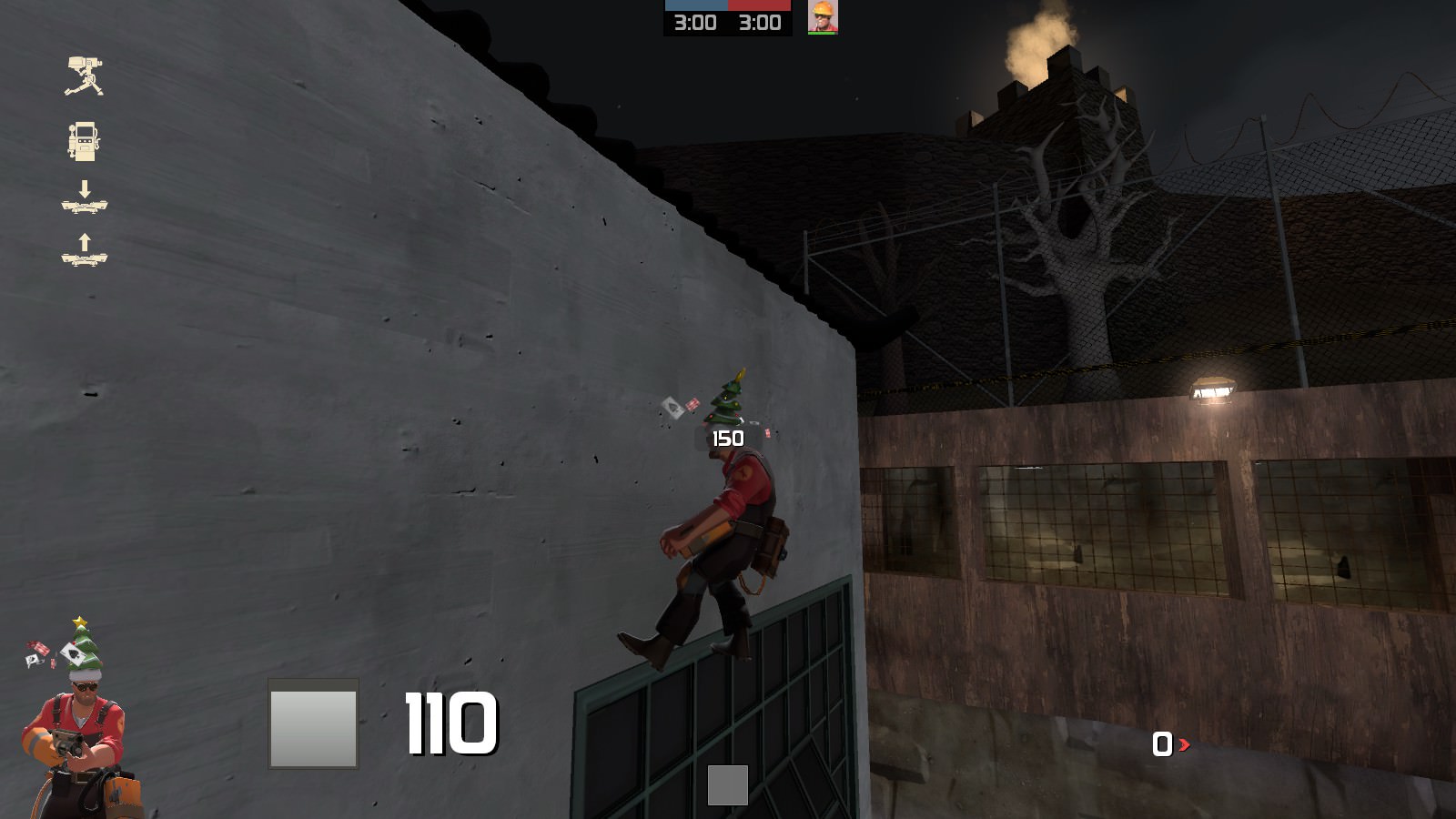
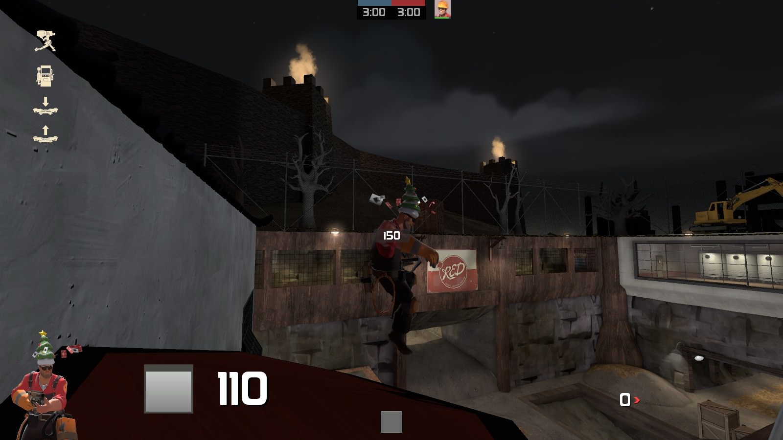
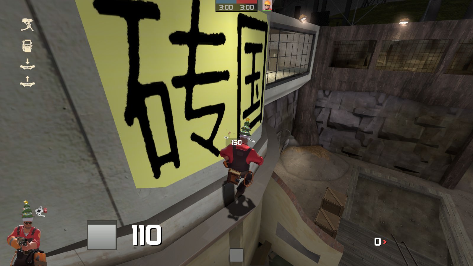
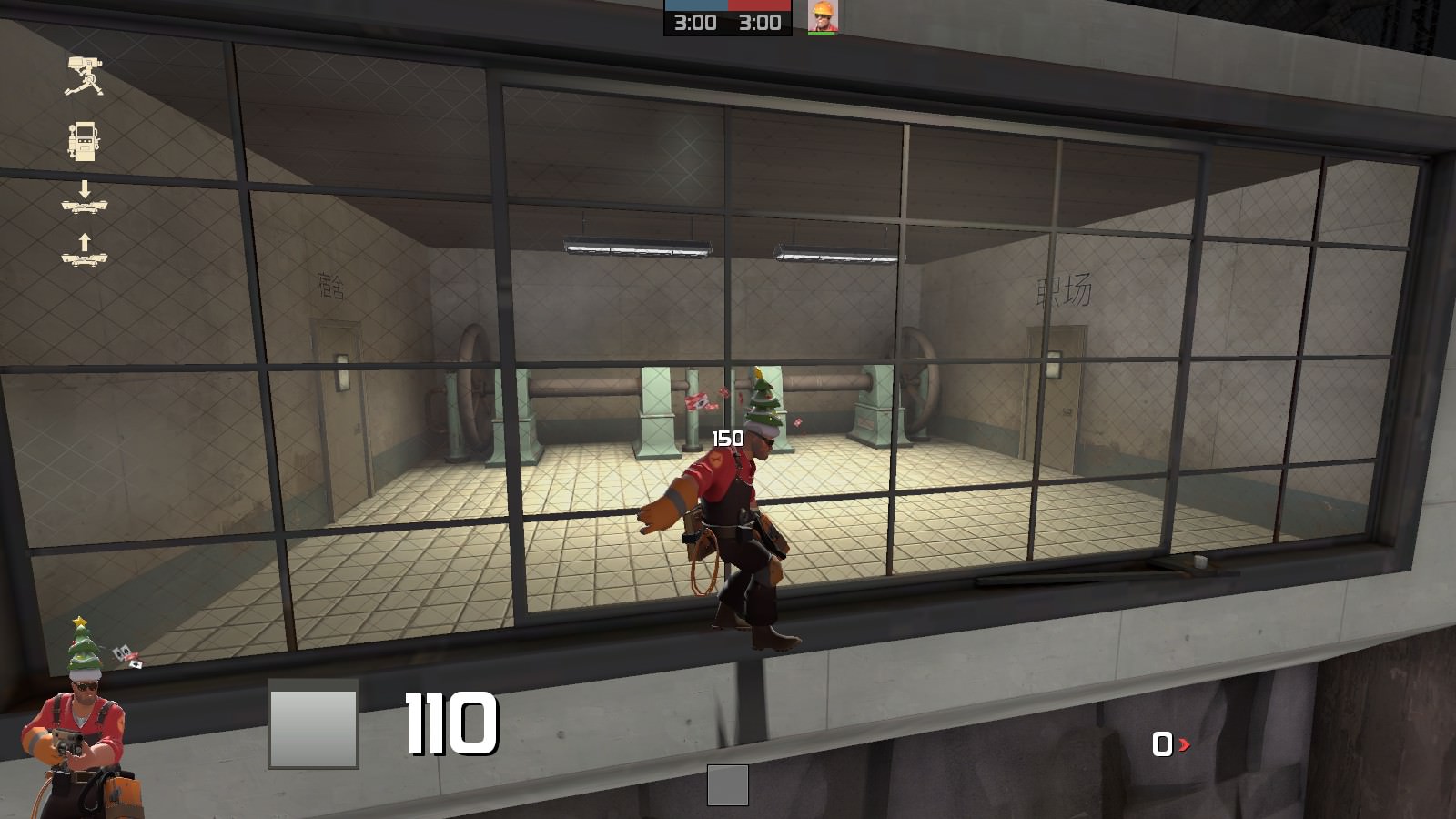
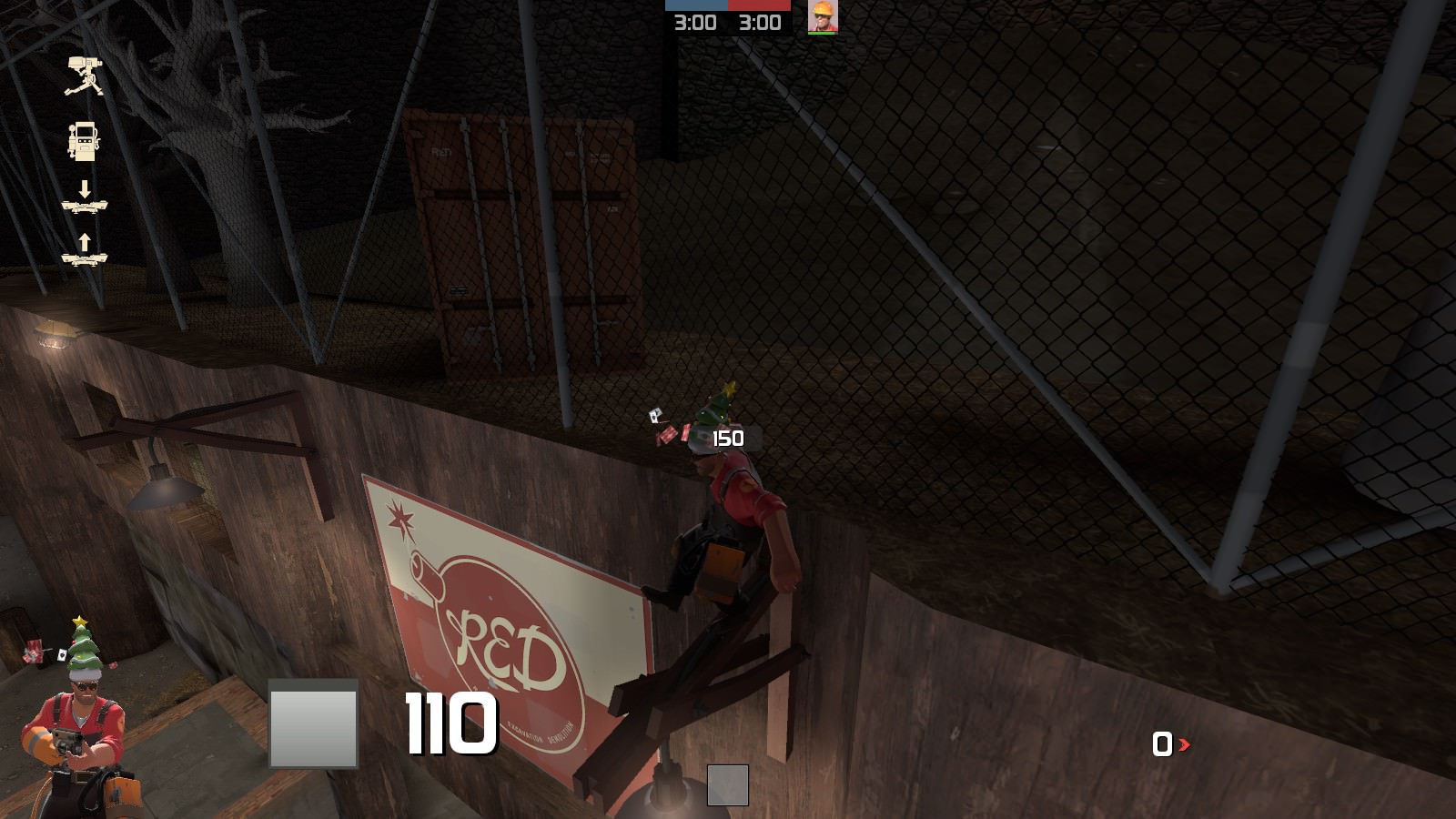
Finally, clipping. There are a lot of places in the outside area that haven't been clipped, allowing for jumping classes to get an extreme advantage over all other players. You should disable the collision of props that are closer to the top of the map but still inside the playable area, and add playerclips where necessary, especially in the roof (2nd picture) and caligraphy (3rd picture) examples.

I look forward to seeing the next version in which these bugs can be patched. Thanks for hearing me out on my unnecessarily long ramble.
 
Nov 28, 2017
130
119
Thanks so much for this update, it makes the map a whole lot less convoluted. Even so, there are still quite a few bugs that need to be addressed, and I will try to do so with as many screenshots as possible.

SJNWFYO.jpg

You've done an OK job of preventing access to cut areas of the map, however this door still opens and can be walked through, making a near impenetrable area that Engineers can place their teleporters in. I suggest removing the door and leaving just a wall.

XDXSZqc.jpg

This room is similar to the above, but here it's an actual sentry hell. Cut this room entirely, including its doors, and move the full ammo pack into the room behind the Engineer in the screenshot. I also suggest changing the full ammo pack to a medium one.

ifcaJZ6.jpg

Here's another forgot-to-prevent-access-to-this area. The vent props should be non-solid, and the platform being pointed to should be playerclipped so it is impossible to get on top of it as any class. You should also make it clear to players that these doors cannot be entered.

JhmfVau.jpg

The sideward sliding doors on the map don't open in conjunction with each-other. They instead open at the same speed, meaning one finishes opening/closing before the other. Adjust their speed so they open and shut at the same time.

5jF1jqY.jpg

There's no reason for this hallway to even be this long since you've cut the spawn on the other side of that door. You should instead halve the length of this cove. The door, again, needs some skin change or an identifying object placed near it to show that it cannot be entered.

JrPfklt.jpg

The doorways in this room, both the one on the left and the hole on the right, need to be made much wider.

tSkTrpk.jpg

This platform is unnecessary as it cannot be reached by anyone other than jumping classes. Including these kind of platforms in a map is not good design and can cause a multitude of problems in community server gamemodes.

Qk7fiu6.jpg

This room and the RED counterpart near it are very claustrophobic. Try to make the passage wider and change the doors to the wider variety. You should avoid using the small doorways most of the time.

VFYNuGt.jpg

If it's even possible, try revising the passage up to the second floor. It's incredibly steep and doesn't accurately represent the ability for characters in Source to travel up these kinds of slopes at normal along-ground speed. It's also very cramped.

Pu2VOBM.jpg

aHSGpJS.jpg

F6nSaM9.jpg

NK1k8cO.jpg

aUb8d7h.jpg

Finally, clipping. There are a lot of places in the outside area that haven't been clipped, allowing for jumping classes to get an extreme advantage over all other players. You should disable the collision of props that are closer to the top of the map but still inside the playable area, and add playerclips where necessary, especially in the roof (2nd picture) and caligraphy (3rd picture) examples.

I look forward to seeing the next version in which these bugs can be patched. Thanks for hearing me out on my unnecessarily long ramble.

Thank you so much for this large feedback!! I'm gonna work on the bugs you mentioned, but I will get back to you on some other proposed changes that you mentioned since some of them may need more information and clarification from me to you and from you to me. Again, thank you!